
One of my current reads is Graphics of Large Datasets: Visualizing a Million (Unwin, Theus & Hofman, 2007). In one of the introductory chapters (I believe it was Theus) makes the point that for histograms with stretched out values it is very difficult to identify outliers in the tails (or really see the density at all).
Here is an example with the crime data for 21,506 street units I am using for my dissertation.
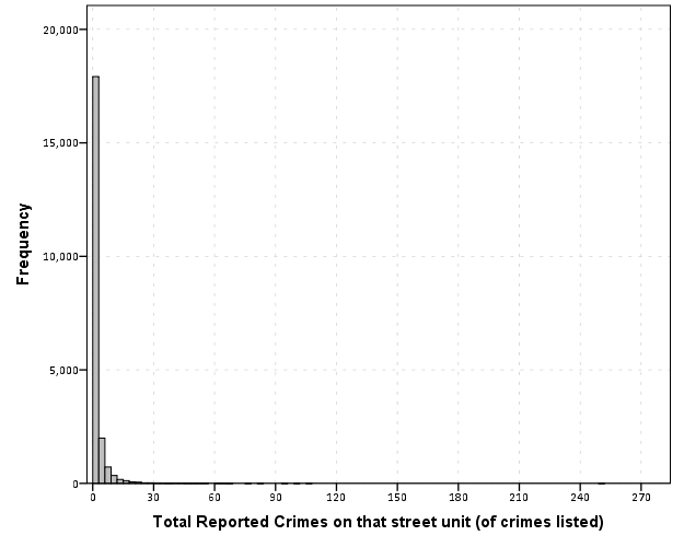
Now we know there likely are a few outliers based on SPSS drawing the chart axis to 300, but we can not see their location. The bar lengths are so tiny that they are indiscriminable from the outline of the chart. In very large datasets, the height of the bar is not even guaranteed to encompass one pixel on the screen (depending on the Y axis scale).
But most statistical packages draw the bars with outlines, so even if the height of the bar won’t necessarily have any pixels devoted to it, most histograms will still spare some ink to draw the outline. So I immediately thought an simple improvement to this same chart would be instead of anchoring the bins to the bottom of the chart, simply add a bit of buffer below the baseline so there is some whitespace between the histogram bars and the chart outline.
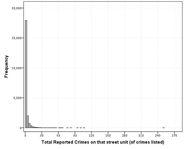
So now we can see that we have a lone outlier around 250 crimes on the street and no others within 100 crimes. The density taking into account the outline of the bar may be inaccurate in an absolute sense, but it is really an inconsequential error in terms of evaluating the shape of the distribution.
Clearly histograms are not the most appropriate tool for identifying outliers (e.g. a rug plot showing individual values below the axis would help), but this is a fairly simple change to make the typical histogram more informative. In SPSS you can simply edit the chart interactively to give the Y axis a buffer below the lowest value. The same advice applies to bar charts as well with low values in certain categories. Knowing the difference between very few and 0 is an important distinction both for histograms and bar charts.
Maybe histograms and bar charts should be drawn with this whitespace buffer by default.


Jon Peck
/ March 27, 2014While you can just barely make out the extreme point by looking at the X axis, and the axis being drawn that far out does indicate that something is out there. offsetting it slightly makes sense in a case like this. It is not necessary, though, to edit the chart to do this. In the GPL code, adding something like
SCALE: linear(dim(2), min(-1))
will do it. The Chart Builder UI does allow you to turn off the automatic axis range and specify an explicit minimum. Changing the border or frame color could also help.
The same issue can occur with other chart types, but in, say, a scatter, the automatic axis range calculation, which looks for nice values, will usually leave some air.
apwheele
/ March 27, 2014I believe the defaults for SPSS has bar charts or histograms with zero padding on the axis that the bar connects to – but scatterplots it is maybe 5% (of wherever the axes ranges are). You can of course change the default template to accommodate the whitespace in the histogram like I suggest though.