Power and bias in logistic regression

Michael Sierra-Arévalo, Justin Nix and Bradley O’Guinn have a recent article about examining officer fatalities following gunshot assaults (Sierra-Arévalo, Nix, & O-Guinn). They do not find that distance to a Level 1/2 trauma ERs make a difference in the survival probabilities, which conflicts with prior work of mine with Gio Circo (Circo & Wheeler, 2021). Justin writes this as a potential explanation for the results:

The results of our multivariable analysis indicated that proximity to trauma care was not significantly associated with the odds of officers surviving a gunshot wound (see Table 2 on p. 9 of the post-print). On the one hand, this was somewhat surprising given that proximity to trauma care predicts survival of gunshot wounds among the general public.1 On the other hand, police have specialized equipment, such as ballistic vests and tourniquets, that reduce the severity of gunshot wounds or allow them to be treated immediately.

I think it is pretty common when results do not pan out, people turn to theoretical (or sociological) reasons why their hypothesis may be invalid. While these alternatives are often plausible, often equally plausible are simpler data based reasons. Here I was concerned about two factors, 1) power and 2) omitted severity of gun shot wound factors. I did a quick simulation in R to show power seems to be OK, but the omitted severity confounders may be more problematic in this design, although only bias the effect towards 0 (it would not cause the negative effect estimate MJB find).

Power In Logistic Regression

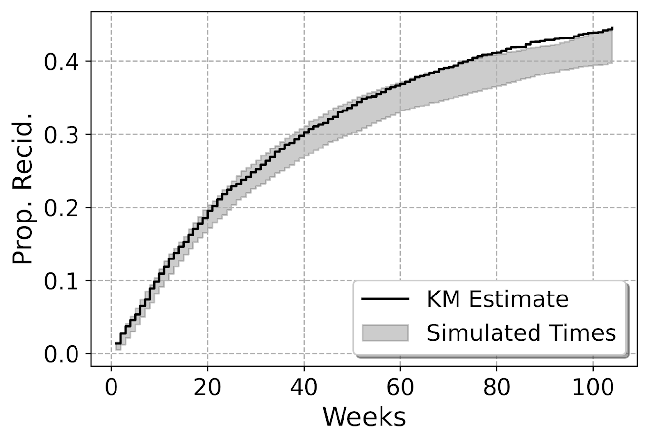
First, MJB’s sample size is just under 1,800 cases. You would think offhand this is plenty of power for whatever analysis right? Well, power just depends on the relevant effect size, a small effect and you need a bigger sample. My work with Gio found a linear effect in the logistic equation of 0.02 (per minute driving increases the logit). We had 5,500 observations, and our effect had a p-value just below 0.05, hence why a first thought was power. Also logistic regression is asymptotic, it is common to have small sample biases in situations even up to 1000 observations (Bergtold et al., 2018). So lets see in a simple example ignoring the other covariates:

# Some upfront work
logistic <- function(x){1/(1+exp(-x))}
set.seed(10)

# Scenario 1, no covariates omitted
n <- 2000; 
de <- 0.02
dist <- runif(n,5,200)
p <- logistic(-2.5 + de*dist)
y <- rbinom(n,1,p)

# Variance is small enough, seems reasonably powered
summary(glm(y ~ dist, family = "binomial"))

Here with 2000 cases, taking the intercept from MJB’s estimates and the 0.02 from my paper, we see 2000 observations is plenty enough well powered to detect that same 0.02 effect in mine and Gio’s paper. Note when doing post-hoc power analysis, you don’t take the observed effect (the -0.001 in Justin’s paper), but a hypothetical effect size you think is reasonable (Gelman, 2019), which I just take from mine and Gio’s paper. Essentially saying “Is Justin’s analysis well powered to detect an effect of the same size I found in the Philly data”.

One thing that helps MJB’s design here is more variance in the distance parameter, looking intra city the drive time distances are smaller, which will increase the standard error of the estimate. If we pretend to limit the distances to 30 minutes, this study is more on the fence as to being well enough powered (but meets the threshold in this single simulation):

# Limited distance makes the effect have a higher variance
n <- 2000; 
de <- 0.02
dist <- runif(n,1,30)
p <- logistic(-2.5 + de*dist)
y <- rbinom(n,1,p)

# Not as much variation in distance, less power
summary(glm(y ~ dist, family = "binomial"))

For a more serious set of analysis you would want to do these simulations multiple times and see the typical result (since they are stochastic), but this is good enough for me to say power is not an issue in this design. If people are planning on replications though, intra-city with only 1000 observations is really pushing it with this design though.

Omitted Confounders

One thing that is special about logistic regression, unlike linear regression, even if an omitted confounder is uncorrelated with the effect of interest, it can still bias the estimates (Mood, 2010). So even if you do a randomized experiment your effects could be biased if there is some large omitted effect from the regression equation. Several people interpret this as logistic regression is fucked, but like that linked Westfall article I think that is a bit of an over-reaction. Odds ratios are very tricky, but logistic regression as a method to estimate conditional means is not so bad.

In my paper with Gio, the largest effect on whether someone would survive was based on the location of the bullet wound. Drive time distances then only marginal pushed up/down that probability. Here are conditional mean estimates from our paper:

So you can see that being shot in the head, drive time can make an appreciable difference over these ranges, from ~45% to 55% probability of death. Even if the location of the wound is independent of drive time (which seems quite plausible, people don’t shoot at your legs because you are far away from a hospital), it can still be an issue with this research design. I take Justin’s comment about ballistic vests as reducing death as essentially taking the people in the middle of my graph (torso and multiple injuries) and pushing them into the purple line at the bottom (extremities). But people shot in the head are not impacted by the vests.

So lets see what happens to our effect estimates when we generate the data with the extremities and head effects (here I pulled the estimates all from my article, baseline reference is shot in head and negative effect is reduction in baseline probability when shot in extremity):

# Scenario 3, wound covariate omitted
dist <- runif(n,5,200)
ext_wound <- rbinom(n,1,0.8)
ef <- -4.8
pm <- logistic(0.2 + de*dist + ef*ext_wound)
ym <- rbinom(n,1,pm)

# Biased downward (but not negative)
summary(glm(ym ~ dist, family = "binomial"))

You can see here the effect estimate is biased downward by a decent margin (less than half the size of the true effect). If we estimate the correct equation, we are on the money in this simulation run:

What happens if we up the sample size? Does this bias go away? Unfortunately it does not, here is an example with 10,000 observations:

# Scenario 3, wound covariate ommitted larger sample
n2 <- 10000
dist <- runif(n2,5,200)
ext_wound <- rbinom(n2,1,0.8)
ef <- -4.8
pm <- logistic(0.2 + de*dist + ef*ext_wound)
ym <- rbinom(n2,1,pm)

# Still a problem
summary(glm(ym ~ dist, family = "binomial"))

So this omission is potentially a bigger deal – but not in the way Justin states in his conclusion. The quote earlier suggests the true effect is 0 due to vests, I am saying here the effect in MJB’s sample is biased towards 0 due to this large omitted confounder on the severity of the wound. These are both plausible, there is no way based just on MJB’s data to determine if one interpretation is right and the other is wrong.

This would not explain the negative effect estimate MJB finds though in their paper, it would only bias towards 0. To be fair, Jessica Beard critiqued mine and Gio’s paper in a similar vein (saying the police wound location data had errors), this would make our drive time estimates be biased towards 0 as well, so if that factor may be even larger than me and Gio even estimated.

Potential robustness checks here are to simply do a linear regression instead of logistic with the same data (my graph above shows a linear regression would be fine for the data if I included interaction effects with wound location). And another would be to look at the unconditional marginal distribution of distance vs probability of death. If that is highly non-linear, it is likely due to omitted confounders in the data (I suspect it may plateau as well, eg the first 30 minutes make a big difference, but after that it flattens out, you’ve either stabilized someone or they are gone at that point).

Policy?

In the case of intra-city public violence, the policy implication of drive times on survival are relevant when people are determining whether to keep open or close trauma centers. I did not publish this in my paper with Gio (you can see the estimates in the replication code), but we actually estimated counter-factual increased deaths by taking away facilities. Its marginal effect is around 10~20 homicides over the 4.5 years if you take away one of the facilities in Philadelphia. I don’t know if reducing 5 homicides per year is sufficient justification to keep a trauma facility open, but officer shootings are themselves much less frequent, and so the marginal effects are very unlikely to justify keeping a trauma facility open/closed by themselves.

You could technically figure out the optimal location to site a new trauma facility from mine and Gio’s paper, but probably a more reasonable response would be to site resources to get people to the ER faster. Philly already does scoop and run (Winter et al., 2021), where officers don’t wait for an ambulance. Another possibility though is to proactively locate ambulances to get to scenes faster (Hosler et al., 2019). Again though it just isn’t as relevant/feasible outside of major urban areas though to do that.

Often times social science authors do an analysis, and then in the policy section say things that are totally reasonable on their face, but are not supported by the empirical analysis. Here the suggestion that officers should increase their use of vests by MJB is totally reasonable, but nothing in their analysis supports that conclusion (ditto with the tourniquets statement). You would need to measure those incidents that had those factors, and see its effect on officer survival to make that inference. MJB could have made the opposite statement, since drive time doesn’t matter, maybe those things don’t make a difference in survival, and be equally supported by the analysis.

I suspect MJB’s interest in the analysis was simply to see if survival rates were potential causes of differential officer deaths across states (Sierra-Arévalo & Nix, 2020). Which is fine to look at by itself, even if it has no obviously direct policy implications. Talking back and forth with Justin before posting this, he did mention it was a bit of prodding from a reviewer to add in the policy implications. Which it goes for both (reviewers or original writers), I don’t think we should pad papers with policy recommendations (or ditto for theoretical musings) that aren’t directly supported by the empirical analysis we conduct.

References

  • Bergtold, J. S., Yeager, E. A., & Featherstone, A. M. (2018). Inferences from logistic regression models in the presence of small samples, rare events, nonlinearity, and multicollinearity with observational data. Journal of Applied Statistics, 45(3), 528-546.
  • Circo, G. M., & Wheeler, A. P. (2021). Trauma Center Drive Time Distances and Fatal Outcomes among Gunshot Wound Victims. Applied Spatial Analysis and Policy, 14(2), 379-393.
  • Gelman, A. (2019). Don’t calculate post-hoc power using observed estimate of effect size. Annals of Surgery, 269(1), e9-e10.
  • Hosler, R., Liu, X., Carter, J., & Saper, M. (2019). RaspBary: Hawkes Point Process Wasserstein Barycenters as a Service.
  • Mood, C. (2010). Logistic regression: Why we cannot do what we think we can do, and what we can do about it. European Sociological Review, 26(1), 67-82.
  • Sierra-Arévalo, M., & Nix, J. (2020). Gun victimization in the line of duty: Fatal and nonfatal firearm assaults on police officers in the United States, 2014–2019. Criminology & Public Policy, 19(3), 1041-1066.
  • Sierra-Arévalo, Michael, Justin Nix, & Bradley O’Guinn (2022). A National Analysis of Trauma Care Proximity and Firearm Assault Survival among U.S. Police. Forthcoming in Police Practice and Research. Post-print available at
  • Winter, E., Hynes, A. M., Shultz, K., Holena, D. N., Malhotra, N. R., & Cannon, J. W. (2021). Association of police transport with survival among patients with penetrating trauma in Philadelphia, Pennsylvania. JAMA network open, 4(1), e2034868-e2034868.

Fitting a pytorch model

Out of the box when fitting pytorch models we typically run through a manual loop. So typically something like this:

# Example fitting a pytorch model
# mod is the pytorch model object
opt = torch.optim.Adam(mod.parameters(), lr=1e-4)
crit = torch.nn.MSELoss(reduction='mean')
for t in range(20000):
    opt.zero_grad()
    y_pred = mod(x)   #x is tensor of independent vars
    loss = crit(y_pred,y) #y is tensor of outcomes
    loss.backward()
    opt.step()

And this would use backpropogation to adjust our model parameters to minimize the loss function, here just the mean square error, over 20,000 iterations. Best practices are to both evaluate the loss in-sample and wait for it to flatten out, as well as evaluate out of sample.

I recently wrote some example code to make this process somewhat more like the sklearn approach, where you instantiate an initial model object, and then use a mod.fit(X, y) function call to fit the pytorch model. For an example use case I will just use a prior Compas recidivism data I have used for past examples on the blog (see ROC/Calibration plots, and Balancing False Positives). Here is the prepped CSV file to download to follow along.

So first, I load the libraries and then prep the recidivism data before I fit my predictive models.

###############################################
# Front end libraries/data prep

import pandas as pd
import numpy as np
import matplotlib.pyplot as plt
import torch

# Setting seeds
torch.manual_seed(10)
np.random.seed(10)

# Prepping the Compas data and making train/test
recid = pd.read_csv('PreppedCompas.csv')

#Preparing the variables I want
recid_prep = recid[['Recid30','CompScore.1','CompScore.2','CompScore.3',
                    'juv_fel_count','YearsScreening']].copy()
recid_prep['Male'] = 1*(recid['sex'] == "Male")
recid_prep['Fel'] = 1*(recid['c_charge_degree'] == "F")
recid_prep['Mis'] = 1*(recid['c_charge_degree'] == "M")
dum_race = pd.get_dummies(recid['race'])

# White for reference category
for d in list(dum_race):
    if d != 'Caucasion':
        recid_prep[d] = dum_race[d]

# reference category is separated/unknown/widowed
dum_mar = pd.get_dummies(recid['marital_status'])
recid_prep['Single'] = dum_mar['Single']
recid_prep['Married'] = dum_mar['Married'] + dum_mar['Significant Other']

#Now generating train and test set
recid_prep['Train'] = np.random.binomial(1,0.75,len(recid_prep))
recid_train = recid_prep[recid_prep['Train'] == 1].copy()
recid_test = recid_prep[recid_prep['Train'] == 0].copy()

#Independant variables
ind_vars = ['CompScore.1','CompScore.2','CompScore.3',
            'juv_fel_count','YearsScreening','Male','Fel','Mis',
            'African-American','Asian','Hispanic','Native American','Other',
            'Single','Married']

# Dependent variable
y_var = 'Recid30'
###############################################

Now next part is more detailed, but it is the main point of the post. Typically we will make a pytorch model object something like this. Here I have various switches, such as the activation function (tanh or relu or pass in your own function), or the final function to limit predictions to 0/1 (either sigmoid or clamp or again pass in your own function).

# Initial pytorch model class
class logit_pytorch(torch.nn.Module):
    def __init__(self, nvars, device, activate='relu', bias=True,
                 final='sigmoid'):
        """
        Construct parameters for the coefficients 
        activate - either string ('relu' or 'tanh', 
                   or pass in your own torch function
        bias - whether to include bias (intercept) in model
        final - use either 'sigmoid' to squash to probs, or 'clamp'
                or pass in your own torch function
        device - torch device to construct the tensors
                 default cuda:0 if available
        """
        super(logit_pytorch, self).__init__()
        # Creating the coefficient parameters
        self.coef = torch.nn.Parameter(torch.rand((nvars,1),
                    device=device)/10)
        # If no bias it is 0
        if bias:
            self.bias = torch.nn.Parameter(torch.zeros(1,
                    device=device))
        else:
            self.bias = torch.zeros(1, device=device)
        # Various activation functions
        if activate == 'relu':
            self.trans = torch.nn.ReLU()
        elif activate == 'tanh':
            self.trans = torch.nn.Tanh()
        else:
            self.trans = activate
        if final == 'sigmoid':
            self.final = torch.nn.Sigmoid()
        elif final == 'clamp':
            # Defining my own clamp function
            def tclamp(input):
                return torch.clamp(input,min=0,max=1)
            self.final = tclamp
        else: 
            # Can pass in your own function
            self.final = final
    def forward(self, x):
        """
        predicted probability
        """
        output = self.bias + torch.mm(x, self.trans(self.coef))
        return self.final(output)

To use this though again we need to specify the number of coefficients to create, and then do a bunch of extras like the optimizer, and stepping through the function (like described at the beginning of the post). So here I have created a second class that behaves more like sklearn objects. I create the empty object, and only when I pass in data to the .fit() method it spins up the actual pytorch model with all its tensors of the correct dimensions.

# Creating a class to instantiate model to data and then fit
class pytorchLogit():
    def __init__(self, loss='logit', iters=25001, 
                 activate='relu', bias=True, 
                 final='sigmoid', device='gpu',
                 printn=1000):
        """
        loss - either string 'logit' or 'brier' or own pytorch function
        iters - number of iterations to fit (default 25000)
        activate - either string ('relu' or 'tanh', 
                   or pass in your own torch function
        bias - whether to include bias (intercept) in model
        final - use either 'sigmoid' to squash to probs, or 'clamp'
                or pass in your own torch function. Should not use clamp
                with default logit loss
        opt - ?optimizer? should add an option for this
        device - torch device to construct the tensors
                 default cuda:0 if available
        printn - how often to check the fit (default 1000 iters)
        """
        super(pytorchLogit, self).__init__()
        if loss == 'logit':
            self.loss = torch.nn.BCELoss()
            self.loss_name = 'logit'
        elif loss == 'brier':
            self.loss = torch.nn.MSELoss(reduction='mean')
            self.loss_name = 'brier'
        else:
            self.loss = loss
            self.loss_name = 'user defined function'
        # Setting the torch device
        if device == 'gpu':
            try:
                self.device = torch.device("cuda:0")
                print(f'Torch device GPU defaults to cuda:0')
            except:
                print('Unsuccessful setting to GPU, defaulting to CPU')
                self.device = torch.device("cpu")
        elif device == 'cpu':
            self.device = torch.device("cpu")
        else:
            self.device = device #can pass in whatever
        self.iters = iters
        self.mod = None
        self.activate = activate
        self.bias = bias
        self.final = final
        self.printn = printn
        # Other stats to carry forward
        self.loss_metrics = []
        self.epoch = 0
    def fit(self, X, y, outX=None, outY=None):
        x_ten = torch.tensor(X.to_numpy(), dtype=torch.float,
                             device=self.device)
        y_ten = torch.tensor(pd.DataFrame(y).to_numpy(), dtype=torch.float,
                             device=self.device)
        # Only needed if you pass in an out of sample to check as well
        if outX is not None:
            x_out_ten = torch.tensor(outX.to_numpy(), dtype=torch.float,
                             device=self.device)
            y_out_ten = torch.tensor(pd.DataFrame(outY).to_numpy(), dtype=torch.float,
                             device=self.device)
        self.epoch += 1
        # If mod is not already created, create a new one, else update prior
        if self.mod is None:
            loc_mod = logit_pytorch(nvars=X.shape[1], activate=self.activate, 
                                    bias=self.bias, final=self.final, 
                                    device=self.device)
            self.mod = loc_mod
        else:
            loc_mod = self.mod
        opt = torch.optim.Adam(loc_mod.parameters(), lr=1e-4)
        crit = self.loss
        for t in range(self.iters):
            opt.zero_grad()
            y_pred = loc_mod(x_ten)
            loss = crit(y_pred,y_ten)
            if t % self.printn == 0:
                if outX is not None:
                    pred_os = loc_mod(x_out_ten)
                    loss_os = crit(pred_os,y_out_ten)
                    res_tup = (self.epoch, t, loss.item(), loss_os.item())
                    print(f'{t}: insample {res_tup[2]:.4f}, outsample {res_tup[3]:.4f}')
                else:
                    res_tup = (self.epoch, t, loss.item(), None)
                    print(f'{t}: insample {res_tup[2]:.5f}')
                self.loss_metrics.append(res_tup)
            loss.backward()
            opt.step()
    def predict_proba(self, X):
        x_ten = torch.tensor(X.to_numpy(), dtype=torch.float,
                             device=self.device)
        res = self.mod(x_ten)
        pp = res.cpu().detach().numpy()
        return np.concatenate((1-pp,pp), axis=1)
    def loss_stats(self, plot=True, select=0):
        pd_stats = pd.DataFrame(self.loss_metrics, columns=['epoch','iteration',
                                                            'insamploss','outsamploss'])
        if plot:
            pd_stats2 = pd_stats.rename(columns={'insamploss':'In Sample Loss', 'outsamploss':'Out of Sample Loss'})
            pd_stats2 = pd_stats2[pd_stats2['iteration'] > select].copy()
            ax = pd_stats2[['iteration','In Sample Loss','Out of Sample Loss']].plot.line(x='iteration', 
                            ylabel=f'{self.loss_name} loss')
            plt.show()
        return pd_stats

Again it allows you to pass in various extras, which here are just illustrations for binary predictions (like the loss function as the Brier score or the more typical log-loss). It also allows you to evaluate the fit for just in-sample, or for out of sample data as well. It also allows you to specify the number of iterations to fit.

So now that we have all that work done, here as some simple examples of its use.

# Creating a model and fitting
mod = pytorchLogit()
mod.fit(recid_train[ind_vars], recid_train[y_var])

So you can see that this is very similar now to sklearn functions. It will print at the console fit statistics over the iterations:

So it defaults to 25k iterations, and you can see that it settles down much before that. I created a predict_proba function, same as most sklearn model objects for binary predictions:

# Predictions out of sample
predprobs = mod.predict_proba(recid_test[ind_vars])
predprobs # 1st column is probability 0, 2nd prob 1

And this returns a numpy array (not a pytorch tensor). Although you could modify to return a pytorch tensor if you wanted it to (or give an option to specify which).

Here is an example of evaluating out of sample fit as well, in addition to specifying a few more of the options.

# Evaluating predictions out of sample, more iterations
mod2 = pytorchLogit(activate='tanh', iters=40001, printn=100)
mod2.fit(recid_train[ind_vars], recid_train[y_var], recid_test[ind_vars], recid_test[y_var])

I also have an object function, .loss_stats(), which gives a nice graph of in-sample vs out-of-sample loss metrics.

# Making a nice graph
dp = mod2.loss_stats()

We can also select the loss function to only show later iterations, so it is easier to zoom into the behavior.

# Checking out further along
mod2.loss_stats(select=10000)

And finally like I said you could modify some of your own functions here. So instead of any activation function I pass in the identity function – so this turns the model into something very similar to a vanilla logistic regression.

# Inserting in your own activation (here identity function)
def ident(input):
    return input

mod3 = pytorchLogit(activate=ident, iters=40001, printn=2000)
mod3.fit(recid_train[ind_vars], recid_train[y_var], recid_test[ind_vars], recid_test[y_var])

And then if you want to access the coefficients weights, it is just going down the rabbit hole to the pytorch object:

# Can get the coefficients/intercept
print( mod3.mod.coef )
print( mod3.mod.bias )

This type of model can of course be extended however you want, but modifying the pytorchLogit() and logit_pytorch class objects to specify however detailed switches you want. E.g. you could specify adding in hidden layers.

One thing I am not 100% sure the best way to accomplish is loss functions that take more parameters, as well as the best way to set up the optimizer. Maybe use *kwargs for the loss function. So for my use cases I have stuffed extra objects into the initial class, so they are there later if I need them.

Also here I would need to think more about how to save the model to disk. The model is simple enough I could dump the tensors to numpy, and on loading re-do them as pytorch tensors.

A changepoint logistic model in pystan

So the other day I showed how to use the mcp library in R to estimate a changepoint model with an unknown changepoint location. I was able to get a similar model to work in pystan, although it ends up being slower in practice than the mcp library (which uses JAGS under the hood). It also limits the changepoints to a specific grid of values. So offhand there isn’t a specific reason to prefer this approach to the R mcp library, but I post here to show my work. Also I illustrate that with this particular model, using 1000 simulated observations.

To be clear what this model is, instead of the many time series examples floating around about changepoints (like the one in the Stan guide), we have a model with a particular continuous independent variable x, and we are predicting the probability of something based on that x variable. It is not that different, but many of those time series examples the universe to check for changepoints is obvious, only the observed time series locations. But here we have a continuous input (distance a crime event is from a CCTV camera), but we can only check a finite number of locations. It ends up being closer in spirit to this recent post by Keith Goldfield.

So in some quick and dirty text math, here c is the changepoint location and l is the logit function:

l(Prob[y]) = intercept + b1*x; if x <= c
l(Prob[y]) = intercept + b1*x + b2*(x - c); if x > c

This model can be expanded however you want – such as other covariates that do not change with the changepoint. But for this simple simulation I am just looking at the one running variable x and the binary outcome y.

Python Code

So first, I load up the libraries I will be using, then I simulate some data. Here the changepoint is located at 0.42 for the x variable, and in the ylogit line you can see the underlying logistic regression equation.

#################################
# Libraries I am using
import pystan
import numpy as np
import pandas as pd
import statsmodels.api as sm
#################################

#################################
# Creating simulated data
np.random.seed(10)
total_cases = 1000 #30000
x = np.random.uniform(size=total_cases) #[total_cases,1]
change = 0.42
xdif = (x - change)*(x > change)
ylogit = 1.1 + -4.3*x + 2.4*xdif
yprob = 1/(1 + np.exp(-ylogit))
ybin = np.random.binomial(1,yprob)
#################################

When testing out these models, one mistake I made was thinking offhand that 1,000 observations should be plenty. (Easier to run more draws with a smaller dataset.) When I had smaller effect sizes, the logistic coefficients could be pretty badly biased. So I started as a check estimating the logistic model inputting the correct changepoint location. Those biased estimates are pretty much the best case scenario you could hope for in the subsequent MCMC models. So here is an example fitting a logit model inputting the correct location for the changepoint.

#################################
#Statsmodel code to get
#The coefficient estimates 
#And standard errors for the sims
con = [1]*len(x)
xcomb = pd.DataFrame(zip(con,list(x),list(xdif)),columns=['const','x','xdif'])
log_reg = sm.Logit(ybin, xcomb).fit()
print(log_reg.summary()) 
#################################

So you can see that my coefficient estimates and the frequentist standard errors are pretty large even with 1,000 samples. So I shouldn’t expect my later MCMC model to have any smaller credible intervals than above.

So here is the Stan model. I am using pystan here, but of course it would be the same text file if you wanted to fit the model using R. (Just compiles C++ code under the hood.) Of only real note is that I show how to use the softmax function to estimate the actual mean location of the changepoint. Note that that mean summary though only makes sense if you make your grid of changepoint locations regular and fairly fine. (So if you said a changepoint could be at 0.1, 0.36, and 0.87, taking a weighted mean of those three locations doesn’t make sense.)

#################################
#Stan model
changepoint_stan = """
data {
   int<lower=1> N;
   vector[N] x;
   int<lower=0,upper=1> y[N];
   int<lower=1> Samp_Points;
   vector[Samp_Points] change;
}
transformed data {
  real log_unif;
  log_unif = -log(Samp_Points);
}
parameters {
  real intercept;
  real b_x;
  real b_c;
}
transformed parameters {
  vector[Samp_Points] lp;
  real before;
  real after;
  lp = rep_vector(log_unif, Samp_Points);
  for (c in 1:Samp_Points){
    for (n in 1:N){
      before = intercept + b_x*x[n]; 
      after = before + b_c*(x[n] - change[c]);
      lp[c] = lp[c] + bernoulli_logit_lpmf(y[n] | x[n] < change[c] ? before : after );
    }  
  }
}
model {
  intercept ~ normal(0.0, 10.0);
  b_x ~ normal(0.0, 10.0);
  b_c ~ normal(0.0, 10.0);
  target += log_sum_exp(lp);
}
generated quantities {
  vector[Samp_Points] prob_point;
  real change_loc;
  prob_point = softmax(lp);
  change_loc = sum( prob_point .* change );
}
"""
#################################

And finally I show how to prepare the data for pystan (as a dictionary), compile the model, and then draw a ton of samples. I generate a regular grid of 0.01 intervals from 0.03 to 0.97 (can’t have a changepoint outside of the x data locations, which I drew as a random uniform 0,l). Note the more typical default of 1000 tended to not converge, the effective number of samples is quite small for that many. So 5k to 10k samples in my experiments tended to converge. Note that this is not real fast either, took about 40 minutes on my machine (the Stan guesstimates for time were always pretty good ballpark figures).

#################################
# Prepping data and fitting the model

stan_dat = {'N': ybin.shape[0]}
stan_dat['change'] = np.linspace(0.03,0.97,95) #[0.1, 0.2, 0.3, 0.4, 0.5, 0.6, 0.7, 0.8, 0.9]
stan_dat['Samp_Points'] = len(stan_dat['change'])
stan_dat['x'] = x
stan_dat['y'] = ybin


sm = pystan.StanModel(model_code=changepoint_stan)
#My examples needed more like 10,000 iterations
#effective sample size very low, took about 40 minutes on my machine
fit = sm.sampling(data=stan_dat, iter=5000, 
                  warmup=500, chains=4, verbose=True)
#Prints some results at the terminal!
print(fit.stansummary(pars=['change_loc','intercept','b_x','b_c']))
#################################

So you can see the results – the credible intervals for the intercept and regression coefficient before the change point are not bad, just slightly larger than the logistic model. The credible interval for the changepoint location and the changepoint effect different are quite uncertain though. The changepoint location covers almost the whole interval I examined. It may be better to plot the individual probabilities, like Goldfield did in his post, as opposed to summarized a mean location for the distribution (which is discrete in the end based on your grid of locations you look at).

So that at least gives a partial warning that you need quite big data samples to effectively identify the changepoint location, at least for this Stan model as I have shown. I haven’t run it on my 26k actual data sample, as it will end up taking my computer around 30 hours to crunch out 10k draws with 4 chains. Next up I rather see if I can get a similar model working in pyro, as my GPU on my personal machine I think will be faster than the C++ code here. (There are probably smarter ways to vectorize the Stan model as well.)

Graphing Spline Predictions in SPSS

I might have around 10 blog posts about using splines in regression models – and you are about to get another. Instead of modeling non-linear effects via polynomial terms (e.g. including x^2, x^3 in a model, etc.), splines are a much better default procedure IMO. For a more detailed mathy exposition on splines and a walkthrough of the functions, see my class notes.

So I had a few questions about applying splines in generalized linear models and including control variables in my prior post (on a macro to estimate the spline terms). These include can you use them in different types of generalized linear models (yes), can you include other covariates into the model (yes). For either of those cases, interpreting the splines are more difficult though. I am going to show an example here of how to do that.

Additionally I have had some recent critiques of my paper on CCTV decay effects. One is that the locations of the knots we chose in that paper is arbitrary. So while that is true, one of the reasons I really like splines is that they are pretty robust – you can mis-specify the knot locations, and if you have enough of them they will tend to fit quite a few non-linear functions. (Also a note on posting pre-prints, despite being rejected twice and under review for around 1.5 years, it has over 2k downloads and a handful of citations. The preprint has more downloads than my typical published papers do.)

So here I am going to illustrate these points using some simulated data according to a particular logistic regression equation. So I know the true effect, and will show how mis-located spline knots still recovers the true effect quite closely. This example is in SPSS, and uses my macro on estimating spline basis.

Generating Simulated Data

So first in SPSS, I define the location where I am going to save my files. Then I import my Spline macro.

* Example of splines for generalized linear models 
* and multiple variables.

DATASET CLOSE ALL.
OUTPUT CLOSE ALL.

* Spline Macro.
FILE HANDLE macroLoc /name = "C:\Users\andre\OneDrive\Desktop\Spline_SPSS_Example".
INSERT FILE = "macroLoc\MACRO_RCS.sps".

Second, I create a set of synthetic data, in which I have a linear changepoint effect at x = 0.42. Then I generate observations according to a particular logistic regression model, with not only the non-linear X effects, but also two covariates Z1 (a binary variable) and Z2 (a continuous variable).

*****************************************************.
* Synthetic data.
SET SEED = 10.
INPUT PROGRAM.
LOOP Id = 1 to 10000.
END CASE.
END LOOP.
END file.
END INPUT PROGRAM.
DATASET NAME Sim.

COMPUTE X = RV.UNIFORM(0,1).
COMPUTE #Change = 0.42.
DO IF X <= #Change.
  COMPUTE XDif = 0.
ELSE.
  COMPUTE XDif = X - #Change.
END IF.
COMPUTE Z1 = RV.BERNOULLI(0.5).
COMPUTE Z2 = RV.NORMAL(0,1).  

DEFINE !INVLOGIT (!POSITIONAL  !ENCLOSE("(",")") ) 
1/(1 + EXP(-!1))
!ENDDEFINE.

*This is a linear changepoint at 0.42, other variables are additive.
COMPUTE ylogit = 1.1 + -4.3*x + 2.4*xdif + -0.4*Z1 + 0.2*Z2.
COMPUTE yprob = !INVLOGIT(ylogit).
COMPUTE Y = RV.BERNOULLI(yprob).
*These are variables you won't have in practice.
ADD FILES FILE =* /DROP ylogit yprob XDif.
FORMATS Id (F9.0) Y Z1 (F1.0) X Z2 (F3.2).
EXECUTE.
*****************************************************.

Creating Spline Basis and Estimating a Model

Now like I said, the correct knot location is at x = 0.42. Here I generate a set of regular knots over the x input (which varies from 0 to 1), at not the exact true value for the knot.

!rcs x = X loc = [0.1 0.3 0.5 0.7 0.9].

Now if you look at your dataset, there are 3 new splinex? variables. (For restricted cubic splines, you get # of knots - 2 new variables, so with 5 knots you get 3 new variables here.)

We are then going to use those new variables in a logistic regression model. We are also going to save our model results to an xml file. This allows us to use that model to score a different dataset for predictions.

GENLIN Y (REFERENCE=0) WITH X splinex1 splinex2 splinex3 Z1 Z2 
  /MODEL X splinex1 splinex2 splinex3 Z1 Z2 
      INTERCEPT=YES DISTRIBUTION=BINOMIAL LINK=LOGIT
  /OUTFILE MODEL='macroLoc\LogitModel.xml'. 

And if we look at the coefficients, you will see that the coefficients look offhand very close to the true coefficients, minus splinex2 and splinex3. But we will show in a second that those effects should be of no real concern.

Generating New Data and Plotting Predictions

So you should do this in general with generalized linear models and/or non-linear effects, but to interpret spline effects you can’t really look at the coefficients and know what those mean. You need to make plots to understand what the non-linear effect looks like.

So here in SPSS, I create a new dataset, that has a set of regularly sampled locations along X, and then set the covariates Z1=1 and Z2=0. These set values you may choose to be at some average, such as mean, median, or mode depending on the type of covariate. So here since Z1 can only take on values of 0 and 1, it probably doesn’t make sense to choose 0.5 as the set value. Then I recreate my spline basis functions using the exact sample macro call I did earlier.

INPUT PROGRAM.
LOOP #xloc = 0 TO 300.
  COMPUTE X = #xloc/300.
  END CASE.
END LOOP.
END FILE.
END INPUT PROGRAM.
DATASET NAME Fixed.
COMPUTE Z1 = 1.
COMPUTE Z2 = 0.
EXECUTE.
DATASET ACTIVATE Fixed.

*Redoing spline variables.
!rcs x = X loc = [0.1 0.3 0.5 0.7 0.9].

Now in SPSS, we score this dataset using our prior model xml file we saved. Here this generates the predicted probability from our logistic model.

MODEL HANDLE NAME=LogitModel FILE='macroLoc\LogitModel.xml'. 
COMPUTE PredPr = APPLYMODEL(LogitModel, 'PROBABILITY', 1).
EXECUTE.
MODEL CLOSE NAME=LogitModel.

And to illustrate how close our model is, I generate what the true predicted probability should be based on our simulated data.

*Lets also do a line for the true effect to show how well it fits.
COMPUTE #change = 0.42.
DO IF X <= #change.
  COMPUTE xdif = 0.
ELSE.
  COMPUTE xdif = (X - #change).
END IF.
EXECUTE.
COMPUTE ylogit = 1.1 + -4.3*x + 2.4*xdif + -0.4*Z1 + 0.2*Z2.
COMPUTE TruePr = !INVLOGIT(ylogit).
FORMATS TruePr PredPr X (F2.1).
EXECUTE.

And now we can put these all into one graph.

DATASET ACTIVATE Fixed.
GGRAPH
  /GRAPHDATASET NAME="graphdataset" VARIABLES=X PredPr TruePr
  /FRAME INNER=YES
  /GRAPHSPEC SOURCE=INLINE.
BEGIN GPL
  SOURCE: s=userSource(id("graphdataset"))
  DATA: X=col(source(s), name("X"))
  DATA: PredPr=col(source(s), name("PredPr"))
  DATA: TruePr=col(source(s), name("TruePr"))
  GUIDE: axis(dim(1), label("X"))
  GUIDE: axis(dim(2), label("Prob"))
  SCALE: cat(aesthetic(aesthetic.shape), map(("PredPr",shape.solid),("TruePr",shape.dash)))
  ELEMENT: line(position(X*PredPr), shape("PredPr"))
  ELEMENT: line(position(X*TruePr), shape("TruePr")) 
END GPL.

So you can see that even though I did not choose the correct knot location, my predictions are nearly spot on with what the true probability should be.

Generating Predictions Over Varying Inputs

So in practice you can do more complicated models with these splines, such as allowing them to vary over different categories (e.g. interactions with other covariates). Or you may simply want to generate predicted plots such as above, but have a varying set of inputs. Here is an example of doing that; for Z1 we only have two options, but for Z2, since it is a continuous covariate we sample it at values of -2, -1, 0, 1, 2, and generate lines for each of those predictions.

*****************************************************.
* Can do the same thing, but vary Z1/Z2.

DATASET ACTIVATE Sim.
DATASET CLOSE Fixed.

INPUT PROGRAM.
LOOP #xloc = 0 TO 300.
  LOOP #z1 = 0 TO 1.
    LOOP #z2 = -2 TO 2.
      COMPUTE X = #xloc/300.
      COMPUTE Z1 = #z1.
      COMPUTE Z2 = #z2.
      END CASE.
    END LOOP.
  END LOOP.
END LOOP.
END FILE.
END INPUT PROGRAM.
DATASET NAME Fixed.
EXECUTE.
DATASET ACTIVATE Fixed.

*Redoing spline variables.
!rcs x = X loc = [0.1 0.3 0.5 0.7 0.9].

MODEL HANDLE NAME=LogitModel FILE='macroLoc\LogitModel.xml'. 
COMPUTE PredPr = APPLYMODEL(LogitModel, 'PROBABILITY', 1).
EXECUTE.
MODEL CLOSE NAME=LogitModel.

FORMATS Z1 Z2 (F2.0) PredPr X (F2.1).
VALUE LABELS Z1
  0 'Z1 = 0'
  1 'Z1 = 1'.
EXECUTE.

*Now creating a graph of the predicted probabilities over various combos.
*Of input variables.
DATASET ACTIVATE Fixed.
GGRAPH
  /GRAPHDATASET NAME="graphdataset" VARIABLES=X PredPr Z1 Z2
  /FRAME INNER=YES
  /GRAPHSPEC SOURCE=INLINE.
BEGIN GPL
  SOURCE: s=userSource(id("graphdataset"))
  DATA: X=col(source(s), name("X"))
  DATA: PredPr=col(source(s), name("PredPr"))
  DATA: TruePr=col(source(s), name("TruePr"))
  DATA: Z1=col(source(s), name("Z1"), unit.category())
  DATA: Z2=col(source(s), name("Z2"), unit.category())
  COORD: rect(dim(1,2), wrap())
  GUIDE: axis(dim(1), label("X"))
  GUIDE: axis(dim(2), label("Predicted Probability"))
  GUIDE: axis(dim(3), opposite())
  GUIDE: legend(aesthetic(aesthetic.color), label("Z2"))
  SCALE: cat(aesthetic(aesthetic.color), map(("-2",color."8c510a"),("-1",color."d8b365"),
               ("0",color."f6e8c3"), ("1",color."80cdc1"), ("2",color."018571")))
  ELEMENT: line(position(X*PredPr*Z1), color(Z2))
END GPL.
*****************************************************.

So between all of these covariates, the form of the line does not change much (as intended, I simulated the data according to an additive model).

If you are interested in drawing more lines for Z2, you may want to use a continuous color scale instead of a categorical one (see here for a similar example).

Discrete time survival models in python

Sorry in the advance for the long post! I’ve wanted to tackle a project on estimating discrete time survival models for awhile now, and may have a relevant project at work where I can use this. So have been crunching out some of this code I am going to share for the last two weeks.

I personally only have one example in my career of estimating discrete time models, I used discrete time models to estimate propensity scores in my demolitions and crime reduction paper (Wheeler et al., 2018), since the demolitions did not occur at all once, but happened over several years. (In that paper I estimated the discrete time models, and then did matches in random cohorts.)

But I was interested in discrete time survival models for one reason – they allow you to estimate very non-linear hazard functions that you cannot with traditional survival models. For Cox models, to do predictions you need to rely on a estimate of the baseline hazard function, and for parametric models (e.g. Weibull) they often can only have monotonic or flat functions (so can’t be low risk and then high risk in a short period). For a good reference about evaluating predictions for survival models, I suggest Haider et al. (2020), and for a general reference for discrete time survival models I suggest the little Sage green book by Paul Allison (Allison, 2014).

For traditional recidivism studies in criminology (e.g. after someone is paroled), I don’t believe the function to be too bumpy like this, so I don’t think prior studies are misleading (e.g. Denver, 2019). But I do think they are worth examining to see if that is the case. For another use case, for chronic offender based police predictions, I think individuals may have more bumpy risk profiles, e.g. you commit a crime and then lay low (so lower risk), or get victimized and may want retaliation (so high risk). A prior work I looked at a year horizon for offender predictions (Wheeler et al., 2019), so I wanted to extend that to shorter time intervals, but never quite got the chance. (Another benefit of discrete time models is that they can incorporate time varying factors no problem the way the model is set up.)

I have code illustrating discrete time models saved on github here. The data I use to illustrate the analysis is taken from Ruderman et al. (2015). This is recidivism for a fairly large cohort. (I don’t think discrete time makes much sense for small samples, you probably need 1000+ to even really consider it I would guess.)

The code ends up being too long to walk though in a blog post. So here are some quick notes/tables/plots, and I encourage you to go check out the github page to dive deeper if you want.

The Discrete Time Model Setup

The main thing to realize about the discrete time modeling set up is that you just turn your survival data problem into a format you can leverage logistic regression (or whatever binary prediction machine learning model you want). So if we have an original set of survival data that looks like:

ID Time Outcome
 A   4    1
 B   3    0

We then explode this dataset into a long format that looks like this:

ID Time Outcome
 A   1     0
 A   2     0
 A   3     0
 A   4     1
 B   1     0
 B   2     0
 B   3     0

So you can see ID A was exploded to 4 observations, and the Outcome variable is only set to 1 at the final time period. For person B, they are exploded 3 observations, but the outcome variable is always set to 0.

Then you model Outcome as a function of time and other covariates, which can be either constant per person or time varying. This then gets you a model that estimates the instant probability of death (or failure) in a particular time sliver. The way I think about it is like this – we can predict whether you will commit a crime sometime within the next week (the cumulative probability over the entire week), or within a particular sliver of time (the probability of committing a crime Friday at 10 pm). Discrete time models pick a sliver of time, e.g. Friday, and calculate the instant probability within that bin.

But then we don’t want to rely on the traditional binary metrics to evaluate this model – we will often want to go from the instant probabilities in a time sliver to the cumulative probabilities. You can take those model estimates though at aggregate them back up to examine over the weekly time horizon example though. So if we have predictions for a new person C that looked like this:

ID Time InstantProb
 A   1     0.2
 A   2     0.1
 A   3     0.3
 A   4     0.05

We could then calculate the cumulative probability of failure over these four time periods. So the failure in time period 1 is just 0.2. For time period 2 it is 1 - [(1-0.2)*(1-0.1)] = 0.28. You just then accumulate those individual specific probabilities into cumulative failure probabilities over particular time horizons, which you can then incorporate into cost-benefit analysis for how you will use those predictions in practice. For various metrics we will then examine not just the instant probability our model spits out, but also the cumulative probability of failure.

The main issue with these models is that when exploding the dataset it can result in large samples. So my initial sample of just over 13k observations, when I expand to observed weeks ends up being over 1 million observations. That is not a big deal though, I can still easily do whatever models I want with that data on my personal machine. Probably don’t need to worry about it for most statistical computing projects until maybe you are dealing with over 20 million observations I would bet for most out of the box desktop computers anymore.

Modeling Notes

In the github page the script 00_PrepData.py prepares the dataset (transforming to the long format). The original Ruderman data has repeated events, but for simplicity I only take out the first events for individuals, which ends up being just over 13k observations. I then split this into a training dataset and a test dataset, and a set the test dataset to 3k cases.

My temporal unit of analysis I transform into weeks since release, and only examine the discrete time models up to 104 weeks (so two years). Here is a traditional KM plot based on the exploded discrete time training dataset.

But really what we are modeling in this set up is the instant hazard, not the cumulative hazard. So here is a plot of the instant probability of recidivism.

You can see that in the first week out, almost 1.4% of the individuals recidivate. There are ups and downs, but the instant probability continues to decrease and slightly flatten out out to 100 weeks. So you can see how over those two years we go from an original dataset of over 10k to around 3k due to censoring.

Part of the reason I was interested in examining discrete time models is that I was wondering if the instant hazard was bumpy and had some ups and downs when people are first exposed.

But this data appears fairly smooth, so in the end I end up fitting a logistic regression model with restricted cubic splines for time with knot locations at [4,10,20,40,60,80]. I also incorporate various interactions with the some of the time invariant covariates in the original Ruderman data (age at first arrest, male, overcrowding, concentrated disadvantage index, and offense category dummies).

I initially tried my GoTo machine learning models of random forests and XGBoost, but they performed quite poorly. Tree based models aren’t very well suited to estimate very tiny probabilities I am afraid. So that will need some more tinkering to see if I can use those machine learning models more effectively in this circumstance. I’m wondering if doing a different loss function makes sense (so do the loss based on the cumulative hazard instead of the instant). Here also I did not regularize the logit model, but with time varying factors that may make sense.

The Haider paper looks at the R MLTR package, which is similar to here but slightly different, in that they are modeling the cumulative hazard directly instead of the instant hazard. (So instead of chopping off the 1’s and the end of the vector, you keep padding them on for observations.) So in that case you want to enforce monotonic constraints on the time effect.

Checking Out Individual Predictions

The remaining sections in the blog post are all taken from the second 01_EvalTime.py script. So first, after you generate your predictions on the training data, you can then pull out a particular individual and check out our predictions for their cumulative survival probability based on our predictive model. The red line shows that this individual actually recidivated at 45 weeks, in which their cumulative risk was just above 20%.

The cumulative probability will never be super interesting though – in that even if you had a very wiggly instant hazard the cumulative hazard is always monotonically increasing. So if you check out the instant hazard this will show how a persons risk level varies over time.

So we can see here that person 39 had a predicted high risk when they are first released, but gradual decreases in a few steps over time. The way I have modeled this using restricted cubic splines it has to be smooth, but you could say incorporate dummy variables for the first 10 weeks, in which case this prediction could be quite bumpy.

Given this always shows monotonically decreasing hazard, you wouldn’t be able to exactly fit that function using parametric models, but they would be not too far off. So this dataset doesn’t appear to be a real great showcase of the utility of discrete time models!

But doing some plots of the instant hazards may be interesting to try to identify particular different risk profiles, or maybe even use some clustering (like group based trajectory models) to identify particular latent risk profiles. (It may be most people are smoothly decreasing, but some people have bumpier profiles.)

Evaluating Model Calibration

Haider et al. (2020) break down predictive metrics to evaluate survival models into two types: calibration is that the model predictions match actual cases, e.g. if my model says the probability of failure is 20%, does the data actually show failure in 20% of the cases. The other is discrimination, can I rank individuals as high risk to low risk, and do the high risk ones have the negative outcome more frequently.

While the Haider paper has various metrics, I am kind of confused how to do them in practice. My confusion mostly stems from the test dataset will ultimately have censoring in it as well, so the calibration metrics need to take this into account. Here are my attempts at a few plots that take on the task of checking model calibration.

First, I’ve previously discussed what I call a lift calibration chart. I adjust it here though to account for the fact that we have interval censoring, and I create ignorance bounds for the actual proportion of failures in the dataset.

This is for the full sample, which I expanded out and did calculations for up to 104 weeks for everyone. You can do a slice of the data though for a particular time period and check the same calibration. So here is an example checking calibration at one year out.

The earlier in time the smaller the ignorance bands will be (as there will be less censoring in sample). Here is what the created dataset looks like to illustrate how the ignorance bands are calculated.

The CumHazard column is my predicted line, which I break down into 20 bins for that yearly plot (so with 3000 training dataset observations, results in bins of 150 observations). Then you can see the LowTrue column (in Bin 1) signifies I observed 19 failures in that set of observations, but there ending up being a total of 27 observations censored in that bin, 46 - 19. So the actual proportion in the data could either be 19/150 (all censored never recidivate) or 46/150 (all of those who were censored would end up recidivating). I would suggest for notes on ignorance bounds like these (which also apply to ECDF type functions), Ferson et al. (2007).

I’d note that this is the same way you generate data for a Hosmer-Lemeshow test for logit models, but I don’t bother with the Chi-Square test. For large samples it will always reject, and small samples it may mean you just have low power, not that your model is well calibrated. So doing that stat test is a lose-lose IMO. But you can just make the plot to see whether your predictions are on the mark, or if they are low or high on average. Here we can see that they hug the lower ignorance band, so are not too bad. But may be a shade too low (more people recidivate than predicted).

This calibration is examining the probability, but another way to think about calibration here is calibrated in terms of time, e.g. I say something will happen in 30 weeks, does it actually happen in 30 weeks? Here is my attempt at a plot to check that out. Using the test dataset, I generate the usual KM estimate. Then based on the predicted probabilites, I generate simulated outcomes for individuals (here 99), and then plot the range of those outcomes on the same chart.

So here you can see that my predicted failure times are somewhat longer than observed in the data (simulation bands slightly below observed for the later time periods). These two charts are likely not in contradiction, the error bands in each show somewhat observe patterns, so they both hint at my model is conservative in assigning risk. But it is not too shabby in terms of calibration (you should have seen some of these plots when I was trying random forest and XGBoost models!).

I’m wondering offhand if I have some edge effects going on. So maybe even if I am only interested in examining a time horizon of two years, I should still tack on longer time periods for the initial models.

Both of these charts you can subset the data and look at the same chart, so here is an example table generated for simulations based on 332 test dataset females. Because the sample is smaller, the simulated bands are wider, so the observed KM cumulative hazard estimate appears well inside the bands here for the female subsample. (Probably because of less diagnostic ability to identify tiny bits off in the calibration.)

Evaluating Model Discrimination

The second way you might evaluate survival predictions is in terms of rankings, can I discriminate in my model between individuals who are high risk and who are low risk. One of the crazy things about these individual level survival curves is that they can cross! So imagine we had a set of two individuals and are looking at a horizon of four periods:

ID Time InstProb CumProb
A   1      0.1     0.1
A   2      0.1     0.19
A   3      0.1     0.271
A   4      0.1     0.3439

B   1      0.2     0.2
B   2      0.1     0.28
B   3      0.05    0.316
B   4      0.01    0.32284

So person B is at higher risk right away. So if we ranked these individuals for who was more likely to recidivate, ID B will be ranked higher for periods 1, 2 and 3. But by period 4, ID A is at higher risk in terms of their cumulative probability of recidivating.

The simplest metric to evaluate discrimination IMO is AUC (which is related to the concordance metric). And to do that you just do slices of particular weeks, and then calculate the AUC based on the cumulative failure probability estimate at that time period.

So you can see here that it is pretty meh – only AUC stats around 0.6 for my logit model. So better than the random 0.5, but not by much. Even though my model appears to be reasonably calibrated, it is nothing to brag to grandma about being able to identify people at different risk levels for recidivism, not matter the time horizon I am interested in.

For this estimate I just dropped censored observations, so I am not sure how to deal with them in this case. If you have suggestions or references let me know! But offhand I don’t think they are too off, the earlier time periods should have less censoring, but they are all pretty close in terms of the overall metric.

Future Stuff?

Besides seeing how others have dealt with censoring in their prediction metrics, another metric introduced in the Haider et al. (2020) paper is a Brier Score that is both a calibration and discrimination metric.

Also for folks interested in survival analysis in python, I suggest to check out statsmodel or the lifelines packages.

Citations