Some microsynth notes

Nate Connealy, a criminologist colleague of mine heading to Tampa asks:

My question is from our CPP project on business improvement districts (Piza, Wheeler, Connealy, Feng 2020). The article indicates that you ran three of the microsynth matching variables as an average over each instead of the cumulative sum (street length, percent new housing structures, percent occupied structures). How did you get R to read the variables as averages instead of the entire sum of the treatment period of interest? I have the microsynth code you used to generate our models, but cannot seem to determine how you got R to read the variables as averages.

So Nate is talking about this paper, Crime control effects of a police substation within a business improvement district: A quasi-experimental synthetic control evaluation (Piza et al., 2020), and here is the balance table in the paper:

To be clear to folks, I did not balance on the averages, but simply reported the table in terms of averages. So here is the original readout from R:

So I just divided those noted rows by 314 to make them easier to read. You could divide values by the total number of treated units though in the original data to have microsynth match on the averages instead if you wanted to. Example below (this is R code, see the microsynth library and paper by Robbins et al., 2017):

library(microsynth)
#library(ggplot2) #not loading here, some issue
set.seed(10)

data(seattledmi) #just using data in the package
cs <- seattledmi
# calculating proportions
cs$BlackPerc <- (cs$BLACK/cs$TotalPop)*100
cs$FHHPerc <- (cs$FEMALE_HOU/cs$HOUSEHOLDS)*100
# replacing 0 pop with 0
cs[is.na(cs)] <- 0

cov.var <- c("TotalPop","HISPANIC","Males_1521","FHHPerc","BlackPerc")
match.out <- c("i_felony", "i_misdemea")

sea_prop <- microsynth(cs, 
                       idvar="ID", timevar="time", intvar="Intervention", 
                       start.pre=1, end.pre=12, end.post=16, 
                       match.out.min=match.out,match.out=FALSE,
                       match.covar=FALSE,check.feas=FALSE,
                       match.covar.min=cov.var, 
                       result.var=match.out)

summary(sea_prop) # balance table

And here you can see that we are matching on the cumulative sums for each of the areas, but we can divide our covariates by the number of treated units, and we will match on the proportional values.

# Can divide by 39 and get the same results
cs[,cov.var] <- cs[,cov.var]/39

sea_div <- microsynth(cs, 
                      idvar="ID", timevar="time", intvar="Intervention", 
                      start.pre=1, end.pre=12, end.post=16, 
                      match.out.min=match.out,match.out=FALSE,
                      match.covar=FALSE,check.feas=FALSE,
                      match.covar.min=cov.var, 
                      result.var=match.out)

summary(sea_div) # balance table

Note that these do not result in the same weights. If you look at the results you will see the treatment effects are slightly different. Also if you do:

# Showing weights are not equal
all.equal(sea_div$w$Weights,sea_prop$w$Weights)

It does not return True. Honestly not familiar enough with the procedure that microsynth uses to do the matching (Raking survey weights) to know if this is due to stochastic stuff or due to how the weighting algorithm works (I would have thought a linear change does not make a difference, but I was wrong).

On the bucket list is to do a matching algorithm that returns geographically contiguous areas and gives the weights all values of 1 (so creates comparable neighborhoods), instead of estimating Raking weights. That may be 5 years though before I get around to that. Gio has a nice map to show the way the weights work now is they may be all over the place (Circo et al., 2021) – I am not sure that is a good thing though.

But I did want to share some functions I used for the paper I worked with Nate on. First, this is for if you use the permutation approach, the function prep_synth returns some of the data in a nicer format to make graphs and calculate your own stats:

# Function to scoop up the data nicely
prep_synth <- function(mod){
    #Grab the plot data
    plotStats <- mod[['Plot.Stats']]
    #For the left graph
    Treat <- as.data.frame(t(plotStats$Treatment))
    Treat$Type <- "Treat"
    #This works for my data at years, will not 
    #Be right for data with more granular time though
    Treat$Year <- as.integer(rownames(Treat))
    Cont <- as.data.frame(t(plotStats$Control))
    Cont$Type <- "Control"
    Cont$Year <- as.integer(rownames(Cont))
    AllRes <- rbind(Treat,Cont)
    #For the right graph
    Perm <- as.data.frame(t(as.data.frame(plotStats$Difference)))
    SplitStr <- t(as.data.frame(strsplit(rownames(Perm),"[.]")))
    colnames(SplitStr) <- c("Type","Year")
    rownames(SplitStr) <- 1:nrow(SplitStr)
    SplitStr <- as.data.frame(SplitStr)
    Perm$Type <- as.character(SplitStr$Type)
    Perm$Year <- as.integer(as.character(SplitStr$Year))
    Perm$Group <- ifelse(Perm$Type == 'Main','Treatment Effect','Permutations') 
    #Reordering factor levels for plots
    AllRes$Type <- factor(AllRes$Type,levels=c('Treat','Control'))
    levels(AllRes$Type) <- c('Treated','Synthetic Control')
    Perm$Group <- factor(Perm$Group,levels=c('Treatment Effect','Permutations'))
    #Exporting result
    Res <- vector("list",length=2)
    Res[[1]] <- AllRes
    Res[[2]] <- Perm
    names(Res) <- c("AggOutcomes","DiffPerms")
    return(Res)
}

It works for the prior tables, but I really made these functions to work with when you used permutations to get the errors. (In the micro synth example, it is easier to work with permutations than in the state level example for synth, in which I think conformal prediction intervals makes more sense, see De Biasi & Circo, 2021 for a recent real example with micro place based data though.)

# Takes like 1.5 minutes
sea_perm <- microsynth(seattledmi, 
                      idvar="ID", timevar="time", intvar="Intervention", 
                      start.pre=1, end.pre=12, end.post=16, 
                      match.out.min=match.out,match.out=FALSE,
                      match.covar=FALSE,check.feas=FALSE,
                      match.covar.min=cov.var, 
                      result.var=match.out, perm=99)

res_prop <- prep_synth(sea_perm)
print(res_prop)

So the dataframe in the first slot is the overall treatment effect, and the second dataframe is a nice stacked version for the permutations. First, I really do not like the percentage change (see Wheeler, 2016 for the most direct critique, but I have a bunch on this site). So I wrote code to translate the treatment effects into crime count reductions instead of the percent change stuff.

# Getting the observed treatment effect on count scale
# vs the permutations

agg_fun <- function(x){
    sdx <- sd(x)
    minval <- min(x)
    l_025 <- quantile(x, probs=0.025)
    u_975 <- quantile(x, probs=0.975)
    maxval <- max(x)
    totn <- length(x)
    res <- c(sdx,minval,l_025,u_975,maxval,totn)
    return(res)
}

treat_count <- function(rp){
    # Calculating the treatment effect based on permutations
    keep_vars <- !( names(rp[[2]]) %in% c("Year","Group") )
    out_names <- names(rp[[2]])[keep_vars][1:(sum(keep_vars)-1)]
    loc_dat <- rp[[2]][,keep_vars]
    agg_treat <- aggregate(. ~ Type, data = loc_dat, FUN=sum)
    n_cols <- 2:dim(agg_treat)[2]
    n_rows <- 2:nrow(agg_treat)
    dif <- agg_treat[rep(1,max(n_rows)-1),n_cols] - agg_treat[n_rows,n_cols]
    dif$Const <- 1
    stats <- aggregate(. ~ Const, data = dif, FUN=agg_fun)
    v_names <- c("se","min","low025","up975","max","totperm")
    long_stats <- reshape(stats,direction='long',idvar = "Const", 
                      varying=list(2:ncol(stats)),
                      v.names=v_names, times=out_names)
    # Add back in the original stats
    long_stats <- long_stats[,v_names]
    rownames(long_stats) <- 1:nrow(long_stats)
    long_stats$observed <- t(agg_treat[1,n_cols])[,1]
    long_stats$outcome <- out_names
    ord_vars <- c('outcome','observed',v_names)
    return(long_stats[,ord_vars])
}

treat_count(res_prop)

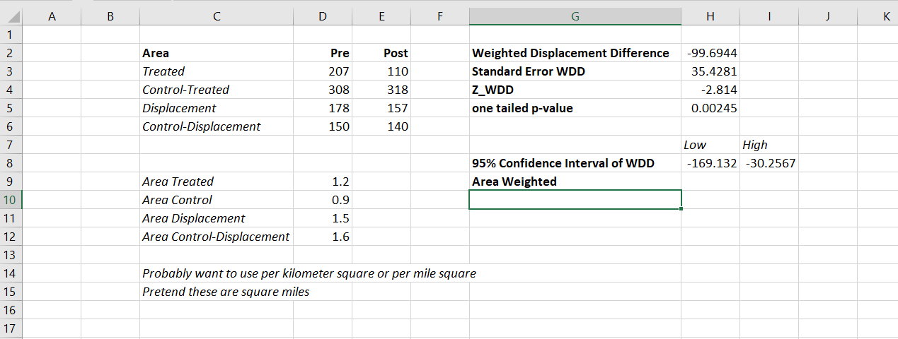
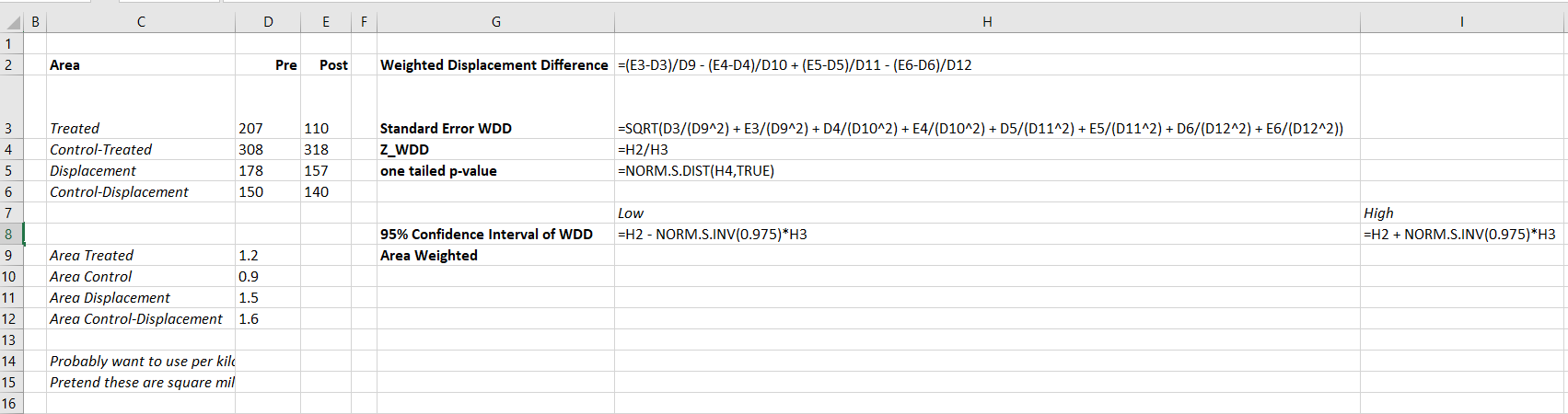
So that is the cumulative total effect of the intervention. This is more similar to the WDD test (Wheeler & Ratcliffe, 2018), but since the pre-time period is matched perfectly, just is the differences in the post time periods. And here it uses the permutations to estimate the error, not any Poisson approximation.

But I often see folks concerned about the effects further out in time for synthetic control studies. So here is a graph that just looks at the instant effects for each time period, showing the difference via the permutation lines:

# GGPLOT graphs, individual lines
library(ggplot2)
perm_data <- res_prop[[2]]
# Ordering factors to get the treated line on top
perm_data$Group <- factor(perm_data$Group, c("Permutations","Treatment Effect"))
perm_data$Type <- factor(perm_data$Type, rev(unique(perm_data$Type)))
pro_perm <- ggplot(data=perm_data,aes(x=Year,y=i_felony,group=Type,color=Group,size=Group)) + 
            geom_line() +
            scale_color_manual(values=c('grey','red')) + scale_size_manual(values=c(0.5,2)) +
            geom_vline(xintercept=12) + theme_bw() + 
            labs(x=NULL,y='Felony Difference from Control') + 
            scale_x_continuous(minor_breaks=NULL, breaks=1:16) + 
            scale_y_continuous(breaks=seq(-10,10,2), minor_breaks=NULL) +
            theme(panel.grid.major = element_line(linetype="dashed"), legend.title= element_blank(),
            legend.position = c(0.2,0.8), legend.background = element_rect(linetype="solid", color="black")) +
            theme(text = element_text(size=16), axis.title.y=element_text(margin=margin(0,10,0,0)))

And I also like looking at this for the cumulative effects as well, which you can see with the permutation lines widen over time.

# Cumulative vs Pointwise
perm_data$csum_felony <- ave(perm_data$i_felony, perm_data$Type, FUN=cumsum)
pro_cum  <- ggplot(data=perm_data,aes(x=Year,y=csum_felony,group=Type,color=Group,size=Group)) + 
              geom_line() +
              scale_color_manual(values=c('grey','red')) + scale_size_manual(values=c(0.5,2)) +
              geom_vline(xintercept=12) + theme_bw() + 
              labs(x=NULL,y='Felony Difference from Control Cumulative') + 
              scale_x_continuous(minor_breaks=NULL, breaks=1:16) + 
              scale_y_continuous(breaks=seq(-20,20,5), minor_breaks=NULL) +
              theme(panel.grid.major = element_line(linetype="dashed"), legend.title= element_blank(),
              legend.position = c(0.2,0.8), legend.background = element_rect(linetype="solid", color="black")) +
              theme(text = element_text(size=16), axis.title.y=element_text(margin=margin(0,10,0,0)))

If you do a ton of permutations (say 999 instead of 99), it would likely make more sense to do a fan chart type error bars and show areas of different percentiles instead of each individual line (Yim et al., 2020).

I will need to slate a totally different blog post to discuss instant vs cumulative effects for time series analysis. Been peer-reviewing quite a few time series analyses of Covid and crime changes – most everyone only focuses on instant changes, and does not calculate cumulative changes. See for example estimating excess deaths for the Texas winter storm power outage (Aldhous et al., 2021). Folks could do similar analyses for short term crime interventions. Jerry has a good example of using the Causal Impact package to estimate cumulative effects for a gang takedown intervention (Ratcliffe et al., 2017) for one criminal justice example I am familiar with.

Again for folks feel free to ask me anything. I may not always be able to do as deep a dive as this, but always feel free to reach out.

References

Minimum detectable effect sizes for place based designs

So I was reading Blattman et al.’s (2018) work on a hot spot intervention in Bogotá the other day. It is an excellent piece, but in a supplement to the paper Blattman makes the point that while his study is very high powered to detect spillovers, most other studies are not. I am going to detail here why I disagree with his assessment on that front.

In appendix A he has two figures, one for the direct effect comparing the historical hot spot policing studies (technically he uses the older 2014 Braga study, but here is the cite for the update Braga et al., 2020).

The line signifies a Cohen’s D of 0.17, and here is the same graph for the spillover estimates:

So you can see Blattman’s study in total number of spatial units of analysis breaks the chart so to speak. You can see however there are plenty of hot spot studies in either chart that reported statistically significant differences, but do not meet the 0.17 threshold in Chris’s chart. How can this be? Well, Chris is goal switching a bit here, he is saying using his estimator the studies appear underpowered. The original studies on the graph though did not necessarily use his particular estimator.

The best but not quite perfect analogy I can think of is this. Imagine I build a car that gets better gas mileage compared to the current car in production. Then someone critiques this as saying the materials that go into production of the car have worse carbon footprints, so my car is actually worse for the environment. It would be fine to argue a different estimate of total carbon footprint is reasonable (here Chris could argue his estimator is better than the ones the originally papers used). It is wrong though to say you don’t actually improve gas mileage. So it is wrong for Chris to say the original articles are underpowered using his estimator, they may be well powered using a different estimator.

Indeed, using either my WDD estimator (Wheeler & Ratcliffe, 2018) or Wilson’s log IRR estimator (Wilson, 2021), I will show how power does not grow with more experimental units, but with a larger baseline number of crimes for those estimators. They both only have two spatial units of analysis, so in Chris’s chart will never gain more power.

One way I think about the issue for spatial designs is this – you could always split up a spatial lattice into ever finer and finer spatial units of analysis. For example Chris could change his original design to use addresses instead of street segments, and split up the spillover buffers into finer slices as well. Do you gain something for doing nothing though? I doubt it.

I describe in my dissertation how finer spatial units of analysis allow you to check for finer levels of spatial spillovers, e.g. can check if crime spills over from the back porch to the front stoop (Wheeler, 2015). But when you do finer spatial units, you get more cold floor effects as well due to the limited nature of crime counts – they cannot go below 0. So designs with lower baseline crime rates tend to show lower power (Hinkle et al., 2013).

MDE for the WDD and log IRR

For minimum detectable effect (MDE) sizes for OLS type estimators, you need to specify the variance you expect the underlying treated/control groups to have. With the count type estimators I will show here, the variance is fixed according to the count. So all I need to specify is the alpha level of the test. Here I will do a default of 0.05 alpha level (with different lines for one-tailed vs two-tailed). The other assumption is the distribution of crime counts between treated/control areas. Here I assume they are all equal, so 4 units (pre/post and treated/control). For my WDD estimator this actually does not matter, for the later IRR estimator though it does (so the lines won’t really be exact for his scenario).

So here is the MDE for mine and Jerry’s WDD estimator:

What this means is that if you have an average of 20 crimes in the treated/control areas for each time period separately, you would need to find a reduction of 15 crimes to meet this threshold MDE for a one-tailed. It is pretty hard when starting with low baselines! For an example close to this, if the treated area went from 24 to 9, and the control area was 24 to 24, this would meet the minimal treated reduction of 15 crimes in this example.

And here is the MDE for the log IRR estimator. The left hand Y axis has the logged effect, and the right hand side has the exponentiated IRR (incident rate ratio).

Since the IRR is commonly thought of as a percent reduction, this suggests even with baselines of 200 crimes, for Wilson’s IRR estimator you need percent reductions of over 20% relative to control areas.

So I have not gone through the more recent Braga et al. (2020) meta-analysis. I do not know if they have the data readily available to draw the points on this plot the same as in the Blattman article. To be clear, it may be Blattman is right and these studies are underpowered using either his or my estimator, I am not sure. (I think they probably are quite underpowered to detect spillover, since this presumably will be an even smaller amount than the direct effect. But that would not explain estimates of diffusion of benefits commonly found in these studies!)

I also do not know if one estimator is clearly better or not – for example Blattman could use my estimator if he simply pools all treated/control areas. This is not obviously better than his approach though, and foregoes any potential estimates of treatment effect variance (I will be damned if I can spell that word starting with het even close enough for autocorrect). But maybe the pooled estimate is OK, Blattman does note that he has cold floor effects in his linear estimator – places with higher baselines have larger effects. This suggests Wilson’s log IRR estimator with the pooled data may be just fine and dandy for example.

Python code

Here is the python code in its entirety to generate the above two graphs. You can see the two functions to calculate the MDE given an alpha level and average crime counts in each area if you are planning your own study, the wdd_mde and lirr_mde functions.

'''
Estimating minimum detectable effect sizes
for place based crime interventions

Andy Wheeler
'''

import numpy as np
from scipy.stats import norm
import matplotlib
import matplotlib.pyplot as plt
import os
my_dir = r'D:\Dropbox\Dropbox\Documents\BLOG\min_det_effect'
os.chdir(my_dir)

#########################################################
#Settings for matplotlib

andy_theme = {'axes.grid': True,
              'grid.linestyle': '--',
              'legend.framealpha': 1,
              'legend.facecolor': 'white',
              'legend.shadow': True,
              'legend.fontsize': 14,
              'legend.title_fontsize': 16,
              'xtick.labelsize': 14,
              'ytick.labelsize': 14,
              'axes.labelsize': 16,
              'axes.titlesize': 20,
              'figure.dpi': 100}

matplotlib.rcParams.update(andy_theme)
#########################################################

#########################################################
# Functions for MDE for WDD and logIRR estimator


def wdd_mde(avg_counts,alpha=0.05,tails='two'):
    se = np.sqrt( avg_counts*4 )
    if tails == 'two':
        a = 1 - alpha/2
    elif tails == 'one':
        a = 1 - alpha
    z = norm.ppf(a)
    est = z*se
    return est

def lirr_mde(avg_counts,alpha=0.05,tails='two'):
    se = np.sqrt( (1/avg_counts)*4 )
    if tails == 'two':
        a = 1 - alpha/2
    elif tails == 'one':
        a = 1 - alpha
    z = norm.ppf(a)
    est = z*se
    return est

# Generating regular grid from 10 to 200
cnts = np.arange(10,201)
wmde1 = wdd_mde(cnts, tails='one')
wmde2 = wdd_mde(cnts)

imde1 = lirr_mde(cnts, tails='one')
imde2 = lirr_mde(cnts)

# Plot for WDD MDE
fig, ax = plt.subplots(figsize=(8,6))
ax.plot(cnts, wmde1,color='k',linewidth=2, label='One-tailed')
ax.plot(cnts, wmde2,color='blue',linewidth=2, label='Two-tailed')
ax.set_axisbelow(True)
ax.set_xlabel('Average Number of Crimes in Treated/Control')
ax.set_ylabel('Crime Count Reduction')
ax.legend(loc='upper left')
plt.xticks(np.arange(0,201,20))
plt.yticks(np.arange(10,61,5))
plt.title("WDD MDE alpha level 0.05")
plt.savefig('WDD_MDE.png', dpi=500, bbox_inches='tight')

# Plot for IRR MDE
fig, ax = plt.subplots(figsize=(8,6))
ax2 = ax.secondary_yaxis("right", functions=(np.exp, np.log))
ax.plot(cnts,-1*imde1,color='k',linewidth=2, label='One-tailed')
ax.plot(cnts,-1*imde2,color='blue',linewidth=2, label='Two-tailed')
ax.set_axisbelow(True)
ax.set_xlabel('Average Number of Crimes in Treated/Control')
ax.set_ylabel('log IRR')
ax.set_ylim(-0.16, -1.34)
ax.legend(loc='upper right')
ax.set_yticks(-1*np.arange(0.2,1.31,0.1))
ax2.set_ylabel('IRR')
ax2.grid(False)
plt.xticks(np.arange(0,201,20))
plt.title("IRR MDE alpha level 0.05")
plt.savefig('IRR_MDE.png', dpi=500, bbox_inches='tight')

#########################################################

References

The WDD test with different area sizes

So I have two prior examples of weighting the WDD test (a simple test for pre-post crime counts in an experimental setting):

And a friend recently asked about weighting for different areas, so the test is crime reduction per area density instead of overall counts. First before I get into the example, this isn’t per se necessary. All that matters in the end for this test to be valid is 1) the crime data are Poisson distributed, 2) the control areas follow parallel trends to the treated area. So based on this I’ve advocated that it is ok to have a control area be ‘the rest of the city’ for example.

Some of my work on long term crime trends at micro places, shows low-crime and high-crime areas all tend to follow the same overall temporal trends (and Martin Andresen’s related work one would come to the same conclusion). So that would suggest you can aggregate up many low crimes to make a reasonable control comparison to a hot spot treated area.

So as I will show weighting by area is possible, but it actually changes the identification strategy slightly (whereas the prior two weighting examples do not) – the parallel trends assumption needs to be on the crime per area estimate, as opposed to the original count scale. Since the friend who asked about this is an Excel GURU (check out Grant’s very nice YouTube videos for crime analysis) I will show how to do the calculations in Excel, as well as how to do a simulation to show my estimator behaves as it should. (And the benefit of that is you can do power analysis based on the simulations.)

Example Calculations in Excel

I have posted an Excel spreadsheet to show the calculations here. But for a quick overview, I made the spreadsheet very similar to the original WDD calculation, you just need to insert your areas for the different treated/control/displacement areas.

And you can check out the formulas, again it is just weighting the estimator by the areas, and then making the appropriate transformations to the variance estimates.

I have an added extra portion of this though – a simulation tab to show the estimator works.

Only thing to note, a way to simulate to Poisson data in Excel is to generate a random number on the unit interval (0,1), and then for the distribution of interest use the inverse CDF function. There is no inverse Poisson function in Excel, but you can reasonably approximate it via the inverse binomial with a very large number of trials. I’ve tested and it is good enough for my purposes to use a base of 10k for the binomial trials.

The simulation tab on this spreadsheet you can input your own numbers for planning purposes as well. So the idea is if you think you can only reasonably reduce crimes by X amount in your targeted areas, this lets you do power analysis. So in this example, going from 60 to 40 crimes results in a power estimate of only 0.44 (so you will fail to reject the null over 5 out of 10 times, even if your intervention actually works as well as you think). But if you think you can reduce crimes from 60 to 30, the power in this example gets close to 0.8 (what you typically shoot for in up-front experiments, although there is no harm for going for higher power!). So if you have low power you may want to expand the time periods under study or expand the number of treated areas.

Wrap Up

Between this and the prior WDD examples, I have about wrapped up all the potential permutations of weighting I can think of offhand. So you can mix/match all of these different weighting strategies together (e.g. you could do multiple time periods and area weighting). It is just algebra and carrying through the correct changes to the variance estimates.

I do have one additional blog post slated in the future. David Wilson has a recent JQC article using a different estimate, but essentially the same pre/post data I am using here. The identifying assumptions are different again for this (parallel trends on the ratio scale, not the linear scale), and I will have more to say when I think you would prefer the WDD to David’s estimator. (In short I think David’s is good for meta-analysis, but I prefer my WDD for individual evaluations.)

A Festschrift (blog post) for Lord, his paradox and Novick’s prediction

Lord’s paradox is a situation in which analyzing change scores between two time points results in different treatment effect estimates than analyzing the treatment effect of the second time point conditional on the first time point. In terms of regression equations we have the following as the change score model:

Y_2 - Y_1 = \beta_a \cdot T

And the following as the conditional model:

Y_2 = \beta_b \cdot T + \gamma \cdot Y_1

Lord’s paradox is the fact that \beta_a and \beta_b won’t always be the same. I won’t go into too many details on why that is the case, and I would suggest the reader to review Allison (1990) and Holland and Rubin (1983) for some treatments of the problem. The traditional motivation for the change score model (which is pretty similar to fixed effects in panel regressions) is to account for any time invariant omitted variables that may be correlated with a unit being exposed to the treatment.

So lets say that we have an equation predicting Y_2

Y_2 = \beta \cdot T + \delta \cdot X

Lets also say that we cannot observe X, we know that it is correlated with T, but that X does not vary in time. For an example lets say that the treatment is a diet regimen for freshman college students and the outcome of interest is body fat content, and if they sign up they get discounts on specific cafeteria meals. Students voluntarily sign up to take the treatment though, so one may think that certain student characteristics (like being in better shape or have more self control with eating) are correlated with selecting to sign up for the diet. So how can we account for those pre-treatment characteristics that are likely correlated with selection into the treatment?

If we happen to have pre-treatment measures of Y, we can see that:

Y_1 = \delta \cdot X

And so we can subtract the latter equation from the former to cancel out the omitted variable effect:

Y_2 - Y_1 = \beta \cdot T + \delta \cdot X - \delta \cdot X = \beta \cdot T

Now, a frequent critique of the change score model is that it assumes that the autoregressive effect of the baseline score on the post score is 1. See Frank Harrell’s comment on this answer on the Cross Validated site (also see my answer to that question as to why change scores that include the baseline on the right hand side don’t make sense). Holland and Rubin (1983) make the same assertion. To make it clear, these critiques say that change scores are only justified when in the below equation \rho is equal to 1.

Y_2 = \beta \cdot T + \delta \cdot X + \rho \cdot Y_1

This caused me some angst though. As you can see in my original formulation there is no \rho \cdot Y_1 term at all, so it would seem that if anything I assume it is 0. But it seems that my description of time constant ommitted variables is making the same presumption. To show this lets go back one further step in time:

Y_0 = \delta \cdot X

We can see that we could just replace \delta \cdot X with the lagged value. Substituting this into the equation predicting Y_1 we would then have.

Y_1 = \rho \cdot Y_0 = Y_0

Which is the same as saying \rho=1. So my angst is resolved and Frank Harrell, Don Rubin and Paul Holland are correct in their assertions and doubting such a group of individuals surely makes me crazy! This does bring other questions though as to when the change score model is appropriate. Obviously our models are never entirely correct, and the presumption of \rho = 1 is on its face ridiculous in most situations. It is akin to saying the outcome is a random walk that is only guided by various exogenous shocks.

As always, the model one chooses should be balanced against alternatives in an attempt to reduce bias in the effect estimates we are interested in. When the unobserved and omitted X is potentially very large and have a strong correlation with being given the treatment, it seems the change score model should be preferred. I presume someone smarter than me can give better quantitative estimates as to when the bias of assuming \rho=1 is a better choice than making the assumption of no other unobserved time invariant omitted variables.


I end this post on a tangent. I recently revisited the material as I wanted to read Holland and Rubin (1983) which is a chapter in the reader Principals of moderns Psychological Measurement: A Festschrift for Frederic M. Lord. I also saw in that same reader a chapter by Melvin Novick, The centrality of Lord’s paradox and exchangeability for all statistical inference. At the end he was pretty daring in making some predictions for the state of statistics as of November 12, 2012 – so I am a year late with my Festschrift but they are still interesting fodder none-the-less. I’ll leave the reader to judge the extent Novick was correct in his following predictions:

  1. be less dependent on constricting models such as the normal and will primarily use more general classes of distributions, for example, the exponential power distribution;
  2. be fully Bayesian with full emphasis on the psychometric assessment of proper prior distributions;
  3. be fully decision theoretic with emphasis on the pyschometric assessment of individual and institutional utilities;
  4. use robust classes of prior distributions and utility functions as well as robust model distributions;
  5. rely completely on full-rank Bayesian univariate and multivariate analyses of variance and covariance using fully exchangeable, informative prior distributions as appropriate;
  6. emphasize exchangeability through careful modeling, blocking, and covariation with randomization playing a residual role;
  7. emphasize the use of posterior predictive distributions using the lessons of Lord’s paradox, exchangeability, and appropriate conditional probabilities;
  8. place great emphasis on numerical solutions when exact Bayesian solutions prove intractable;
  9. still use some pseudo Bayesian methods when both theoretical and computational fully Bayesian solutions remain intractable. (This prevision is subject to modification if I can convince Rubin, Holland and their associates to devote their impressive skills to the quest for fully Bayesian solutions. Should this happen, there may be no need for any pseudo Bayesian methods.)

Citations

  • Allison, Paul. 1990. Change scores as dependent variables in regression analysis. Sociological methodology 20: 93-114.
  • Holland, Paul & Donald Rubin. 1983. On Lord’s Paradox. In Principles of modern psychological measurement: A festchrift for Frederic M. Lord edited by Wainer, Howard & Samuel Messick pgs:3-25. Lawrence Erlbaum Associates. Hillsdale, NJ.
  • Novick, Melvin. 1983. The centrality of Lord’s paradox and exchangeability for all statistical inference. In Principles of modern psychological measurement: A festchrift for Frederic M. Lord edited by Wainer, Howard & Samuel Messick pgs:3-25. Lawrence Erlbaum Associates. Hillsdale, NJ.
  • Wainer, Howard & Samuel Messick. 1983. Principles of modern psychological measurement: A festchrift for Frederic M. Lord. Lawrence Erlbaum Associates. Hillsdale, NJ.