Viz. JTC Flow lines – Paper for ASC this fall

Partly because I would go crazy if I worked only on my dissertation, I started a paper about visualizing JTC flow lines awhile back, and I am going to present what I have so far at the American Society of Criminology (ASC) meeting at Atlanta this fall.

My paper is still quite rough around the edges (so not quite up for posting to SSRN), but here is the current version. This actually started out as an answer I gave to a question on the GIS stackexchange site, and after I wrote it up I figured it would be worthwhile endeavor to write an article. Alasdair Rae has a couple of viz. flow data papers currently, but I thought I could extend those papers and write for a different audience of criminologists using journey to crime (JTC) data.

As always, I would still appreciate any feedback. I’m hoping to send this out to a journal in the near future, and so far I have only goated one of my friends into reviewing the paper.

Using the edge element in SPSS inline GPL with arbitrary X,Y coordinates

This post is intended to be a brief illustration of how one can utilize the edge element in SPSS’s GGRAPH statements to produce vector flow fields. I post this because the last time I consulted the GGRAPH manual (which admittedly is probably a few versions olds) they only have examples of SPSS’s ability to utilize random graph layouts for edge elements. Here I will show how to specify the algebra for edge elements if you already have X and Y coordinates for the beginning and end points for the edges. Also to note if you want arrow heads for line elements in your plots you need to utilize edge elements (the main original motivation for me to figure this out!)

So here is a simple example of utilizing coordinate begin and end points to specify arrows in a graph, and below the code is the image it produces.

DATA LIST FREE/ X1 X2 Y1 Y2 ID.
BEGIN DATA
1 3 2 4 1
1 3 4 3 2
END DATA.

GGRAPH
  /GRAPHDATASET NAME="graphdataset" VARIABLES=X1 Y1 X2 Y2 ID MISSING=LISTWISE REPORTMISSING=NO
  /GRAPHSPEC SOURCE=INLINE.
BEGIN GPL
  SOURCE: s=userSource(id("graphdataset"))
  DATA: X1=col(source(s), name("X1"))
  DATA: Y1=col(source(s), name("Y1"))
  DATA: X2=col(source(s), name("X2"))
  DATA: Y2=col(source(s), name("Y2"))
  DATA: ID=col(source(s), name("ID"))
  GUIDE: axis(dim(1), label("X"))
  GUIDE: axis(dim(2), label("Y"))
  ELEMENT: edge(position((X1*Y1)+(X2*Y2)), shape(shape.arrow))
END GPL.

The magic happens in the call to the edge element, specifically the graph algebra position statement of (X1*Y1)+(X2*Y2). I haven’t read Wilkinson’s Grammar of Graphics, and I will admit with SPSS’s tutorial on graph algebra at the intro to the GPL manual it isn’t clear to me why this works. I believe the best answer I can say is that different elements have different styles to specify coordinates in the graph. For instance interval elements (e.g. bar charts) can take a location in one dimension and an interval in another dimension in the form of X*(Y1+Y2) (see an example in this post of mine on Nabble – I also just found in my notes an example of specifying an edge element in the similar manner to the interval element). This just happens to be a valid form to specify coordinates in edge elements when you aren’t using one of SPSS’s automatic graph layout rendering. I guess it is generically of the form FromNode(X*Y),ToNode(X*Y), but I haven’t seen any documentation for this and all of the examples I had seen in the reference guide utilize a different set of nodes and edges, and then specify a specific type of graph layout.

Here is another example visualizing a vector flow field. Eventually I would like to be able to superimpose such elements on a map – but that appears to not yet be possible in SPSS.

set seed = 10.
input program.
loop #i = 0 to 10.
loop #j = 0 to 10.
compute X = #i.
compute Y = #j.
*compute or_deg = RV.UNIFORM(0,360).
end case.
end loop.
end loop.
end file.
end input program.
dataset name sim.
execute.

*making orientation vary directly with X & Y attributes.

compute or_deg = 18*X + 18*Y.

*now to make the edge I would figure out the X & Y coordinate with alittle distance added (lets say .01) based on the orientation.
COMPUTE #pi=4*ARTAN(1).
compute or_rad = (or_deg/180)*#pi.
compute distance = .7.
execute.

compute X2 = X + sin(or_rad)*distance.
compute Y2 = Y + cos(or_rad)*distance.
execute.

DATASET ACTIVATE sim.
* Chart Builder.
GGRAPH
  /GRAPHDATASET NAME="graphdataset" VARIABLES=X Y X2 Y2 or_deg MISSING=LISTWISE REPORTMISSING=NO
  /GRAPHSPEC SOURCE=INLINE.
BEGIN GPL
  SOURCE: s=userSource(id("graphdataset"))
  DATA: X=col(source(s), name("X"))
  DATA: Y=col(source(s), name("Y"))
  DATA: X2=col(source(s), name("X2"))
  DATA: Y2=col(source(s), name("Y2"))
  DATA: or_deg=col(source(s), name("or_deg"))
  GUIDE: axis(dim(1), label("X"))
  GUIDE: axis(dim(2), label("Y"))
  ELEMENT: edge(position((X*Y)+(X2*Y2)), shape(shape.arrow))
END GPL.

You can then use other aesthetics in these charts same as usual (color, size, transparency, etc.)

Using Bezier curves to draw flow lines

As I talked about previously, great circle lines are an effective way to visualize flow lines, as the bending of the arcs creates displacement among over-plotted lines. A frequent question that comes up though (see an example on GIS.stackexchange and on the flowing data forums) is that great circle lines don’t provide enough bend over short distances. Of course for visualizing journey to crime data (one of the topics I am interested in), one has the problem that most known journey’s are within one particular jurisdiction or otherwise short distances.

In the GIS question I linked to above I suggested to utilize half circles, although that seemed like over-kill. I have currently settled on drawing an arcing line utilizing quadratic Bezier curves. For a thorough demonstration of Bezier curves, how to calculate them, and to see one of the coolest interactive websites I have ever come across, check out A primer on Bezier curves – by Mike "Pomax" Kamermans. These are flexible enough to produce any desired amount of bend (and are simple enough for me to be able to program!) Also I think they are more aesthetically pleasing than irregular flows. I’ve seen some programs use hook like bends (see an example of this flow mapping software from the Spatial Data Mining and Visual Analytics Lab), but I’m not all that fond of that for either aesthetic reasons or for aiding the visualization.

I won’t go into too great of details here on how to calculate them, (you can see the formulas for the quadratic equations from the Mike Kamermans site I referenced), but you basically, 1) define where the control point is located at (origin and destination are already defined), 2) interpolate an arbitrary number of points along the line. My SPSS macro is set to 100, but this can be made either bigger or smaller (or conditional on other factors as well).

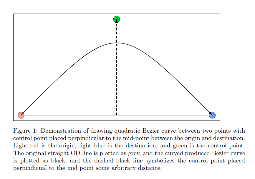
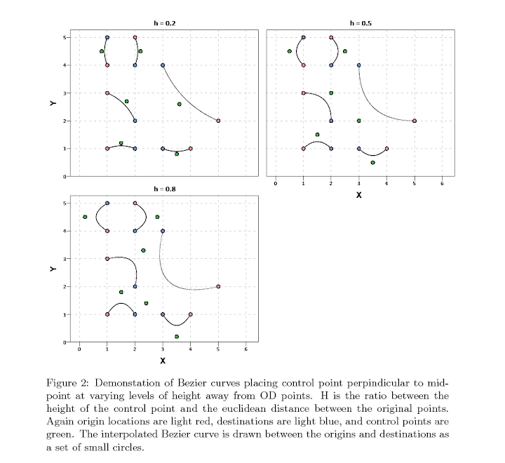
Below is an example diagram I produced to demonstrate quadratic Bezier curves. For my application, I suggest placing a control point perpindicular to the mid point between the origin and destination. This creates a regular arc between the two locations, and conditional on the direction one can control the direction of the arc. In the SPSS function provided the user then provides a value of a ratio of the height of the control point to the distance between the origin and destination location (so points further away from each other will be given higher arcs). Below is a diagram using Latex and the Tikz library (which has a handy function to calulate Bezier curves).

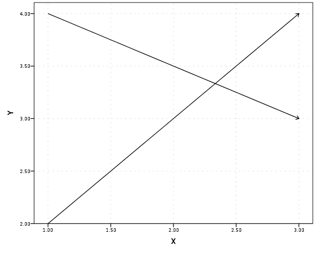
Here is a simpler demonstration of the controlling the direction and adjusting the control point to produce either a flatter arc or an arc with more eccentricity.

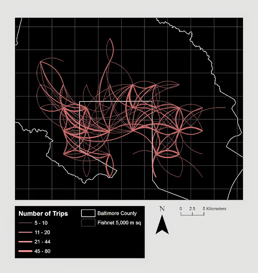
Here is an example displaying 200 JTC lines from the simulated data that comes with the CrimeStat program. The first image are the original straight lines, and the second image are the curved lines using a control point at a height half the distance between the origin and destination coordinate.

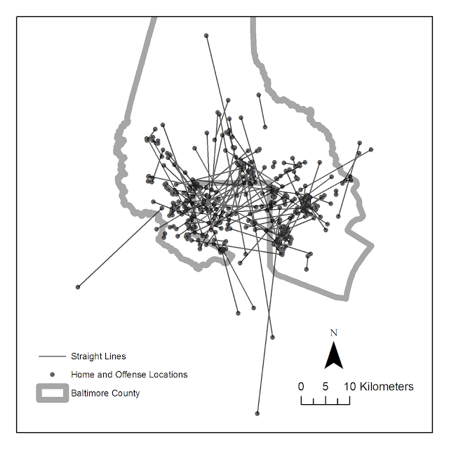
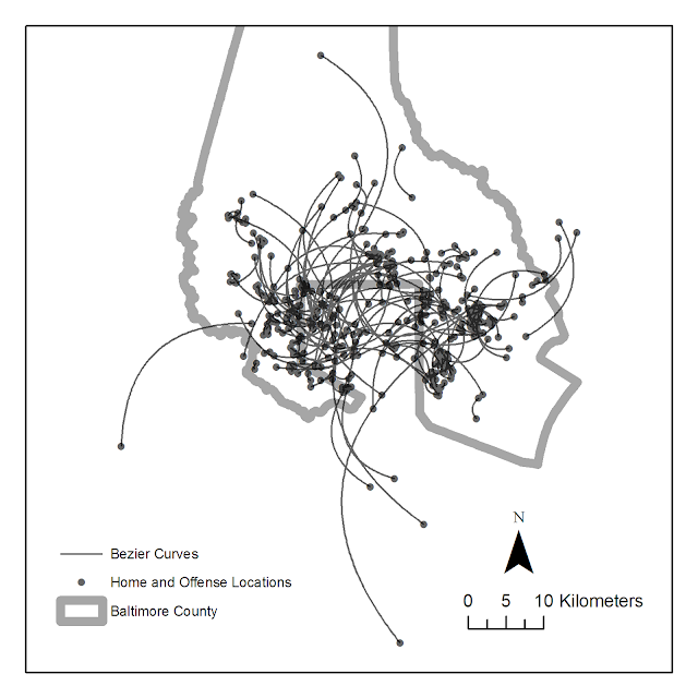
Of course, both are most definately still quite crowded, but what do people think? Are my curved lines suggestion benificial in this example?

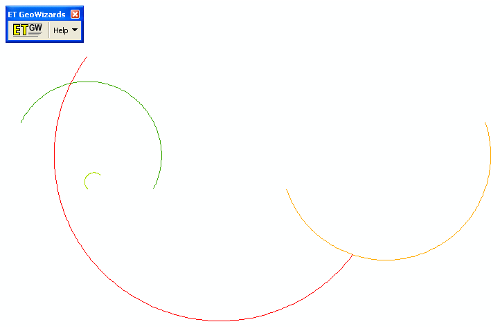
Here I have provided the SPSS function (and some example data) used to calculate the lines (I then use the ET Geowizards add-on to turn the points into lines in ArcGIS). Perhaps in the future I will work on an R function to calculate Bezier curves (I’m sure they could be of some use), but hopefully for those interested this is simple enough to program your own function in whatever language of interest. I have the starting of a working paper on visualizing flow lines, and I plan on this being basically my only unique contribution (everything else is just a review of what other people have done!)

One could be more fancy as well, and make the curves different based on other factors. For instance make the control point closer to either the origin or destination is the flow amount is assymetrical, or make the control point further away (and subsequently make the arc larger) is the flow is more volumous. Ideas for the future I suppose.

Why great circle lines look nicer in flow maps

I got sick of working on my dissertation the other day so I started writing a review article on visualizing flow lines for journey to crime data. Here I will briefly illustrate why great circle lines tend to look nicer in flow maps than do straight lines.

Flow maps tend to be very visually complicated, and so what happens (to a large extent) is what happens in Panel B in the above graphic. Bending the lines, as is done with great circles, tends to displace the lines from one another to a greater extent. Although perfect overlap as is demonstrated in the picture doesn’t necessarily happen that frequently, the same logic applies to nearly overlapped lines. One of the nicest examples of this you can find is the facebook friends map that made the internet rounds (note there are many other aesthetic elements in the plot that make it look nice besides just the great circle lines).

Of course with great circle lines you don’t get the bending in the other direction for reciprocal flows I demonstrate in my first figure (the great circle line is the same regardless of direction). Because of this, and because when using a local projection great circles lines don’t really provide enough eccentricity in the bend to produce the desired displacement of the lines, I suggested to utilize half circles and discuss how to calculate them given a set of origin-destination coordinates at this question on the GIS site.

I need to test this out in the wild some more though. I suspect a half-circle is too much, but my attempts to script a version where the eccentricity is less pronounced has befuddled me so far. I will post an update on here if I come to a better solution, and when the working paper is finished I will post a copy of that as well. Preferably I would like the script to take an arbitrary parameter to control the amount of bend in the arc, so if you have suggestions feel free to shoot me an email or leave a comment here.

For those interested in the topic I would suggest to peruse one of my other answers at the GIS site. Therein I give a host of references and online mapping examples of visualizing flows.