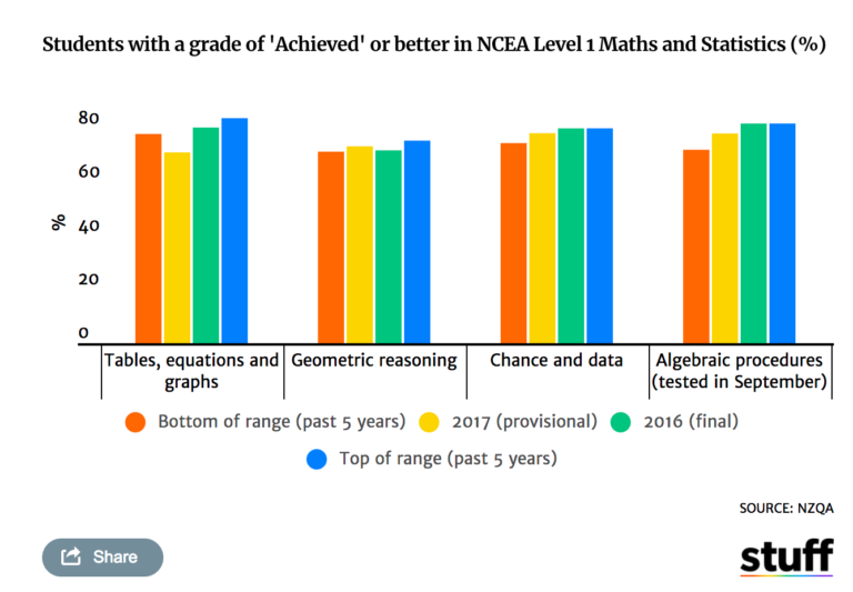
Thomas Lumley on his blog had a recent example of remaking a clustered bar chart that I thought was a good idea. Here is a screenshot of the clustered bar chart (the original is here):

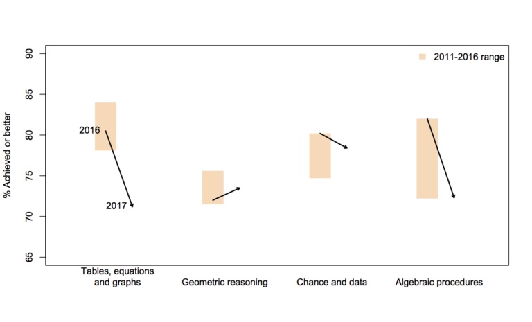
And here is Lumley’s remake:

In the original bar chart it is hard to know what is the current value (2017) and what are the past values. Also the bar chart goes to zero on the Y axis, which makes any changes seem quite small, since the values only range from 70% to 84%. Lumley’s remake clearly shows the change from 2016 to 2017, as well as the historical range from 2011 through 2016.
I like Lumley’s remake quite alot, so I made some code in SPSS syntax to show how to make a similar chart. The grammar of graphics I always thought is alittle confusing when using clustering, so this will be a good example demonstration. Instead of worrying about the legend I just added in text annotations to show what the particular elements were.
One additional remake is instead of offsetting the points and using a slope chart (this is an ok use, but see my general critique of slopegraphs here) is to use a simpler dotplot showing before and after.
One reason I do not like the slopes is that slope itself is dictated by the distance from 16 to 17 in the chart (which is arbitrary). If you squeeze them closer together the slope gets higher. The slope itself does not encode the data you want, you want to calculate the difference from beginning to end. But it is not a big difference here (my main complaints for slopegraphs are when you superimpose many different slopes that cross one another, in those cases I think a scatterplot is a better choice).
Jonathan Schwabish on his blog often has similar charts (see this one example).
Pretty much all clustered bar charts can be remade into either a dotplot or a line graph. I won’t go as far as saying you should always do this, but I think dot plots or line graphs would be a better choice than a clustered bar graph for most examples I have seen.
Here like Lumley said instead of showing the ranges likely a better chart would just be a line chart over time of the individual years, that would give a better since of both trends as well as typical year-to-year changes. But these alternatives to a clustered bar chart I do not think turned out too shabby.
SPSS Code to replicate the charts. I added in the labels for the elements manually.
**********************************************************************************************.
*data from https://www.stuff.co.nz/national/education/100638126/how-hard-was-that-ncea-level-1-maths-exam.
*Motivation from Thomas Lumley, see https://www.statschat.org.nz/2018/01/18/better-or-worse/.

DATA LIST FREE / Type (A10) Low Y2017 Y2016 High (4F3.1).
BEGIN DATA
Tables 78.1 71.2 80.5 84
Geo 71.5 73.5 72 75.6
Chance 74.7 78.4 80.2 80.2
Algebra 72.2 78.3 82 82
END DATA.
DATASET NAME Scores.
VALUE LABELS Type
  'Tables' 'Tables, equations, and graphs'
  'Geo' 'Geometric Reasoning'
  'Chance' 'Chance and data'
  'Algebra' 'Algebraic procedures'
.
FORMATS Low Y2017 Y2016 High (F3.0).
EXECUTE.

*In this format I can make a dot plot.
GGRAPH
  /GRAPHDATASET NAME="graphdataset" VARIABLES=Y2017 Y2016 Low High Type
  /GRAPHSPEC SOURCE=INLINE.
BEGIN GPL
  SOURCE: s=userSource(id("graphdataset"))
  DATA: Y2017=col(source(s), name("Y2017"))
  DATA: Y2016=col(source(s), name("Y2016"))
  DATA: Low=col(source(s), name("Low"))
  DATA: High=col(source(s), name("High"))
  DATA: Type=col(source(s), name("Type"), unit.category())
  GUIDE: axis(dim(1), delta(1), start(70))
  GUIDE: axis(dim(1), label("Percent Students with a grade of 'Achieved' or better"), opposite(), delta(100), start(60))
  GUIDE: axis(dim(2))
  SCALE: cat(dim(2), include("Algebra", "Chance", "Geo", "Tables"))
  ELEMENT: edge(position((Low+High)*Type), size(size."30"), color.interior(color.grey),
           transparency.interior(transparency."0.5"))
  ELEMENT: edge(position((Y2016+Y2017)*Type), shape(shape.arrow), color(color.black), size(size."2"))
  ELEMENT: point(position(Y2016*Type), color.interior(color.black), shape(shape.square), size(size."10"))
END GPL.

*Now trying a clustered bar graph.
GGRAPH
  /GRAPHDATASET NAME="graphdataset" VARIABLES=Y2017 Y2016 Low High Type
  /GRAPHSPEC SOURCE=INLINE.
BEGIN GPL
  SOURCE: s=userSource(id("graphdataset"))
  DATA: Y2017=col(source(s), name("Y2017"))
  DATA: Y2016=col(source(s), name("Y2016"))
  DATA: Low=col(source(s), name("Low"))
  DATA: High=col(source(s), name("High"))
  DATA: Type=col(source(s), name("Type"), unit.category())
  TRANS: Y17 = eval("2017")
  TRANS: Y16 = eval("2016")
  COORD: rect(dim(1,2), cluster(3,0))
  GUIDE: axis(dim(3))
  GUIDE: axis(dim(2), label("% Achieved"), delta(1), start(70))
  ELEMENT: edge(position(Y16*(Low+High)*Type), size(size."30"), color.interior(color.grey),
           transparency.interior(transparency."0.5"))
  ELEMENT: edge(position((Y16*Y2016*Type)+(Y17*Y2017*Type)), shape(shape.arrow), color(color.black), size(size."2"))
  ELEMENT: point(position(Y16*Y2016*Type), color.interior(color.black), shape(shape.square), size(size."10"))
END GPL.

*This can get tedious if you need to make a line for many different years.
*Reshape to make a clustered chart in a less tedious way (but cannot use arrows this way).
VARSTOCASES /MAKE Perc FROM Y2016 Y2017 /INDEX Year.
COMPUTE Year = Year + 2015.
DO IF Year = 2017.
  COMPUTE Low = $SYSMIS.
  COMPUTE High = $SYSMIS.
END IF.
EXECUTE.

GGRAPH
  /GRAPHDATASET NAME="graphdataset" VARIABLES=Type Perc Year Low High MISSING=VARIABLEWISE REPORTMISSING=NO
  /GRAPHSPEC SOURCE=INLINE.
BEGIN GPL
  SOURCE: s=userSource(id("graphdataset"))
  DATA: Type=col(source(s), name("Type"), unit.category())
  DATA: Perc=col(source(s), name("Perc"))
  DATA: Low=col(source(s), name("Low"))
  DATA: High=col(source(s), name("High"))
  DATA: Year=col(source(s), name("Year"), unit.category())
  COORD: rect(dim(1,2), cluster(3,0))
  GUIDE: axis(dim(3))
  GUIDE: axis(dim(2), label("% Achieved"), delta(1), start(70))
  SCALE: cat(dim(3), include("Algebra", "Chance", "Geo", "Tables"))
  ELEMENT: edge(position(Year*(Low+High)*Type), color.interior(color.grey), size(size."20"), transparency.interior(transparency."0.5"))
  ELEMENT: path(position(Year*Perc*Type), split(Type))
  ELEMENT: point(position(Year*Perc*Type), size(size."8"), color.interior(color.black), color.exterior(color.white))
END GPL.
**********************************************************************************************.


