Scorpion was probably not doing hot spots policing

So the Wall Street Journal had a recent article describing how crackdowns in hot spots of crime may not be the best policing tactic, Tyre Nichols Case Prompts Questions About Police Tactics in Crime Hot Spots. This is actually an OK article, but to be clear “hot spots” policing isn’t really defined by police tactics, hot spots are just a method to identify small areas with the most crime in a city. Identifying the hot spots does not explicitly determine the policing (or non-policing) tactic that one should use to reduce crime in that area. The Washington Post had a recent article in a similar vein critiquing the work of Tamara Herold in Breonna Taylor’s death. The WaPo article even prompted a response by a group of well known criminologists how it was inappropriate to blame Herold’s strategy.

So hotspots have always had a mix of different policing tactics that go with it, the most common strategies I would say are problem oriented policing (Braga et al., 1999), increased street or traffic stops (MacDonald et al., 2016; Sherman & Rogan, 1995), or simply patrolling/hanging out in the area (Groff et al., 2015; Koper, 1995). The WSJ article talks about Joel Caplan’s RTM group (which I think do good work), and they are really just doing a version of problem oriented policing. (POP has always had a component of working in tandem with the community and different public/private sector agencies.)

One of the reasons I wanted to write about this post though, is that often in my career I see a disconnect in purportedly hot spots policing (or similar tactics, such as DDACTS) on paper and what is actually happening on the ground. So using the Memphis Open Crime Data, I identified the top 100 street segments in terms of violent crime (code on github to replicate). As I suspected, the place where Nichols was pulled over is not a hot spot of crime, making the connection between the Scorpion units behavior and hot spots policing tactics a bit suspect.

If the embedded google map does now work, here is a screen shot to show how none of the top 100 street midpoints are around the location of where Nichol’s was initially stopped:

It happens to be the case that officers often have misperceptions of where hot spots are (Macbeth & Ariel, 2019; Ratcliffe & McCullagh, 2001). And that if left to no oversight, there tends to be a mismatch between where police proactivity is occurring and where the most serious crime is spatially concentrated (Wheeler et al., 2018). That is why a system to feed back information to officers for whether they are making high quality stops is so important (Worden et al., 2018).

To be clear, this is not me making excuses for researchers or crime analysts to not know what is actually occurring in their jurisdictions, and to potentially ignore the secondary harms that can come with intensive policing. But in my experience, taking the time to do hot spots policing right, which at its most basic is actually identifying hot spots using data, is a good sign that police departments take seriously the tactics they use and to seriously think about mitigating some of these secondary harms. Hot spots policing does not intrinsically result in unequal outcomes, which can be done via tactics that mitigate harm (such as problem oriented policing), or constructing a hot spots policy that promotes racial equity in outcomes from the start (Wheeler, 2020).

References

  • Braga, A.A., Weisburd, D.L., Waring, E.J., Mazerolle, L.G., Spelman, W., & Gajewski, F. (1999). Problem‐oriented policing in violent crime places: A randomized controlled experiment. Criminology, 37(3), 541-580.
  • Groff, E. R., Ratcliffe, J. H., Haberman, C. P., Sorg, E. T., Joyce, N. M., & Taylor, R. B. (2015). Does what police do at hot spots matter? The Philadelphia policing tactics experiment. Criminology, 53(1), 23-53.
  • Koper, C.S. (1995). Just enough police presence: Reducing crime and disorderly behavior by optimizing patrol time in crime hot spots. Justice Quarterly, 12(4), 649-672.
  • Macbeth, E., & Ariel, B. (2019). Place-based statistical versus clinical predictions of crime hot spots and harm locations in Northern Ireland. Justice Quarterly, 36(1), 93-126.
  • MacDonald, J., Fagan, J., & Geller, A. (2016). The effects of local police surges on crime and arrests in New York City. PLoS one, 11(6), e0157223.
  • Ratcliffe, J.H., & McCullagh, M.J. (2001). Chasing ghosts? Police perception of high crime areas. British Journal of Criminology, 41(2), 330-341.
  • Sherman, L.W., & Rogan, D.P. (1995). Effects of gun seizures on gun violence:“Hot spots” patrol in Kansas City. Justice Quarterly, 12(4), 673-693.
  • Wheeler, A.P. (2020). Allocating police resources while limiting racial inequality. Justice Quarterly, 37(5), 842-868.
  • Wheeler, A. P., Steenbeek, W., & Andresen, M. A. (2018). Testing for similarity in area‐based spatial patterns: Alternative methods to Andresen’s spatial point pattern test. Transactions in GIS, 22(3), 760-774.
  • Worden, R.E., McLean, S.J., Wheeler, A.P., Reynolds, D.L., Dole, C., Cochran, H. Smart Stops: An Inquiry into Proactive Policing. Summary Report to the National Institute of Justice, Award No. 2013-MU-CX-0012.

Hot spots of crime in Raleigh and home buying

So my realtor, Ellen Pitts (who is highly recommended, helped us a ton remotely moving into Raleigh), has a YouTube channel where she talks about real estate trends. Her most recent video she discussed a bit about crime in Raleigh relative to other cities because of the most recent shooting.

My criminologist hot take is that generally most cities in the US are relatively low crime. So Ellen shows Dallas has quite a few more per-capita shootings than Raleigh, but Dallas is quite safe “overall”. Probably somewhat contra to what most people think, the cities that in my opinion really have the most crime problems tend to be smaller rust belt cities. I love Troy, NY (where I was a crime analyst for a few years), but Troy is quite a bit rougher around the edges than Raleigh or Dallas.

So this post is more about, you have already chosen to move to Raleigh – if I am comparing house 1 and house 2 (or looking at general neighborhoods), do I need to worry about crime in this specific location?

So for a few specific resources/strategies for the home hunter. Not just in Raleigh, but many cities now have an open data portal. You can often look at crime. Here is an example with the Raleigh open data:

So if you have a specific address in mind, you can go and see the recent crime around that location (cities often fuzz the address a bit, so the actual points are just nearby on that block of the street). Blue dots in that screenshot are recent crimes in 2022 against people (you can click on each dot and get a more specific breakdown). Be prepared when you do this – crime is everywhere. But that said the vast majority of minor crime incidents should not deter you from buying a house or renting at a particular location.

Note I recommend looking at actual crime data (points on a map) for this. Several vendors release crime stats aggregated to neighborhoods or zipcodes, but these are of very low quality. (Often they “make up” data when it doesn’t exist, and when data does exist they don’t have a real great way to rank areas of low or high crime.)

For the more high level, should I worry about this neighborhood, I made an interactive hotspot map.

For the methodology, I focused on crimes that I would personally be concerned with as a homeowner. If I pull larceny crimes, I am sure the Target in North Hills would be a hotspot (but I would totally buy a condo in North Hills). So this pulls the recent crime data from Raleigh open data starting in 2020, but scoops up aggravated assaults, interpersonal robberies, weapon violations, and residential burglaries. Folks may be concerned about drug incidents and breaking into cars as well, but my experience those also do not tend to be in residential areas. The python code to replicate the map is here.

Then I created DBScan clusters that had at least 34 crimes – so these areas average at least one of these crimes per month over the time period I sampled. Zooming in, even though I tried to filter for more potentially residential related crimes, you can see the majority of these hot spots of crime are commercial areas in Raleigh. So for example you can zoom in and check out the string of hot spots on Capital Blvd (and if you click a hot spot you can get breakdowns of specific crime stats I looked at):

Very few of these hot spots are in residential neighborhoods – most are in more commercial areas. So when considering looking at homes in Raleigh, there are very few spots I would worry about crime at all in the city when making a housing choice. If moving into a neighborhood with a higher proportion of renters I think is potentially more important long term signal than crime here in Raleigh.

Minimum detectable effect sizes for place based designs

So I was reading Blattman et al.’s (2018) work on a hot spot intervention in Bogotá the other day. It is an excellent piece, but in a supplement to the paper Blattman makes the point that while his study is very high powered to detect spillovers, most other studies are not. I am going to detail here why I disagree with his assessment on that front.

In appendix A he has two figures, one for the direct effect comparing the historical hot spot policing studies (technically he uses the older 2014 Braga study, but here is the cite for the update Braga et al., 2020).

The line signifies a Cohen’s D of 0.17, and here is the same graph for the spillover estimates:

So you can see Blattman’s study in total number of spatial units of analysis breaks the chart so to speak. You can see however there are plenty of hot spot studies in either chart that reported statistically significant differences, but do not meet the 0.17 threshold in Chris’s chart. How can this be? Well, Chris is goal switching a bit here, he is saying using his estimator the studies appear underpowered. The original studies on the graph though did not necessarily use his particular estimator.

The best but not quite perfect analogy I can think of is this. Imagine I build a car that gets better gas mileage compared to the current car in production. Then someone critiques this as saying the materials that go into production of the car have worse carbon footprints, so my car is actually worse for the environment. It would be fine to argue a different estimate of total carbon footprint is reasonable (here Chris could argue his estimator is better than the ones the originally papers used). It is wrong though to say you don’t actually improve gas mileage. So it is wrong for Chris to say the original articles are underpowered using his estimator, they may be well powered using a different estimator.

Indeed, using either my WDD estimator (Wheeler & Ratcliffe, 2018) or Wilson’s log IRR estimator (Wilson, 2021), I will show how power does not grow with more experimental units, but with a larger baseline number of crimes for those estimators. They both only have two spatial units of analysis, so in Chris’s chart will never gain more power.

One way I think about the issue for spatial designs is this – you could always split up a spatial lattice into ever finer and finer spatial units of analysis. For example Chris could change his original design to use addresses instead of street segments, and split up the spillover buffers into finer slices as well. Do you gain something for doing nothing though? I doubt it.

I describe in my dissertation how finer spatial units of analysis allow you to check for finer levels of spatial spillovers, e.g. can check if crime spills over from the back porch to the front stoop (Wheeler, 2015). But when you do finer spatial units, you get more cold floor effects as well due to the limited nature of crime counts – they cannot go below 0. So designs with lower baseline crime rates tend to show lower power (Hinkle et al., 2013).

MDE for the WDD and log IRR

For minimum detectable effect (MDE) sizes for OLS type estimators, you need to specify the variance you expect the underlying treated/control groups to have. With the count type estimators I will show here, the variance is fixed according to the count. So all I need to specify is the alpha level of the test. Here I will do a default of 0.05 alpha level (with different lines for one-tailed vs two-tailed). The other assumption is the distribution of crime counts between treated/control areas. Here I assume they are all equal, so 4 units (pre/post and treated/control). For my WDD estimator this actually does not matter, for the later IRR estimator though it does (so the lines won’t really be exact for his scenario).

So here is the MDE for mine and Jerry’s WDD estimator:

What this means is that if you have an average of 20 crimes in the treated/control areas for each time period separately, you would need to find a reduction of 15 crimes to meet this threshold MDE for a one-tailed. It is pretty hard when starting with low baselines! For an example close to this, if the treated area went from 24 to 9, and the control area was 24 to 24, this would meet the minimal treated reduction of 15 crimes in this example.

And here is the MDE for the log IRR estimator. The left hand Y axis has the logged effect, and the right hand side has the exponentiated IRR (incident rate ratio).

Since the IRR is commonly thought of as a percent reduction, this suggests even with baselines of 200 crimes, for Wilson’s IRR estimator you need percent reductions of over 20% relative to control areas.

So I have not gone through the more recent Braga et al. (2020) meta-analysis. I do not know if they have the data readily available to draw the points on this plot the same as in the Blattman article. To be clear, it may be Blattman is right and these studies are underpowered using either his or my estimator, I am not sure. (I think they probably are quite underpowered to detect spillover, since this presumably will be an even smaller amount than the direct effect. But that would not explain estimates of diffusion of benefits commonly found in these studies!)

I also do not know if one estimator is clearly better or not – for example Blattman could use my estimator if he simply pools all treated/control areas. This is not obviously better than his approach though, and foregoes any potential estimates of treatment effect variance (I will be damned if I can spell that word starting with het even close enough for autocorrect). But maybe the pooled estimate is OK, Blattman does note that he has cold floor effects in his linear estimator – places with higher baselines have larger effects. This suggests Wilson’s log IRR estimator with the pooled data may be just fine and dandy for example.

Python code

Here is the python code in its entirety to generate the above two graphs. You can see the two functions to calculate the MDE given an alpha level and average crime counts in each area if you are planning your own study, the wdd_mde and lirr_mde functions.

'''
Estimating minimum detectable effect sizes
for place based crime interventions

Andy Wheeler
'''

import numpy as np
from scipy.stats import norm
import matplotlib
import matplotlib.pyplot as plt
import os
my_dir = r'D:\Dropbox\Dropbox\Documents\BLOG\min_det_effect'
os.chdir(my_dir)

#########################################################
#Settings for matplotlib

andy_theme = {'axes.grid': True,
              'grid.linestyle': '--',
              'legend.framealpha': 1,
              'legend.facecolor': 'white',
              'legend.shadow': True,
              'legend.fontsize': 14,
              'legend.title_fontsize': 16,
              'xtick.labelsize': 14,
              'ytick.labelsize': 14,
              'axes.labelsize': 16,
              'axes.titlesize': 20,
              'figure.dpi': 100}

matplotlib.rcParams.update(andy_theme)
#########################################################

#########################################################
# Functions for MDE for WDD and logIRR estimator


def wdd_mde(avg_counts,alpha=0.05,tails='two'):
    se = np.sqrt( avg_counts*4 )
    if tails == 'two':
        a = 1 - alpha/2
    elif tails == 'one':
        a = 1 - alpha
    z = norm.ppf(a)
    est = z*se
    return est

def lirr_mde(avg_counts,alpha=0.05,tails='two'):
    se = np.sqrt( (1/avg_counts)*4 )
    if tails == 'two':
        a = 1 - alpha/2
    elif tails == 'one':
        a = 1 - alpha
    z = norm.ppf(a)
    est = z*se
    return est

# Generating regular grid from 10 to 200
cnts = np.arange(10,201)
wmde1 = wdd_mde(cnts, tails='one')
wmde2 = wdd_mde(cnts)

imde1 = lirr_mde(cnts, tails='one')
imde2 = lirr_mde(cnts)

# Plot for WDD MDE
fig, ax = plt.subplots(figsize=(8,6))
ax.plot(cnts, wmde1,color='k',linewidth=2, label='One-tailed')
ax.plot(cnts, wmde2,color='blue',linewidth=2, label='Two-tailed')
ax.set_axisbelow(True)
ax.set_xlabel('Average Number of Crimes in Treated/Control')
ax.set_ylabel('Crime Count Reduction')
ax.legend(loc='upper left')
plt.xticks(np.arange(0,201,20))
plt.yticks(np.arange(10,61,5))
plt.title("WDD MDE alpha level 0.05")
plt.savefig('WDD_MDE.png', dpi=500, bbox_inches='tight')

# Plot for IRR MDE
fig, ax = plt.subplots(figsize=(8,6))
ax2 = ax.secondary_yaxis("right", functions=(np.exp, np.log))
ax.plot(cnts,-1*imde1,color='k',linewidth=2, label='One-tailed')
ax.plot(cnts,-1*imde2,color='blue',linewidth=2, label='Two-tailed')
ax.set_axisbelow(True)
ax.set_xlabel('Average Number of Crimes in Treated/Control')
ax.set_ylabel('log IRR')
ax.set_ylim(-0.16, -1.34)
ax.legend(loc='upper right')
ax.set_yticks(-1*np.arange(0.2,1.31,0.1))
ax2.set_ylabel('IRR')
ax2.grid(False)
plt.xticks(np.arange(0,201,20))
plt.title("IRR MDE alpha level 0.05")
plt.savefig('IRR_MDE.png', dpi=500, bbox_inches='tight')

#########################################################

References

Clumpy hotspots

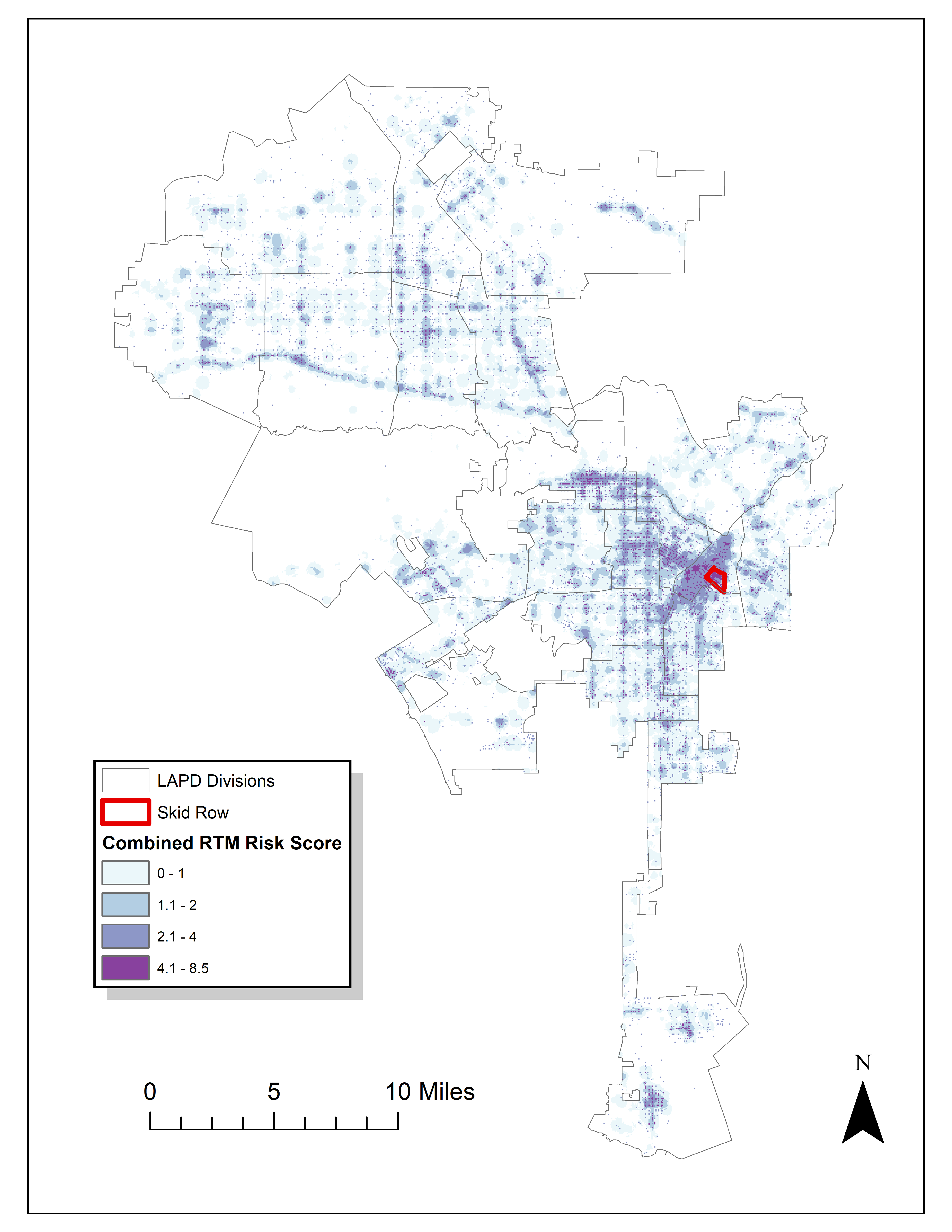
Read an article by Tim Hart the other day (part of a special issue I will have an article in as well here soon). In it he evaluated hot spot methods not only by how well they forecast crime, but also by the clumpiness of the hot spot method. Some hot spot methods, such as risk terrain modeling (Caplan et al., 2020; Fox et al., 2021), machine learning models (Wheeler & Steenbeek, 2020), or self-exciting point process models (Mohler et al., 2018) can by their nature produce discontinuous hot spots. Here is an example of a RTM map I made in Yoo & Wheeler (2019) for homeless related crime in Los Angeles, and you can see this is quite spotty in the ups/downs in the high risk areas:

Other hot spot methods, like hierarchical clustering (Wheeler & Reuter, 2020) or kernel density maps however this is not as big an issue. Here is an example kernel density map also from Yoo & Wheeler (2019) based on the same data:

So you can see how the hot spots in the kernel density map are spatially contiguous, whereas the RTM example can be little hot spots all over the jurisdiction. So it is obviously easier to patrol a single contiguous area than many islands over the entire jurisdiction. So it may make sense to trade off a contiguous area that captures somewhat fewer crimes than speckled areas that are all over the map.

Adepeju et al. (2016) was the first to use a particular statistic, the clumpiness index, to evaluate different hot spot methods. Their figure below is a pretty good depiction of the idea – count up the number of internal edges to a hot spot (when a hot spot grid-cell neighbors another hot spot), and the number of external edges. Then it is just a particular formula to make the index range from -1 to 1 given different sized hot spots.

So here I flip this idea on its head abit – instead of using a particular hot spot technique and see its clumpiness, I formulate a linear program given a prediction to trade off a smaller number of predicted crimes in the hot spot vs making the hot spot areas more clumpy. I illustrate my clumpy hot spots using just prior data to predict future data, in particular thefts from motor vehicles in Raleigh North Carolina.

I have posted the data/code on github here. It is a bit too long to embed the code directly in the blog post, but just see the 00_PrepData.py file. The crime data and Raleigh border I downloaded from the Raleigh open data website.

A Linear Program to Clump Hot Spots

So for some quick and dirty math in text, the linear program I formulate is:

Maximize { Sum[ theta*S_i*Crime_i + (1 - theta)*E_i ] }
Subject To:
    1) Sum( S_i ) = k
    2) E_i <= Sum(S_n for n in neighbors(i) ) for each i
    3) E_i <= S_i for each i
    4) S_i element of {0,1}, E_i >= 0 (and can be continuous)

The idea behind this is that if theta=1, this is the same as just taking whatever your input areas are and ranking them to pick the top k areas. So if you have 10000 500 by 500 foot grid cells as your spatial units of analysis, and you wanted the top 1% of the city, that is 100 grid cells. So you would choose k=100 in that scenario. Crime_i here I use as prior counts of crime in the grid cell, but it could be the predicted value from whatever model as well. That is the first constraint in this model approach – you need to choose the total area you want. S_i are the decision variables for the final selected hot spot areas.

The second and third constraints determine the values for the second set of decision variables, E_i. These are the decision variables that encode the interconnected links when a selected grid cell touches another grid cell. Constraint 2 sets E_i to the total number of neighbors of i that are selected, except constraint 3 says if S_i is 0 E_i needs to be 0 as well.

In this formulation, S_i need to be integer variables, but the E_i are defined by the sum of S_i, so they can be continuous. In this formulation if you have N grid cells (or whatever spatial units of analysis), this results in 2*N decision variables, and 2*N + 1 constraints. You could maybe save a few constraints here by working with an undirected graph instead of a directed one (in essence this double counts, a-b and b-a would count as two links). But this will just make it 1.5*N constraints instead of 2*N. So not a big deal probably. I did have some issues solving this using pulps default coin/GLPK solver. But CPLEX solved it no problem. (My example is a total of 20,986 500 by 500 foot grid cells, and I use rook contiguity like the Adepeju article as well. And using CPLEX it solves the models in just a few seconds.)

In this formulation you can think of theta as trading off crimes in the hot spot vs interior edges. So imagine you had theta=0.9, and you had a solution with 200 crimes and 100 interior edges. The objective function in that scenario would be 0.9*200 + 0.1*100 = 190. Now imagine you had an alternative scenario with 190 crimes, but 200 internal edges, the objective function would be 0.9*190 + 0.1*200 = 191. So you are saying, it is ok to have hot spots capture a smaller number of crimes, if they are more connected.

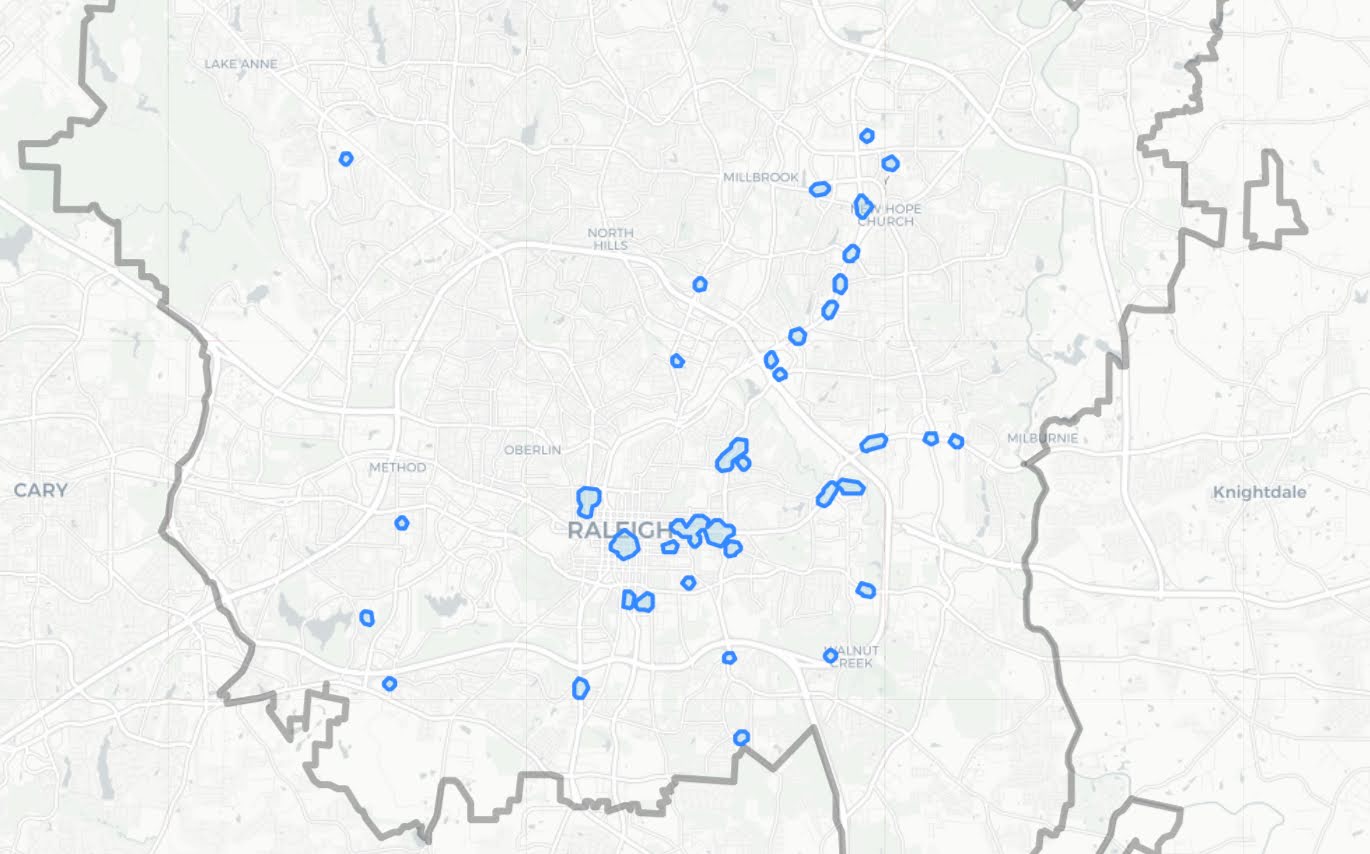
Normal Hotspots vs Clumpy Ones in Raleigh

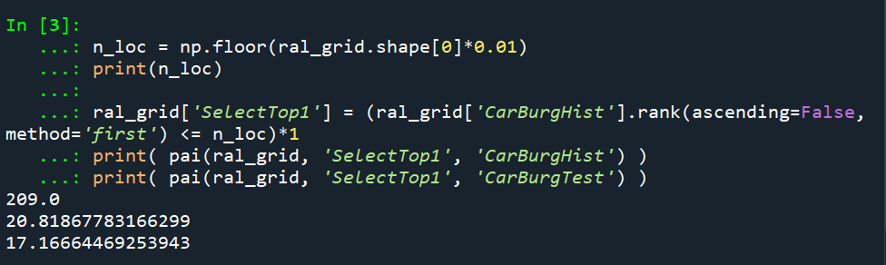
The open data I use for Raleigh, North Carolina for the NIBRS dataset goes back to June 2014, and has data updated in the beginning of March 2021. I pull out larcenies from motor vehicles, and for the historical train dataset use car larcenies from 2014 through 2019 (n = 17,681). For the test dataset I use car larcenies in 2020 and what is available so far in 2021 (n = 3,376). Again these are grid cells generated over the city boundaries at 500 by 500 foot intervals. For illustration I grab out the top 1% of the city (209 grid cells). I use a train/test dataset as out of sample test data will typically result in reduced predictions. Here are the PAI stats for train vs test when selecting the top 1%.

For all subsequent selections I always use the historical training data to select the hot spots, and the test dataset to evaluate the PAI.

If we do the typical approach of just taking the highest crime grid cells based on the historical data, here are the results both for the PAI and the CI (clumpy index). For those not familiar, PAI is % Crime Capture/% Area, so if the denominator is 1%, and the PAI (for the test data) is 17, that means the hot spots capture 17% of the total thefts from vehicles. The CI ranges from -1 (spread apart) to 1 (entirely clustered). Here it is just over 0, suggesting these are basically randomly distributed in terms of clustering.

You may think that almost spatial randomness in terms of clumping seems at odds with that crime clusters! But it is not really – a consistent relationship with crime hot spots is that they are intensely localized, and often you can go down the street and be in a low crime area (Harries, 2006). The same idea when people say high crime neighborhoods often are spotty interior – they tend to have mostly low crime areas and just a few specific hot spots.

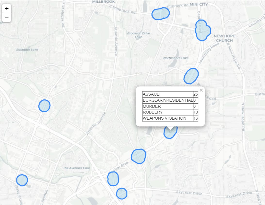
OK, so now to show off my linear program. So what happens if we use theta=0.9?

The total crime numbers are here for the historical data, and it ends up capturing the exact same number of crimes as the select top 1% does (3,664). But, it switches the selection of one of the areas. So what happens here is that we have ties – even with basically little weight assigned to the interior connections, it will prioritize tied crime areas to be connected to other chosen hot spots (whereas before the ties are just random in the way I chose the top 1%). So if you have many ties at the threshold for your hot spot, this is a great way to prioritize particular tied areas.

What happens if we turn down theta to 0.5? So this is saying you would trade off one for one – one interior edge is equal to one crime.

You can see that it changed the selections slightly more here, traded off 24 areas compared to the original just rank solution. Lets check out the map and the CI:

The CI value is now 0.17 (up from 0.08). You can see some larger blobs, but it is still pretty spread apart. But the reduction in the total number of crimes captured is pretty small, going from a PAI of 17 to now a PAI of 16. How about if we crank down theta even more to 0.2?

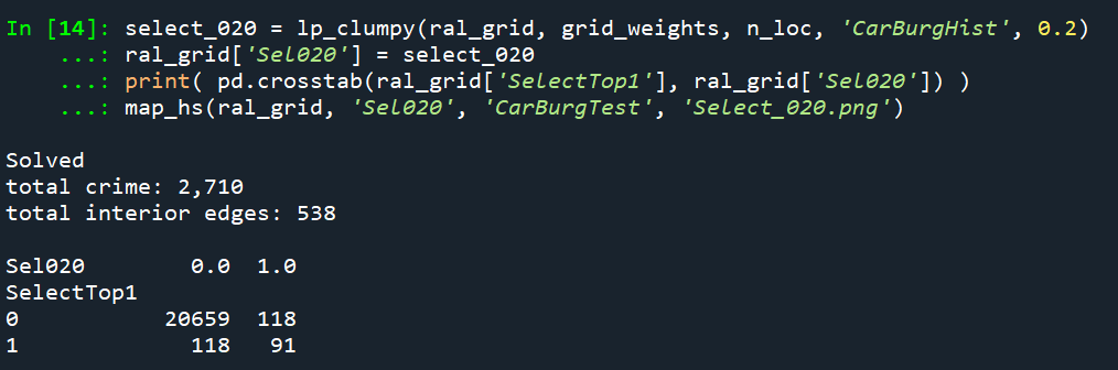
This trades off a much larger number of areas and total amount of crime – over half of the chosen grid cells are flipped in this scenario. In the subsequent map you can see the hot spots are much more clumpy now, and have a CI of 0.64.

The PAI of 12.6 is a bit of a hit as well, but is not too shabby still. I typically take a PAI of 10 to be the ballpark of what is reasonable based on Weisburd’s Law of Crime Concentration – 5% of the areas contain 50% of the crime (which is a PAI of 10).

So this shows one linear programming approach to trade off clumpy chosen areas vs disconnected speckles over the map. It may be the case though that other approaches are more reasonable, such as using some type of clustering to begin with. E.g. I could use DBSCAN on the gridded predicted values (Wheeler & Reuter, 2020) as see how clumpy those hot spots are. This approach is nice though if you have a fixed area you want to cover though.

Why Raleigh?

For a bit of personal news, I will be moving to the Raleigh area here shortly. I recently negotiated to be 100% remote at my job – so I will still be at HMS (or since we were recently purchased I might be employed by Gainwell I guess by the time I move). So looking forward to the new adventure back on the east coast but still in more temperate climates than PA or NY!

References

New preprint: Allocating police resources while limiting racial inequality

I have a new working paper out, Allocating police resources while limiting racial inequality. In this work I tackle the problem that a hot spots policing strategy likely exacerbates disproportionate minority contact (DMC). This is because of the pretty simple fact that hot spots of crime tend to be in disadvantaged/minority neighborhoods.

Here is a graph illustrating the problem. X axis is the proportion of minorities stopped by the police in 500 by 500 meter grid cells (NYPD data). Y axis is the number of violent crimes over along time period (12 years). So a typical hot spots strategy would choose the top N areas to target (here I do top 20). These are all very high proportion minority areas. So the inevitable extra police contact in those hot spots (in the form of either stops or arrests) will increase DMC.

I’d note that the majority of critiques of predictive policing focus on whether reported crime data is biased or not. I think that is a bit of a red herring though, you could use totally objective crime data (say swap out acoustic gun shot sensors with reported crime) and you still have the same problem.

The proportion of stops by the NYPD of minorities has consistently hovered around 90%, so doing a bunch of extra stuff in those hot spots will increase DMC, as those 20 hot spots tend to have 95%+ stops of minorities (with the exception of one location). Also note this 90% has not changed even with the dramatic decrease in stops overall by the NYPD.

So to illustrate my suggested solution here is a simple example. Consider you have a hot spot with predicted 30 crimes vs a hot spot with predicted 28 crimes. Also imagine that the 30 crime hot spot results in around 90% stops of minorities, whereas the 28 crime hot spot only results in around 50% stops of minorities. If you agree reducing DMC is a reasonable goal for the police in-and-of-itself, you may say choosing the 28 crime area is a good idea, even though it is a less efficient choice than the 30 crime hot spot.

I show in the paper how to codify this trade-off into a linear program that says choose X hot spots, but has a constraint based on the expected number of minorities likely to be stopped. Here is an example graph that shows it doesn’t always choose the highest crime areas to meet that racial equity constraint.

This results in a trade-off of efficiency though. Going back to the original hypothetical, trading off a 28 crime vs 30 crime area is not a big deal. But if the trade off was 3 crimes vs 30 that is a bigger deal. In this example I show that getting to 80% stops of minorities (NYC is around 70% minorities) results in hot spots with around 55% of the crime compared to the no constraint hot spots. So in the hypothetical it would go from 30 crimes to 17 crimes.

There won’t be a uniform formula to calculate the expected decrease in efficiency, but I think getting to perfect equality with the residential pop. will typically result in similar large decreases in many scenarios. A recent paper by George Mohler and company showed similar fairly steep declines. (That uses a totally different method, but I think will be pretty similar outputs in practice — can tune the penalty factor in a similar way to changing the linear program constraint I think.)

So basically the trade-off to get perfect equity will be steep, but I think the best case scenario is that a PD can say "this predictive policing strategy will not make current levels of DMC worse" by applying this algorithm on-top-of your predictive policing forecasts.

I will be presenting this work at ASC, so stop on by! Feedback always appreciated.

New course in the spring – Crime Science

This spring I will be teaching a new graduate level course, Crime Science. A better name for the course would be evidence based policing tactics to reduce crime — but that name is too long!

Here you can see the current syllabus. I also have a page for the course, which I will update with more material over the winter break.

Given my background it has a heavy focus on hot spots policing (different tactics at hot spots, time spent at hot spots, crackdowns vs long term). But the class covers other policing strategies; such as chronic offenders, the focused deterrence gang model, and CPTED. We also discuss the use of technology in policing (e.g. CCTV, license plate readers, body-worn-cameras).

I will weave in ethical discussions throughout the course, but I reserved the last class to specifically talk about predictive policing strategies. In particular the two main concerns are increasing disproportionate minority contact through prediction, and privacy concerns with police collecting various pieces of information.

So take my course!