AI disclosure – I used AI to write this blog post. I figure having an AI blog post is better than not writing it at all. I will always disclose though if I use AI to heavily write any content on this blog. (I use it for minor copy editing all the time.)
For the tech details, I used gemini flash 3.5 with medium reasoning in the Antigravity IDE, using the same advice I said in this blog post. (Minor preference to Claude Code for writing blog posts for those who care.) It is the outline of the thread I did on X (which I wrote entirely by hand). Using this approach, e.g. I give a detailed outline and prior examples, Pangram says this is only lightly AI assisted.
Notes on Valuing the Cost of Crime
We often hear eye-popping figures about the “cost of crime.” For example, that a single aggravated assault costs society $100,000, or that a statistical life is worth $10 million. But if you look under the hood of these estimates, they are built on a house of cards: Willingness-to-Pay (WTP) surveys.
WTP estimates wildly inflate the costs of crime. For realistic policy decisions and police budgeting, we should be using concrete measures that are easier to calculate and verify.
The Three Buckets of Crime Costs
To evaluate criminal justice interventions, we can break costs into three broad categories:
- A) Cost to the individual: Personal hospital bills, lost work, and physical trauma.
- B) Cost to public sector agencies: Police labor, court proceedings, jail/prison operations, and public healthcare programs like Medicaid.
- C) Cost to society: Reduced business activity in high-crime areas and the loss of workers to the economy.
Most cost-of-crime estimates do not calculate these countable categories. Instead, they use survey estimates of willingness-to-pay to approximate the costs of crime to individuals. I believe WTP estimates themselves are junk and should not be used to guide operations.
The Scaling Problem of Willingness-to-Pay
If you have heard the phrase “a statistical life costs $10 million,” you are seeing a WTP estimate in action.
The scaling math is straightforward, but the resulting estimates themselves are junk. Researchers ask survey respondents questions like: “Would you pay $100 in increased taxes to fund sidewalk improvements that reduce pedestrian fatalities?” If the safety measures are estimated to reduce pedestrian deaths by 1 in 100,000 annually in a city, the math scales up simply:
100 × 100, 000 = $10, 000, 000
People are thus deemed “willing to pay” $10 million to reduce one death.
This methodology yields massive, noisy estimates. You can see these WTP metrics compiled on the RAND Cost of Crime site. The primary limitation is that survey respondents will agree to pay almost any seemingly small amount when they do not actually have to pay it. In one street lighting survey I reviewed, participants were paid $1 to participate and claimed they were willing to pay $200 on average for better streetlights. It is highly doubtful that someone who sells their time for $1 to complete a survey will actually pay $200 in taxes for streetlights. As Andrew Gelman has pointed out, valuing lives based on ability to pay reveals how detached these hypothetical exercises are from real-world resource constraints.
Countable Costs vs. Theoretical Valuations
When we rely on concrete cost estimates that can be verified—such as labor hours and medical bills—the figures are much lower.
For instance, while a WTP estimate for an aggravated assault is close to $100,000, Priscilla Hunt’s study on law enforcement costs estimates the actual police labor cost for an assault is closer to $10,000.
I cannot prove what people are hypothetically willing to pay. But I can show a police chief that reducing ten assaults in a specific sector will save $100,000 in labor and overtime.
This distinction matters for other public costs too. Serious physical assaults can easily generate six-figure medical bills. In New York, more than 70% of gun violence hospitalizations are paid for via Medicaid. While it is reasonable for state or federal governments to weigh these medical costs, a local county or police department does not bear them. It makes no sense for a local police department to justify its budget by claiming it is reducing Medicaid expenses.
Example Cost-Benefit Case Studies
When we restrict our analysis to tangible costs, how do common interventions stack up?
Hotspots Policing
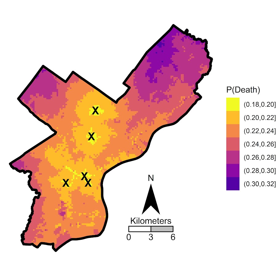
Because crime is highly concentrated, we can identify specific geographic areas that generate massive public costs. I have previously written about locating Million-Dollar Hotspots in Baltimore and Dallas. In my research on redrawing hotspots, I show how spatial concentration makes 24/7 hotspots policing cost-effective based purely on offsetting tangible labor costs.
For code examples of this, check out my crimepy python library (DBSCAN with weights for cost of crime estimates).
ShotSpotter
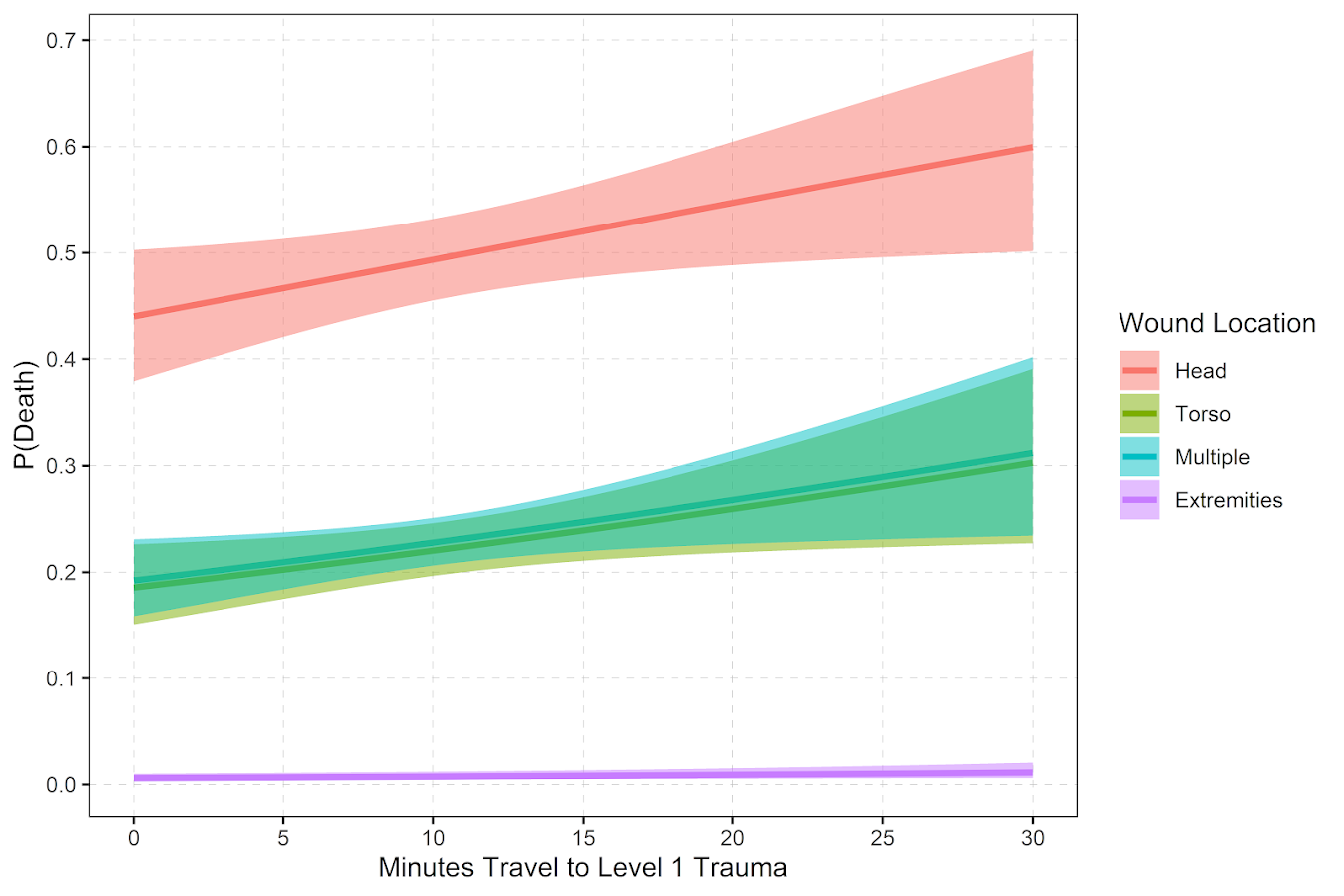
I am much less bullish on acoustic gunshot detection systems like ShotSpotter due to their high cost, as detailed in my ShotSpotter cost-benefit analysis. I estimate that ShotSpotter saves approximately 1 life for every 100 shooting victims it covers by dispatching emergency services faster. If you value a life at $10 million using WTP, the system easily looks cost-effective. If you use tangible costs, the math changes. ShotSpotter has not shown consistent evidence that it increases case clearances or prevents victimization. In fact, saving a shooting victim via faster response generates higher medical bills than if they had died, highlighting the complex economics of reactive vs. proactive interventions.
Business Improvement Districts (BIDs)
A great example of societal cost-shifting is Business Improvement Districts (BIDs). As shown in John MacDonald and colleagues’ study on BIDs in Los Angeles, BIDs demonstrate that commercial businesses are actually willing to spend their own money to improve safety in their areas through private security, cleaning services, and physical improvements. This is not hypothetical willingness-to-pay; it is a real-world, out-of-pocket expenditure by local merchants who calculate that reducing crime is directly worth their private investment.
Gun Violence Interventions (READI)
When looking at community-based interventions, the cost-benefit models face a different hurdle. Monica Bhatt and her colleagues evaluated Chicago’s READI program in their study on predicting and preventing gun violence. They claim a massive benefit of around $180,000 per participant (translating to a 3:1 benefit-cost ratio).
However, this estimated benefit of $180,000 is derived by mixing up WTP estimates and lifetime projections of individual offending (specifically, the Cohen & Piquero lifecourse model). As I discussed in my analysis of limits on gun violence interventions, extrapolating high-risk youth crime savings over an entire lifecourse using inflated WTP values creates a benefit estimate that is completely detached from the immediate budget realities of local governments.
The Missing Metric: The Value of an Arrest
This brings us to a major gap in criminology: we do not have good estimates for what it is worth to clear a crime.
Because crime is highly concentrated among a small number of chronic offenders, an arrest is often worth more than preventing a single crime. Apprehending a chronic offender can prevent dozens of future offenses.
This is why tools like automated License Plate Readers (LPR) are interesting. As Ozer’s study on LPR effectiveness shows, they are much cheaper than ShotSpotter and are highly cost-effective even if they only generate a small percentage increase in arrests. However, to truly calculate their ROI, we need a better grasp on the actual monetary value of a clearance.
To build better policy, we need to stop relying on WTP surveys and start measuring the real, tangible savings that police departments and local governments can actually bank.
References
-
Bhatt, M. P., Heller, S. B., et al. (2024). Predicting and preventing gun violence: An experimental evaluation of READI Chicago. The Quarterly Journal of Economics, 139(1), 1-56.
-
Cohen, M. A., & Piquero, A. R. (2009). New evidence on the monetary value of saving a high risk youth. Journal of Quantitative Criminology, 25(1), 25-49.
-
Hunt, P., Saunders, J., & Kilmer, B. (2019). Estimates of law enforcement costs by crime type for benefit-cost analyses. Journal of Benefit-Cost Analysis, 10(1), 95-123.
-
MacDonald, J., Golinelli, D., Stokes, R. J., & Bluthenthal, R. (2010). The effect of business improvement districts on the incidence of violent crimes. Injury Prevention, 16(5), 327-332.
-
Ozer, M. (2016). The impact of automatic number plate recognition (ANPR) technology on crime. Police Journal, 89(2), 117-132.
-
Wheeler, A. P., & Reuter, S. (2021). Redrawing Hot Spots of Crime in Dallas, Texas. Police Quarterly, 24(2), 159-184.