Aoristic analysis for hour of day and day of week in Excel

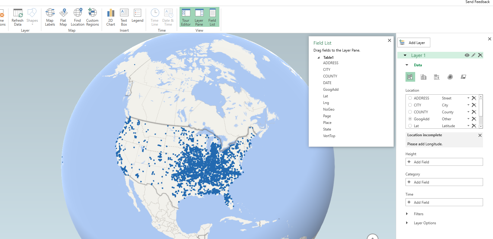
I’ve previously written code to conduct Aoristic analysis in SPSS. Since this reaches about an N of three crime analysts (if that even), I created an Excel spreadsheet to do the calculations for both the hour of the day and the day of the week in one go.

Note if you simply want within day analysis, Joseph Glover has a nice spreadsheet with VBA functions to accomplish that. But here I provide analysis for both the hour of the day and the day of the week. Here is the spreadsheet and some notes, and I will walk through using the spreadsheet below.

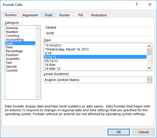
First off, you need your data in Excel to be BeginDateTime and EndDateTime — you cannot have the dates and times in separate fields. If you do have them in separate fields, if they are formatting correctly you can simply add your date field to your hour field. If you have the times in three separate date, hour, and minute fields, you can do a formula like =DATE + HOUR/24 + MINUTE/(60*24) to create the combined datetime field in Excel (excel stores a single date as one integer).

Presumably at this stage you should fix your data if it has errors. Do you have missing begin/end times? Some police databases when there is an exact time treat the end date time as missing — you will want to fix that before using this spreadsheet. I constructed the spreadsheet so it will ignore missing cells, as well as begin datetimes that occur after the end datetime.

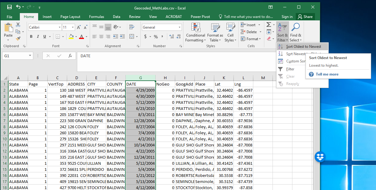
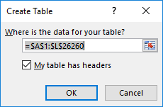
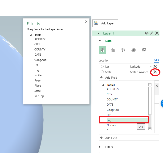
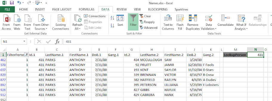
So once your begin and end times are correctly set up, you can copy paste your dates into my Aoristic_HourWeekday.xlsx excel spreadsheet to do the aoristic calculations. If following along with my data I posted, go ahead and open up the two excel files in the zip file. In the Arlington_Burgs.xlsx data select the B2 cell.

Then scroll down to the bottom of the sheet, hold Shift, and then select the D3269 cell. That should highlight all of the data you need. Right-click, and the select Copy (or simply Ctrl + C).

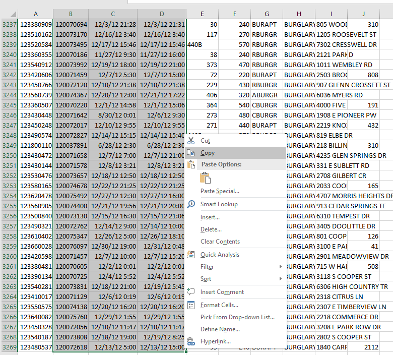
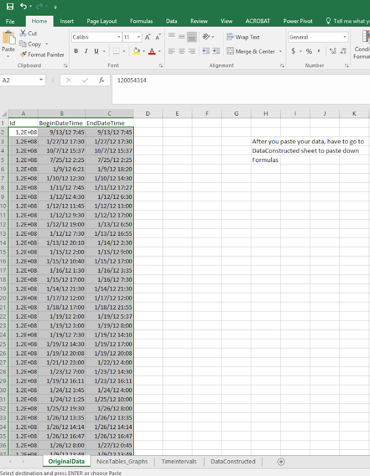
Now migrate over to the Aoristic_HourWeekday.xlsx spreadsheet, and paste the data into the first three columns of the OriginalData sheet.

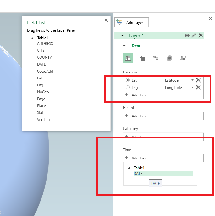
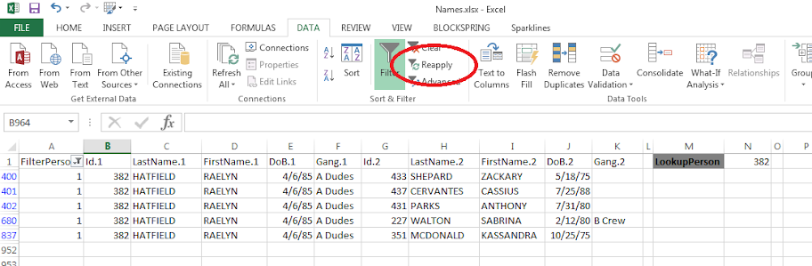
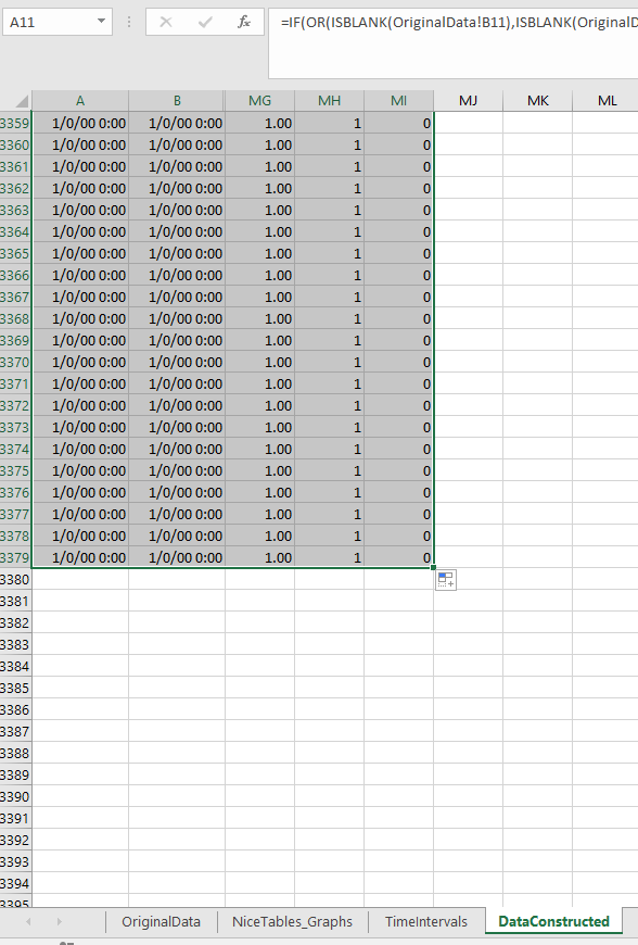
Now go to the DataConstructed sheet. Basically we need to update the formulas to recognize the new rows of data we just copied in. So go ahead and select the A11 to MI11 row. (Note there are a bunch of columns hidden from view).

Now we have a few over 3,000 cases in the Arlington burglary data. Grab the little green square in the lower right hand part of the selected cells, and then drag down the formulas. With your own data, you simply want to do this for as many cases as you have. If you go past your total N it is ok, it just treats the extra rows like missing data. This example with 3,268 cases then takes about a minute to crunch all of the calculations.

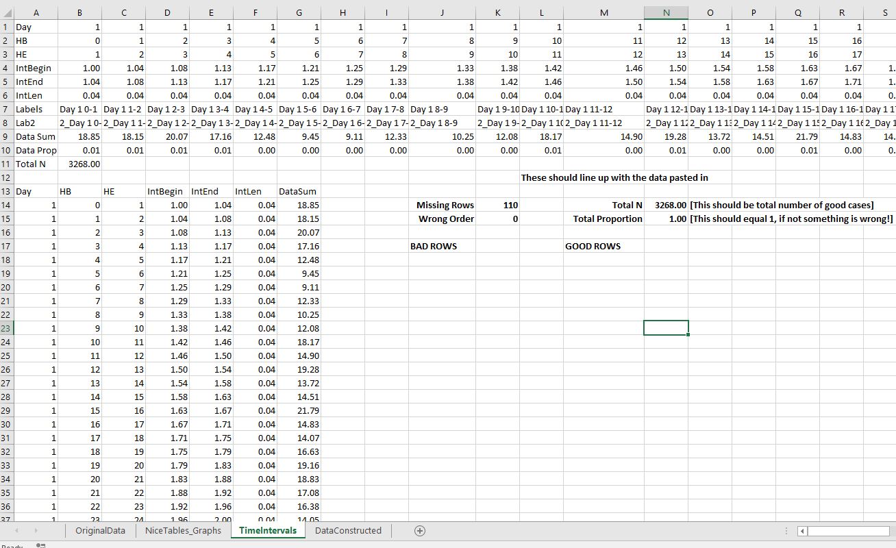
If you navigate to the TimeIntervals sheet, this is where the intervals are actually referenced, but I also place several summary statistics you might want to check out. The Total N shows that I have 3,268 good rows of data (which is what I expected). I have 110 missing rows (because I went over), and zero rows that have the begin/end times switched. The total proportion should always equal 1 — if it doesn’t I’ve messed up something — so please let me know!

Now the good stuff, if you navigate to the NiceTables_Graphs sheet it does all the summaries that you might want. Considering it takes awhile to do all the calculations (even for a tinier dataset of 3,000 cases), if you want to edit things I would suggest copying and pasting the data values from this sheet into another one, to avoid redoing needless calculations.

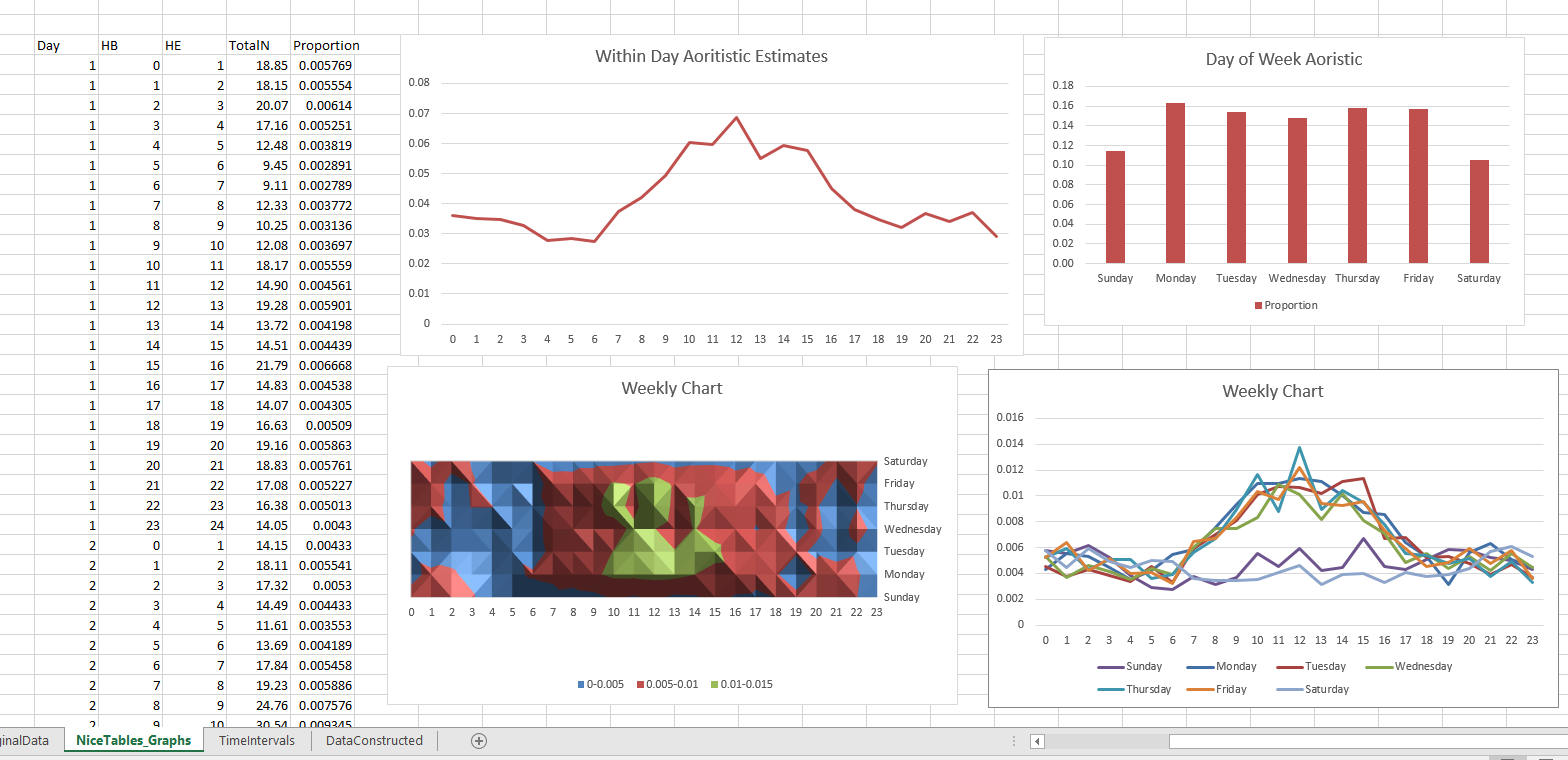
Interpreting the graphs you can see that burglaries in this dataset have a higher proportion of events during the daytime, but only on weekdays. Basically what you would expect.

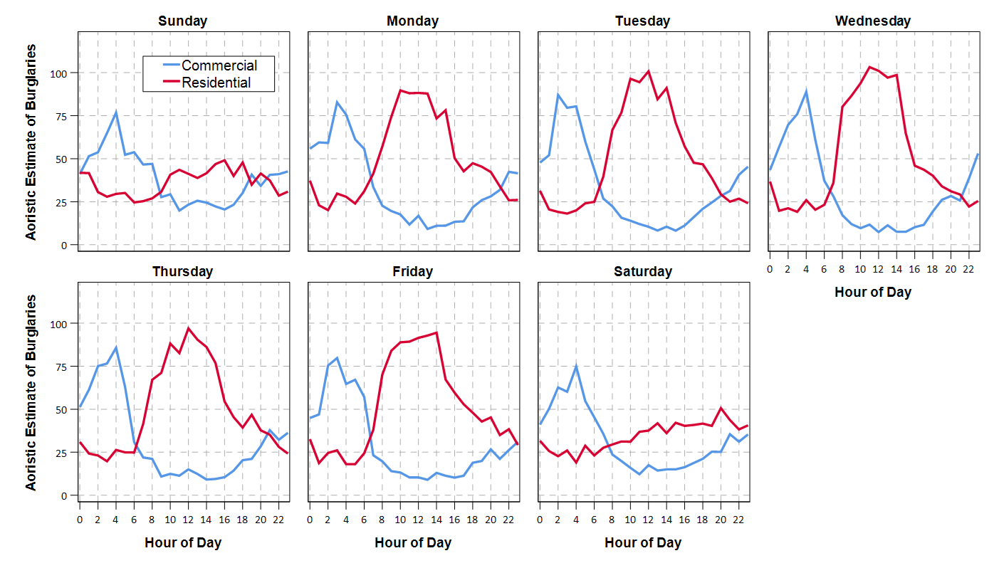
Personally I would always do this analysis in SPSS, as you can make much nicer small multiple graphs than Excel like below. Also my SPSS code can split the data between different subsets. This particular Excel code you would just need to repeat for whatever subset you are interested in. But a better Excel sleuth than me can likely address some of those critiques.

One minor additional note on this is that Jerry’s original recommendation rounded the results. My code does proportional allocation. So if you have an interval like 00:50 TO 01:30, it would assign the [0-1] hour as 10/40, and [1-2] as 30/40 (original Jerry’s would be 50% in each hour bin). Also if you have an interval that is longer than the entire week, I simply assign equal ignorance to each bin, I don’t further wrap it around.

Creating an animated heatmap in Excel

I’ve been getting emails recently about the online Carto service not continuing their free use model. I’ve previously used this service to create animated maps heatmaps over time, in particular a heatmap of reported meth labs over time. That map still currently works, but I’m not sure how long it will though. But the functionality can be replicated in recent versions of Excel, so I will do a quick walkthrough of how to make an animated map. The csv to follow along with, as well as the final produced excel file, you can down download from this link.

I split the tutorial into two parts. Part 1 is prepping the data so the Excel 3d Map will accept the data. The second is making the map pretty.

Prepping the Data

The first part before we can make the map in Excel are:

  1. eliminate rows with missing dates
  2. turn the data into a table
  3. explicitly set the date column to a date format
  4. save as an excel file

We need to do those four steps before we can worry about the mapping part. (It took me forever to figure out it did not like missing data in the time field!)

So first after you have downloaded that data, double click to open the Geocoded_MethLabs.csv file in word. Once that sheet is open select the G column, and then sort Oldest to Newest.

It will give you a pop-up to Expand the selection – keep that default checked and click the Sort button.

After that scroll down to the current bottom of the spreadsheet. There are around 30+ records in this dataset that have missing dates. Go ahead and select the row labels on the left, which highlights the whole row. Once you have done that, right click and then select Delete. Again you need to eliminate those missing records for the map to accept the time field.

After you have done that, select the bottom right most cell, L26260, then scroll back up to the top of the worksheet, hold shift, and select cell A1 (this should highlight all of the cells in the sheet that contain data). After that, select the Insert tab, and then select the Table button.

In the pop-up you can keep the default that the table has headers checked. If you lost the selection range in the prior step, you can simply enter it in as =$A$1:$;$26260.

After that is done you should have a nice blue formatted table. Select the G column, and then right click and select Format Cells.

Change that date column to a specific date format, here I just choose the MM/DD/YY format, but it does not matter. Excel just needs to know it represents a date field.

Finally, you need to save the file as an excel file before we can make the maps. To do this, click File in the top left header menu’s, and then select Save As. Choose where you want to save the file, and then in the Save as Type dropdown in the bottom of the dialog select xlsx.

Now the data is all prepped to create the map.

Making an Animated Map

Now in this part we basically just do a set of several steps to make our map recognize the correct data and then make the map look nice.

With the prior data all prepped, you should be able to now select the 3d Map option that you can access via the Insert menu (just to the right of where the Excel charts are).

Once you click that, you should get a map opened up that looks like mine below.

Here it actually geocoded the points based on the address (very fast as well). So if you only have address data you can still create some maps. Here I want to change the data though so it uses my Lat/Lon coordinates. In the little table on the far right side, under Layer 1, I deleted all of the fields except for Lat by clicking the large to their right (see the X circled in the screenshot below). Then I selected the + Add Field option, and then selected my Lng field.

After you select that you can select the dropdown just to the right of the field and set it is Longitude. Next navigate down slightly to the Time option, and there select the DATE field.

Now here I want to make a chart similar to the Carto graph that is of the density, so in the top of the layer column I select the blog looking thing (see its drawn outline). And then you will get various options like the below screenshot. Adjust these to your liking, but for this I made the radius of influence a bit larger, and made the opacity not 100%, but slightly transparent at 80%.

Next up is setting the color of the heatmap. The default color scale uses the typical rainbow, which should be avoided for multiple reasons, one of which is color-blindness. So in the dropdown for colors select Custom, and then you will get the option to create your own color ramp. If you click on one of the color swatches you will then get options to specify the color in a myriad of ways.

Here I use the multi-hue pink-purple color scheme via ColorBrewer with just three steps. You can see in the above screenshot I set the lowest pink step via the RGB colors (which you can find on the color brewer site.) Below is what my color ramp looks like in the end.

Next part we want to set the style of the map. I like the monotone backgrounds, as it makes the animated kernel density pop out much more (see also my blog post, When should we use a black background for a map). It is easy to experiement with all of these different settings though and see which ones you like more for your data.

Next I am going to change the format of the time notation in the top right of the map. Left click to select the box around the time part, and then right click and select Edit.

Here I change to the simpler Month/Year. Depending on how fast the animation runs, you may just want to change it to year. But you can leave it more detailed if you are manually dragging the time slider to look for trends.

Finally, the current default is to show all of the data permanently. There are examples where you may want to do that (see the famous example by Nathan Yau mapping the growth of Wal Mart), but here we do not want that. So navigate back to the Layer options on the right hand side, and in the little tiny clock above the Time field select the dropdown, and change it to Data shows for an instant.

Finally I select the little cog in the bottom of the map window to change the time options. Here I set the animation to run longer at 30 seconds. I also set the transition duration to slightly longer at 5 seconds. (Think of the KDE as a moving window in time.)

After that you are done! You can zoom in the map, set the slider to run (or manually run it forward/backward). Finally you can export the map to an animated file to share or use in presentations if you want. To do that click the Create Video option in the toolbar in the top left.

Here is my exported video


Now go make some cool maps!

IACA Conference 2017 workshop: Monitoring temporal crime trends for outliers (Excel)

This fall at the International Association of Crime Analysts conference I am doing a workshop, Monitoring temporal crime trends for outliers: A workshop using Excel. If you can’t wait (or are not going) I have all my materials already prepared, which you can download here. That includes a walkthrough of my talk/tutorial, as well as a finished Excel workbook. It is basically a workshop to go with my paper, Tables and graphs for monitoring temporal crime trends: Translating theory into practical crime analysis advice.

For some preview, I will show how to make a weekly smoothed chart with error bands:

As well as a monthly seasonal chart:

I use Excel not because I think it is the best tool, but mainly because I think it is the most popular among crime analysts. In the end I just care about getting the job done! (Although I’ve given reasons why I think Excel is more painful than any statistical program.) Even though it is harder to make small multiple charts in Excel, I show how to make these charts using pivot tables and filters, so watching them auto-update when you update the filter is pretty cool.

For those with SPSS I have already illustrated how to make similar charts in SPSS here. You could of course replicate that in R or Stata or whatever if you wanted.

I am on the preliminary schedule currently for Tuesday, September 12th at 13:30 to 14:45. I will be in New Orleans on the 11th, 12th and 13th, so if you want to meet always feel free to send an email to set up a time.

Using and Making Cumulative Probability Charts

Stephen Few had a recent post critiquing an evaluation of a particular data visualization. Long story short, the experiment asked questions like “What is the probability that X is above 5?”, and showed the accuracy based on mean+error bar charts, histogram like visualizations, and animated vizualations showing random draws.

It is always the case in data viz. that some charts are easier to answer particular questions. This is one question, what is the probability a value is above X, in which traditional histograms or error bar charts are not well suited for. But there is an alternative I don’t see used very often, the cumulative probability chart, that is well suited to answer that question.

It is a totally reasonable question to ask as well. For one example use when I was a crime analyst, I used this chart to show the time in-between shootings. Many shootings are retaliatory so I was interested in saying if a shooting happened on Sunday, how long should be PD be on guard for after an initial shooting. Do most retaliatory shootings happen within hours, days, or weeks of a prior shooting? This is a hard question to answer with histograms, but is easier to answer with cumulative probability plots.

Here is that example chart for time-in-between shootings:

Although this chart is not regularly used, it is really easy to explain how to interpret. For example, at time equals 7 days (on the X axis), the probability that a shooting would have occurred is under 60%. In my opinion, it is easier to explain this chart than a histogram to a lay audience.

To produce the chart it is often not a canned option in software, but it takes very simple set of steps to produce the right ingrediants – and then you can use a typical line chart. So those steps generically are:

  • sort the data
  • rank the data (1 for the lowest value, 2 for the second lowest value, etc.)
  • calculate rank/(total sample size) – call this Prop
  • plot the data on the X axis, and Prop on the Y axis

Which can be easily done in any software, but here you can download an excel spreadsheet here used to make the above chart.

A variant of this chart often used in crime analysis is the proportion of places on the X axis and the cumulative proportion of crime on the Y axis. E.g. Pareto’s 80/20 rule – or 50/1 rule – or whatever. The chart makes it easy to pick whatever cut-offs you want. If you have your spatial units of analysis in one column, and the total number of crimes in a second column, the procedure to produce this chart is:

  • sort the data descending by number of crimes
  • rank the data
  • calculate rank/(total sample size) – this equals the proportion of all spatial units – call this PropUnits
  • calculate the cumulative number of crimes – call this Cum_Crime
  • calculate Cum_Crime/(Total Crime) – this equals the proportion of all crimes – call this PerCumCrime
  • plot PerCumCrime on the Y axis and PropUnits on the X axis.

See the third sheet of the excel file for a hypothetical example. This pattern basically happens in all aspects of criminal justice. That is, the majority of the bad stuff is happening among a small number of people/places. See this example from William Spelman showing places, victims, and offenders.

We can see there that 10% of the victims account for 40% of all victimizations etc.

Making and Exploring Crime Networks (Access and Excel)

I’ve been doing quite a bit of stuff with gang networks lately at work. Networks are a total PIA though to create and do data manipulation on in traditional spreadsheets and statistic tools, so I figured I would blog about some of my attempts to ease the pain for fellow crime analysts.

First I will show how to create an edge list in Access from the way a traditional police RMS database is set up. Second I will show a trick about exploring people and gangs by creating a dynamic lookup in Excel. You can download the Access Database I used and the Excel spreadsheet here to follow along.

Making an Edge List in Access

I’ve previously shown how to make an edgelist in SPSS. I’ll cast the net wider and show how to do this in Access though.

In a nutshell, an edge list is a table of the form:

Person A, Person B
Person B, Person C
Person C, Person D

Where being in the same row shows some type of connection between the two persons, e.g. Person A is connected to Person B. In police databases the connections most often of interest are co-offending (e.g. two people were arrested for the same incident) or being stopped together (e.g. in the same car or during the same field interrogation).

Typically police databases will have a table that lists a common incident identifier, along with persons associated with that incident and their involvement. Here is a screen shot of the simple example I made in an Access Database to mimic this which I named IncidentPersons:

So here we can see that for incident 1, Andy Pandy, Sandy Randy, and Candy Dandy are all persons involved. Candy is the victim, and the other two were arrested. This table is always called something different for every PD’s RMS system, but some examples I have come across are crossref and person_exploded. All RMS’s I have seen though have some sort of table like this.

To make an edge list from this table takes some knowledge of SQL, but it can be done in one query. Basically we will be joining a table to itself, and selecting out distinct rows. Here is the most basic SQL query in Access to accomplish this.

SELECT DISTINCT F.PersonID, F.PersonName, S.PersonID, S.PersonName
FROM IncidentPersons AS F INNER JOIN IncidentPersons AS S ON F.IncidentID = S.IncidentID
WHERE F.PersonID < S.PersonID;

To walk through this, we make two table aliases from the same original IncidentPersons table, F and S. Then we do an INNER JOIN based on the original incident ID. If we stopped here without the last WHERE clase, what would happen is we would have pairs of people with themselves, and with duplicate ties of the form A -> B and B -> A. So selecting only instances in which F.PersonID < S.PersonID eliminates those self edges and duplicates. The last part here is SELECT DISTINCT instead of select. This will make it so any particular edge is only returned once. (If you deleted DISTINCT in this database, Andy Pandy -> Sandy Randy would be returned twice.)

Running this query we then have:

In practice it will be more complicated because you will want to filter certain connections and add more info. on people into the final edge list. Here I ignore the involvement type, but you may want to only restrict matches to certain co-involvements (since offender-victim is of a different nature than co-offending). You also may want to not just know those connected, but count up the number of times those people are connected. For my work, I have always just limited to co-offending and being stopped together (and haven’t ever worried about the number of ties).

Also depending on how the database is normalized, often people names will change/have spelling errors, but they will still be linked to the same personid. These different spellings would cause the DISTINCT selection to not work as expected. A workaround is to only select based on the unique PersonID’s and not import other data, then in an additoional query merge in the person data. For gang network analysis you will likely want to merge in gang affiliation (which will probably be in a seperate table, not in the RMS). If you are still following along though you can figure that stuff out on your own.

Making an Edge Lookup Table in Excel

So now that I have shown how to make the edge table, what to do with it now? (No excuses – since I gave examples in both SPSS and SQL!) Here I will show a simple trick to explore the network using filtering in Excel.

The edge list itself is often the needed format to import into other network based software. So you can make a nice network graph using Gephi or whatever. The graph is good to see the overall form of the network when the graph is limited to only a few nodes, but they are typically really complicated, and tools like Gephi aren’t very good for drilling down into specific people. Here I will show my simple drilldown solution using Excel.

The network I use for this example is entirely made up; it was simulated using NetworkX (python), names are random based on some internet lists of popular baby names and last names I forgot the source of already, and Date of births are random between 1975 and 1997. I also made up a list of 7 gangs (but people have a 9/16 chance to be assigned to no gang).

So starting with an edgelist, here is a screenshot of my made up edge list excel table.

The problem in this format is if I filter the Id.1 column for 19 (BONNIE BARKER), they could potentially be in the Id.2 column as well, so I potentially miss edges. A simple solution to this is just to duplicate the data, but switch the order of the edges. Then when I filter by Id = 19, I will get all possible Bonnie Barker edges.

For a simple example of how to do this on a small table, if you start with:

17,19
18,19
19,20
19,21

If you filter the first column by 19, you will eliminate the 19’s in the second column. So just make a new table that has the ID’s reversed:

19,17
19,18
20,19
21,19

And then stack the two tables on top of one another

17,19 |
18,19 |  Table 1
19,20 |
19,21 |
19,17 +
19,18 +  Table 2
20,19 +
21,19 +

So now if you filter the first column by 19 you get 19’s all four connections. This is just three copy-pastes in excel to go from the original edge list to this table.

Now we can make a filter that dynamically changes based on user input. Here I make a selection in the top row, in N2 you can put in a persons ID. Then in A2, the formula is =IF(B2=$N$1,1,0). You can then paste this formula down, and it always references cell N2 because of the absolute $ modifiers.

Here is a screenshot of my example LookupTable in excel filtering for person 431.

If you update the personid in N1, then hit the reapply button in the toolbar (or hit Ctrl+Alt+L) to update the filter. Here I updated to be person 382.

The context of why I created this example was to identify people that were connected to gang members, but themselves were not in the gang. Basically have a list to take to officers and say, are you sure this person is not an actual member of the gang? The spreadsheet is then a tool if I have a meeting, where someone can say, who is Raelyn Hatfield connected to? I can easily update the id and filter.

You can do this drill down in the original edge table if you have the IF condition look in both the first and second id column, but I do this because it is easier to see who a person is connected to. You only have to look in one column – you don’t have to scan back and forth between two columns to see the connections.

You can also do other aggregations on this table as well. For instance if you aggregate using a pivot table and count the number of instances it is the edge centrality of a person (i.e. the number of different people a person is connected to).

If you want to do a drilldown of specific gangs you could use the same logic and build another filter column, but this will duplicate people when they are connected to another person in the same gang. That would be an instance where it might be easier to use just the original edge table.

Sparklines for Time Interval Crime Data

I developed some example sparklines for tables when visualizing crime data that occurs in an uncertain window. The use case is small tables that list the begin and end date-times, and the sparklines provide a quick visual assessment of the day of week and time of day. Examining for overlaps in two intervals is one of the hardest things to do when examining a table, and deciphering days of week when looking at dates is just impossible.

Here is an example table of what they look like.

The day of week sparklines are a small bar chart, with Sunday as the first bar and Saturday as the last bar. The height of the bar represents the aoristic estimate for that day of week. An interval over a week long (entirely uncertain what day of week the crime took place) ends up looking like a dashed line over the week. This example uses the sparkline bar chart built into Excel 2010, but the Sparklines for Excel add-on provides synonymous functionality. The time of day sparkline is a stacked bar chart in disguise; it represents the time interval with a dark grey bar, and the remaining stack is white. This allows you to have crimes that occur overnight and are split in the middle of the day. Complete ignorance of when the crime occurred during the day I represent with a lighter grey bar.

The spreadsheet can be downloaded from my drop box account here.

A few notes the use of the formulas within the sheet:

  • The spreadsheet does have formulas to auto-calculate the example sparklines (how they exactly work is worth another blog post all by itself) but it should be pretty clear to replicate the example bar chart for the day of week and time of day in case you just want to hand edit (or have another program return the needed estimates).
  • For the auto-calculations to work for the Day of Week aoristic estimates the crime interval needs to have a positive value. That is, if the exact same time is listed in the begin and end date column you will get a division by zero error.
  • For the day of week aoristic estimates it calculates the proportion as 1/7 if the date range is over one week. Ditto for the time range it is considered the full range if it goes over 24 hours.

A few notes on the aesthetics of sparklines:

  • For the time of day sparkline if you have zero (or near zero) length for the interval it won’t show up in the graph. Some experimentation suggests the interval needs around 15 to 45 minutes for typical cell sizes to be visible in the sheet (and for printing).
  • For the time of day sparkline the empty time color is set to white. This will make the plot look strange if you use zebra stripes for the table. You could modify it to make the empty color whatever the background color of the cell is, but I suspect this might make it confusing looking.
  • A time of day bar chart could be made just the same as the day of week bar chart. It would require the full expansion for times of day, which I might do in the future anyway to provide a conveniant spreadsheet to calculate aoristic estimates. (I typically do them with my SPSS MACRO – but it won’t be too arduous to expand what I have done here to an excel template).
  • If the Sparklines for Excel add-on allowed pie charts with at least two categories or allowed the angle of the pie slice to be rotated, you could make a time of day pie chart sparkline. This is currently not possible though.

I have not thoroughly tested the spreadsheet calculations (missing values will surely return errors, and if you have the begin-end backwards it may return some numbers, but I doubt they will be correct) so caveat emptor. I think the sparklines are a pretty good idea though. I suspect some more ingenious uses of color could be used to cross-reference the days of week and the time of day, but this does pretty much what I hoped for when looking at the table.