Downloading Social Vulnerability Index data

So Gainwell has let me open source one of the projects I have been working on at work – a python package to download SVI data. The SVI is an index created by the CDC to identify areas of high health risk in four domains based on census data (from the American Community Survey).

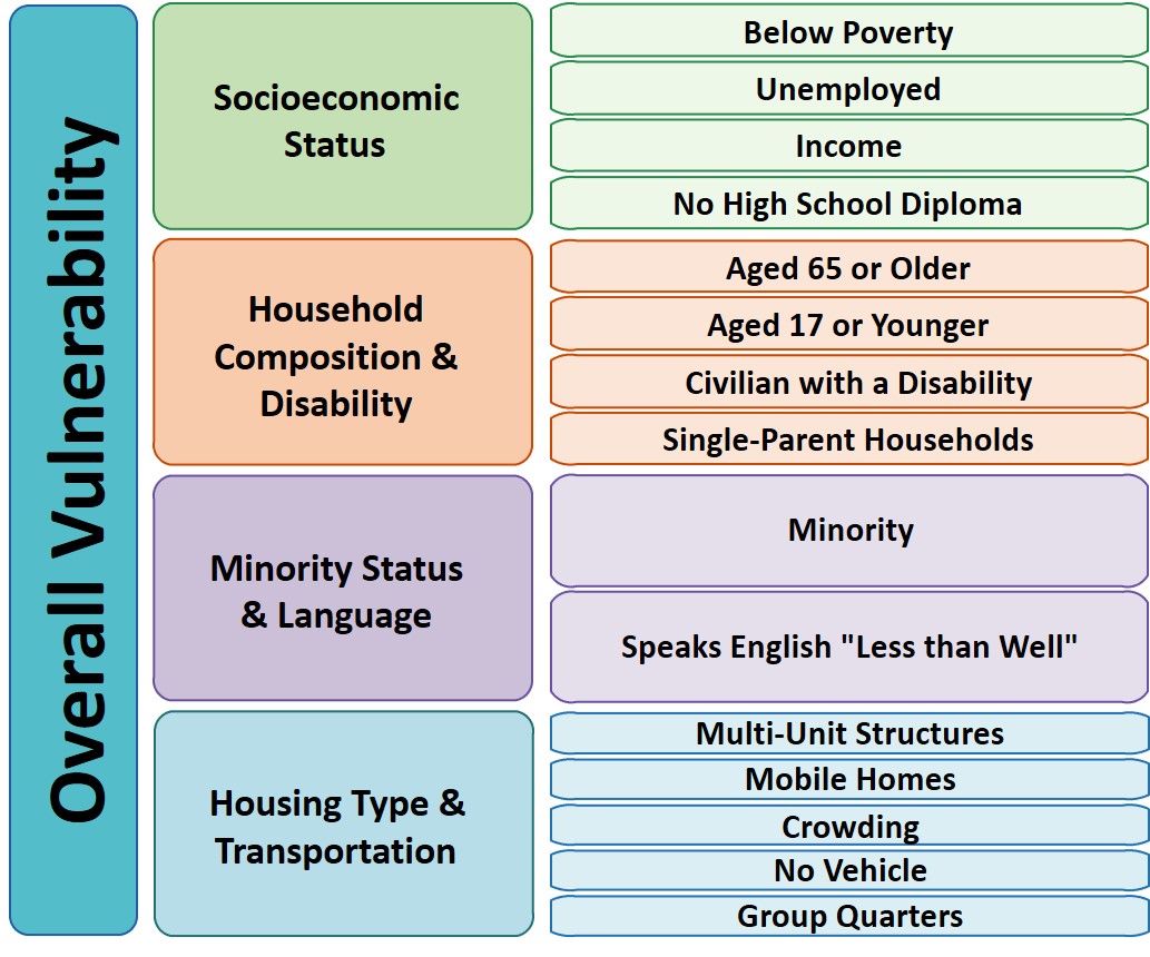
For my criminologist friends, these are very similar variables we typically use to measure social disorganization (see Wheeler et al., 2018 for one example criminology use case). It is a simple python install, pip install svi-data. And then you can get to work. Here is a simple example downloading zip code data for the entire US.

import numpy as np
import pandas as pd
import svi_data

# Need to sign up for your own key
key = svi_data.get_key('census_api.txt')

# Download the data from census API
svi_zips = svi_data.get_svi(key,'zip',2019)
svi_zips['zipcode'] = svi_zips['GEO_ID'].str[-5:]

Note I deviate from the CDC definition in a few ways. One is that when I create the themes, instead of using percentile rankings, I z-score the variables instead. It will likely result in very similar correlations, but this is somewhat more generalizable across different samples. (I also change the denominator for single parent heads of households to number of families instead of number of households, I think that is likely just an error on CDC’s part.)

Summed Index vs PCA

So here quick, lets check out my z-score approach versus a factor analytic approach via PCA. Here I just focus on the poverty theme:

pov_vars = ['EP_POV','EP_UNEMP','EP_PCI','EP_NOHSDP','RPL_THEME1']
svi_pov = svi_zips[['zipcode'] + pov_vars ].copy()

from sklearn import decomposition
from sklearn.preprocessing import scale

svi_pov.corr()

Note the per capita income has a negative correlation, but you can see the index works as expected – lower correlations for each individual item, but fairly high correlation with the summed index.

Lets see what the index would look like if we used PCA instead:

pca = decomposition.PCA()
sd = scale(svi_pov[pov_vars[:-1]])
pc = pca.fit_transform(sd)
svi_pov['PC1'] = pc[:,0]
svi_pov.corr() #almost perfect correlation

You can see that besides the negative value, we have an almost perfect correlation between the first principal component vs the simpler sum score.

One benefit of PCA though is a bit more of a structured approach to understand the resulting indices. So we can see via the Eigen values that the first PC only explains about 50% of the variance.

print(pca.explained_variance_ratio_)

And if we look at the loadings, we can see a more complicated pattern of residual loadings for each sucessive factor.

comps = pca.components_.T
cols = ['PC' + str(i+1) for i in range(comps.shape[0])]
load_dat = pd.DataFrame(comps,columns=cols,index=pov_vars[:-1])
print(load_dat)

So for PC3 for example, it has areas with high no highschool, as well as high per capita income. So higher level components can potentially identify more weird scenarios, which healthcare providers probably don’t care about so much by is a useful thing to know for exploratory data analysis.

Mapping

Since these are via census geographies, we can of course map them. (Here I grab zipcodes, but the code can download counties or census tracts as well.)

We can download the census geo data directly into geopandas dataframe. Here I download the zip code tabulation areas, grab the outline of Raleigh, and then only plot zips that intersect with Raleigh.

import geopandas as gpd
import matplotlib.pyplot as plt

# Getting the spatial zipcode tabulation areas
zip_url = r'https://www2.census.gov/geo/tiger/TIGER2019/ZCTA5/tl_2019_us_zcta510.zip'
zip_geo = gpd.read_file(zip_url)
zip_geo.rename(columns={'GEOID10':'zipcode'},inplace=True)

# Merging in the SVI data
zg = zip_geo.merge(svi_pov,on='zipcode')

# Getting outline for Raleigh
ncp_url = r'https://www2.census.gov/geo/tiger/TIGER2019/PLACE/tl_2019_37_place.zip'
ncp_geo = gpd.read_file(ncp_url)
ral = ncp_geo[ncp_geo['NAME'] == 'Raleigh'].copy()
ral_proj = 'EPSG:2278'
ral_bord = ral.to_crs(ral_proj)

ral_zips = gpd.sjoin(zg,ral,how='left')
ral_zips = ral_zips[~ral_zips['index_right'].isna()].copy()
ral_zipprof = ral_zips.to_crs(ral_proj)

# Making a nice geopandas static map, zoomed into Raleigh

fig, ax = plt.subplots(figsize=(6,6), dpi=100)

# Raleighs boundary is crazy
#ral_bord.boundary.plot(color='k', linewidth=1, edgecolor='k', ax=ax, label='Raleigh')
ral_zipprof.plot(column='RPL_THEME1', cmap='PRGn',
                 legend=True,
                 edgecolor='grey',
                 ax=ax)

# via https://stackoverflow.com/a/42214156/604456
ral_zipprof.apply(lambda x: ax.annotate(text=x['zipcode'], xy=x.geometry.centroid.coords[0], ha='center'), axis=1)

ax.get_xaxis().set_ticks([])
ax.get_yaxis().set_ticks([])

plt.show()

I prefer to use smaller geographies when possible, so I think zipcodes are about the largest areas that are reasonable to use this for (although I do have the ability to download this for counties). Zipcodes since they don’t nicely overlap city boundaries can cause particular issues in data analysis as well (Grubesic, 2008).

Other Stuff

I have a notebook in the github repo showing how to grab census tracts, as well as how to modify the exact variables you can download.

It does allow you to specify a year as well (in the notebook I show you can do the 2018 SVI for the 16/17/18/19 data at least). Offhand for these small geographies I would only expect small changes over time (see Miles et al., 2016 for an example looking at SES).

One of the things I think has more value added (and hopefully can get some time to do more on this at Gainwell), is to peg these metrics to actual health outcomes – so instead of making an index for SES, look at micro level demographics for health outcomes, and then post-stratify based on census data to get estimates across the US. But that being said, the SVI often does have reasonable correlations to actual geospatial health outcomes, see Learnihan et al. (2022) for one example that medication adherence the SVI is a better predictor than distance for pharmacy for example.

References

genrules: using a genetic algo to find high risk cases

So I recently participated in the Decoding Maternal Morbidity Data Challenge. I did not win, but will share my work anyway. I created a genetic algorithm in python to identify sets of association rules that result in high relative risks, genrules. Here I intentionally used a genetic algorithm, with the idea I wanted not just one final model, but a host of different potential rules with the goal of exploratory data analysis.

You can go see how it works by checking out the notebook using the nuMoM2b data (which you have to request, I cannot upload that to github). Here are rules I found to predict high relative risk for infections:

And I have other code to summarize these, it happens to govt insurance is very commonly in the set of rules found.

I actually like it better just as a convenient tool (that can take weights), and go through every possible permutation of a set of categorical data. I uploaded a second notebook showing off NIBRS and predicting officer assaults (see my prior blog post on this).

So here one of the rules is stolen property, and the assailant using their motor vehicle as a weapon. So perhaps people running with stolen property in a vehicle? (While I built quite a bit of machinery to look through higher level rules, why bother with higher sets than 3 variables in the vast majority of circumstances.)

This shows the risk of competing in challenges, so a few weekends lost with no reward. This was a fuzzy competition, and something that appears I misread was in the various notes the challenge asked for the creation of novel algorithms. It appears from the titles of the winners people just used typical machine learning approaches and did a deep dive into the data. I did the opposite, created a general tool that could be used by many (who are better experts on the topical material than me).

Also note this approach is very data mining. While I use p-values as a mechanism to penalize too complicated of outcomes in the genetic algorithm, I wouldn’t take those at face value. With large datasets you will always mine some sets that are ultimately confounded.

Similarities between crime and health insurance data

One of the things I was mildly worried about when making the jump to the private sector was that the knowledge I had built up from my work in crime analysis over the years would not be transferable. I had basically 10+ year experience working with crime data (directly as a crime analyst at Troy, or when I was a research analyst at the Finn Institute, or when I was doing other collaborations with PDs).

PDs all basically have a similar records management set up. Typical tables are CAD, incident reports, arrests, charges, etc. PDs will have somewhat different fields – but the way they all related to each other are very similar.

Because the company I work for now aggregates health insurance claims from multiple insurance agencies it is a bit more complicated, but there are similarities between how people analyze health insurance claims that in broad strokes are similar to issues with crime data. Below are my musings on that front.

Classifying Events: UCR vs DRG

Historically the predominate way in which people classify what type of crime occurs in a particular incident is via the Uniform Crime Report (UCR) hierarchy. Imagine a crime incident in which someone breaks into a house (burglary), and then also assaults the individual within the home (aggravated assault). When we count these crimes for reporting purposes, we typically take ‘the top charge’, and analyze the event strictly as an assault.

Inpatient health insurance claims (when someone goes to a hospital) have a somewhat unifying classification, Diagnostic Related Groupings, DRG for short. Unlike UCR for general crime reporting though, these are used to bill insurance claims. The idea being that instead of itemizing your hospital bill, insurance companies broadly compensate according to the DRG. This purportedly discourages tacking on extra medical procedures, although brings with it some other problems instead (see the later section in this post on discretion).

Unlike the UCR, DRGs have quite a few more categories, check out the APR DRG weights for New York State for example. For the APR DRG, the DRG also includes a severity category. This I think would be a neat idea for crime incidents – it is somewhat codified in penal laws, but not so much in typical crime reporting. It is somewhat accomplished by folks creating harm weights for crimes (e.g. Ratcliffe, 2015). (There is also a second major DRG used by insurance agencies here in the states, the MS-DRG. That is not a good idea to take from medical records, having multiple common ways to group events!)

One major difference between crimes and health insurance claims are ICD codes. One insurance claim can have multiple ICD codes. For example a claim with an APR DRG of 161 could have ICD codes for:

  • I214: Heart Attack
  • E119: Diabetes
  • I2510: Heart Disease
  • E785: High Cholesterol

So there are a mix of chronic conditions (that for billing purposes can modify the severity of the claim), but are not directly related to the current claim/incident/hospital stay.

This could be a neat idea for crime records – say a domestic incident happens, and there is a field to record prior history of domestic incidents. I can see how that would be useful both in the immediate term for the officer handling the call, as well as for an analyst crunching numbers/trends. That being said, ICD codes are crazy in their specificity, so that is not a good thing.

You could also maybe do some other crunching to create your own crime categories based on the individual crime types, see for example Kuang et al. (2017). This is sort of like creating your own DRG for crimes.

Aggregate vs Individual

The point of creating high level groupings is to aggregate multiple events together. In policing, UCR statistics are commonly used to evaluate crime trends over time. Health insurance claims are typically not used for monitoring disease outcomes – since there isn’t any standardized location where they are all collated it would be pretty difficult to use them in that manner for the general pop.

But, overall aggregate statistics pooling claims from particular healthcare providers (e.g. hospitals) are sometimes used for different reimbursement policies. For examples, MIPS is intended as a metric for healthcare providers to promote value based care (Liao & Navathe, 2021), or the CaseMix system (Steinbusch et al., 2007). If you checked out the prior APR DRG list I linked to, you can see they had weights, and higher weights have higher standard billing. The idea behind CaseMix is that if a provider takes on many high weight cases, they get a modifier that ups the weights/billing by a certain percent.

You could maybe consider MIPS to be similar to agencies that give PDs scorecards, aggregating many different metrics together. I rather look at individual metrics though, such as this funnel chart example I give for monitoring use of force. I don’t see much point in aggregating different metrics all together into one final score.

Currently in policing many agencies are migrating from the UCR system, which is just an aggregate tally of events, to NIBRS, which is a database that reports individual events (Kaplan, 2021a, 2021b).

Discretion

Police departments and health care providers (the ones creating the incidents/claims) both have discretion. For PDs, they often want to downgrade the severity of crime incidents, see Thomas and Wolff (2021) for example. Health providers have incentives going the other way though, they have incentives to upcode claims to increase insurance payouts (Farbmacher et al., 2020). Some claims are more fuzzy than others, for example CPT codes that determine a doctors time on a particular office visit are one good example – doctors can just claim they spent larger amounts of time on the office visit (Brunt, 2011).

Like I said previously, health insurance claims are not typically used to monitor overall health outcomes, so non-reporting is not something people really worry about (although researchers should be cognizant of non reporting if they are using insurance claims to look at say policy analysis). The dark figure of crime though is a perpetual threat to the validity of interpreting crime trends.

Health insurance claims have a somewhat opposite problem – submitting claims for when events actually did not happen. One example this occurs is ambulance ghost rides, ambulance billing for events that appear to not have occurred at all (Sanghavi et al., 2021).

Similar to crime events, these reporting/claim errors can either be the result of unintentional accidents, or they can be malicious. Often times, even in retrospect if you know something was in error, it can be difficult to impossible to tell the difference between the two scenarios.

The big difference is $$

The scale of healthcare insurance in the US is massive. Because of this, there is a market to audit these health insurance claims. For example, Georgia is likely to recover nearly half a billion in medical overpayments for the past year. Some of the work I am doing at HMS is related to using machine learning to identify these overpaid Medicare claims. My work is spread across multiple states, but I have easily identified over 8 digits of medical overpayments based on that work in the past year.

There is nothing equivalent to this for policing. There is no monetary incentive for individuals to audit how crime complaints are handled/recorded/resolved.

I wonder if there were a market how much criminal justice would look differently in the United States? For example, say if you had victimization insurance, and detectives worked for the insurance agencies instead of the public sector. This could maybe improve clearance rates, but of course would place more economic burdens on individuals to be insured. That is pure speculation though.

References

Geocoding the CMS NPI Registry (python)

So previously I wrote out creating service deserts. I have since found a nicer data source to use for this, the NPI CMS registry. This data file has over 6 million service providers across the US.

Here I will provide an example of using that data to geocode all the pharmacy’s in Texas, again using the census geocoding API and python.

Chunking up the NPI database

So first, you can again download the entire NPI database from here. So I have already downloaded and unzipped that file, which contains a CSV for the January version, named npidata_pfile_20050523-20210110.csv. So as some upfront, here are the libraries I will be using, and I also set the directory to where my data is located.

###############################
import pandas as pd
import numpy as np
import censusgeocode as cg
import time
from datetime import datetime
import os
os.chdir(r'D:\HospitalData\NPPES_Data_Dissemination_January_2021')
###############################

The file is just a bit too big for me to fit in memory on my machine. On Windows, you can use Get-Content npidata_pfile_20050523-20210110.csv | Measure-Object -Line in powershell to get the line counts, or on Unix use wc -l *.csv for example. So I know the file is not quite 6.7 million rows.

So what I do here is create a function to read in the csv file in chunks, only select the columns and rows that I want, and then return that data frame. In the end, you need to search across all of the Taxonomy codes to pull out the type of service provider you want. So for community pharmacies, the code is 3336C0003X, but it is not always in the first Taxonomy slot (some CVS’s have it in the second slot for example). You can see the big list of taxonomy codes here, so my criminology friends may say be interested in mental health or substance abuse service providers for other examples.

In addition to the taxonomy code, I always select organizations, not individuals (Entity Type = 2). And then I only select out pharmacies in Texas (although I bet you could fit all of the US pharmacies in memory pretty easily, maybe 60k in total?) Caveat emptor, I am not 100% sure how to use the deactivation codes properly in this database, as that data is always NaN for Texas pharmacies.

######################################################################
# Prepping the input data in chunks

keep_col = ['NPI','Entity Type Code','Provider Organization Name (Legal Business Name)',
            'NPI Deactivation Reason Code','NPI Deactivation Date','NPI Reactivation Date',
            'Provider First Line Business Practice Location Address',
            'Provider Business Practice Location Address City Name',
            'Provider Business Practice Location Address State Name',
            'Provider Business Practice Location Address Postal Code']
            
taxon_codes = ['Healthcare Provider Taxonomy Code_' + str(i+1) for i in range(15)]
keep_col += taxon_codes
community_pharm = '3336C0003X'
npi_csv = 'npidata_pfile_20050523-20210110.csv' #Newer files will prob change the name

# This defines the rows I want
def sub_rows(data):
    ec = data['Entity Type Code'] == "2"
    st = data['Provider Business Practice Location Address State Name'] == 'TX'
    ta = (data[taxon_codes] == community_pharm).any(axis=1)
    #ac = data['NPI Deactivation Reason Code'].isna()
    all_together = ec & st & ta #& ac
    sub = data[all_together]
    return sub

def csv_chunks(file,chunk_size,keep_cols,row_sub):
    # First lets get the header and figure out the column indices
    header_fields = list(pd.read_csv(npi_csv, nrows=1))
    header_locs = [header_fields.index(i) for i in keep_cols]
    # Now reading in a chunk of data
    skip = 1
    it_n = 0
    sub_n = 0
    ret_chunk = chunk_size
    fin_li_dat = []
    while ret_chunk == chunk_size:
        file_chunk = pd.read_csv(file, usecols=header_locs, skiprows=skip, 
                     nrows=chunk_size, names=header_fields, dtype='str')
        sub_dat = row_sub(file_chunk)
        fin_li_dat.append( sub_dat.copy() )
        skip += chunk_size
        it_n += 1
        sub_n += sub_dat.shape[0]
        print(f'Grabbed iter {it_n} total sub n so far {sub_n}')
        ret_chunk = file_chunk.shape[0]
    fin_dat = pd.concat(fin_li_dat, axis=0)
    return fin_dat


# Takes about 3 minutes
print( datetime.now() )
pharm_tx = csv_chunks(npi_csv, chunk_size=1000000, keep_cols=keep_col, row_sub=sub_rows)
print( datetime.now() )

# No deactivated codes in all of Texas
print( pharm_tx['NPI Deactivation Reason Code'].value_counts() )
######################################################################

So this ends up returning not quite 6800 pharmacies in all of Texas.

Geocoding using the census API

So first, the address data is pretty well formatted. But for those new to geocoding, if you have end parts of address strings like Apt 21 or Suite C, those endings will typically throw geocoders off the mark. So in just a few minutes, I noted the different strings that marked the parts of the addresses I should chop off, and wrote a function to clean those up. Besides that I just limit the zip code to 5 digits, as that field is a mix of 5 and 9 digit zipcodes.

######################################################################
# Now prepping the data for geocoding

ph_tx = pharm_tx.drop(columns=taxon_codes).reset_index(drop=True)

#['Provider First Line Business Practice Location Address', 'Provider Business Practice Location Address City Name', 'Provider Business Practice Location Address State Name', 'Provider Business Practice Location Address Postal Code']

# I just looked through the files and saw that after these strings are not needed
end_str = [' STE', ' SUITE', ' BLDG', ' TOWER', ', #', ' UNIT',
           ' APT', ' BUILDING',',', '#']

 
def clean_add(address):
    add_new = address.upper()
    for su in end_str:
        sf = address.find(su)
        if sf > -1:
            add_new = add_new[0:sf]
    add_new = add_new.replace('.','')
    add_new = add_new.strip()
    return add_new

# Some examples
clean_add('5700 S GESSNER DR STE G')
clean_add('10701-B WEST BELFORT SUITE 170')
clean_add('100 EAST UNIVERSITY BLVD.')
clean_add('5800 BELLAIRE BLVD BLDG 1')
clean_add('2434 N I-35 # S')

ph_tx['Zip5'] = ph_tx['Provider Business Practice Location Address Postal Code'].str[0:5]
ph_tx['Address'] = ph_tx['Provider First Line Business Practice Location Address'].apply(clean_add)
ph_tx.rename(columns={'Provider Business Practice Location Address City Name':'City',
                      'Provider Business Practice Location Address State Name':'State2'},
             inplace=True)
######################################################################

Next is my function to use the batch geocoding in the census api. Note the census api is a bit finicky – technically the census api says you can do batches of up to 5k rows, but I tend to get kicked off for higher values. So here I have a function that chunks it up into tinier batch portions and submits to the API. (A better function would cache intermediate results and wrap all that jazz in a try function.)

 ######################################################################
 #This function breaks up the input data frame into chunks
 #For the census geocoding api
 def split_geo(df, add, city, state, zipcode, chunk_size=500):
     df_new = df.copy()
     df_new.reset_index(inplace=True)
     splits = np.ceil( df.shape[0]/chunk_size)
     chunk_li = np.array_split(df_new['index'], splits)
     res_li = []
     pick_fi = []
     for i,c in enumerate(chunk_li):
         # Grab data, export to csv
         sub_data = df_new.loc[c, ['index',add,city,state,zipcode]]
         sub_data.to_csv('temp_geo.csv',header=False,index=False)
         # Geo the results and turn back into df
         print(f'Geocoding round {int(i)+1} of {int(splits)}, {datetime.now()}')
         result = cg.addressbatch('temp_geo.csv') #should try/except?
         # May want to dump the intermediate results
         #pi_str = f'pickres_{int(i)}.p'
         #pickle.dump( favorite_color, open( pi_str, "wb" ) )
         #pick_fi.append(pi_str.copy())
         names = list(result[0].keys())
         res_zl = []
         for r in result:
             res_zl.append( list(r.values()) )
         res_df = pd.DataFrame(res_zl, columns=names)
         res_li.append( res_df.copy() )
         time.sleep(10) #sleep 10 seconds to not get cutoff from request
     final_df = pd.concat(res_li)
     final_df.rename(columns={'id':'row'}, inplace=True)
     final_df.reset_index(inplace=True, drop=True)
     # Clean up csv file
     os.remove('temp_geo.csv')
     return final_df
 ######################################################################

And now we are onto the final stage, actually running the geocoding function, and piping the end results to a csv file. (Which you can see the final version here.)

######################################################################
# Geocoding the data in chunks

# Takes around 35 minutes
geo_pharm = split_geo(ph_tx, add='Address', city='City', state='State2', zipcode='Zip5', chunk_size=100)

#What is the geocoding hit rate?
print( geo_pharm['match'].value_counts() )
# Only around 65%

# Now merging back with the original data if you want
# Not quite sorted how I need them
geo_pharm['rowN'] = geo_pharm['row'].astype(int)
gp2 = geo_pharm.sort_values(by='rowN').reset_index(drop=True)

# Fields I want
kg = ['address','match','lat','lon']
kd = ['NPI',
      'Provider Organization Name (Legal Business Name)',
      'Provider First Line Business Practice Location Address',
      'Address','City','State2','Zip5']

final_pharm = pd.concat( [ph_tx[kd], gp2[kg]], axis=1 )

final_pharm.to_csv('Pharmacies_Texas.csv',index=False)
######################################################################

Unfortunately the geocoding hit rate is pretty disappointing, only around 65% in this sample. So if I were using this for a project, I would likely do a round of geocoding using the Google API (which is a bit more unforgiving for varied addresses), or perhaps build my own openstreet map geocoder for the US. (Or in general if you don’t have too many to review, doing it interactively in ArcGIS is very nice as well if you have access to Arc.)

Buffers and hospital deserts with geopandas

Just a quick blog post today. As a bit of a side project at work I have been looking into medical service provider deserts. Most people simply use a geographic cutoff of say 1 mile (see Wissah et al., 2020 for example for Pharmacy deserts). Also for CJ folks, John Hipp has done some related work for parolees being nearby service providers (Hipp et al., 2009; 2011), measuring nearby as 2 miles.

So I wrote some code to calculate nice sequential buffer areas and dissolve them in geopandas. Files and code to showcase are here on GitHub. First, as an example dataset, I geocode (using the census geocoding API) CMS certified Home Healthcare facilities, so these are hospice facilities. To see a map of those facilities across the US, and you can click on the button to get info, go to here, CMS HOME FACILITY MAP. Below is a screenshot:

Next I then generate sequential buffers in kilometers of 2, 4, 8, 16, and then the leftover (just for Texas). So you can then zoom in and darker areas are at a higher risk of not having a hospice facility nearby. HOSPICE DESERT MAP

Plotting some of these in Folium were giving me fits, so I will need to familiarize myself with that more in the future. The buffers for the full US as well were giving me trouble (these just for Texas result in fairly large files, surprised Github doesn’t yell at me for them being too big).

Going forward, what I want to do is instead of relying on a fixed function of distance, is to fit a model to identify individuals probability of going to the doctor based on distance. So instead of just saying 1+ mile and you are at high risk, fit a function that defines that distance based on behavioral data (maybe using insurance claims). Also I think the distances matter quite a bit for urban/rural and car/no-car. So rural folks traveling a mile is not a big deal, since you need a car to really do anything in rural areas. But for folks in the city relying on public transportation going a mile or two is a bigger deal.

The model then would be similar to the work I did with Gio on gunshot death risk (Circo & Wheeler, 2020), although I imagine the model would spatially vary (so maybe geographically weighted regression may work out well).

References

Outliers in Distributions

If you google ‘outlier’, all of the results that come up are in terms of individual observation outliers. So if you have a set of transaction data that is 10, 20, 30, 8000, the singlet observation 8000 is an outlier. But for many situations with transaction data, you don’t want to examine individual outlier incidents, but look for systematic patterns. For example, if I am looking at healthcare insurance claims for my work, a single claim that is $100,000 is actually not that rare. But if we have a hospital that has mostly $100,000 claims for a specific treatment, whereas another with similar cases has a range of $50,000 to $100,000, that may signal there is some funny business going on.

There is no singular way to examine outliers in distribution. A plain old t-test of mean differences may make sense for some situations. But a generally more useful way IMO to think about the problem is to examine the distribution of the outcome in CDF space, as opposed to looking at particular moments of the distribution. A t-test basically only looks at the differences in means for the distributions, whereas examining the CDF we are looking for weird patterns at any point in the distribution.

Here is an example of comparing the cost of hospital stays (per length of stay), for a hospital compared to all others from the same datasource (details on the data in a sec). The way to read this graph is that at 10^3 (so $1000 per day claims) for facility 1458, we have around 20% of the claims data are below this value. For the rest of the hospital data, a larger proportion of claims are under a thousand dollars, more like 25%. Since the red line is always below the black line, it also means that the claims at this hospital are pretty much always larger than the claims at all the other hospitals.

For this example analysis, I am using data from New York State health insurance claims data (SPARC). I have posted python code to replicate here (note if you cannot access dropbox links, feel free to email and I will forward).

Here I am specifically analyzing medical, in-patient insurance claims (I dropped surgical claims) for around 300+ hospitals. There are quite a few claims in this data, over 2 million, and the majority of hospitals have plenty of claims to examine (so no hospitals with only 10 claims). I also specifically examine costs per length of stay. Initially I just examined costs, but will get to why I changed to the normalized version towards the end of the post.

Analysis of CDF Outliers

So first what I did was attempt to do a leave-one-out type stat test using the Kolmogorov-Smirnov test. This is a test that looks at the maximum vertical difference between the CDFs I showed earlier. I should have known better though. Given this large of sample size, even with multiple comparison adjustments for false discovery rate, every hospital was considered an outlier. This is sort of the curse of null hypothesis significance testing, it is either underpowered, so you get null results when things should really be flagged, or with large samples everything is flagged.

So what I did first was make a graph of all the different CDFs for each individual hospital. You can see from this plot we have a mass of the distribution that looks very similar in shape, but is shifted left or right. (Hospitals can bill different values, i.e. casemix, so can have the same types of events but have different bills, so that is normal.) But then we have a few outliers really stick out.

To characterize the central mass in this image, what I did was calculate each empirical CDF for each hospital (over 300 in this sample). Then I estimated the CDF for each hospital at a sample of points logspace distributed between $100 to $100,000. Then I took the 90% distribution between the ECDF values. This is easier to show than to say, so in the below pic the grey area is the 90% region for the CDFs. Then you can do stats to see how hospitals may fall outside that band.

So here 1320 is looking good until around 60% of the distribution, and then it is shifted right. There is a kink in the CDF as well, so this suggests really a set of different types of claims, and in that second group it is the outlier. 1320 was the hospital that had the most sample points outside of my grey coverage area, but you could also do outliers in terms of the distance between those two lines (again like a KS test stat), or in the area between those two lines (that is like a version of the Wasserstein distance only considering above/below moves). So here is the hospital that has the largest distance below the band (above the band signals that a hospital has lower claims on average):

Flat lines horizontally signal an absence of data, whereas vertical lines signal a set of claims with the exact same bill. So here we have a set of claims around $1000 per day that look normal, then an abnormal absence of data from $1,000 to $10,000. Then a large spike of claims that end up being around $45k per day.

So this is looking at the distribution relative to other hospitals, but a few examples I am familiar with look for these flat/vertical spikes in the CDF to identify fraud. Mike Maltz has an example of identifying collusion in bids. In another, Chris Stucchio identifies spikes in transaction data signaling potential fraud. Here I am just doing a test relative to other data to identify weird curves, not just flat lines though.

One limitation of this analysis I have conducted here is that it does not take into account the nature of the claims data. So say you had a hospital that specializes in cancer treatment, it may be totally normal for them to have claims that are higher value overall than a more typical hospital that spreads claims among a wider variety of types of visits/treatments. Initially I analyzed just the cost data, and it identified a few big outliers that ended up being hospice/nursing homes. So they had really high dollar value claims, but also really long stays. So when analyzing the claim per length of say, they were totally normal in that central mass.

So ultimately there could be other characteristics in the types of claims hospitals submit that could explain the weird CDF. One way to take that into account is to do a conditional model for the claims, and then do the ECDF tests on those conditional models. One way may be to look at the residuals for each individual hospital, another would be to draw a matched comparison sample. (Greg Ridgeway did this when examining police behavior in the NYPD.)

That would be like making a single comparison line (like my initial black/red line graph). So controlling the false discovery after that will be tough with larger samples (again the typical KS test, even with a matched sample, will likely always reject). So wondering if there is another machine learning way to identify outliers in CDF space, like a mashup of isolation forests and conditional density forests. Essentially I want to fit a model to draw those grey CDF bands, instead of relying on my sample of hospitals to draw the grey band in those latter plots.