Use circles instead of choropleth for MSAs

We are homeschooling the kiddo at the moment (the plunge was reading by Bryan Caplan’s approach, and seeing with online schooling just how poor middle school education was). Wife is going through AP biology at the moment, and we looked up various job info on biomedical careers. Subsequently came across this gem of a map of MSA estimates from the Bureau of Labor Stats (BLS) Occupational Employment and Wage Stats series (OES).

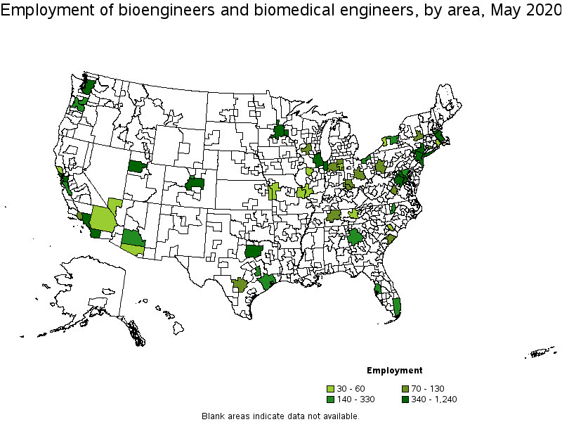
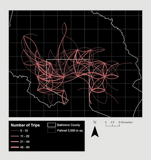
I was actually mapping some metro stat areas (MSAs) at work the other day, and these are just terrifically bad geo areas to show via a choropleth map. All choropleth maps have the issue of varying size areas, but I never realized having somewhat regular borders (more straight lines) makes the state and county maps not so bad – these MSA areas though are tough to look at. (Wife says it scintillates for her if she looks too closely.)

There are various incredibly tiny MSAs next to giant ones that you will just never see in these maps (no matter what color scheme you use). Nevada confused for me quite a bit, until I zoomed in to see that there are 4 areas, Reno is just a tiny squib.

Another example is Boulder above Denver. (Look closely at the BLS map I linked, you can just make out Boulder if you squint, but I cannot tell what color it corresponds to in the legend.) The outline heavy OES maps, which are mostly missing data, are just hopeless to display like this effectively. Reno could be the hottest market for whatever job, and it will always be lost in this map if you show employment via the choropleth approach. So of course I spent the weekend hacking together some maps in python and folium.

The BLS has a public API, but I was not able to find the OES stats in that. But if you go through the motions of querying the data and muck around in the source code for those queries, you can see they have an undocumented API call to generate json to fill the tables. Then using this tool to convert the json calls to python (thank you Hacker News), I was able to get those tables into python.

I have these functions saved on github, so check out that source for the nitty gritty. But just here quickly, here is a replicated choropleth map, showing the total employees for bio jobs (you can go to here to look up the codes, or run my function bls_maps.ocodes() to get a pandas dataframe of those fields).

# Creating example bls maps
from bls_geo import *

# can check out https://www.bls.gov/oes/current/oes_stru.htm
bio = '172031'
bio_stats = oes_geo(bio)
areas = get_areas() # this takes a few minutes
state = state_albers()
geo_bio = merge_occgeo(bio_stats,areas)

ax = geo_bio.plot(column='Employment',cmap='inferno',legend=True,zorder=2)
state.boundary.plot(ax=ax,color='grey',linewidth=0.5,zorder=1)
ax.set_ylim(0.1*1e6,3.3*1e6)
ax.set_xlim(-0.3*1e7,0.3*1e7)   # lower 48 focus (for Albers proj)
ax.set_axis_off()
plt.show()

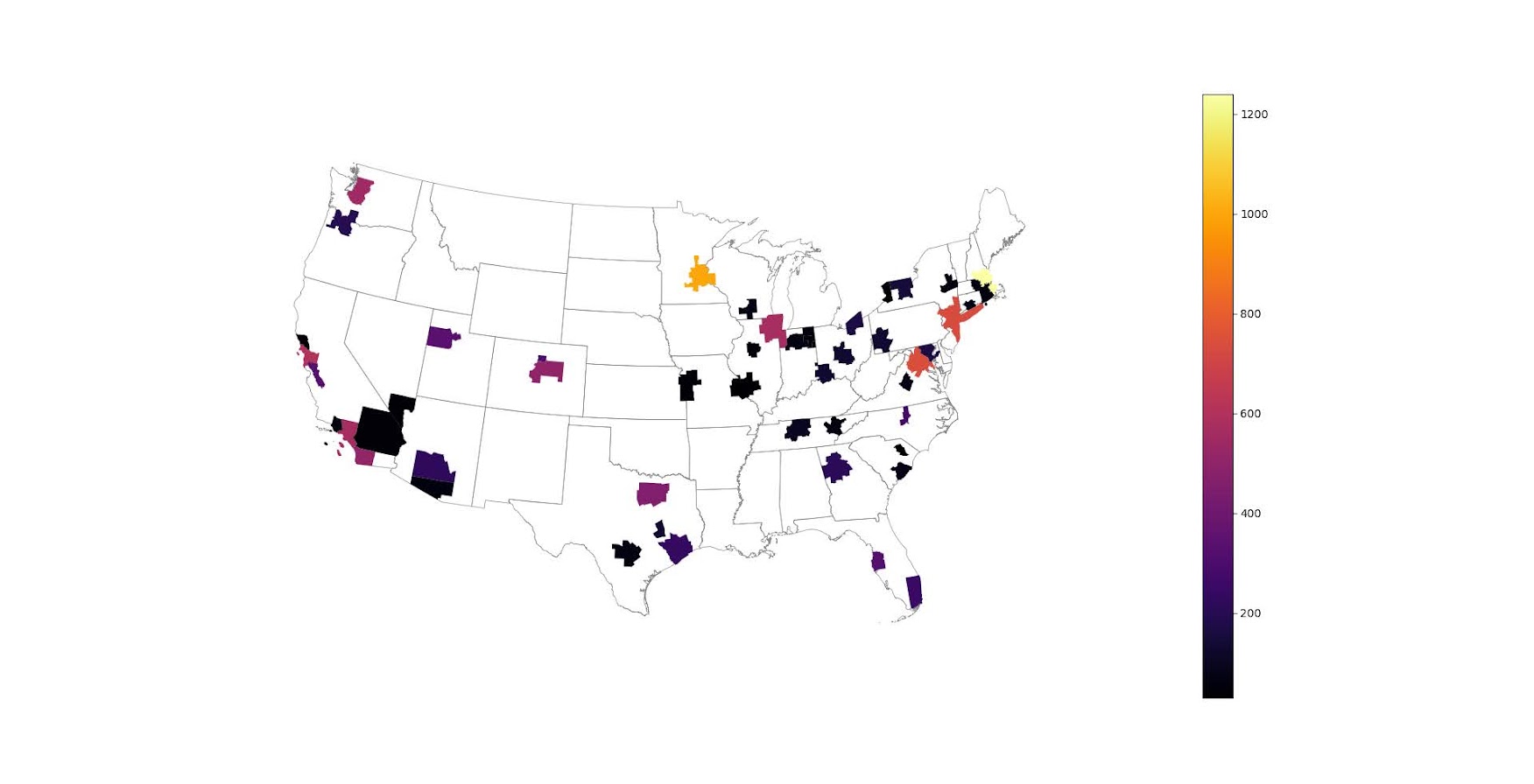
And that is not much better than BLSs version. For this data, if you are just interested in looking up or seeing the top metro areas, just doing a table, e.g. above geo_bio.to_excel('biojobs.xlsx'), works just as well as a map.

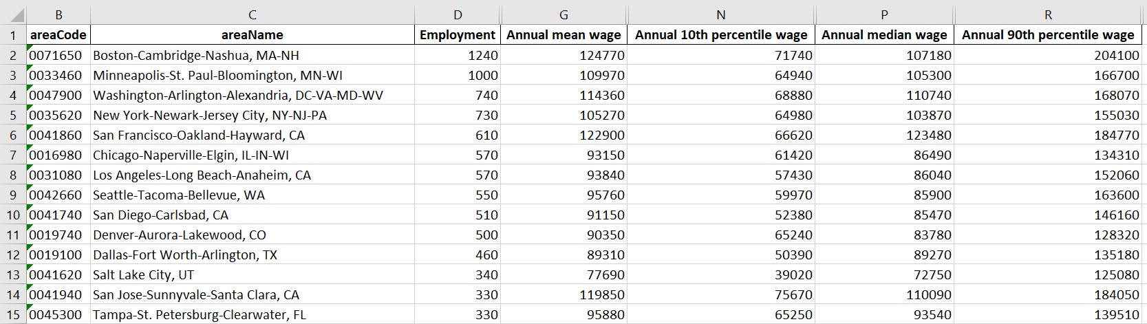
So I was surprised to see Minneapolis pop up at the top of that list (and also surprised Raleigh doesn’t make the list at all, but Durham has a few jobs). But if you insist on seeing spatial trends, I prefer to go the approach of mapping proportion or graduate circles, placing the points at the centroid of the MSA:

att = ['areaName','Employment','Location Quotient','Employment per 1,000 jobs','Annual mean wage']
form = ['',',.0f','.2f','.2f',',.0f']

map_bio = fol_map(geo_bio,'Employment',['lat', 'lon'],att,form)
#map_bio.save('biomap.html')
map_bio #if in jupyter can render like this

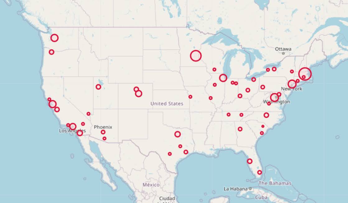
I am too lazy to make a legend, you can check out nbviewer to see an interactive Folium map, which I have tool tips (similar to the hover for the BLS maps).

Forgive my CSS/HTML skills, not sure how to make nicer popups. So you lose the exact areas these MSA cover in this approach, but I really only expect a general sense from these maps anyway.

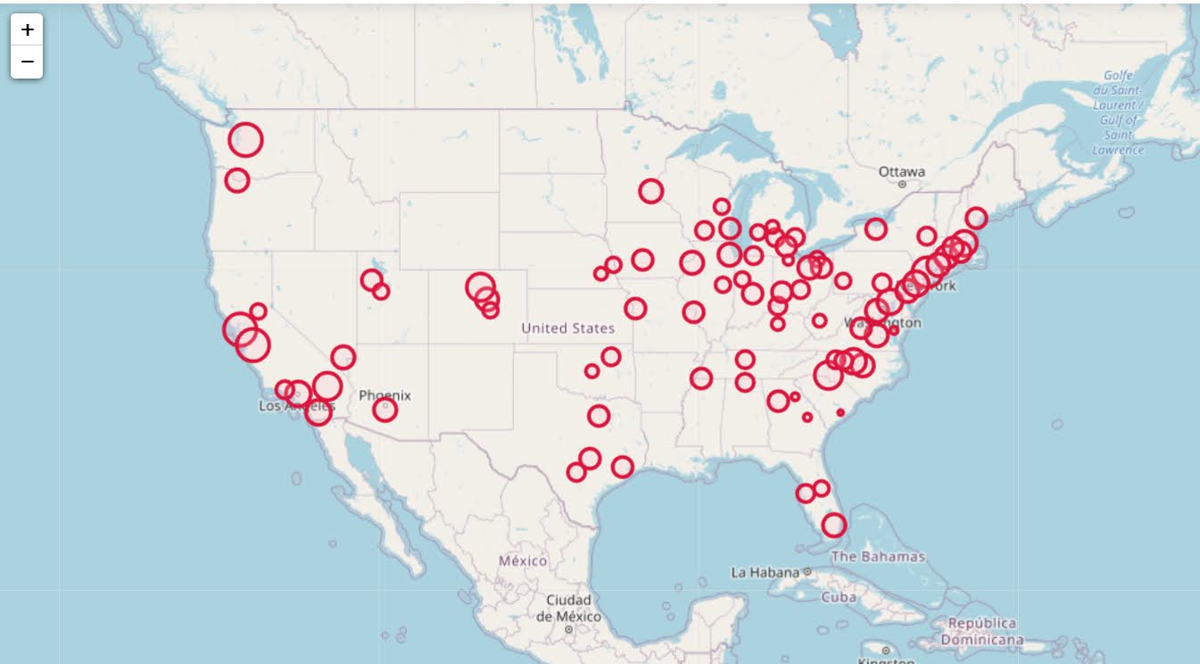
These functions are general enough for whatever wage series you want (although these functions will likely break when the 2021 data comes out). So here is the OES table for data science jobs:

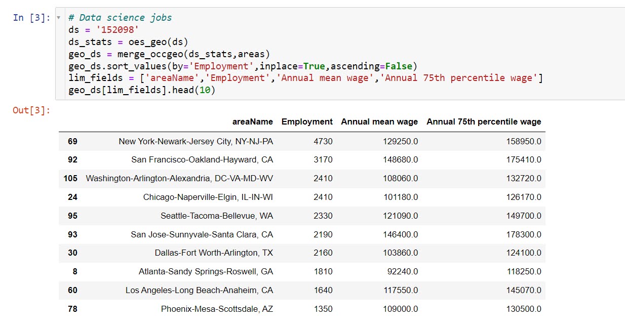
I feel going for the 90th percentile (mapping that to the 10 times programmer) is a bit too over the top. But I can see myself reasonably justifying 75th percentile. (Unfortunately these agg tables don’t have a way to adjust for years of experience, if you know of a BLS micro product I could do that with let me know!). So you can see here the somewhat inflated salaries for the SanFran Bay area, but not as inflated as many might have you think (and to be clear, these are for 2020 survey estimates).

If we look at map of data science jobs, varying the circles by that 75th annual wage percentile, it looks quite uniform. What happens is we have some real low outliers (wages under 70k), resulting in tiny circles (such as Athen’s GA). Most of the other metro regions though are well over 100k.

In more somber news, those interactive maps are built using Leaflet as the backend, which was create by a Ukranian citizen, Vladimir Agafonkin. We can do amazing things with open source code, but we should always remember it is on the backs of someones labor we are able to do those things.

New preprint: Testing for Similarity in Area-Based Spatial Patterns: Alternative Methods to Andresen’s Spatial Point Pattern Test

I just posted another pre-print to SSRN, Testing for Similarity in Area-Based Spatial Patterns: Alternative Methods to Andresen’s Spatial Point Pattern Test. This is work with Wouter Steenbeek and Martin Andresen. Below is the abstract:

Andresen’s spatial point pattern test (SPPT) compares two spatial point patterns on defined areal units: it identifies areas where the spatial point patterns diverge and aggregates these local (dis)similarities to one global measure. We discuss the limitations of the SPPT and provide two alternative methods to calculate differences in the point patterns. In the first approach we use differences in proportions tests corrected for multiple comparisons. We show how the size of differences matter, as with large point patterns many areas will be identified by SPPT as statistically different, even if those differences are substantively trivial. The second approach uses multinomial logistic regression, which can be extended to identify differences in proportions over continuous time. We demonstrate these methods on identifying areas where pedestrian stops by the New York City Police Department are different from violent crimes from 2006 through 2016.

And here is an example map using our proportion differences test and graduated circles to identify places with larger differences in the percentages:

This is opposed to the traditional SPPT output, which just identifies whether two areas are different and does not focus on the size of the difference, like below:

You can see with a large sample size, basically everything is statistically different! (This uses over 4 million stops and over 800,000 violent crimes). Focusing on the magnitude of the differences gives a much clear indication of patterns.

The paper includes a dropbox link to download the data and code used to estimate the different techniques (it includes code in SPSS, R, and Stata). If you have any feedback as always let me know. This was submitted as a GISScience presentation for the 2018 ESRI User conference in July in San Diego, so I should have news about that presentation in the near future as well.

One sided line buffers in R using rgeos

I’ve started to do more geographic data manipulation in R, and part of the reason I do blog posts is for self-reference, so I figured I would share some of the geographic functions I have been working on.

The other day on StackOverflow there was a question that asked how to do one sided buffers in R. The question was closed (and the linked duplicate is closed as well), so I post my response here.

The workflow I describe to make one sided buffers is in a nutshell

  • expand the original polyline into a very small area by using a normal buffer, calls this Buf0
  • do a normal two sided buffer on the original polyline, without square or rounded ends, call this Buf1
  • take the geographic difference between Buf1 and Buf0, which basically splits the original buffer into two parts, and then return them as two separate spatial objects

Here is a simple example.

library(rgeos)
library(sp)

TwoBuf <- function(line,width,minEx){
  Buf0 <- gBuffer(line,width=minEx,capStyle="SQUARE")
  Buf1 <- gBuffer(line,width=width,capStyle="FLAT")
  return(disaggregate(gDifference(Buf1,Buf0)))
}

Squig <- readWKT("LINESTRING(0 0, 0.2 0.1, 0.3 0.6, 0.4 0.1, 1 1)") #Orig
TortBuf <- TwoBuf(line=Squig,width=0.05,minEx=0.0001)
plot(TortBuf, col=c('red','blue'))  #First object on left, second on right

If you imagine travelling along the polyline, which in this example goes from left to right, this is how I know the first red polygon is the left hand and the blue is the right hand side buffer. (To pick a specific one, you can subset like TortBuf[1] or TortBuf[2].)

If we reverse the line string, the order will subsequently be reversed.

SquigR <- readWKT("LINESTRING(1 1, 0.4 0.1, 0.3 0.6, 0.2 0.1, 0 0)") #Reversed
TortBuf <- TwoBuf(line=SquigR,width=0.05,minEx=0.0001)
plot(TortBuf, col=c('red','blue'))  #Again first object on left, second on right

Examples of south to north and north to south work the same as well.

SquigN <- readWKT("LINESTRING(0 0, 0 1)") #South to North
TortBuf <- TwoBuf(line=SquigN,width=0.05,minEx=0.0001)
plot(TortBuf, col=c('red','blue'))  #Again first object on left, second on right

SquigS <- readWKT("LINESTRING(0 1, 0 0)") #North to South
TortBuf <- TwoBuf(line=SquigS,width=0.05,minEx=0.0001)
plot(TortBuf, col=c('red','blue'))  #Again first object on left, second on right

One example in which this procedure does not work is if the polyline creates other polygons.

Square <- readWKT("LINESTRING(0 0, 1 0, 1 1, 0 1, 0 0)") #Square
TortBuf <- TwoBuf(line=Square,width=0.05,minEx=0.0001)
plot(TortBuf, col=c('red','blue','green'))

#Switch the direction
SquareR <- readWKT("LINESTRING(0 0, 0 1, 1 1, 1 0, 0 0)") #Square Reversed
TortBuf <- TwoBuf(line=SquareR,width=0.05,minEx=0.0001)
plot(TortBuf, col=c('red','blue','green'))                #Still the same order

This messes up the order as well. If you know that your polyline is actually a polygon you can do a positive and negative buffer to get the desired effect of interest. If I have a need to expand this to multipart polylines I will post an update, but I have some other buffer functions I may share in the mean time.

What is up with 3d graphics for book covers?

The other day in Google books I noticed Graphics for Statistics and Data Analysis with R by Kevin Keen in the related book section. What caught my eye was not the title (there have to be 100+ related R books at this point) but the really awful 3d pie chart.

Looking at the preview on google books this appears to be an unfortunate substitution. The actual cover has a much more reasonable set of surface plots and other online book stores (e.g. Amazon) appear to have the correct cover.

I suspect someone at CRC Press used some stock imagery for the cover, and unfortunately the weird 3d pie graph has been propagated to the google book preview without correction.

This reminded me of a few other book covers in cartography and data visualization though that I find less than appealing. Now, I’m not saying here to judge a book by its cover, and I have not read all of the books I will point to here. But I find the use of 3d graphics in book covers in the data visualization field to be strange and bordering cognitive dissonance with the advice most of the authors give.

First I’ll start with a book I have read, and would suggest to everyone, Thematic cartography and geographic visualization by Slocum et al. I have the 2005 version, and it is dawned by this 3d landscape. (Sorry this is the largest image I can find online – other editions I believe have different covers.)

The multivariate display of data is admirable – so for exploratory analysis you could make a reasonable argument for the use of proportional sized circles superimposed on the choropleth map. The use of 3d in this circumstance though is gratuitous, and the extreme perspective hides much of the data while highlighting the green hills in the background.

The second mapping book I have slight reservations about critiquing the cover (I am on the job market!). I have not read the book, so I can not say anything about its contents. But roaming the book displays at an ASC conference I remember seeing this cover, GIS and Spatial Analysis for the Social Sciences: Coding, Mapping, and Modeling by Nash and Asencio.

This probably should not count in the other 3d graphics I am showing. The bar columns do have shading for 3d perspective – but the map otherwise is 2d. But the spectral color scheme is an awful choice. The red in the map tends to stand out the most – which places with zero crimes I don’t think you want to make that impression. The choropleth colors appear to be displaying the same data as the point data. The point data are so clustered that the choropleth can only be described as misleading – which may be a good point in text for side by side maps – but on the cover? Bar locations seem to be unrelated (as we might expect for juvenile crime) but they are again aggregated to the (probably) census units – making me question if the aggregation obfuscates the relationship. Bars are not available from the census – so it is likely this aggregation was intentional. I have no idea about the content of the book and I will likely get it and do an overall review of all crime mapping books sometime. But the cover is unambiguously a bad map.

The last book cover with 3d graphics (related to data-visualization) that I immediately remembered was R For Dummies by Meys and de Vries.

Now this when you look close really is not bad. It is not a graph on the cover, but a set of winding, hexagon cylinder stairsteps. So the analogy of taking small steps is fine – but the visual similarity to other statistical 3d graphics is clear. Consider the SPSS For Dummies book by Griffith.

Now that is an intentional, 3d chart made up of tiny blocks, with a trend line if you look closely, shadowed by cigarette like red bars in the background. At least this is so strange (and not possible in statistical software) that this example would never be confused with an actual reasonable statistical graphic. The Dummies series has such brand recognition as well that the dominant part of the cover might be the iconic yellow and type, as opposed to the inset graphic.

Not wanting to leave other software out of the loop, I looked for examples for SAS and Stata. SAS has a reasonable 3d cover in SAS System for Statistical Graphics by Friendly.

Short sidetrack story: I first learned statistical programming using SAS back in undergrad days at Bloomsburg University. Default graphics for SAS at that point (04-08) I believe were still the ASCII art looking things (at least that is what I remember). During our last meeting for my last statistics class – one of the other students showed me you could turn on the ODS output to html – and tables and graphs were by default pretty nice. I since have not had a need to use SAS.

This 3d cover by Friendly is arguably a reasonable use of 3d. 3d graphs are hard to navigate, and the use the anchors connecting the observations to the non-linear surface more easily associate a point with below or above the surface. It is certainly difficult though to understand the fit of the function – so likely a series of bivariate graphs would be more intuitive – especially given the meager number of points. I suspect the 3d on the cover is for the same reason 3d graphics were used in the other covers – because it looks cooler to book marketers!

Stata managed to debunk the 3d graph trends – I could not find any example Stata books with 3d graphics. Nick Cox’s newer collection of his Speaking Stata series though has some interesting embellishments.

While in isolation all of the graphs are fine – I’m sure Cox would not endorse the gratuitous use of color gradients in the graphics (I don’t think svg like gradients like that are even possible in Stata graphics). The ternary diagrams show nothing but triangles as well – so I don’t think such gradients are a good idea in any case for simply the background of the plot. Such embellishments could actually decode data, but in the case of bar graphs do not likely hurt or help with understanding the plot. When such gradients are used as the background though they likely compete with the actual data in the plot. Stata apparently can do 3d graphs – so I might suggest I write a book on crime modelling (published by Stata press) and insert a 3d graph on the cover (as this is clearly a niche in the market not currently filled!) I might have to make room for Chernoff faces somewhere on the front or back cover as well.

So maybe I am just seeing things in the examples of 3d covers. If anyone has any insight into how these publishers choose the covers let me know – or if you have other examples of bad book cover examples of data vizualization! Since most of my maps and graphs are pretty dull in 2d I might just outsource the graphic design if I made a book.

Some more value-by-alpha maps for D.C. Census Blocks

I’ve made some more value-by-alpha maps for my dissertation for percent non-white population in comparison to percentage of female-headed households for Census blocks in 2010 in D.C. See my first post for some background. The choropleth classes for the percents are chosen according to quintiles of the distributions and the alpha classes are arbitrary (note the alpha class uses households as the baseline in both maps, even though percent non-white uses the population counts).

When making these maps I’ve found that the Color Brewer sequential styles that range two colors work out much better than those that span one color. What happens with the one color sequential themes is that the faded out colors end up being confounded with the lighter colors in the fully opaque ranges. When using the two sequential color schemes (here showing Yellow to Red and Yellow to Blue) it provides greater discrepancy between the classes.


I did not try out the black background for these maps (I thought perhaps it would be a bit jarring in the document have a swath of black stand out). The CUNY Center for Urban Research has some other example value-by-alpha maps for New York City elections in 2013. After some discussion with Steven Romalewski they decided they liked the white background better for there maps, and my quick attempts for these examples I think I agree.

Article: Viz. techniques for JTC flow data

My publication Visualization techniques for journey to crime flow data has just been posted in the online first section of the Cartography and Geographic Information Science journal. Here is the general doi link, but Taylor and Francis gave me a limited number of free offprints to share the full version, so the first 50 visitors can get the PDF at this link.

Also note that:

  • The pre-print is posted to SSRN. The pre-print has more maps that were cut for space, but the final article is surely cleaner (in terms of concise text and copy editing) and has slightly different discussion in various places based on reviewer feedback.
  • Materials I used for the article can be downloaded from here. The SPSS code to make the vector geometries for a bunch of the maps is not terribly friendly. So if you have questions feel free – or if you just want a tutorial just ask and I will work on a blog post for it.
  • If you ever want an off-print for an article just send me an email (you can find it on my CV. I plan on continuing to post pre-prints to SSRN, but I realize it is often preferable to cite the final in print version (especially if you take a quote).

The article will be included in a special issue on crime mapping in the CaGIS due to be published in January 2015.

Viz. JTC Flow lines – Paper for ASC this fall

Partly because I would go crazy if I worked only on my dissertation, I started a paper about visualizing JTC flow lines awhile back, and I am going to present what I have so far at the American Society of Criminology (ASC) meeting at Atlanta this fall.

My paper is still quite rough around the edges (so not quite up for posting to SSRN), but here is the current version. This actually started out as an answer I gave to a question on the GIS stackexchange site, and after I wrote it up I figured it would be worthwhile endeavor to write an article. Alasdair Rae has a couple of viz. flow data papers currently, but I thought I could extend those papers and write for a different audience of criminologists using journey to crime (JTC) data.

As always, I would still appreciate any feedback. I’m hoping to send this out to a journal in the near future, and so far I have only goated one of my friends into reviewing the paper.

Some more about black backgrounds for maps

I am at it again discussing black map backgrounds. I make a set of crime maps for several local community groups as part of my job as a crime analyst for Troy PD. I tend to make several maps for each group, seperating out violent, property and quality of life related crimes. Within each map I try to attempt to make a hierarchy between crime types, with more serious crimes as larger markers and less severe crimes as smaller markers.

Despite critiques, I believe the dark background can be useful, as it creates greater contrast for map elements. In particular, the small crime dots are much easier to see (and IMO in these examples the streets and street name labels are still easy to read). Below are examples of the white background, a light grey background, and a black background for the same map (only changes are the black point marker is changed to white in the black background map, streets and parks are drawn with a heavy amount of transparency to begin with so don’t need to be changed).

Surprisingly to me, ink be damned, even printing out the black background looks pretty good! (I need to disseminate paper copies at these meetings) I think if I had to place the legend on the black map background I would be less thrilled, but currently I have half the page devoted to the map and the other half devoted to a table listing the events and the time they occurred, along with the legend (ditto for the scale bar and the North arrow not looking so nice).

I could probably manipulate the markers to provide more contrast in the white background map (e.g. make them bigger, draw the lighter/smaller symbols with dark outlines, etc.) But, I was quite happy with the black background map (and the grey background may be a useful in-between the two as well). It took no changes besides changing the background in my current template (and change black circles to white ones) to produce the example maps. I also chose those sizes for markers for a reason (so the map did not appear flooded with crime dots, and more severe and less severe crimes were easily distinguished), and so I’m hesistant to think that I can do much better than what I have so far with the white background maps (and I refuse to put those cheesy crime marker symbols, like a hand gun or a body outline, on my maps).

In terms of differentiating between global and local information in the maps, I believe the high contrast dark background map is nice to identify local points, but does not aid any in identifying general patterns. I don’t think general patterns are a real concern though for the local community groups (displaying so many points on the same map in general isn’t good for distinguishing general patterns anyway).

I’m a bit hesitant to roll out the black maps as of yet (maybe if I get some good feedback on this post I will be more daring). I’m still on the fence, but I may try out the grey background maps for the next round of monthly meetings. I will have to think if I can devise a reasonable experiment to differentiate between the maps and whether they meet the community groups goals and/or expectations. But, all together, the black background maps should certainly be given serious consideration for similar tasks. Again, as I said previously, the high contrast with smaller elements makes them more obvious (brings them more to the foreground) than with the white background, which as I show here can be useful in some circumstances.

Using Bezier curves to draw flow lines

As I talked about previously, great circle lines are an effective way to visualize flow lines, as the bending of the arcs creates displacement among over-plotted lines. A frequent question that comes up though (see an example on GIS.stackexchange and on the flowing data forums) is that great circle lines don’t provide enough bend over short distances. Of course for visualizing journey to crime data (one of the topics I am interested in), one has the problem that most known journey’s are within one particular jurisdiction or otherwise short distances.

In the GIS question I linked to above I suggested to utilize half circles, although that seemed like over-kill. I have currently settled on drawing an arcing line utilizing quadratic Bezier curves. For a thorough demonstration of Bezier curves, how to calculate them, and to see one of the coolest interactive websites I have ever come across, check out A primer on Bezier curves – by Mike "Pomax" Kamermans. These are flexible enough to produce any desired amount of bend (and are simple enough for me to be able to program!) Also I think they are more aesthetically pleasing than irregular flows. I’ve seen some programs use hook like bends (see an example of this flow mapping software from the Spatial Data Mining and Visual Analytics Lab), but I’m not all that fond of that for either aesthetic reasons or for aiding the visualization.

I won’t go into too great of details here on how to calculate them, (you can see the formulas for the quadratic equations from the Mike Kamermans site I referenced), but you basically, 1) define where the control point is located at (origin and destination are already defined), 2) interpolate an arbitrary number of points along the line. My SPSS macro is set to 100, but this can be made either bigger or smaller (or conditional on other factors as well).

Below is an example diagram I produced to demonstrate quadratic Bezier curves. For my application, I suggest placing a control point perpindicular to the mid point between the origin and destination. This creates a regular arc between the two locations, and conditional on the direction one can control the direction of the arc. In the SPSS function provided the user then provides a value of a ratio of the height of the control point to the distance between the origin and destination location (so points further away from each other will be given higher arcs). Below is a diagram using Latex and the Tikz library (which has a handy function to calulate Bezier curves).

Here is a simpler demonstration of the controlling the direction and adjusting the control point to produce either a flatter arc or an arc with more eccentricity.

Here is an example displaying 200 JTC lines from the simulated data that comes with the CrimeStat program. The first image are the original straight lines, and the second image are the curved lines using a control point at a height half the distance between the origin and destination coordinate.

Of course, both are most definately still quite crowded, but what do people think? Are my curved lines suggestion benificial in this example?

Here I have provided the SPSS function (and some example data) used to calculate the lines (I then use the ET Geowizards add-on to turn the points into lines in ArcGIS). Perhaps in the future I will work on an R function to calculate Bezier curves (I’m sure they could be of some use), but hopefully for those interested this is simple enough to program your own function in whatever language of interest. I have the starting of a working paper on visualizing flow lines, and I plan on this being basically my only unique contribution (everything else is just a review of what other people have done!)

One could be more fancy as well, and make the curves different based on other factors. For instance make the control point closer to either the origin or destination is the flow amount is assymetrical, or make the control point further away (and subsequently make the arc larger) is the flow is more volumous. Ideas for the future I suppose.

When should we use a black background for a map?

Some of my favorite maps utilize black (or dark) backgrounds. For some examples;


Steven Romalewski offers a slight critique of them recently in his blog post, Mapping NYC stop and frisks: some cartographic observations;

I know that recently the terrific team at MapBox put together some maps using fluorescent colors on a black background that were highly praised on Twitter and in the blogs. To me, they look neat, but they’re less useful as maps. The WNYC fluorescent colors were jarring, and the hot pink plus dark blue on the black background made the map hard to read if you’re trying to find out where things are. It’s a powerful visual statement, but I don’t think it adds any explanatory value.

I don’t disagree with this, and about all I articulate in their favor so far is essentially “well lit places create a stunning contrast with the dark background” while white background maps just create a contrast and are not quite as stunning!

I think the proof of a black backgrounds usefulness can be seen in the example value-by-alpha maps and the flow maps of James Chesire, where a greater amount of contrast is necessary. IMO in the value by alpha maps the greater contrast is needed for the greater complexity of the bivariate color scheme, and in Chesire’s flow maps it is needed because lines frequently don’t have enough areal gurth to be effectively distinguished from the background.

I couldn’t find any more general literature on the topic though. It doesn’t seem to be covered in any of the general cartography books that I have read. Since it is really only applicable to on-screen maps (you certainly wouldn’t want to print out a map with a black background) perhaps it just hasn’t been addressed. I may be looking in the wrong place though, some text editors have a high contrast setting where text is white on a dark background (for likely the same reasons they look nice in maps), so it can’t be that foreign a concept to have no scholarly literature on the topic.

So in short, I guess my advice is utilize a black background when you want to highly focus attention on the light areas, essentially at the cost of greatly diminishing the contrast with other faded elements in the map. This is perhaps a good thing for maps intended as complex statistical summaries, and the mapnificient travel times map is probably another good example where high focus in one area is sufficient and other background elements are not needed. I’m not sure though for choropleth maps black backgrounds are really needed (or useful), and any more complicated thematic maps certainly would not fit this bill.

To a certain extent I wonder what lessons from black backgrounds can be applied to the backgrounds of statistical graphics more generally. Leave me some comments if you have any thoughts or other examples of black background maps!