
Some of my favorite maps utilize black (or dark) backgrounds. For some examples;
- Several of the maps in the Examples of Beautiful Maps thread utilize dark backgrounds. These include value-by-alpha maps, the facebook friends connection map, and the Mapnificent London travel times map has a nightime setting which changes the background map to dark.
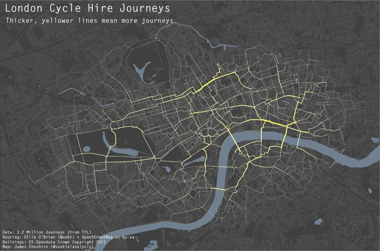
- I think many of James Chesire’s maps of London flows are quite nice. For two examples see one with a darker grey background and an animation with a black background. Below is a picture taken from the second post.
Steven Romalewski offers a slight critique of them recently in his blog post, Mapping NYC stop and frisks: some cartographic observations;
I know that recently the terrific team at MapBox put together some maps using fluorescent colors on a black background that were highly praised on Twitter and in the blogs. To me, they look neat, but they’re less useful as maps. The WNYC fluorescent colors were jarring, and the hot pink plus dark blue on the black background made the map hard to read if you’re trying to find out where things are. It’s a powerful visual statement, but I don’t think it adds any explanatory value.
I don’t disagree with this, and about all I articulate in their favor so far is essentially “well lit places create a stunning contrast with the dark background” while white background maps just create a contrast and are not quite as stunning!
I think the proof of a black backgrounds usefulness can be seen in the example value-by-alpha maps and the flow maps of James Chesire, where a greater amount of contrast is necessary. IMO in the value by alpha maps the greater contrast is needed for the greater complexity of the bivariate color scheme, and in Chesire’s flow maps it is needed because lines frequently don’t have enough areal gurth to be effectively distinguished from the background.
I couldn’t find any more general literature on the topic though. It doesn’t seem to be covered in any of the general cartography books that I have read. Since it is really only applicable to on-screen maps (you certainly wouldn’t want to print out a map with a black background) perhaps it just hasn’t been addressed. I may be looking in the wrong place though, some text editors have a high contrast setting where text is white on a dark background (for likely the same reasons they look nice in maps), so it can’t be that foreign a concept to have no scholarly literature on the topic.
So in short, I guess my advice is utilize a black background when you want to highly focus attention on the light areas, essentially at the cost of greatly diminishing the contrast with other faded elements in the map. This is perhaps a good thing for maps intended as complex statistical summaries, and the mapnificient travel times map is probably another good example where high focus in one area is sufficient and other background elements are not needed. I’m not sure though for choropleth maps black backgrounds are really needed (or useful), and any more complicated thematic maps certainly would not fit this bill.
To a certain extent I wonder what lessons from black backgrounds can be applied to the backgrounds of statistical graphics more generally. Leave me some comments if you have any thoughts or other examples of black background maps!


Steven Romalewski
/ July 28, 2012Thanks for mentioning my post and quoting an excerpt. Your post makes some good points; it’s a refreshingly thoughtful take on the subject. I agree that I don’t think there’s much literature out there about this particular cartographic technique. I wonder what people like Cynthia Brewer would say.
I appreciate your point about maps like this being stunning, they certainly are. As I’m sure you read in my post, when I created an alternative map of the stop and frisk data using more traditional color schemes, I acknowledged that it was boring, and it certainly is compared with the fluorescence of WNYC’s map! I think that’s what gives me pause, though, about these “black light poster” maps. I worry that maybe they rely on splashiness to get the point across, and maybe that’s a crutch when the data’s not all there (at least that was my sense after I looked through WNYC’s effort in great detail). I presume that’s not the case with the London examples you provide.
Or the MapBox examples from NYC’s “Reinvent Green” hackathon. I don’t really see the need to portray the map features with fluorescent colors against a black/dark basemap. Striking, yes. But it seems a bit too gimmicky to me.
But maybe that’s just me being old and stodgy and not open enough to new, bold approaches. Dunno. Another example from several years ago are maps from the “Million Dollar Blocks” project (http://www.spatialinformationdesignlab.org/projects.php?id=16), showing the spatial patterns of prison expenditures allocated to the prisoners home communities.
I’ll take a closer look at the links you provide to gis.stackexchange and others. Very helpful resources. Thanks.
apwheele
/ July 30, 2012Hi Steven and thanks for the comment,
I don’t think your being stodgy. I think your right in the examples you point to the black backgrounds and fluorescent choropleth colors weren’t needed, and they may have hindered map reading. I was just pointing to some examples where I think the black background helped (and my guesses as to why in those examples the black background appeared more effective).
As far as the black background being a tool for propaganda, I don’t think I’m as much a skeptic as you. Although I had my own critiques of the WNYC map when I first saw it, the black background did not cross my mind. Honestly I’m happy most of the time when the legend is clearly documented and the color scheme makes sense for the data being displayed! That being said though I’m probably in a better position to critically judge a map and the information it contains than the general public.
I debated on commenting on your original post, but in full disclosure I am not a neutral party either (I have been hired as a consultant for the defendants in this legal case). But I would like to commend you for your post. As you said it is a very polarizing topic, and so it is difficult topic to openly debate. I thought you did an excellent job of being critical but fair and objective at the same time.
Although like you, I was somewhat critical of the initial propositions of the negative correlation between stops and gun recoveries in WNYC stop-and-frisk map and article, at least the data was there for people to zoom out and see for themselves (black background pink colors and all). Although your discussion of choosing suitable bins is relevant (bins can be manipulated to emphasize or de-emphasize relationships) choosing bins isn’t always a straightforward task, and I would assume it is just as easy someone mistakenly chose a bin scheme that was arguably innapropriate as it is someone intentionally chose a set of bins to misguide the map readers. I would say the same for background color and choropleth color scheme.
Thanks for the link to the spatial information design lab. Besides some nice looking black background maps it looks like they have some projects also right up my alley on crime and justice issues. Thanks again for commenting (I’m flattered you paid attention!) You have some pretty awesome projects coming out of CUNY, and I’ve followed your blog for awhile now (so keep the good posts coming!)
Steven Romalewski
/ August 31, 2012I happened to be reading James Fee’s Spatially Adjusted blog and came across an amusing rationale for black background maps. See item #3 at his “Hurricane Tracker 101” post. He notes that maps from Stamen Design are not only beautiful but “…are always taken at night [I’m assuming he means they have a black basemap]. These are handy when you want to look at the map and not keep your significant other up from the light of your iPad. With the Esri map [linked here], you’d have to build a pillow fort to keep the light on your side of the bed or couch.”
James not only has great insights into the GIS world, but has a terrific sense of humor. Gotta love it!
apwheele
/ August 31, 2012Yes, I agree James does often have something enjoyable/insightful to hear (although he seems a bit curmudgeonly in that post)! Those Stamen maps are really nice too, but not all of them are taken at night! See for an example their crime maps don’t utilize a black background.
I’ve also come across some related discussion about dark backgrounds on phone apps, see Why do most financial apps use a black or dark background? and What are the negative and positive aspects of dark color scheme? on the UX stackexchange site. Alot of this discussion focuses on eye strain, something I’m not sure how applicable/pertinent it is to short term map viewing.
Some more food for thought, although it still stands to reason the original WNYC map you criticized didn’t have any real obvious reason or need for the black background.