I recently finished reading Cynthia Brewer’s Designing better maps: A guide for GIS users. Within the book she had an example of making a bi-variate map legend manually in ArcMap, and then the light-bulb went off in my mind that I could use that same technique to make value by alpha maps in ArcMap.
For a brief intro into what value by alpha maps are, Andy Woodruff (one of the creators) has a comprehensive blog post on them on what they are and their motivation. Briefly though, we want to visualize some variable in a choropleth map, but that variable is measured with varying levels of reliability. Value by alpha maps de-emphasize areas of low reliability in the choropleth values by increasing the transparency of that polygon. I give a few other examples of interest related to mapping reliability in this answer on the GIS site as well, How is margin of error reported on a map?. Essentially those techniques mentioned either only display certain high reliability locations, make two maps, or use technqiues to overlay multiple attributes (like hashings). But IMO the value by alpha maps looks much nicer than the maps with multiple elements, and so I was interested in how to implement them in ArcMap.
What value by alpha maps effectively do is reduce the saturation and contrast of polygons with high alpha blending, making them fade into the background and be less noticable. I presented an applied example of value by alpha maps in my question asking for examples of beautiful maps on the GIS site. You can click through to see further citations for the map and reasons for why I think the map is beautiful. But below I include an image here as well (taken from the same Andy Woodruff blog post mentioned earlier).

Here I will show to make the same maps in ArcMap, and present some discussion about their implementation, in particular suitable choices for the original choropleth colors. Much was already discussed by the value by alpha originators, but I suppose I didn’t really appreciate them until I got my hands alittle dirty and tried to make them myself. Note this question on the GIS site, How to implement value-by-alpha map in GIS? gives other resources for implementing value-by-alpha maps. But as far as I am aware this contribution about how to do them in ArcMap is novel.
Below I present an example displaying the percentage of female heads of households with children (abbreviated PFHH from here on) for 2010 census blocks within Washington, D.C. Here we can consider the reliability of the PFHH dependent on the number of households within the block itself (i.e. we would expect blocks with smaller number of households to have a higher amount of variability in the PFHH). The map below depicts blocks that have at least one household, and so the subsequent PFHH maps will only display those colored polygons (about a third, 2132 out of 6507, have no households).

I chose the example because female headed households are a typical covariate of interest to criminologists for ecological studies. I also chose blocks as they are the smallest unit available from the census, and hence I expected them to show the widest variability in estimates. Below I provide an example on how one might typically display PFHH, while simultaneously incorporating information on the baseline number the maps will be map of.
The first example seperately displays the denominator number of households on the left and the percent of female headed households with children on the right both in a sequential choropleth scheme (darker colors are a higher PFHH and Number of Households).

One can also superimpose the same information on the map. Sun & Wong, 2010 suggest one use cross hatching above the the choropleth colors to depict reliability, but here I will demonstrate using choropleth colors for the baseline number of households and a proportional point symbols for the PFHH. I supplement the map on the right with a scatterplot, that has the number of households on the X axis and the PFHH on the Y axis.

How to make the value by alpha map
First one can start out by making the base layer with the desired choropleth classifications and color scheme. Note here I changed what I am visualizing from a sequential color scheme of PFHH to location quotients with only four categories. I will discuss why I did this later on in the post.
Then one can make several copies of that layer (right click -> copy -> paste within hierarchy), based on however many different reliability classifications you want to display. Here I will do 4 different reliability classifications. Note after you make them for management of the TOC it is easier to group them.
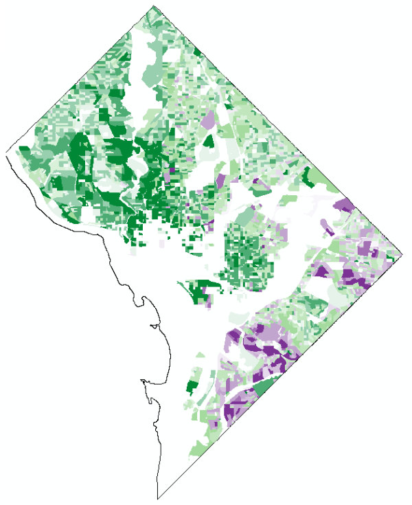
Then one uses selection criteria to filter out only those polygons that fall within the specified reliability range. And then sets the transparency for the that level to the desired value.
And voila, you have your value by alpha map. Note if after you make the layers you decide you want a different classification and/or color scheme, you can make the changes to one layer and then apply the changes to all of the other layers.
How to make the legend
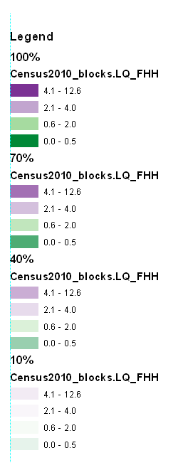
Now making the legend is the harder part. If one goes to the layout view, one will see that since in this example one has essentially for layers superimposed on the same map, one has four seperate legend entries. Below is what it looks like with my defaults (plus a vertical rule I have in my map).
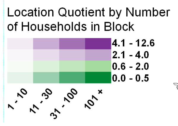
What we want in the end is a bivariate scheme, with the PFHH dimension running up and down, and the transparency dimension running from one side to the other (the same as in the example mortality rate map at the beginning of the post). To do this, one has to convert the legends to graphics.
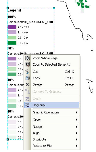
The ungroup the elements so each can be individualy manipulated. Note, sometimes I have to do this operation multiple times.
Then re-arrange the panels and labels into the desired format.
More tedious than making the seperate layers, but not crazy unreasonable if you only have to do it for one (or a small number of maps). If you need to do it for a larger number of maps a better workflow will be needed, like creating a seperate “fake inset” map that replicates the legend, making the legend in a seperate tool, or just making the map entirely in a program where alpha blending is more readily incorporated. For instance in statistical packages it is typically a readily available encoding that can be added to a graphic (they also will allow continous color ramps and continous levels of transparency).
And voila, here is the final map. To follow is some discussion about choosing color schemes and whether you should use a black background or not.

Some discussion about color schemes
The Roth et al. (2010) paper in the cartographic journal and Andy Woodruff’s blog post I cited at the beginning of this post initially talked about color schemes and utilizing a black background, but I didn’t really appreciate the complexity of this choice until I went and made a value-by-alpha map of my own. In the end I decided to use location quotients to display the data, as the bivariate color scheme provides further contrast. I feel weird using a bivariate color scheme for a continous scale (hence the conversion to location quotients), but I feel like I should get over that. Everything has its time and place, and set rules like that aren’t good for anyone but bureaucrats or the mindless.
I certainly picked a complex dataset to start with, and the benifits of the value by alpha map over the two side by side maps (if any) are slight. I suspect why mine don’t look quite as nice as the ones created by Roth, Woodruff and company are partially due to the greater amount of complexity. The map with the SatScan reliabilities I noted as one of my favorite maps is quite striking, but it is partly due to the relibaility having a very spatially contiguous pattern (although the underlying cancer mortality rate map is quite spatially heterogenous). Here the spatial regularity is much weaker, in either the pattern being mapped or the reliability thresholds I had chosen. It does produce a quite pretty map though, FWIW.
For reference, here is the same map utilizing a black background. The only thing different in this map is that the most transparent layer is now set to 80% transparency instead of 90% (it was practically invisible at 90% with black as the modifying background color). Also it was necessary to do the fake inset map for a legend I talked about earlier with black as the background color. This is because the legend generated by ArcGIS always has white as the modifying color. If you refer back to the map with white as the modifying color, you can tell this produces greater contrast among the purples (the location quotient 2.1 – 4 for fully opaque and 4.1 – 12.6 for 40% transparent with white as the modifying color appear very similar).

The Roth Cartographic journal article gives other bivariate and nominal color scheme suggestions, you should take their advice. Hopefully in the future it will be simpler to incorporate bivariate color schemes in ArcMap, as it would make the process much simpler (and hence more useful for exploratory data analysis).
I would love it if people point me to other examples in which value by alpha maps are useful. I think in theory it is a good idea, but the complexity intoduced in the map is a greater burden than I intially estimated until I made a few. I initially thought this would be useful for presenting the results of geographically weighted regression or perhaps cancer atlas maps in general (where sometimes people just filter out results below some population threshold). But maybe not given the greater complexity introduced.


Andre Levesque
/ June 30, 2014thanks for the information, it has been useful.