Updates on CRIME De-Coder and ASEBP

So I have various updates on my CRIME De-Coder consulting site, as well as new posts on the American Society of Evidence Based Policing Criminal Justician series.

CRIME De-Coder

Blog post, Don’t use percent change for crime data, use this stat instead. I have written a bunch here about using Poisson Z-scores, so if you are reading this it is probably old news. Do us all a favor and in your Compstat reports drop ridiculous percent change metrics with low baselines, and use 2 * ( sqrt(Current) - sqrt(Past) ).

Blog post, Dashboards should be up to date. I will have a more techy blog post here on my love/hate relationship with dashboards (most of the time static reports are a better solution). But one scenario they do make sense is for public facing dashboards, but they should be up to date. The “free” versions of popular tools (Tableau, PowerBI) don’t allow you to link to a source dataset and get auto-updated, so you see many old dashboards out of date online. If you contract with me, I can automate it so it is up to date and doesn’t rely on an analyst manually updating the information.

Demo page – that page currently includes demonstrations for:

The WDD Tool is pure javascript – picking up more of that slowly (the Folium map has a few javascript listener hacks to get it to look the way I want). As a reference for web development, I like Jon Duckett’s three books (HTML, javascript, PHP).

Ultimately too much stuff to learn, but on the agenda are figuring out google cloud compute + cloud databases a bit more thoroughly. Then maybe add some PHP to my CRIME De-Coder site (a nicer contact me form, auto-update sitemap, and rss feed). I also want to learn how to make ArcGIS dashboards as well.

Criminal Justician

The newest post is Situational crime prevention and offender planning – discussing one of my favorite examples of crime prevention through environmental design (on suicide prevention) and how it is a signal about offender behavior that goes beyond simplistic impulsive behavior. I then relate this back to current discussion of preventing mass shootings.

If you have ideas about potential posts for the society (or this blog or crime de-coders blog), always feel free to make a pitch

Random notes, digital art, and pairwise comparisons is polynomial

So not too much in the hopper for the blog at the moment. Have just a bunch of half-baked ideas (random python tips, maybe some crime analysis using osmnx, scraping javascript apps using selenium, normal nerd data science stuff).

Still continuing my blog series on the American Society of Evidence Based Policing, and will have a new post out next week on officer use of force.

If you have any suggestions for topics always feel free to ask me anything!


Working on some random digital art (somewhat focused on maps but not entirely). For other random suggestions I like OptArt and Rick Wicklin’s posts.

Dall-E is impressive, and since it has an explicit goal of creating artwork I think it is a neat idea. Chat bots I have nothing good to say. Computer scientists working on them seem to be under the impression that if you build a large/good enough language model out pops general intelligence. Wee bit skeptical of that.


At work a co-worker was working on timing applications for a particular graph-database/edge-detection project. Initial timings on fake data were not looking so good. Here we have number of nodes and timings for the application:

  Nodes    Minutes
   1000       0.16
  10000       0.25
 100000       1.5
1000000      51

Offhand people often speak about exponential functions (or growth), but here what I expect is we are really looking at is pairwise comparisons (not totally familiar with the tech the other data scientist is using, so I am guessing the algorithmic complexity). So this likely scales something like (where n is the number of nodes in the graph):

Time = Fixed + C1*(n) + C2*(n choose 2) + e

Fixed is just a small constant, C1 is setting up the initial node database, and C2 is the edge detection which I am guessing uses pairwise comparisons, (n choose 2). We can rewrite this to show that the binomial coefficient is really polynomial time (not exponential) in terms of just the number of nodes.

C2*[n choose 2] = C2*[{n*(n-1)}/2]
                  C2*[ (n^2 - n)/2 ]
                  C2/2*[n^2 - n]
                  C2/2*n^2 - C2/2*n

And so we can rewrite our original equation in terms of simply n:

Time = Fixed + (C1 - C2/2)*N + C2/2*N^2

Doing some simple R code, we can estimate our equation:

n <- 10^(3:6)
m <- c(0.16,0.25,1.5,51)
poly_mod <- lm(m ~ n + I(n^2))

Since this fits 3 parameters with only 4 observations, the fit is (not surprisingly) quite good. Which to be clear does not mean much, if really cared would do much more sampling (or read the docs more closely about the underlying tech involved):

> pred <- predict(poly_mod)
> cbind(n,m,pred)
      n     m       pred
1 1e+03  0.16  0.1608911
2 1e+04  0.25  0.2490109
3 1e+05  1.50  1.5000989
4 1e+06 51.00 50.9999991

And if you do instead poly_2 <- lm(m ~ n + choose(n,2)) you get a change in scale of the coefficients, but the same predictions.

We really need this to scale in our application at work to maybe over 100 million records, so what would we predict in terms of minutes based on these initial timings?

> nd = data.frame(n=10^(7:8))
> predict(poly_mod,nd)/60 # convert to hours
         1          2
  70.74835 6934.56850

So doing 10 million records will take a few days, and doing 100 million will be close to 300 days.

With only 4 observations not much to chew over (really it is too few to say it should be a different model). I am wondering though how to best handle errors for these types of extrapolations. Errors are probably not homoskedastic for such timing models (error will be larger for larger number of nodes). Maybe better to use quantile regression (and model the median?). I am not sure (and that advice I think will also apply to modeling exponential growth as well).

New working paper: Mapping attitudes towards the police at micro places

I have a new preprint posted, Mapping attitudes towards the police at micro places. This is work with Jasmine Silver, as well as Rob Worden and Sarah McLean. See the abstract:

We demonstrate the utility of mapping community satisfaction with the police at micro places using data from citizen surveys conducted in 2001, 2009 and 2014 in one city. In each survey, respondents provided the nearest intersection to their address. We use inverse distance weighting to map a smooth surface of satisfaction with police over the entire city, which shows broader neighborhood patterns of satisfaction as well as small area hot spots of dissatisfaction. Our results show that hot spots of dissatisfaction with police do not conform to census tract boundaries, but rather align closely with hot spots of crime and police activity. Models predicting satisfaction with police show that local counts of violent crime are the strongest predictors of attitudes towards police, even above individual level predictors of race and age.

In this article we make what are analogs of hot spot maps of crime, but measure dissatisfaction with the police.


One of the interesting findings is that these hot spots do not align nicely with census tracts (the tracts are generalized, we cannot divulge the location of the city). So the areas identified by each procedure would be much different.


As always, feel free to comment or send me an email if you have feedback on the article.

Creating an animated heatmap in Excel

I’ve been getting emails recently about the online Carto service not continuing their free use model. I’ve previously used this service to create animated maps heatmaps over time, in particular a heatmap of reported meth labs over time. That map still currently works, but I’m not sure how long it will though. But the functionality can be replicated in recent versions of Excel, so I will do a quick walkthrough of how to make an animated map. The csv to follow along with, as well as the final produced excel file, you can down download from this link.

I split the tutorial into two parts. Part 1 is prepping the data so the Excel 3d Map will accept the data. The second is making the map pretty.

Prepping the Data

The first part before we can make the map in Excel are:

  1. eliminate rows with missing dates
  2. turn the data into a table
  3. explicitly set the date column to a date format
  4. save as an excel file

We need to do those four steps before we can worry about the mapping part. (It took me forever to figure out it did not like missing data in the time field!)

So first after you have downloaded that data, double click to open the Geocoded_MethLabs.csv file in word. Once that sheet is open select the G column, and then sort Oldest to Newest.

It will give you a pop-up to Expand the selection – keep that default checked and click the Sort button.

After that scroll down to the current bottom of the spreadsheet. There are around 30+ records in this dataset that have missing dates. Go ahead and select the row labels on the left, which highlights the whole row. Once you have done that, right click and then select Delete. Again you need to eliminate those missing records for the map to accept the time field.

After you have done that, select the bottom right most cell, L26260, then scroll back up to the top of the worksheet, hold shift, and select cell A1 (this should highlight all of the cells in the sheet that contain data). After that, select the Insert tab, and then select the Table button.

In the pop-up you can keep the default that the table has headers checked. If you lost the selection range in the prior step, you can simply enter it in as =$A$1:$;$26260.

After that is done you should have a nice blue formatted table. Select the G column, and then right click and select Format Cells.

Change that date column to a specific date format, here I just choose the MM/DD/YY format, but it does not matter. Excel just needs to know it represents a date field.

Finally, you need to save the file as an excel file before we can make the maps. To do this, click File in the top left header menu’s, and then select Save As. Choose where you want to save the file, and then in the Save as Type dropdown in the bottom of the dialog select xlsx.

Now the data is all prepped to create the map.

Making an Animated Map

Now in this part we basically just do a set of several steps to make our map recognize the correct data and then make the map look nice.

With the prior data all prepped, you should be able to now select the 3d Map option that you can access via the Insert menu (just to the right of where the Excel charts are).

Once you click that, you should get a map opened up that looks like mine below.

Here it actually geocoded the points based on the address (very fast as well). So if you only have address data you can still create some maps. Here I want to change the data though so it uses my Lat/Lon coordinates. In the little table on the far right side, under Layer 1, I deleted all of the fields except for Lat by clicking the large to their right (see the X circled in the screenshot below). Then I selected the + Add Field option, and then selected my Lng field.

After you select that you can select the dropdown just to the right of the field and set it is Longitude. Next navigate down slightly to the Time option, and there select the DATE field.

Now here I want to make a chart similar to the Carto graph that is of the density, so in the top of the layer column I select the blog looking thing (see its drawn outline). And then you will get various options like the below screenshot. Adjust these to your liking, but for this I made the radius of influence a bit larger, and made the opacity not 100%, but slightly transparent at 80%.

Next up is setting the color of the heatmap. The default color scale uses the typical rainbow, which should be avoided for multiple reasons, one of which is color-blindness. So in the dropdown for colors select Custom, and then you will get the option to create your own color ramp. If you click on one of the color swatches you will then get options to specify the color in a myriad of ways.

Here I use the multi-hue pink-purple color scheme via ColorBrewer with just three steps. You can see in the above screenshot I set the lowest pink step via the RGB colors (which you can find on the color brewer site.) Below is what my color ramp looks like in the end.

Next part we want to set the style of the map. I like the monotone backgrounds, as it makes the animated kernel density pop out much more (see also my blog post, When should we use a black background for a map). It is easy to experiement with all of these different settings though and see which ones you like more for your data.

Next I am going to change the format of the time notation in the top right of the map. Left click to select the box around the time part, and then right click and select Edit.

Here I change to the simpler Month/Year. Depending on how fast the animation runs, you may just want to change it to year. But you can leave it more detailed if you are manually dragging the time slider to look for trends.

Finally, the current default is to show all of the data permanently. There are examples where you may want to do that (see the famous example by Nathan Yau mapping the growth of Wal Mart), but here we do not want that. So navigate back to the Layer options on the right hand side, and in the little tiny clock above the Time field select the dropdown, and change it to Data shows for an instant.

Finally I select the little cog in the bottom of the map window to change the time options. Here I set the animation to run longer at 30 seconds. I also set the transition duration to slightly longer at 5 seconds. (Think of the KDE as a moving window in time.)

After that you are done! You can zoom in the map, set the slider to run (or manually run it forward/backward). Finally you can export the map to an animated file to share or use in presentations if you want. To do that click the Create Video option in the toolbar in the top left.

Here is my exported video


Now go make some cool maps!

Communities and Crime

This was my first semester teaching undergrads at UT Dallas. I taught the Communities and Crime undergrad course. I thought it went very well, and I was impressed with the undergrads here. For the course I had students do a bunch of different prediction assignments based on open data in Dallas, such as predicting what neighborhood has the most crime, or which specific bar has the most assaults. The idea being they would use the theories I discussed in the prior lecture to make the best predictions.

For their final assignment, I had students predict an arbitrary area to capture the most robberies in 2016 (up to that point they had only been predicting crimes in 2015). I used the same metric that NIJ is using in their crime forecasting challenge – the predictive accuracy index. This is simply % crime/% area, so students who give larger areas are more penalized. This ended up producing a pretty neat capstone to the end of the semester.

Below is a screen shot of the map, and here is a link to an interactive version. (WordPress.com sites only allow specific types of iframe sources, so my dropbox src link to the interactive Leaflet map gets stripped.)

Look forward to teaching this class again (as of now it seems I will regularly offer it every spring).

More news on classes to come soon. I am teaching GIS applications in Criminology online over the summer. For a quick idea about the content, it will be almost the same as the GIS course in criminal justice I previously taught at SUNY.

In short, if you think maps rock then you should take my classes 😉

Scraping Meth Labs with Python

For awhile in my GIS courses I have pointed to the DEA’s website that has a list of busted meth labs across the county, named the National Clandestine Laboratory Register. Finally a student has shown some interest in this, and so I spent alittle time writing a scraper in Python to grab the data. For those who would just like the data, here I have a csv file of the scraped labs that are geocoded to the city level. And here is the entire SPSS and Python script to go from the original PDF data to the finished product.

So first off, if you visit the DEA website, you will see that each state has its own PDF file (for example here is Texas) that lists all of the registered labs, with the county, city, street address, and date. To turn this into usable data, I am going to do three steps in Python:

  1. download the PDF file to my local machine using urllib python library
  2. convert that PDF to an xml file using the pdftohtml command line utility
  3. use Beautifulsoup to parse the xml file

I will illustrate each in turn and then provide the entire Python script at the end of the post.

So first, lets import the libraries we need, and also note I downloaded the pdftohtml utility and placed that location as a system path on my Windows machine. Then we need to set a folder where we will download the files to on our local machine. Finally I create the base url for our meth labs.

from bs4 import BeautifulSoup
import urllib, os

myfolder = r'C:\Users\axw161530\Dropbox\Documents\BLOG\Scrape_Methlabs\PDFs' #local folder to download stuff
base_url = r'https://www.dea.gov/clan-lab' #online site with PDFs for meth lab seizures

Now to just download the Texas pdf file to our local machine we would simply do:

a = 'tx'
url = base_url + r'/' + a + '.pdf'
file_loc = os.path.join(myfolder,a)
urllib.urlretrieve(url,file_loc + '.pdf')

If you are following along and replaced the path in myfolder with a folder on your personal machine, you should now see the Texas PDF downloaded in that folder. Now I am going to use the command line to turn this PDF into an xml document using the os.system() function.

#Turn to xml with pdftohtml, does not need xml on end
cmd = 'pdftohtml -xml ' + file_loc + ".pdf " + file_loc
os.system(cmd)

You should now see that there is an xml document to go along with the Texas file. You can check out its format using a text editor (wordpress does not seem to like me showing it here).

So basically we can use the top and the left attributes within the xml to identify what row and what column the items are in. But first, we need to read in this xml and turn it into a BeautifulSoup object.

MyFeed = open(file_loc + '.xml')
textFeed = MyFeed.read()
FeedParse = BeautifulSoup(textFeed,'xml')
MyFeed.close()

Now the FeedParse item is a BeautifulSoup object that you can query. In a nutshell, we have a top level page tag, and then within that you have a bunch of text tags. Here is the function I wrote to extract that data and dump it into tuples.

#Function to parse the xml and return the line by line data I want
def ParseXML(soup_xml,state):
    data_parse = []
    page_count = 1
    pgs = soup_xml.find_all('page')
    for i in pgs:
        txt = i.find_all('text')
        order = 1
        for j in txt:
            value = j.get_text() #text
            top = j['top']
            left = j['left']
            dat_tup = (state,page_count,order,top,left,value)
            data_parse.append(dat_tup)
            order += 1
        page_count += 1
    return data_parse

So with our Texas data, we could call ParseXML(soup_xml=FeedParse,state=a) and it will return all of the data nested in those text tags. We can just put these all together and loop over all of the states to get all of the data. Since the PDFs are not that large it works quite fast, under 3 minutes on my last run.

from bs4 import BeautifulSoup
import urllib, os

myfolder = r'C:\Users\axw161530\Dropbox\Documents\BLOG\Scrape_Methlabs\PDFs' #local folder to download stuff
base_url = r'https://www.dea.gov/clan-lab' #online site with PDFs for meth lab seizures
                                           #see https://www.dea.gov/clan-lab/clan-lab.shtml
state_ab = ['al','ak','az','ar','ca','co','ct','de','fl','ga','guam','hi','id','il','in','ia','ks',
            'ky','la','me','md','ma','mi','mn','ms','mo','mt','ne','nv','nh','nj','nm','ny','nc','nd',
            'oh','ok','or','pa','ri','sc','sd','tn','tx','ut','vt','va','wa','wv','wi','wy','wdc']
            
state_name = ['Alabama','Alaska','Arizona','Arkansas','California','Colorado','Connecticut','Delaware','Florida','Georgia','Guam','Hawaii','Idaho','Illinois','Indiana','Iowa','Kansas',
              'Kentucky','Louisiana','Maine','Maryland','Massachusetts','Michigan','Minnesota','Mississippi','Missouri','Montana','Nebraska','Nevada','New Hampshire','New Jersey',
              'New Mexico','New York','North Carolina','North Dakota','Ohio','Oklahoma','Oregon','Pennsylvania','Rhode Island','South Carolina','South Dakota','Tennessee','Texas',
              'Utah','Vermont','Virginia','Washington','West Virginia','Wisconsin','Wyoming','Washington DC']

all_data = [] #this is the list that the tuple data will be stashed in

#Function to parse the xml and return the line by line data I want
def ParseXML(soup_xml,state):
    data_parse = []
    page_count = 1
    pgs = soup_xml.find_all('page')
    for i in pgs:
        txt = i.find_all('text')
        order = 1
        for j in txt:
            value = j.get_text() #text
            top = j['top']
            left = j['left']
            dat_tup = (state,page_count,order,top,left,value)
            data_parse.append(dat_tup)
            order += 1
        page_count += 1
    return data_parse

#This loops over the pdfs, downloads them, turns them to xml via pdftohtml command line tool
#Then extracts the data

for a,b in zip(state_ab,state_name):
    #Download pdf
    url = base_url + r'/' + a + '.pdf'
    file_loc = os.path.join(myfolder,a)
    urllib.urlretrieve(url,file_loc + '.pdf')
    #Turn to xml with pdftohtml, does not need xml on end
    cmd = 'pdftohtml -xml ' + file_loc + ".pdf " + file_loc
    os.system(cmd)
    #parse with BeautifulSoup
    MyFeed = open(file_loc + '.xml')
    textFeed = MyFeed.read()
    FeedParse = BeautifulSoup(textFeed,'xml')
    MyFeed.close()
    #Extract the data elements
    state_data = ParseXML(soup_xml=FeedParse,state=b)
    all_data = all_data + state_data

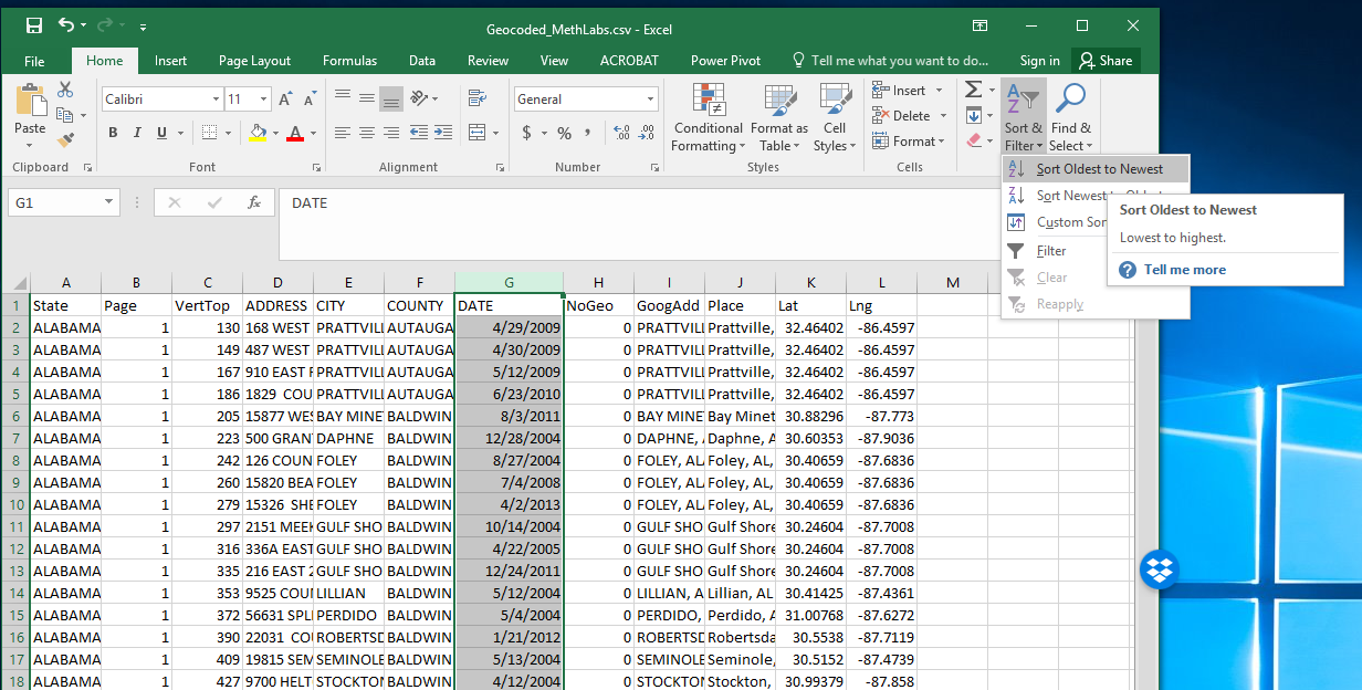
Now to go from those sets of tuples to actually formatted data takes a bit of more work, and I used SPSS for that. See here for the full set of scripts used to download, parse and clean up the data. Basically it is alittle more complicated than just going from long to wide using the top marker for the data as some rows are off slightly. Also there is complications for long addresses being split across two lines. And finally there are just some data errors and fields being merged together. So that SPSS code solves a bunch of that. Also that includes scripts to geocode the to the city level using the Google geocoding API.

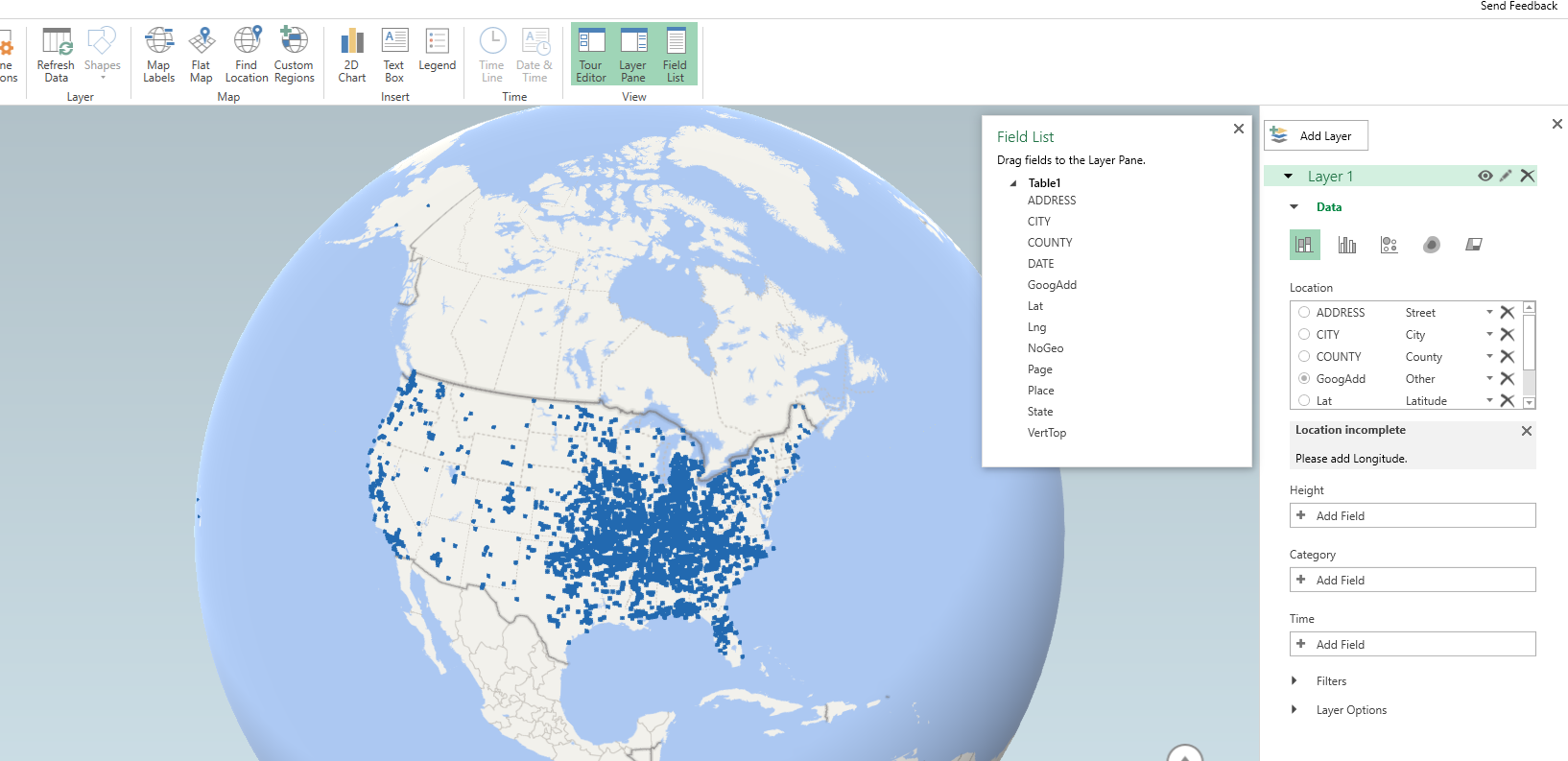
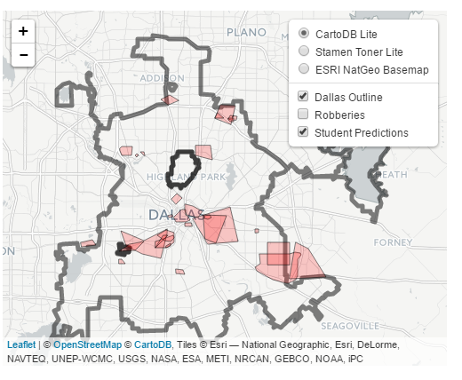
Let me know if you do any analysis of this data! I quickly made a time series map of these events via CartoDB. You can definately see some interesting patterns of DEA concentration over time, although I can’t say if that is due to them focusing on particular areas or if they are really the areas with the most prevalent Meth lab problems.

Spatial join points to polygons using Python and SPSS

A recent use case of mine I had around 60 million points that I wanted to assign to census block groups. ArcGIS was being problematic to simply load in the 60 million point dataset (let alone spatial join it), so I wrote some python code and will show using python and SPSS how to accomplish this.

First, a shout out to Rex Douglass and this blog post, I’ve adapted most of the python code here from that example. Also before we get started, it will be necessary to download several geospatial libraries for python. Here you need shapely, pyshp, and rtree. As a note, I have only been able to get these to install and work using the IOOS channel for Anaconda, e.g. conda install -c ioos shapely rtree pyshp. (I have not been able to get fiona to work.)

The Python Part

So I will go through a quick rundown of the python code first. All of the data and code to run this yourself can be downloaded here. To start, I import all of the necessary libraries and functions.

import shapefile
from rtree import index
from shapely.geometry import Polygon, Point

The next step is to read in the polygon shapefile that we want to assign points to. Note you could swap this part out with fiona (if you can get it working!), but I just use the pyshp function shapefile.Reader. Note you need to change the data string to point to where the shapefile containing your polygons is located on your local machine.

#load in the shapefile of block groups
data = r'C:\Users\axw161530\Dropbox\Documents\BLOG\Point_inPoly_PythonSPSS'
bg_NYC = shapefile.Reader(data + r'\NYC_BG14_Proj.shp')

In my data these are block groups for New York city, and they are projected into feet using a local projection. (As an FYI, you can open up the “prj” file for shapefiles in a plain text editor to see the projection.) Now, the shapefile object, bg_NYC here, has several iterables that you can access either the geometries or the records available. First we need to get those individual polygons and stuff into a list, and then convert into a Polygon object shapely can deal with.

bg_shapes = bg_NYC.shapes()  #get the iterable for the polygon boundary points
bg_points = [q.points for q in bg_shapes] #convert to list of geometry
polygons = [Polygon(q) for q in bg_points] #convert to a shapely Polygon

Next I am going to do two things. First to make a vector that matches those Polygons to a particular id, I need to read in the data attributes from the shapefile. This is accomplished via the .records() attribute. For US census geometries they have what is oft labeled a GEOID. In this example shapefile the GEOID ends up being in the second variable slot. The second thing I accomplish here is I build an rtree lookup. The motivation for this is, when we do a point in polygon check, it can be an expensive procedure the more polygons you have. You can first limit the number of potential polygons to check though by only checking whether a point falls within the bounding box of a polygon, and then do the more expensive operation on the actual (more complicated) boundary of the polygon.

#build spatial index from bounding boxes
#also has a second vector associating area IDs to numeric id
bg_records = bg_NYC.records() #bg_records[0][1] is the geoid
idx = index.Index() #creating an rtree
c_id = 0
area_match = []
for a,b in zip(bg_shapes,bg_records):
    area_match.append(b[1])
    idx.insert(c_id,a.bbox,obj=b[1])
    c_id += 1

Now we have all the necessary ingredients to make a function that inputs one X,Y point, and then returns a GEOID. First, the function turns the input X,Y points into a Point object shapely can work with. Second, it does the bounding box lookup I mentioned earlier, using the idx rtree that is available in the global environment. Third, it loops over those resulting polygons that intersected the bounding box, and checks to see if the point is within that polygon using the shapely operation point.within(polygon). If that is true, it returns the associated GEOID, and if none are found it returns None. Again, the objects in this function idx, polygons, and area_match are taken from the global environment. A few additional notes: it will return the first point in polygon found, so if you have overlapping polygons this will simply return the first, not necessarily all of them. That is not the case with our census polygons here though. Second, the functionality here is for a point on the exact border between two polygons to return False.

#now can define function with polygons, area_match, and idx as globals
def assign_area(x,y):
    point = Point(x,y)
    for i in idx.intersection((x,y,x,y)): 
        if point.within(polygons[i]):
            return area_match[i]
    return None
#note points on the borders will return None

To test this function I have a set of points in New York for this particular projection already associated with a GEOID.

#now testing
test_vec = [(1003610, 239685, '360050063002'),
            (1006787, 240666, '360050183022'),
            ( 993580, 219484, '360610122001'),
            ( 986385, 214971, '360610115001'),
            ( 947148, 167688, '360850201001'),
            (      0,      0, 'Miss')]

for a,b,c in test_vec:
    print [assign_area(x=a,y=b),c]

And this should subsequently print out at your console:

['360050063002', '360050063002']
['360050183022', '360050183022']
['360610122001', '360610122001']
['360610115001', '360610115001']
['360850201001', '360850201001']
[None, 'Miss']

For those wishing to do this in vectorized in python, check out the GeoPanda’s functionality. But here I let it churn out one by one by using SPSS.

The SPSS Part

So once the above function is defined in your SPSS environment, we can simply use SPSSINC TRANS to assign XY data to a block group. Here is a quick example. First we read in some data, this is the homicide data from the New York times discussed here. It has the points projected in the same feet as the polygons were.

*Conducting point in polygon tests with Python and SPSS.
FILE HANDLE data /NAME = "C:\Users\axw161530\Dropbox\Documents\BLOG\Point_inPoly_PythonSPSS".
*Read in the NYC homicide data.
GET TRANSLATE FILE='data\HomPoints_JoinBG.dbf' /TYPE=DBF /MAP .
DATASET NAME HomData.

Now I am going to use the SPSS command SHOW to display the current date and time, (so you can see how long the operation takes). This dataset has 4,021 cases of homicide, and the set of polygons we are matching to has around 6,500 block groups. The time the operation takes depends on both, but the rtree search should make the number of polygons not as big a deal as simply looping through all of them. Second, I use SPSSINC TRANS to call the python function we previously constructed. Third, this dataset already has the GEOID matched to the points (via ArcGIS), so I check to make sure I get the same results as ArcGIS. In this example there are quite a few points that ArcGIS failed to return a match for, but this operation does. (It would take more investigation on my part though as to why that is the case.)

*Use this to show timing.
SHOW $VAR.

*Now using SPSSINC TRANS to assign geoid.
SPSSINC TRANS RESULT=GeoID2 TYPE=12
  /FORMULA "assign_area(x=XFt,y=YFt)".

SHOW $VARS.
*Check that the operations are all correct (as compared to ArcGIS)
COMPUTE Check = (GEOID = GEOID2).
FREQ Check.

This example runs almost instantly. For some tests with my bigger dataset of 60 million, matching half a million points to this set of polygons took around 12 minutes.

To End

Again, all of the data and code to run this at once can be downloaded here. I will need to make a blog post at some point of using pyproj to project point data in SPSS as well, such as to go to and from Lat-Lon to a local projection. You probably always want to do geometric operations like this and buffers with projected data, but you may get the data in Lat-Lon or want to export data in Lat-Lon to use online maps.

For those working with crime data, I oft complain that crime is frequently on the borders of census geographies. But due to slight differences in resolution, most GIS systems will still assign crime points to census geographies. I’m not sure if it is a big problem for much analysis in our field, but the proportion on the border is clearly quite large in some instances. For things that can occur often outdoors, like robberies and field stops, the proportion is even higher because crime is often recorded at intersections (I have estimates for the percentage of crimes at intersections for 14 years in Albany in this paper). So the problem depends on the crime type or nature of the incident (traffic stops are almost always listed at intersections), but I have seen analysis I would bet over 50% of the incidents are on the border of census blocks and/or block groups.

A general way to check this in GIS is to turn your polygon data into lines, and then assign points to the nearest line and check the distance. You will see many points that are very close to the border (say within 5 meters) that really should be undetermined.

Some inverse distance weighting hacks – using R and spatstat

For a recent project I was mapping survey responses to attitudes towards the police, and I wanted to make a map of those responses. The typical default to accomplish this is inverse distance weighting. For those familiar with hot spot maps of crime, this is similar in that is produces a smooth isarithmic map, but instead of being a density it predicts values. For my project I wanted to explore two different things; 1) estimating the variance of the IDW estimate, and 2) explore different weighting schemes besides the default inverse distance. The R code for my functions and data for analysis can be downloaded here.


What is inverse distance weighting?

Since this isn’t typical fodder for social scientists, I will present a simple example to illustrate.

Imagine you are a farmer and want to know where to plant corn vs. soy beans, and are using the nitrogen content of the soil to determine that. You take various samples from a field and measure the nitrogen content, but you want predictions for the areas you did not sample. So say we have four measures at various points in the field.

Nit     X   Y
1.2     0   0
2.1     0   5
2.6    10   2
1.5     6   5

From this lets say we want to estimate average nitrogen content at the center, 5 and 5. Inverse distance weighting is just as the name says, the weight to estimate the average nitrogen content at the center is based on the distance between the sample point and the center. Most often people use the distance squared as the weight. So from this we have as the weights.

Nit     X   Y Weight
1.2     0   0   1/50
2.1     0   5   1/25
2.6    10   2   1/34
1.5     6   5   1/ 1

You can see the last row is the closest point, so gets the largest weight. The weighted average of nitrogen for the 5,5 point ends up being ~1.55.

For inverse distance weighted maps, one then makes a series of weighted estimates at a regular grid over the study space. So not just an estimate at 5,5, but also 5,4|5,3|5,2 etc. And then you have a regular grid of values you can plot.


Example – Street Clean Scores in LA

An ok example to demonstrate this is an LA database rating streets based on their cleanliness. Some might quibble about it only makes sense to estimate street cleanliness values on streets, but I think it is ok for exploratory data analysis. Just visualizing the streets is very hard given their small width and irregularity.

So to follow along, first I load all the libraries I will be using, then set my working directory, and finally import my updated inverse distance weighted hacked functions I will be using.

library(spatstat)
library(inline)
library(rgdal)
library(maptools)
library(ncf)

MyDir <- "C:\\Users\\axw161530\\Dropbox\\Documents\\BLOG\\IDW_Variance_Bisquare\\ExampleAnalysis"
setwd(MyDir)

#My updated idw functions
source("IDW_Var_Functions.R")

Next we need to create an point pattern object spatstat can work with, so we import our street scores that contain an X and Y coordinate for the midpoint of the street segment, as well as the boundary of the city of Los Angeles. Then we can create a marked point pattern. For reference, the street scores can range from 0 (clean) to a max of 3 (dirty).

CleanStreets <- read.csv("StreetScores.csv",header=TRUE)
summary(CleanStreets)
BorderLA <- readOGR("CityBoundary.shp", layer="CityBoundary")

#create Spatstat object and window
LA_Win <- as.owin(BorderLA)
LA_StreetPP <- ppp(CleanStreets$XMidPoint,CleanStreets$YMidPoint, window=LA_Win, marks=CleanStreets$StreetScor)

Now we can estimate a smooth inverse distance weighted map by calling my new function, idw2. This returns both the original weighted mean (equivalent to the original spatstat idw argument), but also returns the variance. Here I plot them side by side (see the end of the blog post on how I calculate the variance). The weighted mean is on the left, and the variance estimate is on the right. For the functions the rat image is the weighted mean, and the var image is the weighted variance.

#Typical inverse distance weighted estimate
idw_res <- idw2(LA_StreetPP) #only takes a minute
par(mfrow=c(1,2))
plot(idw_res$rat) #this is the weighted mean
plot(idw_res$var) #this is the weighted variance

So contrary to expectations, this does not provide a very smooth map. It is quite rough. This is partially because social science data is not going to be as regular as natural science measurements. In spatial stats jargon street to street measures will have a large nugget – a clean street can be right next to a dirty one.

Here the default is using inverse distance squared – what if we just use inverse distance though?

#Inverse distance (linear)
idw_Lin <- idw2(LA_StreetPP, power=1)
plot(idw_Lin$rat)
plot(idw_Lin$var)

This is smoothed out a little more. There is essentially one dirty spot in the central eastern part of the city (I don’t know anything about LA neighborhoods). Compared to the first set of maps, the dirty streets in the northern mass of the city are basically entirely smoothed out, whereas before you could at least see little spikes.

So I was wondering if there could maybe be better weights we could choose to smooth out the data a little better. One I have used in a few recent projects is the bisquare kernel, which I was introduced by the geographically weighted regression folks. The bisquare kernel weight equals [1 - (d/b)^2]^2, when d < b and zero otherwise. Here d is the distance, and b is a user chosen distance threshold. We can make a plot to illustrate the difference in weight functions, here using a bisquare kernel distance of 2000 meters.

#example weight functions over 3000 meters
dist <- 1:3000
idw1 <- 1/dist
idw2 <- 1/(dist^2)
b <- 2000
bisq <- ifelse(dist < b, ( 1 - (dist/b)^2 )^2, 0)
plot(dist,idw1,type='l')
lines(dist,idw2,col='red')
lines(dist,bisq,col='blue')

Here you can see both of the inverse distance weighted lines trail to zero almost immediately, whereas the bisquare kernel trails off much more slowly. So lets check out our maps using a bisquare kernel with the distance threshold set to 2000 meters. The biSqW function is equivalent to the original spatstat idw function, but uses the bisquare kernel and returns the variance estimate as well. You just need to pass it a distance threshold for the b_dist parameter.

#BiSquare weighting, 2000 meter distance
LA_bS_w <- biSqW(LA_StreetPP, b_dist=2000)
plot(LA_bS_w$rat)
plot(LA_bS_w$var)

Here we get a map that looks more like a typical hot spot kernel density map. We can see some of the broader trends in the northern part of the city, and even see a really dirty hot spot I did not previously notice in the northeastern peninsula.

The 2,000 meter distance threshold was just ad-hoc though. How large or small should it be? A quick check of the spatial correlogram is one way to make it slightly more objective. Here I use the correlog function in the ncf package to estimate this. I subsample the data first (I presume it has a call to dist somewhere).

#correleogram, random sample, it is too big
subSamp <- CleanStreets[sample(nrow(CleanStreets), 3000), ]
fit <- correlog(x=subSamp$XMidPoint,y=subSamp$YMidPoint,z=subSamp$StreetScor, increment=100, resamp=0, quiet=TRUE)
plot(fit)

Here we can see points very nearby each other have a correlation of 0.2, and then this trails off into zero before 20 kilometers (the distances here are in meters). FYI the rising back up in correlation for very large distances often occurs for data that have broader spatial trends.

So lets try out a bisquare kernel with a distance threshold of 10 kilometers.

#BiSquare weighting, 10000 meter distance
LA_bS_w <- biSqW(LA_StreetPP, b_dist=10000)
plot(LA_bS_w$rat)
plot(LA_bS_w$var)

That is now a bit oversmoothed. But it allows a nicer range of potential values, as oppossed to simply sticking with the inverse distance weighting.


A few notes on the variance of IDW

So I hacked the idw function in the spatstat package to return the variance of the estimate as well as the actual weighted mean. This involved going into the C function, so I use the inline package to create my own version. Ditto for creating the maps using the bisquare weights instead of inverse distance weighting. To quick see those functions here is the R code.

Given some harassment on Crossvalidated by Mark Stone, I also updated the algorithm to be a more numerically safe one, both for the weighted mean and the weighted variance. Note though that that Wikipedia article has a special definition for the variance. The correct Bessel correction for weighted data though (in this case) is the sum of the weights (V1) minus the sum of square of the weights (V2) divided by V1. Here I just divide by V1, but that could easily be changed (not sure if in the sum of squares I need to worry about underflow). I.e. change the line MAT(var, ix, iy, Ny) = m2 / sumw; to MAT(var, ix, iy, Ny) = m2 / (sumw - sumw/sumw2); in the various C calls.

Someone should also probably write in a check to prevent distances of zero. Maybe by capping the weights to never be above a certain value, although that is not trivial what the default top value should be. (If you have data on the unit square weights above 1 would occur quite regularly, but for a large city like this projected in meters capping the weight at 1 would be fine.)

In general these variance maps did not behave like I expected them to, either with this or other data. When using Bessel’s correction they tended to look even weirder. So I would need to explore some more before I go and recommend them. Probably should not waste more time on this though, and just fit an actual kriging model though to produce the standard error of the estimates.

Neighborhoods in Albany according to Google

One of the most vexing aspects of spatial analysis in the social sciences in the concept of neighborhoods. There is a large literature on neighborhood effects in criminology, but no one can really define a neighborhood. For analysis they are most often assumed to approximately conform to census areas (like tracts or blocks). Sometimes there are obvious physical features that divide neighborhoods (most often a major roadway), but more often boundaries are fuzzy.

I’ve worked on several surveys (at the Finn Institute) in which we ask people what neighborhood they live in as well as the nearest intersection to their home. Even where there is a clear border, often people say the “wrong” neighborhood, especially near the borders. IIRC, when I calculated the wrongness for one survey in Syracuse we did it was only around 60% of the time the respondents stated they lived the right neighborhood. I do scare quotes around “wrong” because it is obviously arbitrary where people draw the boundaries, so more people saying the wrong neighborhood is indicative of the borders being misaligned than the respondents being wrong.

For this reason I like the Google maps approach in which they just place a label at the approximate center of noteworthy neighborhoods. I emulated this for a recent background map I made for a paper in Albany. (Maps can be opened in a separate tab to see a larger image.)

As background I did not grow up in Albany, but I’ve lived and worked in the Capital District since I came up to Albany for grad school – since 2008. Considering this and the fact that I make maps of Albany on a regular basis is my defense I have a reasonable background to make such judgements.

When looking at Google’s reverse geocoding API the other day I noticed they returned a neighborhood field in the response. So I created a regular sampling grid over Albany to see what they return. First, lets see my grid and where Google actually decides some neighborhood exists. Large grey circles are null, and small red circles some neighborhood label was returned. I have no idea where Google culls such neighborhood labels from.

See my python code at the end of the post to see how I extracted this info. given an input lat-lng. In the reverse geo api they return multiple addresses – but I only examine the first returned address and look for a neighborhood. (So I could have missed some neighborhoods this way – it would take more investigation.)

Given the input fishnet I then dissolved the neighborhood labels into areas. Google has quite a few more specific neighborhoods than me.

I’ve never really made much of a distinction between West Hill and Arbor Hill – although the split is clearly at Henry Johnson. Also I tend to view Pine Hill as the triangle between Western and Central before the State campus – but Google and others seem to disagree with me. What I call the Pinebush Google calls the Dunes. Dunes is appropriate, because it actually has sand dunes, but I can’t recall anyone referring to it as that. Trees are pretty hard to come by in Arbor Hill though, so don’t be misled. Also kill is Dutch for creek, so you don’t have to worry that Normanskill is such a bad place (even if your name is Norman).

For a third opinion, see albany.com

You can see more clearly in this map how Pine Hill’s area goes south of Madison. Google maps has a fun feature showing related maps, and so they show a related map on someones take for where law students should or should not get an apartment. In that map you can see that south of Madison is affectionately referred to as the student ghetto. That comports with my opinion as well, although I did not think putting student ghetto was appropriate for my basemap for a journal article!

People can’t seem to help but shade Arbor Hill in red. Which sometimes may be innocent – if red is the first color used in defaults (as Arbor Hill will be the first neighborhood in an alphabetic list). But presumably the law student making the apartment suggestions map should know better.

In short, it would be convenient for me (as a researcher) if everyone could agree with what a neighborhood is and where its borders are, but that is not reality.


Here is the function in Python to grab the neighborhood via the google reverse geocoding API. Here if it returns anything it grabs the first address returned and searches for the neighborhood in the json. If it does not find a neighborhood it returns None.

#Reverse geocoding and looking up neighborhoods
import urllib, json

def GoogRevGeo(lat,lng,api=""):
  base = r"https://maps.googleapis.com/maps/api/geocode/json?"
  GeoUrl = base + "latlng=" + str(lat) + "," + str(lng) + "&key=" + api
  response = urllib.urlopen(GeoUrl)
  jsonRaw = response.read()
  jsonData = json.loads(jsonRaw)
  neigh = None
  if jsonData['status'] == 'OK':
    for i in jsonData['results'][0]['address_components']:
      if i['types'][0] == 'neighborhood':
        neigh = i['long_name']
        break
  return neigh

The spatial consistency of bar locations – Buffalo 1901 vs. 2015

Part of my work I’m interested in the correlates of crime at very small places, particularly aspects of the built environment. Part of the difficulty of this work though is that some aspects of the built environment change very slowly. I often just anecdotally give bars as an example – when a bar goes under it often just gets replaced by another bar. So for example if I want to make an estimate of how much crime would decrease if you took a bar away, it is difficult looking at historical data because most of the time when a bar goes away it is just replaced by another in a short time span.

But admittedly this perception was just based on my anecdotal experiences. So when I saw some historical maps John Krygier posted of saloons I wanted to put a pretty strict test to my assertion. Here is a map of saloons in Buffalo (circa 1901 on John’s website):

I grabbed the current locations of places licensed to sell alcohol in New York State via the open data portal and geocoded those in Buffalo. (This includes things like grocery stores as well as bars.) I did a mediocre job trying to digitize the old map (here is the digitized image), and here we can see the overlap between the current and the historical locations. Zoom into the area with the blue icons to see the historical locations.

So we can see that my baseline of bars not changing is not accurate for this for this extreme comparison. If you zoom out you can see that there is a higher concentration of bars just to the west, so I wonder if over time there was a shift of these bar locations.

John has some more examples of historical saloon maps in Baltimore plus San Francisco and New York City (in the same post with Buffalo). I’d be interested to see those locations as well if someone takes the time to replicate this.

I may have to think more seriously about evaluating the effect of bars over time, and seeing if things like bars losing their licenses because of violations result in crime decreases.