
I’ve been getting emails recently about the online Carto service not continuing their free use model. I’ve previously used this service to create animated maps heatmaps over time, in particular a heatmap of reported meth labs over time. That map still currently works, but I’m not sure how long it will though. But the functionality can be replicated in recent versions of Excel, so I will do a quick walkthrough of how to make an animated map. The csv to follow along with, as well as the final produced excel file, you can down download from this link.
I split the tutorial into two parts. Part 1 is prepping the data so the Excel 3d Map will accept the data. The second is making the map pretty.
Prepping the Data
The first part before we can make the map in Excel are:
- eliminate rows with missing dates
- turn the data into a table
- explicitly set the date column to a date format
- save as an excel file
We need to do those four steps before we can worry about the mapping part. (It took me forever to figure out it did not like missing data in the time field!)
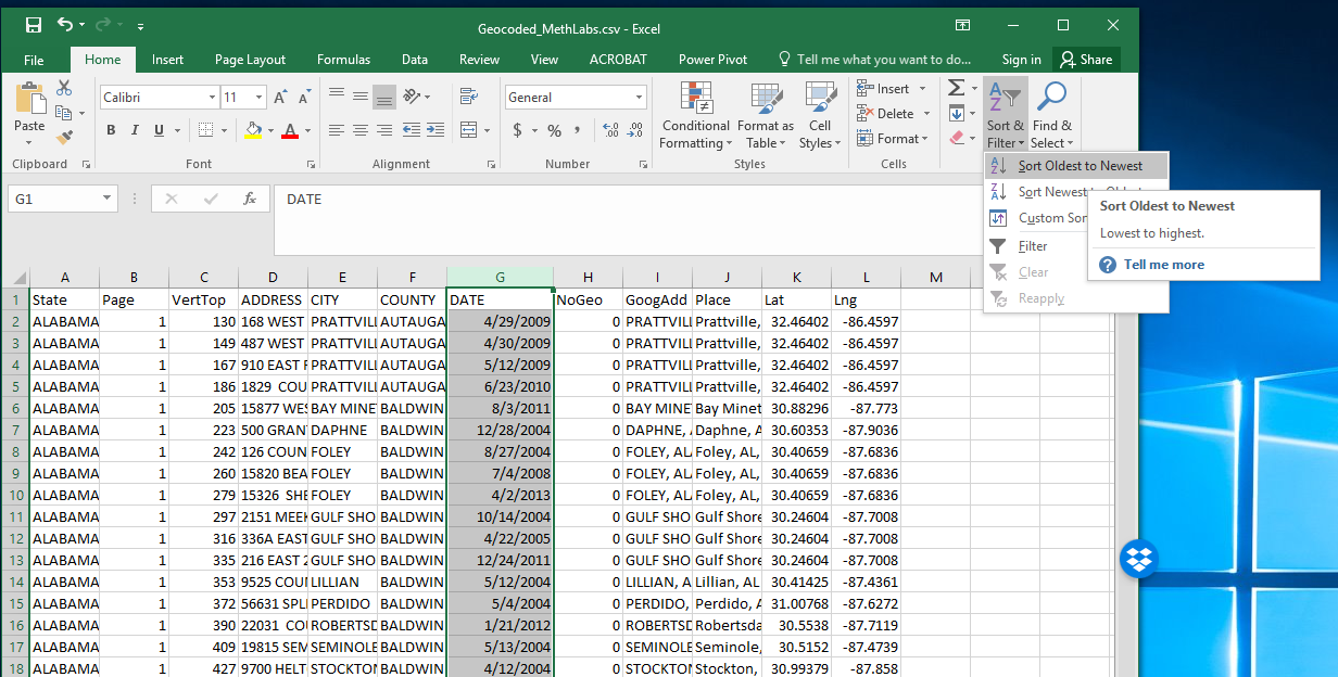
So first after you have downloaded that data, double click to open the Geocoded_MethLabs.csv file in word. Once that sheet is open select the G column, and then sort Oldest to Newest.
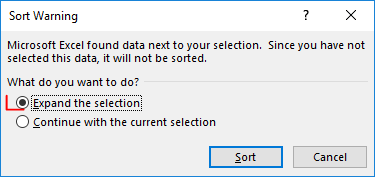
It will give you a pop-up to Expand the selection – keep that default checked and click the Sort button.
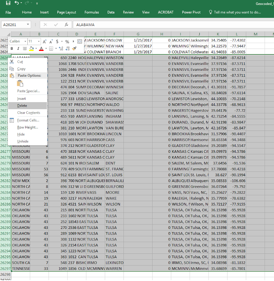
After that scroll down to the current bottom of the spreadsheet. There are around 30+ records in this dataset that have missing dates. Go ahead and select the row labels on the left, which highlights the whole row. Once you have done that, right click and then select Delete. Again you need to eliminate those missing records for the map to accept the time field.
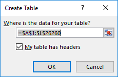
After you have done that, select the bottom right most cell, L26260, then scroll back up to the top of the worksheet, hold shift, and select cell A1 (this should highlight all of the cells in the sheet that contain data). After that, select the Insert tab, and then select the Table button.
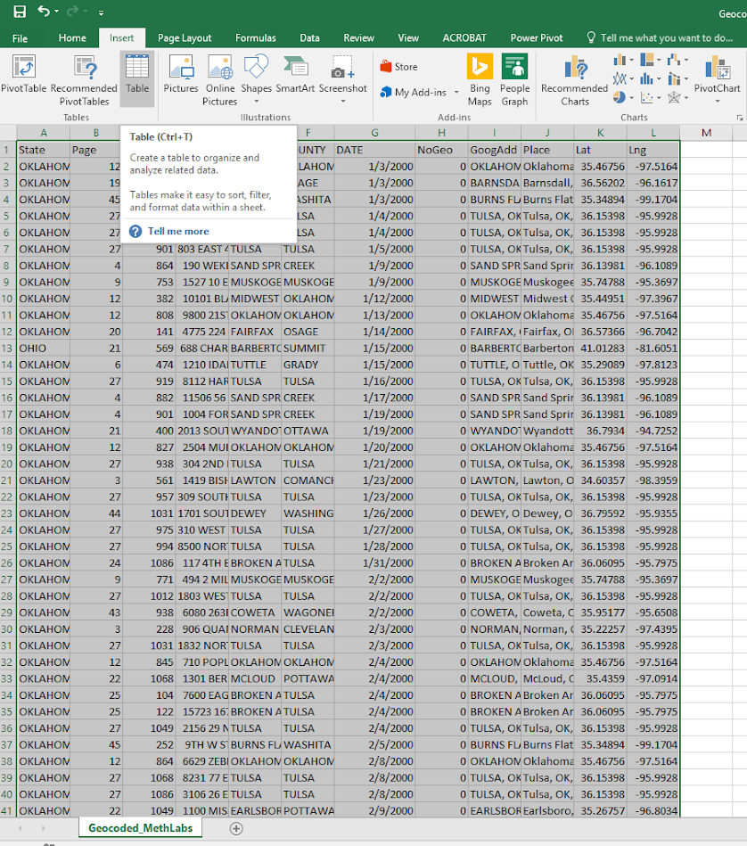
In the pop-up you can keep the default that the table has headers checked. If you lost the selection range in the prior step, you can simply enter it in as =$A$1:$;$26260.
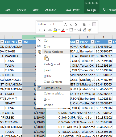
After that is done you should have a nice blue formatted table. Select the G column, and then right click and select Format Cells.
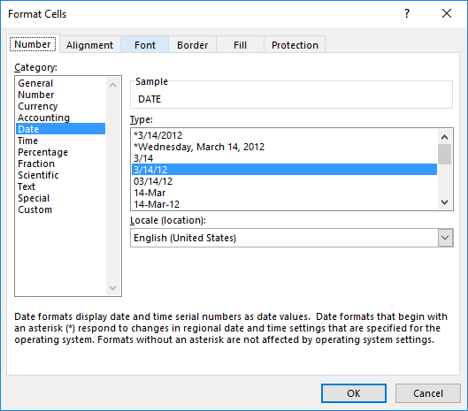
Change that date column to a specific date format, here I just choose the MM/DD/YY format, but it does not matter. Excel just needs to know it represents a date field.
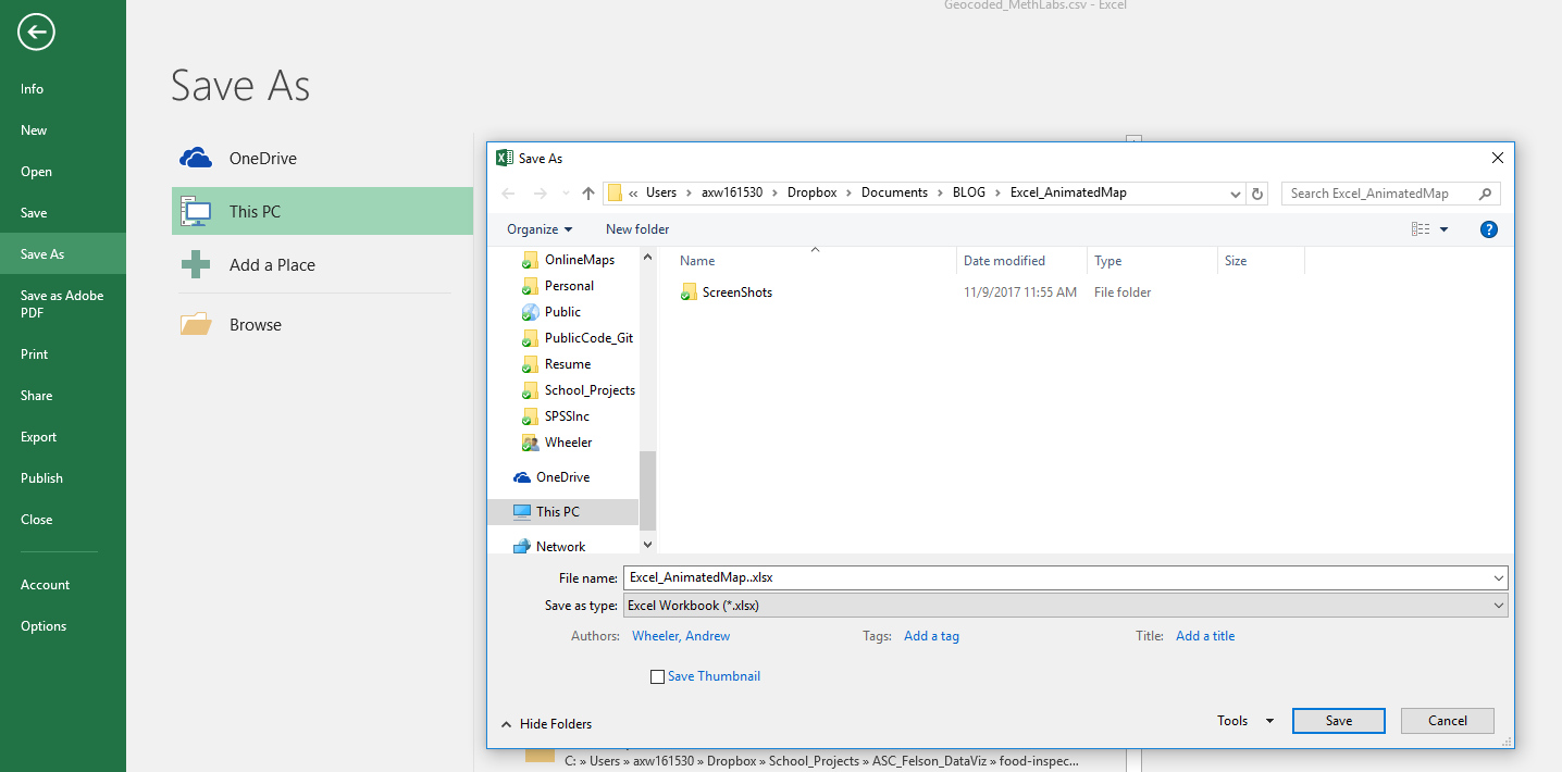
Finally, you need to save the file as an excel file before we can make the maps. To do this, click File in the top left header menu’s, and then select Save As. Choose where you want to save the file, and then in the Save as Type dropdown in the bottom of the dialog select xlsx.
Now the data is all prepped to create the map.
Making an Animated Map
Now in this part we basically just do a set of several steps to make our map recognize the correct data and then make the map look nice.
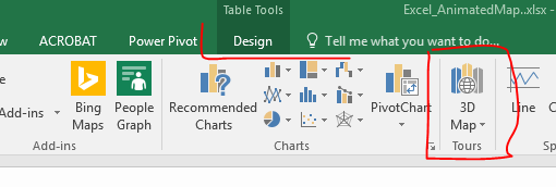
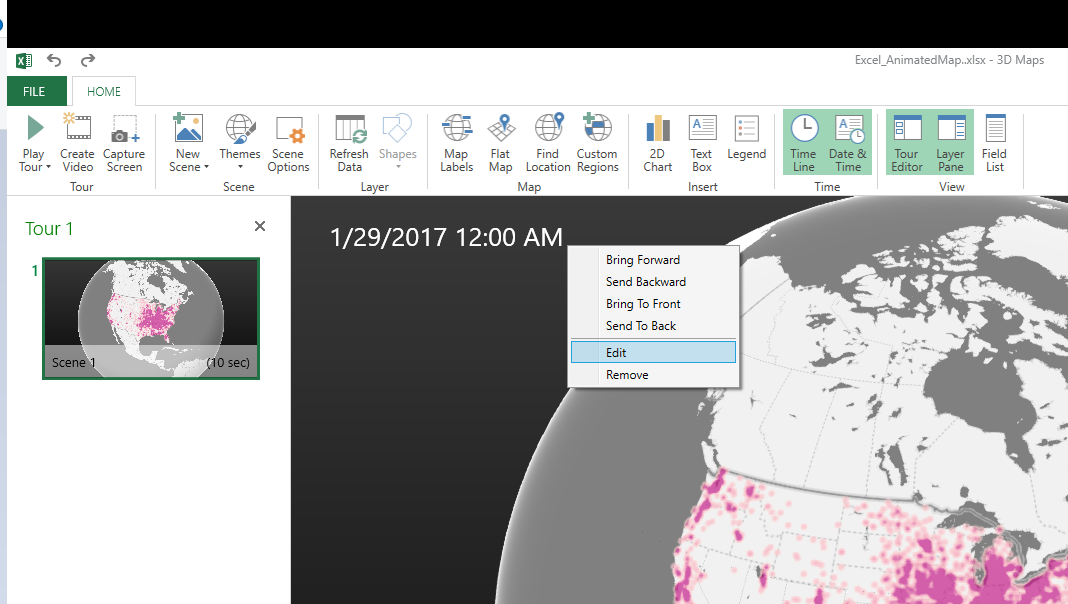
With the prior data all prepped, you should be able to now select the 3d Map option that you can access via the Insert menu (just to the right of where the Excel charts are).
Once you click that, you should get a map opened up that looks like mine below.
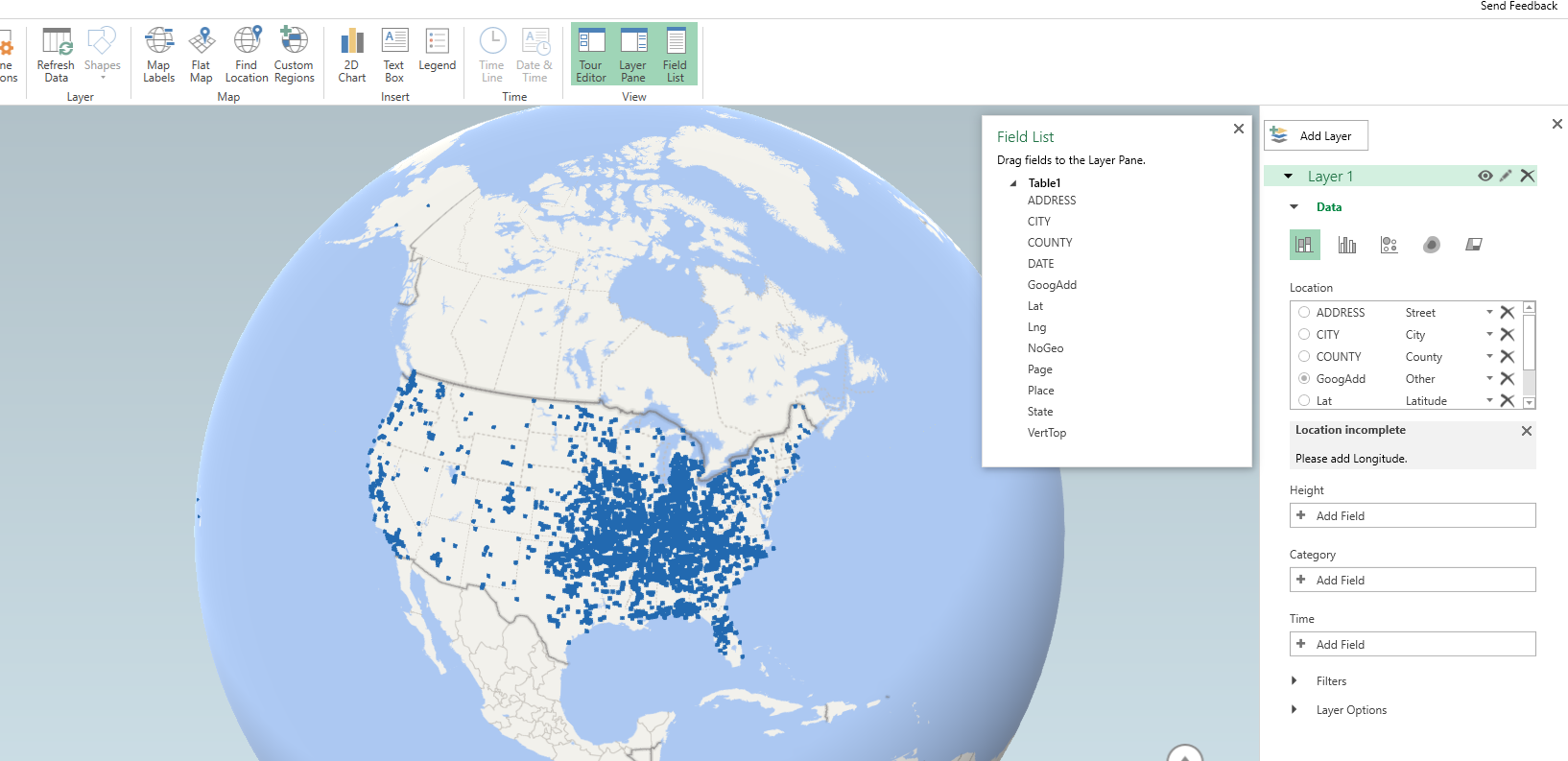
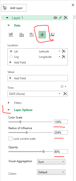
Here it actually geocoded the points based on the address (very fast as well). So if you only have address data you can still create some maps. Here I want to change the data though so it uses my Lat/Lon coordinates. In the little table on the far right side, under Layer 1, I deleted all of the fields except for Lat by clicking the large to their right (see the X circled in the screenshot below). Then I selected the + Add Field option, and then selected my Lng field.
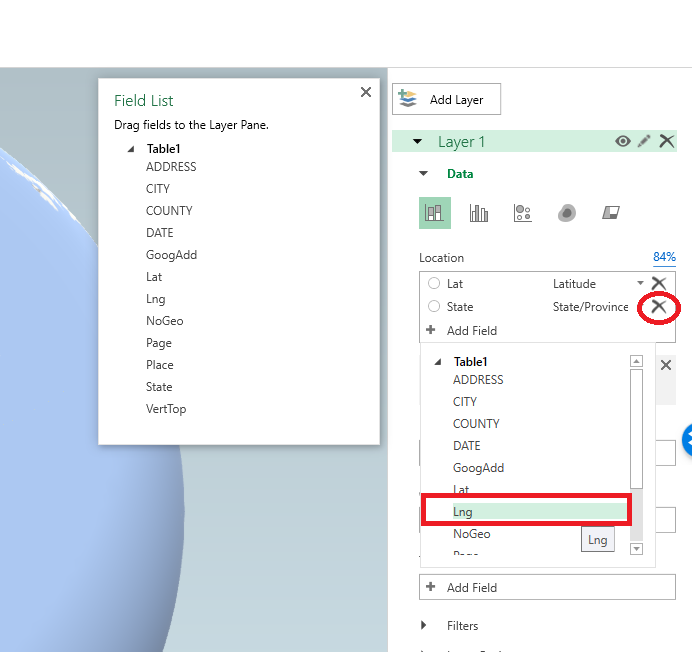
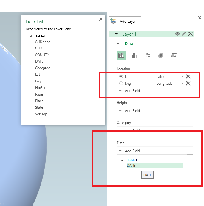
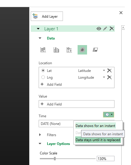
After you select that you can select the dropdown just to the right of the field and set it is Longitude. Next navigate down slightly to the Time option, and there select the DATE field.
Now here I want to make a chart similar to the Carto graph that is of the density, so in the top of the layer column I select the blog looking thing (see its drawn outline). And then you will get various options like the below screenshot. Adjust these to your liking, but for this I made the radius of influence a bit larger, and made the opacity not 100%, but slightly transparent at 80%.
Next up is setting the color of the heatmap. The default color scale uses the typical rainbow, which should be avoided for multiple reasons, one of which is color-blindness. So in the dropdown for colors select Custom, and then you will get the option to create your own color ramp. If you click on one of the color swatches you will then get options to specify the color in a myriad of ways.
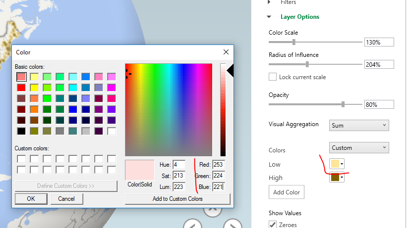
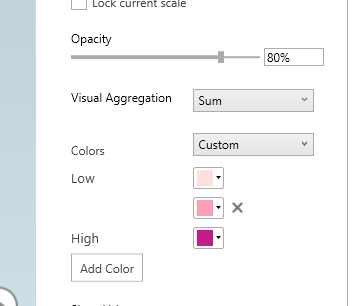
Here I use the multi-hue pink-purple color scheme via ColorBrewer with just three steps. You can see in the above screenshot I set the lowest pink step via the RGB colors (which you can find on the color brewer site.) Below is what my color ramp looks like in the end.
Next part we want to set the style of the map. I like the monotone backgrounds, as it makes the animated kernel density pop out much more (see also my blog post, When should we use a black background for a map). It is easy to experiement with all of these different settings though and see which ones you like more for your data.
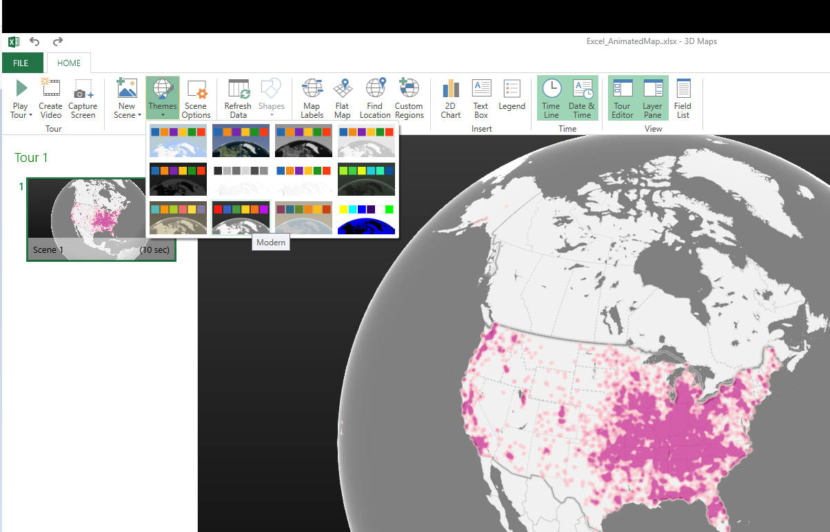
Next I am going to change the format of the time notation in the top right of the map. Left click to select the box around the time part, and then right click and select Edit.
Here I change to the simpler Month/Year. Depending on how fast the animation runs, you may just want to change it to year. But you can leave it more detailed if you are manually dragging the time slider to look for trends.

Finally, the current default is to show all of the data permanently. There are examples where you may want to do that (see the famous example by Nathan Yau mapping the growth of Wal Mart), but here we do not want that. So navigate back to the Layer options on the right hand side, and in the little tiny clock above the Time field select the dropdown, and change it to Data shows for an instant.
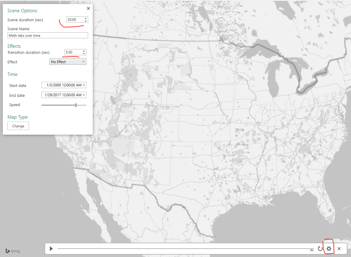
Finally I select the little cog in the bottom of the map window to change the time options. Here I set the animation to run longer at 30 seconds. I also set the transition duration to slightly longer at 5 seconds. (Think of the KDE as a moving window in time.)
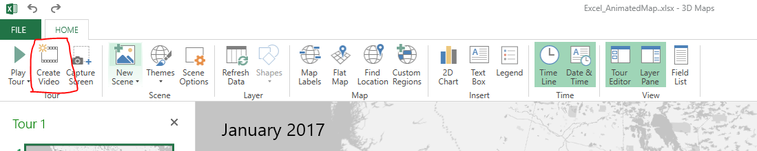
After that you are done! You can zoom in the map, set the slider to run (or manually run it forward/backward). Finally you can export the map to an animated file to share or use in presentations if you want. To do that click the Create Video option in the toolbar in the top left.
Here is my exported video
Now go make some cool maps!


Antron
/ December 6, 2017Hey! Thank you very much for your explanation! I used to use this method in my job at the central analytical police department.
But can help me with a solution, how can I add the name of the regions and borderlines of the areas on the map? (or maybe you can help me with explanation how to make the same map but a lit more tweakable using Python?)
And the last question, how do you think why do we need this type visualization? What decision we can make based on that visualization? I mean, we even can’t see the description of each crime when it occurs on the map, to do some analysis. But I agree visualization is excellent.
Looking forward to your answers.
Anton,
Criminal Analyst
apwheele
/ December 6, 2017For the areas on the map Excel does allow you to upload an image to use as the background, but I have not tried that myself. I don’t have enough experience creating graphs in python to give much advice there either.
This visualization is good for seeing a pattern evolve over time. Here I like it because you can see the consistency in a few places in the US, and then the big spike across the nation in this database (that is likely due to differential reporting though, it is not likely indicative of actual drug use patterns). Another good example is the growth of wal-mart animated map, http://projects.flowingdata.com/walmart/.
For some crimes that are fairly spatially consistent this viz. does not work so well, as the places just look like random dots on the map.