For a recent project of mine I was exploring arrest rates at small units of analysis (street midpoints and intersections) for one of the collaborations we have at the Finn Institute.
One of the graphs I was interested in making was a funnel plot of the arrest rates on the Y axis and the total number of stops on the X axis. You can then draw confidence bands around a particular percentage (typically the overall rate) to see if any observations have oddly high or low rates. This procedure is described in Funnel plots for comparing institutional performance (Spiegelhalter, 2005), PDF Here. Funnel charts are more common in meta-analysis, but I hope to illustrate their utility here in monitoring rates with different denominators.
For an illustration I will make a funnel plot of the homicide rates per 100,000 given by the police agencies in New York and Pennsylvania in 2012 (available via the UCR data tool). Here is the data and code available to replicate the results in this blog post in a zip file. If you have the SPSSINC GETURI DATA add-on you can start just by calling (otherwise you have to download the data to follow along).
SPSSINC GETURI DATA
URI="https://dl.dropboxusercontent.com/u/3385251/NY_PA_crimerates_2012.sav"
FILETYPE=SAV DATASET=NY_PA.
I start at the point in the code where the data is already loaded, and I generate a scatterplot for Population and Murder_and_nonnegligent_manslaughter_rate. I eliminate agencies that did not report a full 12 months or had missing data for homicides and/or the population, and this results in around 360 homicide rates for populations above 10,000 and up nearly 10 million (in New York City). The labels for SPSS graphs inherit the format for the original data, so I make the homicide rates F2.0 to avoid decimal places in the axis tick mark labels.
FORMATS Murder_and_nonnegligent_manslaughter_rate (F2.0).
GGRAPH
  /GRAPHDATASET NAME="graphdataset" VARIABLES=Population Murder_and_nonnegligent_manslaughter_rate
  /GRAPHSPEC SOURCE=INLINE.
BEGIN GPL
  SOURCE: s=userSource(id("graphdataset"))
  DATA: Population=col(source(s), name("Population"))
  DATA: Murder_and_nonnegligent_manslaughter_rate=col(source(s),
        name("Murder_and_nonnegligent_manslaughter_rate"))
  GUIDE: axis(dim(1), label("Population"))
  GUIDE: axis(dim(2), label("Murder Rate per 100,000"))
  SCALE: log(dim(1))
  ELEMENT: point(position(Population*Murder_and_nonnegligent_manslaughter_rate))
END GPL.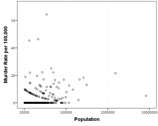
So we can see that the bulk of the institutions have very low murder rates, the overall rate is just shy of 6 murders per 100,000 in this sample. But there are quite a few locations that appear to be high outliers. We are talking about proportions as small as 0.00006 to 0.00065 though, so are some of the high murder rate locations really that surprising? Lets see by adding an estimate of the error if the individual rates were drawn from the same distribution as the overall rate.
Now to make the funnel chart we need to estimate the confidence interval for a rate of 6/100,000 for population sizes between 10,000 and 10 million to add to our chart. We can add these interpolated bounds directly into our SPSS dataset. So to estimate the lines what I do is use the AGGREGATE command to interpolate population step sizes for the min and max population in the sample (and calculate the total homicide rate). Here I interpolate the population steps on the log scale, as the X axis in the chart uses a log scale.
*Aggregate proportions and max/min counts.
COMPUTE Id = $casenum - 1.
AGGREGATE OUTFILE=* MODE=ADDVARIABLES
  /BREAK
  /MaxPop = MAX(Population)
  /MinPop = MIN(Population)
  /AllHom = SUM(Murder_and_nonnegligent_Manslaughter)
  /TotalPop = SUM(Population)
  /TotalObs = MAX(Id).
*Overall homicide rate per 100,000.
COMPUTE HomRate = (AllHom/TotalPop)*100000.
*Now interpolating bounds for the population.
COMPUTE #Step = (LG10(MaxPop) - LG10(MinPop))/TotalObs.
COMPUTE N = 10**(LG10(MinPop) + Id*#Step).
So if you see the variable N in the dataset now you will see that the highest value is equal to the population in New York City at over 8 million. SPSS does not have an inverse function for the binomial distribution, but it does have one for the beta distribution. Wikipedia lists how the Clopper-Pearson binomial confidence intervals can be rewritten in terms of the beta distribution. I use this equality here to generate 99% confidence intervals for the population sizes in the N variable for the overall homicide rate, HomeRate (remembering to convert rates per 100,000 back to proportions).
*Now calculating bands based on statewide homicide rates.
*Exact bounds based on inverse beta.
*http://en.wikipedia.org/wiki/Binomial_proportion_confidence_interval#Clopper-Pearson_interval.
COMPUTE #Alph = 0.01.
COMPUTE #Suc = (HomRate*N)/100000.
COMPUTE LowB = IDF.BETA(#Alph/2,#Suc,N-#Suc+1)*100000.
COMPUTE HighB = IDF.BETA(1-#Alph/2,#Suc+1,N-#Suc)*100000.
EXECUTE.
Now we can superimpose LowB, HighB, and HomRate on the same graph as the previous scatterplot to give a sense of the uncertainty in the estimates. Here I also change the size of the graph using PAGE statements. I color the error bounds as light grey lines, and the overall homicide rate as a red line, and then superimpose the homicide rates for each agency on top of them.
*Now can make the plot with the error bounds.
FORMATS LowB HighB HomRate (F2.0) N (F8.0).
GGRAPH
  /GRAPHDATASET NAME="graphdataset" VARIABLES=Population Murder_and_nonnegligent_manslaughter_rate
                                              LowB HighB HomRate N
  /GRAPHSPEC SOURCE=INLINE.
BEGIN GPL
  PAGE: begin(scale(600px,800px))
  SOURCE: s=userSource(id("graphdataset"))
  DATA: Population=col(source(s), name("Population"))
  DATA: Murder_and_nonnegligent_manslaughter_rate=col(source(s),
        name("Murder_and_nonnegligent_manslaughter_rate"))
  DATA: LowB=col(source(s), name("LowB"))
  DATA: HighB=col(source(s), name("HighB"))
  DATA: HomRate=col(source(s), name("HomRate"))
  DATA: N=col(source(s), name("N"))
  GUIDE: axis(dim(1), label("Population"))
  GUIDE: axis(dim(2), label("Murder Rate per 100,000"), delta(2))
  SCALE: log(dim(1))
  SCALE: linear(dim(2), min(2), max(64))
  ELEMENT: line(position(N*HomRate), color(color.red), size(size."2"))
  ELEMENT: line(position(N*LowB), color(color.grey))
  ELEMENT: line(position(N*HighB), color(color.grey))
  ELEMENT: point(position(Population*Murder_and_nonnegligent_manslaughter_rate), size(size."5"),
           transparency.exterior(transparency."0.5"))
  PAGE: end()
END GPL.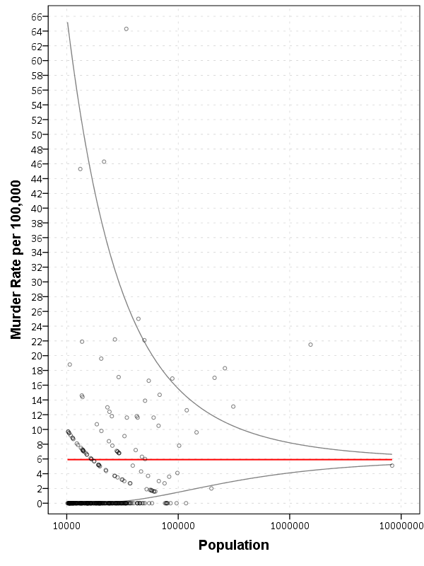
So I hope you see where the name funnel chart comes from now! This chart gives us an idea of the variability we would expect if random data were drawn with a rate of 6/100000 for population sizes between 10,000 and 100,000 is quite large, and most of the agencies with high homicide rates are still below the upper bound. Even with a population of 100,000, the 99% confidence interval covers rates between 2 and almost 16 per 100,000 – which translates directly to 2 and 16 homicides in a jurisdiction of that size.
Here I add labels to the chart for locations above the interval and below the interval (but at least have one homicide). I add the total number of homicides in that jurisdiction in parenthesis to the label as well.
*Now adding in labels.
COMPUTE #Alph = 0.01.
COMPUTE #Suc = (HomRate*Population)/100000.
COMPUTE LowA = IDF.BETA(#Alph/2,#Suc,Population-#Suc+1)*100000.
COMPUTE HighA = IDF.BETA(1-#Alph/2,#Suc+1,Population-#Suc)*100000.
EXECUTE.

STRING HighLab (A50).
IF Murder_and_nonnegligent_manslaughter_rate > HighA
   HighLab = CONCAT(RTRIM(REPLACE(Agency,"Police Dept",""))," (",LTRIM(STRING(Murder_and_nonnegligent_Manslaughter,F3.0)),")").
IF Murder_and_nonnegligent_manslaughter_rate  0
   HighLab = CONCAT(RTRIM(REPLACE(Agency,"Police Dept",""))," (",LTRIM(STRING(Murder_and_nonnegligent_Manslaughter,F3.0)),")").
EXECUTE.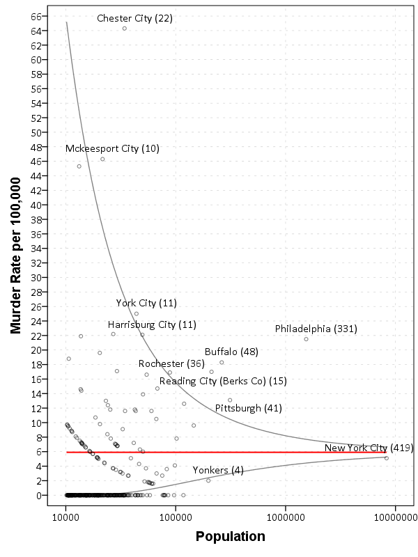
The labels get a little busy, but we can see that save for Buffalo and Rochester, all of the jurisdictions with higher than expected homicide rates are in Pennsylvania, with Philadelphia being the most egregious outlier. New York City and Yonkers are actually lower than the confidence interval, although quite close (along with a set of cities with zero homicides in populations between mainly the lower bound of 10,000 to 100,000). Chester city and Mckeesport are high locations as well, but we can see from the labels they only have 22 and 10 homicides respectively. The point to the left of Mckeesport is Coatesville, which ends up having only 6 homicides.
Where I consider such charts useful are to identify outliers (such as Philadelphia and Chester City). Depending on the nature of the study will depend on what this information could be useful for. For a reporting agency like the FBI they may be interested in seeing if Chester City is a reporting anomaly, or the NIJ/DOJ may be interested in funnelling resources to these high homicide rate locations. The same is true for a police department monitoring rates of say contraband recovery at particular locations, or uses of force per officer incident.
For a researcher they may be interested in other causal factors that could cause a high or low rate, as this might give insight into the mechanisms that increase or decrease homicides (for this particular chart). Evaluating against the overall homicide rate for the sample is an ad-hoc decision (it appears in this chart that PA and NY may plausibly have distinct homicide rate values, with PA being higher) but it at least gives the analyst an idea of the variability when evaluating rates.