State dependence and trajectory models

I am currently reviewing a paper that uses group based trajectory models (GBTM) – and to start this isn’t a critique of the paper. GBTM I think is a very useful descriptive tool (how this paper I am reading mostly uses it), and can be helpful in some predictive contexts as well.

It is much more difficult though to attribute a causal framework to those trajectories though. First, my favorite paper on this topic is Distinguishing facts and artifacts in group-based modeling (Skardhamar, 2010). Torbjørn in that paper simulates random data (not dissimilar to what I do here, but a few more complicated factors), and shows that purely random data will still result in GBTM identifying trajectories. You can go the other way as well, I have a blog post where I simulate actual latent trajectories and GBTM recovers them, and another example where fit stats clearly show a random effects continuous model is better for a different simulation. In real data though we don’t know the true model like these simulations, so we can only be reasonably skeptical that the trajectories we uncover really represent latent classes.

In particular, the paper I was reading is looking at a binary outcome, so you just observe a bunch of 0s and 1s over the time period. So given the limited domain, it is difficult to uncover really wild looking curves. They ended up finding a set of curves that although meet all the good fit stats, pretty much cover the domain of possibilities – one starting high an linearly sloping down, one starting low and sloping up, one flat high, one flat low, and a single curved up slope.

So often in criminology we interpret these latent trajectories as population heterogeneity – people on different curves are fundamentally different (e.g. Moffitt’s taxonomy for offending trajectories). But there are other underlying data generating processes that can result in similar trajectories – especially over a limited domain of 0/1 data.

Here I figured the underlying data the paper I am reviewing is subject to very strong state dependence – your value at t-1 is very strongly correlated to t. So here I simulate data in R, and use the flexmix package to fit the latent trajectories.

First, I simulate 1500 people over 15 time points. I assign them an original probability estimate uniformly, then I generate 15 0/1 observations, updating that probability slightly over time with an auto-correlation of 0.9. (Simulations are based on the logit scale, but then backed out into 0/1s.)

# R Code simulating state dependence 0/1
# data
library("flexmix")
set.seed(10)

# logit and inverse function
logistic <- function(x){1/(1+exp(-x))}
logit <- function(x){log(x/(1-x))}

# generate uniform probabilities
n <- 1500
orig_prob <- runif(n)

# translate to logits
ol <- logit(orig_prob)
df <- data.frame(id=1:n,op=orig_prob,ol)

# generate auto-correlated data for n = 10
auto_corr <- 0.90
tp <- 15
vl <- paste0('v',1:tp)
vc <- var(ol) #baseline variance, keep equal

for (v in vl){
   # updated logit
   rsd <- sqrt(vc - vc*(auto_corr^2))
   ol <- ol*0.9 + rnorm(n,0,rsd)
   # observed outcome
   df[,v] <- rbinom(n,1,logistic(ol))
}

This generates the data in wide format, so I reshape to long format needed to fit the models using flexmix, and I by default choose 5 trajectories (same as chosen in the paper I am reviewing).

# reshape wide to long
ld <- reshape(df, idvar="id", direction="long",
        varying = list(vl))

# fit traj model for binary outcomes
mod <- flexmix(v1 ~ time + I(time^2) | id,
               model = FLXMRmultinom(),
               data=ld, k=5)

rm <- refit(mod)
summary(rm)

Now I create smooth curves over the period to plot. I am lazy here, the X axis should actually be 1-15 (I simulated 15 discrete time points).

tc <- summary(rm)@components[[1]]
pd <- data.frame(c=1,t=seq(1,tp,length.out=100))
pd$tsq <- pd$t^2

co <- matrix(-999,nrow=3,ncol=5)

for (i in 1:5){
  vlab <- paste0('pred',i)
  co[,i] <- tc[[i]][,1]
}

pred <- as.matrix(pd) %*% co

# plot on probability scale
matplot(logistic(pred))

These are quite similar to the curves for the paper I am reviewing, a consistent low probability (5), and a consistent high (1), a downward mostly linear slope (3), and an upward linear slope (2), and then one parabola concave down (4) (in the paper they had one concave up).

I figured the initial probability I assigned would highly impact the curve the model assigned a person to in this simulation. It ends up being more spread out than I expected though.

# distribution of classes vs original probability
ld$clus <- clusters(mod)
r1 <- ld[ld$time == 1,]
clustjit <- r1$clus + runif(n,-0.2,0.2)
plot(clustjit,r1$op) # more spread out than I thought

So there is some tendency for each trajectory to be correlated based on the original probability, but it isn’t that strong.

If we look at the average max posterior probabilities, they are OK minus the parabola group 4.

# average posterior probability
pp <- data.frame(posterior(mod))
ld$pp <- pp[cbind(1:(n*tp),ld$clus)]
r1 <- ld[ld$time == 1,]
aggregate(pp ~ clus, data = r1, mean)
#   clus        pp
# 1    1 0.8923801
# 2    2 0.7903938
# 3    3 0.7535281
# 4    4 0.6380946
# 5    5 0.8419221

The paper I am reviewing has much higher APPs for each group, so maybe they are really representing pop heterogeneity instead of continuous state dependence, it is just really hard with such observational data to tell the difference.

Simulating data with numpy and scipy

I’ve answered a few different questions on forums recently about simulating data:

I figured it would be worth my time to put some of my notes down in a blog post. It is not just academic, not too infrequently I use simulations at work to generate estimated return on investment estimates for putting a machine learning model into production. For social scientists this is pretty much equivalent to doing cost/benefit policy simulations.

Simulations are also useful for testing the behavior of different statistical tests, see prior examples on my blog for mixture trajectories or random runs.

Here I will be showing how to mostly use the python libraries numpy and scipy to do various simulation tasks. For some upfront (note I set the seed in numpy, important for reproducing your simulations):

import itertools as it
import numpy as np
import pandas as pd
np.random.seed(10)

# total simulations for different examples
n = 10000

# helper function to pretty print values
def pu(x,ax=1):
  te1,te2 = np.unique(x.sum(axis=ax),return_counts=True)
  te3 = 100*te2/te2.sum()
  res = pd.DataFrame(zip(te1,te2,te3),columns=['Unique','Count','Percent'])
  return res

Sampling from discrete choice sets

First, in the linked data science post, the individual had a very idiosyncratic set of simulations. Simulate a binary vector of length 10, that had 2,3,4 or 5 ones in that vector, e.g. [1,1,0,0,0,0,0,0,0,0] is a valid solution, but [0,0,0,0,1,0,0,0,0,0] is not, since the latter only has 1 1. One way to approach problems like these is to realize that the valid outcomes are a finite number of discrete solutions. Here I use itertools to generate all of the possible permutations (which can easily fit into memory, only 627). Then I sample from that set of 627 possibilities:

# Lets create the whole sets of possible permutation lists
res = []
zr = np.zeros(10)
for i in range(2,6):
    for p in it.combinations(range(10),i):
        on = zr.copy()
        on[list(p)] = 1
        res.append(on.copy())

resnp = np.stack(res,axis=0)

# Now lets sample 1000 from this list
total_perms = resnp.shape[0]
samp = np.random.choice(total_perms,n)
res_samp = resnp[samp]

# Check to make sure this is OK
pu(res_samp)

Ultimately you want the simulation to represent reality. So pretend this scenario was we randomly pick a number out of the set {2,3,4,5}, and then randomly distribute the 1s in that length 10 vector. In that case, this sampling procedure does not reflect reality, because 2’s have fewer potential permutations than do 5’s. You can see this in the simulated proportions of rows with 2 (7.25%) vs rows with 5 (39.94%) in the above simulation.

We can fix that though by adjusting the sampling probabilities from the big set of 627 possibilities though. Pretty much all of the np.random methods an option to specify different marginal probabilities, where in choice it defaults to equal probability.

# If you want the different subsets to have equal proportions
sum_pop = resnp.sum(axis=1)
tot_pop = np.unique(sum_pop,return_counts=True)
equal_prop = 1/tot_pop[1].shape[0]
pop_prob = pd.Series(equal_prop/tot_pop[1],index=tot_pop[0])
long_prob = pop_prob[sum_pop]

samp_equal = np.random.choice(total_perms,n,p=long_prob)
res_samp_equal = resnp[samp_equal]
pu(res_samp_equal)

So now we can see that each of those sets of results have similar marginal proportions in the simulation.

You can often figure out exact distributions for your simulations, for an example of similar discrete statistics, see my work on small sample Benford tests. But I often use simulations to check my math even if I do know how to figure out the exact distribution.

Another trick that I commonly use in other applications that don’t have access to something equivalent to np.random.choice, but most applications have a random uniform generator. Basically you can generate random numbers on whatever interval, chunk those up into bits, and turn those bits into your resulting categories. This is what I did in that SPSS post at the beginning.

unif = np.floor(np.random.uniform(1,33,(32*n,1)))/2
pu(unif)

But again this is not strictly necessary in python because we can generate the set/list of items and sample from that directly.

# Same as using random choice from that set of values
half_vals = np.arange(1,33)/2
unif2 = np.random.choice(half_vals,(32*n,1))
pu(unif2)

But if limited in your libraries that is a good trick to know. Note that most random number generators operate over (0,1), so open intervals and will never generate an exact 0 or 1. To get a continuous distribution over whatever range, you can just multiply the 0/1 random number generator (and subtract if you need negative values) to match the range you want. But again most programs let you input min/max in a uniform number generator.

Sampling different stat distributions

So real data often can be reasonably approximated via continuous distributions. If you want to generate different continuous distribtions with approximate correlations, one approach is to:

  • generate multi-variate standard normal data (mean 0, variance 1, and correlations between those variables)
  • turn that matrix into a standard uniform via the CDF function
  • then for each column, use the inverse CDF function for the distribution of choice

Here is an example generating a uniform 0/1 and a Poisson with a mean of 3 variable using this approach.

from scipy.stats import norm, poisson

# Here generate multivariate standard normal with correlation 0.2
# then transform both to uniform
# Then transform 2nd column to Poisson mean 3

mu = [0,0]
cv = [[1,0.2],[0.2,1]] #needs to be symmetric
mv = np.random.multivariate_normal([0,0],cov=cv,size=n)
umv = pd.DataFrame(norm.cdf(mv),columns=['Uniform','Poisson'])
umv['Poisson'] = poisson.ppf(umv['Poisson'],3)
print(umv.describe())

This of course doesn’t guarantee the transformed data has the exact same correlation as the original specified multi-variate normal. (If interested in more complicated scenarios, it will probably make sense to check out copulas.)

Like I mentioned in the beginning, I am often dealing with processes of multiple continuous model predictions. E.g. one model that predicts a binary ‘this claim is bad’, and then a second model predicting ‘how bad is this claim in terms of $$$’. So chaining together simulations of complicated data (which can be mixtures of different things) can be useful to see overall behavior of a hypothetical system.

Here I chain together a predicted probability for 3 claims (20%,50%,90%), and mean/standard deviations of (1000,100),(100,20),(50,3). So pretend we can choose 1 of these three claims to audit. We have the predicted probability that the claim is wrong, as well as an estimate of how much money we would make if the claim is wrong (how wrong is the dollar value).

The higher dollar values have higher variances, so do you pick the safe one, or do you pick the more risky audit with higher upside. We can do a simulation to see the overall distribution:

pred_probs = np.array([0.2,0.5,0.9])
bin_out = np.random.binomial(n=1,p=pred_probs,size=(n,3))
print( bin_out.mean(axis=0) )

# Pretend have both predicted prob
# and distribution of values
# can do a simulation of both

val_pred = np.array([1000,100,50])
val_std = np.array([100,20,3])
val_sim = np.random.normal(val_pred,val_std,size=(n,3))
print(val_sim.mean(axis=0))
print(val_sim.std(axis=0))

revenue = val_sim*bin_out
print(revenue.mean(axis=0))
print(revenue.std(axis=0))

I could see a reasonably risk averse person picking the lowest dollar claim here to audit. Like I said in the discrete case, we can often figure out exact distributions. Here the expected value is easy, prob*val, the standard deviation is alittle more tricky to calculate in your head (it is a mixture of a spike at 0 and then the rest of the typical distribution):

# Theoretical mean/variance
expected = pred_probs*val_pred
low_var = (expected**2)*(1-pred_probs)
hig_var = ((val_pred - expected)**2)*pred_probs
std_exp = np.sqrt(low_var + hig_var)

But it still may be useful to do the simulation here anyway, as the distribution is lumpy (so just looking at mean/variance may be misleading).

Other common continuous distributions I use are beta, to simulate between particular endpoints but not have them uniform. And negative binomial is a good fit to not only many count distributions, but things that are more hypothetically continuous (e.g. for distances instead of gamma, or for money instead of log-normal).

Here is an example generating a beta distribution between 0/1, with more of the distribution towards 0 than 1:

# mean probability 0.2
a,b = 1,5
beta_prob = beta.rvs(a, b, size=n)
plt.hist(beta_prob, bins=100,density=True,label='Sim')
# theoretical PDF
x = np.arange(0,1.01,0.01)
plt.plot(x,beta.pdf(x,a,b),label=f'beta({a},{b}) PDF')
plt.legend()
plt.show()

For beta, the parameters a,b, the mean is a/b. To make the distribution more spread out, you have larger overall values of a/b (I don’t have the conversion to variance memorized offhand). But if you have real data, you can plop that into scipy to fit the parameters, here I fix the location and scale parameters.

# If you want to fit beta based on observed data
fitbeta = beta.fit(beta_prob,floc=0,fscale=1)

We can do similar for negative binomial, I often think of these in terms of regression dispersion parameters, and I have previously written about translating mean/dispersion to n/p notation:

# Ditto for negative binomial
mean_nb = 2
disp_nb = 4

def trans_np(mu,disp):
    x = mu**2/(1 - mu + disp*mu)
    p = x/(x + mu)
    n = mu*p/(1-p)
    return n,p

nb_n,nb_p = trans_np(mean_nb,disp_nb)
nb_sim = nbinom.rvs(nb_n,nb_p,size=(n,1))
nb_bars = pu(nb_sim)
plt.bar(nb_bars['Unique'],nb_bars['Percent'],label='Sim')

x = np.arange(0,nb_sim.max()+1)
plt.plot(x,nbinom.pmf(x,nb_n,nb_p)*100,linestyle='None',
         marker='o',markerfacecolor='k',ms=7,
         label=f'PMF Negative Binomial')
plt.legend()
plt.show()

Power and bias in logistic regression

Michael Sierra-Arévalo, Justin Nix and Bradley O’Guinn have a recent article about examining officer fatalities following gunshot assaults (Sierra-Arévalo, Nix, & O-Guinn). They do not find that distance to a Level 1/2 trauma ERs make a difference in the survival probabilities, which conflicts with prior work of mine with Gio Circo (Circo & Wheeler, 2021). Justin writes this as a potential explanation for the results:

The results of our multivariable analysis indicated that proximity to trauma care was not significantly associated with the odds of officers surviving a gunshot wound (see Table 2 on p. 9 of the post-print). On the one hand, this was somewhat surprising given that proximity to trauma care predicts survival of gunshot wounds among the general public.1 On the other hand, police have specialized equipment, such as ballistic vests and tourniquets, that reduce the severity of gunshot wounds or allow them to be treated immediately.

I think it is pretty common when results do not pan out, people turn to theoretical (or sociological) reasons why their hypothesis may be invalid. While these alternatives are often plausible, often equally plausible are simpler data based reasons. Here I was concerned about two factors, 1) power and 2) omitted severity of gun shot wound factors. I did a quick simulation in R to show power seems to be OK, but the omitted severity confounders may be more problematic in this design, although only bias the effect towards 0 (it would not cause the negative effect estimate MJB find).

Power In Logistic Regression

First, MJB’s sample size is just under 1,800 cases. You would think offhand this is plenty of power for whatever analysis right? Well, power just depends on the relevant effect size, a small effect and you need a bigger sample. My work with Gio found a linear effect in the logistic equation of 0.02 (per minute driving increases the logit). We had 5,500 observations, and our effect had a p-value just below 0.05, hence why a first thought was power. Also logistic regression is asymptotic, it is common to have small sample biases in situations even up to 1000 observations (Bergtold et al., 2018). So lets see in a simple example ignoring the other covariates:

# Some upfront work
logistic <- function(x){1/(1+exp(-x))}
set.seed(10)

# Scenario 1, no covariates omitted
n <- 2000; 
de <- 0.02
dist <- runif(n,5,200)
p <- logistic(-2.5 + de*dist)
y <- rbinom(n,1,p)

# Variance is small enough, seems reasonably powered
summary(glm(y ~ dist, family = "binomial"))

Here with 2000 cases, taking the intercept from MJB’s estimates and the 0.02 from my paper, we see 2000 observations is plenty enough well powered to detect that same 0.02 effect in mine and Gio’s paper. Note when doing post-hoc power analysis, you don’t take the observed effect (the -0.001 in Justin’s paper), but a hypothetical effect size you think is reasonable (Gelman, 2019), which I just take from mine and Gio’s paper. Essentially saying “Is Justin’s analysis well powered to detect an effect of the same size I found in the Philly data”.

One thing that helps MJB’s design here is more variance in the distance parameter, looking intra city the drive time distances are smaller, which will increase the standard error of the estimate. If we pretend to limit the distances to 30 minutes, this study is more on the fence as to being well enough powered (but meets the threshold in this single simulation):

# Limited distance makes the effect have a higher variance
n <- 2000; 
de <- 0.02
dist <- runif(n,1,30)
p <- logistic(-2.5 + de*dist)
y <- rbinom(n,1,p)

# Not as much variation in distance, less power
summary(glm(y ~ dist, family = "binomial"))

For a more serious set of analysis you would want to do these simulations multiple times and see the typical result (since they are stochastic), but this is good enough for me to say power is not an issue in this design. If people are planning on replications though, intra-city with only 1000 observations is really pushing it with this design though.

Omitted Confounders

One thing that is special about logistic regression, unlike linear regression, even if an omitted confounder is uncorrelated with the effect of interest, it can still bias the estimates (Mood, 2010). So even if you do a randomized experiment your effects could be biased if there is some large omitted effect from the regression equation. Several people interpret this as logistic regression is fucked, but like that linked Westfall article I think that is a bit of an over-reaction. Odds ratios are very tricky, but logistic regression as a method to estimate conditional means is not so bad.

In my paper with Gio, the largest effect on whether someone would survive was based on the location of the bullet wound. Drive time distances then only marginal pushed up/down that probability. Here are conditional mean estimates from our paper:

So you can see that being shot in the head, drive time can make an appreciable difference over these ranges, from ~45% to 55% probability of death. Even if the location of the wound is independent of drive time (which seems quite plausible, people don’t shoot at your legs because you are far away from a hospital), it can still be an issue with this research design. I take Justin’s comment about ballistic vests as reducing death as essentially taking the people in the middle of my graph (torso and multiple injuries) and pushing them into the purple line at the bottom (extremities). But people shot in the head are not impacted by the vests.

So lets see what happens to our effect estimates when we generate the data with the extremities and head effects (here I pulled the estimates all from my article, baseline reference is shot in head and negative effect is reduction in baseline probability when shot in extremity):

# Scenario 3, wound covariate omitted
dist <- runif(n,5,200)
ext_wound <- rbinom(n,1,0.8)
ef <- -4.8
pm <- logistic(0.2 + de*dist + ef*ext_wound)
ym <- rbinom(n,1,pm)

# Biased downward (but not negative)
summary(glm(ym ~ dist, family = "binomial"))

You can see here the effect estimate is biased downward by a decent margin (less than half the size of the true effect). If we estimate the correct equation, we are on the money in this simulation run:

What happens if we up the sample size? Does this bias go away? Unfortunately it does not, here is an example with 10,000 observations:

# Scenario 3, wound covariate ommitted larger sample
n2 <- 10000
dist <- runif(n2,5,200)
ext_wound <- rbinom(n2,1,0.8)
ef <- -4.8
pm <- logistic(0.2 + de*dist + ef*ext_wound)
ym <- rbinom(n2,1,pm)

# Still a problem
summary(glm(ym ~ dist, family = "binomial"))

So this omission is potentially a bigger deal – but not in the way Justin states in his conclusion. The quote earlier suggests the true effect is 0 due to vests, I am saying here the effect in MJB’s sample is biased towards 0 due to this large omitted confounder on the severity of the wound. These are both plausible, there is no way based just on MJB’s data to determine if one interpretation is right and the other is wrong.

This would not explain the negative effect estimate MJB finds though in their paper, it would only bias towards 0. To be fair, Jessica Beard critiqued mine and Gio’s paper in a similar vein (saying the police wound location data had errors), this would make our drive time estimates be biased towards 0 as well, so if that factor may be even larger than me and Gio even estimated.

Potential robustness checks here are to simply do a linear regression instead of logistic with the same data (my graph above shows a linear regression would be fine for the data if I included interaction effects with wound location). And another would be to look at the unconditional marginal distribution of distance vs probability of death. If that is highly non-linear, it is likely due to omitted confounders in the data (I suspect it may plateau as well, eg the first 30 minutes make a big difference, but after that it flattens out, you’ve either stabilized someone or they are gone at that point).

Policy?

In the case of intra-city public violence, the policy implication of drive times on survival are relevant when people are determining whether to keep open or close trauma centers. I did not publish this in my paper with Gio (you can see the estimates in the replication code), but we actually estimated counter-factual increased deaths by taking away facilities. Its marginal effect is around 10~20 homicides over the 4.5 years if you take away one of the facilities in Philadelphia. I don’t know if reducing 5 homicides per year is sufficient justification to keep a trauma facility open, but officer shootings are themselves much less frequent, and so the marginal effects are very unlikely to justify keeping a trauma facility open/closed by themselves.

You could technically figure out the optimal location to site a new trauma facility from mine and Gio’s paper, but probably a more reasonable response would be to site resources to get people to the ER faster. Philly already does scoop and run (Winter et al., 2021), where officers don’t wait for an ambulance. Another possibility though is to proactively locate ambulances to get to scenes faster (Hosler et al., 2019). Again though it just isn’t as relevant/feasible outside of major urban areas though to do that.

Often times social science authors do an analysis, and then in the policy section say things that are totally reasonable on their face, but are not supported by the empirical analysis. Here the suggestion that officers should increase their use of vests by MJB is totally reasonable, but nothing in their analysis supports that conclusion (ditto with the tourniquets statement). You would need to measure those incidents that had those factors, and see its effect on officer survival to make that inference. MJB could have made the opposite statement, since drive time doesn’t matter, maybe those things don’t make a difference in survival, and be equally supported by the analysis.

I suspect MJB’s interest in the analysis was simply to see if survival rates were potential causes of differential officer deaths across states (Sierra-Arévalo & Nix, 2020). Which is fine to look at by itself, even if it has no obviously direct policy implications. Talking back and forth with Justin before posting this, he did mention it was a bit of prodding from a reviewer to add in the policy implications. Which it goes for both (reviewers or original writers), I don’t think we should pad papers with policy recommendations (or ditto for theoretical musings) that aren’t directly supported by the empirical analysis we conduct.

References

  • Bergtold, J. S., Yeager, E. A., & Featherstone, A. M. (2018). Inferences from logistic regression models in the presence of small samples, rare events, nonlinearity, and multicollinearity with observational data. Journal of Applied Statistics, 45(3), 528-546.
  • Circo, G. M., & Wheeler, A. P. (2021). Trauma Center Drive Time Distances and Fatal Outcomes among Gunshot Wound Victims. Applied Spatial Analysis and Policy, 14(2), 379-393.
  • Gelman, A. (2019). Don’t calculate post-hoc power using observed estimate of effect size. Annals of Surgery, 269(1), e9-e10.
  • Hosler, R., Liu, X., Carter, J., & Saper, M. (2019). RaspBary: Hawkes Point Process Wasserstein Barycenters as a Service.
  • Mood, C. (2010). Logistic regression: Why we cannot do what we think we can do, and what we can do about it. European Sociological Review, 26(1), 67-82.
  • Sierra-Arévalo, M., & Nix, J. (2020). Gun victimization in the line of duty: Fatal and nonfatal firearm assaults on police officers in the United States, 2014–2019. Criminology & Public Policy, 19(3), 1041-1066.
  • Sierra-Arévalo, Michael, Justin Nix, & Bradley O’Guinn (2022). A National Analysis of Trauma Care Proximity and Firearm Assault Survival among U.S. Police. Forthcoming in Police Practice and Research. Post-print available at
  • Winter, E., Hynes, A. M., Shultz, K., Holena, D. N., Malhotra, N. R., & Cannon, J. W. (2021). Association of police transport with survival among patients with penetrating trauma in Philadelphia, Pennsylvania. JAMA network open, 4(1), e2034868-e2034868.

Using simulations to show ROI for predictive models in python

Two resources I have been consuming lately I would highly recommend:

Keith’s perspective is nearly a 100% match to my experiences, e.g. should aim for projects that have around $1 million in expected revenue to justify a data science person/team, up front estimates should be on the low end, the easiest projects you can formulate as micro-decisions and you use a model to improve those binary decisions, etc. How to measure anything fits right into this as well, where Hubbard basically says get a prior distribution on expected outcomes, and then do simulations to see possible outcomes.

Here I am going to show an example that is very close to several of the projects I have done to show the potential increase in revenue from taking a model based approach using simulations in python.

Background

So the point in the data science project I am going to be illustrating is you have already decided to do an initial pilot model, and you have historical cases and then predicted probabilities from your model. Here I am thinking of the case of auditing some type transaction (it can be whatever you want, tax-returns, bank transactions, insurance claims, etc.). Here I am going to simulate some fake data to illustrate the later ROI estimates, but in real life you would use your own data for the business.

Here the variables I simulate are:

  • 5000 transactions, total_cases
  • a model based predicted probability, prob
  • a dollar value for the transaction, dollar
  • a historical marker whether a transaction was audited, audit
  • a historical marker whether the transaction was bad, hit

To be clear, this would be data you would normally already have for your business use case (e.g. historical transactions). To just illustrate my point I am making 100% fake data for everyone to follow along.

####################################
# Simulating data, probabilities
# and money values

from scipy.stats import norm
from scipy.stats import binom
from scipy.stats import beta
import numpy as np
import pandas as pd
from matplotlib import pyplot as plt

np.random.seed(10)
total_cases = 5000

# Beta(1,5), to generate the probs
prob = beta.rvs(1, 5, size=total_cases)

# Lognormal for the dollar values, clipped
dollar = np.exp(norm.rvs(7,2,size=total_cases)).clip(500,25000)

# Historical auditing process, all cases over 15000
audit = (dollar > 15000)*1

# Out of these, random 10% are hits
hit = binom.rvs(1, 0.10, size=total_cases)

# Putting into a dataframe
cases = pd.concat([pd.Series(dollar),pd.Series(audit),
                   pd.Series(prob), pd.Series(hit)], 
                   axis=1)
cases.columns = ['value','audit','prob', 'hit']
cases['revenue'] = cases['hit']*cases['value']*cases['audit']

cases['revenue'].sum() # about 1.1 million

cases.head()
####################################

These are all simulated from various probability distributions to look somewhat like real data. Probabilities and dollar values are right skewed. They are independent here, but it is ok if in your real data they are not.

Here I pretend the historical audit selection process is they automatically audit all large transactions, over $15k. And these historical audits have a 10% probability of finding a hit (think of it as fraud if you want). So the context is given our model estimates prob, how much more money do we think we can make if you use these model based decision as opposed to our simple threshold that is the current process?

Revenue Simulations

So here for my revenue simulations, what I am going to do is pretend I can audit the same number of cases (471), based on my model estimates, audit_total.

audit_total = audit.sum() #pretend we get to model the same
                          #number of cases
cases['model_expected'] = cases['prob']*cases['value']
cases['model_rank'] = cases['model_expected'].rank(method='first', ascending=False)
cases['model_audit'] = 1*(cases['model_rank'] >= audit_total)

# Expected revenue from our model based approach
(cases['model_audit']*cases['model_expected']).sum()
# About 1.3 million

So if our model is well calibrated, we can take those predicted probabilities and estimate what we think should happen if we used our model to audit 471 cases. Here we think we would make around 1.3 million, so about a lift of over $200k.

But, these models are probabilistic estimates. So I like to use simulations to hedge a bit when I am presenting to the business. Here I do 5000 simulations where I select my 471 cases, use a binomial random number generator to flip the coin whether the case results in a hit or not, and then calculate the total revenue.

# Simulating binomial process, seeing what the revenue is
cases_audit = cases[cases['model_audit'] == 1].copy()
rev_sim = [] #doing 5000 simulations
for i in range(5000):
    hit_sim = binom.rvs(1, cases_audit['prob'])
    sim_outs = hit_sim * cases_audit['value']
    rev_sim.append( (sim_outs.sum(), hit_sim.mean()) )

rev_sim = pd.DataFrame(rev_sim, columns=['RevSim','HitRateSim'])

We can then turn this into a nice graph of simulated potential outcomes. In our model approach, on average we would expect to make $1.3 million (versus the actual revenue of $1.1 million), but we have variance around that estimate:

# making a nice graph
actual_rev = cases['revenue'].sum()/1000000
ax = (rev_sim['RevSim']/1000000).hist(bins=100, alpha=0.8, color='grey')
ax.grid(False)
ax.axvline(actual_rev, color='r', linewidth=3)
ax.set_xlabel('Audit Revenue in $1,000,000')
plt.text(actual_rev + 0.008, 150, 'Actual Revenue', color='r')
plt.title('Simulated Revenue when using Model')
plt.show()

So you can see on a very few occasions we make less than the revenue under the current strategy of audit all large cases. But in just as many circumstances we are making over $400k in additional profit.

You may ask why 5000 simulations instead of more or less? Well these are small enough I can easily do them quickly, so I could up the simulations to a higher value if I wanted. Long story short, if you look at the histogram of outcomes and it is still quite bumpy, you should probably do more simulations. Here 5000 is plenty, although 1000 was clearly more bumpy.

If you don’t want to present the histogram, or have more complicated scenarios and prefer a table laying those scenarios out, you can pull out simulated confidence intervals of the additional revenue outcomes:

# If you want to put a confidence interval on it
# Per 1000 dollars
diff = (rev_sim['RevSim'] - cases['revenue'].sum())/1000
diff.describe()

# 95% confidence interval
diff.quantile([0.025,0.975])

One of the benefits of having a model, even if the revenue is not increased, is that you can generate estimates for other types of interventions. In the auditing case, you can potentially justify more auditors (e.g. we can hire more people to investigate 400 more cases and still expect to make a profit). (Here I have a related criminal justice example for bail decisions.) Or you can apply the models as a potential sales pitch to a new client. E.g. if you hire us to do these audits, given your data and our model, we think we can make the $X dollars.

Model based approaches also allow you to meet more constraints, such as increasing the hit rate, or meeting fairness constraints. Here in this simulation if we use a model based approach, the hit rate goes up to around 15% as opposed to 10%. Which may be worth it for your investigators or clients depending on the situation.

Comparing the WDD vs the Wilson log IRR estimator

So this is maybe my final post on the WDD estimator for the time being (Wheeler & Ratcliffe, 2018). Recently David Wilson had an article in JQC that proposes a different estimator using the same basic information, just pre-post crime counts for treated and control areas (Wilson, 2021). So say we had the table:

         Pre   Post
Treated   50     30
Control   60     55

So in this scenario, my WDD estimate is -20 in the treated area, and -5 in the control area, so the overall estimate is -20 – -5 = -15.

30 - 50 - (55 - 60) = -15

So an estimated reduction of -15 crimes overall. David’s estimator is the logged incident rate ratio (IRR), and so is just like above, except logs all of the values:

log(30) - log(50) - ( log(55) - log(60) ) = -0.4238142

This is a logged incident rate adjustment, so most of the time people exponentiate this value, which is exp(-0.4238142) = 0.6545455. So this suggests crime is reduced by approximately 35% in the treated area relative to the control area in this hypothetical. Or another way to write it is (30/50)/(55/60) = 0.6545455.

So instead of a linear estimate of the total numbers of crimes reduced, this is an estimate of the overall rate reduction. So this begs the question when would you prefer my WDD vs the IRR? I will try to answer that below – in short I think David’s estimator makes sense for meta-analyses (as I have said before in reference to the work in Braga & Weisburd, 2020). But for an individual agency doing an experimental evaluation I much prefer my estimator. The skinny of this logic is that we only really care about the overall crime reduction estimate from a cost-benefit analysis perspective. Backing out this total crime reduction count estimate from David’s IRR estimate can result in some funny business for an individual study.

Identifying Assumptions

So there are really two different assumptions my WDD estimator and David’s IRR estimator make. To generate a standard error estimate around the point estimate for either estimator, both require the data are Poisson distributed. So that makes no difference between the two. The assumption that really distinguishes between the WDD and the IRR estimate is the parallel trends assumption. The WDD assumes parallel trends are on the linear scale, whereas the IRR assumes parallel trends are on the ratio scale.

What exactly does this mean? Imagine we have a treated and control area, but look at the crime trends per time period before the treatment occurred. This set of areas has a set of parallel trends on the linear scale:

Time Treated Control
 0     50      60
 1     40      50
 2     45      55
 3     50      60

When the treated area goes down by 10 crimes, the control area goes down by 10 crimes. That is a parallel on the linear scale. Whereas this scenario is parallel on the ratio scale:

Time Treated Control
 0     50      60
 1     40      48
 2     45      54
 3     50      60

When crime goes down by 20% in the treated area, it goes down by 20% in the control area.

So while this gives a potential way to say you should use the WDD (parallel on the linear scale), or the IRR (parallel on the ratio scale), in practice it is not so simple. For one thing, if you only has the pre/post counts of crime, you cannot distinguish between these two scenarios. You can only tell in the case you have historical data to examine.

For a second part of this, you typically can choose your own control area (see for example the synthetic control estimator). So in most scenarios you could choose a control area to obey the linear or the ratio parallel trends assumption if you wanted to. However it may be in many scenarios there is a natural/easy control area, and you may see what is a better fit in that case for linear/ratio.

A final wee bit of a perverse aspect about this I will mention – pretend we have a treated/control area have approximately the same baseline crime counts/rates:

Time Treated Control
 0      30     30
 1      25     25
 2      20     20
 3      25     25

You actually cannot tell in this scenario whether the parallel trends are on the linear scale for my WDD or the ratio scale for the IRR estimate. They are consistent with either! In practice I think in many cases it will be like this – with noisy data, if you choose a control area that has approximately the same baseline crime counts, it will be quite hard to tell whether the linear parallel trends makes more sense or the ratio parallel trends makes more sense.

There are situations where the linear changes do not make sense, but they tend to be scenarios such as the control area has very little crime (so cannot go below 0 to match larger ups/downs in the treated area). So in that case sure the IRR is plausible and the WDD is not, but those are cases where the control area itself is quite questionable. Also note the IRR is not defined for any cells with 0 crimes – but again it is not good for either of our estimators in that case (although mine won’t fail to spit out a number, the power is so low the number it spits out won’t be worth much).

Bias/Coverage

So I have adapted the same simulation code I used in prior studies/blog posts to evaluate the null distribution and the coverage of David’s IRR estimator. I partly did not pursue it initially back when me and Jerry were discussing this idea, because I thought it would be biased. Generalized linear models are based on maximum likelihood estimators, which are only asymptotically valid. In short it appears I was wrong here and David’s IRR estimator is fine even with just four observations, at least for the handful of scenarios I have tried it (have not looked at very tiny counts of crime, it is undefined if any cell has 0 crimes, as you cannot take the log of 0).

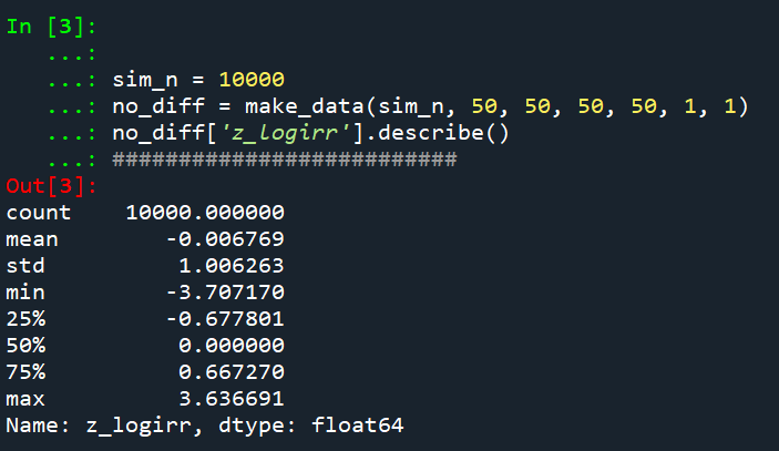
Python code pasted at the very end of the blog post, but for example if we generate a set of null no changes pre/post with a baseline of 50 crimes, the logged irr estimate (converted into a z-score here) is just fine and dandy and has a very close to standard normal distribution based on 10k simulations.
So lets look at the scenario where the control area doesn’t change, but the treated area goes from 50 to 30. We can see again the point estimate in this scenario is spot on the money.
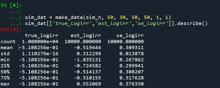
And then we can see the coverage of the logged irr estimator is spot on as well:

So if you are interested in slightly different baseline scenarios, you can use that same simulation code to check out the behavior of David’s estimator and conduct simulated power analysis the same way I have shown for the WDD estimator in prior blog posts.

So if both are unbiased and have good coverage again, why would you prefer the WDD estimator over the IRR estimator (or vice-versa)? Well, lets take the 35% reduction I talked about at the beginning of the post, and the department needs to spend $250k on extra officers to conduct whatever hot spot policing intervention. A 35% reduction may be worth it if we start with a baseline of 200 crimes (so would expect to go down to 130, for a reduction of 70 crimes). If the baseline is 20 crimes, it goes down to 13 crimes (so only a reduction of 7 crimes). The actual benefit of the IRR estimate is entirely dependent on the baseline count of crimes it is applied to.

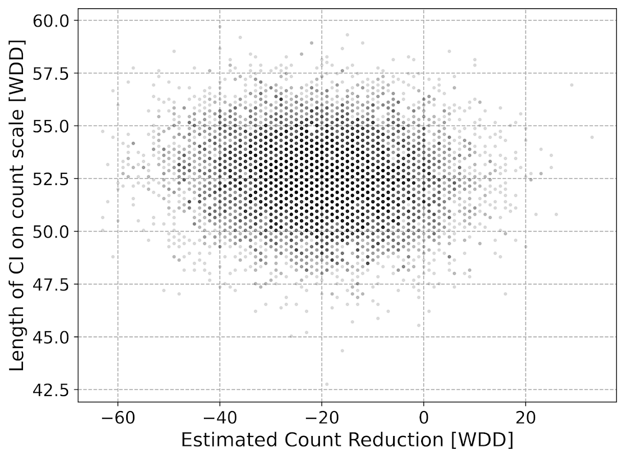
Even if the IRR estimate is itself unbiased and has proper coverage, for even an individual study backing out the estimated reduction in total crimes from the IRR is biased. So here in this same simulated data (50 to 30 in treated, and 50 to 50 in control areas). The true count reduction is -20, and here is the point estimate on the X axis and the length of the confidence interval for each simulation on the Y axis for my WDD test. You can see they are nicely centered on -20, and the length of the confidence intervals has a very tiny variance – they are mostly just a smidge over 50 in total length. So that is probably tough to wrap your head around, but the variance of the variance estimates for the WDD are small.
Now lets do the same graph for the IRR estimate, but translated back out to a count crime reduction based on the simulated values:
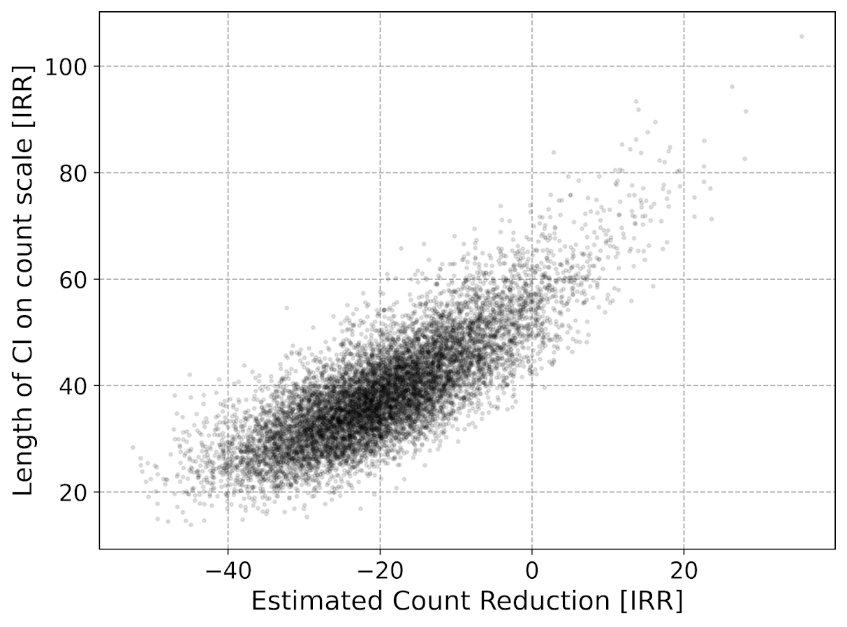
We either have a ton of bias in this estimate (if the estimate of the count reduction is too large, the confidence interval is too small). Or the opposite, the estimate of the count reduction is too small, and the confidence interval is crazy wide. In Andrew Gelman’s terminology, it can result in pretty large type M (magnitude) errors in this simulated example (Gelman & Carlin, 2014). So the variance of the variance estimates in this scenario are quite large.

To be clear – if you are interested in estimating a percent reduction, by all means use David’s IRR estimator. If you however want to translate that percent reduction into an estimate of the total crimes reduced though you should use my WDD estimator in that case. You should not back out a total crimes reduced estimate from the IRR.

Final Thoughts

So I have said a few times I think the IRR estimator makes more sense for meta-analyses. Why do I think that? Well, imagine we have an underlying causal process through which a hot spots policing experiment can randomly deter/prevent a particular proportion of crimes. That underlying causal process suggests an IRR effect. And also the problem I mention with translating back to crime counts I believe should get smaller with tighter estimates.

For a causal process that is more akin to my WDD estimator, imagine some crimes will always be deterred/prevented from a hot spots policing experiment, and some will never be. And we don’t know up-front which is which, so the observed reduction is based on whatever mixture of the two we have at that particular location.

The proportion reduction seems to make more sense to me for active patrol type interventions (which are ephemeral) vs permanent CPTED like interventions which should prevent certain criminal acts in perpetuity. But of course any situation in the real world could have both occurring at the same time.

When you go and look at the meta-analysis of hot spots policing, those interventions are all over the place (Hinkle et al., 2020). I think my WDD estimate would not make sense to mash up into a final meta-analytic estimate. The IRR may not make sense either in the end, but it is plausibly more relevant to compare the IRRs from a study with a baseline of 200 crimes vs one with 40 crimes at baseline. I am not sure it makes sense to compare WDDs in that scenario. But that being said, a few of my blog posts have discussed the WDD normalized per unit area or per unit time. Those normalized estimates are probably more apples to apples in the 200 vs 40 scenario.

A final note I have not discussed here is that David discusses a correction for overdispersion, so that is a potential feather in the cap for his estimator vs the WDD. I’d be a bit hesitant though with that – only four observations to estimate the dispersion term is slicing it a bit thin IMO. But I was wrong about the original estimator, so I may be wrong about that as well. It will take simulation evidence to determine that though – David’s paper just provides the correction term, he doesn’t provide evidence for its utility with small sample data.

And to be fair I have not done simulations to see how my estimator behaves in the presence of overdispersion either. I believe it will simply just cause the standard errors to be too small, so like in Wheeler (2016), I imagine it will just require upping the interval (e.g. use a z-score of 3 instead of 2) to get proper coverage for real crime data.

References

Other Posts of Interest

Python simulation code

Here is a copy-pasted chunk of the entire python simulation code.

'''
Comparing WDD to log(IRR) from Wilson's
recent paper, https://link.springer.com/article/10.1007/s10940-021-09494-w

Andy Wheeler
'''

import pandas as pd
import numpy as np
from scipy.stats import norm
from scipy.stats import poisson
from scipy.stats import uniform
import matplotlib
import matplotlib.pyplot as plt
import os
my_dir = r'D:\Dropbox\Dropbox\Documents\BLOG\wdd_vs_irr'
os.chdir(my_dir)

#########################################################
#Settings for matplotlib

andy_theme = {'axes.grid': True,
              'grid.linestyle': '--',
              'legend.framealpha': 1,
              'legend.facecolor': 'white',
              'legend.shadow': True,
              'legend.fontsize': 14,
              'legend.title_fontsize': 16,
              'xtick.labelsize': 14,
              'ytick.labelsize': 14,
              'axes.labelsize': 16,
              'axes.titlesize': 20,
              'figure.dpi': 100}

matplotlib.rcParams.update(andy_theme)
#########################################################


#This works for the scipy functions as well
np.random.seed(seed=10)

# A function to generate the WDD estimate for simulated data
def wdd_sim(treat0,treat1,cont0,cont1,pre,post):
    tr_cr_0 = poisson.rvs(mu = treat0, size=int(pre)).sum()
    co_cr_0 = poisson.rvs(mu = cont0, size=int(pre)).sum()
    tr_cr_1 = poisson.rvs(mu = treat1, size=int(post)).sum()
    co_cr_1 = poisson.rvs(mu = cont1, size=int(post)).sum()
    # WDD estimates
    est = ( tr_cr_1/post - tr_cr_0/pre ) - ( co_cr_1/post - co_cr_0/pre )
    post2 = (1/post)**2
    pre2 = (1/pre)**2
    var_est = tr_cr_0*pre2 + tr_cr_1*post2 + co_cr_0*pre2 + co_cr_1*post2
    true_val = ( treat1 - treat0 ) - ( cont1 - cont0 )
    z_score = est / np.sqrt(var_est)
    # Wilson log IRR estimates
    true_logirr = np.log( (treat1*cont0) / (cont1*treat0) )
    est_logirr = np.log( ((tr_cr_1/post)*(co_cr_0/pre)) / ( (co_cr_1/post)*(tr_cr_0/pre) ) )
    se_logirr = np.sqrt( 1/tr_cr_1 + 1/co_cr_0 + 1/co_cr_1 + 1/tr_cr_0 )
    z_logirr = est_logirr / se_logirr
    return (tr_cr_0, co_cr_0, tr_cr_1, co_cr_0, est, var_est, true_val, z_score, true_logirr, est_logirr, se_logirr, z_logirr)

def make_data(n, treat0, treat1, cont0, cont1, pre, post):
    base = pd.DataFrame( range(n), columns=['index'])
    base['treat0'] = treat0
    if treat1 is not None:
        base['treat1'] = treat1
    else:
        base['treat1'] = base['treat0']
    if cont0 is not None:
        base['cont0'] = cont0
    else:
        base['cont0'] = base['treat0']
    if cont1 is not None:
        base['cont1'] = cont1
    else:
        base['cont1'] = base['cont0']
    base.drop(columns='index',inplace=True)
    base['pre'] = pre
    base['post'] = post
    sim_vals = base.apply(lambda x: wdd_sim(**x), axis=1, result_type='expand')
    sim_vals.columns = ['sim_t0','sim_c0','sim_t1','sim_c1','est','var_est','true_val','z_score',
                        'true_logirr','est_logirr','se_logirr','z_logirr']
    return pd.concat([base,sim_vals], axis=1)

# Coverage of the log irr estimate
# Lets look at the coverage rate for a decline from 40 to 20
def cover_logirr(data, ci=0.95):
    mult = (1 - ci)/2
    nv = norm.ppf(1 - mult)
    dif = nv*data['se_logirr']
    low = data['est_logirr'] - dif
    high = data['est_logirr'] + dif
    cover = ( data['true_logirr'] > low) & ( data['true_logirr'] < high )
    return cover

# Length of ci for WDD
def len_ci(data, ci=0.95):
    mult = (1 - ci)/2
    nv = norm.ppf(1 - mult)
    dif = nv*np.sqrt( data['var_est'] )
    low = data['est'] - dif
    high = data['est'] + dif
    return low, high, high - low

# Length of ci for IRR estimate on count scale
# This depends on the baseline estimate to multiply
# The IRR by, using the baseline average of the 
# Treatment area

def len_irr(data, ci=0.95):
    mult = (1 - ci)/2
    nv = norm.ppf(1 - mult)
    dif = nv*data['se_logirr']
    low = data['est_logirr'] - dif
    high = data['est_logirr'] + dif
    baseline = data['sim_t0']/data['pre']
    # Even if you use hypothetical, the variance is quite high
    #baseline = data['treat0']
    est_count = baseline*np.exp(data['est_logirr']) - baseline
    c1 = baseline*np.exp(low) - baseline
    c2 = baseline*np.exp(high) - baseline
    return est_count, c1, c2, np.abs(c2 - c1)

##########################
# Example with no change, lets look at the null distribution
sim_n = 10000
no_diff = make_data(sim_n, 50, 50, 50, 50, 1, 1)
no_diff['z_logirr'].describe()
##########################

##########################
# Example with equal time periods, a reduction from 50 to 30 and 50 to 50 in control area
sim_dat = make_data(sim_n, 50, 30, 50, 50, 1, 1)
sim_dat[['true_logirr','est_logirr','se_logirr']].describe()

cl = cover_logirr(sim_dat)
cl.mean()

# Compare length of CI for IRR vs WDD

# WDD length
lowdd, highwdd, lwdd = len_ci(sim_dat)
lwdd.describe()

# IRR length on the count scale
est_cnt_irr, lo_irr, hi_irr, ln_irr = len_irr(sim_dat)
ln_irr.describe()

# Scatterplot of estimated count reduction vs
# Length of CI
fig, ax = plt.subplots(figsize=(8,6))
ax.scatter(est_cnt_irr, ln_irr, c='k', 
            alpha=0.1, s=4)
ax.set_axisbelow(True)
ax.set_xlabel('Estimated Count Reduction [IRR]')
ax.set_ylabel('Length of CI on count scale [IRR]')
plt.savefig('IRR_Len_Est.png', dpi=500, bbox_inches='tight')
plt.show()

# Lets compare to the WDD estimate
fig, ax = plt.subplots(figsize=(8,6))
ax.scatter(sim_dat['est'], lwdd, c='k', 
            alpha=0.1, s=4)
ax.set_axisbelow(True)
ax.set_xlabel('Estimated Count Reduction [WDD]')
ax.set_ylabel('Length of CI on count scale [WDD]')
plt.savefig('WDD_Len_Est.png', dpi=500, bbox_inches='tight')
plt.show()
##########################

Simulating Group Based Trajectories (in R)

The other day I pointed out on Erwin Kalvelagen’s blog how mixture models are a solution to fit regression models with multiple lines (where identification of which particular function/line is not known in advance).

I am a big fan of simulating data when testing out different algorithms for simply the reason it is often difficult to know how an estimator will behave with your particular data. So we have a bunch of circumstances with mixture models (in particular here I am focusing on repeated measures group based traj type mixture models) that it is hard to know upfront how they will do. Do you want to estimate group based trajectories, but have big N and small T? Or the other way, small N and big T? (Larger sample sizes tend to result in identifying more mixtures as you might imagine (Erosheva et al., 2014).) Do you have sparse Poisson data? Or high count Poisson data? Do you have 100,000 data points, and want to know how big of data and how long it may take? These are all good things to do a simulation to see how it behaves when you know the correct answer.

These are relevant no matter what the particular algorithm – so the points are all the same for k-medoids for example (Adepeju et al., 2021; Curman et al., 2015). Or whatever clustering algorithm you want to use in this circumstance. So here I show a few different simulations showing:

  • GBTM can recover the correct underlying equations
  • AIC/BIC fit stats have a difficult time distinguishing the correct number of groups
  • If the underlying model is a random effects instead of latent clusters, AIC/BIC performs quite well

The last part is because GBTM models have a habit of spitting out solutions, even if the true underlying data process has no discrete groups. This is what Skardhamar (2010) did in his article. It was focused on life course, but it applies equally to the spatial analysis GBTM myself and others have done as well (Curman et al., 2015; Weisburd et al., 2004; Wheeler et al., 2016). I’ve pointed out in the past that even if the fit for GBTM looks good, the underlying data can suggest a random effects model will work quite well, and Greenberg (2016) makes pretty much the same point as well.

Example in R

In the past I have shown how to use the crimCV package to fit these group based traj models, specifically zero-inflated Poisson models (Nielsen et al., 2014). Here I will show a different package, the R flexmix package (Grün & Leisch, 2007). This will be Poisson mixtures, but they have an example of doing zip models in there docs if you want.

So first, I load in the flexmix library, set the seed, and generate longitudinal data for three different Poisson models. One thing to note here, mixture models don’t assign an observation 100% to an underlying mixture, but the data I simulate here is 100% in a particular group.

################################################
library("flexmix")
set.seed(10)

# Generate simulated data
n <- 200 #number of individuals
t <- 10   #number of time periods
dat <- expand.grid(t=1:t,id=1:n)

# Setting up underlying 3 models
time <- dat$t
p1 <- 3.5 - time
p2 <- 1.3 + -1*time + 0.1*time^2
p3 <- 0.15*time
p_mods <- data.frame(p1,p2,p3)

# Selecting one of these by random
# But have different underlying probs
latent <- sample(1:3, n, replace=TRUE, prob=c(0.35,0.5,0.15))
dat$lat <- expand.grid(t=1:t,lat=latent)$lat
dat$sel_mu <- p_mods[cbind(1:(n*t), dat$lat)]
dat$obs_pois <- rpois(n=n*t,lambda=exp(dat$sel_mu))
################################################

Now that is the hard part really – figuring out exactly how you want to simulate your data. Here it would be relatively simple to increase the number of people/areas or time period. It would be more difficult to figure out underlying polynomial functions of time.

Next part we fit a 3 mixture model, then assign the highest posterior probabilities back into the original dataset, and then see how we do.

################################################
# Now fitting flexmix model
mod3 <- flexmix(obs_pois ~ time + I(time^2) | id, 
                model = FLXMRglm(family = "poisson"),
                data = dat, k = 3)
dat$mix3 <- clusters(mod3)

# Seeing if they overlap with true labels
table(dat$lat, dat$mix3)/t
################################################

So you can see that the identified groupings are quite good. Only 4 groups out of 200 are mis-placed in this example.

Next we can see if the underlying equations were properly recovered (you can have good separation between groups, but the polynomial fit may be garbage).

# Seeing if the estimated functions are close
rm3 <- refit(mod3)
summary(rm3)

This shows the equations are really as good as you could expect. The standard errors are as wide as they are because this isn’t really all that large a data sample for generalized linear models.

So this shows that if I feed in the correct underlying equation (almost, I could technically submit different equations with/without quadratic terms for example). But what about the real world situation in which you do not know the correct number of groups? Here I fit models for 1 to 8 groups, and then use the typical AIC/BIC to see which group it selects:

################################################
# If I look at different groups will AIC/BIC
# pick the right one?

group <- 1:8
left_over <- group[!(group %in% 3)]
aic <- rep(-1, 8)
bic <- rep(-1, 8)
aic[3] <- AIC(mod3)
bic[3] <- BIC(mod3)

for (i in left_over){
  mod <- flexmix(obs_pois ~ time + I(time^2) | id, 
                 model = FLXMRglm(family = "poisson"),
                 data = dat, k = i)
  aic[i] <- AIC(mod)
  bic[i] <- BIC(mod)
}

fit_stats <- data.frame(group,aic,bic)
fit_stats
################################################

Here it actually fit the same model for 3/5 groups (sometimes even if you tell flexmix to fit 5 groups, it will only return a smaller number). You can see that the fit stats for group 4 through are almost the same. So while AIC/BIC did technically pick the right number in this simulated example, it is cutting the margin pretty close to picking 4 groups in this data instead of 3.

So the simulation Skardhamar (2010) did was slightly different than this so far. What he did was simulate data with no underlying trajectory groups, and then showed GBTM tended to spit out solutions. Here I will show that is the case as well. I simulate random intercepts and a simple linear trend over time.

################################################
# Simulate random effects model
library(lme4)
rand_eff <- rnorm(n=n,0,1.5)
dat$re <- expand.grid(t=1:t,re=rand_eff)$re
dat$re_pois <- rpois(n=n*t,lambda=exp(dat$sel_mu))
dat$mu_re <- 3 + -0.2*time + dat$re
dat$re_pois <- rpois(n=n*t,lambda=exp(dat$mu_re))

re_mod <- glmer(re_pois ~ 1 + time + (1 | id), 
                data = dat, family = poisson(link = "log"))
summary(re_mod)
################################################

So you can see that the random effects model is all fine and dandy – recovers both the fixed coefficients, as well as estimates the correct variance for the random intercepts.

So here I go and see how the AIC/BIC compares for the random effects models vs GBTM models for 1 to 8 groups (I stuff the random effects model in the first row for group 0):

################################################
# Test AIC/BIC for random effects vs GBTM
group <- 0:8
left_over <- 1:8
aic <- rep(-1, 9)
bic <- rep(-1, 9)
aic[1] <- AIC(re_mod)
bic[1] <- BIC(re_mod)

for (i in left_over){
  mod <- flexmix(re_pois ~ time + I(time^2) | id, 
                 model = FLXMRglm(family = "poisson"),
                 data = dat, k = i)
  aic[i+1] <- AIC(mod)
  bic[i+1] <- BIC(mod)
}

fit_stats <- data.frame(group,aic,bic)
fit_stats
################################################

So it ends up flexmix will not give us any more solutions than 2 groups. But that the random effect fit is so much smaller (either by AIC/BIC) than the GBTM you wouldn’t likely make that mistake here.

I am not 100% sure how well we can rely on AIC/BIC for these different models (R does not count the individual intercepts as a degree of freedom here, so k=3 instead of k=203). But no reasonable accounting of k would flip the AIC/BIC results for these particular simulations.

One of the things I will need to experiment with more, I really like the idea of using out of sample data to validate these models instead of AIC/BIC – no different than how Nielsen et al. (2014) use leave one out CV. I am not 100% sure if that is possible in this set up with flexmix, will need to investigate more. (You can have different types of cross validation in that context, leave entire groups out, or forecast missing data within an observed group.)

References

Adepeju, M., Langton, S., & Bannister, J. (2021). Anchored k-medoids: a novel adaptation of k-medoids further refined to measure long-term instability in the exposure to crime. Journal of Computational Social Science, 1-26.

Grün, B., & Leisch, F. (2007). Fitting finite mixtures of generalized linear regressions in R. Computational Statistics & Data Analysis, 51(11), 5247-5252.

Curman, A. S., Andresen, M. A., & Brantingham, P. J. (2015). Crime and place: A longitudinal examination of street segment patterns in Vancouver, BC. Journal of Quantitative Criminology, 31(1), 127-147.

Erosheva, E. A., Matsueda, R. L., & Telesca, D. (2014). Breaking bad: Two decades of life-course data analysis in criminology, developmental psychology, and beyond. Annual Review of Statistics and Its Application, 1, 301-332.

Greenberg, D. F. (2016). Criminal careers: Discrete or continuous?. Journal of Developmental and Life-Course Criminology, 2(1), 5-44.

Nielsen, J. D., Rosenthal, J. S., Sun, Y., Day, D. M., Bevc, I., & Duchesne, T. (2014). Group-based criminal trajectory analysis using cross-validation criteria. Communications in Statistics-Theory and Methods, 43(20), 4337-4356.

Skardhamar, T. (2010). Distinguishing facts and artifacts in group-based modeling. Criminology, 48(1), 295-320.

Weisburd, D., Bushway, S., Lum, C., & Yang, S. M. (2004). Trajectories of crime at places: A longitudinal study of street segments in the city of Seattle. Criminology, 42(2), 283-322.

Wheeler, A. P., Worden, R. E., & McLean, S. J. (2016). Replicating group-based trajectory models of crime at micro-places in Albany, NY. Journal of Quantitative Criminology, 32(4), 589-612.

Simulating runs of events

I still lurk on the Cross Validated statistics site every now and then. There was a kind of common question about the probability of a run of events occurring, and the poster provided a nice analytic solution to the problem using Markov Chains and absorbing states I was not familiar with.

I was familiar with a way to approximate the answer though using a simple simulation, and encoding data via run length encoding. Run length encoding works like this, if you have an original sequence that is AABBBABBBB, then the run length encoded version of this sequence is:

A,2
B,2
A,1
B,4

This is a quite convenient sparse data format to be familiar with. E.g. if you are using tensors in various deep learning libraries, you can encode the data like this and then stack the tensor. But the stacked tensor is just a view, so it doesn’t take up as much memory as the initial full tensor.

Using this encoding also makes a simulation to answer the question, how often do runs of 5+ occur in this hypothetical experiment quite easy to estimate. You just calculate the run length encoded version of the data, and see if any of the lengths are equal to or greater than 5. Below are code snippets in R and Python.

While the analytic solution is of course preferable when you can figure it out, simulations are nice to test whether the solution is correct, as well as to provide an answer when you are not familiar with how to analytically derive a solution.

R Code

R has a native run-length encoding command, rle. The reason is that runs tests are a common time series technique for looking at randomness. Encourage you to run the code yourself to see how my simulated answer lines up with the analytic answer provided on the stats site!

##########################################
# R Code
set.seed(10)
die <- 1:6
run_sim <- function(rolls=1000, conseq=5){
    test <- sample(die,rolls,TRUE)
    res <- max(rle(test)$lengths) >= conseq
    return(res)
}

sims <- 1000000
results <- replicate(sims, run_sim(), TRUE)
print( mean(results) )
##########################################

Python Code

The python code is very similar to the R code. Main difference is there is no native run length encoding command in numpy or scipy I am aware of (although there should be)! So I edited a function I found from Stackoverflow to accomplish the rle.

##########################################
# Python code

import numpy as np
np.random.seed(10)

# Edited from https://stackoverflow.com/a/32681075/604456
# input numpy arrary, return tuple (lengths, vals)
def rle(ia):
    y = np.array(ia[1:] != ia[:-1])         # pairwise unequal (string safe)
    i = np.append(np.where(y), len(ia) - 1) # must include last element
    z = np.diff(np.append(-1, i))           # run lengths
    return (z, ia[i])

die = list(range(6))

def run_sim(rolls=1000, conseq=5):
    rlen, vals = rle(np.random.choice(a=die,size=rolls,replace=True))
    return rlen.max() >= conseq

sims = 1000000
results = [run_sim() for i in range(sims)]
print( sum(results)/len(results) )
##########################################

I debated on expanding this post to show how to do these simulations in parallel, this is a bit of a cheesy experiment to show though. To do 1 million simulations on my machine still only takes like 10~20 seconds for each of these code snippets. So that will have to wait until another post!

You may be thinking why do I care about runs of dice rolls? Well, it can be extended to many different types of time series monitoring problems. For example, when I worked as a crime analyst at Troy I thought about this in terms of analyzing domestic violent reports. They were too numerous for me to read through every report, so I needed to devise a system to identify if there were anomalous patterns in the recent number of reports. You could devise a test here, say how many days of 10+ reports in a row, and see how frequently you would expect that occur in say a year of monitoring. The simulations above could easily be amended to do that, via doing simulations of the Poisson distribution instead of dice rolls, or assigning weights to particular outcomes.

Using SPSS’s SIMPLAN to generate fake data

A while ago I had a post about generating fake data in SPSS. This is useful for conducting your own simulations, or as I mentioned in the prior post it is often useful when posting questions to discussion lists to have example data that demonstrates your problem.

As of SPSS version 21, it includes a new simulation procedure in which you can take a predictive model and simulate new outcomes (it is in base, so everyone has it if you have a version of SPSS 21 or later). You can also use it to create data from scratch, with unique distributions for each variable and have it conform to either an approximate correlation matrix or a contingency table. Below is an example set of syntax that creates a simulation plan using the SIMPLAN function.

FILE HANDLE save /NAME = "!your handle here!".
SIMPLAN CREATE 
  /SIMINPUT 
    INPUT = input1(FORMAT=F)
    TYPE = MANUAL 
    DISTRIBUTION = POISSON(MEAN=1.2)
  /SIMINPUT
    INPUT = input2 input3
    TYPE = MANUAL
    DISTRIBUTION = NORMAL(MEAN = 0 STDDEV = 1)
  /CORRELATIONS
    VARORDER = input1 input2 input3 
    CORRMATRIX = 1; 0.5, 1; 0.2 0.1 1
  /STOPCRITERIA MAXCASES=50000
  /PLAN FILE='save\test.splan'.

First I create a file handle named save that ends up being where I save the splan file. The SIMPLAN function is quite complex, but here is a quick rundown of what is going on in this particular statement:

  • On the SIMINPUT subcommand, you can specify a variable to create, its format and its marginal distribution. Note numeric formats on this command are a little different than typical, they are not of the form F3.0, but just take an input format type and then if you want decimals would be F,2 for two decimals.
  • I then have two separate SIMINPUT subcommands, the first specifies input1 as being distributed as Poisson with a mean of 1.2. The second specifies variables input2 and input3 as being normally distributed with a mean of zero and a standard deviation of 1.
  • The CORRELATIONS subcommand then lets you specify a set of approximate bivariate correlations for each of the variables.
  • The STOPCRITERIA subcommand then specifies that only 50,000 cases are generated.
  • The PLAN subcommand then specifies a file to save the simulation plan to.

Once you have the simulation plan created, you can then run the SIMRUN command to generate the data.

SIMRUN
 /PLAN FILE='save\test.splan'
 /CRITERIA  REPRESULTS=TRUE  SEED=10
 /PRINT ASSOCIATIONS=YES DESCRIPTIVES=YES
 /OUTFILE FILE=*.

Note in this code snippet I save the simulated data to the active dataset, which was a feature added as of V22. Otherwise you need to use DATASET DECLARE and the specify that file name on the OUTFILE command (or I presume save to a file).

Using the simulation builder is probably overkill for generating data for troubleshooting problems to the list-serve, although if you use its capabilities to mimic the current dataset it can be a quick way to generate fake data that you can upload to a public site without divulging confidential info. This is certainly just scratching the surface of what the simulation builder can do though. I’m hoping its functionality will be continually extended in the future, in particular more complicated transformations being allowed on the SIMPREP command I would like to see.