A Tableau walkthough: Seasonal chart

So my workplace uses Tableau quite a bit, and I know it is becoming pretty popular for crime analysis units as well. So I was interested in trying to pick some up. It can be quite daunting though. I’ve tried to sit through a few general tutorials, but they make my head spin.

Students of mine when I teach ArcGIS have said it is so many buttons it can be overwhelming, and Tableau is much the same way. I can see the appeal of it though, in particular for analysts who exclusively use Excel. The drag/drop you can somewhat intuitively build more detailed charts that are difficult to put together in Excel. And of course out of the box it produces interactive charts you can share, which is really the kicker that differentiates Tableau from other tools.

So instead of sitting through more tutorials I figured I would just jump in and make a few interactive graphics. And along the way I will do tutorials, same as for my other crime analysis labs, for others to follow along.

And I’ve finished/posted my first tutorial, making a seasonal chart. It is too big to fit into a blog post (over 30 screenshots!). But shows how to make a monthly seasonal chart, which is a nice interactive to have for Compstat like meetings.

Here is the final interactive version, and here is a screenshot of the end result:

And you can find the full walkthrough with screenshots here:

TABLEAU SEAONAL CHART TUTORIAL/WALKTHROUGH

Some Things Crime Analysts Should Consider When Using Tableau

So first, I built this using the free version of Tableau. I don’t think the free version will cut it though for most crime analysts.

One of the big things I see Tableau as being convenient is a visualization layer on top of a database. It can connect to the live database, and so automatically update. You cannot do this though with the free version. (And likely you will need some SQL chops to get views for data in formats you can’t figure out how to coerce Tableau functions.)

So if you go through the above tutorial and say that is alot of work, well it is, but you can set it up once on a live data stream, and it just works going forward.

The licensing isn’t crazy though, and if you are doing this for data that can be shared with the public, I think that can make sense for crime analysts. For detailed report info that cannot be shared with the public, it is a bit more tricky though (and I definitely cannot help with the details for doing your own on prem server).

There are other totally free interactive dashboard like options as well, such as Shiny in R, plotly libraries (in R and python), and python has a few other interactive ones as well. The hardest part really is the server portion for any of them (making it so others can see the interactive graphic). Tableau is nice and reactive though in my experience, even when hooked up to a live data stream (but not crazy big data).

I hope to expand to my example Poisson z-score charts with error bands, and then maybe see if I can build a dashboard with some good cross-linking between panes with geo data.

For this example I am almost 100% happy with the end result. One thing I would like is for the hover behavior to select the entire line (but the tooltips still be individual months). Also would like the point at the very end to be larger, and not show the label. But these are very minor things in the end.

Some additional plots to go with Crime Increase Dispersion

So Jerry nerdsniped me again with his Crime Increase Dispersion statistic (Ratcliffe, 2010). Main motivation for this post is that I don’t find that stat very intuitive to be frank. So here are some alternate plots, based on how counts of crime approximately follow a Poisson distribution. These get at the same question though as Jerry’s work, is a crime increase (or decrease) uniform across the city or specific to a few particular sub-areas.

First, in R I am going to simulate some data. This creates a set of data that has a constant increase over 50 areas of 20%, but does the post crime counts as Poisson distributed (so it isn’t always exactly a 20% increase). I then create 3 outliers (two low places and one high place).

###########################################
#Setting up the simulation
set.seed(10)
n <- 50
low <- 10
hig <- 400
inc <- 0.2
c1 <- trunc(runif(n,low,hig))
c2 <- rpois(n,(1+inc)*c1)
#Putting in 2 low outliers and 1 high outlier
c2[5] <- c1[5]*0.5
c2[10] <- c1[10]*0.5
c2[40] <- c1[40]*2
#data frame for ggplot
my_dat <- data.frame(pre=c1,post=c2)
###########################################

The first plot I suggest is a simple scatterplot of the pre-crime counts on the X axis vs the post-crime counts on the Y axis. My make_cont function takes those pre and post crime counts as arguments and creates a set of contour lines to put as a backdrop to the plot. Points within those lines support the hypothesis that the area increased in crime at the same rate as the overall crime increase, taking into account the usual ups and downs you would expect with Poisson data. This is very similar to mine and Jerry’s weighted displacement difference test (Wheeler & Ratcliffe, 2018), and uses a normal based approximation to examine the differences in Poisson data. I default to plus/minus three because crime data tends to be slightly over-dispersed (Wheeler, 2016), so coverage with real data should be alittle better (although here is not necessary).

###########################################
#Scatterplot of pre vs post with uniform 
#increase contours

make_cont <- function(pre_crime,post_crime,levels=c(-3,0,3),lr=10,hr=max(pre_crime)*1.05,steps=1000){
    #calculating the overall crime increase
    ov_inc <- sum(post_crime)/sum(pre_crime)
    #Making the sequence on the square root scale
    gr <- seq(sqrt(lr),sqrt(hr),length.out=steps)^2
    cont_data <- expand.grid(gr,levels)
    names(cont_data) <- c('x','levels')
    cont_data$inc <- cont_data$x*ov_inc
    cont_data$lines <- cont_data$inc + cont_data$levels*sqrt(cont_data$inc)
    return(as.data.frame(cont_data))
}

contours <- make_cont(c1,c2)

library(ggplot2)
eq_plot <- ggplot() + 
           geom_line(data=contours, color="darkgrey", linetype=2, 
                     aes(x=x,y=lines,group=levels)) +
           geom_point(data=my_dat, shape = 21, colour = "black", fill = "grey", size=2.5, 
                      alpha=0.8, aes(x=pre,y=post)) +
           scale_y_continuous(breaks=seq(0,500,by=100)) +
           coord_fixed() +
           xlab("Pre Crime Counts") + ylab("Post Crime Counts")
           #scale_y_sqrt() + scale_x_sqrt() #not crazy to want square root scale here
eq_plot

#weighted correlation to view the overall change
cov.wt(my_dat[,c('pre','post')], wt = 1/sqrt(my_dat$pre), cor = TRUE)$cor[1,2]
########################################### 

So places that are way outside the norm here should pop out, either for increases or decreases. This will be better than Jerry’s stats for identifying outliers in lower baseline crime places.

I also show how to get an overall index based on a weighted correlation coefficient on the last line (as is can technically return a value within (-1,1), so might square it for a value within (0,1)). But I don’t think the overall metric is very useful – it has no operational utility for a crime department deciding on a strategy. You always need to look at the individual locations, no matter what the overall index metric says. So I think you should just cut out the middle man and go straight to these plots. I’ve had functionally similar discussions with folks about Martin Andresen’s S index metric (Wheeler, Steenbeek, Andresen, 2018), just make your graphs and maps!

An additional plot that basically takes the above scatterplot and turns it on its side is a Poisson version of a Bland-Altman plot. Traditionally this plot is the differences of two measures on the Y axis, and the average of the two measures on the X axis. Here to make the measures have the same variance, I divide the post-pre crime count differences by sqrt(post+pre). This is then like a Poison Z-score, taking into account the null of an equal increase (or decrease) in crime stats among all of the sub-areas. (Here you might also use the Poisson e-test to calculate p-values of the differences, but the normal based approximation works really well for say crime counts of 5+.)

###########################################
#A take on the Bland-Altman plot for Poisson data

ov_total <- sum(my_dat$post)/sum(my_dat$pre)
my_dat$dif <- (my_dat$post - ov_total*my_dat$pre)/sqrt(my_dat$post + my_dat$pre)
my_dat$ave <- (my_dat$post + my_dat$pre)/2

ba_plot <- ggplot(data=my_dat, aes(x=ave, y=dif)) + 
           geom_point(shape = 21, colour = "black", fill = "grey", size=2.5, alpha=0.8) +
           scale_y_continuous(breaks=seq(-8,6,by=2)) +
           xlab("Average Crime") + ylab("Z-score (Equal Increase)")

ba_plot

#false discovery rate correction
my_dat$p_val <- pnorm(-abs(my_dat$dif))*2 #two-tailed p-value
my_dat$p_adj <- p.adjust(my_dat$p_val,method="BY") #BY correction since can be correlated
my_dat <- my_dat[order(my_dat$p_adj),]
my_dat #picks out the 3 cases I adjusted
###########################################

So again places with large changes that do not follow the overall trend will pop out here, both for small and large crime count places. I also show here how to do a false-discovery rate correction (same as in Wheeler, Steenbeek, & Andresen, 2018) if you want to actually flag specific locations for further investigation. And if you run this code you will see it picks out my three outliers in the simulation, and all other adjusted p-values are 1.

One thing to note about these tests are they are conditional on the observed overall citywide crime increase. If it does happen that only one area increased by alot, it may make more sense to set these hypothesis tests to a null of equal over time. If you see that one area is way above the line and a ton are below the line, this would indicate that scenario. To set the null to no change in these graphs, for the first one just pass in the same pre estimates for both the pre and post arguments in the make_cont function. For the second graph, change ov_total <- 1 would do it.

References

  • Ratcliffe, J. H. (2010). The spatial dependency of crime increase dispersion. Security Journal, 23(1), 18-36.
  • Wheeler, A. P. (2016). Tables and graphs for monitoring temporal crime trends: Translating theory into practical crime analysis advice. International Journal of Police Science & Management, 18(3), 159-172.
  • Wheeler, A. P., & Ratcliffe, J. H. (2018). A simple weighted displacement difference test to evaluate place based crime interventions. Crime Science, 7(1), 11.
  • Wheeler, A. P., Steenbeek, W., & Andresen, M. A. (2018). Testing for similarity in area‐based spatial patterns: Alternative methods to Andresen’s spatial point pattern test. Transactions in GIS, 22(3), 760-774.

New paper: A simple weighted displacement difference test to evaluate place based crime interventions

At the ECCA conference this past spring Jerry Ratcliffe asked if I could apply some of my prior work on evaluating changes in crime patterns over time to make a set of confidence intervals for the weighted displacement quotient statistic (WDQ). The answer to that is no, you can’t, but in its stead I created another statistic in which you can do that, the weighted displacement difference (WDD). The work is published in the open access journal Crime Science.

The main idea is we wanted a simple statistic folks can use to evaluate place based interventions to reduce crime. All you need is pre and post crime counts for you treated and control areas of interest. Here is an excel spreadsheet to calculate the statistic, and below is a screen shot. You just need to fill in the pre and post counts for the treated and control locations and the spreadsheet will spit out the statistic, along with a p-value and a 95% confidence interval of the number of crimes reduced.

What is different compared to the WDQ statistic is that you need a control area for the displacement area too in this statistic. But if you are not worry about displacement, you can actually just put in zero’s for the displacement area and still do the statistic for the local (and its control area). In this way you can actually do two estimates, one for the local effects and one for the displacement. Just put in zero’s for the other values.

While you don’t really need to read the paper to be able to use the statistic, we do have some discussion on choosing control areas. In general the control areas should have similar counts of crime, you shouldn’t have a treatment area that has 100 crimes and a control area that only has 10 crimes. We also have this graph, which is basically a way to conduct a simple power analysis — the idea that “could you reasonably detect whether the intervention reduced crime” before you actually conduct the analysis.

So the way to read this graph is if you have a set of treated and control areas that have an average of 100 crimes in each period (so the cumulative total crimes is around 800), the number of crimes you need to reduce due to the intervention to even have weak evidence of a crime reduction (a one-tailed p-value of less than 0.1), the intervention needs to have prevented around 30 crimes. Many interventions just aren’t set up to have strong evidence of crime reductions. For example if you have a baseline of 20 crimes, you need to prevent 15 of them to find weak evidence of effectiveness. Interventions in areas with fewer baseline crimes basically cannot be verified they are effective using this simple of a design.

For those more mathy, I created a test statistic based on the differences in the changes of the counts over time by making an assumption that the counts are Poisson distributed. This is then basically just a combination of two difference-in-difference estimates (for the local and the displacement areas) using counts instead of means. For researchers with the technical capabilities, it probably makes more sense to use a data based approach to identify control areas (such as the synthetic control method or propensity score matching). This is of course assuming an actual randomized experiment is not feasible. But this is too much a burden for many crime analysts, so if you can construct a reasonable control area by hand you can use this statistic.

Testing changes in short run crime patterns: The Poisson e-test

A common task for a crime analyst is to see if a current set of crime numbers is significantly rising. For a typical example, in prior data there are on average 16 robberies per month, so are the 25 robberies that occurred this month a significant change from the historical pattern? Before I go any further:

PERCENT CHANGE IS A HORRIBLE METRIC — PLEASE DO NOT USE PERCENT CHANGE ANYMORE

But I cannot just say don’t use X — I need to offer alternatives. The simplest is to just report the change in the absolute number of crimes and let people judge for themselves whether they think the increase is noteworthy. So you could say in my hypothetical it is an increase of 9 crimes. Not good, but not the end of the world. See also Jerry Ratcliffe’s different take but same general conclusion about year-to-date percent change numbers.

Where this fails for the crime analyst is that you are looking at so many numbers all the time, it is difficult to know where to draw the line to dig deeper into any particular pattern. Time is zero-sum, if you spend time looking into the increase in robberies, you are subtracting time from some other task. If you set your thresholds for when to look into a particular increase too low, you will spend all of your time chasing noise — looking into crime increases that have no underlying cause, but are simply just due to the random happenstance. Hence the need to create some rules about when to look into crime increases that can be applied to many different situations.

For this I have previously written about a Poisson Z-score test to replace percent change. So in our original example, it is a 56% increase in crimes, (25-16)/16 = 0.5625. Which seems massive when you put it on a percent change scale, but only amounts to 9 extra crimes. But using my Poisson Z-test, which is simply 2 * [ Square_Root(Current) - Square_Root(Historical) ] and follows an approximate standard normal distribution, you end up with:

2*(sqrt(25) - sqrt(16)) = 2*(5 - 4) = 2

Hearkening back to your original stats class days, you might remember a z-score of plus or minus 2 has about a 0.05 chance in occurring (1 in 20). Since all analysts are monitoring multiple crime patterns over time, I suggest to up-the-ante beyond the usual plus or minus 2 to the more strict plus or minus 3 to sound the alarm, which is closer to a chance occurrence of 1 in 1000. So in this hypothetical case there is weak evidence of a significant increase in robberies.

The other day on the IACA list-serve Isaac Van Patten suggested to use the Poisson C-test via this Evan Miller app. There is actually a better test than that C-test approach, see A more powerful test for comparing two Poisson means, by Ksrishnamoorthy and Thomson (2004), which those authors name as the E-test (PDF link here). So I just examine the E-test here and don’t worry about the C-test.

Although I had wrote code in Python and R to conduct the e-test, I have never really studied it. In this example the e-test would result in a p-value rounded to 0.165, so again not much evidence that the underlying rate of changes in the hypothetical example.

My Poisson Z-score wins in terms of being simple and easy to implement in a spreadsheet, but the Poisson e-test certainly deserves to be studied in reference to my Poisson Z-score. So here I will test the Poisson e-test versus my Poisson Z-score approach using some simulations. To do this I do two different tests. First, I do a test where the underlying Poisson distribution from time period to time period does not change at all, so we can estimate the false positive rate for each technique. The second I introduce actual changes into the underlying crime patterns, so we can see if the test is sensitive enough to actually identify when changes do occur in the underlying crime rate. SPSS and Python code to replicate this simulation can be downloaded from here.

No Changes and the False Positive Rate

First for the set up, I generate 100,000 pairs of random Poisson distributed numbers. I generate the Poisson means to have values of 5, 10, 15, 20 and 25. Since each of these pairs is always the same, any statistically significant differences are just noise chasing. (I limit to a mean of 25 as the e-test takes a bit longer for higher integers, which is not a big deal for an analyst in practice, but is for a large simulation!)

Based on those simulations, here is a table of the false positive rate given both procedures and different thresholds.1

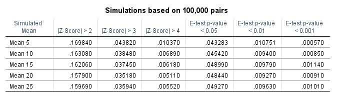
So you can see my Poisson Z-score has near constant false positive rate for each of the different means, but the overall rate is higher than you would expect from the theoretical standard normal distribution. My advice to up the threshold to 3 only limits the false positive rate for this data to around 4 in 100, whereas setting the threshold to a Z-score of 4 makes it fewer than 1 in 100. Note these are false positives in either direction, so the false positive rate includes both false alarms for significantly increasing trends as well as significantly decreasing trends.

The e-test is as advertised though, the false positive rate is pretty much exactly as it should be for p-values of less than 0.05, 0.01, and 0.001. So in this round the e-test is a clear winner based on false positives over my Poisson Z-score.

Testing the power of each procedure

To be able to test the power of the procedure, I add in actual differences to the underlying Poisson distributed random values and then see if the procedure identifies those changes. The differences I test are:

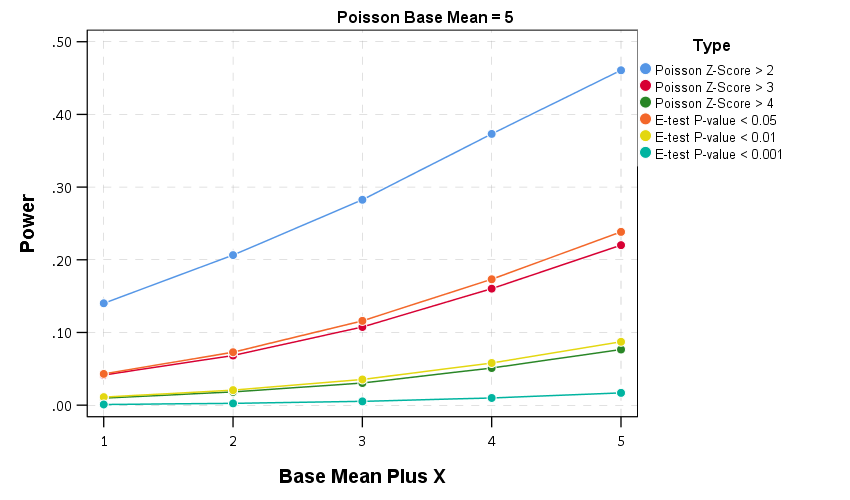
  • base 5, add in increase of 1 to 5 by 1
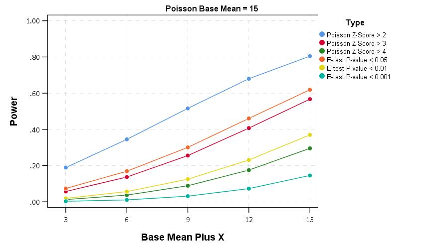
  • base 15, add in increase of 3 to 15 by 3
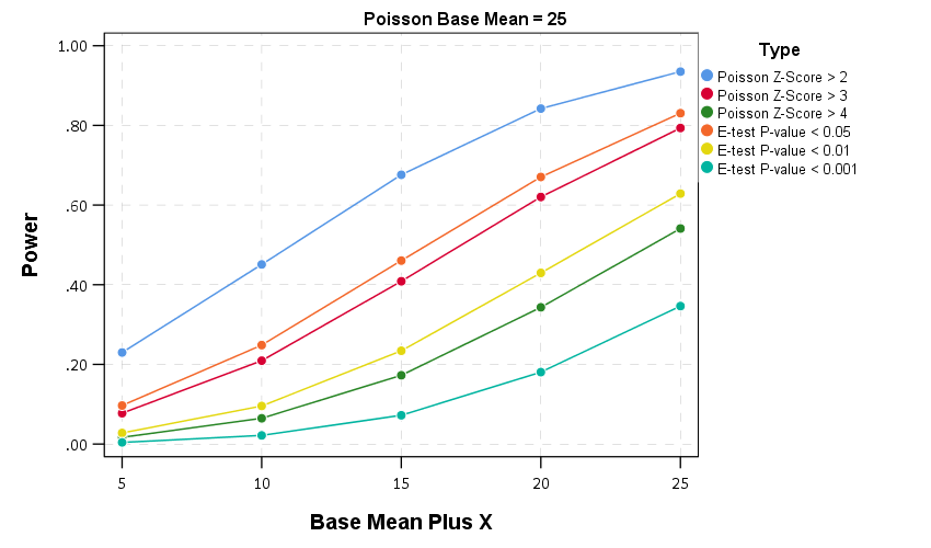
  • base 25, add in increase of 5 to 25 by 5

I do each of these for pairs of again 100,000 random Poisson draws, then see how often the procedure flags the the second value as being significantly larger than the first (so I don’t count bad inferences in the wrong direction). Unlike the prior simulation, these numbers are always different, so a test with 100% power would always say these simulated values are different. No test will ever reach that level of power though for tiny differences in Poisson data, so we see what proportion of the tests are flagged as different, and that proportion is the power of the test. In the case with tiny changes in the underlying Poisson distribution, any test will have less power, so you evaluate the power of the test over varying ranges of actual differences in the underlying data.

Then we can draw the power curves for each procedure, where the X axis is the difference from the underlying Poisson distribution, and the Y axis is the proportion of true positives flagged for each procedure.2 A typical "good" amount of power is considered to be 0.80, but that is more based on being a simple benchmark to aim for in experimental designs than any rigorous reasoning that I am aware of.

So you can see there is a steep trade-off in power with setting a higher threshold for either the Poisson Z score or the E-test. The curves for the Z score of above 3 and above 4 basically follow the E-test curves for <0.05 and <0.01. The Poisson Z-score of over 2 has a much higher power, but of course that comes with the much higher false positive rate as well.

For the lowest base mean of 5, even doubling the underlying rate to 10 still has quite low power to uncover the difference via any of these tests. With bases of 15 and 25 doubling gets into a bit better range of at least 0.5 power or better. Despite the low power though, the way these statistics are typically implemented in crime analysis departments along regular intervals, I think doing a Poisson Z-score of > 3 should be the lowest evidentiary threshold an analyst should use to say "lets look into this increase further".

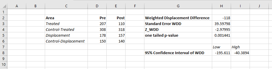
Of course since the E-test is better behaved than my Poisson Z-score you could swap that out as well. It is a bit harder to implement as a simple spreadsheet formula, but for those who do not use R or Python I have provided an excel spreadsheet to test the differences in two simple pre-post counts in the data files to replicate this analysis.

In conclusion

I see a few things to improve upon this work in the future.

First is that given the low power, I wonder if there is a better way to identify changes when monitoring many series but still be able to control the false positive rate. Perhaps some lower threshold for the E-test but simultaneously doing a false discovery rate correction to the p-values, or maybe some way to conduct partial pooling of the series into a multi-level model with shrinkage and actual parameters of the increase over time.

A second is a change in the overall approach about how such series are monitored, in particular using control charting approaches in place of just testing one vs another, but to identify consistent rises and falls. Control charting is tricky with crime data — there is no gold standard for when an alarm should be sounded, crime data show seasonality that needs to be adjusted, and it is unclear when to reset the CUSUM chart — but I think those are not unsolvable problems.

One final thing I need to address with future work is the fact that crime data is often over-dispersed. For my Poisson Z-score just setting the threshold higher with data seemed to work ok for real and simulated data distributed like a negative binomial distribution, but I would need to check whether that is applicable to the e-test as well. I need to do more general analysis to see the typical amounts of over/under dispersion though in crime data to be able to generate a reasonable simulation though. I can probably use NIBRS data to figure that out — so for the next blog post!


  1. Note the e-test is not defined when both values are zero.

  2. You can technically calculate the exact power of the e-test, see the cited Ksrishnamoorthy & Thomson (2004) article that introduces it. For simplicity I am just doing the simulation for both my Poisson Z-scores and the e-test here.

Much ado about nothing: Overinterpreting volatility in homicide rates

I’m not much of a macro criminologist, but being asked questions by my dad (about Richard Rosenfeld and the Ferguson effect) and the dentist yesterday (asking about some of Trumps comments about rising crime trends) has prompted me to jump into it and give my opinion. Long story short — many sources I believe are overinterpreting short term fluctuations as more meaningful than they are.

First I will tackle national crime rates. So if you have happened to walk by a TV playing CNN the past few days, you may have heard Donald Trump being criticized for his statements on crime rates. This is partially a conflation with the difference between overall levels of crime versus changes in crime over time. Basically crime is currently low compared to historical patterns, but homicide rates have been rising in the past two years. This is easier to show in a chart than to explain in words. So here is the national estimated homicide rate per 100,000 individuals since 1960.1

2016 is not official and is still an estimate, but basically the pattern is this – crime has been falling generally across the country since the early 1990’s. Crime rates in just the past few years have finally dropped below levels in the 1960’s, but for the past two years homicides have been increasing. So some have pointed to the increase in the past two years and have claimed the sky is falling. To say this they say the rate of change is the largest in past 40 years. There are better charts to show rates of change (a semi-log chart), but the overall look is basically the same.

You have to really squint to see that change from 2014 to 2015 is a larger jump than any of the changes over the entire period, so arguments based on the size of recent changes in the homicide rate are hyperbole (either on a linear scale or a logarithmic scale). And even if you take the recent increases over the past two years as evidence of a more general rising trend, for a broader term pattern we still have homicide rates close to a low point in the past 50 years.

For a bit of general advice — any source that gives you a percent change you always want to see the base numbers and any longer term historical trends. Any media source that cites recent increases in homicides without providing this graph of long term historical crime trends is simply misleading. I’ve seen this done in many places, see this example from the New York Times or this recent note from the Economist. So this isn’t something specific to the President.

Now, macro criminologists don’t really have any better track record explaining these patterns than macro economists have in explaining economic trends. Basically we have a bunch of patch work theories that make sense for parts of the trend, but not the entire time frame. Changes in routine activities in 1960’s, increases in incarceration, the decline of crack use, ease of calling 911 with cell-phones, lead use, abortion (just to name a few). And academics come up with new theories all the time, the most recent being the Ferguson effect — which is simply another term for de-policing.

Now a bit on trends for specific cities. How this ties in with the national trend is that some articles have been pointing out that some cities have seen increases and some have not. That is fine to point out (albeit trivial), but then the articles frequently go on generate stories about why crime is rising in those specific places. Those on the left cite civil unrest and police brutality as possible reasons (Milwaukee, St. Louis, Chicago, Baltimore), while those on the right cite the deleterious effects of police departments not being as proactive (stops in Chicago, arrests in Baltimore).

While any of these explanations may turn out reasonable in the end, I’m pretty sure most of these articles severely underappreciate the volatility in homicide rates. Take an example with St. Louis, with a city population of just over 300,000. A homicide rate of 50 individuals per 100,000 means a total of 150 murders. A homicide rate of 40 per 100,000 means 120 murders. So we are only talking about a change of 30 murders overall. Fluctuations of around 10 in the murder rate would not be unexpected for a city with a population of 300,000 individuals. The confidence interval for a rate of 150 murders per 300,000 individuals is 126 to 176 murders.2

Even that though understates the typical volatility in homicide rates. As basically that assumes the proportion does not change over time. In reality crime statistics are more bursty, and show wilder fluctuations in different places.3 To show this for many cities, I use the data from the Economist article mentioned earlier, and create a motion chart of the changes in homicide rates over time. The idea behind this chart is a funnel chart. Cities with lower populations will show higher variance, and subsequently those dots on the left hand side of the chart will jump around alot more. The population figures are current and not varying, so the dots just move up and down on the Y axis.

For best viewing, make the X axis on the log scale, and size the points according to the population of the city. If you are at a desktop computer, you can open up a bigger version of the chart here.

Selecting individual points and then letting the animation run though illustrates the typical variability of crime over time. Here is the trace of St. Louis over the 36 year period.

New Orleans is another good example, we have fluctuations from under 30 to over 90 in the time period.

And here is Chicago, which shows less fluctuation than the smaller cities (as expected) but still has a range of homicide rates around 20 over the time period.

Howard Wainer has previously pointed this relationship out, and called it The Most Dangerous Equation. Basically, if you look you will be able to find some upward crime trends, especially in smaller cities. You need to look at it in the long term though and understand typical fluctuations to make a reasonable decision as to whether crime is increasing or if it is just typical year to year variation. The majority of news articles on the topic and just chock full of post hoc ergo propter hoc for particular cherry picked cites, and they often don’t make sense in explaining crime patterns over the past decade in those particular cities, let alone make sense for different cities experience similar conditions but not having rising homicide rates.


  1. For my notes about data sources, generally the data have come from the FBI UCR data tool (for the 1960 through 2014 data). 2015 data have come from the FBI web page for the 2015 UCR report. The 2016 projections come from this Economist article as well as the 50 cities data for the google motion chart.
  2. Calculated in R via (binom.test(150,300000)$conf.int[1:2])*300000. This is the exact Clopper-Pearson confidence interval.
  3. So even though this 538 article does a better job of acknowledging volatility, whatever test they use to determine statistically significant increases is likely to have too many false positives.