
So Jerry nerdsniped me again with his Crime Increase Dispersion statistic (Ratcliffe, 2010). Main motivation for this post is that I don’t find that stat very intuitive to be frank. So here are some alternate plots, based on how counts of crime approximately follow a Poisson distribution. These get at the same question though as Jerry’s work, is a crime increase (or decrease) uniform across the city or specific to a few particular sub-areas.
First, in R I am going to simulate some data. This creates a set of data that has a constant increase over 50 areas of 20%, but does the post crime counts as Poisson distributed (so it isn’t always exactly a 20% increase). I then create 3 outliers (two low places and one high place).
###########################################
#Setting up the simulation
set.seed(10)
n <- 50
low <- 10
hig <- 400
inc <- 0.2
c1 <- trunc(runif(n,low,hig))
c2 <- rpois(n,(1+inc)*c1)
#Putting in 2 low outliers and 1 high outlier
c2[5] <- c1[5]*0.5
c2[10] <- c1[10]*0.5
c2[40] <- c1[40]*2
#data frame for ggplot
my_dat <- data.frame(pre=c1,post=c2)
###########################################
The first plot I suggest is a simple scatterplot of the pre-crime counts on the X axis vs the post-crime counts on the Y axis. My make_cont function takes those pre and post crime counts as arguments and creates a set of contour lines to put as a backdrop to the plot. Points within those lines support the hypothesis that the area increased in crime at the same rate as the overall crime increase, taking into account the usual ups and downs you would expect with Poisson data. This is very similar to mine and Jerry’s weighted displacement difference test (Wheeler & Ratcliffe, 2018), and uses a normal based approximation to examine the differences in Poisson data. I default to plus/minus three because crime data tends to be slightly over-dispersed (Wheeler, 2016), so coverage with real data should be alittle better (although here is not necessary).
###########################################
#Scatterplot of pre vs post with uniform
#increase contours

make_cont <- function(pre_crime,post_crime,levels=c(-3,0,3),lr=10,hr=max(pre_crime)*1.05,steps=1000){
    #calculating the overall crime increase
    ov_inc <- sum(post_crime)/sum(pre_crime)
    #Making the sequence on the square root scale
    gr <- seq(sqrt(lr),sqrt(hr),length.out=steps)^2
    cont_data <- expand.grid(gr,levels)
    names(cont_data) <- c('x','levels')
    cont_data$inc <- cont_data$x*ov_inc
    cont_data$lines <- cont_data$inc + cont_data$levels*sqrt(cont_data$inc)
    return(as.data.frame(cont_data))
}

contours <- make_cont(c1,c2)

library(ggplot2)
eq_plot <- ggplot() +
           geom_line(data=contours, color="darkgrey", linetype=2,
                     aes(x=x,y=lines,group=levels)) +
           geom_point(data=my_dat, shape = 21, colour = "black", fill = "grey", size=2.5,
                      alpha=0.8, aes(x=pre,y=post)) +
           scale_y_continuous(breaks=seq(0,500,by=100)) +
           coord_fixed() +
           xlab("Pre Crime Counts") + ylab("Post Crime Counts")
           #scale_y_sqrt() + scale_x_sqrt() #not crazy to want square root scale here
eq_plot

#weighted correlation to view the overall change
cov.wt(my_dat[,c('pre','post')], wt = 1/sqrt(my_dat$pre), cor = TRUE)$cor[1,2]
###########################################
So places that are way outside the norm here should pop out, either for increases or decreases. This will be better than Jerry’s stats for identifying outliers in lower baseline crime places.
I also show how to get an overall index based on a weighted correlation coefficient on the last line (as is can technically return a value within (-1,1), so might square it for a value within (0,1)). But I don’t think the overall metric is very useful – it has no operational utility for a crime department deciding on a strategy. You always need to look at the individual locations, no matter what the overall index metric says. So I think you should just cut out the middle man and go straight to these plots. I’ve had functionally similar discussions with folks about Martin Andresen’s S index metric (Wheeler, Steenbeek, Andresen, 2018), just make your graphs and maps!
An additional plot that basically takes the above scatterplot and turns it on its side is a Poisson version of a Bland-Altman plot. Traditionally this plot is the differences of two measures on the Y axis, and the average of the two measures on the X axis. Here to make the measures have the same variance, I divide the post-pre crime count differences by sqrt(post+pre). This is then like a Poison Z-score, taking into account the null of an equal increase (or decrease) in crime stats among all of the sub-areas. (Here you might also use the Poisson e-test to calculate p-values of the differences, but the normal based approximation works really well for say crime counts of 5+.)
###########################################
#A take on the Bland-Altman plot for Poisson data

ov_total <- sum(my_dat$post)/sum(my_dat$pre)
my_dat$dif <- (my_dat$post - ov_total*my_dat$pre)/sqrt(my_dat$post + my_dat$pre)
my_dat$ave <- (my_dat$post + my_dat$pre)/2

ba_plot <- ggplot(data=my_dat, aes(x=ave, y=dif)) +
           geom_point(shape = 21, colour = "black", fill = "grey", size=2.5, alpha=0.8) +
           scale_y_continuous(breaks=seq(-8,6,by=2)) +
           xlab("Average Crime") + ylab("Z-score (Equal Increase)")

ba_plot

#false discovery rate correction
my_dat$p_val <- pnorm(-abs(my_dat$dif))*2 #two-tailed p-value
my_dat$p_adj <- p.adjust(my_dat$p_val,method="BY") #BY correction since can be correlated
my_dat <- my_dat[order(my_dat$p_adj),]
my_dat #picks out the 3 cases I adjusted
###########################################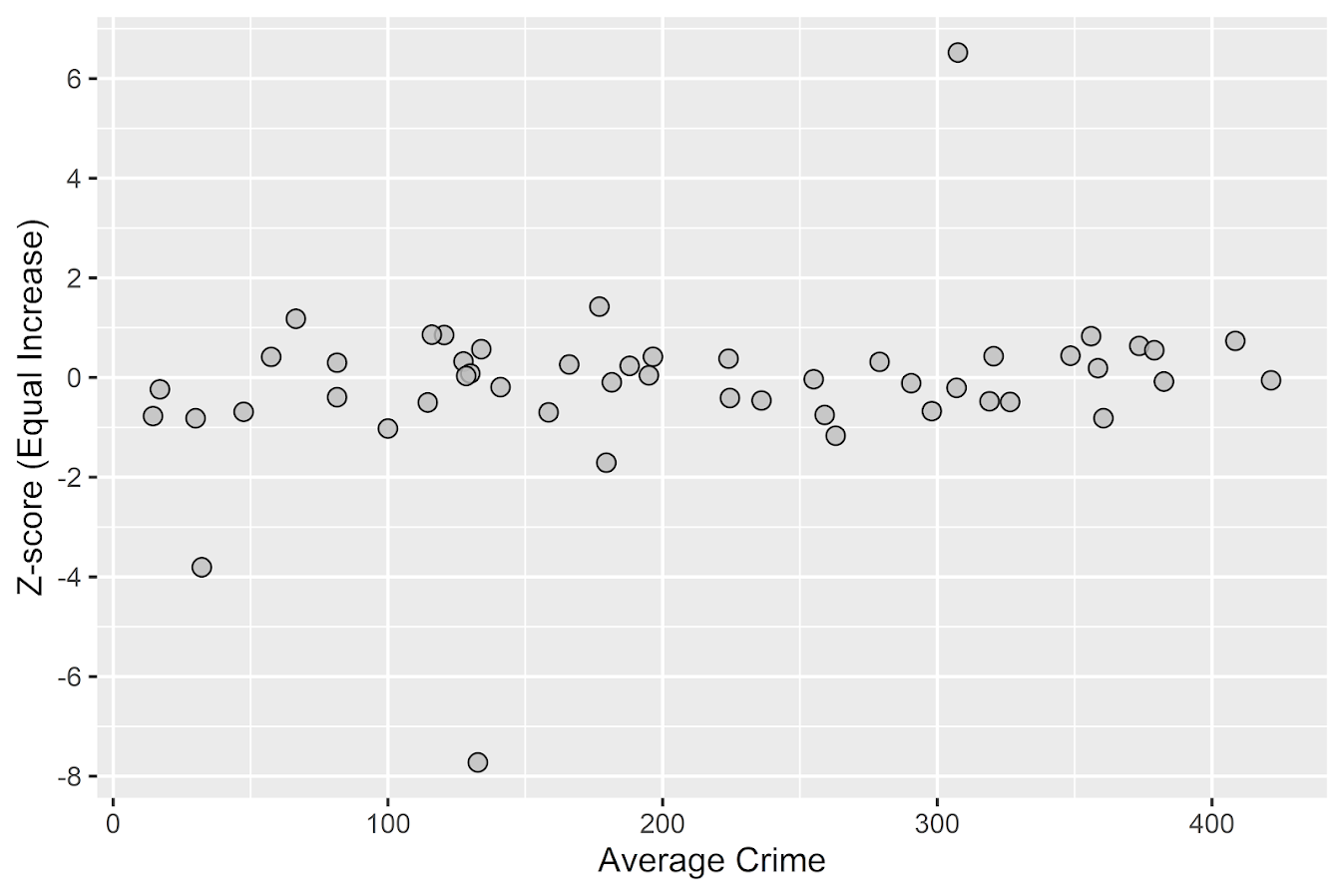
So again places with large changes that do not follow the overall trend will pop out here, both for small and large crime count places. I also show here how to do a false-discovery rate correction (same as in Wheeler, Steenbeek, & Andresen, 2018) if you want to actually flag specific locations for further investigation. And if you run this code you will see it picks out my three outliers in the simulation, and all other adjusted p-values are 1.
One thing to note about these tests are they are conditional on the observed overall citywide crime increase. If it does happen that only one area increased by alot, it may make more sense to set these hypothesis tests to a null of equal over time. If you see that one area is way above the line and a ton are below the line, this would indicate that scenario. To set the null to no change in these graphs, for the first one just pass in the same pre estimates for both the pre and post arguments in the make_cont function. For the second graph, change ov_total <- 1 would do it.
References
- Ratcliffe, J. H. (2010). The spatial dependency of crime increase dispersion. Security Journal, 23(1), 18-36.
- Wheeler, A. P. (2016). Tables and graphs for monitoring temporal crime trends: Translating theory into practical crime analysis advice. International Journal of Police Science & Management, 18(3), 159-172.
- Wheeler, A. P., & Ratcliffe, J. H. (2018). A simple weighted displacement difference test to evaluate place based crime interventions. Crime Science, 7(1), 11.
- Wheeler, A. P., Steenbeek, W., & Andresen, M. A. (2018). Testing for similarity in area‐based spatial patterns: Alternative methods to Andresen’s spatial point pattern test. Transactions in GIS, 22(3), 760-774.


1 Comment