Comparing samples post-matching – some helper functions after FUZZY (SPSS)

I’ve been conducting quite a few case-control or propensity score matching studies lately. So I wrote some helper functions for use after the SPSS FUZZY command. These create the case-control dataset, plus calculate some of the standardized bias metrics for matching on continuous outcomes.

The use case here is if you have a sub-set of treated individuals, and you want to draw a comparison sample matched on certain characteristics (which can include just one propensity score and/or multiple covariates). Here is the macro to follow along, and I will provide a quick walkthrough of how it works. (There is documentation in the header for what the parameters are and what the function returns.)

So first I am going to import my macro using INSERT:

*Inserting the macro.
INSERT FILE = "C:\Users\andrew.wheeler\Dropbox\Documents\BLOG\Matching_StandBias\PropBalance_Macro.sps".

Now just for illustration I am going to make a fake dataset to illustrate the utility of matching. Here I have a universe of 2,000 people. There is a subset of treated individuals (165), but they are only selected if they are under 28 years old and male.

*Create a fake dataset.
SET SEED 10.
INPUT PROGRAM.
LOOP Id = 1 TO 2000.
END CASE.
END LOOP.
END FILE.
END INPUT PROGRAM.
DATASET NAME OrigData.
COMPUTE Male = RV.BERNOULLI(0.7).
COMPUTE YearsOld = RV.UNIFORM(18,40).
FORMATS Male (F1.0) YearsOld (F2.0).
DO IF Male = 1 AND YearsOld <= 28.
  COMPUTE Treated = RV.BERNOULLI(0.3).
ELSE.
  COMPUTE Treated = 0.
END IF.
COMPUTE #OutLogit = 0.7 + 0.5*Male - 0.05*YearsOld - 0.7*Treated.
COMPUTE #OutProb = 1/(1 + EXP(-#OutLogit)).
COMPUTE Outcome = RV.BERNOULLI(#OutProb).
FREQ Treated Outcome.

So what happens when we make comparisons among the entire sample, which includes females and older people?

*Compare means with the original full sample.
T-TEST GROUPS=Treated(0 1) /VARIABLES=Outcome.

We get basically no difference, our treated mean is 0.40 and the untreated mean is 0.39. But instead of comparing the 165 to the entire sample, we draw more reasonable control cases. Here we do an exact match on Male, and then we do a fuzzy match on YearsOld to within 3 years.

*Draw the comparison sample based on Male (exact) and YearsOld (Fuzzy).
FUZZY BY=Male YearsOld SUPPLIERID=Id NEWDEMANDERIDVARS=Match1 GROUP=Treated
    EXACTPRIORITY=FALSE FUZZ=0 3 MATCHGROUPVAR=MGroup DRAWPOOLSIZE=CheckSize
/OPTIONS SAMPLEWITHREPLACEMENT=FALSE MINIMIZEMEMORY=TRUE SHUFFLE=TRUE SEED=10.

Now what the FUZZY command does in SPSS is creates a new variable, named Match1 here, that places the matched Id in the same row as the original treated sample. You cannot easily make the updated comparisons that you want though in this data format. So after writing the code to do this about 7 times, I decided to make it into a simple macro. Here is an example of calling my macro, !MatchedSample.

*Now run my macro to make the matched sample.
!MatchedSample Dataset=OrigData Id=Id Case=Treated MatchGroup=MGroup Controls=[Match1] 
  MatchVars=[YearsOld] OthVars=Outcome Male.

This then spits out two new datasets, as well as appends a new variable to the original dataset named MatchedSample to show what cases have been matched. Then it is simple to see the difference in our means among our matched sample.

*Now the t-test with the matched sample subset.
DATASET ACTIVATE MatchedSamples.
T-TEST GROUPS=Treated(0 1) /VARIABLES=Outcome.

Which shows the same mean for treated, 0.40 (since all the treated were matched), but the comparison group now has a mean of 0.51, so here the treatment reduced the outcome.

The macro also provides an additional dataset named AggStats that estimates the standardized bias in the original sample vs. the standardized bias in the matched sample. (Standardized bias is just Cohen’s D measure multiplied by 100.) This then also calculates the standardized bias reduction for each continuous covariate. Before I forget, a neat way to test for balance jointly (instead of one variable at a time) is to conduct an additional regression equation predicting treatment and then testing for all coefficients equal to zero.

In this fake example the propensity scores would not be needed, you could just estimate a typical logistic regression equation controlling for YearsOld and Male. But the utility of matching comes from when you don’t know the functional form of how those covariates affect the outcome. So if the outcome was a very non-linear function of age, you don’t have to worry about estimating that function, you can just match on age and still get a reasonable comparison of the mean difference for treated vs. not-treated.

ROC and Precision-Recall curves in SPSS

Recently I was tasked with evaluating a tool used to predict violence. I initially created some code to plot ROC curves in SPSS for multiple classifiers, but then discovered that the ROC command did everything I wanted. Some recommend precision-recall curves in place of ROC curves, especially when the positive class is rare. This fit my situation (a few more than 100 positive cases in a dataset of 1/2 million) and it was pretty simple to adapt the code to return the precision. I will not go into the details of the curves (I am really a neophyte at this prediction stuff), but here are a few resources I found useful:

The macro is named !Roc and it takes three parameters:

  • Class – the numeric classifier (where higher equals a greater probability of being predicted)
  • Target – the outcome you are trying to predict. Positive cases need to equal 1 and negative cases 0
  • Suf – this the the suffix on the variables returned. The procedure returns “Sens[Suf]”, “Spec[Suf]” and “Prec[Suf]” (which are the sensitivity, specificity, and precision respectively).

So here is a brief made up example using the macro to draw ROC and precision and recall curves (entire syntax including the macro can be found here). So first lets make some fake data and classifiers. Here Out is the target being predicted, and I have two classifiers, X and R. R is intentionally made to be basically random. The last two lines show an example of calling the macro.

SET SEED 10.
INPUT PROGRAM.
LOOP #i = 20 TO 70.
  COMPUTE X = #i + RV.UNIFORM(-10,10).
  COMPUTE R = RV.NORMAL(45,10).
  COMPUTE Out = RV.BERNOULLI(#i/100).
  END CASE.
END LOOP.
END FILE.
END INPUT PROGRAM.
DATASET NAME RocTest.
DATASET ACTIVATE RocTest.
EXECUTE.

!Roc Class = X Target = Out Suf = "_X".
!Roc Class = R Target = Out Suf = "_R".

Now we can make an ROC curve plot with this information. Here I use inline TRANS statements to calculate 1 minus the specificity. I also use a blending trick in GPL to make the beginning of the lines connect at (0,0) and the end at (1,1).

*Now make a plot with both classifiers on it.
GGRAPH
  /GRAPHDATASET NAME="graphdataset" VARIABLES=Spec_X Sens_X Spec_R Sens_R 
  /GRAPHSPEC SOURCE=INLINE.
BEGIN GPL
  PAGE: begin(scale(770px,600px))
  SOURCE: s=userSource(id("graphdataset"))
  DATA: Spec_X=col(source(s), name("Spec_X"))
  DATA: Sens_X=col(source(s), name("Sens_X"))
  DATA: Spec_R=col(source(s), name("Spec_R"))
  DATA: Sens_R=col(source(s), name("Sens_R"))
  TRANS: o = eval(0)
  TRANS: e = eval(1)
  TRANS: SpecM_X = eval(1 - Spec_X)
  TRANS: SpecM_R = eval(1 - Spec_R) 
  COORD: rect(dim(1,2), sameRatio())
  GUIDE: axis(dim(1), label("1 - Specificity"), delta(0.1))
  GUIDE: axis(dim(2), label("Sensitivity"), delta(0.1))
  GUIDE: text.title(label("ROC Curve"))
  SCALE: linear(dim(1), min(0), max(1))
  SCALE: linear(dim(2), min(0), max(1))
  ELEMENT: edge(position((o*o)+(e*e)), color(color.lightgrey))
  ELEMENT: line(position(smooth.step.right((o*o)+(SpecM_R*Sens_R)+(e*e))), color("R"))
  ELEMENT: line(position(smooth.step.right((o*o)+(SpecM_X*Sens_X)+(e*e))), color("X"))
  PAGE: end()
END GPL.

This just replicates the native SPSS ROC command though, and that command returns other useful information as well (such as the actual area under the curve). We can see though that my calculations of the curve are correct.

*Compare to SPSS's ROC command.
ROC R X BY Out (1)
  /PLOT CURVE(REFERENCE)
  /PRINT SE COORDINATES.

To make a precision-recall graph we need to use the path element and sort the data in a particular way. (SPSS’s line element works basically the opposite of the way we need it to produce the correct sawtooth pattern.) The blending trick does not work with this graph, but it is immaterial in interpreting the graph.

*Now make precision recall curves.
*To make these plots, need to reshape and sort correctly, so the path follows correctly.
VARSTOCASES
  /MAKE Sens FROM Sens_R Sens_X
  /MAKE Prec FROM Prec_R Prec_X
  /MAKE Spec FROM Spec_R Spec_X
  /INDEX Type.
VALUE LABELS Type
 1 'R'
 2 'X'.
SORT CASES BY Sens (A) Prec (D).
GGRAPH
  /GRAPHDATASET NAME="graphdataset" VARIABLES=Sens Prec Type
  /GRAPHSPEC SOURCE=INLINE.
BEGIN GPL
  PAGE: begin(scale(770px,600px))
  SOURCE: s=userSource(id("graphdataset"))
  DATA: Sens=col(source(s), name("Sens"))
  DATA: Prec=col(source(s), name("Prec"))
  DATA: Type=col(source(s), name("Type"), unit.category())
  COORD: rect(dim(1,2), sameRatio())
  GUIDE: axis(dim(1), label("Recall"), delta(0.1))
  GUIDE: axis(dim(2), label("Precision"), delta(0.1))
  GUIDE: text.title(label("Precision-Recall Curve"))
  SCALE: linear(dim(1), min(0), max(1))
  SCALE: linear(dim(2), min(0), max(1))
  ELEMENT: path(position(Sens*Prec), color(Type))
  PAGE: end()
END GPL.
*The sawtooth is typical.

These curves both show that X is the clear winner. In my use application the ROC curves are basically superimposed, but there is more separation in the precision-recall graph. Being very generic, most of the action in the ROC curve is at the leftmost area of the graph (with only a few positive cases), but the PR curve is better at identifying how wide you have to cast the net to find the few positive cases. In a nut-shell, you have to be willing to live with many false positives to be able to predict just the few positive cases.

I would be interested to hear other analysts perspective. Predicting violence is a popular topic in criminology, with models of varying complexity. But what I’m finding so far in this particular evaluation is basically that there are set of low hanging fruit of chronic offenders that score high no matter how much you crunch the numbers (around 60% of the people who committed serious violence in a particular year in my sample), and then a set of individuals with basically no prior history (around 20% in my sample). So basically ad-hoc scores are doing about as well predicting violence as more complicated machine learning models (even machine learning models fit on the same data).

Aggregating values in time series charts

One common task I undertake in is to make time series graphs of crime counts, often over months or shorter time periods. Here is some example data to illustrate, a set of 20 crimes with a particular date in 2013.

*Make some fake data.
SET SEED 10.
INPUT PROGRAM.
LOOP #i = 1 TO 20.
  COMPUTE #R = RV.UNIFORM(0,364).
  COMPUTE DateRob = DATESUM(DATE.MDY(1,1,2013),#R,"DAYS").
  END CASE.
END LOOP.
END FILE.
END INPUT PROGRAM.
FORMATS DateRob (ADATE10).
EXECUTE.

SPSS has some convenient functions to aggregate right within GGRAPH, so if I want a chart of the number of crimes per month I can create my own Month variable and aggregate. The pasted GGRAPH code is generated directly though the Chart Builder GUI.

COMPUTE Month = XDATE.MONTH(DateRob).
FORMATS Month (F2.0).

*Default Line chart.
GGRAPH
  /GRAPHDATASET NAME="graphdataset" VARIABLES=Month COUNT()[name="COUNT"] MISSING=LISTWISE 
    REPORTMISSING=NO
  /GRAPHSPEC SOURCE=INLINE.
BEGIN GPL
  SOURCE: s=userSource(id("graphdataset"))
  DATA: Month=col(source(s), name("Month"), unit.category())
  DATA: COUNT=col(source(s), name("COUNT"))
  GUIDE: axis(dim(1), label("Month"))
  GUIDE: axis(dim(2), label("Count"))
  SCALE: linear(dim(2), include(0))
  ELEMENT: line(position(Month*COUNT), missing.wings())
END GPL.

So at first glance that looks alright, but notice that the month’s do not start until 3. Also if you look close you will see a 5 is missing. What happens is that to conduct the aggregation in GGRAPH, SPSS needs to treat Month as a categorical variable – not a continuous one. SPSS only knows of the existence of categories contained in the data. (A similar thing happens in GROUP BY statements in SQL.) So SPSS just omits those categories.

We can manually specify all of the month categories in the axis. To reinforce where the measurements come from I also plot the points on top of the line.

*Line chart with points easier to see.
GGRAPH
  /GRAPHDATASET NAME="graphdataset" VARIABLES=Month COUNT()[name="COUNT"] MISSING=LISTWISE 
    REPORTMISSING=NO
  /GRAPHSPEC SOURCE=INLINE.
BEGIN GPL
  SOURCE: s=userSource(id("graphdataset"))
  DATA: Month=col(source(s), name("Month"), unit.category())
  DATA: COUNT=col(source(s), name("COUNT"))
  GUIDE: axis(dim(1), label("Month"))
  GUIDE: axis(dim(2), label("Count of Robberies"))
  SCALE: cat(dim(1), include("1","2","3","4","5","6","7","8","9","10","11","12"))
  SCALE: linear(dim(2), include(0))
  ELEMENT: line(position(Month*COUNT), missing.wings())
  ELEMENT: point(position(Month*COUNT), color.interior(color.black), 
           color.exterior(color.white), size(size."10"))
END GPL.

So you can see that include statement with all of the month numbers. You can also see what that mysterious missing.wings() function actually does in this example. It is misleading though, as 5 isn’t missing, it is simply zero.

A simple workaround for this example is to just use a bar chart. A zero bar is not misleading.

GGRAPH
  /GRAPHDATASET NAME="graphdataset" VARIABLES=Month COUNT()[name="COUNT"] MISSING=LISTWISE 
    REPORTMISSING=NO
  /GRAPHSPEC SOURCE=INLINE.
BEGIN GPL
  SOURCE: s=userSource(id("graphdataset"))
  DATA: Month=col(source(s), name("Month"), unit.category())
  DATA: COUNT=col(source(s), name("COUNT"))
  GUIDE: axis(dim(1), label("Month"))
  GUIDE: axis(dim(2), label("Count of Robberies"))
  SCALE: cat(dim(1), include("1","2","3","4","5","6","7","8","9","10","11","12"))
  SCALE: linear(dim(2), include(0))
  ELEMENT: interval(position(Month*COUNT))
END GPL.

I often prefer line charts for several reasons though, often to superimpose multiple lines (e.g. I may want to put the lines for counts of crimes in 2012 and 2011 as well). Line charts are clearly superior to clustered bar charts in that situation. Also I prefer to be able to keep time is a numerical variable in the charts, and one can’t do that with aggregation in GGRAPH.

So I do the aggregation myself.

*Make a new dataset.
DATASET DECLARE AggRob.
AGGREGATE OUTFILE='AggRob'
  /BREAK = Month
  /CountRob = N.
DATASET ACTIVATE AggRob.

But we have the same problem here, in that months with zero counts are not in the data. To fill in the zeroes, I typically make a new dataset of the date ranges using INPUT PROGRAM and loops, same as I did to make the fake data at the beginning of the post.

*Make a new dataset to expand to missing months.
INPUT PROGRAM.
LOOP #i = 1 TO 12.
  COMPUTE Month = #i.
  END CASE.
END LOOP.
END FILE.
END INPUT PROGRAM.
DATASET NAME TempMonExpan.

Now we can simply merge this expanded dataset back into AggRob, and the recode the system missing values to zero.

*File merge back into AggRob.
DATASET ACTIVATE AggRob.
MATCH FILES FILE = *
  /FILE = 'TempMonExpan'
  /BY Month.
DATASET CLOSE TempMonExpan.
RECODE CountRob (SYSMIS = 0).

Now we can make our nice line chart with the zeros in place.

GGRAPH
  /GRAPHDATASET NAME="graphdataset" VARIABLES=Month CountRob
  /GRAPHSPEC SOURCE=INLINE.
BEGIN GPL
  SOURCE: s=userSource(id("graphdataset"))
  DATA: Month=col(source(s), name("Month"))
  DATA: CountRob=col(source(s), name("CountRob"))
  GUIDE: axis(dim(1), label("Month"), delta(1), start(1))
  GUIDE: axis(dim(2), label("Count of Robberies"), start(0))
  SCALE: linear(dim(1), min(1), max(12))
  SCALE: linear(dim(2), min(-0.5))
  ELEMENT: line(position(Month*CountRob))
  ELEMENT: point(position(Month*CountRob), color.interior(color.black), 
           color.exterior(color.white), size(size."10"))
END GPL.

To ease making these separate time series datasets I have made a set of macros, one named !TimeExpand and the other named !DateExpand. Both take a begin and end date and then make an expanded dataset of times. The difference between the two is that !TimeExpand takes a user specified step size, and !DateExpand takes a string of the types used in SPSS date time calculations. The situation in which I like to use !TimeExpand is when I do weekly aggregations from a specified start time (e.g. the weeks don’t start over at the beginning of the year). It also works for irregular times though, say if you wanted 15 minute bins. !DateExpand can take years, quarters, months, weeks, days, hours, minutes, and seconds. The end dates can also be system variables like $TIME as well. The macro can be found here, and it contains several examples within. Update: I have added a few macros that do the same thing for panel data. It just needs to take one numeric variable as the panel id, otherwise the argument for the macros are the same.

Visualizing multi-level data using ellipses

After reading Elliptical Insights: Understanding Statistical Methods through Elliptical Geometry (Friendly, Monette & Fox 2013) I was interested in trying ellipses out for viz. multi-level data. Note there is an add-on utility for SPSS to draw ellipses in R graphics (ScatterWEllipse.spd), but I wanted to give it a try in SPSS graphics.

So I’ve made two SPSS macros. The first, !CorrEll, takes two variables and returns a set of data that can be used by the second macro, !Ellipse, to draw data ellipses based on the eigenvectors and eigenvalues of those 2 by 2 covariance matrices by group. In this example I will be using the popular2.sav data available from Joop Hox’s Multilevel Analysis book. The code can be downloaded from here to follow along.

So first lets define the FILE HANDLE where the data and scripts are located. Then we can read in the popular2.sav data. I only know very little about the data – but it is students nested within classrooms (pretty close to around 20 students in 100 classes), and it appears focused on student evaluations of teachers.


FILE HANDLE Mac / name = "!Location For Your Data!".
INSERT FILE = "Mac\MACRO_CorrEll.sps".
INSERT FILE = "Mac\MACRO_EllipseSPSS.sps".
GET FILE = "Mac\popular2.sav".
DATASET NAME popular2.

Now we can call the first macro, !CorrEll for the two variables extrav (a measure of the teachers extroversion) and popular (there are two popular measures in here, and I am unsure what the difference between them are – this is the "sociometry" popular variable though). This will return a dataset with the means, variances and covariances for those two variables split by the group variable class. It will also return the major and minor diameters based on the square root of the eigenvalues of that 2 by 2 matrix, and then the ellipse is rotated according to direction of the covariance.


!CorrEll X = extrav Y = popular Group = class.

This returns a dataset named CorrEll as the active dataset, with which we can then draw the coordinate geometry for our ellipses using the !Ellipse macro.


!Ellipse X = Meanextrav Y = Meanpopular Major = Major Minor = Minor Angle = AngDeg Steps = 100.

The Steps parameter defines the coordinates around the circle that are drawn. So more steps means a more precise drawing (but also more datapoints to draw). This makes a new dataset called Ellipse as the active dataset, and based on this we can draw those ellipses in SPSS using the path element with the split modifier so the ellipses aren’t drawn in one long pen stroke. Also note the ellipses are not closed circles (that is the first point does not meet the last point) so I use the closed() option when drawing the paths.


FORMATS X Y Id (F3.0).
GGRAPH
  /GRAPHDATASET NAME="graphdataset" DATASET = 'Ellipse' VARIABLES=X Y Id
  REPORTMISSING=NO
  /GRAPHSPEC SOURCE=INLINE.
BEGIN GPL
 SOURCE: s=userSource(id("graphdataset"))
 DATA: X=col(source(s), name("X"))
 DATA: Y=col(source(s), name("Y"))
 DATA: Id=col(source(s), name("Id"), unit.category())
 GUIDE: axis(dim(1), label("Extraversion"))
 GUIDE: axis(dim(2), label("Popular"))
 ELEMENT: path(position(X*Y), split(Id), closed())
END GPL.

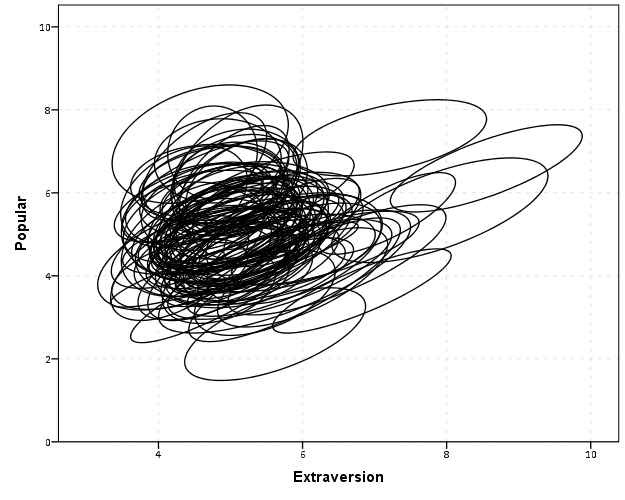
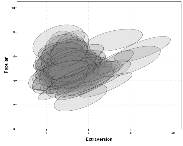
With 100 groups this is a pretty good test of the efficacy of the display. While many multi-level modelling strategies will have fewer groups, if the technique can not scale to at least 100 groups it would be a tough sell. So above is a bit of an overplotted mess, but here I actually draw the polygons with a light grey fill and use a heavy amount of transparency in both the fill and the exterior line. To draw the ellipses I use the polygon element and connect the points using the link.hull statement. The link.hull modifier draws the convex hull of the set of points, which of course an ellipse is convex.


GGRAPH
  /GRAPHDATASET NAME="graphdataset" DATASET = 'Ellipse' VARIABLES=X Y Id
  REPORTMISSING=NO
  /GRAPHSPEC SOURCE=INLINE.
BEGIN GPL
 SOURCE: s=userSource(id("graphdataset"))
 DATA: X=col(source(s), name("X"))
 DATA: Y=col(source(s), name("Y"))
 DATA: Id=col(source(s), name("Id"), unit.category())
 GUIDE: axis(dim(1), label("Extraversion"))
 GUIDE: axis(dim(2), label("Popular"))
 ELEMENT: polygon(position(link.hull(X*Y)), split(Id), color.interior(color.grey), transparency.interior(transparency."0.8"),
          transparency.exterior(transparency."0.5"))
END GPL.

I thought that using a fill might make the plot even more busy, but that doesn’t appear to be the case. Using heavy transparency helps a great deal. Now what can we exactly learn from these plots?

First, you can assess the distribution of the effect of extroversion on popularity by class. In particular for multi-level models we can assess whether we can to include random intercepts and/or random slopes. In this case the variance of the extroversion slope looks very small to me, so it may be reasonable to not let its slope vary by class. Random intercepts for classes though seem reasonable.

Other things you can assess from the plot are if there are any outlying groups, either in coordinates on the x or y axis, or in the direction of the ellipse. Even in a busy – overplotted data display like this we see that the covariances are all basically in the same positive direction, and if one were strongly negative it would stick out. You can also make some judgements about the between group and within group variances for each variable. Although any one of these items may be better suited for another plot (e.g. you could actually plot a histogram of the slopes estimated for each group) the ellipses are a high data density display that may reveal many characteristics of the data at once.

A few other interesting things that are possible to note from a plot like this are aggregation bias and interaction effects. For aggregation bias, if the direction of the orientation of the ellipses are in the opposite direction of the point cloud of the means, it provides evidence that the correlation for the aggregate data is in the opposite direction as the correlation for the micro level data.

For interaction effects, if you see any non-random pattern in the slopes it would suggest an interaction between extroversion and some other factor. The most common one is that slopes with larger intercepts tend to be flatter, and most multi-level software defaults to allow the intercepts and slopes to be correlated when they are estimated. I was particularly interested in this here, as the popularity score is bounded at 10. So I really expected that to have a limiting effect on the extroversion slope, but that doesn’t appear to be the case here.

So unfortunately none of the cool viz. things I mention (outliers, aggregation bias or interaction effects) really appear to occur in this plot. The bright side is it appears to be a convenient set of data to fit a multi-level model too, and even the ceiling effect of the popularity measure do not appear to be an issue.

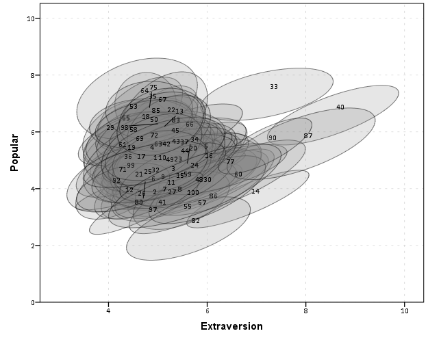
We can add in other data to the plot from either the original dataset or the CorrEll calculated dataset. Here is an example of grabbing data from the CorrEll dataset and labelling the ellipses with their group numbers. It is not very useful for the dense cloud, but for the outlying groups you can pretty easily see which label is associated with each ellipse.


DATASET ACTIVATE CorrEll.
FORMATS Meanpopular Meanextrav class (F3.0).
DATASET ACTIVATE Ellipse.
GGRAPH
  /GRAPHDATASET NAME="graphdataset" DATASET = 'Ellipse' VARIABLES=X Y Id
  /GRAPHDATASET NAME="Center" DATASET = 'CorrEll' VARIABLES=Meanpopular Meanextrav class
  REPORTMISSING=NO
  /GRAPHSPEC SOURCE=INLINE.
BEGIN GPL
 SOURCE: s=userSource(id("graphdataset"))
 DATA: X=col(source(s), name("X"))
 DATA: Y=col(source(s), name("Y"))
 DATA: Id=col(source(s), name("Id"), unit.category())
 SOURCE: c=userSource(id("Center"))
 DATA: CentY=col(source(c), name("Meanpopular"))
 DATA: CentX=col(source(c), name("Meanextrav"))
 DATA: class=col(source(c), name("class"), unit.category())
 GUIDE: axis(dim(1), label("Extraversion"))
 GUIDE: axis(dim(2), label("Popular"))
 ELEMENT: polygon(position(link.hull(X*Y)), split(Id), color.interior(color.grey), transparency.interior(transparency."0.8"),
          transparency.exterior(transparency."0.5"))
 ELEMENT: point(position(CentX*CentY), transparency.exterior(transparency."1"), label(class))
END GPL.

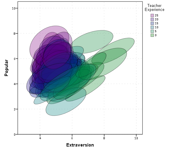
Another piece of information we can add into the plot is to color the fill of the ellipses using some alternative variable. Here I color the fill of the ellipse according to teacher experience with a green to purple continuous color ramp. SPSS uses some type of interpolation through some color space, and the default is the dreaded blue to red rainbow color ramp. With some experimentation I discovered the green to purple color ramp is aesthetically pleasing (I figured the diverging color ramps from colorbrewer would be as good a place to start as any). I use a diverging ramp as I want a higher amount of discrimination for exploratory graphics like this. Using a sequential ramp ends up muting one end of the spectrum, which I don’t really want in this circumstance.


DATASET ACTIVATE popular2.
DATASET DECLARE TeachExp.
AGGREGATE OUTFILE='TeachExp'
  /BREAK=Class
  /TeachExp=FIRST(texp).
DATASET ACTIVATE Ellipse.
MATCH FILES FILE = *
  /TABLE = 'TeachExp'
  /RENAME (Class = Id)
  /BY Id.
FORMATS TeachExp (F2.0).
*Now making plot with teacher experience colored.
DATASET ACTIVATE Ellipse.
GGRAPH
  /GRAPHDATASET NAME="graphdataset" DATASET = 'Ellipse' VARIABLES=X Y Id TeachExp
  REPORTMISSING=NO
  /GRAPHSPEC SOURCE=INLINE.
BEGIN GPL
 SOURCE: s=userSource(id("graphdataset"))
 DATA: X=col(source(s), name("X"))
 DATA: Y=col(source(s), name("Y"))
 DATA: TeachExp=col(source(s), name("TeachExp"))
 DATA: Id=col(source(s), name("Id"), unit.category())
 GUIDE: axis(dim(1), label("Extraversion"))
 GUIDE: axis(dim(2), label("Popular"))
 GUIDE: legend(aesthetic(aesthetic.color.interior), label("Teacher Experience"))
 SCALE: linear(aesthetic(aesthetic.color.interior), aestheticMinimum(color.green), aestheticMaximum(color.purple))
 ELEMENT: polygon(position(link.hull(X*Y)), split(Id), color.interior(TeachExp), transparency.interior(transparency."0.7"),
          transparency.exterior(transparency."0.5"))
END GPL.

Again I use a heavy amount of transparency and it produces what I think is a very nice looking plot. From this we can deduce that there is a clear relationship between extroversion and teacher experience, younger teachers tend to be more extroverted. We can also see that teacher experience explains some of the differences in means not explained by extroversion. That is some of the teachers with higher mean popular scores but lower extroversion scores are more experienced. This suggests the effects of teacher experience and extroversion are additive in the model predicting popularity.

You could of course color the ellipse with other variables as well. Because these are data ellipses and not confidence ellipses, you could make ellipses with fewer observations more transparent to illustrate that those estimates are less certain. Here the classrooms are all very similar size, so the error in the estimates is basically constant for all of the groups in this example.

The current code calculates the ellipses based on the eigenvectors and eigenvalues of the covariance matrix, but I may change this in the future to calculate them based on the Cholesky decomposition. If you read the Friendly paper most of the notation is written in terms of the Cholesky decomposition, and this would allow one to estimate confidence ellipses as well as the data ellipses here. So you could draw an ellipse that shows a confidence interval as opposed to the ellipses here that are just one possible level curve through the bivariate normal estimate.

Another thing I noticed the other day in the bowels of the SPSS chart template was that the xml defined glyphs had a rotation and an aspect parameter, so you could actually make a set of ellipse glyphs (although to cycle through them in SPSS charts is a pain). That makes me think that rotation and aspect should be mappable in the grammar of graphics, but I am unfamiliar with any statistical packages that allow you to easily manipulate figures in plots by specifying either the rotation of a glyph or the aspect of the glyph.

Let me know if there are any other good examples of using ellipses to visualize multi-level data.

Working with American Community Survey Data in SPSS

Going through the documentation and downloading data from the Census is quite a chore. Here I am going to give some example SPSS functions I have created for working with the plain text 5 year summary files available from the Census’s FTP site. I mainly use this for mapping purposes, in particular mapping the small area census geographies. Here I have posted the code used for this analysis.

To start off, last time I checked you can not get block group data from the Census’s GUI interface that allows you to point and click certain data downloads, so if you want small geographies you have to grab it from the plain text files. Of course, if you check out the technical document you will see there are hundreds of tables which each have hundreds of variables. So if you navigate to Appendix E (page 45) of the Tech Doc. You will see here that a set of variables in a table, say table B01001 (which contains variables related to Sex by Age) is available at the block group level and is in the summary file sequence number 1.

Slightly confusingly, the sequence number is what signals which plain text file the data is located in, and if you download and uzip the state table you will see a set of text files that look like e20125ny0002000.txt or m20125ny0002000.txt. The e stands for estimates, and the m stands for margin of error. These comma separated files (with no text qualifiers, as they do not have strings with commas) contain a set of 6 consistent variables at the start, and then a variable number of variables at the end of the file. From here on when I refer to a table, I don’t mean the B01001 descriptor, I mean either the sequence number and/or the actual text file the data is located in.

Associating the particular variable in a table to its definition is accomplished with the sequence number and table number lookup file. I think I am just going to say look at my code on how to associate those two tables – I’m pretty sure anything I narrate will only confuse matters. Unfortunately the line number field does not correspond to the actual variable order in the text file – you have to take into account that the same text file contains multiple sequences of line numbers that restart at 1.

So again I have all of the materials I will use in the post available to download (linked earlier in the post), but to follow along with your own data you will need;

  • The ACS Technical Doc (to look up what variables you want).
  • The sequence number and table number lookup file (to figure out what the variables represent)
  • An unzipped file of the actual data
  • The SPSS MACRO to grab the ACS data (contained in the ACS_MACRO.sps file) and the VariableLabels.sps file that helps to figure out what the variables are.

Here I placed that and my syntax all into the same folder. So to reference these files I only need to define one file handle. So to start lets define a file handle named data and then insert my two other syntax files. The first grabs the sequence number table lookup (and names the SPSS dataset MetaACS) and does some data manipulations on that lookup table. The second INSERT command defines our macro to grab the actual ACS data. (You can open up the ACS_Examples.sps syntax to follow along – the example tables are for New York State block groups only file.)


FILE HANDLE data /name = "!Your file location Here!".
INSERT FILE = "data\VariableLabels.sps" CD=YES.
INSERT FILE = "data\ACS_MACRO.sps". 

So now from looking at the technical document I know I want to grab the information from the Sex by Age table. This happens to be sequence number 2. So first I run the command:


!ACSTable Seq = 2.

And this produces a table that looks like below:

In this table the TableTitle is the description of the variable, and the Order column tells you what number the variable is in the subsequent text file. Not all rows will refer to a variable, and so we see here that for the SEX BY AGE table (first row), for the subsequent variables, V1 is the Total population, V2 is the Male population, and V3 is the Male population Under 5 years of age. Most of the variables provided by the ACS have this subsequent nesting structure, and so although thousands of variables exist in all of the tables, they just tend to be various demographic breakdowns into more specific categories.

The variable in the right most column tells us that in this table (besides the 6 that are at the start of every table) there ends up being 235 total variables in the table. So now we can call the syntax to grab the actual data.


!ImportACS File = 'data\e20125ny0002000.txt' Table = T2 Cells = 235.

This !ImportACS macro takes as parameters:

  • File – the full file location (in quotes) of the text file that contains the data
  • Table – this token assigns the dataset name and the prefix for all of the variables in the file (excluding the 6 consistent ones). So it needs to follow the conventions for naming those files.
  • Cells – this defines the total number of variables that the table contains after the 6 consistent ones.

So after you run this syntax it will open a table that has the variables as below:

So we can see the variables FileID, Filetype, State, chariter, sequence, and LOGRECNO will always be the first six variables. After those we have a set of 235 variables of the form T2_1, T2_2 …. T2_235.

As I noted from the original !ACSTable macro, we can look up each individual value, and so we know T2_1 is the total population, T2_2 is the male population, and T2_3 is the male population under 5 years of age. So when I grabbed this table I actually wanted the entire population between 5 and 17 years old (not just males or females). So to calculate that variable I need to sum several variables together.


COMPUTE Under17 = SUM(T2_4 to T2_6,T2_28 to T2_30).

I have some further examples in the ACS_Example.sps syntax that grabs data on race, children in female headed households, Spanish speaking households, and households below poverty. I then merge the tables together using the LOGRECNO variable (which is the census geography id).

From this you can grab whatever tables you want and then merge them together. Digging through the documentation tends to be the hardest part, given how large it is. I originally wrote this for the 5 year estimates in 2010 and recently needed to revisit with 2012 data. The format of the data is the same, but the sequence numbers differed from 2010 to 2012. I only provide examples with the estimates data here, but the macro should work just fine with the margin of error data files as well.

Quick SPSS tip: Suppressing output

When running commands in SPSS, it routes summaries and output of particular functions to the active Output document. This is very nice for statistical reporting of various tables, like crosstabs or frequencies or nested regression models. This however is not so nice in some circumstances in which the tables are very big. Rendering the output of these large tables takes a fair bit of memory. Also it is near impossible to navigate the tables when they get very large. (I should note SPSS does have some nice pivot table functionality for nested tables, e.g. in CTABLES, but the examples that follow with don’t apply to that.)

A few examples I come across tables being annoying often are:

  • Large correlation matrices or distance matrices (which I often export directly to an SPSS file – note PROXIMITIES has the option to suppress the table on the command, CORRELATIONS does not).
  • Macro commands that have various data transformations and may produce a series of tables (e.g. VARSTOCASES or CREATE). The regression procedures tend to be the worst offenders, so if you say want the predicted values from a REGRESSION or covariances from FACTOR you get half a dozen other tables along with it.
  • Using SPLIT FILE with many groups.

There are basically two ways I know of to easily suppress the output:

  • Use the Output Management System (OMS)
  • Use SET RESULTS OFF ERRORS OFF. – Via David Marso

It is pretty simple to use either to just suppress the output. For OMS it would be:


OMS /SELECT ALL EXCEPT = [WARNINGS] 
    /DESTINATION VIEWER = NO 
    /TAG = 'NoJunk'.
*Your Commands here.
OMSEND TAG = 'NoJunk'.

The OMS command just grabs all output except for warnings and tells SPSS to not send it to the output viewer. Per some comments I updated the example to take a TAG subcommand on the OMS command, as this allows you to have multiple OMS statements and only turn off specific ones at a time. Here it is hard to see the utility, but it should be more obvious when we place this inside a macro.

To replace the OMS example with the SET RESULTS OFF ERRORS OFF. trick by David Marso, you would basically just replace the original OMS command and then wrap it in PRESERVE and RESTORE statements.


PRESERVE.
SET RESULTS OFF ERRORS OFF.
*Your Commands here.
RESTORE.

Because this changes the system output settings, it is always a good idea to use PRESERVE and then set the user settings back to what they originally were with RESTORE. OMS has the slight advantage here that you can set it to still print warning messages. (I do not know off-hand which version of SPSS the OMS command was introduced.)

I will give a pretty simple example of using OMS with CORRELATIONS to suppress such junk output. A question on SO the other day asked about producing all pair-wise correlations above a threshold, and I gave an answer and an example macro to accomplish this (FYI such things would be useful for producing corrgrams or a network diagram of correlations). The output in that example though still produces the correlation table (which in the original posters situation would produce a 200*200 table in the output) and will produce various junk when running the VARSTOCASES command. Here I wrap the macro in the OMS statement suppressing the tables and you do not get such junk.


DEFINE !CorrPairs (!POSITIONAL !CMDEND)
OMS /SELECT ALL EXCEPT = [WARNINGS] 
    /DESTINATION VIEWER = NO 
    /TAG = "CorrPairs".
DATASET DECLARE Corrs.
CORRELATIONS  /VARIABLES=!1  /MATRIX=OUT('Corrs'). 
DATASET ACTIVATE Corrs.
SELECT IF ROWTYPE_ = "CORR".
COMPUTE #iter = 0.
DO REPEAT X = !1.
  COMPUTE #iter = #iter + 1.
  IF #iter > ($casenum-1) X = $SYSMIS.
END REPEAT.
VARSTOCASES /MAKE Corr FROM !1 /INDEX X2 (Corr) /DROP ROWTYPE_.
RENAME VARIABLES (VARNAME_ = X1).
OMSEND TAG="CorrPairs".
!ENDDEFINE.

And now using the same example data as I used on the question:


***********************************.
*Making fake data.
set seed 5.
input program.
loop i = 1 to 100.
end case.
end loop.
end file.
end input program.
dataset name test.
compute #base = RV.NORMAL(0,1).
vector X(20).
loop #i = 1 to 20.
compute X(#i) = #base*(#i/20)  + RV.NORMAL(0,1).
end loop.
exe.
***********************************.
*Now generate correlation pairs.
!CorrPairs X1 to X20.

If you want to see all the output that was originally generated just comment out the two lines with the OMS and OMSEND statements in the macro. Newer versions of SPSS limit the number of rows displayed in output tables, so your system shouldn’t crash with newer versions of SPSS even when you have enormous tables. But the advice here still applies, as you might as well route the output for those large tables somewhere else so that they are easier to explore (either using OMS to save the tables or helper functions on certain commands to export tables).

Equal Probability Histograms in SPSS

The other day on NABBLE an individual asked for displaying histograms with unequal bar widths. I showed there if you have the fences (and the height of the bar) you can draw the polygons in inline GPL using a polygon element and the link.hull option for edges. I used a similar trick for spineplots.

On researching when someone would use unequal bar widths a common use is to make the fences at specified quantiles and plot the density of the distribution. That is the area of the bars in the plot is equal, but the width varies giving the bars unequal height. Nick Cox has an awesome article about graphing univariate distributions in Stata with equally awesome discussion of said equal probability histograms.

The full code is at the end of the post, but in a nutshell you can call the !EqProbHist MACRO by specifying the Var and how many quantiles to slice it, NTiles. The macro just uses OMS to capture the table of NTiles produced by FREQUENCIES along with the min and max, and returns a dataset named FreqPoly with the lower and upper fences plus the height of the bar. This dataset can then be plotted with a seperate GGRAPH command.

!EqProbHist Var = X NTiles = 25.
GGRAPH
  /GRAPHDATASET DATASET = 'FreqPoly' NAME="graphdataset" VARIABLES=FenceL FenceU Height
  /GRAPHSPEC SOURCE=INLINE.
BEGIN GPL
 SOURCE: s=userSource(id("graphdataset"))
 DATA: FenceL=col(source(s), name("FenceL"))
 DATA: FenceU=col(source(s), name("FenceU"))
 DATA: Height=col(source(s), name("Height"))
 TRANS: base=eval(0)
 TRANS: casenum = index() 
 GUIDE: axis(dim(1), label("X"))
 GUIDE: axis(dim(2), label("Density"))
 SCALE: linear(dim(2), include(0))
 ELEMENT: polygon(position(link.hull((FenceL + FenceU)*(base + Height))), color.interior(color.grey), split(casenum)) 
END GPL.

An example histogram is below.

Note if you have quantiles that are tied (e.g you have categorical or low count data) you will get division by zero errors. So this type of chart is only reasonable with continuous data.

*********************************************************************************************.
*Defining Equal Probability Macro - only takes variable and number of tiles to slice the data.
DEFINE !EqProbHist (Var = !TOKENS(1)
                   /NTiles = !TOKENS(1) )
DATASET DECLARE FreqPoly.
OMS
/SELECT TABLES
/IF SUBTYPES = 'Statistics'
/DESITINATION FORMAT = SAV OUTFILE = 'FreqPoly' VIEWER = NO.
FREQUENCIES VARIABLES=!Var
  /NTILES = !NTiles
  /FORMAT = NOTABLE
  /STATISTICS = MIN MAX.
OMSEND.
DATASET ACTIVATE FreqPoly.
SELECT IF Var1 <> "N".
SORT CASES BY Var4.
COMPUTE FenceL = LAG(Var4).
RENAME VARIABLES (Var4 = FenceU).
COMPUTE Height = (1/!NTiles)/(FenceU - FenceL).
MATCH FILES FILE = *
/KEEP FenceL FenceU Height.
SELECT IF MISSING(FenceL) = 0.
!ENDDEFINE.
*Example Using the MACRO and then making the graph.
dataset close all.
output close all.
set seed 10.
input program.
loop #i = 1 to 10000.
  compute X = RV.LNORMAL(1,0.5).
  compute X2 = RV.POISSON(3).
  end case.
end loop.
end file.
end input program.
dataset name sim.
PRESERVE.
SET MPRINT OFF.
!EqProbHist Var = X NTiles = 25.
GGRAPH
  /GRAPHDATASET DATASET = 'FreqPoly' NAME="graphdataset" VARIABLES=FenceL FenceU Height
  /GRAPHSPEC SOURCE=INLINE.
BEGIN GPL
 SOURCE: s=userSource(id("graphdataset"))
 DATA: FenceL=col(source(s), name("FenceL"))
 DATA: FenceU=col(source(s), name("FenceU"))
 DATA: Height=col(source(s), name("Height"))
 TRANS: base=eval(0)
 TRANS: casenum = index() 
 GUIDE: axis(dim(1), label("X"))
 GUIDE: axis(dim(2), label("Density"))
 SCALE: linear(dim(2), include(0))
 ELEMENT: polygon(position(link.hull((FenceL + FenceU)*(base + Height))), color.interior(color.grey), split(casenum)) 
END GPL.
RESTORE.
*********************************************************************************************.

Querying Graph Neighbors in SPSS

The other day I showed how one could make an edge list in SPSS, which is needed to generate network graphs. Today, I will show how one can use an edge list in long format to identify neighbors for higher degree relationships.

So to start, what do I mean by a neighbor of higher degree relationship? Lets say I have a relationship between two nodes A B. Now lets also say I have another relationship between nodes B C. I might say that A and C don’t have a direct relationship, but they are related in that they both have a relationship to B. So A is a first degree neighbor of B, and A is a second degree neighbor of C. If I drew a graph of the listed network, the degree relationship between A and C would be the minimum number of edges one would have to traverse to get from the A node to the C node.

A  B  C

Why would a criminologist or crime analyst care about relationships of higher degrees? Well, here are two examples I am familiar with in criminology;

For more simple and practical motivation for crime analysts, you may just have some particular individuals who you want to have targeted enforcement towards (known chronic offenders, violent gang members) and you would like to compile a more extended network of individuals related to those particular offenders to keep an eye on, or further investigate for possible ties to co-offending or gang activity.

So to start in SPSS, lets say that we have a edge list in long format, where there is a column that ID’s each person, and another column that shows if those two people are related at the same event. Exampe ties for a crime analyst may be victimizations, or co-offending, or being stopped for field interviews at the same time.

*Long dataset marking people sharing same incident (ID).
data list free / IncID (F2.0) Person (A15).
begin data
1 John 
1 Mary
2 John 
2 Frank
3 John 
3 William
4 John 
4 Andrew
5 Mary 
5 Frank
6 Mary 
6 William
7 Frank 
7 Kelly
8 Andrew 
8 Penny
9 Matt 
9 Andrew
10 Kelly 
10 Andrew
end data.
dataset name long.
dataset activate long.

Now, lets say we want to grab higher degree neighbors for Mary, first I will ID the first degree neighbors by creating a flag, and then aggregating within the incident ID. That is, cases that share an incident with Mary.


*ID Mary and then aggregate to get first degree.
compute degree1 = (Person = "Mary").
*Now aggregate to get all degree1s.
AGGREGATE
  /OUTFILE=* MODE=ADDVARIABLES OVERWRITE = YES
  /BREAK=IncID
  /degree1 = MAX(degree1).

To identify if a person is a second degree neighbor of Mary, I can first aggregate within person, to ID that both John and Frank are first degree neighbors, and then pick their first degree neighbors, who I will then be able to tell are second degree neighbors of Mary.


*Aggregate within edge ID to get second degrees.
AGGREGATE
  /OUTFILE=* MODE=ADDVARIABLES OVERWRITE = YES
  /BREAK=Person
  /degree2 = MAX(degree1).
AGGREGATE
  /OUTFILE=* MODE=ADDVARIABLES OVERWRITE = YES
  /BREAK=IncID
  /degree2 = MAX(degree2).

I can continue to do the same procedure for third degree neighbors.


*Aggregate within edge ID to get third degrees.
AGGREGATE
  /OUTFILE=* MODE=ADDVARIABLES OVERWRITE = YES
  /BREAK=Person
  /degree3 = MAX(degree2).
AGGREGATE
  /OUTFILE=* MODE=ADDVARIABLES OVERWRITE = YES
  /BREAK=IncID
  /degree3 = MAX(degree3).

So now this should be clear how I can make a recursive structure to identify neighbors of however many degrees I want. I end the post with a general MACRO to estimate all neighbors of a certain degree given an edge list in long format. Since this will expand to very many cases, you will likely only want to use a smaller list, or I provided an option in the macro to only check certain flagged individuals for neighbors.

I’d love to see or hear about other applications crime analysts are using such social networks for. On the academic bucket list to learn more about graph layout algorithms, so hopefully you see more posts about that from me in the future.


*Current requirement - personid needs to be a string variable.
*Flag argument will return people who have a value of one for that variable and all of there
neighbors in the long list.
DEFINE !neighbor (incid = !TOKENS(1)
                           /personid = !TOKENS(1)
                           /number = !TOKENS(1) 
                           /flag = !DEFAULT ("") !TOKENS(1)   )

dataset copy neighbor.
dataset activate neighbor.
match files file = *
/keep = !incid !personid !flag.

rename variables (!incid = IncID)
(!personid = Person).

*I need to make a stacked dataset for all cases.
compute XXconstXX = 1.

*Making wide dataset of Persons in the long list.
dataset copy XXwideXX.
dataset activate XXwideXX.

*eliminating duplicate people.
sort cases by Person.
match files file = *
/first = XXkeepXX
/by Person
/drop IncID.
select if XXkeepXX = 1.

*reshaping long to wide - could use flip here but that requires numeric PersonIDs.
*flip variables = Person.
!IF (!flag  !NULL) !THEN
select if !flag = 1.
!IFEND
casestovars
/ID = XXconstXX
/seperator = ""
/drop XXkeepXX !flag.
*Similar here you could just replace with a list of all unique offender nodes - just needs to be in wide format.

*Match back to the original long dataset.
dataset activate neighbor.
match files file = *
/table = 'XXwideXX'
/by XXconstXX.
dataset close XXwideXX.

*Reshape wide to long - @ is for filler so I dont need to know how many people - it gets dropped by default in varstocases.
string @ (A1).
varstocases
/make DegreePers from Person1 to @
/drop XXconstXX !flag.

sort cases by DegreePers IncID Person.

*Make first degree.
compute degree1 = (Person = DegreePers).
AGGREGATE
  /OUTFILE=* MODE=ADDVARIABLES OVERWRITE = YES
  /BREAK=IncID DegreePers
  /degree1 = MAX(degree1).
AGGREGATE
  /OUTFILE=* MODE=ADDVARIABLES OVERWRITE = YES
  /BREAK=Person DegreePers
  /degree1 = MAX(degree1).
*dropping self checks.
select if Person  DegreePers.

!LET !past = "degree1"
!DO !i = 2 !TO !number
!LET !current = !CONCAT("degree",!i)
AGGREGATE
  /OUTFILE=* MODE=ADDVARIABLES OVERWRITE = YES
  /BREAK=IncID DegreePers
  /!current = MAX(!past).
AGGREGATE
  /OUTFILE=* MODE=ADDVARIABLES OVERWRITE = YES
  /BREAK=Person DegreePers
  /!current = MAX(!current).
!LET !past = !current
!DOEND
*Clean up and delete duplicates.
compute degree = (!number + 1) - SUM(degree1 to !current).
string P1 P2 (A100).
DO IF Person <= DegreePers.
    compute P1 = Person.
    compute P2 = DegreePers.
ELSE.
    compute P1 = DegreePers.
    compute P2 = Person.
END IF.
sort cases by P1 P2.
match files file = *
/first = XXkeepXX
/by P1 P2
/drop DegreePers Person.
*will be [1 + degrees searched] if not a neighbor.
select if XXkeepXX = 1 and degree <= !number.
match files file = *
/drop degree1 to !current XXkeepXX IncID.
formats degree (!CONCAT("F",!LENGTH(!number),".0")).
!ENDDEFINE.

*Example use case - uncomment to check it out.
*dataset close ALL.
*Long dataset marking people sharing same incident (ID).
*data list free / IncID (F2.0) Person (A15).
*begin data
1 John 
1 Mary
2 John 
2 Frank
3 John 
3 William
4 John 
4 Andrew
5 Mary 
5 Frank
6 Mary 
6 William
7 Frank 
7 Kelly
8 Andrew 
8 Penny
9 Matt 
9 Andrew
10 Kelly 
10 Andrew
*end data.
*dataset name long.
*dataset activate long.
*compute myFlag = 1.
*set mprint on.
*output close ALL.
*neighbor incid = IncID personid = Person number = 3.
*set mprint off.
*dataset activate long.
*dataset close neighbor.
*compute myFlag = (Person = "Mary" or Person = "Andrew").
*set mprint on.
*output close ALL.
*neighbor incid = IncID personid = Person number = 3 flag = myFlag.
*set mprint off.

An example of using a MACRO to make a custom data transformation function in SPSS

MACROS in SPSS are ways to make custom functions. They can either accomplish very simple tasks, as I illustrate here, or can wrap up large blocks of code. If you pay attention to many of my SPSS blog posts, or the NABBLE SPSS forum you will see a variety of examples of their use. They aren’t typical fodder though for introductory books in SPSS, so here I will provide a very brief example and refer those interested to other materials.

I was reading Gelman’s and Hill’s Data Analysis Using Regression and Multilevel/Hierarchical Models and for their chapter on Logistic regression they define a function in R, invlogit, to prevent the needless repetition of writing 1/1 + (exp(-x)) (where x is some arbitrary value or column of data) when transforming predictions on the logit scale to the probability scale. We can do the same in SPSS with a custom macro.


DEFINE !INVLOGIT (!POSITIONAL  !ENCLOSE("(",")") ) 
1/(1 + EXP(-!1))
!ENDDEFINE.

To walk one through the function, an SPSS macro defintion starts with a DEFINE statement, and ends with !ENDDEFINE. In between these are the name of the custom function, !INVLOGIT, and the parameters the function will take within parentheses. This function only takes one parameter, defined as the first argument passed after the function name that is enclosed within parentheses, !POSITIONAL !ENCLOSE("(",")").

After those statements comes the functions the macro will perform. Here it is just a simple data transformation, 1/(1 + EXP(-!1)), and !1 is where the argument is passed to the function. The POSITIONAL key increments if you use mutliple !POSITIONAL arguments in a macro call, and starts at !1. The enclose statement says the value that will be passed to !1 will be contained within a left and right parenthesis.

When the MACRO is called, by typing !INVLOGIT(x) for example, it will then expand to the SPSS syntax 1/(1 + EXP(-x)), where the !1 is replaced by x. I could pass anything here though within the parenthesis, like a constant value or a more complicated value such as (x+5)/3*1.2. To make sense you only need to provide a numeric value. The macro is just a tool to that when expanded writes SPSS code with the arbitrary arguments inserted.

Below is a simple use example case. One frequent mistake of beginners is to not expand the macro call in the text log using SET MPRINT ON. to debug incorrect code, so the code includes that as an example (and uses PRESERVE. and RESTORE. to keep the your intial settings).


DEFINE !INVLOGIT (!POSITIONAL  !ENCLOSE("(",")") ) 
1/(1 + EXP(-!1))
!ENDDEFINE.

data list free / x.
begin data
0.5
1
2
end data.

PRESERVE.
SET MPRINT ON.
compute logit = !INVLOGIT(x).
RESTORE.
*you can pass more complicated arguments since.
*they are enclosed within parentheses.
compute logit2 = !INVLOGIT(x/3).
compute logit3 = !INVLOGIT((x+5)/3*1.2).
compute logit4 = !INVLOGIT(1).
EXECUTE.

Like all SPSS transformation statements, the INVLOGIT transformation is not sensitive to case (e.g. you could write !InvLogit(1) or !invlogit(1) and they both would be expanded). It is typical practice to write custom macro functions with a leading exclamation mark not because it is necessary, but to clearly differentiate them from native SPSS functions. Macros can potentially be expanded even when in * marked comments (but will not be expanded in /* */ style comments), so I typically write macro names excluding the exclamation in comments and state something along the lines of *replace the * with a ! to run the macro.. Here I intentially write the macro to look just like an SPSS data transformation that only takes one parameter and is enclosed within parentheses. Also I do not call the execute statement in the macro, so just like all data transformations this is not immediately performed.

This is unlikely to be the best example case for macros in SPSS, but I merely hope to provide more examples to the unfamiliar. Sarah Boslaugh’s An Intermediate Guide to SPSS Programming has one of the simplest introductions to macros in SPSS you can find. Also this online tutorial has some good use examples of using loops and string functions to perform a variety of tasks with macros. Of course viewing Raynald’s site of SPSS syntax examples provides a variety of use cases in addition to the programming and data management guide that comes with SPSS.

Restricted cubic splines in SPSS

I’ve made a macro to estimate restricted cubic spline (RCS) basis in SPSS. Splines are useful tools to model non-linear relationships. Splines are useful exploratory tools to model non-linear relationships by transforming the independent variables in multiple regression equations. See Durrleman and Simon (1989) for a simple intro. I’ve largely based my implementation around the various advice Frank Harell has floating around the internet (see the rcspline function in his HMisc R package), although I haven’t read his book (yet!!).

So here is the SPSS MACRO (updated link to newer version, older version on google code before 1/3/2022 had an error, see Maria’s comment, but my version in the Code Snippets page was correct), and below is an example of its implementation. It takes either an arbitrary number of knots, and places them at the default locations according to quantiles of x’s. Or you can specify the exact locations of the knots. RCS need at least three knots, because they are restricted to be linear in the tails, and so will return k – 2 bases (where k is the number of knots). Below is an example of utilizing the default knot locations, and a subsequent plot of the 95% prediction intervals and predicted values superimposed on a scatterplot.


FILE HANDLE macroLoc /name = "D:\Temp\Restricted_Cubic_Splines".
INSERT FILE = "macroLoc\MACRO_RCS.sps".

*Example of there use - data example taken from http://www-01.ibm.com/support/docview.wss?uid=swg21476694.
dataset close ALL.
output close ALL.
SET SEED = 2000000.
INPUT PROGRAM.
LOOP xa = 1 TO 35.
LOOP rep = 1 TO 3.
LEAVE xa.
END case.
END LOOP.
END LOOP.
END file.
END INPUT PROGRAM.
EXECUTE.
* EXAMPLE 1.
COMPUTE y1=3 + 3*xa + normal(2).
IF (xa gt 15) y1=y1 - 4*(xa-15).
IF (xa gt 25) y1=y1 + 2*(xa-25).
GRAPH
/SCATTERPLOT(BIVAR)=xa WITH y1.

*Make spline basis.
*set mprint on.
!rcs x = xa n = 4.
*Estimate regression equation.
REGRESSION
  /MISSING LISTWISE
  /STATISTICS COEFF OUTS R ANOVA
  /CRITERIA=PIN(.05) POUT(.10) CIN(95)
  /NOORIGIN
  /DEPENDENT y1
  /METHOD=ENTER xa  /METHOD=ENTER splinex1 splinex2
  /SAVE PRED ICIN .
formats y1 xa PRE_1 LICI_1 UICI_1 (F2.0).
*Now I can plot the observed, predicted, and the intervals.
GGRAPH
  /GRAPHDATASET NAME="graphdataset" VARIABLES=xa y1 PRE_1 LICI_1 UICI_1
  /GRAPHSPEC SOURCE=INLINE.
BEGIN GPL
 SOURCE: s=userSource(id("graphdataset"))
 DATA: xa=col(source(s), name("xa"))
 DATA: y1=col(source(s), name("y1"))
 DATA: PRE_1=col(source(s), name("PRE_1"))
 DATA: LICI_1=col(source(s), name("LICI_1"))
 DATA: UICI_1=col(source(s), name("UICI_1"))
 GUIDE: axis(dim(1), label("xa"))
 GUIDE: axis(dim(2), label("y1"))
 ELEMENT: area.difference(position(region.spread.range(xa*(LICI_1+UICI_1))), color.interior(color.lightgrey), transparency.interior(transparency."0.5"))
 ELEMENT: point(position(xa*y1))
 ELEMENT: line(position(xa*PRE_1), color(color.red))
END GPL.

See the macro for an example of specifying the knot locations. I also placed functionality to estimate the basis by groups (for the default quantiles). My motivation was partly to replicate the nice functionality of ggplot2 to make smoothed regression estimates by groups. I don’t know off-hand though if having different knot locations between groups is a good idea, so caveat emptor and all that jazz.

I presume this is still needed functionality in SPSS, but if this was not needed let me know in the comments. Other examples are floating around (see this technote and this Levesque example), but this is the first I’ve seen of implementing the restricted cubic splines.