Instead of an Xmas tree this year I will discuss a bit about treemaps. Treemaps are a visualization developed by Ben Shneiderman to identify how the current space on ones hard drive is being partitioned. Now they are a popular tool to visualize any hierarchical data that have quantitative size data associated with it. Some of my favorites are from Catherine Mulbrandon of the Visualizing Economics blog. Here is one visualizing the job market sector:
There are quite a few problems with visualizing treemaps, mainly that evaluating areas are a much more difficult task than evaluating the position along an aligned axis. I find some of them visually appealing though, and well suited for their original goal: identifying large categories in unordered hierarchical data with very many categories. So I took some time to write up code to make them in SPSS. The layout algorithm I use (I believe) is the slice and dice, which does not look nice if there are many small categories, but basically a nice workaround is to create different levels in the hierarchy. (This took me about 4+ hours to do, and at this point I would just use a Python or R library to make them if I wanted a different layout algorithm.)
So here is the macro in an sps file (plus the other files used in this post), and it takes as parameters:
Data: the name of the original datasetVal (optional): If your categorical data have a numeric variable indicating the size of the category. If not, it simply counts up the number of times a category is in the data file.Vars: the categorical variables that define the treemap. (This should work with as many categories as you want, tested currently with up to 4.)
So lets make some fake data, load in the macro, and then see what it spits out.
FILE HANDLE data /NAME = "C:\Users\andrew.wheeler\Dropbox\Documents\BLOG\TreeMaps_SPSS".
INSERT FILE = "data\TreeMap_MACRO.sps".
*Making some random data.
SET SEED 10.
INPUT PROGRAM.
LOOP #i = 1 TO 1000.
  COMPUTE Cat1 = RV.UNIFORM(0,1).
  COMPUTE Cat2 = RV.UNIFORM(0,1).
  END CASE.
END LOOP.
END FILE.
END INPUT PROGRAM.
DATASET NAME Tree.
NUMERIC C1 C2.
DO REPEAT Prop1 = 0.6 0.9 0.97 1
         /Prop2 = 0.4 0.7 0.9 1
         /i = 1 TO 4.
  IF (MISSING(C1) AND Cat1 <= Prop1) C1 = i.
  IF (MISSING(C2) AND Cat2 <= Prop2) C2 = i.
END REPEAT.
COMPUTE C3 = RV.BERNOULLI(0.8).
MATCH FILES FILE = * /DROP Cat1 Cat2.
FORMATS C1 C2 C3 (F1.0).
EXECUTE.
*Making the rectangles.
!TreeMap Data = Tree Vars = C1 C2 C3.
You have returned a second dataset named Tree_C3 that contains the corners of the boxes for each level of the hierarchy in a set of variables BL_x, BL_y, TR_x, TR_y (meant to be bottom left x, top right y etc.) Using the link.hull parameter for a polygon element in inline GPL (as I showed for spineplots) we can now create the boxes.
*Now plotting the rectangles.
MATCH FILES FILE = *
  /FIRST = Flag
  /BY C1 C2.
DO IF Flag = 0.
  DO REPEAT x = BL_x2 BL_y2 TR_x2 TR_y2.
    COMPUTE x = $SYSMIS.
  END REPEAT.
END IF.
*Prevents repeated drawing of the same polygon at a higher level.
EXECUTE.
GGRAPH
  /GRAPHDATASET NAME="graphdataset" VARIABLES=BL_x3 BL_y3 TR_x3 TR_y3 BL_x2 BL_y2 TR_x2 TR_y2 C1 C2 C3
                MISSING=VARIABLEWISE
  /GRAPHSPEC SOURCE=INLINE TEMPLATE = "data\Labels_Poly.sgt".
BEGIN GPL
  PAGE: begin(scale(800px,600px))
  SOURCE: s=userSource(id("graphdataset"))
  DATA: BL_x3=col(source(s), name("BL_x3"))
  DATA: BL_y3=col(source(s), name("BL_y3"))
  DATA: TR_x3=col(source(s), name("TR_x3"))
  DATA: TR_y3=col(source(s), name("TR_y3"))
  DATA: BL_x2=col(source(s), name("BL_x2"))
  DATA: BL_y2=col(source(s), name("BL_y2"))
  DATA: TR_x2=col(source(s), name("TR_x2"))
  DATA: TR_y2=col(source(s), name("TR_y2"))
  DATA: C1=col(source(s), name("C1"), unit.category())
  DATA: C2=col(source(s), name("C2"), unit.category())
  DATA: C3=col(source(s), name("C3"), unit.category())
  TRANS: casenum = index()
  SCALE: cat(aesthetic(aesthetic.texture.pattern), map(("0",texture.pattern.mesh),("1",texture.pattern.solid)))
  GUIDE: legend(aesthetic(aesthetic.color.interior), label("Cat 1"))
  GUIDE: legend(aesthetic(aesthetic.texture.pattern), label("Cat 3"))
  GUIDE: axis(dim(1), null())
  GUIDE: axis(dim(2), null())
  ELEMENT: polygon(position(link.hull((BL_x3 + TR_x3)*(BL_y3 + TR_y3))), split(C2), color.interior(C1),
           texture.pattern(C3))
  ELEMENT: polygon(position(link.hull((BL_x2 + TR_x2)*(BL_y2 + TR_y2))), transparency.exterior(transparency."1"),
           transparency.interior(transparency."1"), label(C2), split(casenum))
  ELEMENT: edge(position(link.hull((BL_x2 + TR_x2)*(BL_y2 + TR_y2))), size(size."3"), split(casenum))
  PAGE: end()
END GPL.
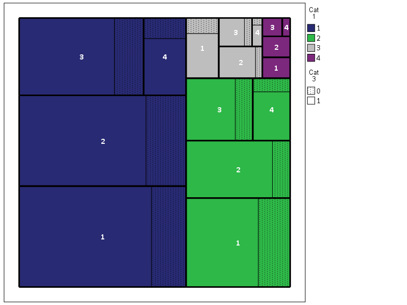
So here is a quick rundown of the complicated GPL code. Here I mapped colors to the first C1 category, and then made C3 a different texture pattern. To get all of the squares to draw I use the split modifier on the C2 category, which has no direct aesthetics mapped, and then placed the C2 label in the center. I made the labels white with an additional chart template to my default, and made the outline for the C2 bars more distinct by plotting them on top as an edge element and making them thicker. If I wanted to publish this, I would probably just export the vector chart and add in the labels in nice spots (SPSS I don’t believe you can style the labels separately, maybe you can with some chart template magic that I am unaware of). So here if I could in SPSS I would make the labels for category 1 in the top left of its respective color, but that is not possible.
If we change the categories to not be so uneven, you can see how my slice-and-dice layout algorithm is not so nice. Here it is with the proportions being about equal for all categories.
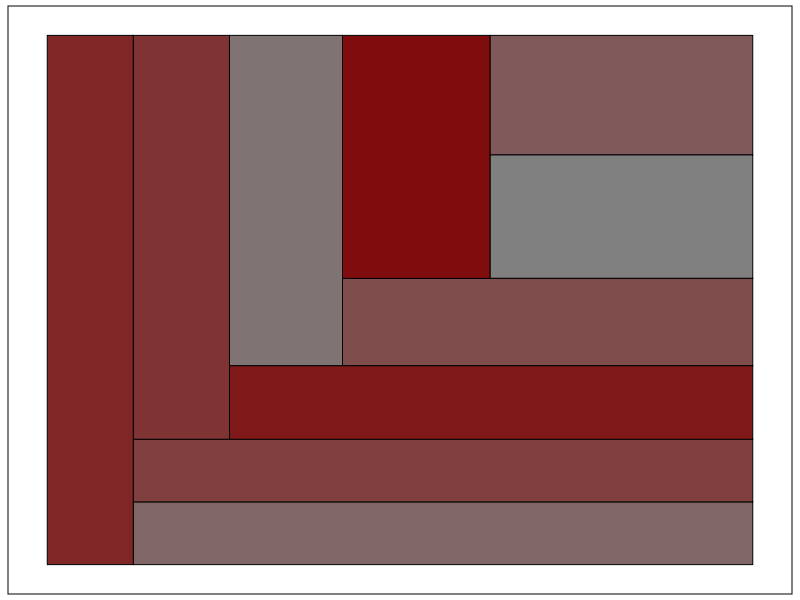
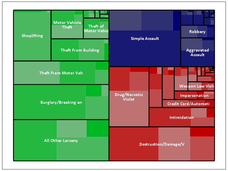
Fortunately most categorical data are not like this, and have uneven distributions (also with even data and more hierarchies it tends to look nicer). For an actual example, I grabbed the NIBRS 2012 incident data from ICPSR, which is incident level crime reports from participating police jurisdictions over the country (NIBRS stands for National Incident Based Reporting System). It is pretty big, over 5 million records, and with the over 350 variables the fixed text file is over 6 gigabytes, but the compressed zsav format is only slightly larger than the original gzipped file from ICPSR, (0.35 gigabytes vs 0.29 gigabytes in the fixed width ascii gzipped). So here I grab the NIBRS data I prepared, and create the hierarchy as follows:
- Level 1: I aggregate the UCR crimes into Part 1 Violent, Part 1 Non-Violent, and Other
- Level 2: Individual UCR categories
- Level 3: Location Type broken down into outdoor, indoor, home, and other/missing
And here is the code and the plot:
*Now NIBRS data.
DATASET CLOSE ALL.
GET FILE = "data\NIBRS_2012.zsav".
DATASET NAME NIBRS_2012.

RECODE V20061 (91 THRU 132 = 1)(200 THRU 240 = 2)(ELSE = 3) INTO UCR_Cat.
VALUE LABELS UCR_Cat 1 'Violent' 2 'Property' 3 'Other'.
RECODE V20111 (10,13,16,18,50,51 = 1)(20 = 3)(25, LO THRU 0 = 4)(ELSE = 2) INTO Loc_Cat.
VALUE LABELS Loc_Cat 1 'Outdoor' 2 'Indoor' 3 'Home' 4 'Other'.

!TreeMap Data = NIBRS_2012 Vars = UCR_Cat V20061 Loc_Cat.
DATASET ACTIVATE Tree_Loc_Cat.

MATCH FILES FILE = *
  /FIRST = Flag_UCRType
  /BY UCR_Cat V20061.
DO IF Flag_UCRType = 0.
  DO REPEAT x = BL_x2 BL_y2 TR_x2 TR_y2.
    COMPUTE x = $SYSMIS.
  END REPEAT.
END IF.

*Calculating width, if under certain value not placing label.
MATCH FILES FILE = * /DROP UCR_Lab.
STRING UCR_Lab (A20).
IF (TR_x2 - BL_x2) >= 0.12 UCR_Lab = VALUELABEL(V20061).
EXECUTE.

GGRAPH
  /GRAPHDATASET NAME="graphdataset" VARIABLES=BL_x3 BL_y3 TR_x3 TR_y3 UCR_Cat UCR_Lab Loc_Cat
                BL_x2 BL_y2 TR_x2 TR_y2 MISSING=VARIABLEWISE
  /GRAPHSPEC SOURCE=INLINE TEMPLATE = "data\Labels_Poly.sgt".
BEGIN GPL
  PAGE: begin(scale(800px,600px))
  SOURCE: s=userSource(id("graphdataset"))
  DATA: BL_x3=col(source(s), name("BL_x3"))
  DATA: BL_y3=col(source(s), name("BL_y3"))
  DATA: TR_x3=col(source(s), name("TR_x3"))
  DATA: TR_y3=col(source(s), name("TR_y3"))
  DATA: BL_x2=col(source(s), name("BL_x2"))
  DATA: BL_y2=col(source(s), name("BL_y2"))
  DATA: TR_x2=col(source(s), name("TR_x2"))
  DATA: TR_y2=col(source(s), name("TR_y2"))
  DATA: UCR_Cat=col(source(s), name("UCR_Cat"), unit.category())
  DATA: UCR_Lab=col(source(s), name("UCR_Lab"), unit.category())
  DATA: Loc_Cat=col(source(s), name("Loc_Cat"))
  TRANS: casenum = index()
  SCALE: linear(aesthetic(aesthetic.color.saturation.interior), aestheticMaximum(color.saturation."1"),
         aestheticMinimum(color.saturation."0.4"))
  GUIDE: legend(aesthetic(aesthetic.color.interior), null())
  GUIDE: legend(aesthetic(aesthetic.color.saturation.interior), null())
  GUIDE: axis(dim(1), null())
  GUIDE: axis(dim(2), null())
  ELEMENT: polygon(position(link.hull((BL_x3 + TR_x3)*(BL_y3 + TR_y3))),
                   color.interior(UCR_Cat), split(casenum), transparency.exterior(transparency."1"),
                   color.saturation.interior(Loc_Cat))
  ELEMENT: polygon(position(link.hull((BL_x2 + TR_x2)*(BL_y2 + TR_y2))),
                   transparency.exterior(transparency."1")), transparency.interior(transparency."1"),
                   label(UCR_Lab), split(casenum))
  ELEMENT: edge(position(link.hull((BL_x2 + TR_x2)*(BL_y2 + TR_y2))), size(size."3"), split(casenum))
  PAGE: end()
END GPL.
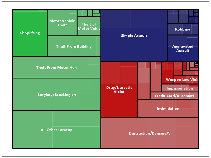
The saturation for locations types goes from lightest to darkest: Outdoor, Indoor, Home, Other. Instead of randomly allocating the saturation to distinguish between the location types furthest down the hierarchy, I can map the saturation to another category. Here I map it to whether someone was arrested for the proportion of offenses.
*Adding in proportion of arrests.
DATASET ACTIVATE NIBRS_2012.
COMPUTE Arrest = (RECSARR > 0).
DATASET DECLARE ArrestProp.
AGGREGATE OUTFILE='ArrestProp'
  /BREAK UCR_Cat V20061 Loc_Cat
  /ArrestProp = MEAN(Arrest).
DATASET ACTIVATE Tree_Loc_Cat.
MATCH FILES FILE = *
  /TABLE = 'ArrestProp'
  /BY UCR_Cat V20061 Loc_Cat.
DATASET CLOSE ArrestProp.


*Now mapping arrest proportion to saturation.
GGRAPH
  /GRAPHDATASET NAME="graphdataset" VARIABLES=BL_x3 BL_y3 TR_x3 TR_y3 UCR_Cat UCR_Lab Loc_Cat ArrestProp
                BL_x2 BL_y2 TR_x2 TR_y2 MISSING=VARIABLEWISE
  /GRAPHSPEC SOURCE=INLINE TEMPLATE = "data\Labels_Poly.sgt".
BEGIN GPL
  PAGE: begin(scale(800px,600px))
  SOURCE: s=userSource(id("graphdataset"))
  DATA: BL_x3=col(source(s), name("BL_x3"))
  DATA: BL_y3=col(source(s), name("BL_y3"))
  DATA: TR_x3=col(source(s), name("TR_x3"))
  DATA: TR_y3=col(source(s), name("TR_y3"))
  DATA: BL_x2=col(source(s), name("BL_x2"))
  DATA: BL_y2=col(source(s), name("BL_y2"))
  DATA: TR_x2=col(source(s), name("TR_x2"))
  DATA: TR_y2=col(source(s), name("TR_y2"))
  DATA: UCR_Cat=col(source(s), name("UCR_Cat"), unit.category())
  DATA: UCR_Lab=col(source(s), name("UCR_Lab"), unit.category())
  DATA: Loc_Cat=col(source(s), name("Loc_Cat"))
  DATA: ArrestProp=col(source(s), name("ArrestProp"))
  TRANS: casenum = index()
  SCALE: linear(aesthetic(aesthetic.color.saturation.interior), aestheticMaximum(color.saturation."1"),
         aestheticMinimum(color.saturation."0.4"))
  GUIDE: legend(aesthetic(aesthetic.color.interior), null())
  GUIDE: legend(aesthetic(aesthetic.color.saturation.interior), null())
  GUIDE: axis(dim(1), null())
  GUIDE: axis(dim(2), null())
  ELEMENT: polygon(position(link.hull((BL_x3 + TR_x3)*(BL_y3 + TR_y3))),
                   color.interior(UCR_Cat), split(casenum), transparency.exterior(transparency."1"),
                   color.saturation.interior(ArrestProp))
  ELEMENT: polygon(position(link.hull((BL_x2 + TR_x2)*(BL_y2 + TR_y2))),
                   transparency.exterior(transparency."1")), transparency.interior(transparency."1"),
                   label(UCR_Lab), split(casenum))
  ELEMENT: edge(position(link.hull((BL_x2 + TR_x2)*(BL_y2 + TR_y2))), size(size."3"), split(casenum))
  PAGE: end()
END GPL.
This ends up being pretty boring though, there does not appear to be much variation within the location types for arrest rates. For here with widely varying category sizes I would likely want to do a model based approach and shrink the extreme proportions in the smaller categories, but that is a challenge for another blog post! (Also the sizes of the categories naturally de-emphasizes the small areas.)
One of the other things I was experimenting with was the use of svg gradients via the chart template, (see Squarified Treemaps (Bruls et al., 2000) for a motivating example) but I was unable to figure out the chart template xml needed to have the polygons drawn with gradients. (I had saved a few templates from V20 that had example gradients in them, and I’ve gotten them to work for bar graphs.) Also I attempted to export this with tooltips, but the tool tips were derived variables from the polygons, so I’m not quite sure how to cajole SPSS to give the tool tips I want.
This is not the best use of treemaps though, and I will have to write a post showing how small multiples of bar graphs can be just as effective as these examples. Shneiderman intended these to be an interactive application in which you could see the forest and then drill down into smaller subsets for exploration. Comparing areas across categories in this example, e.g. comparing the proportion of crimes occurring at home in assaults versus robberies, is very difficult to accomplish in the treemap. I would say that they are slightly more aesthetically pleasing than the wooden Charlie Brown xmas tree I built for my tiny apartment though.
Happy Holidays!