Plotting panel data with many lines in SPSS

A quick blog post – so you all are not continually assaulted by my mug shot on the front page of the blog!

Panel data is complicated. When conducting univariate time series analysis, pretty much everyone plots the series. I presume people do not do this often for panel data because the charts tend to be more messy and less informative. But by using transparency and small multiple plots are easy places to start to unpack the information. Here I am going to show these using plots of arrest rates from 1970 through 2014 in New York state counties. The data and code can be downloaded here, and that zip file contains info. on where the original data came from. It is all publicly available – but mashing up the historical census data for the population counts by county is a bit of a pain.

So I will start with grabbing my created dataset, and then making a default plot of all the lines. Y axis is the arrest rate per 1,000 population, and the X axis are years.

*Grab the dataset.
FILE HANDLE data /NAME = "!!Your File Handle Here!!!".
GET FILE = "data\Arrest_WPop.sav".
DATASET NAME ArrestRates.

*Small multiple lines over time - default plot.
GGRAPH
  /GRAPHDATASET NAME="graphdataset" VARIABLES=Year Total_Rate County 
  /GRAPHSPEC SOURCE=INLINE.
BEGIN GPL
  SOURCE: s=userSource(id("graphdataset"))
  DATA: Year=col(source(s), name("Year"))
  DATA: Total_Rate=col(source(s), name("Total_Rate"))
  DATA: County=col(source(s), name("County"), unit.category())
  GUIDE: axis(dim(1), label("Year"))
  GUIDE: axis(dim(2), label("Total Arrest Rate per 1,000"))
  ELEMENT: line(position(Year*Total_Rate), split(County))
END GPL.

That is not too bad, but we can do slightly better by making the lines small and semi-transparent (which is the same advice for dense scatterplots):

*Make them transparent and smaller.
FORMATS Total_Rate (F2.0).
GGRAPH
  /GRAPHDATASET NAME="graphdataset" VARIABLES=Year Total_Rate County 
  /GRAPHSPEC SOURCE=INLINE.
BEGIN GPL
  SOURCE: s=userSource(id("graphdataset"))
  DATA: Year=col(source(s), name("Year"))
  DATA: Total_Rate=col(source(s), name("Total_Rate"))
  DATA: County=col(source(s), name("County"), unit.category())
  GUIDE: axis(dim(1), label("Year"))
  GUIDE: axis(dim(2), label("Total Arrest Rate per 1,000"))
  SCALE: linear(dim(1), min(1970), max(2014))
  ELEMENT: line(position(Year*Total_Rate), split(County), transparency(transparency."0.7"), size(size."0.7"))
END GPL.

This helps disentangle the many lines bunched up. There appear to be two outliers, and basically the rest of the pack.

A quick way to check out each individual line is then to make small multiples. Here I wrap the panels, and make the plot size bigger. I also make the X and Y axis null. This is ok though, as I am just focusing on the shape of the trend, not the absolute level.

*Small multiples.
GGRAPH
  /GRAPHDATASET NAME="graphdataset" VARIABLES=Year Total_Rate County 
  /GRAPHSPEC SOURCE=INLINE.
BEGIN GPL
  PAGE: begin(scale(1000px,1000px))
  SOURCE: s=userSource(id("graphdataset"))
  DATA: Year=col(source(s), name("Year"))
  DATA: Total_Rate=col(source(s), name("Total_Rate"))
  DATA: County=col(source(s), name("County"), unit.category())
  COORD: rect(dim(1,2), wrap())
  GUIDE: axis(dim(1), null())
  GUIDE: axis(dim(2), null())
  GUIDE: axis(dim(3), opposite())
  SCALE: linear(dim(1), min(1970), max(2014))
  ELEMENT: line(position(Year*Total_Rate*County))
  PAGE: end()
END GPL.
*Manually edited to make less space between panels.

There are a total of 62 counties in New York, so this is feasible. With panel sets of many more lines, you can either split the small multiple into more graphs, or cluster the lines based on the overall shape of the trend into different panels.

Here you can see that the outliers are New York county (Manhattan) and Bronx county. Bronx is a pretty straight upward trend (which mirrors many other counties), but Manhattan’s trajectory is pretty unique and has a higher variance than most other places in the state. Also you can see Sullivan county has quite a high rate compared to most other upstate counties (upstate is New York talk for everything not in New York City). But it leveled off fairly early in the time series.

This dataset also has arrest rates broken down by different categories; felony (drug, violent, dwi, other), and misdemeanor (drug, dwi, property, other). It is interesting to see that arrest rates have been increasing in most places over this long time period, even though crime rates have been going down since the 1990’s. They all appear to be pretty correlated, but let me know if you use this dataset to do some more digging. (It appears index crime totals can be found going back to 1990 here.)

Smoothed regression plots for multi-level data

Bruce Weaver on the SPSS Nabble site pointed out that the Centre for Multilevel Modelling has added some syntax files for multilevel modelling for SPSS. I went through the tutorials (in R and Stata) a few years ago and would highly recommend them.

Somehow following the link trail I stumbled on this white paper, Visualising multilevel models; The initial analysis of data, by John Bell and figured it would be good fodder for the the blog. Bell basically shows how using smoothed regression estimates within groups is a good first step in data analysis of complicated multi-level data. I obviously agree, and previously showed how to use ellipses to the same effect. The plots in the Bell whitepaper though are very easy to replicate directly in base SPSS syntax (no extra stat modules or macros required) using just GGRAPH and inline GPL.

For illustration purposes, I will use the same data as I did to illustrate ellipses. It is the popular2.sav sample from Joop Hox’s book. So onto the SPSS code; first we will define a FILE HANDLE for where the popular2.sav data is located and open that file.

FILE HANDLE data /NAME = "!!!!!!Your Handle Here!!!!!".
GET FILE = "data\popular2.sav".
DATASET NAME popular2.

Now, writing the GGRAPH code that will follow is complicated. But we can use the GUI to help us write the most of it and them edit the pasted code to get the plot we want in the end. So, the easiest start to get the graph with the regression lines we want in the end is to navigate to the chart builder menu (Graphs -> Chart Builder), and then create a scatterplot with extrav on the x axis, popular on the y axis, and use class to color the points. The image below is a screen shot of this process, and below that is the GGRAPH code you get when you paste the syntax.

*Base plot created from GUI.
GGRAPH
  /GRAPHDATASET NAME="graphdataset" VARIABLES=extrav popular class[LEVEL=NOMINAL] MISSING=LISTWISE 
    REPORTMISSING=NO
  /GRAPHSPEC SOURCE=INLINE.
BEGIN GPL
  SOURCE: s=userSource(id("graphdataset"))
  DATA: extrav=col(source(s), name("extrav"))
  DATA: popular=col(source(s), name("popular"))
  DATA: class=col(source(s), name("class"), unit.category())
  GUIDE: axis(dim(1), label("extraversion"))
  GUIDE: axis(dim(2), label("popularity sociometric score"))
  GUIDE: legend(aesthetic(aesthetic.color.exterior), label("class ident"))
  ELEMENT: point(position(extrav*popular), color.exterior(class))
END GPL.

Now, we aren’t going to generate this chart. With 100 classes, it will be too difficult to identify any differences between classes unless a whole class is an extreme outlier. Here I am going to make several changes to generate the linear regression line of extraversion on popular within each class. To do this we will make some edits to the ELEMENT statement:

  • replace point with line
  • replace position(extrav*popular) with position(smooth.linear(extrav*popular)) – this tells SPSS to generate the linear regression line
  • replace color.exterior(class) with split(class) – the split modifier tells SPSS to generate the regression lines within each class.
  • make the regression lines semi-transparent by adding in transparency(transparency."0.7")

Extra things I did for aesthetics:

  • I added jittered points to the plot, and made them small and highly transparent (these really aren’t necessary in the plot and are slightly distracting). Note I placed the points first in the GPL code, so the regression lines are drawn on top of the points.
  • I changed the FORMATS of extrav and popular to F2.0. SPSS takes the formats for the axis in the charts from the original variables, so this prevents decimal places in the chart (and SPSS intelligently chooses to only label the axes at integer values on its own).
  • I take out the GUIDE: legend line – it is unneeded since we do not use any colors in the chart.
  • I change the x and y axis labels, e.g. GUIDE: axis(dim(1), label("Extraversion")) to be title case.

*Updated chart with smooth regression lines.
FORMATS extrav popular (F2.0).
GGRAPH
  /GRAPHDATASET NAME="graphdataset" VARIABLES=extrav popular class[LEVEL=NOMINAL] MISSING=LISTWISE 
    REPORTMISSING=NO
  /GRAPHSPEC SOURCE=INLINE.
BEGIN GPL
  SOURCE: s=userSource(id("graphdataset"))
  DATA: extrav=col(source(s), name("extrav"))
  DATA: popular=col(source(s), name("popular"))
  DATA: class=col(source(s), name("class"), unit.category())
  GUIDE: axis(dim(1), label("Extraversion"))
  GUIDE: axis(dim(2), label("Popularity Sociometric Score"))
  ELEMENT: point.jitter(position(extrav*popular), transparency.exterior(transparency."0.7"), size(size."3"))
  ELEMENT: line(position(smooth.linear(extrav*popular)), split(class), transparency(transparency."0.7"))
END GPL.

So here we can see that the slopes are mostly positive and have intercepts varying mostly between 0 and 6. The slopes are generally positive and (I would guess) around 0.25. There are a few outlier slopes, and given the class sizes do not vary much (most are around 20) we might dig into these outlier locations a bit more to see what is going on. Generally though with 100 classes it doesn’t strike me as very odd as some going against the norm, and a random effects model with varying intercepts and slopes seems reasonable, as well as the assumption that the distribution of slopes are normal. The intercept and slopes probably have a slight negative correlation, but not as much as I would have guessed with a set of scores that are so restricted in this circumstance.

Now the Bell paper has several examples of using the same type of regression lines within groups, but using loess regression estimates to assess non-linearity. This is really simple to update the above plot to incorporate this. One would simply change smooth.linear to smooth.loess. Also SPSS has the ability to estimate quadratic and cubic polynomial terms right within GPL (e.g. smooth.cubic).

Here I will suggest a slightly different chart that allows one to assess how much the linear and non-linear regression lines differ within each class. Instead of super-imposing all of the lines on one plot, I make a small multiple plot where each class gets its own panel. This allows much simpler assessment if any one class shows a clear non-linear trend.

  • Because we have 100 groups I make the plot bigger using the PAGE command. I make it about as big as can fit on my screen without having to scroll, and make it 1,200^2 pixels. (Also note when you use a PAGE: begin command you need an accompanying PAGE: end() command.
  • For the small multiples, I wrap the panels by setting COORD: rect(dim(1,2), wrap()).
  • I strip the x and y axis labels from the plot (simply delete the label options within the GUIDE statements. Space is precious – I don’t want it to be taken up with axis labels and legends.
  • For the panel label I place the label on top of the panel by setting the opposite option, GUIDE: axis(dim(3), opposite()).

WordPress in the blog post shrinks the graph to fit on the website, but if you open the graph up in a second window you can see how big it is and explore it easier.

*Checking for non-linear trends.
GGRAPH
  /GRAPHDATASET NAME="graphdataset" VARIABLES=extrav popular class[LEVEL=NOMINAL] MISSING=LISTWISE 
    REPORTMISSING=NO
  /GRAPHSPEC SOURCE=INLINE.
BEGIN GPL
  PAGE: begin(scale(1200px,1200px))
  SOURCE: s=userSource(id("graphdataset"))
  DATA: extrav=col(source(s), name("extrav"))
  DATA: popular=col(source(s), name("popular"))
  DATA: class=col(source(s), name("class"), unit.category())
  COORD: rect(dim(1,2), wrap())
  GUIDE: axis(dim(1))
  GUIDE: axis(dim(2))
  GUIDE: axis(dim(3), opposite())
  ELEMENT: line(position(smooth.linear(extrav*popular*class)), color(color.black))
  ELEMENT: line(position(smooth.loess(extrav*popular*class)), color(color.red))
  PAGE: end()
END GPL.

The graph is complicated, but with some work one can go group by group to see any deviations from the linear regression line. So here we can see that most of the non-linear loess lines are quite similar to the linear line within each class. The only one that strikes me as noteworthy is class 45.

Here there is not much data within classes (around 20 students), so we have to wary of small samples to be estimating these non-linear regression lines. You could generate errors around the linear and polynomial regression lines within GPL, but here I do not do that as it adds a bit of complexity to the plot. But, this is an excellent tool if you have many points within your groups and it can be amenable to quite a large set of panels.

Plotting interactions and non-linear predictions

When interpreting regression model coefficients in which the predictions are non-linear in the original variables, such as when you have polynomial terms or interaction effects, it is much simpler to make plots of the predicted values and interpret those than it is to interpret the coefficients directly.

This came up in some discussion of interpreting polynomial terms on the SPSS list-serve recently, and the example I will use came from this CrossValidated question. So I figured a blog post showing how to do it in SPSS was warranted.

So to start off I will make some fake data to work with, note the highly non-linear function Y is of the covariates.

FILE HANDLE save /NAME = "!Your Handle Here!".
INPUT PROGRAM.
LOOP Id = 1 TO 3000.
END CASE.
END LOOP.
END FILE.
END INPUT PROGRAM.
VECTOR X(3).
LOOP #i = 1 TO 3.
  COMPUTE X(#i) = RV.NORMAL(0,1).
END LOOP.
COMPUTE Y = 5 + 0.6*(X1) + 0.2*(X2) + -3*(X3) + 
            0.38*(X1**2) + 0.15*(X2**2) + -0.1*(X3**2) +
            0.3*(X1*X2) + -0.1*(X2*X3) + RV.NORMAL(0,1).
COMPUTE X1SQ = X1**2.
COMPUTE X2SQ = X2**2.
COMPUTE X3SQ = X3**2.
COMPUTE X1X2 = X1*X2.
COMPUTE X2X3 = X2*X3.

Now I am going to use REGRESSION to estimate the model with all of the terms and save the model to an XML file (at the save handle location defined before I made the fake data). The point of saving the model estimates is to use it later on to score predictions to a new set of data.

REGRESSION
  /MISSING LISTWISE
  /STATISTICS COEFF OUTS R ANOVA
  /CRITERIA=PIN(.05) POUT(.10)
  /NOORIGIN 
  /DEPENDENT Y
  /METHOD=ENTER X1 X2 X3 X1SQ X2SQ X3SQ X1X2 X2X3
  /OUTFILE=MODEL('save\LinModel.xml').

For illustration of how informative the model coefficients are, below is an image of the table. Given the sample size of 3000 and the small amount of error I added the coefficients are very close the the simulated model.

Now tell me based on the table if X1 takes a value of -1 and X3 takes a value of 0, does a change in X2 from -1 to 0 result in a positive change to the outcome or a negative change in the outcome? If you can figure out the direction of the change how large is the effect? This information is not impossible to cull from the table, but do your readers a favor and spare them these mental calculus gymnastics and plot the effects!

To do that I am going to make a new set of data in regular intervals over the explanatory values of interest.

*Now making a new set of variables to score the model.
DATASET CLOSE ALL.
INPUT PROGRAM.
COMPUTE #dens = 10.
COMPUTE #min = -2.
COMPUTE #max = 2.
COMPUTE #step = (#max - #min)/#dens.
LOOP #x1 = 0 TO #dens.
  LOOP #x2 = 0 TO #dens.
    LOOP #x3 = 0 TO #dens.
      COMPUTE Id = #x2.
      COMPUTE X1 = #min + #step*#x1. 
      COMPUTE X2 = #min + #step*#x2.
      COMPUTE X3 = #min + #step*#x3.       
      END CASE.
    END LOOP.
  END LOOP.
END LOOP.
END FILE.
END INPUT PROGRAM.
COMPUTE X1SQ = X1**2.
COMPUTE X2SQ = X2**2.
COMPUTE X3SQ = X3**2.
COMPUTE X1X2 = X1*X2.
COMPUTE X2X3 = X2*X3.
EXECUTE.

Here I used the INPUT MODEL and loops to control the sampling of where the independent variables are located at. Now you can score the model using the MODEL HANDLE and the subsequent APPLYMODEL statements available for computation.

*Score the model.
MODEL HANDLE NAME=LinModel FILE='save\LinModel.xml'
  /OPTIONS MISSING=SUBSTITUTE.
COMPUTE StandardError=APPLYMODEL(LinModel, 'STDDEV').
COMPUTE PredictedValue=APPLYMODEL(LinModel, 'PREDICT').
EXECUTE.
MODEL CLOSE NAME=LinModel.
FORMATS X1 X2 X3 X1SQ X2SQ X3SQ X1X2 X2X3 (F3.1)
        PredictedValue (F2.0).

Now we have a set of predictions and standard errors for our model. Given the three way set of interactions what I do is make a plot that has X1 on the X axis, varying values of X2 as a set of individual lines (with the color of the line a continuous color ramp) and panelled by values of X3.

*Make predicted graph.
GGRAPH
  /GRAPHDATASET NAME="graphdataset" VARIABLES=X1 PredictedValue X2 X3 Id
    MISSING=LISTWISE REPORTMISSING=NO
  /GRAPHSPEC SOURCE=INLINE.
BEGIN GPL
  PAGE: begin(scale(800px,600px))
  SOURCE: s=userSource(id("graphdataset"))
  DATA: X1=col(source(s), name("X1"))
  DATA: PredictedValue=col(source(s), name("PredictedValue"))
  DATA: X2=col(source(s), name("X2"))
  DATA: X3=col(source(s), name("X3"), unit.category())
  DATA: Id=col(source(s), name("Id"), unit.category())
  COORD: rect(dim(1,2), wrap())
  GUIDE: axis(dim(1), label("X1"))
  GUIDE: axis(dim(2), label("PredictedValue"))
  GUIDE: axis(dim(3), label("X3"), opposite())
  GUIDE: legend(aesthetic(aesthetic.color.interior), label("X2"))
  SCALE: linear(aesthetic(aesthetic.color.interior), aestheticMinimum(color.green), 
         aestheticMaximum(color.purple))
  ELEMENT: line(position(X1*PredictedValue*X3), color.interior(X2), split(Id), 
           transparency(transparency."0.3"))
  PAGE: end()
END GPL.

So lets try to answer my original question now: if X1 takes a value of -1 and X3 takes a value of 0, does a change in X2 from -1 to 0 result in a positive change to the outcome or a negative change in the outcome?

Answer: The predicted value of Y at the covariate values of X1 = -1 and X3 = 0 can be seen in the middle row of panels, second in from the left. The predicted values appear to range between 5 and 6 for the given values of X2. Going up in value for X2 (from green to purple) results in a slight decrease in the predicted value, probably less than 1 in total.

Interpreting the equation more generally though, the values of X3 mainly serve as a change in intercept of the predicted values. The shape of the slopes only changes slightly between panels – but X3 acts a moderator – bringing the slopes closer together. X2 acts a moderator on X1 in most circumstances. The green lines tend to be lower than the purple lines when both X1 and X2 take positive values, but that isn’t the whole story. Describing X2 in terms of mediating or moderating X1 is insufficient here, as you can see when both take negative values the relationship is switched and causes decreases in values of Y. When both are positive, the relationship is moderated, and a smaller change in X1 results in a larger change in the predicted value.

Now, linear OLS regression models typically don’t have so many complicated interaction and polynomial terms. But other regression models that have a link functions (e.g. Logistic, Poisson) are non-linear in the parameters when taking the inverse of the function. So even if they don’t have interaction terms they are prime candidates for similar plots of predicted values with a set of different lines and panels for various values of other explanatory variables in the model. My generic experience is looking at odds ratios (or incident rate ratios) tends to give an overly dramatic representation of effects compared to these types of plots.

When interpreting different effects of changing the explanatory variables these graphs are definitely easier to see the marginal changes of interest than the original regression coefficients. Imagine if Y in this example are physical fitness test scores, and the X’s are time spent in various exercise routines. If you are a Phys. Ed. teacher, you may want to spend more time in one activity, but since time is zero-sum you have to take time away from another. In that case, looking at the original coefficients can be slightly misleading, as you can’t increase X1 by 1 without decreasing X2 or X3 by an equivalent amount.

In this situation, the optimal scenario would be having X3 as low as possible and X1 and X2 as high as possible. For scenarios in which X3 is positive though the predictions dip in the middle, so you are better off having more extreme values of X1 and X2 then you are of having them around 0 in those circumstances.

Using circular dot plots instead of circular histograms

Although as I mentioned in this post on circular helio bar charts, polar coordinates are unlikely to be as effective as rectilinear coordinates for most types of comparisons, I really wanted to use a circular histogram in a recent paper of mine. The motivation is I have circular data in form of azimuths (Journey to Crime), aggregated to quadrants. So I really wanted to use a small multiple plot of circular histograms with the visual connection to the actual direction the azimuths were distributed within each quadrant.

Part of the problem with circular histograms though is that the area near the center of the plot shrinks to nothing.

So a simple solution is to offset the center of the plot, so the bars don’t start at the origin, but a prespecified distance away from the center of the circle. Below is the same chart previously with a slight offset. (I saw this idea originally in Wilkinson’s Grammar of Graphics.)

And here is that technique extended to an example small multiple histogram from an earlier draft of the paper I previously mentioned.

Even with the offset, the problem of the shrinking area is even worse because of the many plots, and the outlying bars in one plot shrinks the rest of the distribution even more dramatically. So, even with the offsetting it is still quite difficult assess trends. Also note I don’t even bother to draw the radius guide lines. I noticed in some recent papers about analyzing circular data that they don’t draw bars for circular histograms, but use dots (and/or kernel density estimates). See examples in Brunsdon and Corcoran (2006), Ashby and Bowers (2013), and Russell and Levitin (1995). The below image is taken from Ashby and Bowers (2013) to demonstrate this.

The idea behind this is that, in polar coordinates, you need to measure the length of the bar, instead of distance from a common reference line. When you use dots, it is pretty trivial to just count the dots to see how far they stack up (so no axis guide is needed). This just replaces one problem for other ones, especially for larger sample sizes (in which you will need to discretize how many observations a point represents) but I don’t think it is any worse than bars at least in this situation (and can potentially be better for a smaller number of dots). One thing that does happen with points is that large stacks deviate from each other the further they grow towards the circumference of the polar coordinate system (the bars in histograms typically get wider). This just looks aesthetically bad, although the bars growing wider could be considered a disingenuous representation (e.g. Florence Nightingale’s coxcomb chart) (Brasseur, 2005; Friendly, 2008).

Unfortunately, SPSS’s routine to stack the dots in polar coordinates is off just slightly (I have full code linked at the end of the post to recreate some of the graphs in the post and display this behavior).

With alittle data manipulation though you can basically roll your own (although this is fixed bins, unlike irregular ones chosen based on the data like in Wilkinson’s dot plots, e.g. bin.dot in GPL) (Wilkinson, 1999).

And here is the same example small multiple histogram using the dots.

Here I have posted the code to demonstrate some of the graphs here (and I have the full code for the Viz. JTC paper here). To make the circular dot plot I use the sequential case processing trick, and then show how to use TRANS statements in inline GPL to adjust the positioning of the dots and if you want the dots to represent multiple values.


References

Why I feel SPSS (or any statistical package) is better than Excel for this particular job

I debated on pulling an Andrew Gelman and adding a ps to my prior Junk Charts Challenge post, but it ended up being too verbose, so I just made an entirely new follow-up. To start, the discussion has currently evolved from this series of posts;

  • The original post on remaking a great line chart by Kaiser Fung, with the suggestion that the task (data manipulation and graphing) is easier in Excel.
  • My response on how to make the chart in SPSS.
  • Kaiser’s response to my post, in which I doubt I swayed his opinion on using Excel for this task! It appears to me based on the discussion so far the only real quarrel is whether the data manipulation is sufficiently complicated enough compared to the ease of pointing and clicking in Excel to justify using Excel. In SPSS to recreate Kaiser’s chart is does take some advanced knowledge of sorting and using lags to identify the pit and recoveries (the same logic could be extended to the data manipulations Kaiser says I skim over, as long as you can numerically or externally define what is a start of a recession).

All things considered for the internet, discussion has been pretty cordial so far. Although it is certainly sprinkled in my post, I didn’t mean for my post on SPSS to say that the task of grabbing data from online, manipulating it, and creating the graph was in any objective way easier in SPSS than in Excel. I realize pointing-and-clicking in Excel is easier for most, and only a few really adept at SPSS (like myself) would consider it easier in SPSS. I write quite a few tutorials on how to do things in SPSS, and that was one of the motivations for the tutorial. I want people using SPSS (or really any graphing software) to make nice graphs – and so if I think I can add value this way to the blogosphere I will! I hope my most value added is through SPSS tutorials, but I try to discuss general graphing concepts in the posts as well, so even for those not using SPSS it hopefully has some other useful content.

My original post wasn’t meant to discuss why I feel SPSS is a better job for this particular task, although it is certainly a reasonable question to ask (I tried to avoid it to prevent flame wars to be frank – but now I’ve stepped in it at this point it appears). As one of the comments on Kaiser’s follow up notes (and I agree), some tools are better for some jobs and we shouldn’t prefer one tool because of some sort of dogmatic allegiance. To make it clear though, and it was part of my motivation to write my initial response to the challenge post, I highly disagree that this particular task, which entails grabbing data from the internet, manipulating it, and creating a graph, and updating said graph on a monthly basis is better done in Excel. For a direct example of my non-allegiance to doing everything in SPSS for this job, I wouldn’t do the grabbing the data from the internet part in SPSS (indeed – it isn’t even directly possible unless you use Python code). Assuming it could be fully automated, I would write a custom SPSS job that manipulates the data after a wget command grabs the data, and have it all wrapped up in one bat file that runs on a monthly timer.

To go off on a slight tangent, why do I think I’m qualified to make such a distinction? Well, I use both SPSS and Excel on a regular basis. I wouldn’t consider myself a wiz at Excel nor VBA for Excel, but I have made custom Excel MACROS in the past to perform various jobs (make and format charts/tables etc.), and I have one task (a custom daily report of the crime incidents reported the previous day) I do on a daily basis at my job in Excel. So, FWIW, I feel reasonably qualified to make decisions on what tasks I should perform in which tools. So I’m giving my opinion, the same way Kaiser gave his initial opinion. I doubt my experience is as illustruous as Kaiser’s, but you can go to my CV page to see my current and prior work roles as an analyst. If I thought Excel, or Access, or R, or Python, or whatever was a better tool I would certainly personally use and suggest that. If you don’t have alittle trust in my opinion on such matters, well, you shouldn’t read what I write!

So, again to be clear, I feel this is a job better for SPSS (both the data manipulation and creating the graphics), although I admit it is initially harder to write the code to accomplish the task than pointing, clicking and going through chart wizards in Excel. So here I will try to articulate those reasons.

  • Any task I do on a regular basis, I want to be as automated as possible. Having to point-click, copy-paste on a regular basis invites both human error and is a waste of time. I don’t doubt you could fully (or very near) automate the task in Excel (as the comment on my blog post mentions). But this will ultimately involve scripting in VBA, which diminishes in any way that the Excel solution is easier than the SPSS solution.
  • The breadth of both data management capabilities, statistical analysis, and graphics are much larger in SPSS than in Excel. Consider the VBA code necessary to replicate my initial VARSTOCASES command in Excel, that is reshaping wide data to stacked long form. Consider the necessary VBA code to execute summary statistics over different groups without knowing what the different groups are beforehand. These are just a sampling of data management tools that are routine in statistics packages. In terms of charting, the most obvious function lacking in Excel is that it currently does not have facilities to make small-multiple charts (you can see some exceptional hacks from Jon Peltier, but those are certainly more limited in functionality that SPSS). Not mentioned (but most obvious) is the statistical capabilities of a statistical software!

So certainly, this particular job, could be done in Excel, as it does not require any functionality unique to a stats package. But why hamstring myself with these limitations from the onset? Frequently after I build custom, routine analysis like this I continually go back and provide more charts, so even if I have a good conceptualization of what I want to do at the onset there is no guarantee I won’t want to add this functionality in later. In terms of charting not having flexible small multiple charts is really a big deal, they can be used all the time.

Admittedly, this job is small enough in scope, if say the prior analyst was doing a regular updated chart via copy-paste like Kaiser is suggesting, I would consider just keeping that same format (it certainly is a lost opportunity cost to re-write the code in SPSS, and the fact that it is only on a monthly basis means to get time recovered if the task were fully automated would take quite some time). I just have personally enough experience in SPSS I know I could script a solution in SPSS quicker from the on-set than in Excel (I certainly can’t extrapolate that to anyone else though).

Part of both my preference and experience in SPSS comes from the jobs I personally have to do. For an example, I routinely pull a database of 500,000 incidents, do some data cleaning, and then merge this to a table of 300,000 charges and offenses and then merge to a second table of geocoded incident locations. Then using this data I routinely subset it, create aggregate summaries, tables, estimate various statistics and models, make some rudimentary maps, or even export the necessary data to import into a GIS software.

For arguments sake (with the exception of some of the more complicated data cleaning) this could be mostly done in SQL – but certainly no reasonable person should consider doing these multiple table merges and data cleaning in Excel (the nice interactive facilities with working with the spreadsheet in Excel are greatly dimished with any tables that take more a few scrolls to see). Statistical packages are really much more than tools to fit models, they are tools for working and manipulating data. I would highly recommend if you have to conduct routine tasks in which you manipulate data (something I assume most analysts have to do) you should consider learning statistical sofware, the same way I would recommend you should get to know SQL.

To be more balanced, here are things (knowing SPSS really well and Excel not as thoroughly) I think Excel excels at compared to SPSS;

  • Ease of making nicely formatted tables
  • Ease of directly interacting and editing components of charts and tables (this includes adding in supplementary vector graphics and labels).
  • Sparklines
  • Interactive Dashboards/Pivot Tables

Routine data management is not one of them, and only really sparklines and interactive dashboards are functionality in which I would prefer to make an end product in Excel over SPSS (and that doesn’t mean the whole workflow needs to be one software). I clean up ad-hoc tables for distribution in Excel all the time, because (as I said above) editing them in Excel is easier than editing them in SPSS. Again, my opinion, FWIW.

The Junk Charts Challenge: Remaking a great line chart in SPSS

I read and very much enjoy Kaiser Fung’s blog Junk Charts. One of the exchanges in the comments to the post, Remaking a great chart, Kaiser asserted it was easier to make the original chart in Excel than in any current programming language. I won’t deny it is easier to use a GUI dialog than learn some code, but here I will present how you would go about making the chart in SPSS’s grammar of graphics. The logic extends part-and-parcel to ggplot2.

The short answer is the data is originally in wide format, and most statistical packages it is only possible (or at least much easier) to make the chart when the data is in long format. This ends up being not a FAQ, but a frequent answer to different questions, so I hope going over such a task will have wider utility for alot of charting tasks.

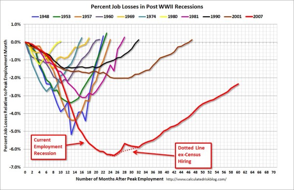
So here is the original chart (originally from the Calculated Risk blog)

And here is Kaiser Fung’s updated version;

Within the article Kaiser states;

One thing you’ll learn quickly from doing this exercise is that this is a task ill-suited for a computer (so-called artificial intelligence)! The human brain together with Excel can do this much faster. I’m not saying you can’t create a custom-made application just for the purpose of creating this chart. That can be done and it would run quickly once it’s done. But I find it surprising how much work it would be to use standard tools like R to do this.

Of course because anyone saavy with a statistical package would call bs (because it is), Kaiser gets some comments by more experienced R users saying so. Then Kaiser retorts in the comments with a question how to go about making the charts in R;

Hadley and Dean: I’m sure you’re better with R than most of us so I’d love to hear more. I have two separate issues with this task:

  1. assuming I know exactly the chart to build, and have all the right data elements, it is still much easier to use Excel than any coding language. This is true even if I have to update the chart month after month like CR blog has to. I see this as a challenge to those creating graphing software. (PS. Here, I’m thinking about the original CR version – I don’t think that one can easily make small multiples in Excel.)
  1. I don’t see a straightforward way to proceed in R (or other statistical languages) from grabbing the employment level data from the BLS website, and having the data formatted precisely for the chart I made. Perhaps one of you can give us some pseudo-code to walk through how you might do it. I think it’s easier to think about it than to actually do it.

So here I will show how one would go about making the charts in a statistical package, here SPSS. I actually don’t use the exact data to make the same chart, but there is very similar data at the Fed Bank of Minneapolis website. Here I utilize the table on cumulative decline of Non-Farm employment (seasonally adjusted) months after the NBER defined peak. I re-format the data so it can actually be read into a statistical package, and here is the xls data sheet. Also at that link the zip file contains all the SPSS code needed to reproduce the charts in this blogpost.

So first up, the data from the Fed Bank of Minneapolis website looks like approximately like this (in csv format);

MAP,Y1948,Y1953,Y1957,Y1960,Y1969,Y1973,Y1980,Y1981,Y1990,Y2001,Y2007
0,0,0,0,0,0,0,0,0,0,0,0
1,-0.4,-0.1,-0.4,-0.6,-0.1,0.2,0.1,0.0,-0.2,-0.2,0.0
2,-1.1,-0.3,-0.7,-0.8,0.1,0.3,0.2,-0.1,-0.3,-0.2,-0.1
3,-1.5,-0.6,-1.1,-0.9,0.3,0.4,0.1,-0.2,-0.4,-0.3,-0.1
4,-2.1,-1.2,-1.4,-1.0,0.2,0.5,-0.4,-0.5,-0.5,-0.4,-0.3

This isn’t my forte, so I’m unsure when Kaiser says grab the employment level data from the BLS website what exact data or table he is talking about. Regardless, if the table you grab the data from is in this wide format, it will be easier to make the charts we want if the data is in long format. So in the end if you want the data in long format, instead of every line being a different column, all the lines are in one column, like so;

MAP, YEAR, cdecline
0, 1948, 0
1, 1948, -.04
.
72, 1948, 8.2
0, 2007, 0
1, 2007, 0
.

So in SPSS, the steps would be like this to reshape the data (after reading in the data from my prepped xls file);

GET DATA /TYPE=XLS
 /FILE='data\historical_recessions_recoveries_data_03_08_2013.xls'
   /SHEET=name 'NonFarmEmploy'
   /CELLRANGE=full
   /READNAMES=on
   /ASSUMEDSTRWIDTH=32767.
DATASET NAME NonFarmEmploy.

*Reshape wide to long.
VARSTOCASES
/MAKE cdecline from Y1948 to Y2007
/INDEX year (cdecline).
compute year = REPLACE(year,"Y","").

This produces the data so instead of having seperate years in different variables, you have the cumulative decline in one column in the dataset, and another categorical variable identifying the year. Ok, so now we are ready to make a chart that replicates the original from the calculated risk blog. So here is the necessary code in SPSS to make a well formatted chart. Note the compute statement first makes a variable to flag if the year is 2007, which I then map to the aesthetics of red and larger size, so it comes to the foreground of the chart;

compute flag_2007 = (year = "2007").
GGRAPH
  /GRAPHDATASET NAME="graphdataset" VARIABLES=MAP cdecline flag_2007 year
  /GRAPHSPEC SOURCE=INLINE.
BEGIN GPL
 SOURCE: s=userSource(id("graphdataset"))
 DATA: MAP=col(source(s), name("MAP"))
 DATA: cdecline=col(source(s), name("cdecline"))
 DATA: flag_2007=col(source(s), name("flag_2007"), unit.category())
 DATA: year=col(source(s), name("year"), unit.category())
 SCALE: cat(aesthetic(aesthetic.color), map(("0", color.grey), ("1", color.red)))
 SCALE: cat(aesthetic(aesthetic.size), map(("0",size."1px"), ("1",size."3.5px")))
 SCALE: linear(dim(1), min(0), max(72))
 SCALE: linear(dim(2), min(-8), max(18))
 GUIDE: axis(dim(1), label("Months After Peak"), delta(6))
 GUIDE: axis(dim(2), label("Cum. Decline from NBER Peak"), delta(2))
 GUIDE: form.line(position(*,0), size(size."1px"), shape(shape.dash), color(color.black))
 GUIDE: legend(aesthetic(aesthetic.color.interior), null())
 GUIDE: legend(aesthetic(aesthetic.size), null())
 ELEMENT: line(position(MAP*cdecline), color(flag_2007), size(flag_2007), split(year))
END GPL.

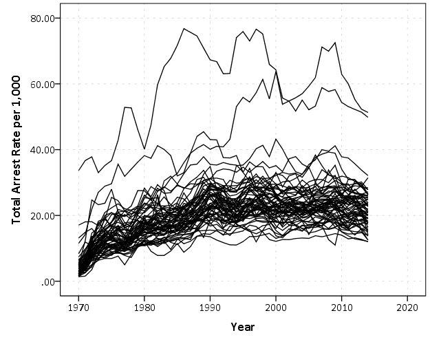
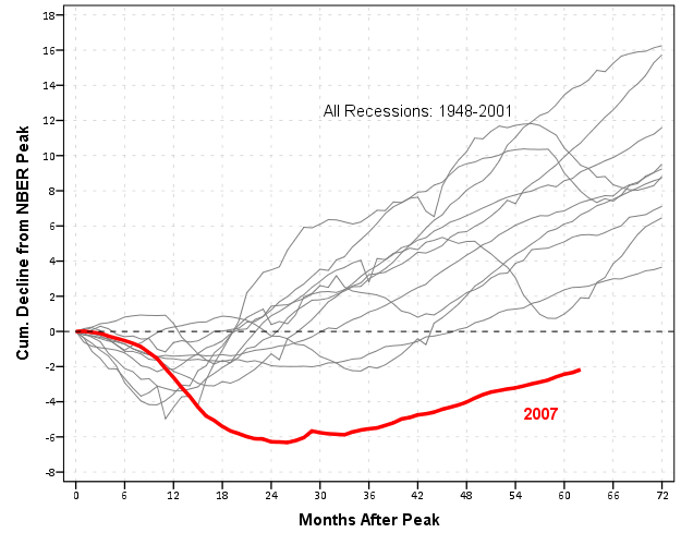
Which produces this chart (ok I cheated alittle, I post-hoc added the labels in by hand in the SPSS editor, as I did not like the automatic label placement and it is easier to add in by hand than fix the automated labels). Also note this will appear slightly different than the default SPSS charts because I use my own personal chart template.

That is one hell of a chart command call though! You can actually produce most of the lines for this call through SPSS’s GUI dialog, and it just takes some more knowledge of the graphic language of SPSS to adjust the aesthetics of the chart. It would take a book to go through exactly how GPL works and the structure of the grammar, but here is an attempt at a more brief run down.

So typically, you would make seperate lines by specifiying that every year gets its own color. This is nearly impossible to distinguish between all of the lines though (as Kaiser originally states). A simple solution is to only highlight the line we are interested in, 2007, and make the rest of the lines the same color. To do this and still have the lines rendered seperately in SPSS’s GPL code, one need to specify the split modifier within the ELEMENT statement (the equivalent in ggplot2 is the group statement within aes). The things I manually edited differently than the original code generated through the GUI are;

  • Guide line at the zero value, and then making the guideline 1 point wide, black, and with a dashed pattern (GUIDE: form.line)
  • Color and size the 2007 line differently than the rest of the lines (SCALE: cat(aesthetic(aesthetic.color), map(("0", color.grey), ("1", color.red))))
  • Set the upper and lower boundary of the x and y axis (SCALE: linear(dim(2), min(-8), max(18)))
  • set the labels for the x and y axis, and set how often tick marks are generated (GUIDE: axis(dim(2), label("Cum. Decline from NBER Peak"), delta(2)))
  • set the chart so the legend for the mapped aesthetics are not generated, because I manually label them anyway (GUIDE: legend(aesthetic(aesthetic.size), null()))

Technically, both in SPSS (and ggplot2) you could produce the chart in the original wide format, but this ends up being more code in the chart call (and grows with the numbers of groups) than simply reshaping the data so the data to makes the lines is in one column.

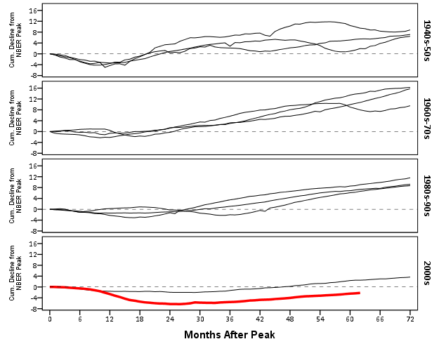
This chart, IMO, makes the point we want to make easily and succintly. The recession in 2007 has had a much harsher drop off in employment and has lasted much longer than employment figures in any recession since 1948. All of the further small multiples are superflous unless you really want to drill down into the differences between prior years, which are small in magnitude compared to the current recession. Using small lines and semi-transparency is the best way to plot many lines (and I wish people running regressions on panel data sets did it more often!)

So although that one graph call is complicated, it takes relatively few lines of code to read in the data and make it. In ggplot2 I’m pretty sure would be fewer lines (Hadley’s version of the grammar is much less verbose than SPSS). So, in code golf terms of complexity, we are doing alright. The power in programming though is it is trivial to reuse the code. So to make a paneled version similar to Kaiser’s remake we simply need to make the panel groupings, then copy-paste and slightly update the prior code to make a new chart;

compute #yearn = NUMBER(year,F4.0).
if RANGE(#yearn,1940,1959) = 1 decade = 1.
if RANGE(#yearn,1960,1979) = 1 decade = 2.
if RANGE(#yearn,1980,1999) = 1 decade = 3.
if RANGE(#yearn,2000,2019) = 1 decade = 4.
value labels decade
1 '1940s-50s'
2 '1960s-70s'
3 '1980s-90s'
4 '2000s'.

GGRAPH
  /GRAPHDATASET NAME="graphdataset" VARIABLES=MAP cdecline year decade flag_2007
  /GRAPHSPEC SOURCE=INLINE.
BEGIN GPL
 SOURCE: s=userSource(id("graphdataset"))
 DATA: MAP=col(source(s), name("MAP"))
 DATA: cdecline=col(source(s), name("cdecline"))
 DATA: year=col(source(s), name("year"), unit.category())
 DATA: flag_2007=col(source(s), name("flag_2007"), unit.category())
 DATA: decade=col(source(s), name("decade"), unit.category())
 SCALE: cat(aesthetic(aesthetic.color), map(("0", color.black), ("1", color.red)))
 SCALE: cat(aesthetic(aesthetic.size), map(("0",size."1px"), ("1",size."3.5px")))
 SCALE: linear(dim(1), min(0), max(72))
 SCALE: linear(dim(2), min(-8), max(18))
 GUIDE: axis(dim(1), label("Months After Peak"), delta(6))
 GUIDE: axis(dim(2), label("Cum. Decline from NBER Peak"), delta(2))
 GUIDE: axis(dim(4), opposite())
 GUIDE: form.line(position(*,0), size(size."0.5px"), shape(shape.dash), color(color.lightgrey))
 GUIDE: legend(aesthetic(aesthetic.color), null())
 GUIDE: legend(aesthetic(aesthetic.size), null())
 ELEMENT: line(position(MAP*cdecline*1*decade), color(flag_2007), size(flag_2007), split(year))
END GPL.

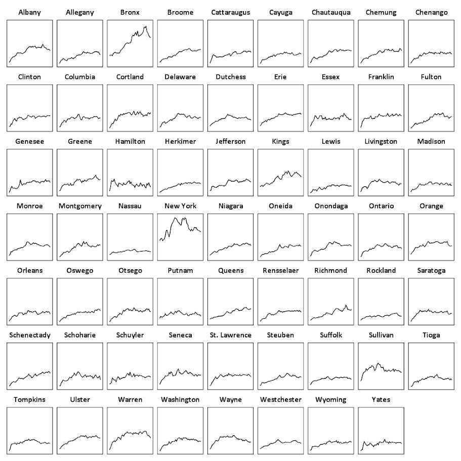
It should be easy to see comparing the new paneled chart syntax to the original, it only took two slight changes; 1) I needed to add in the new decade variable and define it in the DATA mapping, 2) I needed to add it to the ELEMENT call to produce paneling by row. Again I cheated alittle, I post hoc edited the grid lines out of the image, and changed the size of the Y axis labels. If I really wanted to automate these things in SPSS, I would need to rely on a custom template. In R in ggplot2, this is not necessary, as everything is exposed in the programming language. This is quite short work. Harder is to add in labels, I don’t bother here, but I would assume to do it nicely (if really needed) I would need to do it manually. I don’t bother here because it isn’t clear to me why I should care about which prior years are which.

On aesthetics, I would note Kaiser’s original panelled chart lacks distinction between the panels, which makes it easy to confuse Y axis values. I much prefer the default behavior of SPSS here. Also the default here does not look as nice in the original in terms of the X to Y axis ratio. This is because the panels make the charts Y axis shrink (but keep the X axis the same). My first chart I suspect looks nicer because it is closer to the Cleveland ideal of average 45 degree banking in the line slopes.

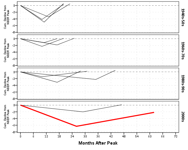
What about the data manipulation Kaiser suggests is difficult to conduct in a statistical programming language? Well, that is more difficult, but certainly not impossible (and certainly not faster in Excel to anyone who knows how to do it!) Here is how I would go about it in SPSS to identify the start, the trough, and the recovery.

*Small multiple chart in piecewise form, figure out start, min and then recovery.
compute flag = 0.
*Start.
if MAP = 0 flag = 1.
*Min.
sort cases by year cdecline.
do if year <> lag(year) or $casenum = 1.
    compute flag = 2.
    compute decline_MAP = MAP.
else if year = lag(year). 
    compute decline_MAP = lag(decline_MAP).
end if.
*Recovery.
*I need to know if it is after min to estimate this, some have a recovery before the
min otherwise.
sort cases by year MAP.
if lag(cdecline) < 0 and cdecline >= 0 and MAP > decline_MAP flag = 3.
if year = "2007" and MAP = 62 flag = 3.
exe.
*Now only select these cases.
dataset copy reduced.
dataset activate reduced.
select if flag > 0.

So another 16 lines (that aren’t comments) – what is this world of complex statistical programming coming too! If you want a run-down of how I am using lagged values to identify the places, see my recent post on sequential case processing.

Again, we can just copy and paste the chart syntax to produce the same chart with the reduced data. This time it is the exact same code as prior, so no updating needed.

GGRAPH
  /GRAPHDATASET NAME="graphdataset" VARIABLES=MAP cdecline year decade flag_2007
  /GRAPHSPEC SOURCE=INLINE.
BEGIN GPL
 SOURCE: s=userSource(id("graphdataset"))
 DATA: MAP=col(source(s), name("MAP"))
 DATA: cdecline=col(source(s), name("cdecline"))
 DATA: year=col(source(s), name("year"), unit.category())
 DATA: flag_2007=col(source(s), name("flag_2007"), unit.category())
 DATA: decade=col(source(s), name("decade"), unit.category())
 SCALE: cat(aesthetic(aesthetic.color), map(("0", color.black), ("1", color.red)))
 SCALE: cat(aesthetic(aesthetic.size), map(("0",size."1px"), ("1",size."3.5px")))
 SCALE: linear(dim(1), min(0), max(72))
 SCALE: linear(dim(2), min(-8), max(1))
 GUIDE: axis(dim(1), label("Months After Peak"), delta(6))
 GUIDE: axis(dim(2), label("Cum. Decline from NBER Peak"), delta(2))
 GUIDE: axis(dim(4), opposite())
 GUIDE: form.line(position(*,0), size(size."0.5px"), shape(shape.dash), color(color.lightgrey))
 GUIDE: legend(aesthetic(aesthetic.color.interior), null())
 GUIDE: legend(aesthetic(aesthetic.size), null())
 ELEMENT: line(position(MAP*cdecline*1*decade), color(flag_2007), size(flag_2007), split(year))
END GPL.

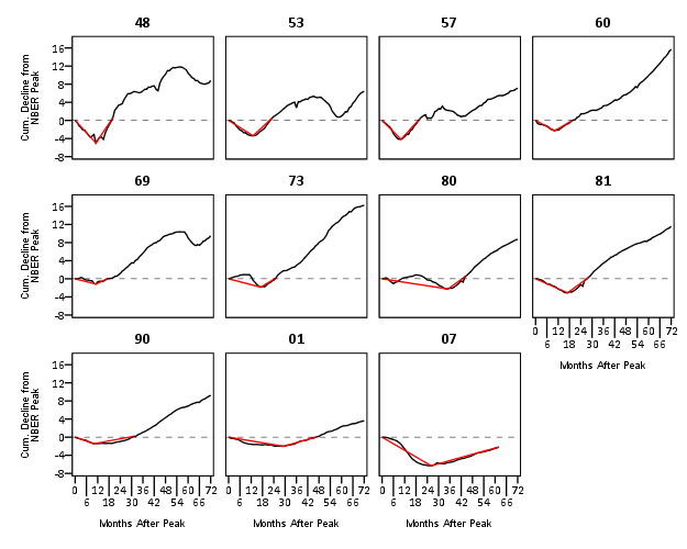
Again I lied a bit earlier, you really only needed 14 lines of code to produce the above chart. I actually spent a few saving to a new dataset. I wanted to see if the reduced summary in this dataset was an accurate representation. You can see it is except for years 73 and 80, in which they had slight positive recoveries before the bottoming out, so one bend in the curve doesn’t really cut it in those instances. Again, the chart only takes some slight editing in the GPL to produce. Here I produce a chart where each year has it’s own panel, and the panels are wrapped (instead of placed in new rows). This is useful when you have many panels.

compute reduced = 1.
dataset activate NonFarmEmploy.
compute reduced = 0.
add files file = *
/file = 'reduced'.
dataset close reduced.
value labels reduced
0 'Full Series'
1 'Kaisers Reduced Series'.

*for some reason, not letting me format labels for small multiples.
value labels year
'1948' "48"
'1953' "53"
'1957' "57"
'1960' "60"
'1969' "69"
'1973' "73"
'1980' "80"
'1981' "81"
'1990' "90"
'2001' "01"
'2007' "07".

GGRAPH
  /GRAPHDATASET NAME="graphdataset" VARIABLES=MAP cdecline year flag_2007 reduced
  /GRAPHSPEC SOURCE=INLINE.
BEGIN GPL
 SOURCE: s=userSource(id("graphdataset"))
 DATA: MAP=col(source(s), name("MAP"))
 DATA: cdecline=col(source(s), name("cdecline"))
 DATA: year=col(source(s), name("year"), unit.category())
 DATA: flag_2007=col(source(s), name("flag_2007"), unit.category())
 DATA: reduced=col(source(s), name("reduced"), unit.category())
 COORD: rect(dim(1,2), wrap())
 SCALE: cat(aesthetic(aesthetic.color), map(("0", color.black), ("1", color.red)))
 SCALE: linear(dim(1), min(0), max(72))
 SCALE: linear(dim(2), min(-8), max(18))
 GUIDE: axis(dim(1), label("Months After Peak"), delta(6))
 GUIDE: axis(dim(2), label("Cum. Decline from NBER Peak"), delta(2))
 GUIDE: axis(dim(3), opposite())
 GUIDE: form.line(position(*,0), size(size."0.5px"), shape(shape.dash), color(color.lightgrey))
 GUIDE: legend(aesthetic(aesthetic.color.interior), null())
 GUIDE: legend(aesthetic(aesthetic.size), null())
 ELEMENT: line(position(MAP*cdecline*year), color(reduced))
END GPL.

SPSS was misbehaving and labelling my years with a comma. To prevent that I made value labels with just the trailing two years. Again I post-hoc edited the size of the Y and X axis labels and manually removed the gridlines. Quite short work. Harder is to add in labels, I don’t bother here, but I would assume to do it nicely (if really needed) I would need to do it manually. I don’t bother here because it isn’t clear to me why I should care

As oppossed to going into a diatribe about the utility of learning a statistical programming language, I will just say that, if you are an analyst that works with data on a regular basis, you are doing yourself a disservice by only sticking to excel. Not only is the tool in large parts limited to the types of graphics and analysis one can conduct, it is very difficult to make tasks routine and reproducible.

Part of my dissapointment is that I highly suspect Kaiser has such programming experience, he just hasn’t taken the time to learn a statistical program thoroughly enough. I wouldn’t care, except that Kaiser is in a position of promoting best practices, and I would consider this to be one of them. I don’t deny that learning such programming languages is not easy, but as an analyst that works with data every day, I can tell you it is certainly worth the effort to learn a statistical programming language well.

Aoristic analysis with SPSS

I’ve written a macro to conduct aoristic analysis with SPSS. Here I will briefly describe what it is, provide alternative references and demonstrate some of its utility on example data from Arlington PD.

In short, crime event data are frequently recorded as occurring within some indefinate time frame. For example, you may park your car and go to work at 08:00, and when you come back out at 04:30 on the same day to find your car window broken and your GPS stolen. Unless there happens to be other witnesses to the crime, you don’t know when the criminal event occurred besides between those two times. Where this is problematic for crime analysis is, you want to be able to look at the distribution of when events occurred, so as to give suggestions to understand why the event is occurring and how to potentially address it. Allocating patrols geographically and temporally to areas of high crime incidence has been regular practice for a long time (Wilson, 1963)! Aoristic analysis is simply a means to take into account that uncertainty of when the event occurred when we examine the overal incidence of crimes occurring across a set of times.

For a very brief illustrative example, lets say we want to know the number of crimes occuring for within the hours of 08:00, 09:00 and 10:00. If we had a criminal event that potentially occurred between 08:00 and 10:00, which is a total time span of 120 minutes (2 hours), instead of counting that event as occurring at 08:00 (the begin time), 10:00 (the end time) or 09:00 (the middle time), we spread the event out over the time frame, and only partially count it within any particular interval. So here it would count as a total of 0.50 weight in both the 08:00 and 09:00 category (60/120=0.25) and assign 0 weight in the 10:00 category (note the weights sum back to the value of 1). This just ends up being a way to estimate the incidence of some event within a given time bin knowing that the event did not necessarily occur in that time bin, so only partially counts towards the total in that bin (where partially is defined by how long the interval is and how much of that interval overlaps with the bin).

Here I illustrate the macro with some examples from the Arlington PD data downloaded on 1/11/2013. This is the only dataset I’ve found publicly available online that has both start and end dates for events (I first looked at NIBRS, and was slightly surprised that they did not have this information). I have the macro code, with examples therein of fake data and the same Arlington PD data, and compare them to this online calculator.

Note, my results will be slightly different than most other programs (including the online app I pointed to) because of one arbitrary (but what I feel is reasonable) coding decision. When an event is over the time period evaluated in the particular estimate (either days or week for my functions), it simply returns the event coded as having equal weight across the time period. Other’s don’t do this as far as I’m aware. So say an event takes place between 08:00 on 1/2/2013 and 10:00 on 1/3/2013. For my functions that only evaluate times over the day, I would return equal probability within every time slot, although some calculators would say there is a higher probability of occurring for times between 08:00 and 10:00 (because of the wrap-around). I believe this practice is a bit of a stretch, and any uncertainty over a day is essentially saying it is totally useless information to determine when during the time of day at all (although my week functions would be equivalent in that example). In those cases the begin and end times say more about when people check there cars, wake up in the morning, get home from work, come back from vacation etc. than they do about when the actual crime occurred.

Some examples

If you want to follow along right within SPSS, I suggest going to the google code site I’ve posted the code and data, but otherwise you can just take my word for it and see how the macro works in practice. I provide several seperate functions to either estimate the frequency of crimes occurring during 1 hour bins over the day, 15 minute bins over the day, days over the week, 1 hour bins over the week, or 15 minute bins over the week.

Here is an example call of the macro and the output from the 1 hour bins over the day with all crimes for the Arlington data.

!aoristic_day1hour begin_date = Date1 begin_time = Time1 end_date = Date2 end_time = Time2.

Date1 and Date2 are the begin and end dates respectively, Time1 and Time2 are the begin and end times respectively. Below is (close to) the automated graph the macro produces, which is just a line chart super-imposing the both the aoristic estimate and what the estimate would be if using the begin, end or middle time. The only differences are I post-hoc edited the aoristoc estimate line to be thicker and in the front (so it is more prominent) plus my personal chart template. Paramaterizing GGRAPH charts to work in macros is quite annoying, and python is a preferable solution (I’m personally happy with just a helper function to return the data in a nice format for me to generate the approprate GGRAPH code to generate the chart myself, there is more power in knowing the grammar than being complacent with the default chart).


So you can see here that overall, the aoristoc number does not make much of a difference. Here is the same info for the 15 minute bins across the week.

!aoristic_day15min begin_date = Date1 begin_time = Time1 end_date = Date2 end_time = Time2.


You can see here the aoristic estimate smooths out the data quite a bit more (which is nice above and beyond just worrying about whether one approach is correct or not. With the smaller time bins you can also see patterns to over-report incidents at natural times of hour and half-hour intervals. You can also see midnight, noon and 08:00 are aberently popular times to report either beginning or end times of incidents. You can spot a few other ones as well that differ between begin and end times, for instance it appears 07:00 is a popular end time but not so popular a begin time. The obverse is true for events in the middle afternoon, late evening and early night (e.g. the big spikes in the green begin time line for hours between 17:00 till midnight). Also note that it is near universal that crime dips to its lowest around 4~5 am, and you can see using either the aoristic estimate or the middle point of the event brings the number of events up during this period (as expected).

Also in the set of functions I have the capability to specify an arbitrary category to split the results by, and here is an example splitting the day of week aoristic estimate by the beat variable provided with the Arlington data. Again this isn’t the direct code, but a subsequent GGRAPH command to produce a nicer chart (the original is ok if you make it much bigger, but with so many categories facet wrapping is appropriate to save space).

!aoristic_week begin_date = Date1 begin_time = Time1 end_date = Date2 end_time = Time2 split = Beat.


The main thing that draws attention in this graph is the difference in levels of calls and different trends between beats (there were no obvious differences in the aoristic estimates versus the naive estimates, which is unsurprising since most incidents don’t have uncertainty of over a day). I know nothing about Arlington, and I don’t know where these beats are, so I can’t say anything about why these differences may potentially occur. In SPSS days start at Sunday (so Sunday = 1 and Saturday = 7). It isn’t that strange to expect slightly more crime on Fridays and Saturdays (people out and about doing things that make them more vulnerable), but for most of the beats showing a flat profile this is not strange either. But it is interesting to see Beat 260 have an atypical pattern of obviously more crimes during the week, and if I had to hazard a guess I would assume there is a middle or high school in Beat 260.

Although you could argue aoristic analysis is called for based purely on theoretical grounds, all these examples show events that it doesn’t make much of a difference whether you use it or simpler methods. Where it is likely to make the most difference though are events which have the longest unknown time intervals. Property crimes tend to be committed when the victim is not around, and so here I compare the aoristic estimate for 15 minute intervals over the day for burglaries, which will show an example where the aoristic estimate makes an actual difference!


One can see the property crimes have a larger difference for the aoristic estimate across the day, and it is largely flat compared to begin and end times. The end and begin times are likely biased to report when people discovered that the victimization occurred or when they last left their home vulnerable. There is some slight trend for more burglaries to occur during the daytime, and somewhat higher periods during the night (with lulls around 08:00 and 18:00. These are near the exact opposite conclusions you would make with utilizing the begin and end times as to when most burglaries occurred! Middle times results in some weird differences as well, with a high spike in the 01:00 to 04:00 range.

Some closing

This project kicked my butt alittle, and took much longer than I expected. Certainly the code could use improvement and re-factoring, but I’m glad it is done (and seemingly working). You will see there is certainly alot of redundancy between the functions, some temporary variables are computed multiple times, and the week long functions take a while to compute.

In the SPSS macro what I do in a nutshell is make a variable for every time bin, calculate the weight each case has for that time bin, then reshape the dataset wide to long, then at last aggregate the total weight within each time bin. Note this results in many more cases than the original data. For example, the Arlington data I will display later in the post has slightly over 49,000 incidents. For the 15 minute intervals per day (96), this results in over 4.7 million cases (49,000*96). For the 1 hour bins across the week, this results in n times 168 more cases, for the 15 minute bins across the week in n times 672! Subsequently those latter two take an appreciable amount of time to compute for larger datasets (if you don’t run out of local memory on your computer entirely, which I’m guessing could easily happen for some of the older systems and when you have upwards of probably 60,000 cases).

For those interested, the bottle-neck is obviously the VARSTOCASES procedure. But, I have a substantive reason for going through that step, and that is if one wants to use the original data weighted, for say kernel density maps sliced by time of day having the data in that format (long with a field identifying the factor) is more convienant than in the wide format. Thinking about it I could generate NULL data for 0 weight categories and then drop those cases during the VARSTOCASES, but it remains to be seen if that will have much of an appreciable effect on real world datasets. Hopefully in the near future I will get the time to provide examples of that (probably in R using facetting and small multiple maps). If anyone has improvements to the code feel free to send them to me (or just shoot me an email).

In the future I plan on talking about some more visualization techniques to explore crime data with intervals like this. In particular I have a plot manipulating the grammar of graphics a bit to produce a visualization of individual incidents, but it still needs some work and writing up into a nice function. Here is an example though.


Citations

Wilson, O.W. 1963. Police Administration. McGraw-Hill.

Ratcliffe, Jerry H. 2002. Aoristic signatures and the spatio-temporal analysis of high volume crime patterns. Journal of Quantitative Criminology 18(1): 23-43. PDF Here.

The leaning tower optical illusion: Is it applicable to statistical graphics?


Save in the memory banks whether the slope of the lines in the left hand panel appear similar, smaller or larger than the slope of the lines in the right hand panel.

I enjoy reading about optical illusions, both purely because I think they are neat and there applicability to how we present and perceive information in statistical graphics. A few examples I am familiar with are;

  • The Rubin Vase optical illusion in which it is difficult to distinguish between what object is the background and which is the foreground. This is applicable to making clear background/foreground seperation between grid lines and chart elements.
  • Change blindness, which makes it difficult to interpret animated graphics that do not have smooth, continous transitions between chart states.
  • Mach bands, where the color of an object is perceived differently given the context of the surrounding colors. I recently came across one of the most dramatic examples of this at the very cool mighty optical illusion site. I actually went and edited the image in that example to make sure there was no funny business it was so dramatic an effect! Image included below.


I was recently pointed to a new (to me) example of an optical illusion, the leaning tower illusion, in a paper by Kingdom, Yoonessi & Gheorghiu (2007) (referred via the Freakonometrics blog).


Although I suggest to read the article (it is very brief) – to sum it up both pictures above are identical, although the tower on the right appears to be leaning more to the right. Although the pictures are seperate (and have some visual distinction) our minds interpret them in the same “plane”. And hence objects that are further away in the distance should not be parallel but should actually converge within the image.

Off-the-cuff this reminded me of the Ponzo illusion, where our minds know that the lines are still running parallel, and our perception of other surrounding elements changes conditional on that dominant parallel lines pattern. Here is another good example of this from the mighty optical illusions site (actually I did not know the name of this effect – and when I googled subway tile illusion this is the site that came up – and I’m glad I found it!)

Is this applicable to statistical graphics though? One of the later images in the Perception article appear to be potentially more reminiscent of a small multiple line chart (and we all know I strongly advocate for the use of small multiple charts).


We do know that interpreting the distance between sloping lines is difficult (as elaborated on in some of Cleveland’s work), but this is different in that potentially our perception of the parallelness of lines between panels in a small multiple is distorted based the directions of lines within the panel. Off-hand though we may expect that the context doesn’t exactly carry-over, there is no visual schematic in 2d statistical graphics that lines are running further from our perspective. So to test this out I attempted to create some settings in small multiple line panels that might cause similar optical illusions.

So, going back to the picture at the beginning of the article, here are those same lines superimposed on the original picture. My personal objectivity to tell if these result in visual distortions is gone at this point, but at best I could only conjure up perhaps some slight distortion between panels (which is perhaps no worse than our ability to effectively perceive slopes accurately anyway).

I think along these lines one could come up with some more examples where between panel comparisons for line graphs in small multiples produce such distortions, but I was unable to produce anything compelling in some brief tries (so let me know if you come across any examples where such distortions occur!) Simply food for thought though at this point.

I do think though that the Ponzo scheme can be illustrated with essentially the same graphic.


It isn’t as dramatic as the subway tile example, but I do think it appears the positive sloping line where the negative sloping lines converge at the top of the image appears larger than the line in space and the bottom right of the image.

I suspect this could actually occur in real life graphics in which we have error bars superimposed on a graph with several lines of point estimates. If the point estimates start at a wide interval and then converge, it may produce a similar illusion that the error bars appear larger around the point estimates that are closer together. Again though I produced nothing real compelling in my short experimentation.

Visualization techniques for large N scatterplots in SPSS

When you have a large N scatterplot matrix, you frequently have dramatic over-plotting that prevents effectively presenting the relationship. Here I will give a few quick examples of simple ways to alter the typical default scatterplot to ease the presentation. I give examples in SPSS, although I suspect any statistical packages contains these options to alter the default scatterplot. At the end of the post I will link to SPSS code and data I used for these examples. For a brief background of the data, these are UCR index crime rates for rural counties by year in Appalachia from 1977 to 1996. This data is taken from the dataset Spatial Analysis of Crime in Appalachia, 1977-1996 posted on ICPSR (doi:10.3886/ICPSR03260.v1). While these scatterplots ignore the time dimension of the dataset, they are sufficient to demonstrate techniques to visualize big N scatterplots, as they result in over 7,000 county years to visualize.

So what is the problem with typical scatterplots for such large data? Below is an example default scatterplot in SPSS, plotting the Burglary Rate per 100,000 on the X axis versus the Robbery Rate per 100,000 on the Y axis. This uses my personal default chart template, but the problem is with the large over-plotted points in the scatter, which is the same for the default template that comes with installation.

The problem with this plot is that the vast majority of the points are clustered in the lower left corner of the plot. For the most part, the graph is expanded simply due to a few outliers in both dimesions (likely due to in part hetereoskedascity that comes with rates in low population areas). While the outliers will certainly be of interest, we kind of lose the forest for the trees in this particular plot.

Two simple suggestions to the base default scatterplot are to utilize smaller points and/or makes the points semi-transparent. On the left is an example of making the points smaller, and on the right is an example utilizing semi-transparency and small points. This de-emphasizes the outlier points (which could be good or bad depending on how you look at it), but allows one to see the main point cloud and the correlation between the two rates within it. (Note: you can open up the images in a new window to see them larger)

Note if you are using SPSS, to define semi-transparency you need to define it in the original GPL code (or in a chart template if you wanted), you can not do it post-hoc in the editor. You can make the points smaller in the editor, but editing charts with this many elements tends to be quite annoying, so to the extent you can specify the aesthetics in GPL I would suggest doing so. Also note making the elements smaller and semi-transparent can also be effectively utilized to visualize line plots, and I gave an example at the SPSS IBM forum recently.

Another option is to bin the elements, and SPSS has the options to either utilze rectangular bins or hexagon bins. Below is an example of each.

One thing that is nice about this technique and how SPSS handles the plot, a bin is only drawn if at least one point falls within it. Thus the outliers and the one high leverage point in the plot are still readily apparent. Other ways to summarize distributions (that are currently not available in SPSS) are sunflower plots or contour plots. Sunflower plots are essentially another way to display and summarize multiple overlapping points (see Carr et al., 1987 or an example from this blog post by Analyzer Assistant). Contour plots are drawn by smoothing the distribution and then plotting lines of equal density. Here is an example of a contour plot using ggplot2 in R on the Cross Validated Q/A site).

This advice can also be extended to scatterplot matrices. In fact such advice is more important in such plots, as the relationship is shrunk in a much smaller space. I talk about this some in my post on the Cross Validated blog, AndyW says Small Multiples are the Most Underused Data Visualization when I say reducing information into key patterns can be useful.

Below on the left is an example of the default SPSS scatter plot matrix produced through the Chart Builder, and on the right after editing the GPL code to make the points smaller and semi-transparent.

I very briefly experimented with adding a loess smooth line or using the binning techniques in SPSS but was not sucessful. I will have to experiment more to see if it can be effectively done in scatterplot matrices. I would like to extend some of the example corrgrams I previously made to plot the loess smoother and bivariate confidence ellipses, and you can be sure I will post the examples here on the blog if I ever get around to it.

The data and syntax used to produce the plots can be found here.

Bean plots in SPSS

It seems like I have come across alot of posts recently about visualizing univariate distributions. Besides my own recent blog post about comparing distributions of unequal size in SPSS, here are a few other blog posts I have recently come across;

Such a variety of references is not surprising though. Examining univariate distributions is a regular task for data analysis and can tell you alot about the nature of data (including potential errors in the data). Here are some posts on the Cross Validated Q/A site of related interest I have compiled;

In particular the recent post on bean plots and Luca Fenu’s post motivated my playing around with SPSS to produce the bean plots here. Note Jon Peck has published a graphboard template to generate violin plots for SPSS, but here I will show how to generate them in the usual GGRAPH commands. It is actually pretty easy, and here I extend the violin plots to include the beans suggested in bean plots!

A brief bit about the motivation for bean plots. Besides consulting the article by Peter Kampstra, one is interested in viewing a univariate continuous distribution among a set of different categories. To do this one uses a smoothed kernel density estimate of the distribution for each of the subgroups. When viewing the smoothed distribution though one loses the ability to identify patterns in the individual data points. Patterns can mean many things, such as outliers, or patterns such as striation within the main body of observations. The bean plot article gives an example where striation in measurements at specific inches can be seen. Another example might be examining the time of reported crime incidents (they will have bunches at the beginning of the hour, as well as 15, 30, & 45 minute marks).

Below I will go through a brief series of examples demonstrating how to make bean plots in SPSS.


SPSS code to make bean plots

First I will make some fake data for us to work with.

******************************************.
set seed = 10.
input program.
loop #i = 1 to 1000.
compute V1 = RV.NORM(0,1).
compute groups = TRUNC(RV.UNIFORM(0,5)).
end case.
end loop.
end file.
end input program.
dataset name sim.
execute.

value labels groups
0 'cat 0'
1 'cat 1'
2 'cat 2'
3 'cat 3'
4 'cat 4'.
******************************************.

Next, I will show some code to make the two plots below. These are typical kernel density estimates of the V1 variable I made for the entire distribution, and these are to show the elements of the base bean plots. Note the use of the TRANS statement in the GPL to make a constant value to plot the rug of the distribution. Also note although such rugs are typically shown as bars, you could pretty much always use point markers as well in any situation where you use bars. Below the image is the GGRAPH code used to produce them.

******************************************.
*Regular density estimate with rug plot.
GGRAPH
  /GRAPHDATASET NAME="graphdataset" VARIABLES=V1 MISSING=LISTWISE REPORTMISSING=NO
  /GRAPHSPEC SOURCE=INLINE.
BEGIN GPL
  SOURCE: s=userSource(id("graphdataset"))
  DATA: V1=col(source(s), name("V1"))
  TRANS: rug = eval(-26)
  GUIDE: axis(dim(1), label("V1"))
  GUIDE: axis(dim(2), label("Density"))
  SCALE: linear(dim(2), min(-30))
  ELEMENT: interval(position(V1*rug), transparency.exterior(transparency."0.8"))
  ELEMENT: line(position(density.kernel.epanechnikov(V1*1)))
END GPL.

*Density estimate with points instead of bars for rug.
GGRAPH
  /GRAPHDATASET NAME="graphdataset" VARIABLES=V1 MISSING=LISTWISE REPORTMISSING=NO
  /GRAPHSPEC SOURCE=INLINE.
BEGIN GPL
  SOURCE: s=userSource(id("graphdataset"))
  DATA: V1=col(source(s), name("V1"))
  TRANS: rug = eval(-15)
  GUIDE: axis(dim(1), label("V1"))
  GUIDE: axis(dim(2), label("Density"))
  SCALE: linear(dim(2), min(-30))
  ELEMENT: point(position(V1*rug), transparency.exterior(transparency."0.8"))
  ELEMENT: line(position(density.kernel.epanechnikov(V1*1)))
END GPL.
******************************************.

Now bean plots are just the above plots rotatated 90 degrees, adding a reflection of the distribution (so the area of the density is represented in two dimensions), and then further paneled by another categorical variable. To do the reflection, one has to create a fake variable equal to the first variable used for the density estimate. But after that, it is just knowing alittle GGRAPH magic to make the plots.

******************************************.
compute V2 = V1.

varstocases
/make V from V1 V2
/index panel_dum.

GGRAPH
  /GRAPHDATASET NAME="graphdataset" VARIABLES=V panel_dum groups MISSING=LISTWISE REPORTMISSING=NO
  /GRAPHSPEC SOURCE=INLINE.
BEGIN GPL
  SOURCE: s=userSource(id("graphdataset"))
  COORD: transpose(mirror(rect(dim(1,2))))
  DATA: V=col(source(s), name("V"))
  DATA: panel_dum=col(source(s), name("panel_dum"), unit.category())
  DATA: groups=col(source(s), name("groups"), unit.category())
  TRANS: zero = eval(10)
  GUIDE: axis(dim(1), label("V1"))
  GUIDE: axis(dim(2), null())
  GUIDE: axis(dim(3), null())
  SCALE: linear(dim(2), min(0))
  ELEMENT: area(position(density.kernel.epanechnikov(V*1*panel_dum*1*groups)), transparency.exterior(transparency."1.0"), transparency.interior(transparency."0.4"), 
           color.interior(color.grey), color.exterior(color.grey)))
  ELEMENT: interval(position(V*zero*panel_dum*1*groups), transparency.exterior(transparency."0.8"))
END GPL.
    ******************************************.

Note I did not label the density estimate anymore. I could have, but I would have had to essentially divide the density estimate by two, since I am showing it twice (which is possible, and if you wanted to show it you would omit the GUIDE: axis(dim(2), null()) command). But even without the axis they are still reasonable for relative comparisons. Also note the COORD statement for how I get the panels to mirror each other (the transpose statement just switches the X and Y axis in the charts).

I just post hoc edited the chart to get it to look nice (in particular settign the spacing between the panel_dum panel to zero and making the panel outlines transparent), but most of those things can likley be more steamlined by making an appropriate chart template. Two things I do not like, which I may need to edit the chart template to be able to accomplish anyway; 1) There is an artifact of a white line running down the density estimates, (it is hard to see with the rug, but closer inspection will show it), 2) I would prefer to have a box around all of the estimates and categories, but to prevent a streak running down the middle of the density estimates one needs to draw the panel boxes without borders. To see if I can accomplish these things will take further investigation.

This framework is easily extended to the case where you don’t want a reflection of the same variable, but want to plot the continuous distribution estimate of a second variable. Below is an example, and here I have posted the syntax in entirety used in making this post. In there I also have an example of weighting groups inversely proportional to the total items in each group, which should make the area of each group equal.

In this example of comparing groups, I utilize dots instead of the bar rug, as I believe it provides more contrast between the two distributions. Also note in general I have not superimposed other summary statistics (some of the bean plots have quartile lines super-imposed). You could do this, but it gets a bit busy.