Turning SPSS data into Python data

Previously I blogged about how to take Python data and turn it back into SPSS data. Here we are going to do the opposite — turn SPSS data into Python objects. First to start out we will make a simple dataset of three variables.

DATA LIST Free /X Y (2F1.0) Z (A1). 
BEGIN DATA
1 2 A
4 5 B
7 8 C
END DATA.
DATASET NAME Test.
EXECUTE.

To import this data into Python, we need to import the spss class of functions, which then you can read cases from the active dataset using the Cursor attribute. Here is an example of grabbing all of the cases.

*Importing all of the data.
BEGIN PROGRAM Python.
import spss
dataCursor = spss.Cursor()
AllData = dataCursor.fetchall()
dataCursor.close()
print AllData
END PROGRAM.

What this then prints out is ((1.0, 2.0, 'A'), (4.0, 5.0, 'B'), (7.0, 8.0, 'C')), a set of nested tuples. You can also just grab one case by replacing dataCursor.fetchall() with dataCursor.fetchone(), in which case it will just return one tuple.

To only grab particular variables from the list, you can pass a set of indices in the spss.Cursor object. Remember, Python indices start at zero, so if you want the first and second variables in the dataset, you need to grab the 0 and 1 indices.

*Only grabbing certain variables.
BEGIN PROGRAM Python.
dataNum = spss.Cursor([0,1])
spNumbers = dataNum.fetchall()
dataNum.close()
print spNumbers
END PROGRAM.

This subsequently prints out ((1.0, 2.0), (4.0, 5.0), (7.0, 8.0)). When grabbing one variable, you may want just a list of the objects instead of the nested tuples. Here I use list comprehension to turn the resulting tuples for the Z variable into a nice list.

*Converting to a nice list.
BEGIN PROGRAM Python.
dataAlp = spss.Cursor([2])
spAlp = dataAlp.fetchall()
dataAlp.close()
spAlp_list = [i[0] for i in spAlp] #convert to nice list
print spAlp
print spAlp_list
END PROGRAM.

The first print object is (('A',), ('B',), ('C',)), but the second is ['A', 'B', 'C'].

The above code works fine if you know the position of the variable in the file, but if the position can change this won’t work. Here is a one liner to get the variable names of the active dataset and plop them in a list.

*Way to get SPSS variable names.
BEGIN PROGRAM Python.
varList = [spss.GetVariableName(i) for i in range(spss.GetVariableCount())]
print varList
END PROGRAM.

Now if you have your list of variable names you want, you can figure out the index value. There are two ways to do it, iterate over the list of variable names in the dataset, or iterate over the list of your specified variables. I do the latter here (note this will result in an error if you supply a variable name not in the dataset).

*Find the indices of specific variables.
BEGIN PROGRAM Python.
LookVars = ["X","Z"]
VarInd = [varList.index(i) for i in LookVars]
print VarInd
END PROGRAM.

Now you can just supply VarInd above to the argument for spss.Cursor to grab those variables. Here I wrapped it all up in a function.

*Easy function to use.
BEGIN PROGRAM Python.
import spss
def AllSPSSdat(vars):
  if vars == None:
    varNums = range(spss.GetVariableCount())
  else:
    allvars = [spss.GetVariableName(i) for i in range(spss.GetVariableCount())]
    varNums = [allvars.index(i) for i in vars]
  data = spss.Cursor(varNums)
  pydata = data.fetchall()
  data.close()
  return pydata
END PROGRAM.

You can either supply a list of variables or None, in the latter case all of the variables are returned.

BEGIN PROGRAM Python.
MyDat = AllSPSSdat(vars=["Y","Z"])
print MyDat
END PROGRAM.

This set of nested tuples is then pretty easy to convert to other Python objects. Panda’s dataframes, Numpy arrays, and NetworkX objects are all one liners. Here is turning the entire dataset into a panda’s data frame.

*Turn into pandas data frame.
BEGIN PROGRAM Python.
import pandas as pd
MyDat = AllSPSSdat(vars=None)
allvars = [spss.GetVariableName(i) for i in range(spss.GetVariableCount())]
PanDat = pd.DataFrame(list(MyDat),columns=allvars)
print PanDat
END PROGRAM.

Which prints out.

   X  Y  Z 
0  1  2  A 
1  4  5  B 
2  7  8  C
Repeating Charts in SPSS for unique IDs

The title is probably not that clear, but I’ve seen this request a few times and have used this trick in one my projects, so figured it would be a worthwhile topic to illustrate. So the problem is you have a background distribution, and you want to tailor a set of individual charts showing the unique individuals score against the background distribution. See two examples (1,2) of this question. In the first link I showed how one can do this by artificially duplicating the data in a specific way using VARSTOCASES and then using SPLIT FILE to generate the separate charts. Here I will show a python based solution that does not require duplicating the data.

So first we will start off with a set of fake student scores, 20 students with 5 scores each.

*Create some fake data, student test scores.
SET SEED 10.
INPUT PROGRAM.
STRING Student (A1).
LOOP #i = 1 TO 5.
  LOOP #j = 1 TO 20.
    COMPUTE Student = STRING(#j+64,PIB).
    COMPUTE Score = RND(RV.NORMAL(100,10)).
    END CASE.
  END LOOP.
END LOOP.
END FILE.
END INPUT PROGRAM.
DATASET NAME Student_Scores.
FORMATS Score (F3.0).
EXECUTE.

Now the students are listed as strings, but here I am going to use AUTORECODE to automatically turn the strings into number variables, and more importantly for what follows create a set of value labels corresponding to those unique strings.

*Use Auto-recode to make the variables 1 to N.
AUTORECODE VARIABLES = Student /INTO Student_N.
FORMATS Student_N (F6.0).

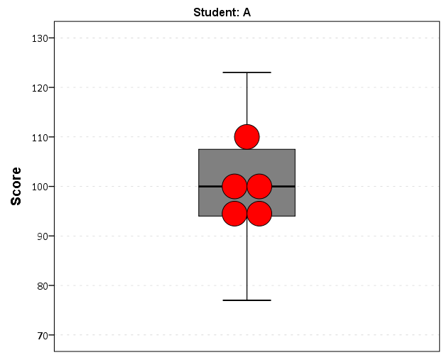
Now the workflow I want to do is to make a set of charts with the background a boxplot for the whole class, and then the individual students scores as foreground dots. To do this I will make a second set of scores that are missing for everyone except that one particular student, the specify MISSING=VARIABLEWISE on the GGRAPH command, and then superimpose Score2 over the boxplot of Score.

*Example of Individual chart.
NUMERIC flag (F1.0) Score2 (F3.0).

DO IF Student_N = 1.
  COMPUTE Score2 = Score.
  COMPUTE flag = 1.
ELSE.
  COMPUTE Score2 = $SYSMIS.
  COMPUTE flag = 0.
END IF.

GGRAPH
  /GRAPHDATASET NAME="graphdataset" VARIABLES=Score Score2 flag MISSING = VARIABLEWISE
  /GRAPHSPEC SOURCE=INLINE.
BEGIN GPL
  SOURCE: s=userSource(id("graphdataset"))
  DATA: Score=col(source(s), name("Score"))
  DATA: Score2=col(source(s), name("Score2"))
  COORD: rect(dim(1), transpose())
  GUIDE: axis(dim(1), label("Score"))
  GUIDE: legend(aesthetic(aesthetic.visible), null())
  GUIDE: text.title(label("Student: A"))
  ELEMENT: schema(position(bin.quantile.letter(Score)), color.interior(color.grey))
  ELEMENT: point.dodge.symmetric(position(bin.dot(Score2)), color.interior(color.red))
END GPL.
*cleaing up temp variables.
MATCH FILES FILE = * /DROP flag Score2.

There are other ways to do this, like using the visible option in GPL aesthetics, but I don’t do that here because they still exist in the chart but simply aren’t shown. This causes problems with the dodging, and if you sent the chart in vector format the information would still be contained in the chart (e.g. if you need to aggregate the background data to be obfuscated for confidentiality reasons you don’t want it in the chart even if it is invisible). Here even the outlier dots in the boxplot are potentially disseminating confidential information, but for simplicity I don’t worry about that here (my syntax at the developerworks forum showed how you can build your own boxplot without having the points, it would be nice to have a no points option for the schema element).

So now the problem is looping through all of the individual students and generating a chart for each one. That is where the AUTORECODE comes in handy. I can grab all of the value labels from the SPSS dictionary and place them in a Python dictionary.

*Python to grab the different students.
BEGIN PROGRAM Python.
import spss
spss.StartDataStep()
datasetObj = spss.Dataset()
StudentLab = datasetObj.varlist['Student_N'].valueLabels
print StudentLab #this is a dictionary of all the unique students
spss.EndDataStep()
END PROGRAM.

Now with the StudentLab Python dictionary I can loop over the dictionary and submit the SPSS syntax for each unique student (using spss.Submit) using string substitutions. I first create the variables and set there formats outside of the loop (the chart inherits the formats). Then I just set several aesthetics of the charts so they are the same for every chart, e.g. the scale goes between 60 and 150, and the size of the superimposed points is 12.

*Now loop through the students.
OUTPUT CLOSE ALL.
BEGIN PROGRAM Python.
spss.Submit("NUMERIC flag (F1.0) Score2 (F3.0).")
for val, lab in StudentLab.data.iteritems():
  spss.Submit("""*Individual score chart.
DO IF Student_N = %d.
  COMPUTE Score2 = Score.
  COMPUTE flag = 1.
ELSE.
  COMPUTE Score2 = $SYSMIS.
  COMPUTE flag = 0.
END IF.
GGRAPH
  /GRAPHDATASET NAME="graphdataset" VARIABLES=Score Score2 flag MISSING = VARIABLEWISE
  /GRAPHSPEC SOURCE=INLINE.
BEGIN GPL
  SOURCE: s=userSource(id("graphdataset"))
  DATA: Score=col(source(s), name("Score"))
  DATA: Score2=col(source(s), name("Score2"))
  DATA: id=col(source(s), name("$CASENUM"), unit.category())
  DATA: flag=col(source(s), name("flag"), unit.category())
  COORD: rect(dim(1), transpose())
  GUIDE: axis(dim(1), label("Score"), delta(10), start(60))
  GUIDE: text.title(label("Student: %s"))
  GUIDE: legend(aesthetic(aesthetic.visible), null())
  SCALE: linear(dim(1), min(60), max(150))
  ELEMENT: schema(position(bin.quantile.letter(Score)), color.interior(color.grey))
  ELEMENT: point.dodge.symmetric(position(bin.dot(Score2)), color.interior(color.red),
           size(size."12"))
END GPL.
""" %(val,lab))
END PROGRAM.

I wanted to export these charts in the loop with the students names, using something like:

SpssOutputDoc.SelectLastOutput() #grab last output
SpssOutputDoc.ExportCharts(SpssClient.SpssExportSubset.SpssSelected, path + lab, SpssClient.ChartExportFormat.png)

but what happens with this is that it is always one behind (e.g. the first chart is selected in the second loop iteration). So what I did was to stuff all of the charts within a list and then loop over that list, select the chart, and then export it using SpssOutputDoc.ExportCharts (another option would be to use EXPORT OUTPUT and then either delete the output in-between charts or clear it, I wish OMS could export only charts). This would be more annoying with multiple individual charts, and could likely be made more concise, but here it is.

*Now exporting the individual charts.
BEGIN PROGRAM Python.
import SpssClient
SpssClient.StartClient()
SpssOutputDoc = SpssClient.GetDesignatedOutputDoc()

#creating a list of all the charts
OutputItems = SpssOutputDoc.GetOutputItems()
Charts = []
for index in range(OutputItems.Size()):
  OutputItem = OutputItems.GetItemAt(index)
  if OutputItem.GetType() == SpssClient.OutputItemType.CHART:
    Charts.append(OutputItem)

labList = []
for val, lab in StudentLab.data.iteritems():
  labList.append(lab)

path = "C:/Users/andrew.wheeler/Dropbox/Documents/BLOG/RepeatingCharts/"

for chart,lab in zip(Charts,labList):
  SpssOutputDoc.ClearSelection() #clear prior selections
  chart.SetSelected(True) #select chart
  #export chart
  SpssOutputDoc.ExportCharts(SpssClient.SpssExportSubset.SpssSelected, path + lab, SpssClient.ChartExportFormat.png)
END PROGRAM.

Here is a screen shot of the resulting images in my folder.

So this will export the charts to PNG format with the image name the same as the students in the file (so the name needs to be in a format appropriate to save a file name). Annoyingly SPSS appends 1 to the end of all charts, even if it is only exporting one chart. Here is an example of the student G’s chart.

Eventually I will figure out how to send emails via Python, and this would be a good tool for individualized report cards for a class. Here is a copy of the full syntax to more easily run on your local machine (just replace path with a location on your local machine).

Turning data from Python into SPSS data

I’ve shown how you can grab data from SPSS and use it in Python commands, and I figured a post about the opposite process (taking data in Python and turning it into an SPSS data file) would be useful. A few different motivating examples are:

So first as a simple illustration, lets make a set of simple data in Python as a list of lists.

BEGIN PROGRAM Python.
MyData = [(1,2,'A'),(4,5,'B'),(7,8,'C')]
END PROGRAM.

Now to export this data into SPSS you can use spss.StartDataStep(), append variables using varlist.append and then add cases using cases.append (see the Python programming PDF that comes with SPSS in the help to peruse all of these functions plus the documentation). This particular codes adds in 3 variables (two numeric and one string) and then loops through the data python object and adds those cases to the define SPSS dataset.

BEGIN PROGRAM Python.
import spss
spss.StartDataStep()                   #start the data setp
MyDatasetObj = spss.Dataset(name=None) #define the data object
MyDatasetObj.varlist.append('X1',0)    #add in 3 variables
MyDatasetObj.varlist.append('X2',0)
MyDatasetObj.varlist.append('X3',1)
for i in MyData:                       #add cases in a loop
  MyDatasetObj.cases.append(i)
spss.EndDataStep()
END PROGRAM.

Here this will create a SPSS dataset and give it a generic name of the form xDataset? where ? will be an incrementing number based on the session history of naming datasets. To specify the name beforehand you need to use the SPSS command DATASET DECLARE X. and then place the dataset name as the option in the spss.Dataset(name='X') command.

As linked above I have had to do this a few times from Python objects, so I decided to make a bit of a simpler SPSS function to take care of this work for me.

BEGIN PROGRAM Python.
#Export to SPSS dataset function
import spss

def SPSSData(data,vars,types,name=None):
  VarDict = zip(vars,types) #combining variables and 
                            #formats into tuples
  spss.StartDataStep()
  datasetObj = spss.Dataset(name=name) #if you give a name, 
                                       #needs to be declared
  #appending variables to dataset
  for i in VarDict:
    datasetObj.varlist.append(i[0],i[1])
  #now the data
  for j in data:
    datasetObj.cases.append(list(j))
  spss.EndDataStep()
END PROGRAM.

This code takes an arbitrary Python object (data), and two lists, one of the SPSS variable names and the other of the format for the SPSS variables (either 0 for numeric or an integer for the size of the strings). To transform the data to SPSS, it needs a list of the same dimension as the variables you have defined, so this works for any data object that can be iterated over and that can be coerced to returning a list. Or more simply, if list(data[0]) returns a list of the same dimensions for the variables you defined, you can pass the data object to this function. This won’t work for all situations, but will for quite a few.

So with the permutation examples I previously linked to, we can use the itertools library to create a set of all the different permutations of string ABC. Then I define a set of variables and formats as lists, and then we can use the SPSSData function I created to make a new dataset.

DATASET DECLARE Combo.
BEGIN PROGRAM Python.
import itertools
YourSet = 'ABC' 
YourLen = 3
x = itertools.permutations(YourSet,YourLen)
v = ['X1','X2','X3']
t = [1,1,1]
SPSSData(data=x,vars=v,types=t,name='Combo')
END PROGRAM. 

This work flow is not optimal if you are creating the data in a loop (such as in the Google Places API example I linked to earlier), but works well for static python objects, such as the object returned by itertools.

The mad scientist workflow: Some examples of using python and R within SPSS

I figured I would share some of the scripts I have been recently working on to produce a set of figures on a regular basis for reports. SPSS GGRAPH can not be directly parameterized within macro’s (at least without a lot of work – see a counter example of Marta Garcia-Granero’s macro for Kalbfleisch-Prentice 95%CI for survival), but can be called using python code. Jon Peck has some examples at the Developerworks blog, and here I will show some more! I am also going to show how to make some automated maps in R using the ggmap package, with which you can grab various basemap tiles from online and superimpose point data.

So lets provide some example data to work with.

DATA LIST FREE / Id (A1) Crime (A8) Hour (F2.0) Lon Lat (2F16.8). BEGIN DATA 1 Robbery 18 -74.00548939 41.92961837 2 Robbery 19 -73.96800055 41.93152595 3 Robbery 19 -74.00755075 41.92996862 4 Burglary 11 -74.01183343 41.92925202 5 Burglary 12 -74.00708100 41.93262613 6 Burglary 14 -74.00923393 41.92667552 7 Burglary 12 -74.00263453 41.93267197 END DATA. DATASET NAME Crimes.

And now let’s say you want to make a graph of the hours of the day that Robberies occur in. Many small to mid-range police departments have few serious crimes when examining over shorter time spans (like a week or a month). So one type of chart I like to use are histogram like dot plots. Here is an example for the entire dataset in question.

GGRAPH /GRAPHDATASET NAME="graphdataset" VARIABLES=Hour MISSING=LISTWISE REPORTMISSING=NO /GRAPHSPEC SOURCE=INLINE. BEGIN GPL PAGE: begin(scale(600px,300px)) SOURCE: s=userSource(id("graphdataset")) DATA: Hour=col(source(s), name("Hour")) TRANS: bottom=eval(0) TRANS: top=eval(10) TRANS: begin=eval(7) TRANS: end=eval(14.5) COORD: rect(dim(1,2)) GUIDE: axis(dim(1), label("Hour of Day"), delta(1)) GUIDE: axis(dim(2), null()) GUIDE: text.title(label("Crimes by Hour Reported")) SCALE: linear(dim(1), min(1), max(22.5)) SCALE: linear(dim(2), min(0), max(3)) ELEMENT: polygon(position(link.hull((begin+end)*(bottom+top))), color.interior(color.lightblue), transparency.interior(transparency."0.5"), transparency.exterior(transparency."1")) ELEMENT: point.dodge.asymmetric(position(bin.dot(Hour, dim(1), binWidth(1))), color.interior(color.darkgrey), size(size."30")) PAGE: end() END GPL.

One of the things I like to do though is to make charts for different subsets of the data. One way is to use FILTER to only plot a subset of the data, but a problem with this approach is the fixed aspects of the chart, like the title, do not change to reflect the current data. Here I will use FILTER in combination with a python BEGIN PROGRAM ... END PROGRAM block to grab the crime type to insert into the title of the graph.

COMPUTE Bur = (Crime = "Burglary"). FILTER BY Bur. BEGIN PROGRAM. import spss MyVars = [1] dataCursor=spss.Cursor(MyVars) MyData=dataCursor.fetchone() dataCursor.close() CrimeType = MyData[0].strip() print CrimeType END PROGRAM. FILTER OFF.

So when grabbing the SPSS case data, python respects the current FILTER on the dataset. First I set an array, MyVars, to grab the variables I want. Here I only want the Crime variable, which is the second variable in the dataset. Python’s arrays are indexed at zero, so I end up wanting the variable in the [1] position. Then SPSS has a set of functions to grab data out of the active dataset using spss.Cursor. What I do is use the fetchone() object property to only grab the first row of data, and assign it the name MyData. Then after closing the cursor using dataCursor.close(), I access the string that is in the first location in the array MyData and use the strip() property to clean up trailing blanks in the string (see this example on Stackoverflow for where this was handy). When running the above code you can see that it prints Burglary, even though the burglary cases are not the first ones in the dataset. Now we can extend this example to insert the chart title and submit the GGRAPH syntax.

FILTER BY Bur. BEGIN PROGRAM. import spss MyVars = [1] dataCursor=spss.Cursor(MyVars) MyData=dataCursor.fetchone() dataCursor.close() CrimeType = MyData[0].strip() spss.Submit(""" GGRAPH /GRAPHDATASET NAME="graphdataset" VARIABLES=Hour MISSING=LISTWISE REPORTMISSING=NO /GRAPHSPEC SOURCE=INLINE. BEGIN GPL PAGE: begin(scale(600px,300px)) SOURCE: s=userSource(id("graphdataset")) DATA: Hour=col(source(s), name("Hour")) TRANS: bottom=eval(0) TRANS: top=eval(10) TRANS: begin=eval(7) TRANS: end=eval(14.5) COORD: rect(dim(1,2)) GUIDE: axis(dim(1), label("Hour of Day"), delta(1)) GUIDE: axis(dim(2), null()) GUIDE: text.title(label("%s by Hour Reported")) SCALE: linear(dim(1), min(1), max(22.5)) SCALE: linear(dim(2), min(0), max(3)) ELEMENT: polygon(position(link.hull((begin+end)*(bottom+top))), color.interior(color.lightblue), transparency.interior(transparency."0.5"), transparency.exterior(transparency."1")) ELEMENT: point.dodge.asymmetric(position(bin.dot(Hour, dim(1), binWidth(1))), color.interior(color.darkgrey), size(size."30")) PAGE: end() END GPL. """ %(CrimeType)) END PROGRAM. FILTER OFF.

You can do this same process for calling R commands, as again grabbing the case data from SPSS respects the current FILTER or (TEMPORARY + SELECT IF). One favorite of mine recently is to make automated maps using the ggmap library. Grabbing the online tiles makes my job of making a nice background much easier. Here is an example of grabbing case data from SPSS and placing the locations on the map (note this is made up data, these aren’t actual crime locations in Kingston!)

FILTER BY Bur. BEGIN PROGRAM R. #using ggmap to make a basemap library(ggmap) loc <- c(left = -74.04, bottom = 41.91, right = -73.960, top = 41.948) KingstonBasemap <- get_map(location = loc, zoom = 14, maptype = "toner", source = "stamen") #setting styles for ggplot map axisStyle <- theme(axis.text.y=element_blank(),axis.text.x=element_blank(), axis.ticks=element_blank(),axis.title.x=element_blank(), axis.title.y=element_blank() ) titleStyle <- theme(plot.title = element_text(face="bold", size=25)) #now grabbing SPSS data casedata <- spssdata.GetDataFromSPSS(variables=c("Id","Crime","Lon","Lat")) TypeCrime <- as.character(casedata$Crime[1]) #grabs first case for chart title #Data to put on the map point <- geom_point(aes(x = Lon, y = Lat), data=casedata, shape=21, size = 9, fill = "Blue") labels <- geom_text(aes(x = Lon, y = Lat, label = as.character(Id)), data=casedata, hjust = -0.03, vjust = -0.8, size = 8, fontface=2, color="cornflowerblue" ) title <- labs(title=paste0(TypeCrime," cases in March")) #Putting all together CrimeMap <- ggmap(KingstonBasemap) + point + labels + axisStyle + titleStyle + title CrimeMap END PROGRAM. FILTER OFF.

To make the map look nice takes a bit of code, but all of the action with grabbing data from SPSS and setting the string I want to use in my chart title are in the two lines of code after the #now grabbing SPSS data comment. (Note I like using Stamen base maps as they allow one to grab non-square tiles. I typically like to use the terrain map – not because the terrain is necessary but just because I like the colors – but I’ve been having problems using the terrain tiles.)

Basically the set up I have now is to place some arbitrary code for graphs and maps in a separate syntax file. So all I need to do set the filter, use INSERT, and then turn the filter off. I can then add graphs for any subsets I am interested in. I have a separate look up table that stashes all the necessary metadata I want for use in the plots for whatever particular categories, which in addition to titles include other chart aesthetics like sizes for point elements or colors. In the future I will have to explore more options for using the SPLIT FILE facilities that both python and R offer when working with SPSS case data, but this is pretty simple and generalizes to non-overlapping groups as well.