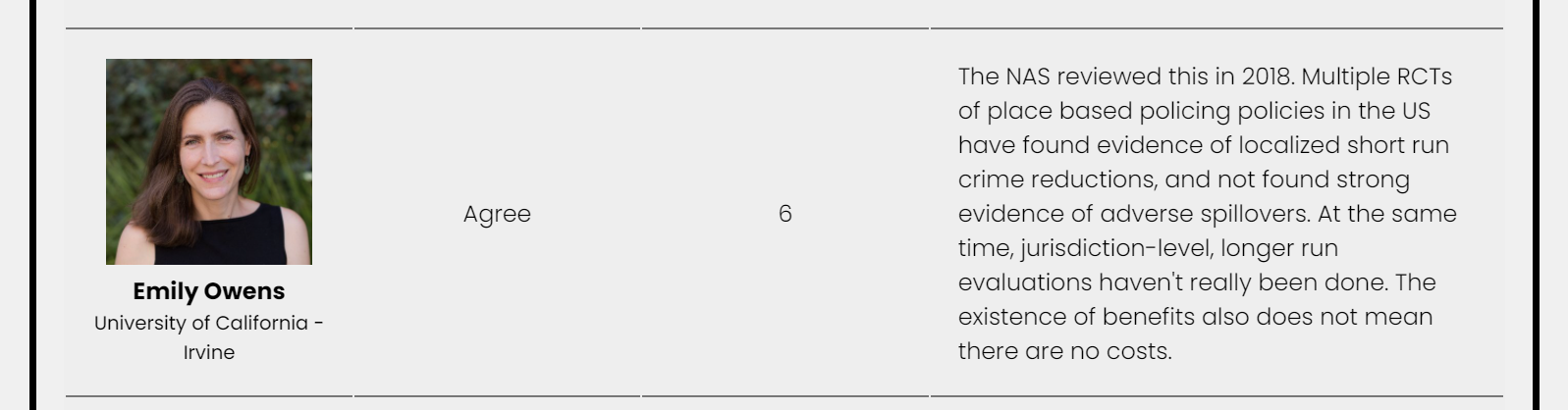
One of the most well vetted criminal justice interventions at this point we have is hot spots policing. We have over 50 randomized control trials at this point, showing modest overall crime reductions on average (Braga & Weisburd, 2020). This of course is not perfect, I think Emily Owen sums it up the best in a recent poll of various academics on the issue of gun violence:
So when people argue that hot spots policing doesn’t show long term benefits, all I can do is agree. If in a world where we are choosing between doing hot spots vs doing nothing, I think it is wrong to choose the ultra risk adverse position of do nothing because you don’t think on average short term crime reductions of 10% in hot spots are worth it. But I cannot say it is a guaranteed outcome and it probably won’t magically reduce crime forever in that hot spot. Mea culpa.
The issue is most people making these risk adverse arguments against hot spots, whether academics or pundits or whoever, are not actually risk adverse or ultra conservative in accepting scientific evidence of the efficacy of criminal justice policies. This is shown when individuals pile on critiques of hot spots policing – which as I noted the critiques are often legitimate in and of themselves – but then take the position that ‘policy X is better than hotspots’. As I said hot spots basically is the most well vetted CJ intervention we have – you are in a tough pickle to explain why you think any other policy is likely to be a better investment. It can be made no doubt, but I haven’t seen a real principled cost benefit analysis to prefer another strategy over it to prevent crime.
One recent example of this is on the GritsForBreakfast blog, where Grits advocates for allocating more resources for detectives to prevent violence. This is an example of an incoherent internal position. I am aware of potential ways in which clearing more cases may reduce crimes, even published some myself on that subject (Wheeler et al., 2021). The evidence behind that link is much more shaky however overall (see Mohler et al. 2021 for a conflicting finding), and even Grits himself is very skeptical of general deterrence. So sure you can pile on critiques of hot spots, but putting the blinders on for your preferred policy just means you are an advocate, not following actual evidence.
To be clear, I am not saying more detective resources is a bad thing, nor do I think we should go out and hire a bunch more police to do hot spots (I am mostly advocating for doing more with the same resources). I will sum up my positions at the end of the post, but I am mostly sympathetic in reference to folks advocating for more oversight for police budgets, as well as that alternative to policing interventions should get their due as well. But in a not unrealistic zero sum scenario of ‘I can either allocate this position for a patrol officer vs a detective’ I am very skeptical Grits is actually objectively viewing the evidence to come to a principled conclusion for his recommendation, as opposed to ex ante justifying his pre-held opinion.
Unfortunately similarly incoherent positions are not all that uncommon, even among academics.
The CJ Expert Panel Opinions on Gun Violence
As I linked above, there was a recent survey of various academics on potential gun violence reduction strategies. I think these are no doubt good things, albeit not perfect, similar to CrimeSolutions.gov but are many more opinions on overall evidence bases but are more superficial.
This survey asked about three general strategies, and asked panelists to give Likert responses (strongly agree,agree,neutral,disagree,strongly disagree), as well as a 1-10 for how confident they were, whether those strategies if implemented would reduce gun violence. The three strategies were:
- investing in police-led targeted enforcement directed at places and persons at high risk for gun crime (e.g.,“hot spot” policing; gang enforcement)
- investing in police-led focused deterrence programs (clearly communicating “carrots and sticks” to local residents identified as high risk, followed by targeted surveillance and enforcement with some community-based support for those who desist from crime)
- investing in purely community-led violence-interruption programs (community-based outreach workers try to mediate and prevent conflict, without police involvement)
The question explicitly stated you should take into account implementation in real life as well. Again people can as individuals have very pessimistic outlooks on any of these programs. It is however very difficult for me to understand a position where you ‘disagree’ with focused deterrence (FD) in the above answer and also ‘agree’ with violence interrupters (VI).
FD has a meta analysis of 20 some studies at this point (Braga et al., 2018), all are quasi-experimental (e.g. differences in differences comparing gang shootings vs non gang shootings, as well as some matched comparisons). So if you want to say – I think it is bunk because there are no good randomized control trials, I cannot argue with this. However there are much fewer studies for VI, Butts et al. (2015) have 5 (I imagine there are some more since then), and they are all quasi-experimental as well. So in this poll of 39 academics, how many agree with VI and disagree with FD?
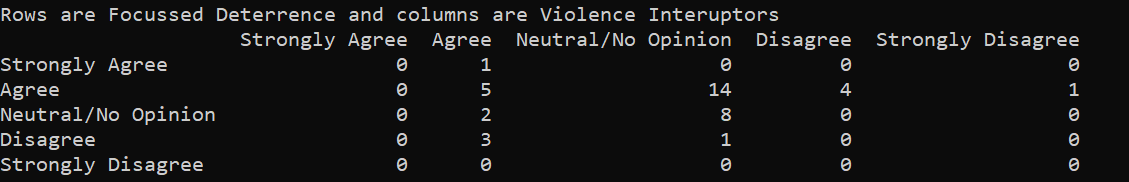
We end up having 3. I show in that screen shot as well the crosstabulation with the hot spots (HS) question as well. It ends up being the same three people disagreed on HS/FD and agreed on VI:

I will come back to Makowski and Apel’s justification for their opinion in a bit. There is a free text field (although not everyone filled in, we have no responses from Harris here), and while I think this is pretty good evidence of having shifting evidentiary standards for their justification, the questions are quite fuzzy and people can of course weight their preferences differently. The venture capitalist approach would say we don’t have much evidence for VI, so maybe it is really good!
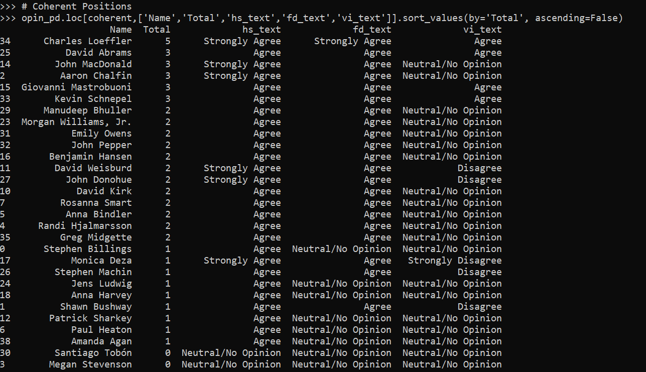
So again as a first blush, I checked to see how many people had opinions that I consider here coherent. You can say they all are bad, or you can agree with all the statements, but generally the opinions should be hs >= fd >= vi if one is going by the accumulated evidence in an unbiased manner. I checked how many coherent opinions there are in this survey according to this measure and it is the majority, 29/39 (those at the top of the list are more hawkish, saying strongly agree and agree more often):
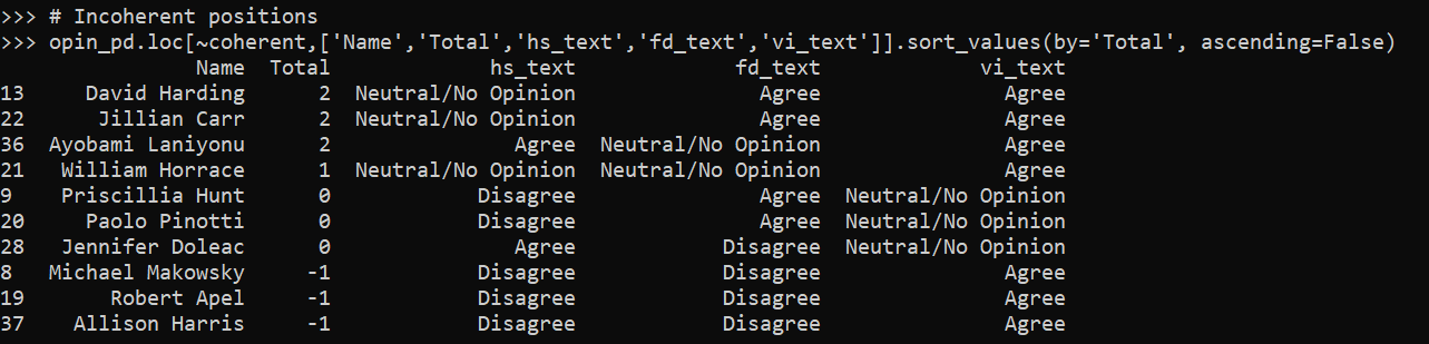
Here are those I considered incoherent according to this measure:
Looking at the free text field for why people justified particular positions in this table, with the exception of Makowski and Apel, I actually don’t think they have all that unprincipled opinions (although how they mapped their responses to agree/disagree I don’t think is internally consistent). For example, Paolo Pinotti disagrees with lumping in hot spots with people based strategies:
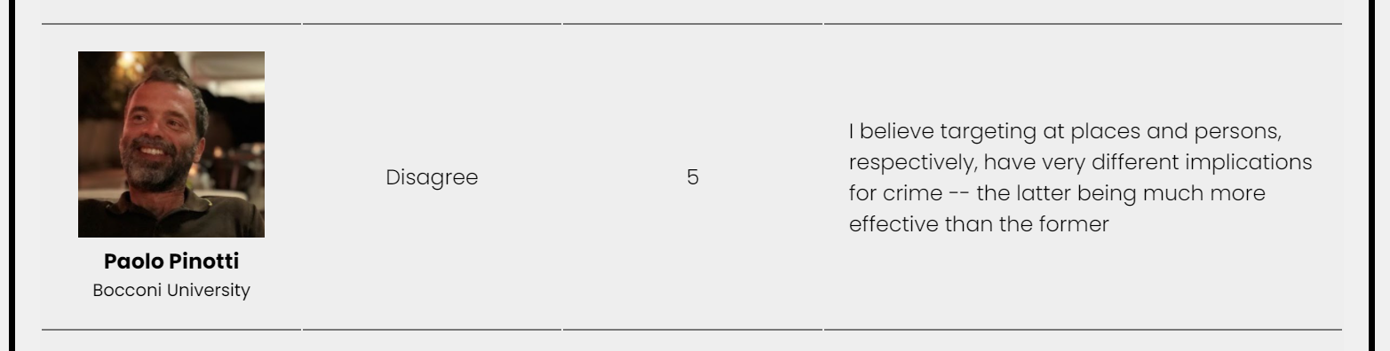
Fair enough and I agree! People based strategies are much more tenuous. Chalfin et al. (2021) have a recent example of gang interdiction, but as far as I’m aware much of the lit on that (say coordinated RICO), is a pretty mixed bad. Pinotti then gives agree to FD and neutral to VI (with no text for either). Another person in this list is Priscilla Hunt, who mentions the heterogeneity of hot spots interventions:
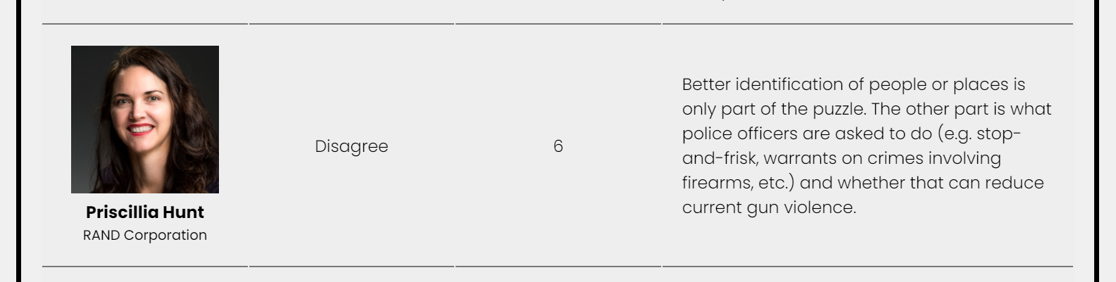
I think this is pretty pessimistic, since the Braga meta analyses often break down by different intervention types and they mostly coalesce around the same effect estimates (about a 10% reduction in hot spots compared to control, albeit with a wide variance). But the question did ask about implementation. Fair enough, hot spots is more fuzzy a category than FD or VI.
Jennifer Doleac is an example where I don’t think they are mapping opinions consistently to what they say, although what they say is reasonable. Here is Doleac being skeptical for FD:
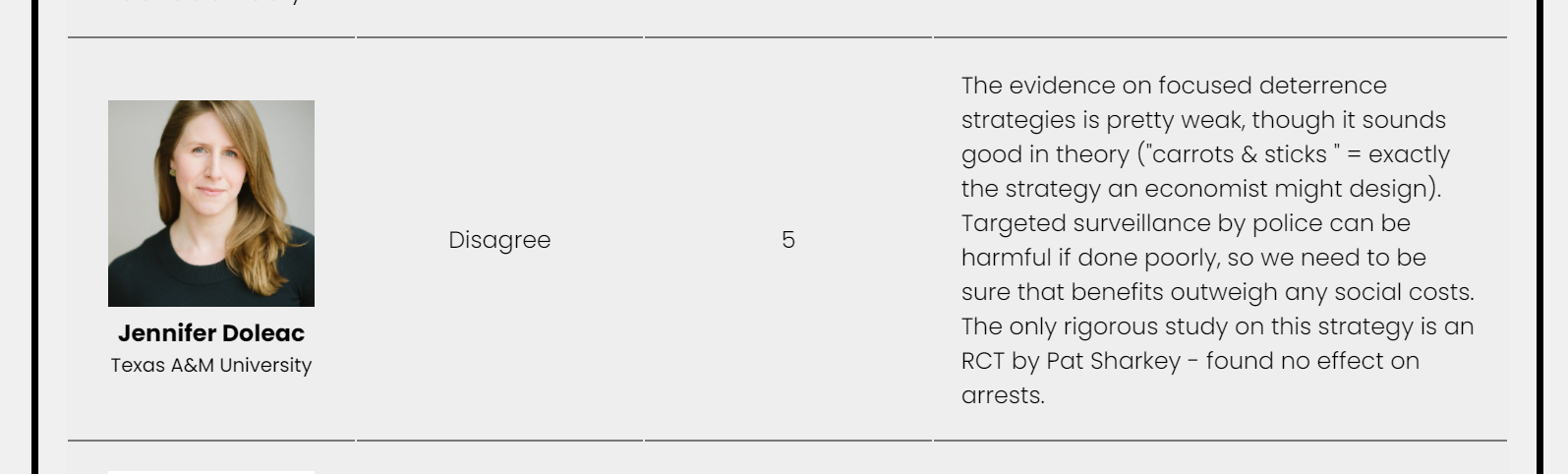
I think Doleac actually means this RCT by Hamilton et al. (2018) – arrests are not the right outcome though (more arrests probably mean the FD strategy is not working actually), so personally I take this study as non-informative as to whether FD reduces gun violence (although there is no issue to see if it has other spillovers on arrests). But Doleac’s opinion is still reasonable in that we have no RCT evidence. Here is Doleac also being skeptical of VI, but giving a neutral Likert response:
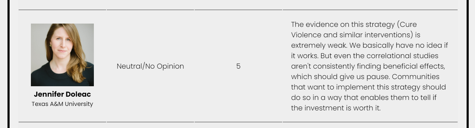
She mentions negative externalities for both (which is of course something people should be wary of when implementing these strategies). So for me to say this is incoherent is really sweating the small stuff – I think incorporating the text statement with these opinions are fine, although I believe a more internally consistent response would be neutral for both or disagree for both.
Jillian Carr gives examples of the variance of hot spots:

This is similar to Priscilla’s point, but I think that is partially an error. When you collect more rigorous studies over time, the effect sizes will often shrink (due to selection effects in the scholarly literature process that early successes are likely to have larger errors, Gelman et al. 2020). And you will have more variance as well and some studies with null effects. This is a good thing – no social science intervention is so full proof to always be 100% success (the lower bound is below 0 for any of these interventions). Offhand the variance of the FD meta analysis is smaller overall than hot spots, so Carr’s opinion of agree on FD can still be coherent, but for VI it is not:

If we are simply tallying when things do not work, we can find examples of that for VI (and FD) as well. So it is unclear why it is OK for FD/VI but not for HS to show some studies that don’t work.
There is an actual strategy I mentioned earlier where you might actually play the variance to suggest particular policies – we know hot spots (and now FD) have modest crime reducing effects on average. So you may say ‘I think we should do VI, because it may have a higher upside, we don’t know’. But that strikes me as a very generous interpretation of Carr’s comments here (which to be fair are only limited to only a few sentences). I think if you say ‘the variance of hot spots is high’ as a critique, you can’t hang your hat on VI and still be internally coherent. You are just swapping out a known variance for an unknown one.
Makowski and Apels Incoherence?
I have saved for last Michael Makowski and Robert Apel’s responses. I will start out by saying I don’t know all of the people in this sample, but the ones I do know are very intelligent people. You should generally listen to what they say, although I think they show some bias here in these responses. We all have biases, and I am sure you can trawl up examples of my opinions over time that are incoherent as well.
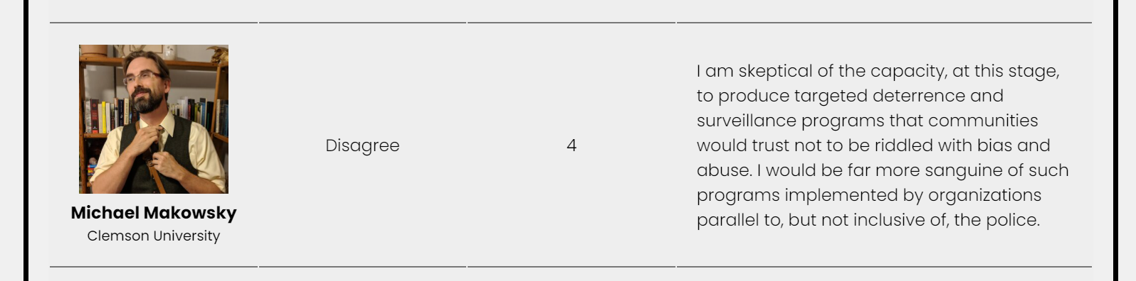
I do not know Michael Makowski, so I don’t mean to pick on him in particular here. I am sure you should listen to him over me for many opinions on many different topics. For example agree with his proposal to sever seized assets with police budgets. But just focusing on what he does say here (which good for him to actually say why he chose his opinions, he did not have to), for his opinion on hot spots:
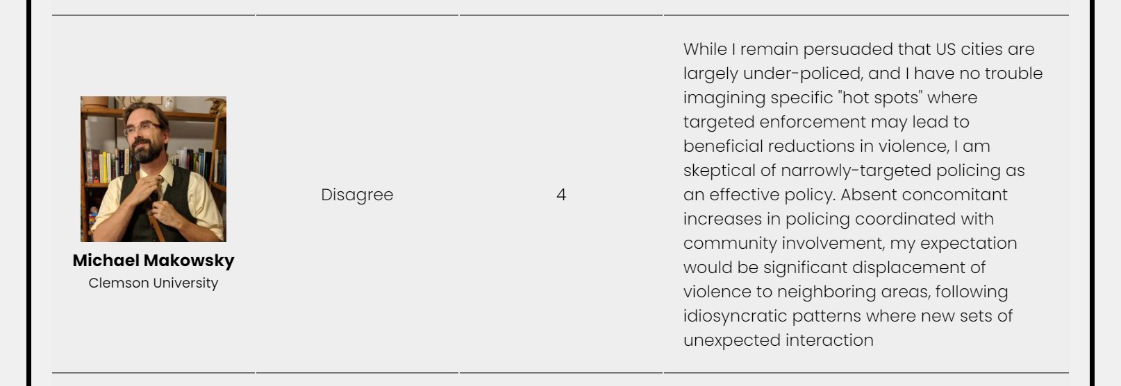
So Makowski thinks policing is understaffed, but hot spots is a no go. OK, I am not sure what he expects those additional officers to do – answer calls for service and drive around randomly? I’d note hot spots can simultaneously be coordinated with the community directly – I know of no better examples of community policing than foot patrols (e.g. Haberman & Stiver, 2019 for an example). But the question was not that specific about that particular hot spot strategy, so that is not a critique of Makowski’s position.
We have so many meta analyses of hot spots now, that we also have meta analyses of displacement (Bowers et al., 2011), and the Braga meta analyses of direct effects have all included supplemental analyses of displacement as well. Good news! We actually often find evidence of diffusion of benefits in quite a few studies. Banking on secondary effects that are larger/nullify direct effects is a strange position to take, but I have seen others take it as well. The Grits blog I linked to earlier mentions that these studies only measure displacement in the immediate area. Tis true, these studies do not measure displacement in surrounding suburbs, nor displacement to the North Pole. Guess we will never know if hot spots reduce crime worldwide. Note however this applies to literally any intervention!
For Makowski’s similarly pessimistic take on FD:
So at least Makowski is laying his cards on the table – the question did ask about implementation, and here he is saying he doesn’t think police have the capability to implement FD. If you go in assuming police are incompetent than yeah no matter what intervention the police might do you would disagree they can reduce violence. This is true for any social policy. But Makowski thinks other orgs (not the police) are good to go – OK.
Again have a meta analysis showing that quite a few agencies can implement FD competently and subsequently reduce gun violence, which are no doubt a self selected set of agencies that are more competent compared to the average police department. I can’t disagree with if you interpret the question as you draw a random police department out of a hat, can they competently implement FD (most of these will be agencies with only a handful of officers in rural places who don’t have large gun violence problems). The confidence score is low from Makowski here though (4/10), so at least I think those two opinions are wrong but are for the most part are internally consistent with each other.
I’d note also as well, that although the question explicitly states FD is surveillance, I think that is a bit of a broad brush. FD is explicitly against this in some respects – Kennedy talks about in the meetings to tell group members the police don’t give a shit about minor infractions – they only care if a body drops. It is less surveillancy than things like CCTV or targeted gang takedowns for example (or maybe even HS). But it is right in the question, so a bit unfair to criticize someone for focusing on that.
Like I said if someone wants to be uber critical across the board you can’t really argue with that. My problem comes with Makowski’s opinion of VI:
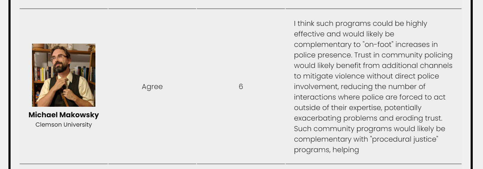
VI is quite explicitly diverged from policing – it is a core part of the model. So when interrupters talk with current gang members, they can be assured the interrupters will not narc on them to police. The interrupters don’t work with the police at all. So all the stuff about complementary policing and procedural justice is just totally non-sequitur (and seems strange to say hot spots no, but boots on the ground are good).
So while Makowski is skeptical of HS/FD, he thinks some mechanism he just made up in his own mind (VI improving procedural justice for police) with no empirical evidence will reduce gun violence. This is the incoherent part. For those wondering, while I can think procedural justice is a good thing, thinking it will reduce crime has no empirical support (Nagin & Telep, 2020).
I’d note that while Makowski thinks police can’t competently implement FD, he makes no such qualms about other agencies implementing VI. I hate to be the bearer of bad news for folks, but VI programs quite often have issues as well. Baltimore’s program over the years have had well known cases of people selling drugs and still quite active in violence themselves. But I guess people are solely concerned about negative externalities from policing and just turn a blind eye to other non policing interventions.
Alright, so now onto Bob Apel. For a bit off topic – one of the books that got me interested in research/grad school was Levitt and Dubners Freakonomics. I had Robert Apel for research design class at SUNY Albany, and Bob’s class really formalized counterfactual logic that I encountered in that book for me. It was really what I would consider a transformative experience from student to researcher for me. That said, it is really hard for me to see a reasonable defense of Bob’s opinions here. We have a similar story we have seen before in the respondents for hot spots, there is high variance:
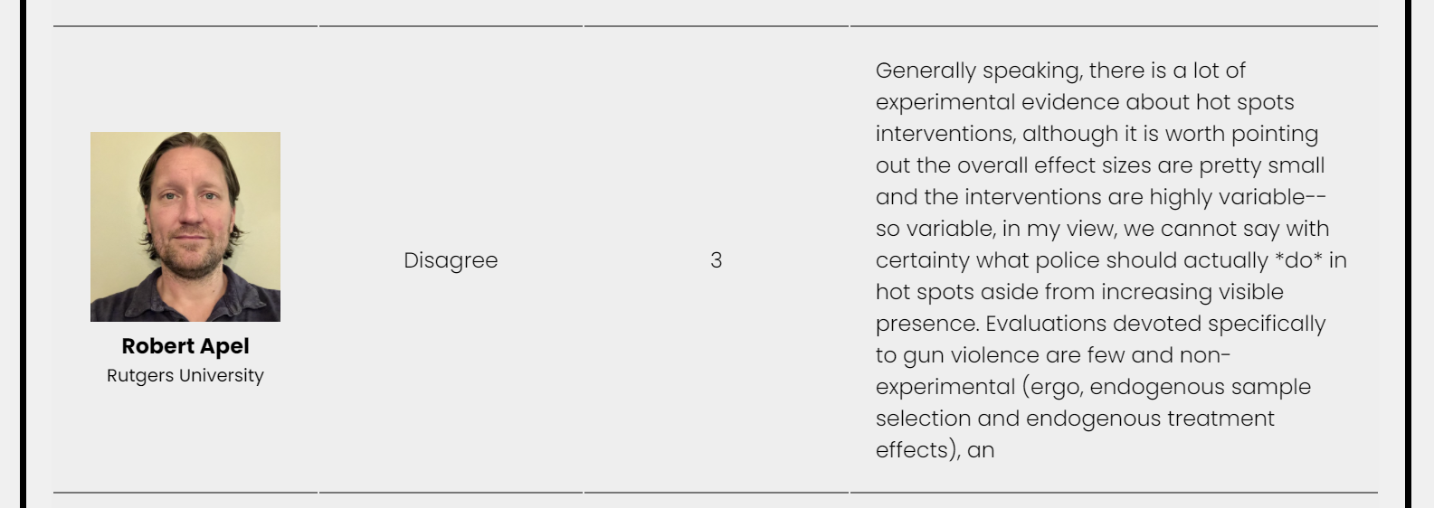
The specific to gun violence is potentially a red herring. The Braga meta analyses do breakdowns of effects on property vs violent crime, with violent typically having smaller but quite similar overall effect sizes (that includes more than just gun violence though). We do have studies specific to gun violence, Sherman et al. (1995) is actually one of the studies with the highest effects sizes in those meta analyses, but is of course one study. I disagree that the studies need to be specific to gun violence to be applicable, hot spots are likely to have effects on multiple crimes. But I think if you only count reduced shootings (and not violent crime as a whole), hot spots are tough, as even places with high numbers of shootings they are typically too small of N to justify a hot spot at a particular location. So again all by itself, I can see a reasonably skeptical person having this position, and Bob did give a low confidence score of 3.
And here we go for Bob’s opinion of FD:
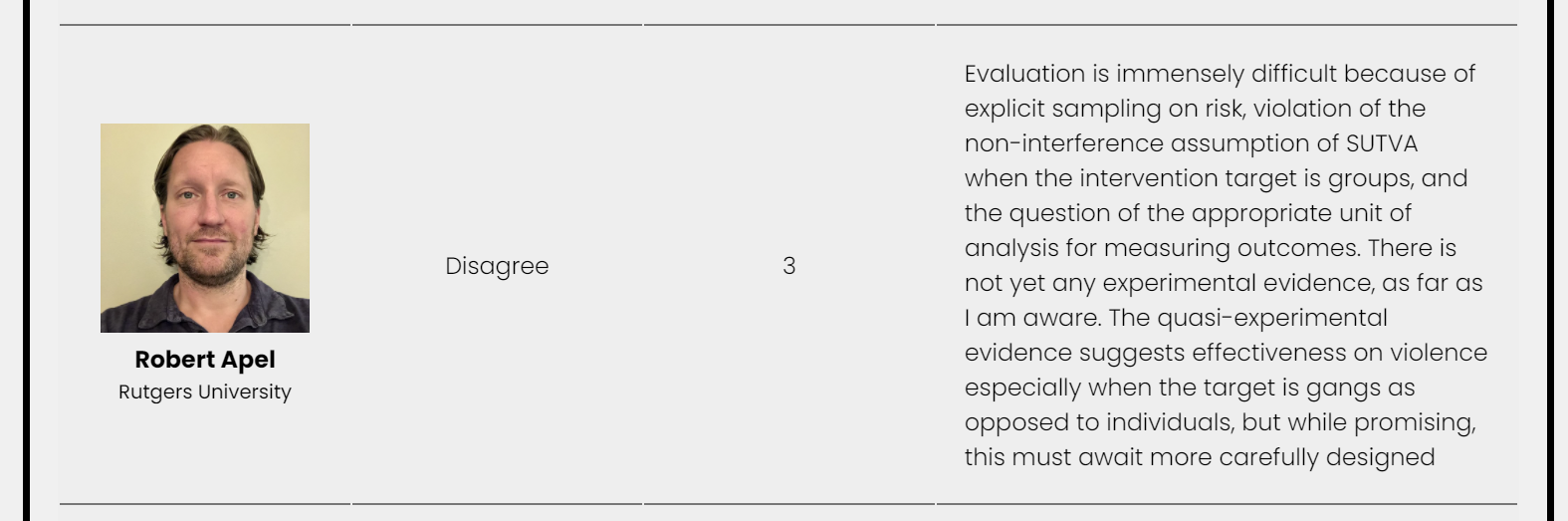
Again, reasonably skeptical. I can buy that. Saying we need more evidence seems to me to be conflicting advice (maybe Bob saying it is worth trying to see if it works, just he disagrees it will work). The question does ask if violence will be reduced, not if it is worth trying. I think a neutral response would have been more consistent with what Bob said in the text field. But again if people want to be uber pessimistic I cannot argue so much against that in particular, and Bob also had a low confidence.
Again though we get to the opinion of VI:
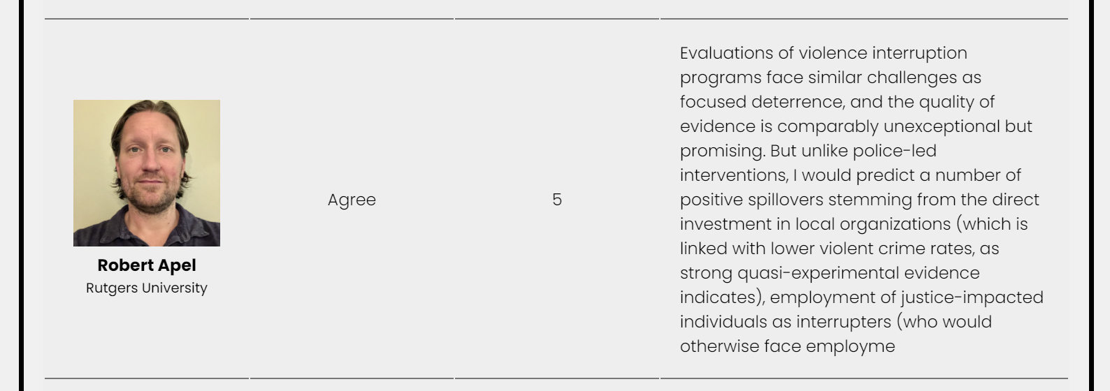
And we see Bob does think VI will reduce violence, but not due to direct effects, but indirect effects of positive spillovers. Similar to Makowski these are mechanisms not empirically validated in any way – just made up. So we get critiques of sample selection for HS, and SUTVA for FD, but Bob agrees VI will reduce violence via agencies collecting rents from administering the program. Okey Dokey!
For the part about the interrupters being employed as a potential positive externality – again you can point to examples where the interrupters are still engaged in criminal activity. So a reasonably skeptical person may think VI could actually be worse in terms of such spillovers. Presumably a well run program would hire people who are basically no risk to engage in violence themselves, so banking on employing a dozen interrupters to reduce gun violence is silly, but OK. (It is a different program to give cash transfers to high risk people themselves.)
I’d note in a few of the cities I have worked/am familiar with, the Catholic orgs that have administered VI are not locality specific. So rents they extract from administering the program are not per se even funneled back into the specific community. But sure, maybe they do some other program that reduces gun violence in some other place. Kind of a nightmare for someone who is actually concerned about SUTVA. This also seems to me to be logic stemmed from Patrick Sharkey’s work on non-profits (Sharkey et al., 2017). If Bob was being equally of critical of that work as HS/FD, it is non-experimental and just one study. But I guess it is OK to ignore study weaknesses for non police interventions.
For both Bob and Makowski here I could concoct some sort of cost benefit analysis to justify these positions. If you think harms from policing are infinite, then sure VI makes sense and the others don’t. A more charitable way to put it would be Makowski and Bob have shown lexicographic preferences for non policing solutions over policing ones, no matter what the empirical evidence for those strategies. So be it – it isn’t opinions based on scientific evidence though, they are just word souping to justify their pre held positions on the topic.
What do I think?
God bless you if you are still reading this rant 4k words in. But I cannot end by just bagging on other peoples opinions without giving my own can I? If I were to answer this survey as is, I guess I would do HS/agree (confidence 6), FD/agree (confidence 5), VI/agree (confidence 3). Now if you changed the question to ‘you get even odds, how much money would you put on reduced violence if a random city with recent gun violence increases implemented this strategy’, I would put down $0.00 (the variance people talked about is real!) So maybe a more internally consistent position would be neutral across the board for these questions with a confidence of 0. I don’t know.
This isn’t the same as saying should a city invest in some of these policies. If you properly valuate all the issues with gun violence, I think each of these strategies are worth the attempt – none of them are guaranteed to work though (any big social problem is hard to fix)! In terms of hot spots and FD, I actually think these have a strong enough evidence base at this point to justify perpetual internal positions at PDs devoted to these functions. The same as police have special investigation units focused on drugs they could have officers devoted to implementing FD. Ditto for community police officers could be specifically devoted to COP/POP at hot spots of crime.
I also agree with the linked above editorial on VI – even given the problems with Safe Streets in Baltimore, it is still worth it to make the program better, not just toss it out.
Subsequently if the question were changed to, I am a mayor and have 500k burning a hole in my pocket, which one of these programs do I fund? Again I would highly encourage PDs to work with what they have already to implement HS, e.g. many predictive policing/hot spots interventions are nudge style just spend some extra time in this spot (e.g. Carter et al., 2021), and I already gave the example of how PDs invest already in different roles that would likely be better shifted to empirically vetted strategies. And FD is mostly labor costs as well (Burgdorf & Kilmer, 2015). So unlike what Makowski implies, these are not rocket science and necessitate no large capital investments – it is within the capabilities of police to competently execute these programs. So I think a totally reasonable response from that mayor is to tell the police to go suck on a lemon (you should do these things already), and fund VI. I think the question of right sizing police budgets and how police internally dole out responsibilities can be reasoned about separately.
Gosh some of my academic colleagues must wonder how I sleep at night, suggesting some policing can be effective and simultaneously think it is worth funding non police programs.
I have no particular opinion about who should run VI. VI is also quite cheap – I suspect admin/fringe costs are higher than the salaries for the interrupters. It is a dangerous thing we are asking these interrupters to do for not much money. Apel above presumes it should be a non-profit community org overseeing the interrupters – I see no issue if someone wanted to leverage current govt agencies to administer this (say the county dept of social services or public health). I actually think they should be proactive – Buffalo PD had a program where they did house visits to folks at high risk after a shooting. VI could do the same and be proactive and target those with the highest potential spillovers.
One of the things I am pretty frustrated with folks who are hyper critical of HS and FD is the potential for negative externalities. The NAS report on proactive policing lays out quite a few potential mechanisms via which negative externalities can occur (National Academies of Sciences, Engineering, and Medicine, 2018). It is evidence light however, and many studies which explicitly look for these negative externalities in conjunction with HS do not find them (Brantingham et al., 2018; Carter et al., 2021; Ratcliffe et al., 2015). I have published about how to weigh HS with relative contact with the CJ system (Wheeler, 2020). The folks in that big city now call it precision policing, and this is likely to greatly reduce absolute contact with the CJ system as well (Manski & Nagin, 2017).
People saying no hot spots because maybe bad things are intentionally conflating different types of policing interventions. Former widespread stop, question and frisk policies do not forever villify any type of proactive policing strategy. To reasonably justify any program you need to make assumptions that the program will be faithfully implemented. Hot spots won’t work if a PD just draws blobs on the map and does no coordinated strategy with that information. The same as VI won’t work if there is no oversight of interrupters.
For sure if you want to make the worst assumptions about police and the best assumptions about everyone else, you can say disagree with HS and agree with VI. Probably some of the opinions on that survey do the same in reverse – as I mention here I think the evidence for VI is plenty good enough to continue to invest and implement such programs. And all of these programs should monitor outcomes – both good and bad – at the onset. That is within the capability of crime analysis units and local govt to do this (Morgan et al., 2017).
I debated on closing the comments for this post. I will leave them open, but if any of the folks I critique here wish to respond I would prefer a more long formed response and I will publish it on my blog and/or link to your response. I don’t think the shorter comments are very productive, as you can see with my back and forth with Grits earlier produced no resolution.
References
- Bowers, K. J., Johnson, S. D., Guerette, R. T., Summers, L., & Poynton, S. (2011). Spatial displacement and diffusion of benefits among geographically focused policing initiatives: a meta-analytical review. Journal of Experimental Criminology, 7(4), 347-374.
- Braga, A. A., & Weisburd, D. L. (2020). Does Hot Spots Policing Have Meaningful Impacts on Crime? Findings from An Alternative Approach to Estimating Effect Sizes from Place-Based Program Evaluations. Journal of Quantitative Criminology, Online First.
- Braga, A. A., Weisburd, D., & Turchan, B. (2018). Focused deterrence strategies and crime control: An updated systematic review and meta-analysis of the empirical evidence. Criminology & Public Policy, 17(1), 205-250.
- Brantingham, P. J., Valasik, M., & Mohler, G. O. (2018). Does predictive policing lead to biased arrests? Results from a randomized controlled trial. Statistics and Public Policy, 5(1), 1-6.
- Burgdorf, J. R., & Kilmer, B. (2015). Police costs of the drug market intervention: Insights from two cities. Policing: A Journal of Policy and Practice, 9(2), 151-163.
- Butts, J. A., Roman, C. G., Bostwick, L., & Porter, J. R. (2015). Cure violence: a public health model to reduce gun violence. Annual Review of Public Health, 36, 39-53.
- Carter, J. G., Mohler, G., Raje, R., Chowdhury, N., & Pandey, S. (2021). The Indianapolis harmspot policing experiment. Journal of Criminal Justice, 74, 101814.
- Chalfin, A., LaForest, M., & Kaplan, J. (2021). Can precision policing reduce gun violence? evidence from “gang takedowns” in New York City. Journal of Policy Analysis and Management Online First.
- Gelman, A., Skardhamar, T., & Aaltonen, M. (2020). Type M error might explain Weisburd’s paradox. Journal of Quantitative Criminology, 36(2), 295-304.
- Haberman, C. P., & Stiver, W. H. (2019). The Dayton foot patrol program: an evaluation of hot spots foot patrols in a central business district. Police Quarterly, 22(3), 247-277.
- Hamilton, B., Rosenfeld, R., & Levin, A. (2018). Opting out of treatment: Self-selection bias in a randomized controlled study of a focused deterrence notification meeting. Journal of Experimental Criminology, 14(1), 1-17.
- Manski, C. F., & Nagin, D. S. (2017). Assessing benefits, costs, and disparate racial impacts of confrontational proactive policing. Proceedings of the National Academy of Sciences, 114(35), 9308-9313.
- Mohler, G., Mishra, S., Ray, B., Magee, L., Huynh, P., Canada, M., … & Flaxman, S. (2021). A modified two-process Knox test for investigating the relationship between law enforcement opioid seizures and overdoses. Proceedings of the Royal Society A, 477(2250), 20210195.
- Morgan, T. H. S., Murphy, D., & Horwitz, B. (2017). Police reform through data-driven management. Police Quarterly, 20(3), 275-294.
- Nagin, D. S., & Telep, C. W. (2020). Procedural justice and legal compliance: A revisionist perspective. Criminology & Public Policy, 19(3), 761-786.
- National Academies of Sciences, Engineering, and Medicine. (2018). Proactive policing: Effects on crime and communities. National Academies Press.
- Ratcliffe, J. H., Groff, E. R., Sorg, E. T., & Haberman, C. P. (2015). Citizens’ reactions to hot spots policing: impacts on perceptions of crime, disorder, safety and police. Journal of Experimental Criminology, 11(3), 393-417.
- Sharkey, P., Torrats-Espinosa, G., & Takyar, D. (2017). Community and the crime decline: The causal effect of local nonprofits on violent crime. American Sociological Review, 82(6), 1214-1240.
- Sherman, L. W., & Rogan, D. P. (1995). Effects of gun seizures on gun violence:“Hot spots” patrol in Kansas City. Justice Quarterly, 12(4), 673-693.
- Wheeler, A. P. (2020). Allocating police resources while limiting racial inequality. Justice Quarterly, 37(5), 842-868.
- Wheeler, A. P., & Reuter, S. (2021). Redrawing hot spots of crime in Dallas, Texas. Police Quarterly, 24(2), 159-184.
- Wheeler, A. P., Riddell, J. R., & Haberman, C. P. (2021). Breaking the chain: How arrests reduce the probability of near repeat crimes. Criminal Justice Review, 46(2), 236-258.