Remaking a clustered bar chart

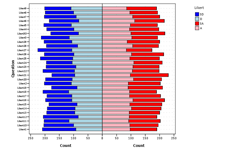
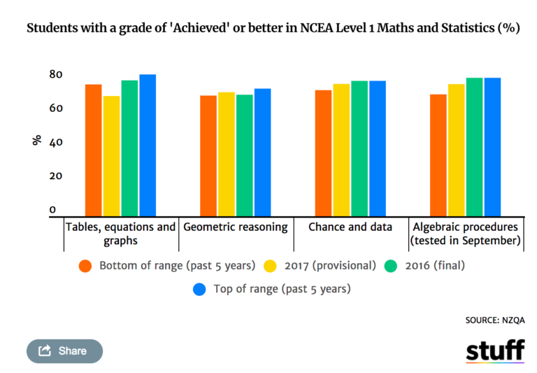
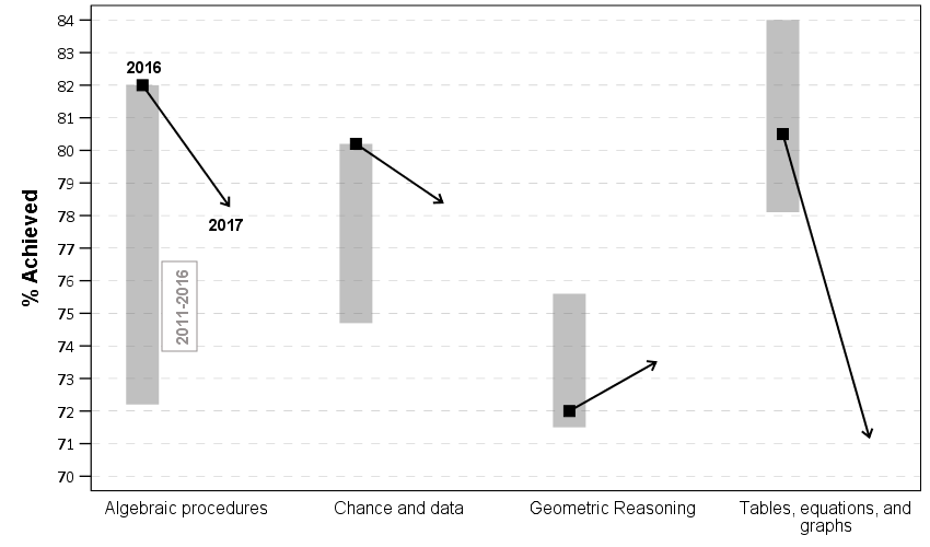
Thomas Lumley on his blog had a recent example of remaking a clustered bar chart that I thought was a good idea. Here is a screenshot of the clustered bar chart (the original is here):

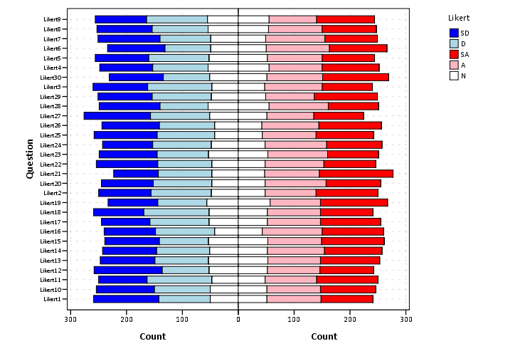
And here is Lumley’s remake:

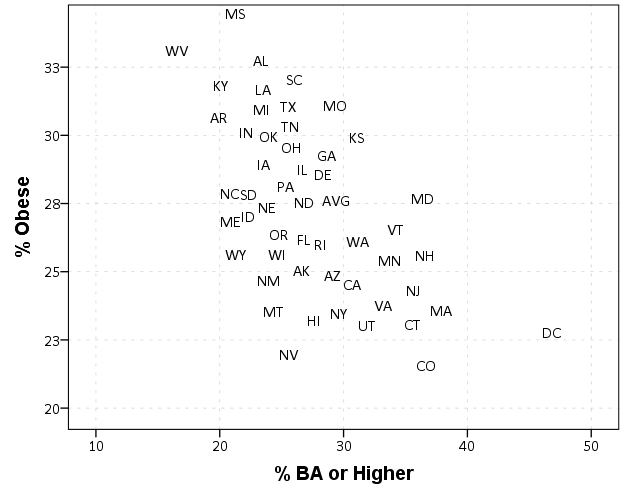
In the original bar chart it is hard to know what is the current value (2017) and what are the past values. Also the bar chart goes to zero on the Y axis, which makes any changes seem quite small, since the values only range from 70% to 84%. Lumley’s remake clearly shows the change from 2016 to 2017, as well as the historical range from 2011 through 2016.

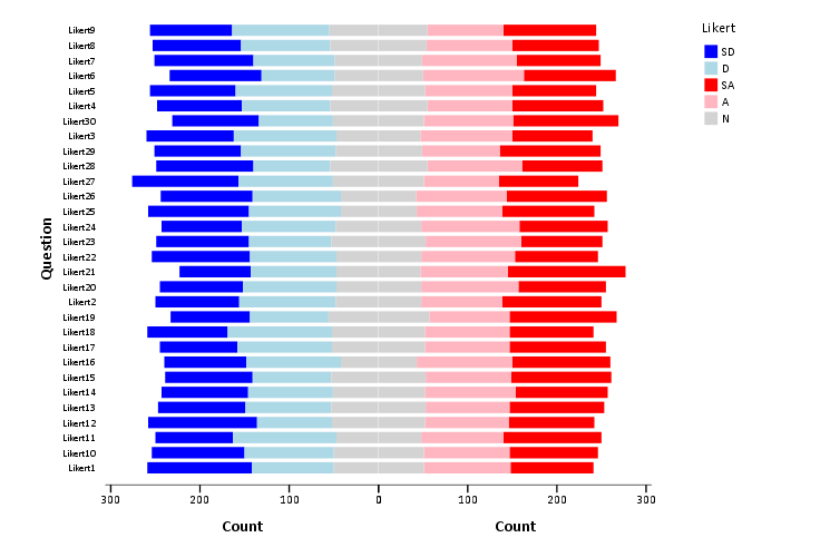
I like Lumley’s remake quite alot, so I made some code in SPSS syntax to show how to make a similar chart. The grammar of graphics I always thought is alittle confusing when using clustering, so this will be a good example demonstration. Instead of worrying about the legend I just added in text annotations to show what the particular elements were.

One additional remake is instead of offsetting the points and using a slope chart (this is an ok use, but see my general critique of slopegraphs here) is to use a simpler dotplot showing before and after.

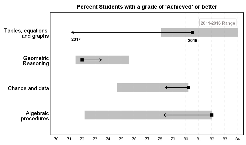
One reason I do not like the slopes is that slope itself is dictated by the distance from 16 to 17 in the chart (which is arbitrary). If you squeeze them closer together the slope gets higher. The slope itself does not encode the data you want, you want to calculate the difference from beginning to end. But it is not a big difference here (my main complaints for slopegraphs are when you superimpose many different slopes that cross one another, in those cases I think a scatterplot is a better choice).

Jonathan Schwabish on his blog often has similar charts (see this one example).

Pretty much all clustered bar charts can be remade into either a dotplot or a line graph. I won’t go as far as saying you should always do this, but I think dot plots or line graphs would be a better choice than a clustered bar graph for most examples I have seen.

Here like Lumley said instead of showing the ranges likely a better chart would just be a line chart over time of the individual years, that would give a better since of both trends as well as typical year-to-year changes. But these alternatives to a clustered bar chart I do not think turned out too shabby.


SPSS Code to replicate the charts. I added in the labels for the elements manually.

**********************************************************************************************.
*data from https://www.stuff.co.nz/national/education/100638126/how-hard-was-that-ncea-level-1-maths-exam.
*Motivation from Thomas Lumley, see https://www.statschat.org.nz/2018/01/18/better-or-worse/.

DATA LIST FREE / Type (A10) Low Y2017 Y2016 High (4F3.1).
BEGIN DATA
Tables 78.1 71.2 80.5 84
Geo 71.5 73.5 72 75.6
Chance 74.7 78.4 80.2 80.2
Algebra 72.2 78.3 82 82
END DATA.
DATASET NAME Scores.
VALUE LABELS Type
  'Tables' 'Tables, equations, and graphs'
  'Geo' 'Geometric Reasoning'
  'Chance' 'Chance and data'
  'Algebra' 'Algebraic procedures'
.
FORMATS Low Y2017 Y2016 High (F3.0).
EXECUTE.

*In this format I can make a dot plot.
GGRAPH
  /GRAPHDATASET NAME="graphdataset" VARIABLES=Y2017 Y2016 Low High Type 
  /GRAPHSPEC SOURCE=INLINE.
BEGIN GPL
  SOURCE: s=userSource(id("graphdataset"))
  DATA: Y2017=col(source(s), name("Y2017"))
  DATA: Y2016=col(source(s), name("Y2016"))
  DATA: Low=col(source(s), name("Low"))
  DATA: High=col(source(s), name("High"))
  DATA: Type=col(source(s), name("Type"), unit.category())
  GUIDE: axis(dim(1), delta(1), start(70))
  GUIDE: axis(dim(1), label("Percent Students with a grade of 'Achieved' or better"), opposite(), delta(100), start(60))
  GUIDE: axis(dim(2))
  SCALE: cat(dim(2), include("Algebra", "Chance", "Geo", "Tables"))
  ELEMENT: edge(position((Low+High)*Type), size(size."30"), color.interior(color.grey), 
           transparency.interior(transparency."0.5"))
  ELEMENT: edge(position((Y2016+Y2017)*Type), shape(shape.arrow), color(color.black), size(size."2"))
  ELEMENT: point(position(Y2016*Type), color.interior(color.black), shape(shape.square), size(size."10"))
END GPL.

*Now trying a clustered bar graph.
GGRAPH
  /GRAPHDATASET NAME="graphdataset" VARIABLES=Y2017 Y2016 Low High Type 
  /GRAPHSPEC SOURCE=INLINE.
BEGIN GPL
  SOURCE: s=userSource(id("graphdataset"))
  DATA: Y2017=col(source(s), name("Y2017"))
  DATA: Y2016=col(source(s), name("Y2016"))
  DATA: Low=col(source(s), name("Low"))
  DATA: High=col(source(s), name("High"))
  DATA: Type=col(source(s), name("Type"), unit.category())
  TRANS: Y17 = eval("2017")
  TRANS: Y16 = eval("2016")
  COORD: rect(dim(1,2), cluster(3,0))
  GUIDE: axis(dim(3))
  GUIDE: axis(dim(2), label("% Achieved"), delta(1), start(70))
  ELEMENT: edge(position(Y16*(Low+High)*Type), size(size."30"), color.interior(color.grey), 
           transparency.interior(transparency."0.5"))
  ELEMENT: edge(position((Y16*Y2016*Type)+(Y17*Y2017*Type)), shape(shape.arrow), color(color.black), size(size."2"))
  ELEMENT: point(position(Y16*Y2016*Type), color.interior(color.black), shape(shape.square), size(size."10"))
END GPL.

*This can get tedious if you need to make a line for many different years.
*Reshape to make a clustered chart in a less tedious way (but cannot use arrows this way).
VARSTOCASES /MAKE Perc FROM Y2016 Y2017 /INDEX Year.
COMPUTE Year = Year + 2015.
DO IF Year = 2017.
  COMPUTE Low = $SYSMIS.
  COMPUTE High = $SYSMIS.
END IF.
EXECUTE.

GGRAPH
  /GRAPHDATASET NAME="graphdataset" VARIABLES=Type Perc Year Low High MISSING=VARIABLEWISE REPORTMISSING=NO
  /GRAPHSPEC SOURCE=INLINE.
BEGIN GPL
  SOURCE: s=userSource(id("graphdataset"))
  DATA: Type=col(source(s), name("Type"), unit.category())
  DATA: Perc=col(source(s), name("Perc"))
  DATA: Low=col(source(s), name("Low"))
  DATA: High=col(source(s), name("High"))
  DATA: Year=col(source(s), name("Year"), unit.category())
  COORD: rect(dim(1,2), cluster(3,0))
  GUIDE: axis(dim(3))
  GUIDE: axis(dim(2), label("% Achieved"), delta(1), start(70))
  SCALE: cat(dim(3), include("Algebra", "Chance", "Geo", "Tables"))
  ELEMENT: edge(position(Year*(Low+High)*Type), color.interior(color.grey), size(size."20"), transparency.interior(transparency."0.5"))
  ELEMENT: path(position(Year*Perc*Type), split(Type))  
  ELEMENT: point(position(Year*Perc*Type), size(size."8"), color.interior(color.black), color.exterior(color.white))
END GPL.
**********************************************************************************************.


Side by side charts in SPSS

One aspect of SPSS charts that you need to use syntax for is to create side-by-side charts. Here I will illustrate a frequent use case, time series charts with different Y axes. You can download the data and code to follow along here. This is data for Buffalo, NY on reported crimes from the UCR data tool.

So after you have downloaded the csv file with the UCR crime rates in Buffalo and have imported the data into SPSS, you can make a graph of violent crime rates over time.

*Making a chart of the violent crime rate.
GGRAPH
  /GRAPHDATASET NAME="graphdataset" VARIABLES=Year ViolentCrimerate MISSING=LISTWISE 
    REPORTMISSING=NO
  /GRAPHSPEC SOURCE=INLINE.
BEGIN GPL
  SOURCE: s=userSource(id("graphdataset"))
  DATA: Year=col(source(s), name("Year"))
  DATA: ViolentCrimerate=col(source(s), name("ViolentCrimerate"))
  GUIDE: axis(dim(1), label("Year"))
  GUIDE: axis(dim(2), label("Violent Crime Rate per 100,000"))
  ELEMENT: line(position(Year*ViolentCrimerate))
  ELEMENT: point(position(Year*ViolentCrimerate), color.interior(color.black), color.exterior(color.white), size(size."7"))
END GPL.

I like to superimpose the points on simple line charts, to reinforce where the year observations are. Here we can see that there is a big drop post 1995 for the following four years (something that would be hard to say exactly without the points). Part of the story of Buffalo though is the general decline in population (similar to most of the rust belt part of the nation since the 70’s).

*Make a chart of the population decline.
GGRAPH
  /GRAPHDATASET NAME="graphdataset" VARIABLES=Year Population MISSING=LISTWISE 
    REPORTMISSING=NO
  /GRAPHSPEC SOURCE=INLINE.
BEGIN GPL
  SOURCE: s=userSource(id("graphdataset"))
  DATA: Year=col(source(s), name("Year"))
  DATA: Population=col(source(s), name("Population"))
  GUIDE: axis(dim(1), label("Year"))
  GUIDE: axis(dim(2), label("Population"))
  ELEMENT: line(position(Year*Population))
  ELEMENT: point(position(Year*Population), color.interior(color.black), color.exterior(color.white), size(size."7"))
END GPL.

Now we want to place these two charts over top of one another. So check out the syntax below, in particular to GRAPH: begin statements.

*Now put the two together.
GGRAPH
  /GRAPHDATASET NAME="graphdataset" VARIABLES=Year Population ViolentCrimerate
  /GRAPHSPEC SOURCE=INLINE.
BEGIN GPL 
  SOURCE: s=userSource(id("graphdataset"))
  DATA: Year=col(source(s), name("Year"))
  DATA: Population=col(source(s), name("Population"))
  DATA: ViolentCrimerate=col(source(s), name("ViolentCrimerate"))
  GRAPH: begin(origin(14%,12%), scale(85%, 60%))
  GUIDE: axis(dim(1), label("Year"), opposite())
  GUIDE: axis(dim(2), label("Violent Crime Rate per 100,000"))
  ELEMENT: line(position(Year*ViolentCrimerate))
  ELEMENT: point(position(Year*ViolentCrimerate), color.interior(color.black), color.exterior(color.white), size(size."7"))
  GRAPH: end()
  GRAPH: begin(origin(14%, 75%), scale(85%, 20%)) 
  GUIDE: axis(dim(1), label("Year"))
  GUIDE: axis(dim(2), label("Population"))
  ELEMENT: line(position(Year*Population))
  ELEMENT: point(position(Year*Population), color.interior(color.black), color.exterior(color.white), size(size."7"))  
  GRAPH: end()
END GPL.    

In a nutshell, the graph begin statements allow you to chunk up the graph space to make different/arbitrary plots. The percentages start in the top right, so for the first violent crime rate graph, the origin is listed as 14% and 12%. This means the graph starts 14% to the right in the overall chart space, and 12% down. These paddings are needed to make room for the axis labels. Then for the scale part, it lists it as 85% and 60%. The 85% means take up 85% of the X range in the chart, but only 60% of the Y range in the chart. So this shows how to make the violent crime chart take a bigger proportion. of the overall chart space than the population chart. You can technically do charts with varying axes in SPSS without this, but you would have to make the panels take up an equal amount of space. This way you can make the panels whatever proportion you want.

For Buffalo the big drop in 1996 is largely due to a very large reduction in aggravated assaults (from over 3,000 in 1995 to under 1,600 in 1996). So here I superimpose a bar to viz. the proportion of all violent crimes. This wouldn’t be my first choice of how to show this, but I think it is a good illustration of how to superimpose and/or stack additional charts using this same technique in SPSS.

*Also superimposing a stacked bar chart on the total types of crimes in the background.
COMPUTE PercentAssault = (Aggravatedassault/ViolentCrimeTotal)*100.
FORMATS PercentAssault (F2.0).
EXECUTE.

GGRAPH
  /GRAPHDATASET NAME="graphdataset" VARIABLES=Year Population ViolentCrimerate PercentAssault
  /GRAPHSPEC SOURCE=INLINE.
BEGIN GPL 
  SOURCE: s=userSource(id("graphdataset"))
  DATA: Year=col(source(s), name("Year"))
  DATA: Population=col(source(s), name("Population"))
  DATA: ViolentCrimerate=col(source(s), name("ViolentCrimerate"))
  DATA: PercentAssault=col(source(s), name("PercentAssault"))
  GRAPH: begin(origin(14%,12%), scale(75%, 60%))
  GUIDE: axis(dim(1), label("Year"), opposite())
  GUIDE: axis(dim(2), label("Violent Crime Rate per 100,000"))
  ELEMENT: line(position(Year*ViolentCrimerate))
  ELEMENT: point(position(Year*ViolentCrimerate), color.interior(color.black), color.exterior(color.white), size(size."7"))
  GRAPH: end()
  GRAPH: begin(origin(14%, 75%), scale(75%, 20%)) 
  GUIDE: axis(dim(1), label("Year"))
  GUIDE: axis(dim(2), label("Population"))
  ELEMENT: line(position(Year*Population))
  ELEMENT: point(position(Year*Population), color.interior(color.black), color.exterior(color.white), size(size."7"))  
  GRAPH: end()
  GRAPH: begin(origin(14%, 12%), scale(75%, 60%)) 
  SCALE: linear(dim(2), min(0), max(60))
  GUIDE: axis(dim(1), null())
  GUIDE: axis(dim(2), label("Percent Assault"), opposite(), color(color.red), delta(10))
  ELEMENT: bar(position(Year*PercentAssault), color.interior(color.red), transparency.interior(transparency."0.7"), transparency.exterior(transparency."1.0"), size(size."5"))
  GRAPH: end()
END GPL.

While doing multiple time series charts is a common use, you can basically use your imagination about what you want to accomplish with this. Another common example is to put border histograms on scatterplot (which the GPL reference guide has an example of). Here is an example I posted recently to Nabble that has the number of individuals at risk in a Kaplan-Meier plot.

Shape, color, and pattern constants in SPSS charts

I have a version of the SPSS (Statistics) Version 24 GPL reference guide bookmarked here. The reference guide is great to skim through and see what is possible in SPSS charts – especially the set of examples on pages 329 to 411.

On page 413 they also give a set of constant colors, shapes, and texture patterns you can use in charts. Colors you can also specify in RGB scale, but it is often convenient to just say color.red or color.pink etc. Shapes and patterns for practical purposes you have to choose among the constants. (Technically in the chart template you can edit the cycle styles, and change a circle to an ellipse for example, or change the points for a dash pattern, but this would be painful for anything besides a few constants.)

Here is a handy reference guide to actually visualize those constants. Many you can guess what they look like, but the colors are more subtle. Who knew there were differences between tomato, salmon, and pink! (The tomato is more like tomato soup color.)

Here are the color constants (you can open the chart in a new tab to see a larger image):

The shape constants:

The elbow and the elbowArrow do not look correct – but will take some more time to investigate. The others look ok to me though. (The number of sides and star points appear to me to be something you can also manipulate in the chart template cycles, if for some reason you want a hendecagon).

And here are the pattern constants. I plot them with a grey filled interior – you can see some specifically only have an outline and always have a transparent fill:

Here is code to replicate the charts, and here is a PDF to download with the constants. The colors and shapes are hard to read because they are squeezed in so small, but you can zoom into the PDF and read the categories. I haven’t used dashed lines ever, so I omit those constants here. (Patterns I use pretty rarely, but I have used them if there are only two categories.)

A useful change for the colors would be sorting in a logical order. They are just currently in alphabetical. I am too lazy though to convert the colors to a colorspace and sort them though. (Maybe converting the PDF to SVG would do the trick easy enough though.)

Maps in inline GPL statements (SPSS)

Here I will go through an example of using inline GPL statements to import map backgrounds in SPSS charts. Here you can download the data and code to follow along with this post. This is different than using maps via VIZTEMPLATE, as I will show.

Note you can also use the graphboard template chooser to make some default maps, but I’ve never really learned how to make them on my own. For example, say I want to map that sets both the color and the transparency of areas based on different attributes. This is not possible with the current selection of map templates that comes with SPSS (V22).

But I figured out some undocumented ways to import maps into inline GPL code, and you can get pretty far with just the possibilities available within the grammar of graphics.

The data I will be using is a regular grid of values across DC. What I calculated was the hour of the day with the most Robberies over along time period (2011 through 2015 data) using a weighted average approach synonymous with geographically weighted regression. Don’t take this too seriously though, as there appears to be some errors in the time fields for the historical DC crime data.

So below I first define a handle to where my data is stored, recode the hour field into a smaller set of bins, and then make a scatterplot.

FILE HANDLE data /NAME = "C:\Users\andrew.wheeler\Dropbox\Documents\BLOG\Inline_Maps_GGRAPH".

GET FILE = "data\MaxRobHour.sav".
DATASET NAME MaxRob.

*Basic Scatterplot.
FREQ HourEv.
RECODE HourEv (0 THRU 3 = 1)(11 THRU 19 = 2)(ELSE = COPY) INTO HourBin.
VALUE LABELS HourBin
 1 '0 to 3'
 2 '11 to 19'.

DATASET ACTIVATE MaxRob.
* Chart Builder.
GGRAPH
  /GRAPHDATASET NAME="graphdataset" VARIABLES=XMetFish[LEVEL=SCALE] YMetFish[LEVEL=SCALE] HourBin
    MISSING=LISTWISE REPORTMISSING=NO
  /GRAPHSPEC SOURCE=INLINE.
BEGIN GPL
  SOURCE: s=userSource(id("graphdataset"))
  DATA: XMetFish=col(source(s), name("XMetFish"))
  DATA: YMetFish=col(source(s), name("YMetFish"))
  DATA: HourBin=col(source(s), name("HourBin"), unit.category())
  GUIDE: axis(dim(1), label("XMetFish"))
  GUIDE: axis(dim(2), label("YMetFish"))
  GUIDE: legend(aesthetic(aesthetic.color.exterior), label("HourBin"))
  ELEMENT: point(position(XMetFish*YMetFish), color.exterior(HourBin))
END GPL.

We can do quite a bit to make this map look nicer. Here I change:

  • make the aspect ratio 1 to 1, and set the map limits
  • get rid of the X and Y axis (the particular projected coordinates make no difference)
  • make a nice set of colors based on a ColorBrewer palatte and map the color to the interior of the point

And below that is the map it produces.

*Making chart nice, same aspect ratio, colors, drop x & y.
FORMATS HourBin (F2.0).
GGRAPH
  /GRAPHDATASET NAME="graphdataset" VARIABLES=XMetFish[LEVEL=SCALE] YMetFish[LEVEL=SCALE] HourBin
    MISSING=LISTWISE REPORTMISSING=NO
  /GRAPHSPEC SOURCE=INLINE.
BEGIN GPL
  SOURCE: s=userSource(id("graphdataset"))
  DATA: XMetFish=col(source(s), name("XMetFish"))
  DATA: YMetFish=col(source(s), name("YMetFish"))
  DATA: HourBin=col(source(s), name("HourBin"), unit.category())
  COORD: rect(dim(1,2), sameRatio())
  GUIDE: axis(dim(1), null())
  GUIDE: axis(dim(2), null())
  GUIDE: legend(aesthetic(aesthetic.color.exterior), label("HourBin"))
  SCALE: linear(dim(1), min(389800), max(408000))
  SCALE: linear(dim(2), min(125000), max(147800))
  SCALE: cat(aesthetic(aesthetic.color.interior), map(("1",color."810f7c"),("2",color."edf8fb"),("20",color."bfd3e6"),("21",color."9ebcda"),
         ("22",color."8c96c6"),("23",color."8856a7")))
  ELEMENT: point(position(XMetFish*YMetFish), color.interior(HourBin))
END GPL.

So that is not too shabby a map for just plain SPSS. Now it is a bit hard to vizualize the patterns though, because the surface has needless discontinuities because of the circles. We can use squares as the shape and just do some experimentation to figure out the size needed to fill up each grid cell. Also pro-tip when making choropleth maps, with many areas often light outlines look nicer than black ones.

*Alittle nicer, squares, no outline.
GGRAPH
  /GRAPHDATASET NAME="graphdataset" VARIABLES=XMetFish[LEVEL=SCALE] YMetFish[LEVEL=SCALE] HourBin
    MISSING=LISTWISE REPORTMISSING=NO
  /GRAPHSPEC SOURCE=INLINE.
BEGIN GPL
  SOURCE: s=userSource(id("graphdataset"))
  DATA: XMetFish=col(source(s), name("XMetFish"))
  DATA: YMetFish=col(source(s), name("YMetFish"))
  DATA: HourBin=col(source(s), name("HourBin"), unit.category())
  COORD: rect(dim(1,2), sameRatio())
  GUIDE: axis(dim(1), null())
  GUIDE: axis(dim(2), null())
  GUIDE: legend(aesthetic(aesthetic.color.exterior), label("HourBin"))
  SCALE: linear(dim(1), min(389800), max(408000))
  SCALE: linear(dim(2), min(125000), max(147800))
  SCALE: cat(aesthetic(aesthetic.color.interior), map(("1",color."810f7c"),("2",color."edf8fb"),("20",color."bfd3e6"),("21",color."9ebcda"),
         ("22",color."8c96c6"),("23",color."8856a7")))
  ELEMENT: point(position(XMetFish*YMetFish), color.interior(HourBin), shape(shape.square), size(size."9.5"), 
           transparency.exterior(transparency."1"))
END GPL.

Again looking pretty good for just a map in plain SPSS. With the larger squares it is easier to clump together areas with similar patterns for the peak robbery time. The city never sleeps in Georgetown it appears. A few of the polygons though are very hard to see on the edge of DC though, so we will add in the outline. See the SOURCE: mapsrc, DATA: lon*lat, and the ELEMENT: polygon lines for how this is done. The “DCOutline.smz” is the map template file created by SPSS.

*Now include the outline.
GGRAPH
  /GRAPHDATASET NAME="graphdataset" VARIABLES=XMetFish[LEVEL=SCALE] YMetFish[LEVEL=SCALE] HourBin
    MISSING=LISTWISE REPORTMISSING=NO
  /GRAPHSPEC SOURCE=INLINE.
BEGIN GPL
  SOURCE: s=userSource(id("graphdataset"))
  DATA: XMetFish=col(source(s), name("XMetFish"))
  DATA: YMetFish=col(source(s), name("YMetFish"))
  DATA: HourBin=col(source(s), name("HourBin"), unit.category())
  SOURCE: mapsrc = mapSource(file("C:\\Users\\andrew.wheeler\\Dropbox\\Documents\\BLOG\\Inline_Maps_GGRAPH\\DCOutline.smz"))
  DATA: lon*lat = mapVariables(source(mapsrc))
  COORD: rect(dim(1,2), sameRatio())
  GUIDE: axis(dim(1), null())
  GUIDE: axis(dim(2), null())
  GUIDE: legend(aesthetic(aesthetic.color.exterior), label("HourBin"))
  SCALE: linear(dim(1), min(389800), max(408000))
  SCALE: linear(dim(2), min(125000), max(147800))
  SCALE: cat(aesthetic(aesthetic.color.interior), map(("1",color."810f7c"),("2",color."edf8fb"),("20",color."bfd3e6"),("21",color."9ebcda"),
         ("22",color."8c96c6"),("23",color."8856a7")))
  ELEMENT: point(position(XMetFish*YMetFish), color.interior(HourBin), shape(shape.square), size(size."9.5"), 
           transparency.exterior(transparency."1"))
  ELEMENT: polygon(position(lon*lat))
END GPL.

Now we have a bit more of a reference. The really late at night area appears to be north of Georgetown. The reason I figured this was even possible is that although mapSource is not documented in the GPL reference guide, there is an example using it with the project function (see page 194).

Now, if I were only making one map this isn’t really much of a help – I would just export the data values, make it in ArcGIS and be done with it. But, one of the things hard to do in GIS is make small multiple maps. That is something we can do fairly easily in stat. software though. For an example, here I make a random map to compare with the observed patterns. The grammar automatically recognizes lon*lat*Type and replicates the background outline across each panel. Also I change the size of the overall plot using PAGE statements. I just typically experiment until it looks nice.

*Can use the outline to do small multiples.
COMPUTE HourRand = TRUNC(RV.UNIFORM(0,24)).
RECODE HourRand (0 THRU 3 = 1)(4 THRU 19 = 2)(ELSE = COPY).
VARSTOCASES 
  /MAKE Hour FROM HourBin HourRand
  /INDEX Type.
VALUE LABELS Type 1 'Observed' 2 'Random'.

*Small multiple.
GGRAPH
  /GRAPHDATASET NAME="graphdataset" VARIABLES=XMetFish YMetFish Hour Type
    MISSING=LISTWISE REPORTMISSING=NO
  /GRAPHSPEC SOURCE=INLINE.
BEGIN GPL
  PAGE: begin(scale(1000px,500px))
  SOURCE: s=userSource(id("graphdataset"))
  DATA: XMetFish=col(source(s), name("XMetFish"))
  DATA: YMetFish=col(source(s), name("YMetFish"))
  DATA: Hour=col(source(s), name("Hour"), unit.category())
  DATA: Type=col(source(s), name("Type"), unit.category())
  SOURCE: mapsrc = mapSource(file("C:\\Users\\andrew.wheeler\\Dropbox\\Documents\\BLOG\\Inline_Maps_GGRAPH\\DCOutline.smz"))
  DATA: lon*lat = mapVariables(source(mapsrc))
  COORD: rect(dim(1,2), sameRatio(), wrap())
  GUIDE: axis(dim(1), null())
  GUIDE: axis(dim(2), null())
  GUIDE: axis(dim(3), opposite())
  GUIDE: legend(aesthetic(aesthetic.color.exterior), label("HourBin"))
  SCALE: linear(dim(1), min(389800), max(408000))
  SCALE: linear(dim(2), min(125000), max(147800))
  SCALE: cat(aesthetic(aesthetic.color.interior), map(("1",color."810f7c"),("2",color."edf8fb"),("20",color."bfd3e6"),("21",color."9ebcda"),
         ("22",color."8c96c6"),("23",color."8856a7")))
  ELEMENT: point(position(XMetFish*YMetFish*Type), color.interior(Hour), shape(shape.square), size(size."8"), 
           transparency.exterior(transparency."1"))
  ELEMENT: polygon(position(lon*lat*Type))
  PAGE: end()
END GPL.

We can see that this extreme amount of clustering is clearly not random.

This example works out quite nice because the micro level areas are a regular grid, so I can simulate a choropleth map look by just using square point markers. Unfortunately, I was not able to figure out how to map areas to merge a map file and an id like you can in VIZTEMPLATE. You can see some of my attempts in the attached code. You can however have multiple mapSource statements, so you could import say a street network, rivers and parks and map a nice background map right in SPSS. Hopefully IBM updates the documentation so I can figure out how to make a choropleth map in inline GPL statements.

Continuous color ramps in SPSS

For graphs in syntax SPSS can specify continuous color ramps. Here I will illustrate a few tricks I have found useful, as well as provide alternatives to the default rainbow color ramps SPSS uses when you don’t specify the colors yourself. First we will start with a simple set of fake data.

INPUT PROGRAM.
LOOP #i = 1 TO 30.
  LOOP #j = 1 TO 30.
    COMPUTE x = #i.
    COMPUTE y = #j.
    END CASE.
  END LOOP.
END LOOP.
END FILE.
END INPUT PROGRAM.
DATASET NAME Col.
FORMATS x y (F2.0).
EXECUTE.

The necessary GGRAPH code to make a continuous color ramp is pretty simple, just include a scale variable and map it to a color.

*Colors vary by X, bar graph default rainbow.
TEMPORARY.
SELECT IF y = 1.
GGRAPH
  /GRAPHDATASET NAME="graphdataset" VARIABLES=x y
  /GRAPHSPEC SOURCE=INLINE.
BEGIN GPL
  SOURCE: s=userSource(id("graphdataset"))
  DATA: x=col(source(s), name("x"), unit.category())
  DATA: xC=col(source(s), name("x"))
  DATA: y=col(source(s), name("y"))
  GUIDE: axis(dim(1), null())
  GUIDE: axis(dim(2), null())
  SCALE: linear(dim(2), min(0), max(1))
  ELEMENT: interval(position(x*y), shape.interior(shape.square), color.interior(xC),
           transparency.exterior(transparency."1"))
END GPL.
EXECUTE.

The TEMPORARY statement is just so the bars have only one value passed, and in the inline GPL I also specify that the outsides of the bars are fully transparent. The necessary code is simply creating a variable, here xC, that is continuous and mapping it to a color in the ELEMENT statement using color.interior(xC). Wilkinson in the Grammar of Graphics discusses that even for continuous color ramps he prefers a discrete color legend, which is the behavior in SPSS.

The default color ramp is well known to be problematic, so I will provide some alternatives. A simple choice suitable for many situations is simply a grey-scale chart. To make this you have to make a separate SCALE statement in the inline GPL, and set the aestheticMinimum and the aestheticMaximum. Besides that one additional SCALE statement, the code is the same as before.

*Better color scheme based on grey-scale.
TEMPORARY.
SELECT IF y = 1.
GGRAPH
  /GRAPHDATASET NAME="graphdataset" VARIABLES=x y
  /GRAPHSPEC SOURCE=INLINE.
BEGIN GPL
  SOURCE: s=userSource(id("graphdataset"))
  DATA: x=col(source(s), name("x"), unit.category())
  DATA: xC=col(source(s), name("x"))
  DATA: y=col(source(s), name("y"))
  GUIDE: axis(dim(1), null())
  GUIDE: axis(dim(2), null())
  SCALE: linear(dim(2), min(0), max(1))
  SCALE: linear(aesthetic(aesthetic.color.interior), 
         aestheticMinimum(color.lightgrey), aestheticMaximum(color.black))
  ELEMENT: interval(position(x*y), shape.interior(shape.square), color.interior(xC),
           transparency.exterior(transparency."1"))
END GPL.
EXECUTE.

Another option I like is to make a grey-to-red scale ramp (which is arguably diverging or continuous).

*Grey to red.
TEMPORARY.
SELECT IF y = 1.
GGRAPH
  /GRAPHDATASET NAME="graphdataset" VARIABLES=x y
  /GRAPHSPEC SOURCE=INLINE.
BEGIN GPL
  SOURCE: s=userSource(id("graphdataset"))
  DATA: x=col(source(s), name("x"), unit.category())
  DATA: xC=col(source(s), name("x"))
  DATA: y=col(source(s), name("y"))
  GUIDE: axis(dim(1), null())
  GUIDE: axis(dim(2), null())
  SCALE: linear(dim(2), min(0), max(1))
  SCALE: linear(aesthetic(aesthetic.color.interior), 
         aestheticMinimum(color.black), aestheticMaximum(color.red))
  ELEMENT: interval(position(x*y), shape.interior(shape.square), color.interior(xC),
           transparency.exterior(transparency."1"))
END GPL.
EXECUTE.

To make an nice looking interpolation with these anchors is pretty difficult, but another one I like is the green to purple. It ends up looking quite close to the associated discrete color ramp from the ColorBrewer palettes.

*Diverging color scale, purple to green.
TEMPORARY.
SELECT IF y = 1.
GGRAPH
  /GRAPHDATASET NAME="graphdataset" VARIABLES=x y
  /GRAPHSPEC SOURCE=INLINE.
BEGIN GPL
  SOURCE: s=userSource(id("graphdataset"))
  DATA: x=col(source(s), name("x"), unit.category())
  DATA: xC=col(source(s), name("x"))
  DATA: y=col(source(s), name("y"))
  GUIDE: axis(dim(1), null())
  GUIDE: axis(dim(2), null())
  SCALE: linear(dim(2), min(0), max(1))
  SCALE: linear(aesthetic(aesthetic.color.interior), 
         aestheticMinimum(color.green), aestheticMaximum(color.purple))
  ELEMENT: interval(position(x*y), shape.interior(shape.square), color.interior(xC),
           transparency.exterior(transparency."1"))
END GPL.
EXECUTE.

In cartography, whether one uses diverging or continuous ramps is typically related to the data, e.g. if the data has a natural middle point use diverging (e.g. differences with zero at the middle point). I don’t really like this advice though, as pretty much any continuous number can be reasonably turned into a diverging number (e.g. continuous rates to location quotients, splitting at the mean, residuals from a regression, whatever). So I would make the distinction like this, the ramp decides what elements you end up emphasizing. If you want to emphasize the extremes of both ends of the distribution use a diverging ramp, if you only want to emphasize one end use a continuous ramp. There are many situations with natural continuous numbers that we want to emphasize both ends of the ramp based on the questions the map or graph is intended to answer.

Going along with this, you may want the middle break to not be in the middle of the actual data. To set the anchors according to an external benchmark, you can use the min and max function within the same SCALE statement that you specify the colors. Here is an example with the black-to-red color ramp, but I set the minimum lower than the data are, so the ramp starts at a more grey location.

*Setting the break with the external min.
TEMPORARY.
SELECT IF y = 1.
GGRAPH
  /GRAPHDATASET NAME="graphdataset" VARIABLES=x y
  /GRAPHSPEC SOURCE=INLINE.
BEGIN GPL
  SOURCE: s=userSource(id("graphdataset"))
  DATA: x=col(source(s), name("x"), unit.category())
  DATA: xC=col(source(s), name("x"))
  DATA: y=col(source(s), name("y"))
  GUIDE: axis(dim(1), null())
  GUIDE: axis(dim(2), null())
  SCALE: linear(dim(2), min(0), max(1))
  SCALE: linear(aesthetic(aesthetic.color.interior), 
         aestheticMinimum(color.black), aestheticMaximum(color.red), 
         min(-10), max(30))
  ELEMENT: interval(position(x*y), shape.interior(shape.square), color.interior(xC),
           transparency.exterior(transparency."1"))
END GPL.
EXECUTE.

Another trick I like using often is to map discrete colors, and then use transparency to create a continuous ramp (most of the examples I use here could be replicated by specifying the color saturation as well). Here I use two colors and make points more towards the center of the graph more transparent. This can be extended to multiple color bins, see this post on Stackoverflow. Related are value-by-alpha maps, using more transparent to signify more uncertainty in the data (or to draw less attention to those areas). (That linked stackoverflow post wanted to emphasize the middle break for diverging data, but the point remains the same, make things you want to de-emphasize more transparent and things to want to emphasize more saturated.)

*Using transparency and fixed color bins.
RECODE x (1 THRU 15 = 1)(ELSE = 2) INTO XBin.
FORMATS XBin (F1.0).
COMPUTE Dis = -1*SQRT((x - 15)**2 + (y - 15)**2).
FORMATS Dis (F2.0).
GGRAPH
  /GRAPHDATASET NAME="graphdataset" VARIABLES=x y Dis XBin
  /GRAPHSPEC SOURCE=INLINE.
BEGIN GPL
  SOURCE: s=userSource(id("graphdataset"))
  DATA: x=col(source(s), name("x"))
  DATA: y=col(source(s), name("y"))
  DATA: Dis=col(source(s), name("Dis"))
  DATA: XBin=col(source(s), name("XBin"), unit.category())
  GUIDE: axis(dim(1), null())
  GUIDE: axis(dim(2), null())
  SCALE: cat(aesthetic(aesthetic.color.interior), map(("1",color.green),("2",color.purple)))
  ELEMENT: point(position(x*y), color.interior(XBin),
           transparency.exterior(transparency."1"), transparency.interior(Dis))
END GPL.

Another powerful visualization tool to emphasize (or de-emphasize) certain points is to map the size of an element in addition to transparency. This is a great tool to add more information to scatterplots.

*Using redundant with size.
GGRAPH
  /GRAPHDATASET NAME="graphdataset" VARIABLES=x y Dis XBin
  /GRAPHSPEC SOURCE=INLINE.
BEGIN GPL
  SOURCE: s=userSource(id("graphdataset"))
  DATA: x=col(source(s), name("x"))
  DATA: y=col(source(s), name("y"))
  DATA: Dis=col(source(s), name("Dis"))
  DATA: XBin=col(source(s), name("XBin"), unit.category())
  GUIDE: axis(dim(1), null())
  GUIDE: axis(dim(2), null())
  SCALE: linear(aesthetic(aesthetic.size), aestheticMinimum(size."1"), 
         aestheticMaximum(size."18"), reverse())
  SCALE: cat(aesthetic(aesthetic.color.interior), map(("1",color.green),("2",color.purple)))
  ELEMENT: point(position(x*y), color.interior(XBin),
           transparency.exterior(transparency."1"), transparency.interior(Dis), size(Dis))
END GPL.

Finally, if you want SPSS to omit the legend (or certain aesthetics in the legend) you have to specify a GUIDE: legend statement for every mapped aesthetic. Here is the previous scatterplot omitting all legends.

*IF you want the legend omitted.
GGRAPH
  /GRAPHDATASET NAME="graphdataset" VARIABLES=x y Dis XBin
  /GRAPHSPEC SOURCE=INLINE.
BEGIN GPL
  SOURCE: s=userSource(id("graphdataset"))
  DATA: x=col(source(s), name("x"))
  DATA: y=col(source(s), name("y"))
  DATA: Dis=col(source(s), name("Dis"))
  DATA: XBin=col(source(s), name("XBin"), unit.category())
  GUIDE: axis(dim(1), null())
  GUIDE: axis(dim(2), null())
  GUIDE: legend(aesthetic(aesthetic.color), null())
  GUIDE: legend(aesthetic(aesthetic.transparency), null())
  GUIDE: legend(aesthetic(aesthetic.size), null())
  SCALE: linear(aesthetic(aesthetic.size), aestheticMinimum(size."1"), 
         aestheticMaximum(size."18"), reverse())
  SCALE: cat(aesthetic(aesthetic.color.interior), map(("1",color.green),("2",color.purple)))
  ELEMENT: point(position(x*y), color.interior(XBin),
           transparency.exterior(transparency."1"), transparency.interior(Dis), size(Dis))
END GPL.

Labeling tricks in SPSS plots

The other day I noticed when making the labels for treemaps that when using a polygon element in inline GPL SPSS places the label directly on the centroid. This is opposed to offsetting the label when using a point element. We can use this to our advantage to force labels in plots to be exactly where we want them. (Syntax to replicate all of this here.)

One popular example I have seen is in state level data to use the state abbreviation in a scatterplot instead of a point. Here is an example using the college degree and obesity example originally via Albert Cairo.

FILE HANDLE save /NAME = "!!!!Your Handle Here!!!".
*Data obtained from http://vizwiz.blogspot.com/2013/01/alberto-cairo-three-steps-to-become.html
*Data was originally from VizWiz blog https://dl.dropbox.com/u/14050515/VizWiz/obesity_education.xls.
*That link does not work anymore though, see https://www.dropbox.com/s/lfwx7agkraci21y/obesity_education.xls?dl=0.
*For my own dropbox link to the data.
GET DATA /TYPE=XLS
   /FILE='save\obesity_education.xls'
   /SHEET=name 'Sheet1'
   /CELLRANGE=full
   /READNAMES=on
   /ASSUMEDSTRWIDTH=32767.
DATASET NAME Obs.
MATCH FILES FILE = *
/DROP V5.
FORMATS BAORHIGHER OBESITY (F2.0).

*Scatterplot with States and labels.
GGRAPH
  /GRAPHDATASET NAME="graphdataset" VARIABLES=BAORHIGHER OBESITY StateAbbr
  /GRAPHSPEC SOURCE=INLINE.
BEGIN GPL
  SOURCE: s=userSource(id("graphdataset"))
  DATA: BAORHIGHER=col(source(s), name("BAORHIGHER"))
  DATA: OBESITY=col(source(s), name("OBESITY"))
  DATA: StateAbbr=col(source(s), name("StateAbbr"), unit.category())
  GUIDE: axis(dim(1), label("% BA or Higher"))
  GUIDE: axis(dim(2), label("% Obese"))
  ELEMENT: point(position(BAORHIGHER*OBESITY), label(StateAbbr))
END GPL.

Here you can see the state abbreviations are off-set from the points. A trick to just plot the labels, but not the points, is to draw the points fully transparent. See the transparency.exterior(transparency."1") in the ELEMENT statement.

 GGRAPH
   /GRAPHDATASET NAME="graphdataset" VARIABLES=BAORHIGHER OBESITY StateAbbr
   /GRAPHSPEC SOURCE=INLINE.
 BEGIN GPL
   SOURCE: s=userSource(id("graphdataset"))
   DATA: BAORHIGHER=col(source(s), name("BAORHIGHER"))
   DATA: OBESITY=col(source(s), name("OBESITY"))
   DATA: StateAbbr=col(source(s), name("StateAbbr"), unit.category())
   GUIDE: axis(dim(1), label("% BA or Higher"))
   GUIDE: axis(dim(2), label("% Obese"))
   ELEMENT: point(position(BAORHIGHER*OBESITY), label(StateAbbr), 
            transparency.exterior(transparency."1"))
 END GPL.

But, this does not draw the label exactly at the data observation. You can post-hoc edit the chart to specify that the label is drawn at the middle of the point element, but another option directly in code is to specify the element as a polygon instead of a point. By default this is basically equivalent to using a point element, since we do not pass the function an actual polygon using the link.??? functions.

GGRAPH
  /GRAPHDATASET NAME="graphdataset" VARIABLES=BAORHIGHER OBESITY StateAbbr
  /GRAPHSPEC SOURCE=INLINE.
BEGIN GPL
  SOURCE: s=userSource(id("graphdataset"))
  DATA: BAORHIGHER=col(source(s), name("BAORHIGHER"))
  DATA: OBESITY=col(source(s), name("OBESITY"))
  DATA: StateAbbr=col(source(s), name("StateAbbr"), unit.category())
  GUIDE: axis(dim(1), label("% BA or Higher"))
  GUIDE: axis(dim(2), label("% Obese"))
  ELEMENT: polygon(position(BAORHIGHER*OBESITY), label(StateAbbr), transparency.exterior(transparency."1"))
END GPL.

To show that this now places the labels directly on the data values, here I superimposed the data points as red dots over the labels.

GGRAPH
  /GRAPHDATASET NAME="graphdataset" VARIABLES=BAORHIGHER OBESITY StateAbbr
  /GRAPHSPEC SOURCE=INLINE.
BEGIN GPL
  SOURCE: s=userSource(id("graphdataset"))
  DATA: BAORHIGHER=col(source(s), name("BAORHIGHER"))
  DATA: OBESITY=col(source(s), name("OBESITY"))
  DATA: StateAbbr=col(source(s), name("StateAbbr"), unit.category())
  GUIDE: axis(dim(1), label("% BA or Higher"))
  GUIDE: axis(dim(2), label("% Obese"))
  ELEMENT: polygon(position(BAORHIGHER*OBESITY), label(StateAbbr), transparency.exterior(transparency."1"))
  ELEMENT: point(position(BAORHIGHER*OBESITY), color.interior(color.red))
END GPL.

Note to get the labels like this my chart template specifies the style of data labels as:

 <!-- Custom data labels for points -->
 <setGenericAttributes elementName="labeling" parentName="point" count="0" styleName="textFrameStyle" color="transparent" color2="transparent"/>

The first style tag specifies the font, and the second specifies the background color and outline (my default was originally a white background with a black outline). The option styleOnly="true" makes it so the labels are not always generated in the chart. Another side-effect of using a polygon element I should note is that SPSS draws all of the labels. When labelling point elements SPSS does intelligent labelling, and does not label all of the points if many overlap (and tries to place the labels at non-overlapping locations). It is great for typical scatterplots, but here I do not want that behavior.

Other examples I think this would be useful are for simple dot plots in which the categories have meaningful labels. Here is an example using a legend, and one has to learn the legend to understand the graph. I like making the points semi-transparent, so when they overlap you can still see the different points (see here for an example with data that actually overlap).

Such a simple graph though we can plot the category labels directly.

The direct labelling will not work out so well if if many of the points overlap, but jittering or dodging can be used then as well. (You will have to jitter or dodge the data yourself if using a polygon element in inline GPL. If you want to use a point element again you can post hoc edit the chart so that the labels are at the middle of the point.)

Another example is that I like to place labels in line graphs at the end of the line. Here I show an example of doing that by making a separate label for only the final value of the time series, offsetting to the right slightly, and then placing the invisible polygon element in the chart.

SET SEED 10.
INPUT PROGRAM.
LOOP #M = 1 TO 5.
  LOOP T = 1 TO 10.
    COMPUTE ID = #M.
    COMPUTE Y = RV.NORMAL(#M*5,1).
    END CASE.
  END LOOP.
END LOOP.
END FILE.
END INPUT PROGRAM.
DATASET NAME TimeSeries.
FORMATS T ID Y (F3.0).
ALTER TYPE ID (A1).

STRING Lab (A1).
IF T = 10 Lab = ID.
EXECUTE.

*Labelled at end of line.
GGRAPH
  /GRAPHDATASET NAME="graphdataset" VARIABLES=T Y ID Lab MISSING=VARIABLEWISE
  /GRAPHSPEC SOURCE=INLINE.
BEGIN GPL
  SOURCE: s=userSource(id("graphdataset"))
  DATA: T=col(source(s), name("T"))
  DATA: Y=col(source(s), name("Y"))
  DATA: ID=col(source(s), name("ID"), unit.category())
  DATA: Lab=col(source(s), name("Lab"), unit.category())
  TRANS: P=eval(T + 0.2)
  GUIDE: axis(dim(1), label("T"))
  GUIDE: axis(dim(2), label("Y"))
  SCALE: linear(dim(1), min(1), max(10.2))
  ELEMENT: line(position(T*Y), split(ID))
  ELEMENT: polygon(position(P*Y), label(Lab), transparency.exterior(transparency."1"))
END GPL.

This works the same for point elements too, but this forces the label to be drawn and they are drawn at the exact location. See the second image in my peremptory challenge post for example behavior when labelling with the point element.

You can also use this to make random annotations in the graph. Code omitted here (it is available in the syntax at the beginning), but here is an example:

If you want you can then style this label separately when post-hoc editing the chart. Here is a silly example. (The workaround to use annotations like this suggests a change to the grammar to allow GUIDES to have a special type specifically for just a label where you supply the x and y position.)

This direct labelling just blurs the lines between tables and graphs some more, what Tukey calls semi-graphic. I recently came across the portmanteau, grables (graphs and tables) to describe such labelling in graphs as well.


Aggregating values in time series charts

One common task I undertake in is to make time series graphs of crime counts, often over months or shorter time periods. Here is some example data to illustrate, a set of 20 crimes with a particular date in 2013.

*Make some fake data.
SET SEED 10.
INPUT PROGRAM.
LOOP #i = 1 TO 20.
  COMPUTE #R = RV.UNIFORM(0,364).
  COMPUTE DateRob = DATESUM(DATE.MDY(1,1,2013),#R,"DAYS").
  END CASE.
END LOOP.
END FILE.
END INPUT PROGRAM.
FORMATS DateRob (ADATE10).
EXECUTE.

SPSS has some convenient functions to aggregate right within GGRAPH, so if I want a chart of the number of crimes per month I can create my own Month variable and aggregate. The pasted GGRAPH code is generated directly though the Chart Builder GUI.

COMPUTE Month = XDATE.MONTH(DateRob).
FORMATS Month (F2.0).

*Default Line chart.
GGRAPH
  /GRAPHDATASET NAME="graphdataset" VARIABLES=Month COUNT()[name="COUNT"] MISSING=LISTWISE 
    REPORTMISSING=NO
  /GRAPHSPEC SOURCE=INLINE.
BEGIN GPL
  SOURCE: s=userSource(id("graphdataset"))
  DATA: Month=col(source(s), name("Month"), unit.category())
  DATA: COUNT=col(source(s), name("COUNT"))
  GUIDE: axis(dim(1), label("Month"))
  GUIDE: axis(dim(2), label("Count"))
  SCALE: linear(dim(2), include(0))
  ELEMENT: line(position(Month*COUNT), missing.wings())
END GPL.

So at first glance that looks alright, but notice that the month’s do not start until 3. Also if you look close you will see a 5 is missing. What happens is that to conduct the aggregation in GGRAPH, SPSS needs to treat Month as a categorical variable – not a continuous one. SPSS only knows of the existence of categories contained in the data. (A similar thing happens in GROUP BY statements in SQL.) So SPSS just omits those categories.

We can manually specify all of the month categories in the axis. To reinforce where the measurements come from I also plot the points on top of the line.

*Line chart with points easier to see.
GGRAPH
  /GRAPHDATASET NAME="graphdataset" VARIABLES=Month COUNT()[name="COUNT"] MISSING=LISTWISE 
    REPORTMISSING=NO
  /GRAPHSPEC SOURCE=INLINE.
BEGIN GPL
  SOURCE: s=userSource(id("graphdataset"))
  DATA: Month=col(source(s), name("Month"), unit.category())
  DATA: COUNT=col(source(s), name("COUNT"))
  GUIDE: axis(dim(1), label("Month"))
  GUIDE: axis(dim(2), label("Count of Robberies"))
  SCALE: cat(dim(1), include("1","2","3","4","5","6","7","8","9","10","11","12"))
  SCALE: linear(dim(2), include(0))
  ELEMENT: line(position(Month*COUNT), missing.wings())
  ELEMENT: point(position(Month*COUNT), color.interior(color.black), 
           color.exterior(color.white), size(size."10"))
END GPL.

So you can see that include statement with all of the month numbers. You can also see what that mysterious missing.wings() function actually does in this example. It is misleading though, as 5 isn’t missing, it is simply zero.

A simple workaround for this example is to just use a bar chart. A zero bar is not misleading.

GGRAPH
  /GRAPHDATASET NAME="graphdataset" VARIABLES=Month COUNT()[name="COUNT"] MISSING=LISTWISE 
    REPORTMISSING=NO
  /GRAPHSPEC SOURCE=INLINE.
BEGIN GPL
  SOURCE: s=userSource(id("graphdataset"))
  DATA: Month=col(source(s), name("Month"), unit.category())
  DATA: COUNT=col(source(s), name("COUNT"))
  GUIDE: axis(dim(1), label("Month"))
  GUIDE: axis(dim(2), label("Count of Robberies"))
  SCALE: cat(dim(1), include("1","2","3","4","5","6","7","8","9","10","11","12"))
  SCALE: linear(dim(2), include(0))
  ELEMENT: interval(position(Month*COUNT))
END GPL.

I often prefer line charts for several reasons though, often to superimpose multiple lines (e.g. I may want to put the lines for counts of crimes in 2012 and 2011 as well). Line charts are clearly superior to clustered bar charts in that situation. Also I prefer to be able to keep time is a numerical variable in the charts, and one can’t do that with aggregation in GGRAPH.

So I do the aggregation myself.

*Make a new dataset.
DATASET DECLARE AggRob.
AGGREGATE OUTFILE='AggRob'
  /BREAK = Month
  /CountRob = N.
DATASET ACTIVATE AggRob.

But we have the same problem here, in that months with zero counts are not in the data. To fill in the zeroes, I typically make a new dataset of the date ranges using INPUT PROGRAM and loops, same as I did to make the fake data at the beginning of the post.

*Make a new dataset to expand to missing months.
INPUT PROGRAM.
LOOP #i = 1 TO 12.
  COMPUTE Month = #i.
  END CASE.
END LOOP.
END FILE.
END INPUT PROGRAM.
DATASET NAME TempMonExpan.

Now we can simply merge this expanded dataset back into AggRob, and the recode the system missing values to zero.

*File merge back into AggRob.
DATASET ACTIVATE AggRob.
MATCH FILES FILE = *
  /FILE = 'TempMonExpan'
  /BY Month.
DATASET CLOSE TempMonExpan.
RECODE CountRob (SYSMIS = 0).

Now we can make our nice line chart with the zeros in place.

GGRAPH
  /GRAPHDATASET NAME="graphdataset" VARIABLES=Month CountRob
  /GRAPHSPEC SOURCE=INLINE.
BEGIN GPL
  SOURCE: s=userSource(id("graphdataset"))
  DATA: Month=col(source(s), name("Month"))
  DATA: CountRob=col(source(s), name("CountRob"))
  GUIDE: axis(dim(1), label("Month"), delta(1), start(1))
  GUIDE: axis(dim(2), label("Count of Robberies"), start(0))
  SCALE: linear(dim(1), min(1), max(12))
  SCALE: linear(dim(2), min(-0.5))
  ELEMENT: line(position(Month*CountRob))
  ELEMENT: point(position(Month*CountRob), color.interior(color.black), 
           color.exterior(color.white), size(size."10"))
END GPL.

To ease making these separate time series datasets I have made a set of macros, one named !TimeExpand and the other named !DateExpand. Both take a begin and end date and then make an expanded dataset of times. The difference between the two is that !TimeExpand takes a user specified step size, and !DateExpand takes a string of the types used in SPSS date time calculations. The situation in which I like to use !TimeExpand is when I do weekly aggregations from a specified start time (e.g. the weeks don’t start over at the beginning of the year). It also works for irregular times though, say if you wanted 15 minute bins. !DateExpand can take years, quarters, months, weeks, days, hours, minutes, and seconds. The end dates can also be system variables like $TIME as well. The macro can be found here, and it contains several examples within. Update: I have added a few macros that do the same thing for panel data. It just needs to take one numeric variable as the panel id, otherwise the argument for the macros are the same.

Network Xmas Tree in SPSS

Motivated by Rick Wicklin’s raster based Christmas Tree in SAS, here I will show how to lay out a network Xmas tree in SPSS – XKCD network style.

SPSS’s GPL language has the ability to lay out different network diagrams given a list of edges and vertices. One of the layouts is a tree layout, and is intended for hierarchical data. Dendrograms created from hierarchical clustering are some of the most popular uses for this type of layout.

So to create the data for our Xmas tree, what I first did was just drew the XKCD tree on a piece of paper, and then replaced the ornaments with an integer value used to represent a node. Below is my best ASCII art representation of that tree.


              1
          ____|______
         |           |
         2           3
     ____|      _____|_____
    |          |           |
    4          5           6
 ___|____      |       ____|____
|        |     |      |         |
7        8     9     10        11
|_____      ___|___   |         |         
|     |    |       |  |         |
12   13    14      15 16       17

From here we can make an edge dataset that consists of the form of all the directed connections in the above graph. So 1 is connected to 2, 2 is connected to 4 etc. That dataset will look like below.


data list free / XFrom XTo.
begin data
1 2
1 3
2 4
3 5
3 6
4 7
4 8
5 9
6 10
6 11
7 12
7 13
9 14
9 15
10 16
11 17
end data.
dataset name edges.

If all I wanted to do was to draw the edges this would be sufficient for the graph. But I also want to style the nodes, so I create a dataset listing the nodes and a color which I will draw them with.


data list free / Node (F2.0) Type (A15).
begin data
1 Yellow
2 Red
3 Red
4 Green
5 Red
6 Red
7 Red
8 Red
9 Red
10 Green
11 Green
12 Green
13 Red
14 Green
15 Red
16 Green
17 Red
end data.
dataset name nodes.

Now here is the magic of GPL to draw our Xmas tree.


GGRAPH
  /GRAPHDATASET NAME="edges" DATASET = "edges" VARIABLES=XFrom XTo
  /GRAPHDATASET NAME="nodes" DATASET = "nodes" VARIABLES=Node Type
  /GRAPHSPEC SOURCE=INLINE.
BEGIN GPL
 SOURCE: e=userSource(id("edges"))
 DATA: XFrom=col(source(e), name("XFrom"), unit.category())
 DATA: XTo=col(source(e), name("XTo"), unit.category())
 SOURCE: n=userSource(id("nodes"))
 DATA: Node=col(source(n), name("Node"), unit.category())
 DATA: Type=col(source(n), name("Type"), unit.category())
 GUIDE: axis(dim(1), null())
 GUIDE: legend(aesthetic(aesthetic.color.interior), null())
 COORD: rect(dim(1,2), reflect(dim(2)))
 SCALE: cat(aesthetic(aesthetic.color.interior), map(("Yellow", color.yellow), ("Red", color.red), ("Green", color.green)))
 ELEMENT: edge(position(layout.tree(node(Node),from(XFrom), to(XTo), root("1"))))
 ELEMENT: point(position(layout.tree(node(Node),from(XFrom), to(XTo), root("1"))), color.interior(Type), size(size."14"))
END GPL.

I ended up drawing the Y axis (and reflecting it) because my chart template did not have enough padding for the root node and the yellow circle was partially cut off in the plot. I then post-hoc deleted the Y axis, changed the aspect ratio and the background color of the plot. And Voila – Happy Holidays!

Equal Probability Histograms in SPSS

The other day on NABBLE an individual asked for displaying histograms with unequal bar widths. I showed there if you have the fences (and the height of the bar) you can draw the polygons in inline GPL using a polygon element and the link.hull option for edges. I used a similar trick for spineplots.

On researching when someone would use unequal bar widths a common use is to make the fences at specified quantiles and plot the density of the distribution. That is the area of the bars in the plot is equal, but the width varies giving the bars unequal height. Nick Cox has an awesome article about graphing univariate distributions in Stata with equally awesome discussion of said equal probability histograms.

The full code is at the end of the post, but in a nutshell you can call the !EqProbHist MACRO by specifying the Var and how many quantiles to slice it, NTiles. The macro just uses OMS to capture the table of NTiles produced by FREQUENCIES along with the min and max, and returns a dataset named FreqPoly with the lower and upper fences plus the height of the bar. This dataset can then be plotted with a seperate GGRAPH command.

!EqProbHist Var = X NTiles = 25.
GGRAPH
  /GRAPHDATASET DATASET = 'FreqPoly' NAME="graphdataset" VARIABLES=FenceL FenceU Height
  /GRAPHSPEC SOURCE=INLINE.
BEGIN GPL
 SOURCE: s=userSource(id("graphdataset"))
 DATA: FenceL=col(source(s), name("FenceL"))
 DATA: FenceU=col(source(s), name("FenceU"))
 DATA: Height=col(source(s), name("Height"))
 TRANS: base=eval(0)
 TRANS: casenum = index() 
 GUIDE: axis(dim(1), label("X"))
 GUIDE: axis(dim(2), label("Density"))
 SCALE: linear(dim(2), include(0))
 ELEMENT: polygon(position(link.hull((FenceL + FenceU)*(base + Height))), color.interior(color.grey), split(casenum)) 
END GPL.

An example histogram is below.

Note if you have quantiles that are tied (e.g you have categorical or low count data) you will get division by zero errors. So this type of chart is only reasonable with continuous data.

*********************************************************************************************.
*Defining Equal Probability Macro - only takes variable and number of tiles to slice the data.
DEFINE !EqProbHist (Var = !TOKENS(1)
                   /NTiles = !TOKENS(1) )
DATASET DECLARE FreqPoly.
OMS
/SELECT TABLES
/IF SUBTYPES = 'Statistics'
/DESITINATION FORMAT = SAV OUTFILE = 'FreqPoly' VIEWER = NO.
FREQUENCIES VARIABLES=!Var
  /NTILES = !NTiles
  /FORMAT = NOTABLE
  /STATISTICS = MIN MAX.
OMSEND.
DATASET ACTIVATE FreqPoly.
SELECT IF Var1 <> "N".
SORT CASES BY Var4.
COMPUTE FenceL = LAG(Var4).
RENAME VARIABLES (Var4 = FenceU).
COMPUTE Height = (1/!NTiles)/(FenceU - FenceL).
MATCH FILES FILE = *
/KEEP FenceL FenceU Height.
SELECT IF MISSING(FenceL) = 0.
!ENDDEFINE.
*Example Using the MACRO and then making the graph.
dataset close all.
output close all.
set seed 10.
input program.
loop #i = 1 to 10000.
  compute X = RV.LNORMAL(1,0.5).
  compute X2 = RV.POISSON(3).
  end case.
end loop.
end file.
end input program.
dataset name sim.
PRESERVE.
SET MPRINT OFF.
!EqProbHist Var = X NTiles = 25.
GGRAPH
  /GRAPHDATASET DATASET = 'FreqPoly' NAME="graphdataset" VARIABLES=FenceL FenceU Height
  /GRAPHSPEC SOURCE=INLINE.
BEGIN GPL
 SOURCE: s=userSource(id("graphdataset"))
 DATA: FenceL=col(source(s), name("FenceL"))
 DATA: FenceU=col(source(s), name("FenceU"))
 DATA: Height=col(source(s), name("Height"))
 TRANS: base=eval(0)
 TRANS: casenum = index() 
 GUIDE: axis(dim(1), label("X"))
 GUIDE: axis(dim(2), label("Density"))
 SCALE: linear(dim(2), include(0))
 ELEMENT: polygon(position(link.hull((FenceL + FenceU)*(base + Height))), color.interior(color.grey), split(casenum)) 
END GPL.
RESTORE.
*********************************************************************************************.

Stacked (pyramid) bar charts for Likert Data

A while ago this question on Cross Validated showed off some R libraries to plot Likert data. Here is a quick post on replicating the stacked pyramid chart in SPSS.

This is one of the (few) examples where stacked bar charts are defensible. One task that is easier with stacked bars (and Pie charts – which can be interpreted as a stacked bar wrapped in a circle) is to combine the lengths of adjacent categories. Likert items present an opportunity with their ordinal nature to stack the bars in a way that allows one to more easily migrate between evaluating positive vs. negative responses or individually evaluating particular anchors.

First to start out lets make some fake Likert data.

**************************************.
*Making Fake Data.
set seed = 10.
input program.
loop #i = 1 to 500.
compute case = #i.
end case.
end loop.
end file.
end input program.
dataset name sim.
execute.
*making 30 likert scale variables.
vector Likert(30, F1.0).
do repeat Likert = Likert1 to Likert30.
compute Likert = TRUNC(RV.UNIFORM(1,6)).
end repeat.
execute.
value labels Likert1 to Likert30 
1 'SD'
2 'D'
3 'N'
4 'A'
5 'SA'.
**************************************.

To make a similar chart to the one posted earlier, you need to reshape the data so all of the Likert items are in one column.

**************************************.
varstocases
/make Likert From Likert1 to Likert30
/index Question (Likert).
**************************************.

Now to make the population pyramid Likert chart we will use SPSS’s ability to reflect panels, and so we assign an indicator variable to delineate the positive and negative responses.

***************************************
*I need to make a variable to panel by.
compute panel = 0.
if Likert > 3 panel = 1.
***************************************.

From here we can produce the chart without displaying the neutral central category. Here I use a temporary statement to not plot the neutral category, and after the code is the generated chart.

***************************************.
temporary.
select if Likert <> 3.
GGRAPH
  /GRAPHDATASET NAME="graphdataset" VARIABLES=Question COUNT()[name="COUNT"] Likert panel
    MISSING=LISTWISE REPORTMISSING=NO
  /GRAPHSPEC SOURCE=INLINE.
BEGIN GPL
  SOURCE: s=userSource(id("graphdataset"))
  COORD: transpose(mirror(rect(dim(1,2))))
  DATA: Question=col(source(s), name("Question"), unit.category())
  DATA: COUNT=col(source(s), name("COUNT"))
  DATA: Likert=col(source(s), name("Likert"), unit.category())
  DATA: panel=col(source(s), name("panel"), unit.category())
  GUIDE: axis(dim(1), label("Question"))
  GUIDE: axis(dim(2), label("Count"))
  GUIDE: axis(dim(3), null(), gap(0px))
  GUIDE: legend(aesthetic(aesthetic.color.interior), label("Likert"))
  SCALE: linear(dim(2), include(0))
  SCALE: cat(aesthetic(aesthetic.color.interior), sort.values("1","2","5","4"), map(("1", color.blue), ("2", color.lightblue), ("4", color.lightpink), ("5", color.red)))
  ELEMENT: interval.stack(position(Question*COUNT*panel), color.interior(Likert), shape.interior(shape.square))
END GPL.
***************************************.

These charts when displaying the Likert responses typically allocate the neutral category half to one panel and half to the other. To accomplish this task I made a continuous random variable and then use the RANK command to assign half of the cases to the positive panel.

***************************************.
compute rand = RV.NORMAL(0,1).
AUTORECODE  VARIABLES=Question  /INTO QuestionN.
RANK
  VARIABLES=rand  (A) BY QuestionN Likert /NTILES (2)  INTO RankT /PRINT=NO
  /TIES=CONDENSE .
if Likert = 3 and RankT = 2 panel = 1.
***************************************.

From here it is the same chart as before, just with the neutral category mapped to white.

***************************************.
GGRAPH
  /GRAPHDATASET NAME="graphdataset" VARIABLES=Question COUNT()[name="COUNT"] Likert panel
    MISSING=LISTWISE REPORTMISSING=NO
  /GRAPHSPEC SOURCE=INLINE.
BEGIN GPL
  SOURCE: s=userSource(id("graphdataset"))
  COORD: transpose(mirror(rect(dim(1,2))))
  DATA: Question=col(source(s), name("Question"), unit.category())
  DATA: COUNT=col(source(s), name("COUNT"))
  DATA: Likert=col(source(s), name("Likert"), unit.category())
  DATA: panel=col(source(s), name("panel"), unit.category())
  GUIDE: axis(dim(1), label("Question"))
  GUIDE: axis(dim(2), label("Count"))
  GUIDE: axis(dim(3), null(), gap(0px))
  GUIDE: legend(aesthetic(aesthetic.color.interior), label("Likert"))
  SCALE: linear(dim(2), include(0))
  SCALE: cat(aesthetic(aesthetic.color.interior), sort.values("1","2","5","4", "3"), map(("1", color.blue), ("2", color.lightblue), ("3", color.white), ("4", color.lightpink), ("5", color.red)))
  ELEMENT: interval.stack(position(Question*COUNT*panel), color.interior(Likert),shape.interior(shape.square))
END GPL.
***************************************.

The colors are chosen to illustrate the ordinal nature of the data, with the anchors having a more saturated color. To end I map the neutral category to a light grey and then omit the outlines of the bars in the plot. They don’t really add anything (except possible moire patterns), and space is precious with so many items.

***************************************.
GGRAPH
  /GRAPHDATASET NAME="graphdataset" VARIABLES=Question COUNT()[name="COUNT"] Likert panel
    MISSING=LISTWISE REPORTMISSING=NO
  /GRAPHSPEC SOURCE=INLINE.
BEGIN GPL
  SOURCE: s=userSource(id("graphdataset"))
  COORD: transpose(mirror(rect(dim(1,2))))
  DATA: Question=col(source(s), name("Question"), unit.category())
  DATA: COUNT=col(source(s), name("COUNT"))
  DATA: Likert=col(source(s), name("Likert"), unit.category())
  DATA: panel=col(source(s), name("panel"), unit.category())
  GUIDE: axis(dim(1), label("Question"))
  GUIDE: axis(dim(2), label("Count"))
  GUIDE: axis(dim(3), null(), gap(0px))
  GUIDE: legend(aesthetic(aesthetic.color.interior), label("Likert"))
  SCALE: linear(dim(2), include(0))
  SCALE: cat(aesthetic(aesthetic.color.interior), sort.values("1","2","5","4", "3"), map(("1", color.blue), ("2", color.lightblue), ("3", color.lightgrey), ("4", color.lightpink), ("5", color.red)))
  ELEMENT: interval.stack(position(Question*COUNT*panel), color.interior(Likert),shape.interior(shape.square),transparency.exterior(transparency."1"))
END GPL.
***************************************.