
A while ago this question on Cross Validated showed off some R libraries to plot Likert data. Here is a quick post on replicating the stacked pyramid chart in SPSS.

This is one of the (few) examples where stacked bar charts are defensible. One task that is easier with stacked bars (and Pie charts – which can be interpreted as a stacked bar wrapped in a circle) is to combine the lengths of adjacent categories. Likert items present an opportunity with their ordinal nature to stack the bars in a way that allows one to more easily migrate between evaluating positive vs. negative responses or individually evaluating particular anchors.
First to start out lets make some fake Likert data.
**************************************.
*Making Fake Data.
set seed = 10.
input program.
loop #i = 1 to 500.
compute case = #i.
end case.
end loop.
end file.
end input program.
dataset name sim.
execute.
*making 30 likert scale variables.
vector Likert(30, F1.0).
do repeat Likert = Likert1 to Likert30.
compute Likert = TRUNC(RV.UNIFORM(1,6)).
end repeat.
execute.
value labels Likert1 to Likert30
1 'SD'
2 'D'
3 'N'
4 'A'
5 'SA'.
**************************************.
To make a similar chart to the one posted earlier, you need to reshape the data so all of the Likert items are in one column.
**************************************.
varstocases
/make Likert From Likert1 to Likert30
/index Question (Likert).
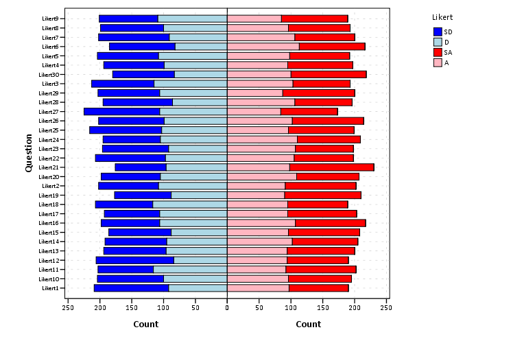
**************************************.Now to make the population pyramid Likert chart we will use SPSS’s ability to reflect panels, and so we assign an indicator variable to delineate the positive and negative responses.
***************************************
*I need to make a variable to panel by.
compute panel = 0.
if Likert > 3 panel = 1.
***************************************.
From here we can produce the chart without displaying the neutral central category. Here I use a temporary statement to not plot the neutral category, and after the code is the generated chart.
***************************************.
temporary.
select if Likert <> 3.
GGRAPH
  /GRAPHDATASET NAME="graphdataset" VARIABLES=Question COUNT()[name="COUNT"] Likert panel
    MISSING=LISTWISE REPORTMISSING=NO
  /GRAPHSPEC SOURCE=INLINE.
BEGIN GPL
  SOURCE: s=userSource(id("graphdataset"))
  COORD: transpose(mirror(rect(dim(1,2))))
  DATA: Question=col(source(s), name("Question"), unit.category())
  DATA: COUNT=col(source(s), name("COUNT"))
  DATA: Likert=col(source(s), name("Likert"), unit.category())
  DATA: panel=col(source(s), name("panel"), unit.category())
  GUIDE: axis(dim(1), label("Question"))
  GUIDE: axis(dim(2), label("Count"))
  GUIDE: axis(dim(3), null(), gap(0px))
  GUIDE: legend(aesthetic(aesthetic.color.interior), label("Likert"))
  SCALE: linear(dim(2), include(0))
  SCALE: cat(aesthetic(aesthetic.color.interior), sort.values("1","2","5","4"), map(("1", color.blue), ("2", color.lightblue), ("4", color.lightpink), ("5", color.red)))
  ELEMENT: interval.stack(position(Question*COUNT*panel), color.interior(Likert), shape.interior(shape.square))
END GPL.
***************************************.
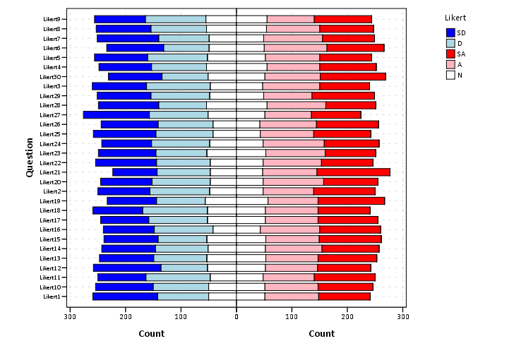
These charts when displaying the Likert responses typically allocate the neutral category half to one panel and half to the other. To accomplish this task I made a continuous random variable and then use the RANK command to assign half of the cases to the positive panel.
***************************************.
compute rand = RV.NORMAL(0,1).
AUTORECODE  VARIABLES=Question  /INTO QuestionN.
RANK
  VARIABLES=rand  (A) BY QuestionN Likert /NTILES (2)  INTO RankT /PRINT=NO
  /TIES=CONDENSE .
if Likert = 3 and RankT = 2 panel = 1.
***************************************.
From here it is the same chart as before, just with the neutral category mapped to white.
***************************************.
GGRAPH
  /GRAPHDATASET NAME="graphdataset" VARIABLES=Question COUNT()[name="COUNT"] Likert panel
    MISSING=LISTWISE REPORTMISSING=NO
  /GRAPHSPEC SOURCE=INLINE.
BEGIN GPL
  SOURCE: s=userSource(id("graphdataset"))
  COORD: transpose(mirror(rect(dim(1,2))))
  DATA: Question=col(source(s), name("Question"), unit.category())
  DATA: COUNT=col(source(s), name("COUNT"))
  DATA: Likert=col(source(s), name("Likert"), unit.category())
  DATA: panel=col(source(s), name("panel"), unit.category())
  GUIDE: axis(dim(1), label("Question"))
  GUIDE: axis(dim(2), label("Count"))
  GUIDE: axis(dim(3), null(), gap(0px))
  GUIDE: legend(aesthetic(aesthetic.color.interior), label("Likert"))
  SCALE: linear(dim(2), include(0))
  SCALE: cat(aesthetic(aesthetic.color.interior), sort.values("1","2","5","4", "3"), map(("1", color.blue), ("2", color.lightblue), ("3", color.white), ("4", color.lightpink), ("5", color.red)))
  ELEMENT: interval.stack(position(Question*COUNT*panel), color.interior(Likert),shape.interior(shape.square))
END GPL.
***************************************.
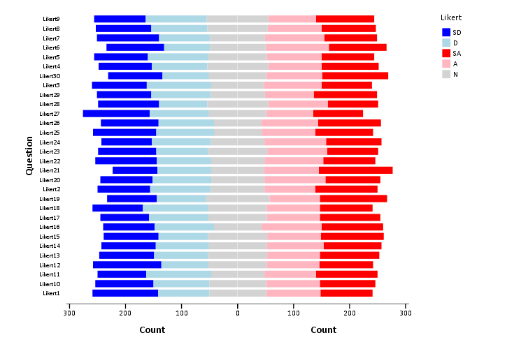
The colors are chosen to illustrate the ordinal nature of the data, with the anchors having a more saturated color. To end I map the neutral category to a light grey and then omit the outlines of the bars in the plot. They don’t really add anything (except possible moire patterns), and space is precious with so many items.
***************************************.
GGRAPH
  /GRAPHDATASET NAME="graphdataset" VARIABLES=Question COUNT()[name="COUNT"] Likert panel
    MISSING=LISTWISE REPORTMISSING=NO
  /GRAPHSPEC SOURCE=INLINE.
BEGIN GPL
  SOURCE: s=userSource(id("graphdataset"))
  COORD: transpose(mirror(rect(dim(1,2))))
  DATA: Question=col(source(s), name("Question"), unit.category())
  DATA: COUNT=col(source(s), name("COUNT"))
  DATA: Likert=col(source(s), name("Likert"), unit.category())
  DATA: panel=col(source(s), name("panel"), unit.category())
  GUIDE: axis(dim(1), label("Question"))
  GUIDE: axis(dim(2), label("Count"))
  GUIDE: axis(dim(3), null(), gap(0px))
  GUIDE: legend(aesthetic(aesthetic.color.interior), label("Likert"))
  SCALE: linear(dim(2), include(0))
  SCALE: cat(aesthetic(aesthetic.color.interior), sort.values("1","2","5","4", "3"), map(("1", color.blue), ("2", color.lightblue), ("3", color.lightgrey), ("4", color.lightpink), ("5", color.red)))
  ELEMENT: interval.stack(position(Question*COUNT*panel), color.interior(Likert),shape.interior(shape.square),transparency.exterior(transparency."1"))
END GPL.
***************************************.


Humberto
/ May 11, 2015Really nice post. Thanks a lot!
I wonder how “percentage”, instead of “count” could be used in the graph. I have tried using something like this in the second last line:
position(summary.percent(Question*COUNT*panel, base.coordinate(dim(1))))
But then the bars in both panels are adjusted to 100%.
apwheele
/ May 12, 2015Good question, I would have thought that would work as well, or
base.coordinate(dim(1,3))
But that does not work either. One way is to divide the COUNT by the total n per question. Here since all questions have the same N (500) you could insert
TRANS: Perc = eval(COUNT/500)
and then use Perc instead of COUNT in the element statement. Another data based way to do it (which does not need the same total counts for each question) is to aggregate the counts per question and pass that as another aggregated variable. Such as below:
******************************.
*Aggregate N per question.
AGGREGATE OUTFILE=* MODE=ADDVARIABLES
/BREAK Question
/TotalPerQ = N.
*Use trans to make a percent.
GGRAPH
/GRAPHDATASET NAME=”graphdataset” VARIABLES=Question MEAN(TotalPerQ)[name=”MeanTotalPerQ”] COUNT()[name=”COUNT”] Likert panel
MISSING=LISTWISE REPORTMISSING=NO
/GRAPHSPEC SOURCE=INLINE.
BEGIN GPL
SOURCE: s=userSource(id(“graphdataset”))
COORD: transpose(mirror(rect(dim(1,2))))
DATA: Question=col(source(s), name(“Question”), unit.category())
DATA: COUNT=col(source(s), name(“COUNT”))
DATA: MeanTotalPerQ=col(source(s), name(“MeanTotalPerQ”))
DATA: Likert=col(source(s), name(“Likert”), unit.category())
DATA: panel=col(source(s), name(“panel”), unit.category())
TRANS: Perc = eval(COUNT/MeanTotalPerQ)
GUIDE: axis(dim(1), label(“Question”))
GUIDE: axis(dim(2), label(“Percent”))
GUIDE: axis(dim(3), null(), gap(0px))
GUIDE: legend(aesthetic(aesthetic.color.interior), label(“Likert”))
SCALE: linear(dim(2), include(0))
SCALE: cat(aesthetic(aesthetic.color.interior), sort.values(“1″,”2″,”5″,”4”, “3”), map((“1”, color.blue), (“2”, color.lightblue), (“3”, color.lightgrey), (“4”, color.lightpink), (“5″, color.red)))
ELEMENT: interval.stack(position(Question*Perc*panel), color.interior(Likert),shape.interior(shape.square),transparency.exterior(transparency.”1”))
END GPL.
******************************.
Humberto
/ May 13, 2015Thanks again Andrew! That made the trick 🙂
Lucian
/ June 11, 2015This is absolutely fantastic! Well done. Quick question adding on to Humberto’s. When I try and use your dividing by N solution in order to calculate percentages, I get the error “The GRAPHDATASET subcommand contains an unrecognized setting “MeanTotalPerQ”. Do you have any thoughts on what may be causing this? I am using your example data set, and only the syntax you have provided above.
apwheele
/ June 12, 2015Code works for me. Here is a more convenient copy of the syntax, https://dl.dropbox.com/s/moul5rdsd341hsx/LikertData_VIz.sps?dl=0.
You can try putting an execute between the last AGGREGATE and GGRAPH commands, but that is my best guess as to solve the situation.
Lucian
/ June 12, 2015That worked! I think I found the error. Stumbling across this saved me literally hours of work. Thanks so much!
Lucian
/ June 12, 2015Last question: What is the best way to reorder legend so that it shows in the order displayed on the graph?
apwheele
/ June 12, 2015Unfortunately you can’t when using the aggregated data functions. The order of the legend is fixed with how SPSS decides what order to stack the bins. If you re-ordered the legend the bins would not be stacked correctly.
In theory you could pre-aggregate the data yourself and not use “interval.stack”, but that will be quite a pain.
Lucian
/ June 12, 2015Is there a way to turn the legend off?
apwheele
/ June 12, 2015Yes, instead of
GUIDE: legend(aesthetic(aesthetic.color.interior), label(“Likert”))
Use
GUIDE: legend(aesthetic(aesthetic.color.interior), null())