
I developed some example sparklines for tables when visualizing crime data that occurs in an uncertain window. The use case is small tables that list the begin and end date-times, and the sparklines provide a quick visual assessment of the day of week and time of day. Examining for overlaps in two intervals is one of the hardest things to do when examining a table, and deciphering days of week when looking at dates is just impossible.
Here is an example table of what they look like.
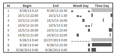
The day of week sparklines are a small bar chart, with Sunday as the first bar and Saturday as the last bar. The height of the bar represents the aoristic estimate for that day of week. An interval over a week long (entirely uncertain what day of week the crime took place) ends up looking like a dashed line over the week. This example uses the sparkline bar chart built into Excel 2010, but the Sparklines for Excel add-on provides synonymous functionality. The time of day sparkline is a stacked bar chart in disguise; it represents the time interval with a dark grey bar, and the remaining stack is white. This allows you to have crimes that occur overnight and are split in the middle of the day. Complete ignorance of when the crime occurred during the day I represent with a lighter grey bar.
The spreadsheet can be downloaded from my drop box account here.
A few notes the use of the formulas within the sheet:
- The spreadsheet does have formulas to auto-calculate the example sparklines (how they exactly work is worth another blog post all by itself) but it should be pretty clear to replicate the example bar chart for the day of week and time of day in case you just want to hand edit (or have another program return the needed estimates).
- For the auto-calculations to work for the Day of Week aoristic estimates the crime interval needs to have a positive value. That is, if the exact same time is listed in the begin and end date column you will get a division by zero error.
- For the day of week aoristic estimates it calculates the proportion as 1/7 if the date range is over one week. Ditto for the time range it is considered the full range if it goes over 24 hours.
A few notes on the aesthetics of sparklines:
- For the time of day sparkline if you have zero (or near zero) length for the interval it won’t show up in the graph. Some experimentation suggests the interval needs around 15 to 45 minutes for typical cell sizes to be visible in the sheet (and for printing).
- For the time of day sparkline the empty time color is set to white. This will make the plot look strange if you use zebra stripes for the table. You could modify it to make the empty color whatever the background color of the cell is, but I suspect this might make it confusing looking.
- A time of day bar chart could be made just the same as the day of week bar chart. It would require the full expansion for times of day, which I might do in the future anyway to provide a conveniant spreadsheet to calculate aoristic estimates. (I typically do them with my SPSS MACRO – but it won’t be too arduous to expand what I have done here to an excel template).
- If the Sparklines for Excel add-on allowed pie charts with at least two categories or allowed the angle of the pie slice to be rotated, you could make a time of day pie chart sparkline. This is currently not possible though.
I have not thoroughly tested the spreadsheet calculations (missing values will surely return errors, and if you have the begin-end backwards it may return some numbers, but I doubt they will be correct) so caveat emptor. I think the sparklines are a pretty good idea though. I suspect some more ingenious uses of color could be used to cross-reference the days of week and the time of day, but this does pretty much what I hoped for when looking at the table.


Fabrice Rimlinger
/ October 22, 2013Hi Andrew, Which version of Excel do you have ? I can upgrade SfE so you can use piechart() to show time if day.
apwheele
/ October 22, 2013Hi Fabrice – glad to see you comment and thank you for the SfE!
This was created in Excel 2010. I can guess why you don’t want people to use many more categories for pie charts (or maybe not even use them at all!) but I hope I’ve made a reasonable case for an exception.
Another suggestion I would like to see if possible would be to either specify an entirely transparent color or allow an alpha-transparency channel for as a general option for colors. I’m sure you get plenty of suggestions all the time though!
Thanks again for SfE,
Andy
Fabrice Rimlinger
/ October 22, 2013Andy,
regarding transparence, would it apply to all “slices” or only some ?
I could make it so that if you set color to “0”, a given slice would be fully transparent.
apwheele
/ October 22, 2013For this particular application just an option to set a particular slice to transparent would be all that is needed.
I think a general option to use transparency in all colors would be nice, but they may not be worth the trouble for sparklines. Transparency is nice in some other graphical ways to demarcate uncertainty in estimates (or just some other value), but the limited space in sparklines may make it unsuitable for the small graphics.
Some example applications I can dream up for transparency in sparklines might be a bullet chart, where transparency varies with distance from the target – this would mute the cells close to the target value and make cells that are farther above/below the target stick out more. Another example might be for pie charts with group sizes varying between the different charts, for example a pie chart based on the values [10,90] would look the same as based on values [1, 9]. You might want to bring more attention to the values [10,90] since it is based on more observations than the values [1,9], and adding a general alpha band would be able to accomplish that.