Using FILE HANDLE in SPSS

To aid in reproducible analysis, I often have a set of FILE HANDLE commands at the header of my syntax. For example, here is basically what most of my syntax’s look like at the top.

DATASET CLOSE ALL.
OUTPUT CLOSE ALL.

*Simple description here of what the syntax does.

FILE HANDLE data /NAME = "H:\ProjectX\OriginalData".
FILE HANDLE save /NAME = "C:\Users\axw161530\Dropbox\Documents\BLOG\FileHandles_SPSS".

What those commands go are point to particular locations on my machine that either have the data I will use for the syntax, and where to save the subsequent results. So what this does instead of having to write something like:

GET FILE = "H:\ProjectX\OriginalData\SPSS_Dataset1.sav".

I can just write something like:

GET FILE = "data\SPSS_Dataset1.sav".

The same works for where I save the files, so I would use the second SAVE line instead of the first after I’ve defined a file handle.

*SAVE OUTFILE = "C:\Users\axw161530\Dropbox\Documents\BLOG\FileHandles_SPSS\TransformedData1.sav"
SAVE OUTFILE = "save\TransformedData1.sav"

Besides being shorter, this greatly aids when you need to move files around. Say I needed to move where I saved the files from my personal drive to a work H drive. If you use file handles, all you need to do is change the one line of code at the top of your syntax. If you used absolute references you would need to edit the file at every location you used that absolute path (e.g. every GET FILE, or GET TRANSLATE, or SAVE).

Another trick you can use is that you can stack multiple file handles together. Consider this example.

FILE HANDLE base /NAME = "H:\ProjectX".
FILE HANDLE data /NAME = "base\Datasets"
FILE HANDLE report /NAME = "base\Reports"

In this case I defined a base location, and then defined the data and report file handles as folders within the base file handle. Again if you need to move this entire project, all you need to do is edit that original base file handle location.

A final note, if I have a set of complicated code that I split up into multiple syntax files, one trick you can use is to place all of your file handles into one set of syntax, and then use INSERT to call that syntax. Depending on the structure though you may need to edit the INSERT call though at the header for all of the sub-syntaxes, so it may not be any less work.

I should also mention you could use the CD command to some of the same effect. So instead of defining a save file handle, you could do:

CD "C:\Users\axw161530\Dropbox\Documents\BLOG\FileHandles_SPSS".
SAVE OUTFILE = "TransformedData1.sav"

I don’t typically change SPSS’s current directory, but there are legitimate reasons to do so. If SPSS needs write access to the directory in particular, this is sometimes easier than dealing with permissions. That does not come up often for me, and most of the time I have data files in many different places, so I typically just stick with using file handles.

Accessing FILE HANDLES in Python or R

If you are using file handles in SPSS code, you may want to be able to access those file handles the same way in Python or R code called within SPSS. This may be for much of the same reason — you may want to access data or save data in those programs, but use the file handles you have identified. Albert-Jan Roskam on the Nabble group showed how to do this.

So for python you could do below:

BEGIN PROGRAM Python.
import spssaux

#Getting the SPSS file handles
file_handles = spssaux.FileHandles().resolve

#Grabbing a particular handle
data_loc = file_handles('data')

#Setting the python directory to the save location
import os
os.chdir(file_handles('save'))
END PROGRAM.

And for R you can do:

BEGIN PROGRAM R.
fh <- spssdata.GetFileHandles()
file_handles <- sapply(fh, function(x) x[2])
names(file_handles) <-  sapply(fh, function(x) x[1])

#Accessing a particular file handle
file_handles["data"]

#setting the R directory to save handle
setwd(file_handles["save"])
END PROGRAM.

In either case it is nice so you again can just edit one line at the top of your syntax if you change file locations, instead of having to edit multiple lines in the subsequent syntax file.

Testing the equality of coefficients – Same Independent, Different Dependent variables

As promised earlier, here is one example of testing coefficient equalities in SPSS, Stata, and R.

Here we have different dependent variables, but the same independent variables. This is taken from Dallas survey data (original data link, survey instrument link), and they asked about fear of crime, and split up the questions between fear of property victimization and violent victimization. Here I want to see if the effect of income is the same between the two. People in more poverty tend to be at higher risk of victimization, but you may also expect people with fewer items to steal to be less worried. Here I also control for the race and the age of the respondent.

The dataset has missing data, so I illustrate how to select out for complete case analysis, then I estimate the model. The fear of crime variables are coded as Likert items with a scale of 1-5, (higher values are more safe) but I predict them using linear regression (see the Stata code at the end though for combining ordinal logistic equations using suest). Race is of course nominal, and income and age are binned as well, but I treat the income bins as a linear effect. I pasted the codebook for all of the items at the end of the post.

These models with multiple dependent variables have different names, economists call them seemingly unrelated regression, psychologists will often just call them multivariate models, those familiar with structural equation modeling can get the same results by allowing residual covariances between the two outcomes — they will all result in the same coefficient estimates in the end.

SPSS

In SPSS we can use the GLM procedure to estimate the model. Simultaneously we can specify particular contrasts to test whether the income coefficient is different for the two outcomes.

*Grab the online data.
SPSSINC GETURI DATA URI="https://dl.dropbox.com/s/r98nnidl5rnq5ni/MissingData_DallasSurv16.sav?dl=0" FILETYPE=SAV DATASET=MissData.

*Conducting complete case analysis.
COUNT MisComplete = Safety_Violent Safety_Prop Gender Race Income Age (MISSING).
COMPUTE CompleteCase = (MisComplete = 0).
FILTER BY CompleteCase.


*This treats the different income categories as a continuous variable.
*Can use GLM to estimate seemingly unrelated regression in SPSS and test.
*equality of the two coefficients.
GLM Safety_Violent Safety_Prop BY Race Age WITH Income
  /DESIGN=Income Race Age
  /PRINT PARAMETER
  /LMATRIX Income 1
  /MMATRIX ALL 1 -1.

FILTER OFF.  

In the output you can see the coefficient estimates for the two equations. The income effect for violent crime is 0.168 (0.023) and for property crime is 0.114 (0.022).

And then you get a separate table for the contrast estimates.

You can see that the contrast estimate, 0.054, equals 0.168 – 0.114. The standard error in this output (0.016) takes into account the covariance between the two estimates. Here you would reject the null that the effects are equal across the two equations, and the effect of income is larger for violent crime. Because higher values on these Likert scales mean a person feels more safe, this is evidence that those with higher incomes are more likely to be fearful of property victimization, controlling for age and race.

Unfortunately the different matrix contrasts are not available in all the different types of regression models in SPSS. You may ask whether you can fit two separate regressions and do this same test. The answer is you can, but that makes assumptions about how the two models are independent — it is typically more efficient to estimate them at once, and here it allows you to have the software handle the Wald test instead of constructing it yourself.

R

As I stated previously, seemingly unrelated regression is another name for these multivariate models. So we can use the R libraries systemfit to estimate our seemingly unrelated regression model, and then use the library multcomp to test the coefficient contrast. This does not result in the exact same coefficients as SPSS, but devilishly close. You can download the csv file of the data here.

library(systemfit) #for seemingly unrelated regression
library(multcomp)  #for hypothesis tests of models coefficients

#read in CSV file
SurvData <- read.csv(file="MissingData_DallasSurvey.csv",header=TRUE)
names(SurvData)[1] <- "Safety_Violent" #name gets messed up because of BOM

#Need to recode the missing values in R, use NA
NineMis <- c("Safety_Violent","Safety_Prop","Race","Income","Age")
#summary(SurvData[,NineMis])
for (i in NineMis){
  SurvData[SurvData[,i]==9,i] <- NA
}

#Making a complete case dataset
SurvComplete <- SurvData[complete.cases(SurvData),NineMis]
#Now changing race and age to factor variables, keep income as linear
SurvComplete$Race <- factor(SurvComplete$Race, levels=c(1,2,3,4), labels=c("Black","White","Hispanic","Other"))
SurvComplete$Age <- factor(SurvComplete$Age, levels=1:5, labels=c("18-24","25-34","35-44","45-54","55+"))
summary(SurvComplete)

#now fitting seemingly unrelated regression
viol <- Safety_Violent ~ Income + Race + Age
prop <- Safety_Prop ~ Income + Race + Age
fitsur <- systemfit(list(violreg = viol, propreg= prop), data=SurvComplete, method="SUR")
summary(fitsur)

#testing whether income effect is equivalent for both models
viol_more_prop <- glht(fitsur,linfct = c("violreg_Income - propreg_Income = 0"))
summary(viol_more_prop) 

Here is a screenshot of the results then:

This is also the same as estimating a structural equation model in which the residuals for the two regressions are allowed to covary. We can do that in R with the lavaan library.

library(lavaan)

#for this need to convert factors into dummy variables for lavaan
DumVars <- data.frame(model.matrix(~Race+Age-1,data=SurvComplete))
names(DumVars) <- c("Black","White","Hispanic","Other","Age2","Age3","Age4","Age5")

SurvComplete <- cbind(SurvComplete,DumVars)

model <- '
    #regressions
     Safety_Prop    ~ Income + Black + Hispanic + Other + Age2 + Age3 + Age4 + Age5
     Safety_Violent ~ Income + Black + Hispanic + Other + Age2 + Age3 + Age4 + Age5
    #residual covariances
     Safety_Violent ~~ Safety_Prop
     Safety_Violent ~~ Safety_Violent
     Safety_Prop ~~ Safety_Prop
'

fit <- sem(model, data=SurvComplete)
summary(fit)

I’m not sure offhand though if there is an easy way to test the coefficient differences with a lavaan object, but we can do it manually by grabbing the variance and the covariances. You can then see that the differences and the standard errors are equal to the prior output provided by the glht function in multcomp.

#Grab the coefficients I want, and test the difference
PCov <- inspect(fit,what="vcov")
PEst <- inspect(fit,what="list")
Diff <- PEst[9,'est'] - PEst[1,'est']
SE <- sqrt( PEst[1,'se']^2 + PEst[9,'se']^2 - 2*PCov[9,1] )
Diff;SE

Stata

In Stata we can replicate the same prior analyses. Here is some code to simply replicate the prior results, using Stata’s postestimation commands (additional examples using postestimation commands here). Again you can download the csv file used here. The results here are exactly the same as the R results.

*Load in the csv file
import delimited MissingData_DallasSurvey.csv, clear

*BOM problem again
rename ïsafety_violent safety_violent

*we need to specify the missing data fields.
*for Stata, set missing data to ".", not the named missing value types.
foreach i of varlist safety_violent-ownhome {
    tab `i'
}

*dont specify district
mvdecode safety_violent-race income-age ownhome, mv(9=.)
mvdecode yearsdallas, mv(999=.)

*making a variable to identify the number of missing observations
egen miscomplete = rmiss(safety_violent safety_prop race income age)
tab miscomplete
*even though any individual question is small, in total it is around 20% of the cases

*lets conduct a complete case analysis
preserve 
keep if miscomplete==0

*Now can estimate multivariate regression, same as GLM in SPSS
mvreg safety_violent safety_prop = income i.race i.age

*test income coefficient is equal across the two equations
lincom _b[safety_violent:income] - _b[safety_prop:income]

*same results as seemingly unrelated regression
sureg (safety_violent income i.race i.age)(safety_prop income i.race i.age)

*To use lincom it is the exact same code as with mvreg
lincom _b[safety_violent:income] - _b[safety_prop:income]

*with sem model
tabulate race, generate(r)
tabulate age, generate(a)
sem (safety_violent <- income r2 r3 r4 a2 a3 a4 a5)(safety_prop <- income r2 r3 r4 a2 a3 a4 a5), cov(e.safety_violent*e.safety_prop) 

*can use the same as mvreg and sureg
lincom _b[safety_violent:income] - _b[safety_prop:income]

You will notice here it is the exact some post-estimation lincom command to test the coefficient equality across all three models. (Stata makes this the easiest of the three programs IMO.)

Stata also allows us to estimate seemingly unrelated regressions combining different generalized outcomes. Here I treat the outcome as ordinal, and then combine the models using seemingly unrelated regression.

*Combining generalized linear models with suest
ologit safety_violent income i.race i.age
est store viol

ologit safety_prop income i.race i.age
est store prop

suest viol prop

*lincom again!
lincom _b[viol_safety_violent:income] - _b[prop_safety_prop:income]

An application in spatial criminology is when you are estimating the effect of something on different crime types. If you are predicting the number of crimes in a spatial area, you might separate Poisson regression models for assaults and robberies — this is one way to estimate the models jointly. Cory Haberman and Jerry Ratcliffe have an application of this as well estimate the effect of different crime types at different times of day – e.g. the effect of bars in the afternoon versus the effect of bars at nighttime.

Codebook

Here is the codebook for each of the variables in the database.

Safety_Violent  
    1   Very Unsafe
    2   Unsafe
    3   Neither Safe or Unsafe
    4   Safe
    5   Very Safe
    9   Do not know or Missing
Safety_Prop 
    1   Very Unsafe
    2   Unsafe
    3   Neither Safe or Unsafe
    4   Safe
    5   Very Safe
    9   Do not know or Missing
Gender  
    1   Male
    2   Female
    9   Missing
Race    
    1   Black
    2   White
    3   Hispanic
    4   Other
    9   Missing
Income  
    1   Less than 25k
    2   25k to 50k
    3   50k to 75k
    4   75k to 100k
    5   over 100k
    9   Missing
Edu 
    1   Less than High School
    2   High School
    3   Some above High School
    9   Missing
Age 
    1   18-24
    2   25-34
    3   35-44
    4   45-54
    5   55+
    9   Missing
OwnHome 
    1   Own
    2   Rent
    9   Missing
YearsDallas
    999 Missing

SPSS Statistics for Data Analysis and Visualization – book chapter on Geospatial Analytics

A book I made contributions to, SPSS Statistics for Data Analysis and Visualization, is currently out. Keith and Jesus are the main authors of the book, but I contributed one chapter and Jon Peck contributed a few.

The book is a guided tour through many of the advanced statistical procedures and data visualizations in SPSS. Jon also contributed a few chapters towards using syntax, python, and using extension commands. It is a very friendly walkthrough, and we have all contributed data files for you to be able to follow along through the chapters.

So there is alot of content, but I wanted to give a more specific details on my chapter, as I think they will be of greater interest to crime analysts and criminologists. I provide two case studies, one of using geospatial association rules to identify areas of high crime plus high 311 disorder complaints in DC (using data from my dissertation). The second I give an example of spatio-temporal forecasting of ShotSpotter data at the weekly level in DC using both prior shootings as well as other prior Part 1 crimes.

Geospatial Association Rules

The geospatial association rules is a technique for high dimensional contingency tables to find particular combinations among categories that are more prevalent. I show examples of finding that thefts from motor vehicles tend to be associated in places nearby graffiti incidents.

And that assaults tend to be around locations with more garbage complaints (and as you can see each has a very different spatial patterning).

I consider this to be a useful exploratory data analysis type technique. It is very similar in application to conjunctive analysis, that has prior very similar crime mapping applications in risk terrain modeling (see Caplan et al., 2017).

Spatio-Temporal Prediction

The second example case study is forecasting weekly shootings in fairly small areas (500 meter grid cells) using ShotSpotter data in DC. I also use the prior weeks reported Part 1 crime types (Assault, Burglary, Robbery, etc.), so it is similar to the leading indicators forecasting model advocated by Wilpen Gorr and colleagues. I show that prior shootings predict future shootings up to 5 lags prior (so over a month), and that the prior crimes do have an effect on future shootings (e.g. robberies in the prior week contribute to more shootings in the subsequent week).

If you have questions about the analyses, or are a crime analyst and want to apply similar techniques to your data always feel free to send me an email.

Side by side charts in SPSS

One aspect of SPSS charts that you need to use syntax for is to create side-by-side charts. Here I will illustrate a frequent use case, time series charts with different Y axes. You can download the data and code to follow along here. This is data for Buffalo, NY on reported crimes from the UCR data tool.

So after you have downloaded the csv file with the UCR crime rates in Buffalo and have imported the data into SPSS, you can make a graph of violent crime rates over time.

*Making a chart of the violent crime rate.
GGRAPH
  /GRAPHDATASET NAME="graphdataset" VARIABLES=Year ViolentCrimerate MISSING=LISTWISE 
    REPORTMISSING=NO
  /GRAPHSPEC SOURCE=INLINE.
BEGIN GPL
  SOURCE: s=userSource(id("graphdataset"))
  DATA: Year=col(source(s), name("Year"))
  DATA: ViolentCrimerate=col(source(s), name("ViolentCrimerate"))
  GUIDE: axis(dim(1), label("Year"))
  GUIDE: axis(dim(2), label("Violent Crime Rate per 100,000"))
  ELEMENT: line(position(Year*ViolentCrimerate))
  ELEMENT: point(position(Year*ViolentCrimerate), color.interior(color.black), color.exterior(color.white), size(size."7"))
END GPL.

I like to superimpose the points on simple line charts, to reinforce where the year observations are. Here we can see that there is a big drop post 1995 for the following four years (something that would be hard to say exactly without the points). Part of the story of Buffalo though is the general decline in population (similar to most of the rust belt part of the nation since the 70’s).

*Make a chart of the population decline.
GGRAPH
  /GRAPHDATASET NAME="graphdataset" VARIABLES=Year Population MISSING=LISTWISE 
    REPORTMISSING=NO
  /GRAPHSPEC SOURCE=INLINE.
BEGIN GPL
  SOURCE: s=userSource(id("graphdataset"))
  DATA: Year=col(source(s), name("Year"))
  DATA: Population=col(source(s), name("Population"))
  GUIDE: axis(dim(1), label("Year"))
  GUIDE: axis(dim(2), label("Population"))
  ELEMENT: line(position(Year*Population))
  ELEMENT: point(position(Year*Population), color.interior(color.black), color.exterior(color.white), size(size."7"))
END GPL.

Now we want to place these two charts over top of one another. So check out the syntax below, in particular to GRAPH: begin statements.

*Now put the two together.
GGRAPH
  /GRAPHDATASET NAME="graphdataset" VARIABLES=Year Population ViolentCrimerate
  /GRAPHSPEC SOURCE=INLINE.
BEGIN GPL 
  SOURCE: s=userSource(id("graphdataset"))
  DATA: Year=col(source(s), name("Year"))
  DATA: Population=col(source(s), name("Population"))
  DATA: ViolentCrimerate=col(source(s), name("ViolentCrimerate"))
  GRAPH: begin(origin(14%,12%), scale(85%, 60%))
  GUIDE: axis(dim(1), label("Year"), opposite())
  GUIDE: axis(dim(2), label("Violent Crime Rate per 100,000"))
  ELEMENT: line(position(Year*ViolentCrimerate))
  ELEMENT: point(position(Year*ViolentCrimerate), color.interior(color.black), color.exterior(color.white), size(size."7"))
  GRAPH: end()
  GRAPH: begin(origin(14%, 75%), scale(85%, 20%)) 
  GUIDE: axis(dim(1), label("Year"))
  GUIDE: axis(dim(2), label("Population"))
  ELEMENT: line(position(Year*Population))
  ELEMENT: point(position(Year*Population), color.interior(color.black), color.exterior(color.white), size(size."7"))  
  GRAPH: end()
END GPL.    

In a nutshell, the graph begin statements allow you to chunk up the graph space to make different/arbitrary plots. The percentages start in the top right, so for the first violent crime rate graph, the origin is listed as 14% and 12%. This means the graph starts 14% to the right in the overall chart space, and 12% down. These paddings are needed to make room for the axis labels. Then for the scale part, it lists it as 85% and 60%. The 85% means take up 85% of the X range in the chart, but only 60% of the Y range in the chart. So this shows how to make the violent crime chart take a bigger proportion. of the overall chart space than the population chart. You can technically do charts with varying axes in SPSS without this, but you would have to make the panels take up an equal amount of space. This way you can make the panels whatever proportion you want.

For Buffalo the big drop in 1996 is largely due to a very large reduction in aggravated assaults (from over 3,000 in 1995 to under 1,600 in 1996). So here I superimpose a bar to viz. the proportion of all violent crimes. This wouldn’t be my first choice of how to show this, but I think it is a good illustration of how to superimpose and/or stack additional charts using this same technique in SPSS.

*Also superimposing a stacked bar chart on the total types of crimes in the background.
COMPUTE PercentAssault = (Aggravatedassault/ViolentCrimeTotal)*100.
FORMATS PercentAssault (F2.0).
EXECUTE.

GGRAPH
  /GRAPHDATASET NAME="graphdataset" VARIABLES=Year Population ViolentCrimerate PercentAssault
  /GRAPHSPEC SOURCE=INLINE.
BEGIN GPL 
  SOURCE: s=userSource(id("graphdataset"))
  DATA: Year=col(source(s), name("Year"))
  DATA: Population=col(source(s), name("Population"))
  DATA: ViolentCrimerate=col(source(s), name("ViolentCrimerate"))
  DATA: PercentAssault=col(source(s), name("PercentAssault"))
  GRAPH: begin(origin(14%,12%), scale(75%, 60%))
  GUIDE: axis(dim(1), label("Year"), opposite())
  GUIDE: axis(dim(2), label("Violent Crime Rate per 100,000"))
  ELEMENT: line(position(Year*ViolentCrimerate))
  ELEMENT: point(position(Year*ViolentCrimerate), color.interior(color.black), color.exterior(color.white), size(size."7"))
  GRAPH: end()
  GRAPH: begin(origin(14%, 75%), scale(75%, 20%)) 
  GUIDE: axis(dim(1), label("Year"))
  GUIDE: axis(dim(2), label("Population"))
  ELEMENT: line(position(Year*Population))
  ELEMENT: point(position(Year*Population), color.interior(color.black), color.exterior(color.white), size(size."7"))  
  GRAPH: end()
  GRAPH: begin(origin(14%, 12%), scale(75%, 60%)) 
  SCALE: linear(dim(2), min(0), max(60))
  GUIDE: axis(dim(1), null())
  GUIDE: axis(dim(2), label("Percent Assault"), opposite(), color(color.red), delta(10))
  ELEMENT: bar(position(Year*PercentAssault), color.interior(color.red), transparency.interior(transparency."0.7"), transparency.exterior(transparency."1.0"), size(size."5"))
  GRAPH: end()
END GPL.

While doing multiple time series charts is a common use, you can basically use your imagination about what you want to accomplish with this. Another common example is to put border histograms on scatterplot (which the GPL reference guide has an example of). Here is an example I posted recently to Nabble that has the number of individuals at risk in a Kaplan-Meier plot.

Heatmaps in SPSS

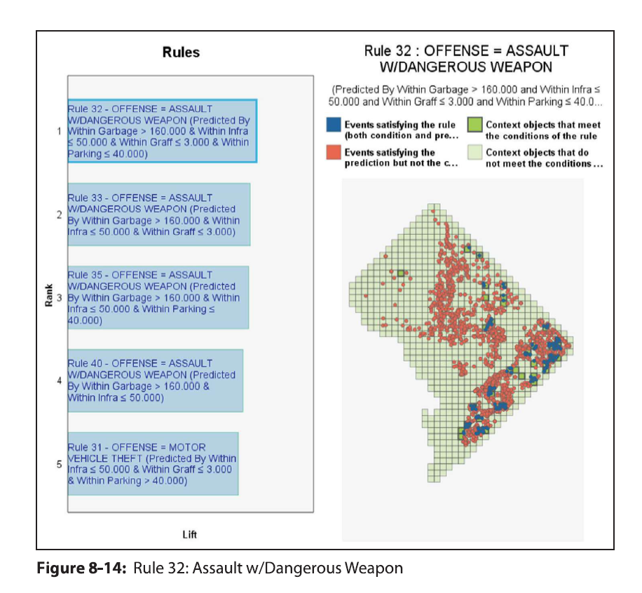
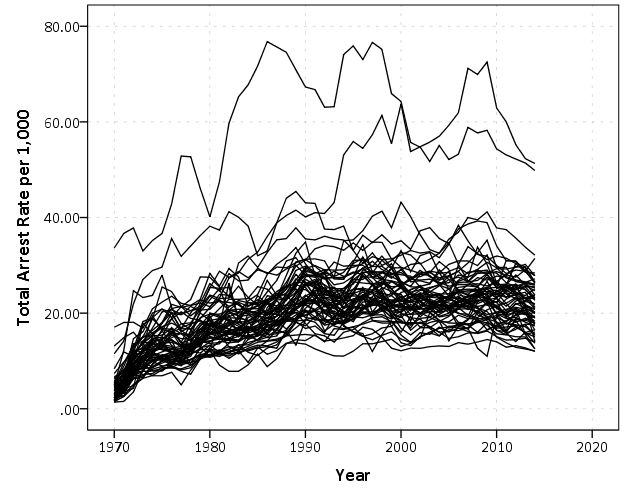
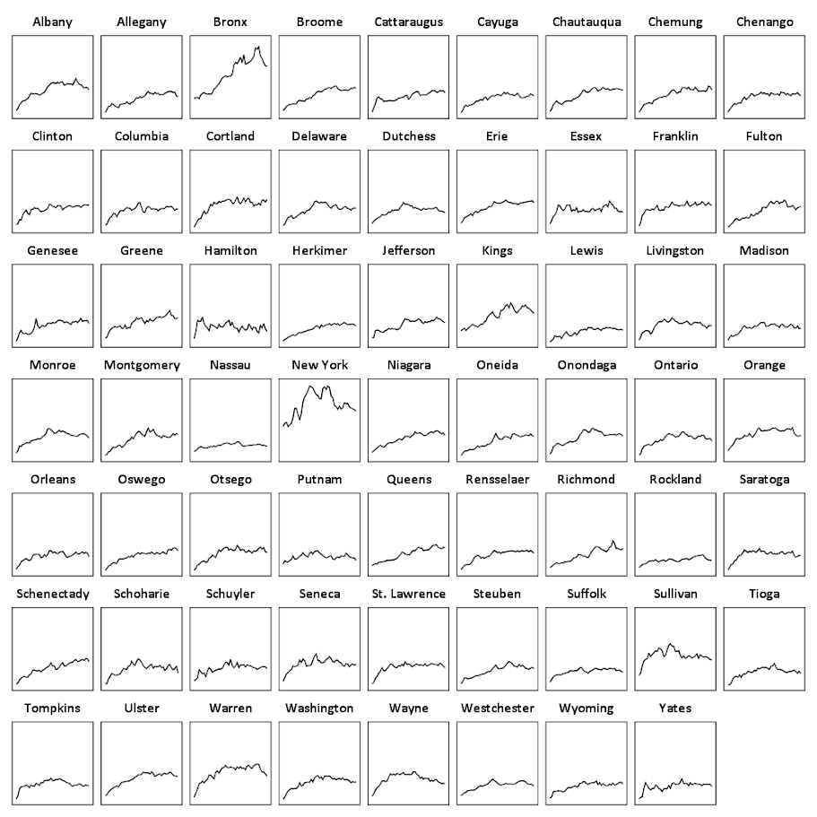
Heatmap is a visualization term that gets used in a few different circumstances, but here I mean a regular grid in which you use color to indicate particular values. Here is an example from Nathan Yau via FlowingData:

They are often not the best visualization to use to evaluate general patterns, but they offer a mix of zooming into specific individuals, as well as to identify overall trends. In particular I like using them to look at missing data patterns in surveys in SPSS, which I will show an example of in this blog post. Here I am going to use a community survey for Dallas in 2016. The original data can be found here, and the original survey questions can be found here. I’ve saved that survey as an SPSS file you can access at this link. (The full code in one sps syntax file is here.)


So first I am going to open up the data file from online, and name the dataset DallasSurv16.

*Grab the data from online.
SPSSINC GETURI DATA
URI="https://dl.dropbox.com/s/5e07yi9hd0u5opk/Surv2016.sav?dl=0"
FILETYPE=SAV DATASET=DallasSurv16.

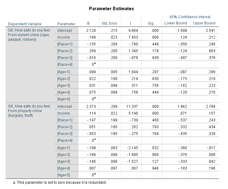
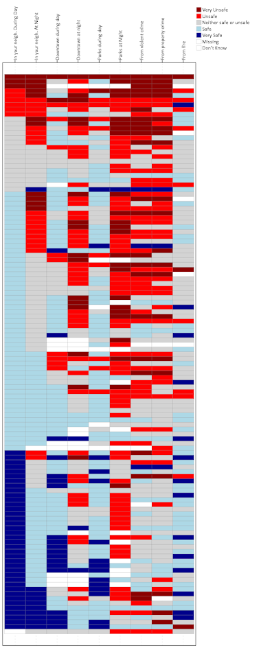
Here I am going to illustrate making a heatmap with the questions asking about fear of crime and victimization, the Q6 questions. First I am going to make a copy of the original dataset, as we will be making some changes to the data. I do this via the DATASET COPY function, and follow it up by activating that new dataset. Then I do a frequency to check out the set of Q6 items.

DATASET COPY HeatMap.
DATASET ACTIVATE HeatMap.
FREQ Q6_1Inyourneighborhoodduringthe TO Q69Fromfire.

From the survey instrument, the nine Q6 items have values of 1 through 5, and then a "Don’t Know" category labeled as 9. All of the items also have system missing values. First we are going to recode the system missing items to a value of 8, and then we are going to sort the dataset by those questions.

RECODE Q6_1Inyourneighborhoodduringthe TO Q69Fromfire (SYSMIS = 8)(ELSE = COPY).
SORT CASES BY Q6_1Inyourneighborhoodduringthe TO Q69Fromfire.

You will see the effect of the sorting the cases in a bit for our graph. But the idea about how to make the heatmap in the grammar of graphics is that in your data you have a variable that specifies the X axis, a variable for the Y axis, and then a variable for the color in your heatmap. To get that set up, we need to go from our nine separate Q6 variables to one variable. We do this in SPSS by using VARSTOCASES to reshape the data.

VARSTOCASES /MAKE Q6 FROM Q6_1Inyourneighborhoodduringthe TO Q69Fromfire /INDEX = QType.

So now every person who answered the survey has 9 different rows in the dataset instead of one. The original answers to the questions are placed in the new Q6 variable, and the QType variable is a number of 1 to 9. So now individual people will go on the Y axis, and each question will go on the X axis. But before we make the chart, we will add the meta-data in SPSS to our new Q6 and QType variables.

VALUE LABELS QType
  1 'In your neigh. During Day'
  2 'In your neigh. At Night'
  3 'Downtown during day'
  4 'Downtown at night'
  5 'Parks during day'
  6 'Parks at Night'
  7 'From violent crime'
  8 'From property crime'
  9 'From fire'
.
VALUE LABELS Q6
 8 "Missing" 
 9 "Don't Know"
 1 'Very Unsafe'
 2 'Unsafe'
 3 'Neither safe or unsafe'
 4 'Safe'
 5 'Very Safe'
.
FORMATS Q6 QType (F1.0).

Now we are ready for our GGRAPH statement. It is pretty gruesome but just bare with me for a second.

TEMPORARY.
SELECT IF DISTRICT = 1.
GGRAPH
  /GRAPHDATASET NAME="graphdataset" VARIABLES=QType ID Q6
  /GRAPHSPEC SOURCE=INLINE.
BEGIN GPL
  PAGE: begin(scale(800px,2000px))
  SOURCE: s=userSource(id("graphdataset"))
  DATA: QType=col(source(s), name("QType"), unit.category())
  DATA: ID=col(source(s), name("ID"), unit.category())
  DATA: Q6=col(source(s), name("Q6"), unit.category())
  GUIDE: axis(dim(1), opposite())
  GUIDE: axis(dim(2), null())
  SCALE: cat(aesthetic(aesthetic.color.interior), map(("1", color.darkred),("2", color.red),("3", color.lightgrey), 
            ("4", color.lightblue), ("5", color.darkblue), ("9", color.white), ("8", color.white)))
  SCALE: cat(dim(2), sort.data(), reverse())
  ELEMENT: polygon(position(QType*ID), color.interior(Q6), color.exterior(color.grey), transparency.exterior(transparency."0.7"))
  PAGE: end()
END GPL.
EXECUTE.

And this produces the chart,

So to start, normally I would use the chart builder dialog to make the skeleton for the GGRAPH code and update that. Here if you make a scatterplot in the chart dialog and assign the color it gets you most of the way there. But I will walk through some of the other steps.

  • TEMPORARY. and then SELECT IF – these two steps are to only draw a heatmap for survey responses for the around 100 individuals from council district 1. Subsequently the EXECUTE. command at the end makes it so the TEMPORARY command is over.
  • Then for in the inline GPL code, PAGE: begin(scale(800px,2000px)) changes the chart dimensions to taller and skinnier than the default chart size in SPSS. Also note you need a corresponding PAGE: end() command when you use a PAGE: begin() command.
  • GUIDE: axis(dim(1), opposite()) draws the labels for the X axis on the top of the graph, instead of the bottom.
  • GUIDE: axis(dim(2), null()) prevents drawing the Y axis, which just uses the survey id to displace survey responses
  • SCALE: cat(aesthetic maps different colors to each different survey response. Feeling safe are given blues, and not safe are given red colors. I gave neutral grey and missing white as well.
  • SCALE: cat(dim(2), sort.data(), reverse()), this tells SPSS to draw the Y axis in the order in which the data are already sorted. Because I sorted the Q6 variables before I did the VARSTOCASES this sorts the responses with the most fear to the top.
  • The ELEMENT: polygon( statement just draws the squares, and then specifies to color the interior of the squares according to the Q6 variable. I given the outline of the squares a grey color, but white works nice as well. (Black is a bit overpowering.)

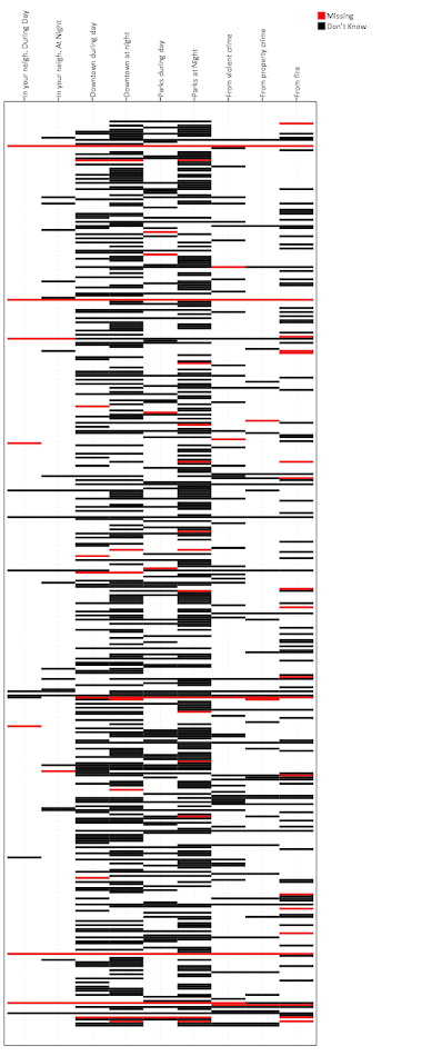
So now you have the idea. But like I said this can be hard to identify overall patterns sometimes. So sometimes I like to limit the responses in the graph. Here I make a heatmap of the full dataset (over 1,500 responses), but just look at the different types of missing data. Red is system missing in the original dataset, and Black is the survey filled in "Don’t Know".

*Missing data representation.
TEMPORARY.
SELECT IF (Q6 = 9 OR Q6 = 8).
GGRAPH
  /GRAPHDATASET NAME="graphdataset" VARIABLES=QType ID Q6 MISSING = VARIABLEWISE
  /GRAPHSPEC SOURCE=INLINE.
BEGIN GPL
  PAGE: begin(scale(800px,2000px))
  SOURCE: s=userSource(id("graphdataset"))
  DATA: QType=col(source(s), name("QType"), unit.category())
  DATA: ID=col(source(s), name("ID"), unit.category())
  DATA: Q6=col(source(s), name("Q6"), unit.category())
  GUIDE: axis(dim(1), opposite())
  GUIDE: axis(dim(2), null())
  SCALE: cat(aesthetic(aesthetic.color.interior), map(("1", color.darkred),("2", color.red),("3", color.lightgrey), 
            ("4", color.lightblue), ("5", color.darkblue), ("9", color.black), ("8", color.red)))
  ELEMENT: polygon(position(QType*ID), color.interior(Q6), color.exterior(color.grey), transparency.exterior(transparency."0.7"))
  PAGE: end()
END GPL.
EXECUTE.

You can see the system missing across all 6 questions happens very rarely, I only see three cases, but there are a ton of "Don’t Know" responses. Another way to simplify the data is to use small multiples for each type of response. Here is the first graph, but using a panel for each of the individual survey responses. See the COORD: rect(dim(1,2), wrap()) and then the ELEMENT statement for the updates. As well as making the size of the chart shorter and fatter, and not drawing the legend.

*Small multiple.
TEMPORARY.
SELECT IF DISTRICT = 1.
GGRAPH
  /GRAPHDATASET NAME="graphdataset" VARIABLES=QType ID Q6
  /GRAPHSPEC SOURCE=INLINE.
BEGIN GPL
  PAGE: begin(scale(1000px,1000px))
  SOURCE: s=userSource(id("graphdataset"))
  DATA: QType=col(source(s), name("QType"), unit.category())
  DATA: ID=col(source(s), name("ID"), unit.category())
  DATA: Q6=col(source(s), name("Q6"), unit.category())
  COORD: rect(dim(1,2), wrap())
  GUIDE: axis(dim(1), opposite())
  GUIDE: axis(dim(2), null())
  GUIDE: legend(aesthetic(aesthetic.color.interior), null())
  SCALE: cat(aesthetic(aesthetic.color.interior), map(("1", color.darkred),("2", color.red),("3", color.lightgrey), 
            ("4", color.lightblue), ("5", color.darkblue), ("9", color.white), ("8", color.white)))
  SCALE: cat(dim(2), sort.data(), reverse())
  ELEMENT: polygon(position(QType*ID*Q6), color.interior(Q6), color.exterior(color.grey), transparency.exterior(transparency."0.7"))
  PAGE: end()
END GPL.
EXECUTE.

You technically do not need to reshape the data using VARSTOCASES at first to make these heatmaps (there is an equivalent VARSTOCASES command within GGRAPH you could use), but this way is simpler in my opinion. (I could not figure out a way to use multiple response sets to make these non-aggregated charts, so if you can figure that out let me know!)


The idea of a heatmap can be extended to much larger grids — basically any raster graphic can be thought of as a heatmap. But for SPSS you probably do not want to make heatmaps that are very dense. The reason being SPSS always makes its charts in vector format, you cannot tell it to just make a certain chart a raster. So a very dense heatmap will take along time to render. But I like to use them in some situations as I have shown here with smaller N data in SPSS.

Also off-topic, but I may be working on a cook-book with examples for SPSS graphics. If I have not already made a blog post let me know what you would examples you would like to see!

Spatial join points to polygons using Python and SPSS

A recent use case of mine I had around 60 million points that I wanted to assign to census block groups. ArcGIS was being problematic to simply load in the 60 million point dataset (let alone spatial join it), so I wrote some python code and will show using python and SPSS how to accomplish this.

First, a shout out to Rex Douglass and this blog post, I’ve adapted most of the python code here from that example. Also before we get started, it will be necessary to download several geospatial libraries for python. Here you need shapely, pyshp, and rtree. As a note, I have only been able to get these to install and work using the IOOS channel for Anaconda, e.g. conda install -c ioos shapely rtree pyshp. (I have not been able to get fiona to work.)

The Python Part

So I will go through a quick rundown of the python code first. All of the data and code to run this yourself can be downloaded here. To start, I import all of the necessary libraries and functions.

import shapefile
from rtree import index
from shapely.geometry import Polygon, Point

The next step is to read in the polygon shapefile that we want to assign points to. Note you could swap this part out with fiona (if you can get it working!), but I just use the pyshp function shapefile.Reader. Note you need to change the data string to point to where the shapefile containing your polygons is located on your local machine.

#load in the shapefile of block groups
data = r'C:\Users\axw161530\Dropbox\Documents\BLOG\Point_inPoly_PythonSPSS'
bg_NYC = shapefile.Reader(data + r'\NYC_BG14_Proj.shp')

In my data these are block groups for New York city, and they are projected into feet using a local projection. (As an FYI, you can open up the “prj” file for shapefiles in a plain text editor to see the projection.) Now, the shapefile object, bg_NYC here, has several iterables that you can access either the geometries or the records available. First we need to get those individual polygons and stuff into a list, and then convert into a Polygon object shapely can deal with.

bg_shapes = bg_NYC.shapes()  #get the iterable for the polygon boundary points
bg_points = [q.points for q in bg_shapes] #convert to list of geometry
polygons = [Polygon(q) for q in bg_points] #convert to a shapely Polygon

Next I am going to do two things. First to make a vector that matches those Polygons to a particular id, I need to read in the data attributes from the shapefile. This is accomplished via the .records() attribute. For US census geometries they have what is oft labeled a GEOID. In this example shapefile the GEOID ends up being in the second variable slot. The second thing I accomplish here is I build an rtree lookup. The motivation for this is, when we do a point in polygon check, it can be an expensive procedure the more polygons you have. You can first limit the number of potential polygons to check though by only checking whether a point falls within the bounding box of a polygon, and then do the more expensive operation on the actual (more complicated) boundary of the polygon.

#build spatial index from bounding boxes
#also has a second vector associating area IDs to numeric id
bg_records = bg_NYC.records() #bg_records[0][1] is the geoid
idx = index.Index() #creating an rtree
c_id = 0
area_match = []
for a,b in zip(bg_shapes,bg_records):
    area_match.append(b[1])
    idx.insert(c_id,a.bbox,obj=b[1])
    c_id += 1

Now we have all the necessary ingredients to make a function that inputs one X,Y point, and then returns a GEOID. First, the function turns the input X,Y points into a Point object shapely can work with. Second, it does the bounding box lookup I mentioned earlier, using the idx rtree that is available in the global environment. Third, it loops over those resulting polygons that intersected the bounding box, and checks to see if the point is within that polygon using the shapely operation point.within(polygon). If that is true, it returns the associated GEOID, and if none are found it returns None. Again, the objects in this function idx, polygons, and area_match are taken from the global environment. A few additional notes: it will return the first point in polygon found, so if you have overlapping polygons this will simply return the first, not necessarily all of them. That is not the case with our census polygons here though. Second, the functionality here is for a point on the exact border between two polygons to return False.

#now can define function with polygons, area_match, and idx as globals
def assign_area(x,y):
    point = Point(x,y)
    for i in idx.intersection((x,y,x,y)): 
        if point.within(polygons[i]):
            return area_match[i]
    return None
#note points on the borders will return None

To test this function I have a set of points in New York for this particular projection already associated with a GEOID.

#now testing
test_vec = [(1003610, 239685, '360050063002'),
            (1006787, 240666, '360050183022'),
            ( 993580, 219484, '360610122001'),
            ( 986385, 214971, '360610115001'),
            ( 947148, 167688, '360850201001'),
            (      0,      0, 'Miss')]

for a,b,c in test_vec:
    print [assign_area(x=a,y=b),c]

And this should subsequently print out at your console:

['360050063002', '360050063002']
['360050183022', '360050183022']
['360610122001', '360610122001']
['360610115001', '360610115001']
['360850201001', '360850201001']
[None, 'Miss']

For those wishing to do this in vectorized in python, check out the GeoPanda’s functionality. But here I let it churn out one by one by using SPSS.

The SPSS Part

So once the above function is defined in your SPSS environment, we can simply use SPSSINC TRANS to assign XY data to a block group. Here is a quick example. First we read in some data, this is the homicide data from the New York times discussed here. It has the points projected in the same feet as the polygons were.

*Conducting point in polygon tests with Python and SPSS.
FILE HANDLE data /NAME = "C:\Users\axw161530\Dropbox\Documents\BLOG\Point_inPoly_PythonSPSS".
*Read in the NYC homicide data.
GET TRANSLATE FILE='data\HomPoints_JoinBG.dbf' /TYPE=DBF /MAP .
DATASET NAME HomData.

Now I am going to use the SPSS command SHOW to display the current date and time, (so you can see how long the operation takes). This dataset has 4,021 cases of homicide, and the set of polygons we are matching to has around 6,500 block groups. The time the operation takes depends on both, but the rtree search should make the number of polygons not as big a deal as simply looping through all of them. Second, I use SPSSINC TRANS to call the python function we previously constructed. Third, this dataset already has the GEOID matched to the points (via ArcGIS), so I check to make sure I get the same results as ArcGIS. In this example there are quite a few points that ArcGIS failed to return a match for, but this operation does. (It would take more investigation on my part though as to why that is the case.)

*Use this to show timing.
SHOW $VAR.

*Now using SPSSINC TRANS to assign geoid.
SPSSINC TRANS RESULT=GeoID2 TYPE=12
  /FORMULA "assign_area(x=XFt,y=YFt)".

SHOW $VARS.
*Check that the operations are all correct (as compared to ArcGIS)
COMPUTE Check = (GEOID = GEOID2).
FREQ Check.

This example runs almost instantly. For some tests with my bigger dataset of 60 million, matching half a million points to this set of polygons took around 12 minutes.

To End

Again, all of the data and code to run this at once can be downloaded here. I will need to make a blog post at some point of using pyproj to project point data in SPSS as well, such as to go to and from Lat-Lon to a local projection. You probably always want to do geometric operations like this and buffers with projected data, but you may get the data in Lat-Lon or want to export data in Lat-Lon to use online maps.

For those working with crime data, I oft complain that crime is frequently on the borders of census geographies. But due to slight differences in resolution, most GIS systems will still assign crime points to census geographies. I’m not sure if it is a big problem for much analysis in our field, but the proportion on the border is clearly quite large in some instances. For things that can occur often outdoors, like robberies and field stops, the proportion is even higher because crime is often recorded at intersections (I have estimates for the percentage of crimes at intersections for 14 years in Albany in this paper). So the problem depends on the crime type or nature of the incident (traffic stops are almost always listed at intersections), but I have seen analysis I would bet over 50% of the incidents are on the border of census blocks and/or block groups.

A general way to check this in GIS is to turn your polygon data into lines, and then assign points to the nearest line and check the distance. You will see many points that are very close to the border (say within 5 meters) that really should be undetermined.

Downloading and reading in American Community Survey Data: Python and SPSS

I had a prior blog post on working with American Community Survey data in SPSS. The meta-data format has changed from that example though, and the Census gives out comma separated files and xls Templates now. So this will be an update, and I have good stuff for those working strictly in python, as well as those wanting to load the data is SPSS.

So first, when downloading the small geographies from the Census’s FTP site, they have a ton of files. See this page, which contains the 5 year estimates for 2014 for New York block groups and tracts. Now instead of downloading each zip file one by one, we can write a quick python script to download all the files.

import urllib, os

downFold = r'C:\Users\axw161530\Dropbox\Documents\BLOG\ACS_Python_SPSS\Data'
base = r'http://www2.census.gov/programs-surveys/acs/summary_file/2014/data/5_year_seq_by_state/NewYork/Tracts_Block_Groups_Only/'

for i in range(1,5):  #change range(1,5) to range(1,122) to download all zip files
    file = "20145ny0" + str(i).zfill(3) + "000.zip"
    urllib.urlretrieve(base + file, os.path.join(downFold,file))

#also download the geography file
urllib.urlretrieve(base + "g20145ny.csv", os.path.join(downFold,"g20145ny.csv"))

The downFold string is where the files will be downloaded to (so change that to a place on your local machine), and the base string ends up being the base URL for that particular set of files. The files go from 1 to 121 in that example, but just to keep the time down I only download tables one through four. The second urlib.urlretrieve line downloads the geography csv file (we won’t be using the other geography file, which is the same data but in tab delimited format).

Now we can go and download the meta data excel file shells. For this dataset they are located here. Here we want the 5 year templates. Once that data is downloaded, then unzip all of the files. You could technically do this in python as well, but I just use 7zip, as that has a handy dialog to unzip multiple files to the same place.

So the way the files work, there are a set of estimate and margin of error text files that are comma delimited that have the demographic characteristics. (Here for all block groups and census tracts in New York.) The xls excel files contain the variable names, along with a brief description for the variables.

If you are a hipster and only do data analysis in python, here is a function that takes the location to a xls template file and the corresponding data file and reads it into a pandas data frame.

#this reads in american community survey data
import xlrd
import pandas as pd

def readACS(Template,Data):
    book = xlrd.open_workbook(Template) #first open the xls workbook
    sh = book.sheet_by_index(0)
    vars = [i.value for i in sh.row(0)] #names on the first row
    labs = [i.value for i in sh.row(1)] #labels on the second
    #this rewrites duplicate 'BLANK' names, mangle dups not working for me
    n = 0
    vars2 = []
    for i in range(len(vars)):
        if vars[i] == 'BLANK':
            n += 1
            vars2.append('BLANK.' + str(n))
        else:
            vars2.append(vars[i])
    #check for if geo file or data file
    if vars2[1] == 'FILETYPE':
        df = pd.read_csv(Data,names=vars2,dtype={'FILETYPE':'object'})
    else:
        df = pd.read_csv(Data,names=vars2)
    return df,zip(vars2,labs)

In a nutshell, it reads the metadata column names and labels from the excel spreadsheet, then reads in the csv file with the data. It returns two objects, the one on the left is a pandas dataframe, and the one on the right is a zipped up list of the variable names and the variable labels. This would be a bit simpler, except that the format for the geo dataset is a little different than all the data files and contains multiple “BLANK” fields (the mangle_dupe_cols option in read_csv is not behaving like I expect it to). For the non-geographic file, I need to tell python the filetype column is a string, else it interprets the “e” in the estimate files as a scientific number (e.g. 1e5 = 100,000).

So here is an example of using this function to grab the second table. When I unzipped the excel templates, it nested the data templates in another subfolder, hence the TemplateFold string.

TemplateFold = downFold + r'\seq'
Tab002,Meta002 = readACS(TemplateFold + r'\Seq2.xls',downFold + r'\e20145ny0002000.txt')

If you want to check out all the variable labels, you can then do:

for i in Meta002:
    print i 

Or if you want to turn that into a dictionary you can simply do dict(Meta002). If you wanted to import all 121 tables and merge them you should be able to figure that out in a simple loop from here (note the “x.zfill(n)” function to pad the integers with leading zeroes). But I typically only work with a select few tables and variables at a time, so I won’t worry about that here.

The function works the same with the geographic data and its template. (Which that metadata template is not nested in the further down seq folder.)

GeoDat,MetaGeo = readACS(downFold + r'\2014_SFGeoFileTemplate.xls',downFold + r'\g20145ny.csv')

Note if you are working with both the estimates and the margin of error files, you may want to put somewhere in the code to change the variable names to signify that, such as by putting a suffix of “e” or “m”. If you just work with the estimates though you don’t need to worry about that.

Reading ACS data into SPSS

For those working in SPSS, I’ve shown previously how to turn python data into SPSS data. I’ve started working on a function to make this simpler with pandas dataframes, but I will hold off on that for now (need to figure out datetimes and NaN’s). So what I did here was grab the meta-data from the template xls file (same as before), but from that build the necessary DATA LIST command in SPSS, and then just submit the command. SPSS has the added benefit of having native meta-data fields, so I can also add in the variable labels. Also, this only uses the xlrd library, in case you do not have access to pandas. (I point SPSS to Anaconda, instead of worrying about using pip with the native SPSS python install.)

So in SPSS, you would first define this function

*This just builds the necessary SPSS program to read in the american community survey data.
BEGIN PROGRAM Python.
#creating my own function to read in data
import xlrd, spss
def OpenACS(Template,Data):
  book = xlrd.open_workbook(Template)
  sh = book.sheet_by_index(0)
  vars = [i.value for i in sh.row(0)]
  labs = [i.value for i in sh.row(1)]
  #this rewrites duplicate 'BLANK' names, mangle dups not working for me
  n = 0
  vars2 = []
  for i in range(len(vars)):
    if vars[i] == 'BLANK':
      n += 1
      vars2.append('BLANK.' + str(n))
    else:
      vars2.append(vars[i])
    #check for if geo file or data file
  if vars2[1] == 'FILETYPE':  #regular data
    ncols = sh.ncols - 6 #need the end of the number of variables
    ext =  ' (' + str(ncols) + 'F7.0)'
    v1 = ' /FILEID FILETYPE (2A6) STUSAB (A2) CHARITER (A3) SEQUENCE (A4) LOGRECNO (A7) '
    v2 = '\n '.join(vars2[6:])
    Tab = Data[-10:-7] #Names the dataset based on the table number
  else: #geo data file
    ncols = sh.ncols
    ext =  ' (' + str(ncols) + 'A255)' #255 should be big enough to fit whatever str
    v1 = " / "
    v2 = '\n '.join(vars2)
    Tab = "Geo"
  #this sets errors off, implicit missing data for block groups
  spss.Submit("PRESERVE.")
  spss.Submit("SET RESULTS OFF ERRORS OFF.")
  #now creating the import program to read in the data
  begin = "DATA LIST LIST(',') FILE = '%s'" % (Data)
  full_str = begin + v1 + v2 + ext + "\n."
  #now reading in the dataset
  spss.Submit(full_str)
  #assigning a dataset name
  datName = "DATASET NAME Table" + Tab + "." 
  spss.Submit(datName)
  #now adding in the variable labels
  for i,j in zip(vars2,labs):
    #replaces double quotes with single quotes in label
    strVal = """VARIABLE LABELS %s "%s".""" % (i,j.replace('"',"'"))
    spss.Submit(strVal)
  if Tab == "Geo":
    spss.Submit("ALTER TYPE ALL (A = AMIN).")
  spss.Submit("RESTORE.")
END PROGRAM.

Again this is much shorter if I only needed to worry about the data files and not the geo file, but that slight formatting difference is a bit of a pain. Here I use the errors off trick to suppress the data list errors for missing data (which is intended, as not all of the data is available at the block group level). But you will still get error messages in the SPSS syntax bottom section. They can be ignored if it is the “insufficient data” warning.

Here is an example of using this python function now to read the data into SPSS. This automatically assigns a dataset name, either based on the Table number, or “Geo” for the geographic data.

*Now reading in the data files I want.
BEGIN PROGRAM Python.
downFold = r'C:\Users\axw161530\Dropbox\Documents\BLOG\ACS_Python_SPSS\Data'
TemplateFold = downFold + r'\seq'

#reading in Data file, table number 2
OpenACS(TemplateFold + r'\Seq2.xls',downFold + r'\e20145ny0002000.txt')

#reading in Geo file
OpenACS(downFold + r'\2014_SFGeoFileTemplate.xls',downFold + r'\g20145ny.csv')
END PROGRAM.
EXECUTE.

And Voila, there is your small area American Community Survey data in SPSS. This will produce two different datasets, “Table002” and “TableGeo” that can be merged together via MATCH FILES.

Let me know in the comments if you have already worked out a function to turn pandas dataframes into SPSS datasets.

Added code snippets page

I’ve written quite a few blog posts over the years, and it is getting to be hard for me to keep all of them orderly. So I recently created a page with a simple table of contents with code snippets broken down into categories. There are also a few extra SPSS macros in there that I have not written blog posts about.

Every now and then I see a broken link and update it, but I know there are more I am missing. So just send an email if I have a link to some of my code and it is currently broken.


Plotting panel data with many lines in SPSS

A quick blog post – so you all are not continually assaulted by my mug shot on the front page of the blog!

Panel data is complicated. When conducting univariate time series analysis, pretty much everyone plots the series. I presume people do not do this often for panel data because the charts tend to be more messy and less informative. But by using transparency and small multiple plots are easy places to start to unpack the information. Here I am going to show these using plots of arrest rates from 1970 through 2014 in New York state counties. The data and code can be downloaded here, and that zip file contains info. on where the original data came from. It is all publicly available – but mashing up the historical census data for the population counts by county is a bit of a pain.

So I will start with grabbing my created dataset, and then making a default plot of all the lines. Y axis is the arrest rate per 1,000 population, and the X axis are years.

*Grab the dataset.
FILE HANDLE data /NAME = "!!Your File Handle Here!!!".
GET FILE = "data\Arrest_WPop.sav".
DATASET NAME ArrestRates.

*Small multiple lines over time - default plot.
GGRAPH
  /GRAPHDATASET NAME="graphdataset" VARIABLES=Year Total_Rate County 
  /GRAPHSPEC SOURCE=INLINE.
BEGIN GPL
  SOURCE: s=userSource(id("graphdataset"))
  DATA: Year=col(source(s), name("Year"))
  DATA: Total_Rate=col(source(s), name("Total_Rate"))
  DATA: County=col(source(s), name("County"), unit.category())
  GUIDE: axis(dim(1), label("Year"))
  GUIDE: axis(dim(2), label("Total Arrest Rate per 1,000"))
  ELEMENT: line(position(Year*Total_Rate), split(County))
END GPL.

That is not too bad, but we can do slightly better by making the lines small and semi-transparent (which is the same advice for dense scatterplots):

*Make them transparent and smaller.
FORMATS Total_Rate (F2.0).
GGRAPH
  /GRAPHDATASET NAME="graphdataset" VARIABLES=Year Total_Rate County 
  /GRAPHSPEC SOURCE=INLINE.
BEGIN GPL
  SOURCE: s=userSource(id("graphdataset"))
  DATA: Year=col(source(s), name("Year"))
  DATA: Total_Rate=col(source(s), name("Total_Rate"))
  DATA: County=col(source(s), name("County"), unit.category())
  GUIDE: axis(dim(1), label("Year"))
  GUIDE: axis(dim(2), label("Total Arrest Rate per 1,000"))
  SCALE: linear(dim(1), min(1970), max(2014))
  ELEMENT: line(position(Year*Total_Rate), split(County), transparency(transparency."0.7"), size(size."0.7"))
END GPL.

This helps disentangle the many lines bunched up. There appear to be two outliers, and basically the rest of the pack.

A quick way to check out each individual line is then to make small multiples. Here I wrap the panels, and make the plot size bigger. I also make the X and Y axis null. This is ok though, as I am just focusing on the shape of the trend, not the absolute level.

*Small multiples.
GGRAPH
  /GRAPHDATASET NAME="graphdataset" VARIABLES=Year Total_Rate County 
  /GRAPHSPEC SOURCE=INLINE.
BEGIN GPL
  PAGE: begin(scale(1000px,1000px))
  SOURCE: s=userSource(id("graphdataset"))
  DATA: Year=col(source(s), name("Year"))
  DATA: Total_Rate=col(source(s), name("Total_Rate"))
  DATA: County=col(source(s), name("County"), unit.category())
  COORD: rect(dim(1,2), wrap())
  GUIDE: axis(dim(1), null())
  GUIDE: axis(dim(2), null())
  GUIDE: axis(dim(3), opposite())
  SCALE: linear(dim(1), min(1970), max(2014))
  ELEMENT: line(position(Year*Total_Rate*County))
  PAGE: end()
END GPL.
*Manually edited to make less space between panels.

There are a total of 62 counties in New York, so this is feasible. With panel sets of many more lines, you can either split the small multiple into more graphs, or cluster the lines based on the overall shape of the trend into different panels.

Here you can see that the outliers are New York county (Manhattan) and Bronx county. Bronx is a pretty straight upward trend (which mirrors many other counties), but Manhattan’s trajectory is pretty unique and has a higher variance than most other places in the state. Also you can see Sullivan county has quite a high rate compared to most other upstate counties (upstate is New York talk for everything not in New York City). But it leveled off fairly early in the time series.

This dataset also has arrest rates broken down by different categories; felony (drug, violent, dwi, other), and misdemeanor (drug, dwi, property, other). It is interesting to see that arrest rates have been increasing in most places over this long time period, even though crime rates have been going down since the 1990’s. They all appear to be pretty correlated, but let me know if you use this dataset to do some more digging. (It appears index crime totals can be found going back to 1990 here.)

Comparing samples post-matching – some helper functions after FUZZY (SPSS)

I’ve been conducting quite a few case-control or propensity score matching studies lately. So I wrote some helper functions for use after the SPSS FUZZY command. These create the case-control dataset, plus calculate some of the standardized bias metrics for matching on continuous outcomes.

The use case here is if you have a sub-set of treated individuals, and you want to draw a comparison sample matched on certain characteristics (which can include just one propensity score and/or multiple covariates). Here is the macro to follow along, and I will provide a quick walkthrough of how it works. (There is documentation in the header for what the parameters are and what the function returns.)

So first I am going to import my macro using INSERT:

*Inserting the macro.
INSERT FILE = "C:\Users\andrew.wheeler\Dropbox\Documents\BLOG\Matching_StandBias\PropBalance_Macro.sps".

Now just for illustration I am going to make a fake dataset to illustrate the utility of matching. Here I have a universe of 2,000 people. There is a subset of treated individuals (165), but they are only selected if they are under 28 years old and male.

*Create a fake dataset.
SET SEED 10.
INPUT PROGRAM.
LOOP Id = 1 TO 2000.
END CASE.
END LOOP.
END FILE.
END INPUT PROGRAM.
DATASET NAME OrigData.
COMPUTE Male = RV.BERNOULLI(0.7).
COMPUTE YearsOld = RV.UNIFORM(18,40).
FORMATS Male (F1.0) YearsOld (F2.0).
DO IF Male = 1 AND YearsOld <= 28.
  COMPUTE Treated = RV.BERNOULLI(0.3).
ELSE.
  COMPUTE Treated = 0.
END IF.
COMPUTE #OutLogit = 0.7 + 0.5*Male - 0.05*YearsOld - 0.7*Treated.
COMPUTE #OutProb = 1/(1 + EXP(-#OutLogit)).
COMPUTE Outcome = RV.BERNOULLI(#OutProb).
FREQ Treated Outcome.

So what happens when we make comparisons among the entire sample, which includes females and older people?

*Compare means with the original full sample.
T-TEST GROUPS=Treated(0 1) /VARIABLES=Outcome.

We get basically no difference, our treated mean is 0.40 and the untreated mean is 0.39. But instead of comparing the 165 to the entire sample, we draw more reasonable control cases. Here we do an exact match on Male, and then we do a fuzzy match on YearsOld to within 3 years.

*Draw the comparison sample based on Male (exact) and YearsOld (Fuzzy).
FUZZY BY=Male YearsOld SUPPLIERID=Id NEWDEMANDERIDVARS=Match1 GROUP=Treated
    EXACTPRIORITY=FALSE FUZZ=0 3 MATCHGROUPVAR=MGroup DRAWPOOLSIZE=CheckSize
/OPTIONS SAMPLEWITHREPLACEMENT=FALSE MINIMIZEMEMORY=TRUE SHUFFLE=TRUE SEED=10.

Now what the FUZZY command does in SPSS is creates a new variable, named Match1 here, that places the matched Id in the same row as the original treated sample. You cannot easily make the updated comparisons that you want though in this data format. So after writing the code to do this about 7 times, I decided to make it into a simple macro. Here is an example of calling my macro, !MatchedSample.

*Now run my macro to make the matched sample.
!MatchedSample Dataset=OrigData Id=Id Case=Treated MatchGroup=MGroup Controls=[Match1] 
  MatchVars=[YearsOld] OthVars=Outcome Male.

This then spits out two new datasets, as well as appends a new variable to the original dataset named MatchedSample to show what cases have been matched. Then it is simple to see the difference in our means among our matched sample.

*Now the t-test with the matched sample subset.
DATASET ACTIVATE MatchedSamples.
T-TEST GROUPS=Treated(0 1) /VARIABLES=Outcome.

Which shows the same mean for treated, 0.40 (since all the treated were matched), but the comparison group now has a mean of 0.51, so here the treatment reduced the outcome.

The macro also provides an additional dataset named AggStats that estimates the standardized bias in the original sample vs. the standardized bias in the matched sample. (Standardized bias is just Cohen’s D measure multiplied by 100.) This then also calculates the standardized bias reduction for each continuous covariate. Before I forget, a neat way to test for balance jointly (instead of one variable at a time) is to conduct an additional regression equation predicting treatment and then testing for all coefficients equal to zero.

In this fake example the propensity scores would not be needed, you could just estimate a typical logistic regression equation controlling for YearsOld and Male. But the utility of matching comes from when you don’t know the functional form of how those covariates affect the outcome. So if the outcome was a very non-linear function of age, you don’t have to worry about estimating that function, you can just match on age and still get a reasonable comparison of the mean difference for treated vs. not-treated.