Buffalo shootings paper published

My article examining spatial shifts in shootings in Buffalo pre/post Covid, in collaboration with several of my Buffalo colleagues, is now published in the Journal of Experimental Criminology (Drake et al., 2022).

If you do not have access to that journal, you can always just email, or check out the open access pre-print. About the only difference is a supplement we added in response to reviewers, including maps of different grid cell areas, here is a hex grid version of the changes:

The idea behind this paper was to see if given the dramatic increase in shootings in Buffalo after Covid started (Kim & Phillips, 2021), they about doubled (similar to NYC), did spatial hot spots change? The answer is basically no (and I did a similar analysis in NYC as well).

While other papers have pointed out that crime increases disproportionately impact minority communities (Schleimer et al., 2022), which is true, it stands to be very specific what the differences in my work and this are saying. Imagine we have two neighborhoods:

Neighborhood A, Disadvantaged/Minority, Pre 100 crimes, Post 200 crimes
Neighborhood B,    Advantaged/Majority, Pre   1 crimes, Post   2 crimes

The work that I have done has pointed to these increases due to Covid being that relative proportions/rates are about the same (shootings ~doubled in both Buffalo/NYC). And that doubling was spread out pretty much everywhere. It is certainly reasonable to interpret this as an increased burden in minority communities, even if proportional trends are the same everywhere.

This proportional change tends to occur when crime declines as well (e.g. Weisburd & Zastrow, 2022; Wheeler et al., 2016). And this just speaks to the stickiness of hot spots of crime. Even with large macro changes in temporal crime trends, crime hot spots are very durable over time. So I really think it makes the most sense for police departments to have long term strategies to deal with hot spots of crime, and they don’t need to change targeted areas very often.

References

Spatial consistency of shootings and NIJ recid working papers

I have two recent working papers out:

The NIJ forecasting paper is the required submission by NIJ. Gio and I will likely try to turn this into a real paper in the near future. I’d note George Mohler and Michael Porter did the same thing as us, clip the probabilities to under 0.5 to win the fairness competition.

NIJ was interested in “what variables are the most important” – I will need to slate a longer blog post about this in the future, but this generally is not the right way to frame predictive challenges. You do not need real in depth understanding of the underlying system, and many times different effects can be swapped out for one another (e.g. Dawes, 1979).

The paper on shootings in Buffalo is consistent with my blog posts on shootings in NYC (precincts, grid cells). Even though shootings have gone up by quite a bit in Buffalo overall, the spatial distribution is very consistent over time. Appears similar to a recent paper by Jeff Brantingham and company as well.

It is a good use case for the differences in SPPT results when adjusting for multiple comparisons, we get a S index of 0.88 without adjustments, (see below distribution of p-values). These are consistent with random data though, so when doing a false discovery rate correction we have 0 areas below 0.05.

If you look at the maps there are some fuzzy evidence of shifts, but it is quite weak overall. Also one thing I mention here is that even though we have hot spots of shootings, even the hottest grid cells only have 1 shooting a month. Not clear to me if that is sufficient density (if only considering shootings) to really justify a hot spots approach.

References

  • Brantingham, P. J., Carter, J., MacDonald, J., Melde, C., & Mohler, G. (2021). Is the recent surge in violence in American cities due to contagion?. Journal of Criminal Justice, 76, 101848.
  • Circo, G., & Wheeler, A. (2021). National Institute of Justice Recidivism Forecasting Challenge Team “MCHawks” Performance Analysis. CrimRxiv. https://doi.org/10.21428/cb6ab371.9aa2c75a
  • Dawes, R. M. (1979). The robust beauty of improper linear models in decision making. American Psychologist, 34(7), 571.
  • Drake, G., Wheeler, A., Kim, D.-Y., Phillips, S. W., & Mendolera, K. (2021). The Impact of COVID-19 on the Spatial Distribution of Shooting Violence in Buffalo, NY. CrimRxiv. https://doi.org/10.21428/cb6ab371.e187aede
  • Mohler, G., & Porter, M. D. (2021). A note on the multiplicative fairness score in the NIJ recidivism forecasting challenge. Crime Science, 10(1), 1-5.

Spatial analysis of NYC Shootings using the SPPT

As a follow up to my prior post on spatial sample size recommendations for the SPPT test, I figured I would show an actual analysis of spatial changes in crime. I’ve previously written about how NYC shootings appear to be going up by a similar amount in each precinct. We can do a similar analysis, but at smaller geographic spatial units, to see if that holds true for everywhere.

The data and R code to follow along can be downloaded here. But I will copy-paste below to walk you through.

So first I load in the libraries I will be using and set my working directory:

###################################################
library(sppt)
library(sp)
library(raster)
library(rgdal)
library(rgeos)

my_dir <- 'C:\\Users\\andre\\OneDrive\\Desktop\\NYC_Shootings_SPPT'
setwd(my_dir)
###################################################

Now we just need to do alittle data prep for the NYC data. Concat the old and new files, convert the data fields for some of the info, and do some date manipulation. I choose the pre/post date here March 1st 2020, but also note we had the Floyd protests not to long after (so calling these Covid vs protest increases is pretty much confounded).

###################################################
# Read in the shooting data

old_shoot <- read.csv('NYPD_Shooting_Incident_Data__Historic_.csv', stringsAsFactors=FALSE)
new_shoot <- read.csv('NYPD_Shooting_Incident_Data__Year_To_Date_.csv', stringsAsFactors=FALSE)

# Just one column off
print( cbind(names(old_shoot), names(new_shoot)) )
names(new_shoot) <- names(old_shoot)
shooting <- rbind(old_shoot,new_shoot)

# I need to conver the coordinates to numeric fields
# and the dates to a date field

coord_fields <- c('X_COORD_CD','Y_COORD_CD')
for (c in coord_fields){
  shooting[,c] <- as.numeric(gsub(",","",shooting[,c])) #replacing commas in 2018 data
}

# How many per year to check no funny business
table(substring(shooting$OCCUR_DATE,7,10))

# Making a datetime variable in R
shooting$OCCUR_DATE <- as.Date(shooting$OCCUR_DATE, format = "%m/%d/%Y", tz = "America/New_York")

# Making a post date to split after Covid started
begin_date <- as.Date('03/01/2020', format="%m/%d/%Y")
shooting$Pre <- ifelse(shooting$OCCUR_DATE < begin_date,1,0)

#There is no missing data
summary(shooting)
###################################################

Next I read in a shapefile of the census tracts for NYC. (Pro-tip for NYC GIS data, I like to use Bytes of the Big Apple where available.) The interior has a few dongles (probably for here should have started with a borough outline file), so I do a tiny buffer to get rid of those interior dongles, and then smooth the polygon slightly. To check and make sure my crime data lines up, I superimpose with a tiny dot map — this is also a great/simple way to see the overall shooting density without the hassle of other types of hot spot maps.

###################################################
# Read in the census tract data

nyc_ct <- readOGR(dsn="nyct2010.shp", layer="nyct2010") 
summary(nyc_ct)
plot(nyc_ct)
nrow(nyc_ct) #2165 tracts

# Dissolve to a citywide file
nyc_ct$const <- 1
nyc_outline <- gUnaryUnion(nyc_ct, id = nyc_ct$const)
plot(nyc_outline)

# Area in square feet
total_area <- area(nyc_outline)
# 8423930027

# Turning crimes into spatial point data frame
coordinates(shooting) <- coord_fields
crs(shooting) <- crs(nyc_ct)

# This gets rid of a few dongles in the interior
nyc_buff <- gBuffer(nyc_outline,1,byid=FALSE)
nyc_simpler <- gSimplify(nyc_buff, 500, topologyPreserve=FALSE)

# Checking to make sure everything lines up
png('NYC_Shootings.png',units='in',res=1000,height=6,width=6,type='cairo')
plot(nyc_simpler)
points(coordinates(shooting),pch='.')
dev.off()
###################################################

The next part I created a function to generate a nice grid over an outline area of your choice to do the SPPT analysis. What this does is generates the regular grid, turns it from a raster to a vector polygon format, and then filters out polygons with 0 overlapping crimes (so in the subsequent SPPT test these areas will all be 0% vs 0%, so not much point in checking them for differences over time!).

You can see the logic from the prior blog post, if I want to use the area with power to detect big changes, I want N*0.85. Since I am comparing data over 10 years compared to 1+ years, they are big differences, so I treat N here as 1.5 times the newer dataset, which ends up being around a suggested 3,141 spatial units. Given the area for the overall NYC, this translates to grid cells that are about 1600 by 1600 feet. Once I select out all the 0 grid cells, there only ends up being a total of 1,655 grid cells for the final SPPT analysis.

###################################################
# Function to create sppt grid over areas with 
# Observed crimes

grid_crimes <- function(outline,crimes,size){
    # First creating a raster given the outline extent
    base_raster <- raster(ext = extent(outline), res=size)
    projection(base_raster) <- crs(outline)
    # Getting the coverage for a grid cell over the city area
    mask_raster <- rasterize(outline, base_raster, getCover=TRUE)
    # Turning into a polygon
    base_poly <- rasterToPolygons(base_raster,dissolve=FALSE)
    xy_df <- as.data.frame(base_raster,long=T,xy=T)
    base_poly$x <- xy_df$x
    base_poly$y <- xy_df$y
    base_poly$poly_id <- 1:nrow(base_poly)
    # May also want to select based on layer value
    # sel_poly <- base_poly[base_poly$layer > 0.05,]
    # means the grid cell has more than 5% in the outline area
    # Selecting only grid cells with an observed crime
    ov_crime <- over(crimes,base_poly)
    any_crime <- unique(ov_crime$poly_id)
    sub_poly <- base_poly[base_poly$poly_id %in% any_crime,]
    # Redo the id
    sub_poly$poly_id <- 1:nrow(sub_poly)
    return(sub_poly)
}


# Calculating suggested sample size
total_counts <- as.data.frame(table(shooting$Pre))
print(total_counts)

# Lets go with the pre-total times 1.5
total_n <- total_counts$Freq[1]*1.5

# Figure out the total number of grid cells 
# Given the total area
side <- sqrt( total_area/total_n ) 
print(side)
# 1637, lets just round down to 1600

poly_cells <- grid_crimes(nyc_simpler,shooting,1600)
print(nrow(poly_cells)) #1655

png('NYC_GridCells.png',units='in',res=1000,height=6,width=6,type='cairo')
plot(nyc_simpler)
plot(poly_cells,add=TRUE,border='blue')
dev.off()
###################################################

Next part is to split the data into pre/post, and do the SPPT analysis. Here I use all the defaults, the Chi-square test for proportional differences, along with a correction for multiple comparisons. Without the multiple comparison correction, we have a total of 174 grid cells that have a p-value < 0.05 for the differences in proportions for an S index of around 89%. With the multiple comparison correction though, the majority of those p-values are adjusted to be above 0.05, and only 25 remain afterwards (98% S-index). You can see in the screenshot that all of those significant differences are increases in proportions from the pre to post. While a few are 0 shootings to a handful of shootings (suggesting diffusion), the majority are areas that had multiple shootings in the historical data, they are just at a higher intensity now.

###################################################
# Now lets do the sppt analysis

split_shoot <- split(shooting,shooting$Pre)
pre <- split_shoot$`1`
post <- split_shoot$`0`

library(dplyr)
sppt_diff <- sppt_diff(pre, post, poly_cells)
summary(sppt_diff)

# Unadjusted vs adjusted p-values
sum(sppt_diff$p.value < 0.05) #174, around 89% similarity
sum(sppt_diff$p.adjusted  < 0.05) #25, 98% similarity

# Lets select out the increases/decreases
# And just map those

sig <- sppt_diff$p.adjusted < 0.05
sppt_sig <- sppt_diff[sig,]
head(sppt_sig,25) # to check out all increases
###################################################

The table is not all that helpful though for really digging into patterns, we need to map out the differences. The first here is a map showing the significant grid cells. They are somewhat tiny though, so you have to kind of look close to see where they are. The second map uses proportional circles to the percent difference (so bigger circles show larger increases). I am too lazy to do a legend/scale, but see my prior post on a hexbin map, or the sp website in the comments.

###################################################
# Making a map
png('NYC_SigCells.png',units='in',res=1000,height=6,width=6,type='cairo')
plot(nyc_simpler,lwd=1.5)
plot(sppt_sig,add=TRUE,col='red',border='white')
dev.off()

circ_sizes <- sqrt(-sppt_sig$diff_perc)*3

png('NYC_SigCircles.png',units='in',res=1000,height=6,width=6,type='cairo')
plot(nyc_simpler,lwd=1.5)
points(coordinates(sppt_sig),pch=21,cex=circ_sizes,bg='red')
dev.off() 

# check out https://edzer.github.io/sp/
# For nicer maps/legends/etc.
###################################################

So the increases appear pretty spread out. We have a few notable ones that made the news right in the thick of things in Manhattan, but there are examples of grid cells that increased scattered all over the boroughs. I am not going to the trouble here, but if I were a crime analyst working on this, I would export this to a format where I could zoom into the local areas and drill down into the specific incidents. You can do that either in ArcGIS, or more directly in R by creating a leaflet map.

So if folks have any better ideas for testing out crime increases I am all ears. At some point will give the R package sparr a try. (Here you could treat pre as the controls and post as the cases.) I am not a real big fan of over interpreting changes in kernel density estimates though (they can be quite noisy, and heavily influenced by the bandwidth), so I do like the SPPT analysis by default (but it swaps out a different problem with choosing a reasonable grid cell size).

The spatial dispersion of NYC shootings in 2020

If you had asked me at the start of widespread Covid lockdown measures what the effect would be on crime, I am pretty sure I would have guessed it will make crime go down. Fewer people out and about causes fewer interactions that can lead to a crime. That isn’t how it has shaped up though, quite a few places have seen increases in serious violent crime. One of the most dramatic examples of this is that shootings in NYC doubled from 900 in 2019 to over 1800 in 2020. I am going to show how to generate this chart later via some R code, but it is easier to show than to say. NYPD’s open data on shootings (historical, current) go back to 2006.

I know I am critical on this site of folks overinterpreting crime increases, for example going from 20 to 35 is pretty weak evidence of an increase given the inherent variance for low count Poisson data (a Poisson e-test has a p-value of 0.04 in that case). But going from 900 to 1800 is a much clearer signal.

Jerry Ratcliffe recently posted an R library to do his crime dispersion analysis, so I figured this would be an excellent example use case. The idea behind this analysis is spatial – we know there is a crime increase, but did the increase happen everywhere, or did it just happen in a few locations. Here I am going to use the NYPD shooting data aggregated at the precinct level to test this.

As another note, while I often use micro-spatial units of analysis in my work, this method, along with others (such as the sppt test), are just not going to work out for very low count, very tiny spatial units of analysis. I would suggest offhand to only do this analysis if the spatial units of analysis under study have an average of at least 10 crimes per area in the pre time period. Which is right about on the mark for the precinct analysis in NYC.

Here is the data and R code to follow along, below I will give a walkthrough.

Crime increase dispersion analysis in R

So first as some front matter, I load in my libraries (Jerry’s crimedispersion you can install from github via devtools, see his page for an example), and the function I define here I’ve gone over in a prior blog post of mine as well.

###############################
library(ggplot2)
library(crimedispersion)

# Increase contours, see https://andrewpwheeler.com/2020/02/21/some-additional-plots-to-go-with-crime-increase-dispersion/
make_cont <- function(pre_crime,post_crime,levels=c(-3,0,3),lr=10,hr=max(pre_crime)*1.05,steps=1000){
    #calculating the overall crime increase
    ov_inc <- sum(post_crime)/sum(pre_crime)
    #Making the sequence on the square root scale
    gr <- seq(sqrt(lr),sqrt(hr),length.out=steps)^2
    cont_data <- expand.grid(gr,levels)
    names(cont_data) <- c('x','levels')
    cont_data$inc <- cont_data$x*ov_inc
    cont_data$lines <- cont_data$inc + cont_data$levels*sqrt(cont_data$inc)
    return(as.data.frame(cont_data))
}

my_dir <- 'D:\\Dropbox\\Dropbox\\Documents\\BLOG\\NYPD_ShootingIncrease\\Analysis'
setwd(my_dir)
###############################

Now we are ready to import our data and stack them into a new data frame. (These are individual incident level shootings, not aggregated. If I ever get around to it I will do an analysis of fatality and distance to emergency rooms like I did with the Philly data.)

###############################
# Get the NYPD data and stack it
# From https://data.cityofnewyork.us/Public-Safety/NYPD-Shooting-Incident-Data-Year-To-Date-/5ucz-vwe8
# And https://data.cityofnewyork.us/Public-Safety/NYPD-Shooting-Incident-Data-Historic-/833y-fsy8
# On 2/1/2021
old <- read.csv('NYPD_Shooting_Incident_Data__Historic_.csv', stringsAsFactors=FALSE)
new <- read.csv('NYPD_Shooting_Incident_Data__Year_To_Date_.csv', stringsAsFactors=FALSE)

# Just one column off
print( cbind(names(old), names(new)) )
names(new) <- names(old)
shooting <- rbind(old,new)
###############################

Now we just want to do aggregate counts of these shootings per year and per precinct. So first I substring out the year, then use table to get aggregate counts in R, then make my nice time series graph using ggplot.

###############################
# Create the current year and aggregate
shooting$Year <- substr(shooting$OCCUR_DATE, 7, 10)
year_stats <- as.data.frame(table(shooting$Year))
year_stats$Year <- as.numeric(as.character(year_stats$Var1))
year_plot <- ggplot(data=year_stats, aes(x=Year,y=Freq)) + 
             geom_line(size=1) + geom_point(shape=21, colour='white', fill='black', size=4) +
             scale_y_continuous(breaks=seq(900,2100,by=100)) +
             scale_x_continuous(breaks=2006:2020) +
             theme(axis.title.x=element_blank(), axis.title.y=element_blank(),
                   panel.grid.minor = element_blank()) + 
             ggtitle("NYPD Shootings per Year")

year_plot
# Not quite the same as Petes, https://copinthehood.com/shooting-in-nyc-2020/
###############################

Part of the reason I do this is not because I don’t trust Pete’s analysis, but because I don’t want to embed pictures from someone elses website! So wanted to recreate the time series graph myself. So next up we need to do the same aggregating, but not for the whole city, but by each precinct. You can use the same table method again, but simply pass in additional columns. That gets you the data in long format, so then I reshape it to wide for later analysis (so each row is a single precinct and each column is a yearly count of shootings). (Note there have been some splits in precincts over the years IIRC, I don’t worry about that here, will cause it to be 0,0 in the 2019/2020 data I look at.)

###############################
#Now aggregating to year and precinct
counts <- as.data.frame(table(shooting$Year, shooting$PRECINCT))
names(counts) <- c('Year','PCT','Count')
# Reshape long to wide
count_wide <-  reshape(counts, idvar = "PCT", timevar = "Year", direction = "wide")
###############################

And now we can give Jerry’s package a test run, where you just pass it your variable names.

# Jerrys function for crime increase dispersion
output <- crimedispersion(count_wide, 'PCT', 'Count.2019', 'Count.2020')
output

The way to understand this is in a hypothetical world in which we could reduce shootings in one precinct at a time, we would need to reduce shootings in 57 of the 77 precincts to reduce 2020 shootings to 2019 levels. So this suggests very widespread increases, it isn’t just concentrated among a few precincts.

Another graph I have suggested to explore this, while taking into account the typical variance with Poisson count data, is to plot the pre crime counts on the X axis, and the post crime counts on the Y axis.

###############################
# My example contour with labels
cont_lev <- make_cont(count_wide$Count.2019, count_wide$Count.2020, lr=5)

eq_plot <- ggplot() + 
           geom_line(data=cont_lev, color="darkgrey", linetype=2, 
                     aes(x=x,y=lines,group=levels)) +
           geom_point(data=count_wide, shape = 21, colour = "black", fill = "grey", size=2.5, 
                      alpha=0.8, aes(x=Count.2019,y=Count.2020)) +
           scale_y_continuous(breaks=seq(0,140,by=10) +
           scale_x_continuous(breaks=seq(0,70,by=5)) +
           coord_cartesian(ylim = c(0, 140)) +
           xlab("2019 Shootings Per Precinct") + ylab("2020 Shootings")
eq_plot
###############################

The contour lines show the hypothesis that crime increased (by around 100% here). So if a point is near the middle line, it follows that doubled mark almost exactly. The upper/lower lines indicate the typical variance, which is a very good fit to the data here you can see. Very few points are outside the boundaries.

Both of these analyses point to the fact that shooting increases were widespread across NYC precincts. Pretty much everywhere doubled in the number of shootings, it is just some places had a larger baseline to double than others (and the data has some noise, you can pick out some places that did not increase if you cherry pick the data).

And as a final R note, if you want to save these graphs as a nice high resolution PNG, here is an example with Jerry’s dispersion object:

# Saving dispersion plot as a high res PNG
png(file = "ODI.png", bg = "transparent", height=5, width=9, units="in", res=1000, type="cairo")
output #this is the object from Jerrys crimedispersion() function earlier
dev.off()

Going forward I am wondering if there is a good way to do spatial monitoring for crime data like this, like some sort of control chart that takes into account both space and time. So isn’t retrospective a year later recap, but in near real time identify spatial increases.

Other References of Interest

  • Justin Nix & company have a few blog posts looking at NYC data as well. In the first they talk about the variance in cities, many are up but several are down as well in violence. A later post though updated with the clear increase in shootings in NYC.
  • There are too many papers at this point for me to do a bibliography of all the Covid and crime updates, but two open examples are Matt Ashby did a paper on several US cities, and Campedelli et al have an analysis of Chicago. Each show variance again, so no universal up or down in trends, but various examples of increases or decreases both between cities and between different crime types within a city.

New paper out: Trauma Center Drive Time Distances and Fatal Outcomes among Gunshot Wound Victims

A recent paper with Gio Circo, Trauma Center Drive Time Distances and Fatal Outcomes among Gunshot Wound Victims, was published in Applied Spatial Analysis and Policy. In this work, me and Gio estimate the marginal effect that drive time distances to the nearest Level 1 trauma center have on the probability a victim dies of a gun shot wound, using open Philadelphia data.

If you do not have access to that published version, here is a pre-print version. (And you can always email me or Gio and ask for a copy.) Also because we use open data, we have posted the data and code used for the analysis. (Gio did most of the work!)

For a bit of the background on the project, Gio had another paper estimating a similar model using Detroit data. But Gio estimated those models with aggregate data. I was familiar with more detailed Philly shooting data, as I used it for an example hot spot cluster map in my GIS crime mapping class.

There are two benefits to leveraging micro data instead of the aggregated data. One is that you can incorporate micro level incident characteristics into the model. The other is that you can get the exact XY coordinates where the incident occurred. And using those exact coordinates we calculate drive time distances to the hospital, which offer a slight benefit in terms of leave-one-out cross-validated accuracy compared to Euclidean distances.

So in terms of incident level characteristics, the biggest factor in determining your probability of death is not the distance to the nearest hospital, but where you physically get shot on your body. Here is a marginal effect plot from our models, showing how the joint effect of injury location (as different colors) and the drive time distance impact the probability of death. So if you get shot in the head vs the torso, you have around a 30% jump in the probability of death from that gun shot wound. Or if you get shot in an extremity you have a very low probability of death as well.

But you can see from that the margins for drive times are not negligible. So if you are nearby a hospital and shot in the torso your probability of dying is around 20%, whereas if you are 30 minutes away your probability rises to around 30%. You can then use this to map out isochrone type survivability estimates over the city. This example map is if you get shot in the torso, and the probability of death based on the drive time distance to the nearest Level 1 trauma location.

Fortunately many shootings do not occur in the northern most parts of Philadelphia, here is a map of the number of shootings over the city for our sample.

You can subsequently use these models to either do hypothetical take a trauma center away or add a trauma center. So given the density of shootings and drive time distances, it might make sense for Philly to invest in a trauma center in the shooting hot spot in the Kensington area (northeast of Temple). (You could technically figure out an ‘optimal’ location given the distribution of shootings, but since you can’t just plop down a hospital wherever it would make more sense to do hypothetical investments in current hospitals.)

For a simplified example, imagine you had 100 shootings in the torso that were an average 20 minutes away. The average probability of death in that case is around 25% (so ~25 homicides). If you hypothetically have a location that is only 5 minutes away, the probability goes down to more like 20% (so ~20 homicides). So in that hypothetical, the distance margin would have prevented 5 deaths.

One future piece of research I would be interested in examining is pre-post Shotspotter. So in that article Jen Doleac is right in that the emipirical evidence for Shotspotter reducing shootings is pretty flimsy, but preventing mortality by getting to the scene faster may be one mechanism that ShotSpotter can justify its cost.

Making a hexbin map in ggplot

In a recent working paper I made a hexbin map all in R. (Gio did most of the hard work of data munging and modeling though!) Figured I would detail the process here for some notes. Hexagon binning is purportedly better than regular squares (to avoid artifacts of runs in discretized data). But the reason I use them in this circumstance is mostly just an aesthetic preference.

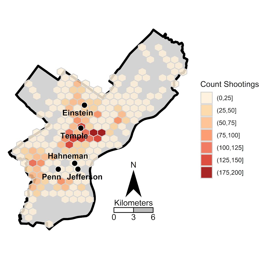
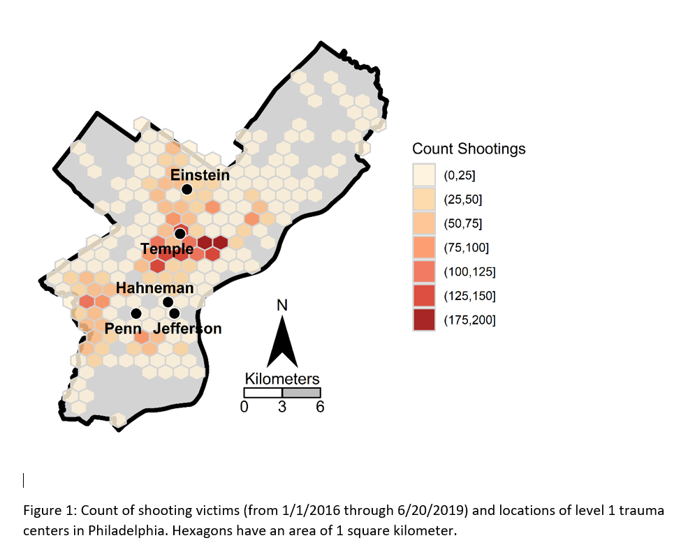
Two tricky parts to this: 1) making the north arrow and scale bar, and 2) figuring out the dimensions to make regular hexagons. As an illustration I use the shooting victim data from Philly (see the working paper for all the details) full data and code to replicate here. I will walk through a bit of it though.

Data Prep

First to start out, I just use these three libraries, and set the working directory to where my data is.

library(ggplot2)
library(rgdal)
library(proj4)
setwd('C:\\Users\\axw161530\\Dropbox\\Documents\\BLOG\\HexagonMap_ggplot\\Analysis')

Now I read in the Philly shooting data, and then an outline of the city that is projected. Note I read in the shapefile data using rgdal, which imports the projection info. I need that to be able to convert the latitude/longitude spherical coordinates in the shooting data to a local projection. (Unless you are making a webmap, you pretty much always want to use some type of local projection, and not spherical coordinates.)

#Read in the shooting data
shoot <- read.csv('shootings.csv')
#Get rid of missing
shoot <- shoot[!is.na(shoot$lng),c('lng','lat')]
#Read in the Philly outline
PhilBound <- readOGR(dsn="City_Limits_Proj.shp",layer="City_Limits_Proj")
#Project the Shooting data
phill_pj <- proj4string(PhilBound)
XYMeters <- proj4::project(as.matrix(shoot[,c('lng','lat')]), proj=phill_pj)
shoot$x <- XYMeters[,1]
shoot$y <- XYMeters[,2]

Making a Basemap

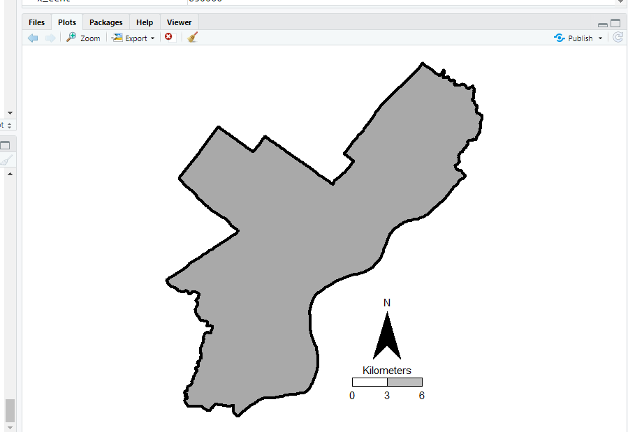
It is a bit of work to make a nice basemap in R and ggplot, but once that upfront work is done then it is really easy to make more maps. To start, the GISTools package has a set of functions to get a north arrow and scale bar, but I have had trouble with them. The ggsn package imports the north arrow as a bitmap instead of vector, and I also had a difficult time with its scale bar function. (I have not figured out the cartography package either, I can’t keep up with all the mapping stuff in R!) So long story short, this is my solution to adding a north arrow and scale bar, but I admit better solutions probably exist.

So basically I just build my own polygons and labels to add into the map where I want. Code is motivated based on the functions in GISTools.

#creating north arrow and scale bar, motivation from GISTools package
arrow_data <- function(xb, yb, len) {
  s <- len
  arrow.x = c(0,0.5,1,0.5,0) - 0.5
  arrow.y = c(0,1.7  ,0,0.5,0)
  adata <- data.frame(aX = xb + arrow.x * s, aY = yb + arrow.y * s)
  return(adata)
}

scale_data <- function(llx,lly,len,height){
  box1 <- data.frame(x = c(llx,llx+len,llx+len,llx,llx),
                     y = c(lly,lly,lly+height,lly+height,lly))
  box2 <- data.frame(x = c(llx-len,llx,llx,llx-len,llx-len),
                     y = c(lly,lly,lly+height,lly+height,lly))
  return(list(box1,box2))
}

x_cent <- 830000
len_bar <- 3000
offset_scaleNum <- 64300
arrow <- arrow_data(xb=x_cent,yb=67300,len=2500)
scale_bxs <- scale_data(llx=x_cent,lly=65000,len=len_bar,height=750)

lab_data <- data.frame(x=c(x_cent, x_cent-len_bar, x_cent, x_cent+len_bar, x_cent),
                       y=c( 72300, offset_scaleNum, offset_scaleNum, offset_scaleNum, 66500),
                       lab=c("N","0","3","6","Kilometers"))

This is about the best I have been able to automate the creation of the north arrow and scale bar polygons, while still having flexibility where to place the labels. But now we have all of the ingredients necessary to make our basemap. Make sure to use coord_fixed() for maps! Also for background maps I typically like making the outline thicker, and then have borders for smaller polygons lighter and thinner to create a hierarchy. (If you don’t want the background map to have any color, use fill=NA.)

base_map <- ggplot() + 
            geom_polygon(data=PhilBound,size=1.5,color='black', fill='darkgrey', aes(x=long,y=lat)) +
            geom_polygon(data=arrow, fill='black', aes(x=aX, y=aY)) +
            geom_polygon(data=scale_bxs[[1]], fill='grey', color='black', aes(x=x, y = y)) + 
            geom_polygon(data=scale_bxs[[2]], fill='white', color='black', aes(x=x, y = y)) + 
            geom_text(data=lab_data, size=4, aes(x=x,y=y,label=lab)) +
            coord_fixed() + theme_void()

#Check it out           
base_map

This is what it looks like on my windows machine in RStudio — it ends up looking alittle different when I export the figure straight to PNG though. Will get to that in a minute.

Making a hexagon map

Now you have your basemap you can superimpose whatever other data you want. Here I wanted to visualize the spatial distribution of shootings in Philly. One option is a kernel density map. I tend to like aggregated count maps though better for an overview, since I don’t care so much for drilling down and identifying very specific hot spots. And the counts are easier to understand than densities.

In geom_hex you can supply a vertical and horizontal parameter to control the size of the hexagon — supplying the same for each does not create a regular hexagon though. The way the hexagon is oriented in geom_hex the vertical parameter is vertex to vertex, whereas the horizontal parameter is side to side.

Here are three helper functions. First, wd_hex gives you a horizontal width length given the vertical parameter. So if you wanted your hexagon to be vertex to vertex to be 1000 meters (so a side is 500 meters), wd_hex(1000) returns just over 866. Second, if for your map you wanted to convert the numbers to densities per unit area, you can use hex_area to figure out the size of your hexagon. Going again with our 1000 meters vertex to vertex hexagon, we have a total of hex_area(1000/2) is just under 650,000 square meters (or about 0.65 square kilometers).

For maps though, I think it makes the most sense to set the hexagon to a particular area. So hex_dim does that. If you want to set your hexagons to a square kilometer, given our projected data is in meters, we would then just do hex_dim(1000^2), which with rounding gives us vert/horz measures of about (1241,1075) to supply to geom_hex.

#ggplot geom_hex you need to supply height and width
#if you want a regular hexagon though, these
#are not equal given the default way geom_hex draws them
#https://www.varsitytutors.com/high_school_math-help/how-to-find-the-area-of-a-hexagon

#get width given height
wd_hex <- function(height){
  tri_side <- height/2
  sma_side <- height/4
  width <- 2*sqrt(tri_side^2 - sma_side^2)
  return(width)
}

#now to figure out the area if you want
#side is simply height/2 in geom_hex
hex_area <- function(side){
  area <- 6 * (  (sqrt(3)*side^2)/4 )
  return(area)
}

#So if you want your hexagon to have a regular area need the inverse function
#Gives height and width if you want a specific area
hex_dim <- function(area){
  num <- 4*area
  den <- 6*sqrt(3)
  vert <- 2*sqrt(num/den)
  horz <- wd_hex(height)
  return(c(vert,horz))
}

my_dims <- hex_dim(1000^2)   #making it a square kilometer
sqrt(hex_area(my_dims[1]/2)) #check to make sure it is square km
#my_dims also checks out with https://hexagoncalculator.apphb.com/

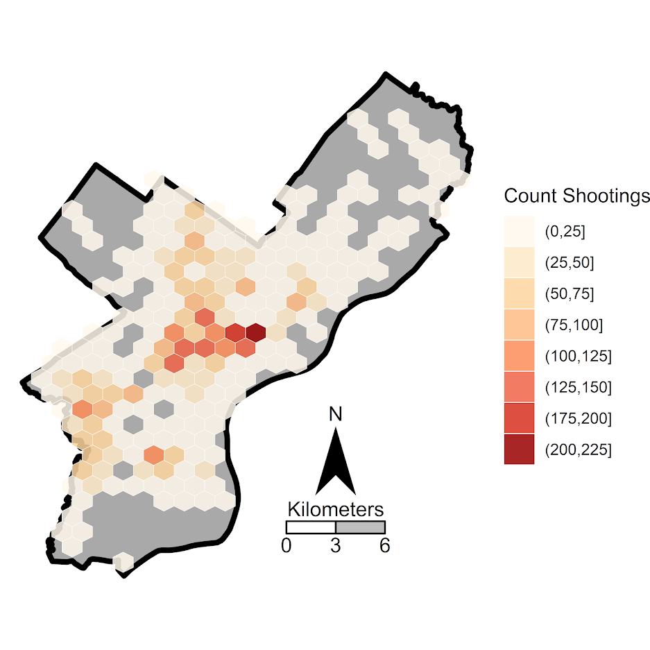
Now onto the good stuff. I tend to think discrete bins make nicer looking maps than continuous fills. So through some trial/error you can figure out the best way to make those via cut. Also I make the outlines for the hexagons thin and white, and make the hexagons semi-transparent. So you can see the outline for the city. I like how by default areas with no shootings are not given any hexagon.

lev_cnt <- seq(0,225,25)
shoot_count <- base_map + 
               geom_hex(data=shoot, color='white', alpha=0.85, size=0.1, binwidth=my_dims, 
                        aes(x=x,y=y,fill=cut(..count..,lev_cnt))) + 
               scale_fill_brewer(name="Count Shootings", palette="OrRd")

We have come so far, now to automate exporting the figure to a PNG file. I’ve had trouble getting journals recently to not bungle vector figures that I forward them, so I am just like going with high res PNG to avoid that hassle. If you render the figure and use the GUI to export to PNG, it won’t be as high resolution, so you can often easily see aliasing pixels (e.g. the pixels in the North Arrow for the earlier base map image).

png('Philly_ShootCount.png', height=5, width=5, units="in", res=1000, type="cairo") 
shoot_count
dev.off()

Note the font size/location in the exported PNG are often not quite exactly as they are when rendered in the RGUI window or RStudio on my windows machine. So make sure to check the PNG file.