Spatial analysis of NYC Shootings using the SPPT

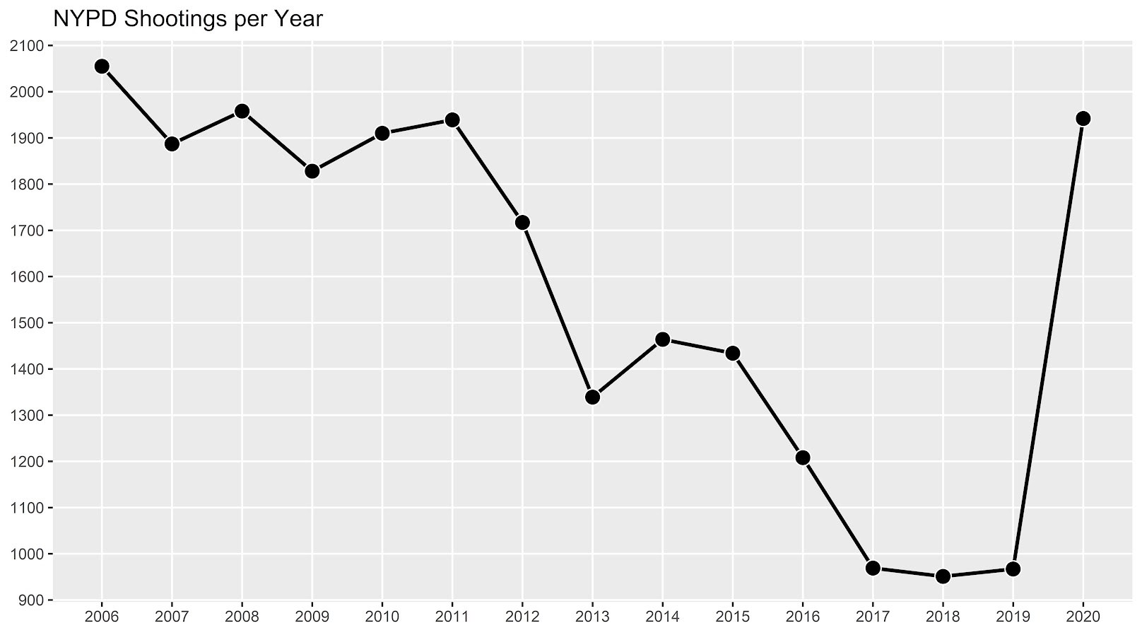
As a follow up to my prior post on spatial sample size recommendations for the SPPT test, I figured I would show an actual analysis of spatial changes in crime. I’ve previously written about how NYC shootings appear to be going up by a similar amount in each precinct. We can do a similar analysis, but at smaller geographic spatial units, to see if that holds true for everywhere.

The data and R code to follow along can be downloaded here. But I will copy-paste below to walk you through.

So first I load in the libraries I will be using and set my working directory:

###################################################
library(sppt)
library(sp)
library(raster)
library(rgdal)
library(rgeos)

my_dir <- 'C:\\Users\\andre\\OneDrive\\Desktop\\NYC_Shootings_SPPT'
setwd(my_dir)
###################################################

Now we just need to do alittle data prep for the NYC data. Concat the old and new files, convert the data fields for some of the info, and do some date manipulation. I choose the pre/post date here March 1st 2020, but also note we had the Floyd protests not to long after (so calling these Covid vs protest increases is pretty much confounded).

###################################################
# Read in the shooting data

old_shoot <- read.csv('NYPD_Shooting_Incident_Data__Historic_.csv', stringsAsFactors=FALSE)
new_shoot <- read.csv('NYPD_Shooting_Incident_Data__Year_To_Date_.csv', stringsAsFactors=FALSE)

# Just one column off
print( cbind(names(old_shoot), names(new_shoot)) )
names(new_shoot) <- names(old_shoot)
shooting <- rbind(old_shoot,new_shoot)

# I need to conver the coordinates to numeric fields
# and the dates to a date field

coord_fields <- c('X_COORD_CD','Y_COORD_CD')
for (c in coord_fields){
  shooting[,c] <- as.numeric(gsub(",","",shooting[,c])) #replacing commas in 2018 data
}

# How many per year to check no funny business
table(substring(shooting$OCCUR_DATE,7,10))

# Making a datetime variable in R
shooting$OCCUR_DATE <- as.Date(shooting$OCCUR_DATE, format = "%m/%d/%Y", tz = "America/New_York")

# Making a post date to split after Covid started
begin_date <- as.Date('03/01/2020', format="%m/%d/%Y")
shooting$Pre <- ifelse(shooting$OCCUR_DATE < begin_date,1,0)

#There is no missing data
summary(shooting)
###################################################

Next I read in a shapefile of the census tracts for NYC. (Pro-tip for NYC GIS data, I like to use Bytes of the Big Apple where available.) The interior has a few dongles (probably for here should have started with a borough outline file), so I do a tiny buffer to get rid of those interior dongles, and then smooth the polygon slightly. To check and make sure my crime data lines up, I superimpose with a tiny dot map — this is also a great/simple way to see the overall shooting density without the hassle of other types of hot spot maps.

###################################################
# Read in the census tract data

nyc_ct <- readOGR(dsn="nyct2010.shp", layer="nyct2010") 
summary(nyc_ct)
plot(nyc_ct)
nrow(nyc_ct) #2165 tracts

# Dissolve to a citywide file
nyc_ct$const <- 1
nyc_outline <- gUnaryUnion(nyc_ct, id = nyc_ct$const)
plot(nyc_outline)

# Area in square feet
total_area <- area(nyc_outline)
# 8423930027

# Turning crimes into spatial point data frame
coordinates(shooting) <- coord_fields
crs(shooting) <- crs(nyc_ct)

# This gets rid of a few dongles in the interior
nyc_buff <- gBuffer(nyc_outline,1,byid=FALSE)
nyc_simpler <- gSimplify(nyc_buff, 500, topologyPreserve=FALSE)

# Checking to make sure everything lines up
png('NYC_Shootings.png',units='in',res=1000,height=6,width=6,type='cairo')
plot(nyc_simpler)
points(coordinates(shooting),pch='.')
dev.off()
###################################################

The next part I created a function to generate a nice grid over an outline area of your choice to do the SPPT analysis. What this does is generates the regular grid, turns it from a raster to a vector polygon format, and then filters out polygons with 0 overlapping crimes (so in the subsequent SPPT test these areas will all be 0% vs 0%, so not much point in checking them for differences over time!).

You can see the logic from the prior blog post, if I want to use the area with power to detect big changes, I want N*0.85. Since I am comparing data over 10 years compared to 1+ years, they are big differences, so I treat N here as 1.5 times the newer dataset, which ends up being around a suggested 3,141 spatial units. Given the area for the overall NYC, this translates to grid cells that are about 1600 by 1600 feet. Once I select out all the 0 grid cells, there only ends up being a total of 1,655 grid cells for the final SPPT analysis.

###################################################
# Function to create sppt grid over areas with 
# Observed crimes

grid_crimes <- function(outline,crimes,size){
    # First creating a raster given the outline extent
    base_raster <- raster(ext = extent(outline), res=size)
    projection(base_raster) <- crs(outline)
    # Getting the coverage for a grid cell over the city area
    mask_raster <- rasterize(outline, base_raster, getCover=TRUE)
    # Turning into a polygon
    base_poly <- rasterToPolygons(base_raster,dissolve=FALSE)
    xy_df <- as.data.frame(base_raster,long=T,xy=T)
    base_poly$x <- xy_df$x
    base_poly$y <- xy_df$y
    base_poly$poly_id <- 1:nrow(base_poly)
    # May also want to select based on layer value
    # sel_poly <- base_poly[base_poly$layer > 0.05,]
    # means the grid cell has more than 5% in the outline area
    # Selecting only grid cells with an observed crime
    ov_crime <- over(crimes,base_poly)
    any_crime <- unique(ov_crime$poly_id)
    sub_poly <- base_poly[base_poly$poly_id %in% any_crime,]
    # Redo the id
    sub_poly$poly_id <- 1:nrow(sub_poly)
    return(sub_poly)
}


# Calculating suggested sample size
total_counts <- as.data.frame(table(shooting$Pre))
print(total_counts)

# Lets go with the pre-total times 1.5
total_n <- total_counts$Freq[1]*1.5

# Figure out the total number of grid cells 
# Given the total area
side <- sqrt( total_area/total_n ) 
print(side)
# 1637, lets just round down to 1600

poly_cells <- grid_crimes(nyc_simpler,shooting,1600)
print(nrow(poly_cells)) #1655

png('NYC_GridCells.png',units='in',res=1000,height=6,width=6,type='cairo')
plot(nyc_simpler)
plot(poly_cells,add=TRUE,border='blue')
dev.off()
###################################################

Next part is to split the data into pre/post, and do the SPPT analysis. Here I use all the defaults, the Chi-square test for proportional differences, along with a correction for multiple comparisons. Without the multiple comparison correction, we have a total of 174 grid cells that have a p-value < 0.05 for the differences in proportions for an S index of around 89%. With the multiple comparison correction though, the majority of those p-values are adjusted to be above 0.05, and only 25 remain afterwards (98% S-index). You can see in the screenshot that all of those significant differences are increases in proportions from the pre to post. While a few are 0 shootings to a handful of shootings (suggesting diffusion), the majority are areas that had multiple shootings in the historical data, they are just at a higher intensity now.

###################################################
# Now lets do the sppt analysis

split_shoot <- split(shooting,shooting$Pre)
pre <- split_shoot$`1`
post <- split_shoot$`0`

library(dplyr)
sppt_diff <- sppt_diff(pre, post, poly_cells)
summary(sppt_diff)

# Unadjusted vs adjusted p-values
sum(sppt_diff$p.value < 0.05) #174, around 89% similarity
sum(sppt_diff$p.adjusted  < 0.05) #25, 98% similarity

# Lets select out the increases/decreases
# And just map those

sig <- sppt_diff$p.adjusted < 0.05
sppt_sig <- sppt_diff[sig,]
head(sppt_sig,25) # to check out all increases
###################################################

The table is not all that helpful though for really digging into patterns, we need to map out the differences. The first here is a map showing the significant grid cells. They are somewhat tiny though, so you have to kind of look close to see where they are. The second map uses proportional circles to the percent difference (so bigger circles show larger increases). I am too lazy to do a legend/scale, but see my prior post on a hexbin map, or the sp website in the comments.

###################################################
# Making a map
png('NYC_SigCells.png',units='in',res=1000,height=6,width=6,type='cairo')
plot(nyc_simpler,lwd=1.5)
plot(sppt_sig,add=TRUE,col='red',border='white')
dev.off()

circ_sizes <- sqrt(-sppt_sig$diff_perc)*3

png('NYC_SigCircles.png',units='in',res=1000,height=6,width=6,type='cairo')
plot(nyc_simpler,lwd=1.5)
points(coordinates(sppt_sig),pch=21,cex=circ_sizes,bg='red')
dev.off() 

# check out https://edzer.github.io/sp/
# For nicer maps/legends/etc.
###################################################

So the increases appear pretty spread out. We have a few notable ones that made the news right in the thick of things in Manhattan, but there are examples of grid cells that increased scattered all over the boroughs. I am not going to the trouble here, but if I were a crime analyst working on this, I would export this to a format where I could zoom into the local areas and drill down into the specific incidents. You can do that either in ArcGIS, or more directly in R by creating a leaflet map.

So if folks have any better ideas for testing out crime increases I am all ears. At some point will give the R package sparr a try. (Here you could treat pre as the controls and post as the cases.) I am not a real big fan of over interpreting changes in kernel density estimates though (they can be quite noisy, and heavily influenced by the bandwidth), so I do like the SPPT analysis by default (but it swaps out a different problem with choosing a reasonable grid cell size).

The spatial dispersion of NYC shootings in 2020

If you had asked me at the start of widespread Covid lockdown measures what the effect would be on crime, I am pretty sure I would have guessed it will make crime go down. Fewer people out and about causes fewer interactions that can lead to a crime. That isn’t how it has shaped up though, quite a few places have seen increases in serious violent crime. One of the most dramatic examples of this is that shootings in NYC doubled from 900 in 2019 to over 1800 in 2020. I am going to show how to generate this chart later via some R code, but it is easier to show than to say. NYPD’s open data on shootings (historical, current) go back to 2006.

I know I am critical on this site of folks overinterpreting crime increases, for example going from 20 to 35 is pretty weak evidence of an increase given the inherent variance for low count Poisson data (a Poisson e-test has a p-value of 0.04 in that case). But going from 900 to 1800 is a much clearer signal.

Jerry Ratcliffe recently posted an R library to do his crime dispersion analysis, so I figured this would be an excellent example use case. The idea behind this analysis is spatial – we know there is a crime increase, but did the increase happen everywhere, or did it just happen in a few locations. Here I am going to use the NYPD shooting data aggregated at the precinct level to test this.

As another note, while I often use micro-spatial units of analysis in my work, this method, along with others (such as the sppt test), are just not going to work out for very low count, very tiny spatial units of analysis. I would suggest offhand to only do this analysis if the spatial units of analysis under study have an average of at least 10 crimes per area in the pre time period. Which is right about on the mark for the precinct analysis in NYC.

Here is the data and R code to follow along, below I will give a walkthrough.

Crime increase dispersion analysis in R

So first as some front matter, I load in my libraries (Jerry’s crimedispersion you can install from github via devtools, see his page for an example), and the function I define here I’ve gone over in a prior blog post of mine as well.

###############################
library(ggplot2)
library(crimedispersion)

# Increase contours, see https://andrewpwheeler.com/2020/02/21/some-additional-plots-to-go-with-crime-increase-dispersion/
make_cont <- function(pre_crime,post_crime,levels=c(-3,0,3),lr=10,hr=max(pre_crime)*1.05,steps=1000){
    #calculating the overall crime increase
    ov_inc <- sum(post_crime)/sum(pre_crime)
    #Making the sequence on the square root scale
    gr <- seq(sqrt(lr),sqrt(hr),length.out=steps)^2
    cont_data <- expand.grid(gr,levels)
    names(cont_data) <- c('x','levels')
    cont_data$inc <- cont_data$x*ov_inc
    cont_data$lines <- cont_data$inc + cont_data$levels*sqrt(cont_data$inc)
    return(as.data.frame(cont_data))
}

my_dir <- 'D:\\Dropbox\\Dropbox\\Documents\\BLOG\\NYPD_ShootingIncrease\\Analysis'
setwd(my_dir)
###############################

Now we are ready to import our data and stack them into a new data frame. (These are individual incident level shootings, not aggregated. If I ever get around to it I will do an analysis of fatality and distance to emergency rooms like I did with the Philly data.)

###############################
# Get the NYPD data and stack it
# From https://data.cityofnewyork.us/Public-Safety/NYPD-Shooting-Incident-Data-Year-To-Date-/5ucz-vwe8
# And https://data.cityofnewyork.us/Public-Safety/NYPD-Shooting-Incident-Data-Historic-/833y-fsy8
# On 2/1/2021
old <- read.csv('NYPD_Shooting_Incident_Data__Historic_.csv', stringsAsFactors=FALSE)
new <- read.csv('NYPD_Shooting_Incident_Data__Year_To_Date_.csv', stringsAsFactors=FALSE)

# Just one column off
print( cbind(names(old), names(new)) )
names(new) <- names(old)
shooting <- rbind(old,new)
###############################

Now we just want to do aggregate counts of these shootings per year and per precinct. So first I substring out the year, then use table to get aggregate counts in R, then make my nice time series graph using ggplot.

###############################
# Create the current year and aggregate
shooting$Year <- substr(shooting$OCCUR_DATE, 7, 10)
year_stats <- as.data.frame(table(shooting$Year))
year_stats$Year <- as.numeric(as.character(year_stats$Var1))
year_plot <- ggplot(data=year_stats, aes(x=Year,y=Freq)) + 
             geom_line(size=1) + geom_point(shape=21, colour='white', fill='black', size=4) +
             scale_y_continuous(breaks=seq(900,2100,by=100)) +
             scale_x_continuous(breaks=2006:2020) +
             theme(axis.title.x=element_blank(), axis.title.y=element_blank(),
                   panel.grid.minor = element_blank()) + 
             ggtitle("NYPD Shootings per Year")

year_plot
# Not quite the same as Petes, https://copinthehood.com/shooting-in-nyc-2020/
###############################

Part of the reason I do this is not because I don’t trust Pete’s analysis, but because I don’t want to embed pictures from someone elses website! So wanted to recreate the time series graph myself. So next up we need to do the same aggregating, but not for the whole city, but by each precinct. You can use the same table method again, but simply pass in additional columns. That gets you the data in long format, so then I reshape it to wide for later analysis (so each row is a single precinct and each column is a yearly count of shootings). (Note there have been some splits in precincts over the years IIRC, I don’t worry about that here, will cause it to be 0,0 in the 2019/2020 data I look at.)

###############################
#Now aggregating to year and precinct
counts <- as.data.frame(table(shooting$Year, shooting$PRECINCT))
names(counts) <- c('Year','PCT','Count')
# Reshape long to wide
count_wide <-  reshape(counts, idvar = "PCT", timevar = "Year", direction = "wide")
###############################

And now we can give Jerry’s package a test run, where you just pass it your variable names.

# Jerrys function for crime increase dispersion
output <- crimedispersion(count_wide, 'PCT', 'Count.2019', 'Count.2020')
output

The way to understand this is in a hypothetical world in which we could reduce shootings in one precinct at a time, we would need to reduce shootings in 57 of the 77 precincts to reduce 2020 shootings to 2019 levels. So this suggests very widespread increases, it isn’t just concentrated among a few precincts.

Another graph I have suggested to explore this, while taking into account the typical variance with Poisson count data, is to plot the pre crime counts on the X axis, and the post crime counts on the Y axis.

###############################
# My example contour with labels
cont_lev <- make_cont(count_wide$Count.2019, count_wide$Count.2020, lr=5)

eq_plot <- ggplot() + 
           geom_line(data=cont_lev, color="darkgrey", linetype=2, 
                     aes(x=x,y=lines,group=levels)) +
           geom_point(data=count_wide, shape = 21, colour = "black", fill = "grey", size=2.5, 
                      alpha=0.8, aes(x=Count.2019,y=Count.2020)) +
           scale_y_continuous(breaks=seq(0,140,by=10) +
           scale_x_continuous(breaks=seq(0,70,by=5)) +
           coord_cartesian(ylim = c(0, 140)) +
           xlab("2019 Shootings Per Precinct") + ylab("2020 Shootings")
eq_plot
###############################

The contour lines show the hypothesis that crime increased (by around 100% here). So if a point is near the middle line, it follows that doubled mark almost exactly. The upper/lower lines indicate the typical variance, which is a very good fit to the data here you can see. Very few points are outside the boundaries.

Both of these analyses point to the fact that shooting increases were widespread across NYC precincts. Pretty much everywhere doubled in the number of shootings, it is just some places had a larger baseline to double than others (and the data has some noise, you can pick out some places that did not increase if you cherry pick the data).

And as a final R note, if you want to save these graphs as a nice high resolution PNG, here is an example with Jerry’s dispersion object:

# Saving dispersion plot as a high res PNG
png(file = "ODI.png", bg = "transparent", height=5, width=9, units="in", res=1000, type="cairo")
output #this is the object from Jerrys crimedispersion() function earlier
dev.off()

Going forward I am wondering if there is a good way to do spatial monitoring for crime data like this, like some sort of control chart that takes into account both space and time. So isn’t retrospective a year later recap, but in near real time identify spatial increases.

Other References of Interest

  • Justin Nix & company have a few blog posts looking at NYC data as well. In the first they talk about the variance in cities, many are up but several are down as well in violence. A later post though updated with the clear increase in shootings in NYC.
  • There are too many papers at this point for me to do a bibliography of all the Covid and crime updates, but two open examples are Matt Ashby did a paper on several US cities, and Campedelli et al have an analysis of Chicago. Each show variance again, so no universal up or down in trends, but various examples of increases or decreases both between cities and between different crime types within a city.

The Failed Idea Bin: Temporal Aggregation and the Crime/Stop Relationship

A recent paper by the Hipp/Kim/Wo trio analyzing robbery at very fine temporal scales in NYC reminded me on a failed project I never quite worked out to completion. This project was about temporal aggregation bias. We talk about spatial aggregation bias quite a bit, which I actually don’t think is that big of deal for many projects (for reasons discussed in my dissertation).

I think it is actually a bigger deal though when dealing with temporal relationships, especially when we are considering endogenous relationships between crime and police action in response to crime. This is because they are a countervailing endogenous relationship – most endogenous relationships are positively correlated, but here we think police do more stuff (like arrests and stops) in areas with more crime, and that crime falls in response.

I remember the first time I thought about the topic was when I was working with the now late Dennis Smith and Robert Purtell as a consultant for the SQF litigation in NYC. Jeff Fagan had some models predicting the number of stops in an area, conditional on crime and demographic factors at the quarterly level. Dennis and Bob critiqued this as not being at the right temporal aggregation – police respond to crime patterns much faster than at the quarterly level. So Jeff redid his models at the monthly level and found the exact same thing as he did at the quarterly level. This however just begs the question of whether monthly is the appropriate temporal resolution.

So to try to tackle the problem I took the same approach as I did for my dissertation – I pretend I know what the micro level equation looks like, and then aggregate it up, and see what happens. So I start with two endogenous equations:

crime_t1 = -0.5*(stops_t0) + e_c
stops_t1 =  0.5*(crime_t0) + e_s

And then aggregation is just a sum of the micro level units:

Crime_T = (crime_t1 + crime_t0)
Stops_T = (stops_t1 + stops_t0)

And then what happens when we look at the aggregate relationship?

Crime_T = Beta*(Stops_T)

Intuitively here you may see where this is going. Since crime and stops have the exact same countervailing effects on each other, they cancel out if you aggregate up one step. I however show in the paper if you aggregate up more than two temporal units in this situation the positive effect wins. The reason is that back substitution for prior negative time series relationships oscillates (so a negative covariance at t-1 is a positive covariance at t-2). And in the aggregate the positive swamps the negative relationship. Even estimating Crime_T = Beta*(Stops_T-1) does not solve the problem. These endogenous auto-regressive relationships actually turn into an integrated series quite quickly (a point that cannot be credited to me, Clive Granger did a bunch of related work).

So this presented a few hypotheses. One, since I think short run effects for stops and crime are more realistic (think the crackdown literature), the covariance between them at higher resolutions (say monthly) should be positive. You should only be able to recover the deterrent effect of stops at very short temporal aggregations I think. Also crime and stops should be co-integrated at large temporal aggregations of a month or more.

Real life was not so convenient for me though. Here I have the project data and code saved. I have the rough draft of the theoretical aggregation junk here for those interested. Part of the reason this is in the failed idea bin is that neither of my hypotheses appears to be true with the actual crime and stop data. For the NYC citywide data I broke up stops into radio-runs and not-radio-runs (less discretion for radio runs, but still should have similar deterrent effects), and crimes as Part 1 Violent, Part 1 Non-Violent, and Part 2. More recently I handed it off to Zach Powell, and he ran various vector auto-regression models at the monthly/weekly/daily/hourly levels. IIRC it was pretty weak sauce evidence that stops at the lower temporal aggregations showed greater evidence of reducing crime.

There of course is a lot going on that could explain the results. Others have found deterrent effects using instrumental variable approaches (such as David Greenberg’s work using Arellano-Bond, or Wooditch/Weisburd using Bartik instruments). So maybe my idea that spatial aggregation does not matter is wrong.

Also there is plenty of stuff going on specifically in NYC. We had the dramatic drop in stops due to the same litigation. Further work by MacDonald/Fagan/Geller have shown stops that met a higher reasonable suspicion standard based on the reported data have greater effects than others (essentially using Impact zones as an instrument there).

So it was a question I was never able to figure out – how to correctly identify the right temporal unit to examine crime and deterrence from police action.