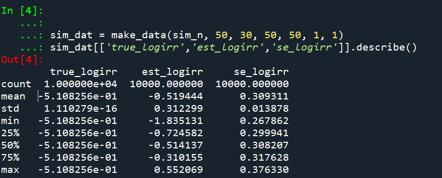
Ian Adam’s posted a working paper the other day on power analysis for analyzing counts, Power Simulations of Rare Event Counts and Introduction to the ‘Power Lift’ Metric (Adams, 2024). I have a few notes I wanted to make in regards to Ian’s contribution. Nothing I say conflicts with what he writes, moreso just the way I have thought about this problem. It is essentially the same issue as I have written about monitoring crime trends (Wheeler, 2016), or examining quasi-experimental designs with count data (Wheeler & Ratcliffe, 2018; Wilson, 2022).
I am going to make two broader points here: point 1, power is solely a property of the aggregate counts in treated vs control, you don’t gain power by simply slicing your data into finer temporal time periods. Part 2 I show an alternative to power, called minimum detectable effect sizes. This focuses more on how wide your confidence intervals are, as opposed to power (which as Ian shows is not monotonic). I think it is easier to understand the implications of certain designs when approached this way – both from “I have this data, what can I determine from it” (a retrospective quasi-experimental design), as well as “how long do I need to let this thing cook to determine if it is effective”. Or more often “how effective can I determine this thing is in a reasonable amount of time”.
Part 1, Establishing it is all about the counts
So lets say you have a treated and control area, where the base rate is 10 per period (control), and 8 per period (treated):
##########
set.seed(10)
n <- 20 # time periods
reduction <- 0.2 # 20% reduced
base <- 10

control <- rpois(n,base)
treat <- rpois(n,base*(1-reduction))

print(cbind(control,treat))
##########
And this simulation produces 20 time periods with values below:
 [1,]      10     6
 [2,]       9     5
 [3,]       5     3
 [4,]       8     8
 [5,]       9     5
 [6,]      10    10
 [7,]      10     7
 [8,]       9    13
 [9,]       8     6
[10,]      13     8
[11,]      10     6
[12,]       8     8
[13,]      11     8
[14,]       7     8
[15,]      10     7
[16,]       6     8
[17,]      12     3
[18,]      15     5
[19,]      10     8
[20,]       7     7
Now we can fit a Poisson regression model, simply comparing treated to control:
##########
outcome <- c(control,treat)
dummy <- rep(0:1,each=n)

m1 <- glm(outcome ~ dummy,family=poisson)
summary(m1)
###########
Which produces:
Call:
glm(formula = outcome ~ dummy, family = poisson)

Deviance Residuals:
     Min        1Q    Median        3Q       Max
-1.69092  -0.45282   0.01894   0.38884   2.04485

Coefficients:
            Estimate Std. Error z value Pr(>|z|)
(Intercept)  2.23538    0.07313  30.568  < 2e-16 ***
dummy       -0.29663    0.11199  -2.649  0.00808 **
---
Signif. codes:  0 '***' 0.001 '**' 0.01 '*' 0.05 '.' 0.1 ' ' 1

(Dispersion parameter for poisson family taken to be 1)

    Null deviance: 32.604  on 39  degrees of freedom
Residual deviance: 25.511  on 38  degrees of freedom
AIC: 185.7

Number of Fisher Scoring iterations: 4
In this set of data, the total treated count is 139, and the total control count is 187. Now watch what happens when we fit a glm model on the aggregated data, where we just now have 2 rows of data?
##########
agg <- c(sum(treat),sum(control))
da <- c(1,0)
m2 <- glm(agg ~ da,family=poisson)
summary(m2)
##########
And the results are:
Call:
glm(formula = agg ~ da, family = poisson)

Deviance Residuals:
[1]  0  0

Coefficients:
            Estimate Std. Error z value Pr(>|z|)
(Intercept)  5.23111    0.07313  71.534  < 2e-16 ***
da          -0.29663    0.11199  -2.649  0.00808 **
---
Signif. codes:  0 '***' 0.001 '**' 0.01 '*' 0.05 '.' 0.1 ' ' 1

(Dispersion parameter for poisson family taken to be 1)

    Null deviance: 7.0932e+00  on 1  degrees of freedom
Residual deviance: 9.5479e-15  on 0  degrees of freedom
AIC: 17.843

Number of Fisher Scoring iterations: 2
Notice how the treatment effect coefficients and standard errors are the exact same results as they are with the micro observations. This is something people who do regression models often do not understand. Here you don’t gain power by having more observations, power in the Poisson model is determined by the total counts of things you have observed.
If this were not the case, you could just slice observations into finer time periods and gain power. Instead of counts per day, why not per hour? But that isn’t how it works when using Poisson research designs. Counter-intuitive perhaps, you get smaller standard errors when you observe higher counts.
It ends up being the treatment effect estimate in this scenario is easy to calculate in closed form. This is just riffing off of David Wilson’s work (Wilson, 2022).
treat_eff <- log(sum(control)/sum(treat))
treat_se <- sqrt(1/sum(control) + 1/sum(treat))
print(c(treat_eff,treat_se))
Which produces [1] 0.2966347 0.1119903.
For scenarios in which are slightly more complicated, such as treated/control have different number of periods, you can use weights to get the same estimates. Here for example we have 25 periods in treated and 19 periods in the control using the regression approach.
# Micro observations, different number of periods
treat2 <- rpois(25,base*(1 - reduction))
cont2 <- rpois(19,base)
val2 <- c(treat2,cont2)
dum2 <- c(rep(1,25),rep(0,19))
m3 <- glm(val2 ~ dum2,family=poisson)

# Aggregate, estimate rates
tot2 <- c(sum(treat2),sum(cont2))
weight <- c(25,19)
rate2 <- tot2/weight
tagg2 <- c(1,0)
# errors for non-integer values is fine
m4 <- glm(rate2 ~ tagg2,weights=weight,family=poisson)
print(vcov(m3)/vcov(m4)) # can see these are the same estimates
summary(m4)
Which results in:
>print(vcov(m3)/vcov(m4)) # can see these are the same estimates
            (Intercept)      dum2
(Intercept)   0.9999999 0.9999999
dum2          0.9999999 0.9999992
>summary(m4)

Call:
glm(formula = rate2 ~ tagg2, family = poisson, weights = weight)

Deviance Residuals:
[1]  0  0

Coefficients:
            Estimate Std. Error z value Pr(>|z|)
(Intercept)  2.36877    0.07019  33.750  < 2e-16 ***
tagg2       -0.38364    0.10208  -3.758 0.000171 ***
---
Signif. codes:  0 '***' 0.001 '**' 0.01 '*' 0.05 '.' 0.1 ' ' 1
The treatment effect estimate is similar, where the variance is still dictated by the counts.
treat_rate <- log(rate2[1]/rate2[2])
treat_serate <- sqrt(sum(1/tot2))
print(c(treat_rate,treat_serate))
Which again is [1] -0.3836361 0.1020814, same as the regression results.
Part 2, MDEs
So Ian’s paper has simulation code to determine power. You can do infinite sums with the Poisson distribution to get closer to closed form estimates, like the e-test does in my ptools package. But the simulation approach is fine overall, so just use Ian’s code if you want power estimates.
The way power analysis works, you pick an effect size, then determine the study parameters to be able to detect that effect size a certain percentage of the time (the power, typically set to 0.8 for convenience). An alternative way to think about the problem is how variable will your estimates be? You can then back out the minimum detectable effect size (MDE), given those particular counts. (Another way people talk about this is plan for precision in your experiment.)
Lets do a few examples to illustrate. So say you wanted to know if training reduced conducted energy device (CED) deployments. You are randomizing different units of the city, so you have treated and control. Baseline rates are around 5% per arrest, and say you have 10 arrests per day in each treated/control arm of the study. Around 30 days, you will have ~15 CED usages. Subsequently the standard error of the logged incident rate ratio will be approximately sqrt(1/15 + 1/15) = 0.37. Thus, the smallest effect size you could detect has to be a logged incident rate ratio pretty much double that value.
Presumably we think the intervention will decrease CED uses, so we are looking at an IRR of exp(-0.37*2) = 0.48. So you pretty much need to cut CED usage in half to be able to detect if the intervention worked when only examining the outcomes for one month. (The 2 comes from using a 95% confidence interval.)
If we say we think best case the intervention had a 20% reduction in CED usage, we would then need exp(-se*2) = 0.8. log(0.8) ~ -0.22, so we need a standard error of se = 0.11 to meet this minimum detectable effect. If we have equal counts in each arm, this is approximately sqrt(1/x + 1/x) = 0.11, with rearranging we get 0.11^2 = 2*(1/x), and then 2/(0.11^2) = x = 166. So we want over 160 events in each treated/control group, to be able to detect a 20% reduction.
Now lets imagine a scenario in which one of the arms is fixed, such as retrospective analysis. (Say the control group is prior time periods before training, and 100% of the patrol officers gets the training.) So we have fixed 100 events in the control group, in that scenario, we need to monitor our treatment until we observe sqrt(1/x + 1/100) = 0.11, that 20% reduction standard. We can rearrange this to be 0.11^2 - 1/100 = 1/x, which is x = 1/0.0021 = 476.
When you have a fixed background count, in either in a treated or control arm, that pretty much puts a lower bound on the standard error. In this case with the control arm that has a fixed 100 events, the standard error can never be smaller than sqrt(1/100) = 0.1. So in that case, you can never detect an effect smaller than exp(-0.2).
Another way to think about this is that with smaller effect sizes, you can approximately translate the standard errors to percent point ranges. So if you want to say plan for precision estimates of around +/- 5% – that is a standard error of 0.05. We are going to need sqrt(z) ~ 0.05. At a minimum we need 400 events in one of the treated or control arms, since sqrt(1/400) = 0.05 (and that is only taking into account one of the arms).
For those familiar with survey stats, these are close to the same sample size recommendation for proportions – it is just instead of total sample size, it is the total counts we are interested in. E.g. if you want +/- 5% for sample proportions, you want around 1,000 observations.
And most of the examples of more complicated research designs (e.g. fixed or random effects, overdispersion estimates) will likely make the power lower, not higher, than the back of the envelope estimates here. But they should be a useful starting to know whether a particular experimental design is dead in the water to detect reasonable effect sizes of interest.
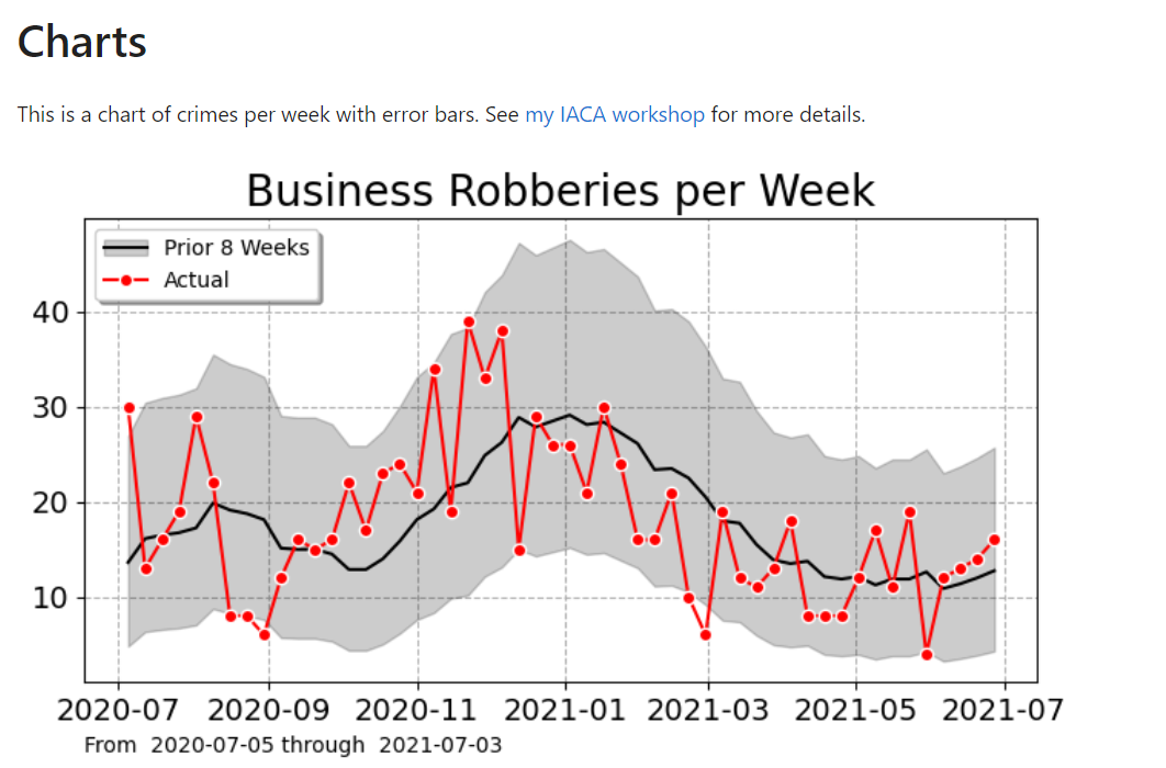
If you found this interesting, you will probably find my work on continuous monitoring of crime trends over time also interesting:
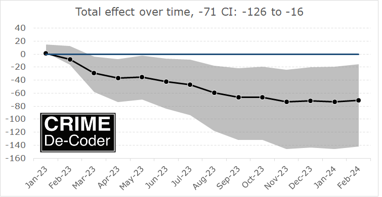
This approach relies on very similar Poisson models to what Ian is showing here, you just monitor the process over time and draw the error intervals as you go. For low powered designs, the intervals will just seem hopelessly wide over time.
References
-
Adams, I. (2024) Power Simulations of Rare Event Counts and Introduction to the ‘Power Lift’ Metric. CrimRxiv
-
Blattman, C., Green, D., Ortega, D., & Tobón, S. (2018). Place-based interventions at scale: The direct and spillover effects of policing and city services on crime (No. w23941). National Bureau of Economic Research.
-
Wheeler, A. P. (2016). Tables and graphs for monitoring temporal crime trends: Translating theory into practical crime analysis advice. International Journal of Police Science & Management, 18(3), 159-172.
-
Wheeler, A.P., & Ratcliffe, J.H. (2018). A simple weighted displacement difference test to evaluate place based crime interventions. Crime Science, 7(1), 11.
-
Wilson, D. B. (2022). The relative incident rate ratio effect size for count-based impact evaluations: When an odds ratio is not an odds ratio. Journal of Quantitative Criminology, 38(2), 323–34.