Making aoristic density maps in R

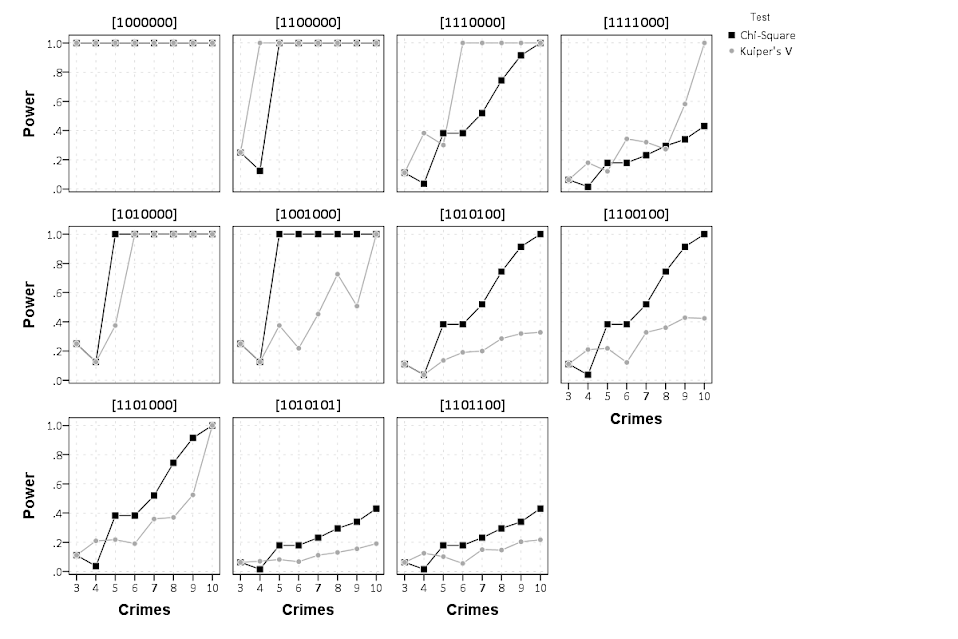
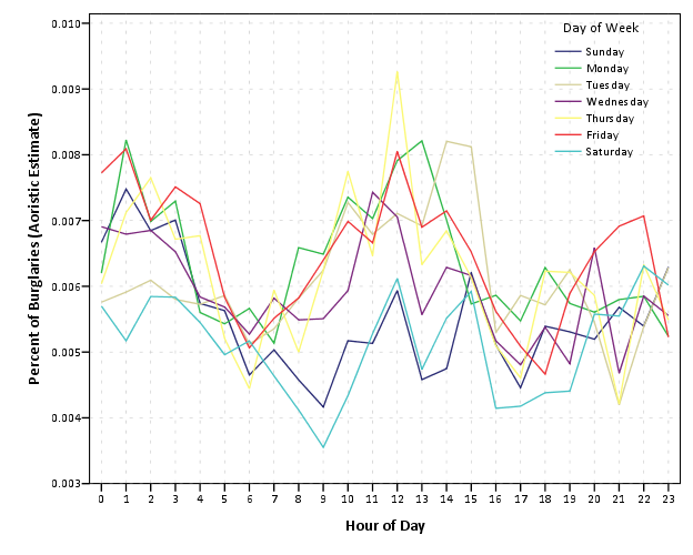
I saw Jerry the other day made/updated an R package to do aoristic analysis. A nice part of this is that it returns the weights breakdown for individual cases, which you can then make maps of. My goto hot spot map for data visualization, kernel density maps, are a bit tough to work with weighted data though in R (tough is maybe not the right word, to use ggplot it takes a bit of work leveraging other packages). So here are some notes on that.

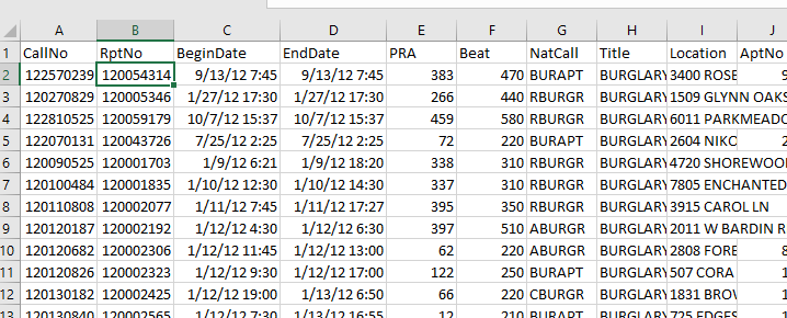
I have provided the data/code here. It is burglaries in Dallas, specifically I filter out just for business burglaries.

R Code Snippet

First, for my front end I load the libraries I will be using, and change the working directory to where my data is located.

############################
library(aoristic) #aoristic analysis 
library(rgdal)    #importing spatial data
library(spatstat) #weighted kde
library(raster)   #manipulate raster object
library(ggplot2)  #for contour graphs
library(sf)       #easier to plot sf objects

my_dir <- "D:\\Dropbox\\Dropbox\\Documents\\BLOG\\aoristic_maps_R\\data_analysis"
setwd(my_dir)
############################

Next I just have one user defined function, this takes an input polygon (the polygon that defines the borders of Dallas here), and returns a raster grid covering the bounding box. It also have an extra data field, to say whether the grid cell is inside/outside of the boundary. (This is mostly convenient when creating an RTM style dataset to make all the features conform to the same grid cells.)

###########################
#Data Manipulation Functions

#B is border, g is size of grid cell on one side
BaseRaster <- function(b,g){
    base_raster <- raster(ext = extent(b), res=g)
    projection(base_raster) <- crs(b)
    mask_raster <- rasterize(b, base_raster, getCover=TRUE) #percentage of cover, 0 is outside
    return(mask_raster)
}
###########################

The next part I grab the datasets I will be using, a boundary file for Dallas (in which I chopped off the Lochs, so will not be doing an analysis of boat house burglaries today), and then the crime data. R I believe you always have to convert date-times when reading from a CSV (it never smartly infers that a column is date/time). And then I do some other data fiddling – Jerry has a nice function to check and make sure the date/times are all in order, and then I get rid of points outside of Dallas using the sp over function. Finally the dataset is for both residential/commercial, but I just look at the commercial burglaries here.

###########################
#Get the datasets

#Geo data
boundary <- readOGR(dsn="Dallas_MainArea_Proj.shp",layer="Dallas_MainArea_Proj")
base_Dallas <- BaseRaster(b=boundary,g=200) 
base_df <- as.data.frame(base_Dallas,long=TRUE,xy=TRUE)

#Crime Data
crime_dat <- read.csv('Burglary_Dallas.csv', stringsAsFactors=FALSE)
#prepping time fields
crime_dat$Beg <- as.POSIXct(crime_dat$StartingDateTime, format="%m/%d/%Y %H:%M:%OS")
crime_dat$End <- as.POSIXct(crime_dat$EndingDateTime, format="%m/%d/%Y %H:%M:%OS")

#cleaning up data
aor_check <- aoristic.datacheck(crime_dat, 'XCoordinate', 'YCoordinate', 'Beg', 'End')
coordinates(crime_dat) <- crime_dat[,c('XCoordinate', 'YCoordinate')]
crs(crime_dat) <- crs(boundary)
over_check <- over(crime_dat, boundary)
keep_rows <- (aor_check$aoristic_datacheck == 0) & (!is.na(over_check$city))
crime_dat_clean <- crime_dat[keep_rows,]

#only look at business burgs to make it go abit faster
busi_burgs <- crime_dat_clean[ crime_dat_clean$UCROffense == 'BURGLARY-BUSINESS', ]
###########################

The next part preps the aoristic weights. First, the aoristic.df function is from Jerry’s aoristic package. It returns the weights broken down by 168 hours per day of the week. Here I then just collapse across the weekdays into the same hour, which to do that is simple, just add up the weights.

After that it is some more geographic data munging using the spatstat package to do the heavy lifting for the weighted kernel density estimate, and then stuffing the result back into another data frame. My bandwidth here, 3000 feet, is a bit large but makes nicer looking maps. If you do this smaller you will have a more bumpy and localized hot spots in the kernel density estimate.

###########################
#aoristic weights

#This takes like a minute
res_weights <- aoristic.df(busi_burgs@data, 'XCoordinate', 'YCoordinate', 'Beg', 'End')

#Binning into same hourly bins
for (i in 1:24){
    cols <- (0:6*24)+i+5
    lab <- paste0("Hour",i)
    res_weights[,c(lab)] <- rowSums(res_weights[,cols])
}

#Prepping the spatstat junk I need
peval <- rasterToPoints(base_Dallas)[,1:2]
spWin <- as.owin(as.data.frame(peval))
sp_ppp <- as.ppp(res_weights[,c('x_lon','y_lat')],W=spWin) #spp point pattern object

#Creating a dataframe with all of the weighted KDE
Hour_Labs <- paste0("Hour",1:24)

for (h in Hour_Labs){
  sp_den <- density.ppp(sp_ppp,weights=res_weights[,c(h)],
                        sigma=3000,
                        edge=FALSE,warnings=FALSE)
  sp_dat <- as.data.frame(sp_den)
  kd_raster <- rasterFromXYZ(sp_dat,res=res(base_Dallas),crs=crs(base_Dallas))
  base_df[,c(h)] <- as.data.frame(kd_raster,long=TRUE)$value
}
###########################

If you are following along, you may be wondering why all the hassle? It is partly because I want to use ggplot to make maps, but for its geom_contour it does not except weights, so I need to do the data manipulation myself to supply ggplot the weighted data in the proper format.

First I turn my Dallas boundary into a simple feature sf object, then I create my filled contour graph, supplying the regular grid X/Y and the Z values for the first Hour of the day (so between midnight and 1 am).

###########################
#now making contour graphs

dallas_sf <- st_as_sf(boundary)

#A plot for one hour of the day
hour1 <- ggplot() + 
  geom_contour_filled(data=base_df, aes(x, y, z = Hour1), bins=9) +
  geom_sf(data=dallas_sf, fill=NA, color='black') +
  scale_fill_brewer(palette="Greens") +
  ggtitle('       Hour [0-1)') + 
  theme_void() + theme(legend.position = "none")
hour1

png('Hour1.png', height=5, width=5, units="in", res=1000, type="cairo") 
hour1
dev.off()
###########################

Nice right! I have in the code my attempt to make a super snazzy small multiple plot, but that was not working out so well for me. But you can then go ahead and make up other slices if you want. Here is an example of taking an extended lunchtime time period.

###########################
#Plot for the afternoon time period
base_df$Afternoon <- rowSums(base_df[,paste0("Hour",10:17)])

afternoon <- ggplot() + 
  geom_contour_filled(data=base_df, aes(x, y, z = Afternoon), bins=9) +
  geom_sf(data=dallas_sf, fill=NA, color='black') +
  scale_fill_brewer(palette="Greens") +
  ggtitle('       Hour [9:00-17:00)') + 
  theme_void() + theme(legend.position = "none")
afternoon
###########################

So you can see that the patterns only slightly changed compared to the midnight prior graph.

Note that these plots will have different breaks, but you could set them to be equal by simply specifying a breaks argument in the geom_contour_filled call.

I will leave it up so someone who is more adept at R code than me to make a cool animated viz over time from this. But that is a way to mash up the temporal weights in a map.

Aoristic analysis for hour of day and day of week in Excel

I’ve previously written code to conduct Aoristic analysis in SPSS. Since this reaches about an N of three crime analysts (if that even), I created an Excel spreadsheet to do the calculations for both the hour of the day and the day of the week in one go.

Note if you simply want within day analysis, Joseph Glover has a nice spreadsheet with VBA functions to accomplish that. But here I provide analysis for both the hour of the day and the day of the week. Here is the spreadsheet and some notes, and I will walk through using the spreadsheet below.

First off, you need your data in Excel to be BeginDateTime and EndDateTime — you cannot have the dates and times in separate fields. If you do have them in separate fields, if they are formatting correctly you can simply add your date field to your hour field. If you have the times in three separate date, hour, and minute fields, you can do a formula like =DATE + HOUR/24 + MINUTE/(60*24) to create the combined datetime field in Excel (excel stores a single date as one integer).

Presumably at this stage you should fix your data if it has errors. Do you have missing begin/end times? Some police databases when there is an exact time treat the end date time as missing — you will want to fix that before using this spreadsheet. I constructed the spreadsheet so it will ignore missing cells, as well as begin datetimes that occur after the end datetime.

So once your begin and end times are correctly set up, you can copy paste your dates into my Aoristic_HourWeekday.xlsx excel spreadsheet to do the aoristic calculations. If following along with my data I posted, go ahead and open up the two excel files in the zip file. In the Arlington_Burgs.xlsx data select the B2 cell.

Then scroll down to the bottom of the sheet, hold Shift, and then select the D3269 cell. That should highlight all of the data you need. Right-click, and the select Copy (or simply Ctrl + C).

Now migrate over to the Aoristic_HourWeekday.xlsx spreadsheet, and paste the data into the first three columns of the OriginalData sheet.

Now go to the DataConstructed sheet. Basically we need to update the formulas to recognize the new rows of data we just copied in. So go ahead and select the A11 to MI11 row. (Note there are a bunch of columns hidden from view).

Now we have a few over 3,000 cases in the Arlington burglary data. Grab the little green square in the lower right hand part of the selected cells, and then drag down the formulas. With your own data, you simply want to do this for as many cases as you have. If you go past your total N it is ok, it just treats the extra rows like missing data. This example with 3,268 cases then takes about a minute to crunch all of the calculations.

If you navigate to the TimeIntervals sheet, this is where the intervals are actually referenced, but I also place several summary statistics you might want to check out. The Total N shows that I have 3,268 good rows of data (which is what I expected). I have 110 missing rows (because I went over), and zero rows that have the begin/end times switched. The total proportion should always equal 1 — if it doesn’t I’ve messed up something — so please let me know!

Now the good stuff, if you navigate to the NiceTables_Graphs sheet it does all the summaries that you might want. Considering it takes awhile to do all the calculations (even for a tinier dataset of 3,000 cases), if you want to edit things I would suggest copying and pasting the data values from this sheet into another one, to avoid redoing needless calculations.

Interpreting the graphs you can see that burglaries in this dataset have a higher proportion of events during the daytime, but only on weekdays. Basically what you would expect.

Personally I would always do this analysis in SPSS, as you can make much nicer small multiple graphs than Excel like below. Also my SPSS code can split the data between different subsets. This particular Excel code you would just need to repeat for whatever subset you are interested in. But a better Excel sleuth than me can likely address some of those critiques.

One minor additional note on this is that Jerry’s original recommendation rounded the results. My code does proportional allocation. So if you have an interval like 00:50 TO 01:30, it would assign the [0-1] hour as 10/40, and [1-2] as 30/40 (original Jerry’s would be 50% in each hour bin). Also if you have an interval that is longer than the entire week, I simply assign equal ignorance to each bin, I don’t further wrap it around.

Stacking Intervals

Motivated by visualizing overlapping intervals from the This is not Rocket Science blog (by Valentine Svensson) (updated link here) I developed some code in SPSS to accomplish a similar feat. Here is an example plot from the blog:

It is related to a graph I attempted to make for visualizing overlap in crime events and interval censored crime data is applicable. The algorithm I mimic by Valentine here is not quite the same, but similar in effect. Here is the macro I made to accomplish this in SPSS. (I know I could also use the python code by the linked author directly in SPSS.)

DEFINE !StackInt (!POSITIONAL = !TOKENS(1)
                 /!POSITIONAL = !TOKENS(1) 
                 /Fuzz = !DEFAULT("0") !TOKENS(1) 
                 /Out = !DEFAULT(Y) !TOKENS(1) 
                 /Sort = !DEFAULT(Y) !TOKENS(1) 
                 /TempVals = !DEFAULT(100) !TOKENS(1) )
!IF (!Sort = "Y") !THEN
SORT CASES BY !1 !2.
!IFEND
VECTOR #TailEnd(!TempVals).
DO IF ($casenum = 1).  
  COMPUTE #TailEnd(1) = End + !UNQUOTE(!Fuzz).
  COMPUTE !Out = 1.
  LOOP #i = 2 TO !TempVals.
    COMPUTE #TailEnd(#i) = Begin-1.
  END LOOP.
ELSE.
  DO REPEAT i = 1 TO !TempVals /T = #TailEnd1 TO !CONCAT("#TailEnd",!TempVals).
    COMPUTE T = LAG(T).
    DO IF (Begin > T AND MISSING(Y)).
      COMPUTE T = End + !UNQUOTE(!Fuzz).
      COMPUTE !Out = i.
    END IF.
  END REPEAT.
END IF.
FORMATS !Out !CONCAT("(F",!LENGTH(!TempVals),".0)").
FREQ !Out /FORMAT = NOTABLE /STATISTICS = MAX.
!ENDDEFINE.

An annoyance for this is that I need to place the ending bins in a preallocated vector. Since you won’t know how large the offset values are to begin with, I default to 100 values. The function prints a set of frequencies after the command though (which forces a data pass) and if you have missing data in the output you need to increase the size of the vector.

One simple addition I made to the code over the original is what I call Fuzz in the code above. What happens for crime data is that there are likely to be many near overlaps in addition to many crimes that have an exact known time. What the fuzz factor does is displaces the lines if they touch within the fuzz factor. E.g. if you had two intervals, (1,3) and (3.5,5), if you specified a fuzz factor of 1 the second interval would be placed on top of the first, even though they don’t exactly overlap. This appears to work reasonably well for both small and large n in some experimentation, but if you use too large a fuzz factor it will produce river like runs through the overlap histogram.

Here is an example of using the macro with some fake data.

SET SEED 10.
INPUT PROGRAM.
LOOP #i = 1 TO 1000.
  COMPUTE Begin = RV.NORMAL(50,15).
  COMPUTE End = Begin + EXP(RV.GAMMA(1,2)).
  END CASE.
END LOOP.
END FILE.
END INPUT PROGRAM.

!StackInt Begin End Fuzz = "1" TempVals = 101.

GGRAPH
  /GRAPHDATASET NAME="graphdataset" VARIABLES=Begin End Mid
  /GRAPHSPEC SOURCE=INLINE.
BEGIN GPL
  SOURCE: s=userSource(id("graphdataset"))
  DATA: End=col(source(s), name("End"))
  DATA: Begin=col(source(s), name("Begin"))
  DATA: Y=col(source(s), name("Y"), unit.category())
  GUIDE: axis(dim(1))
  GUIDE: axis(dim(2), null())
  ELEMENT: edge(position((End+Begin)*Y))
END GPL.

And here is the graph:

Using the same burglary data from Arlington I used for my aoristic macro, here is an example plot for a few over 6,300 burglaries in Arlington in 2012 using a fuzz factor of 2 days.

This is somewhat misleading, as events with a known exact time are not given any area in the plot. Here is the same plot but with plotting the midpoint of the line as a circle over top of the edge.

You can also add in other information to the plot. Here I color edges and points according to the beat that they are in.

It produces a pretty plot, but it is difficult to discern any patterns. I imagine this plot would be good to evaluate when there is the most uncertainty in crime reports. I might guess if I did this type of plot with burglaries after college students come back from break you may see a larger number of long intervals, showing that they have large times of uncertainty. It is difficult to see any patterns in the Arlington data though besides more events in the summertime (which an aoristic chart would have shown to begin with.) At the level of abstraction of over a year I don’t think you will be able to spot any patterns (like with certain days of the week or times of the month).

I wonder if this would be useful for survival analysis, in particular to spot any temporal or cohort effects.

New paper – Testing for Randomness in Day of Week Crime Sprees with Small Samples

I’ve uploaded a new paper, Testing for Randomness in Day of Week Crime Sprees with Small Samples, to SSRN. The abstract is below:

This paper discusses exact tests for evaluating whether a series of offences are randomly distributed across days of the week for small sample sizes. The given context is if a crime analyst has identified a series of events that are committed by the same offender(s), can the analyst determine if those events are randomly distributed with respect to the day of week given only a few offences? I detail how one can develop exact reference distributions since the number of potential permutations are small. I also discuss the power of the chi^2 and Kuiper’s V test for small sample sizes, and give an example of hypothesis testing when crimes have uncertain days of occurrence.

Here is an example graph of the power of the tests under different alternate hypotheses of crimes only having probability of being committed on a certain subset of days in the week. Comments on the paper would be wonderful (I will have to bug someone to give me some pre peer-review feedback) – so feel free.

Sparklines for Time Interval Crime Data

I developed some example sparklines for tables when visualizing crime data that occurs in an uncertain window. The use case is small tables that list the begin and end date-times, and the sparklines provide a quick visual assessment of the day of week and time of day. Examining for overlaps in two intervals is one of the hardest things to do when examining a table, and deciphering days of week when looking at dates is just impossible.

Here is an example table of what they look like.

The day of week sparklines are a small bar chart, with Sunday as the first bar and Saturday as the last bar. The height of the bar represents the aoristic estimate for that day of week. An interval over a week long (entirely uncertain what day of week the crime took place) ends up looking like a dashed line over the week. This example uses the sparkline bar chart built into Excel 2010, but the Sparklines for Excel add-on provides synonymous functionality. The time of day sparkline is a stacked bar chart in disguise; it represents the time interval with a dark grey bar, and the remaining stack is white. This allows you to have crimes that occur overnight and are split in the middle of the day. Complete ignorance of when the crime occurred during the day I represent with a lighter grey bar.

The spreadsheet can be downloaded from my drop box account here.

A few notes the use of the formulas within the sheet:

  • The spreadsheet does have formulas to auto-calculate the example sparklines (how they exactly work is worth another blog post all by itself) but it should be pretty clear to replicate the example bar chart for the day of week and time of day in case you just want to hand edit (or have another program return the needed estimates).
  • For the auto-calculations to work for the Day of Week aoristic estimates the crime interval needs to have a positive value. That is, if the exact same time is listed in the begin and end date column you will get a division by zero error.
  • For the day of week aoristic estimates it calculates the proportion as 1/7 if the date range is over one week. Ditto for the time range it is considered the full range if it goes over 24 hours.

A few notes on the aesthetics of sparklines:

  • For the time of day sparkline if you have zero (or near zero) length for the interval it won’t show up in the graph. Some experimentation suggests the interval needs around 15 to 45 minutes for typical cell sizes to be visible in the sheet (and for printing).
  • For the time of day sparkline the empty time color is set to white. This will make the plot look strange if you use zebra stripes for the table. You could modify it to make the empty color whatever the background color of the cell is, but I suspect this might make it confusing looking.
  • A time of day bar chart could be made just the same as the day of week bar chart. It would require the full expansion for times of day, which I might do in the future anyway to provide a conveniant spreadsheet to calculate aoristic estimates. (I typically do them with my SPSS MACRO – but it won’t be too arduous to expand what I have done here to an excel template).
  • If the Sparklines for Excel add-on allowed pie charts with at least two categories or allowed the angle of the pie slice to be rotated, you could make a time of day pie chart sparkline. This is currently not possible though.

I have not thoroughly tested the spreadsheet calculations (missing values will surely return errors, and if you have the begin-end backwards it may return some numbers, but I doubt they will be correct) so caveat emptor. I think the sparklines are a pretty good idea though. I suspect some more ingenious uses of color could be used to cross-reference the days of week and the time of day, but this does pretty much what I hoped for when looking at the table.

Cyclical color ramps for time series line plots

Morphet & Symanzik (2010) propose different novel cyclical color ramps by taking ColorBrewer ramps and wrapping them on the circle. All other previous continuous circle ramps I had seen prior were always rainbow scales, and there is plenty discussion about why rainbow color scales are bad so we needn’t rehash that here (see Kosara, Drew Skau, and my favorite Why Should Engineers and Scientists Be Worried About Color? for a sampling of critiques).

Below is a picture of the wrapped cyclical ramps from Morphet & Symanzik (2010). Although how they "average" the end points is not real clear to me from reading the paper, they basically use a diverging ramp and have one end merge at a fully saturated end of the sprectrum (e.g. nearly black) and the other merge at the fully light end of the spectrum (e.g. nearly white).

The original motivation is for directional data, and here is a figure from my paper Viz. JTC lines comparing the original rainbow color ramp I chose (on the right) and an updated red-grey cyclical scale on the left. The map is still quite complicated, as part of the motivation of that map was to show how plotting the JTC the longer lines dominate the graphic.

But I was interested in applying this logic to showing cyclical line plots, e.g. aoristic crime estimates by hour of day and day of week. Using the same Arlington data I used before, here are the aoristic estimates for hour of day plotted seperately for each day of the week. The colors for the day of the week use SPSS’s default color scheme for nominal categories. SPSS does not have anything as far as color defaults to distinguish between ordinal data, so if you use a categorical coloring scheme this is what you get.

The default is very good to distinguish between nominal categories, but here I want to take advantage of the cyclical nature of the data, so I employ a cyclical color ramp.

From this it is immediately apparent that the percentage of crimes dips down during the daytime for the grey Saturday and Sunday aoristic estimates. Most burglaries happen during the day, and so you can see that when homeowners are more likely to be in the house (as oppossed to at work) burglaries are less likely to occur. Besides this, day of week seems largely irrelevant to the percentage of burglaries that are occurring in Arlington.

I chose to make during the week shades of red, the dark color split between Friday-Saturday, and the light color split between Sunday-Monday. This trades one problem for another, in that the more fully saturated colors draw more attention in the plot, but I believe it is a worthwhile sacrifice in this instance. Below are the Hexidecimal RGB codes I used for each day of the week.

Sun - BABABA
Mon - FDDBC7
Tue - F4A582
Wed - D6604D
Thu - 7F0103
Fri - 3F0001
Sat - 878787