KDE plots for predicted probabilities in python

So I have previously written about two plots post binary prediction models – calibration plots and ROC curves. One addition to these I am going to show are kernel density estimate plots, broken down by the observed value vs predicted value. One thing in particular I wanted to make these for is to showcase the distribution of the predicted probabilities themselves, which can be read off of the calibration chart, but is not as easy.

I have written about this some before – transforming KDE estimates from logistic to probability scale in R. I will be showing some of these plots in python using the seaborn library. It will be easier instead of transforming the KDE to use edge weighting statistics to get unbiased estimates near the borders for the way the seaborn library is set up.

To follow along, you can download the data I will be using here. It is the predicted probabilities from the test set in the calibration plot blog post, predicting recidivism using several different models.

First to start, I load my python libraries and set my matplotlib theme (which is also inherited by seaborn charts).

Then I load in my data. To make it easier I am just working with the test set and several predicted probabilities from different models.

import pandas as pd
from scipy.stats import norm
import matplotlib
import matplotlib.pyplot as plt
import seaborn as sns

#####################
# My theme

andy_theme = {'axes.grid': True,
              'grid.linestyle': '--',
              'legend.framealpha': 1,
              'legend.facecolor': 'white',
              'legend.shadow': True,
              'legend.fontsize': 14,
              'legend.title_fontsize': 16,
              'xtick.labelsize': 14,
              'ytick.labelsize': 14,
              'axes.labelsize': 16,
              'axes.titlesize': 20,
              'figure.dpi': 100}

matplotlib.rcParams.update(andy_theme)
#####################

And here I am reading in the data (just have the CSV file in my directory where I started python).

################################################################
# Reading in the data with predicted probabilites
# Test from https://andrewpwheeler.com/2021/05/12/roc-and-calibration-plots-for-binary-predictions-in-python/
# https://www.dropbox.com/s/h9de3xxy1vy6xlk/PredProbs_TestCompas.csv?dl=0

pp_data = pd.read_csv(r'PredProbs_TestCompas.csv',index_col=0)
print(pp_data.head())

print(pp_data.describe())
################################################################

So you can see this data has the observed outcome Recid30 – recidivism after 30 days (although again this is the test dataset). And then it also has the predicted probability for three different models (XGBoost, RandomForest, and Logit), and then demographic breakdowns for sex and race.

The plot I am interested in seeing is a KDE estimate for the probabilities, broken down by the observed 0/1 for recidivism. Here is the default graph using seaborn:

# Original KDE plot by 0/1
sns.kdeplot(data=pp_data, x="Logit", hue="Recid30", 
            common_norm=False, bw_method=0.15)

One problem you can see with this plot though is that the KDE estimates are smoothed beyond the data. You cannot have a predicted probability below 0 or above 1. Because we are using a gaussian kernel, we can just reweight observations that are close to the edge, and then clip the KDE estimate. So a predicted probability of 0 would get a weight of 1/0.5 – so it gets double the weight. Note to do this correctly, you need to set the bandwidth the same for the seaborn kdeplot as well as the weights calculation – here 0.15.

# Weighting and clipping
# Amount of density below 0 & above 1
below0 = norm.cdf(x=0,loc=pp_data['Logit'],scale=0.15)
above1 = 1- norm.cdf(x=1,loc=pp_data['Logit'],scale=0.15)
pp_data['edgeweight'] = 1/ (1 - below0 - above1)

sns.kdeplot(data=pp_data, x="Logit", hue="Recid30", 
            common_norm=False, bw_method=0.15,
            clip=(0,1), weights='edgeweight')

This results in quite a dramatic difference, showing the model does a bit better than the original graph. The 0’s were well discriminated, so have many very low probabilities that were smoothed outside the legitimate range.

Another cool plot you can do that again shows calibration is to use seaborn’s fill option:

cum_plot = sns.kdeplot(data=pp_data, x="Logit", hue="Recid30", 
                       common_norm=False, bw_method=0.15,
                       clip=(0,1), weights='edgeweight', 
                       multiple="fill", legend=True)
cum_plot.legend_._set_loc(4) #via https://stackoverflow.com/a/64687202/604456

As expected this shows an approximate straight line in the graph, e.g. 0.2 on the X axis should be around 0.2 for the orange area in the chart.

Next seaborn has another good function here, violin plots. Unfortunately you cannot pass a weight function here. But another option is to simply resample your data a large number of times, using the weights you provided earlier.

n = 1000000 #larger n will result in more accurate KDE
resamp_pp = pp_data.sample(n=n,replace=True, weights='edgeweight',random_state=10)

viol_sex = sns.violinplot(x="Sex", y="XGB", hue="Recid30",
                          data=resamp_pp, split=True, cut=0, 
                          bw=0.15, inner=None,
                          scale='count', scale_hue=False)
viol_sex.legend_.set_bbox_to_anchor((0.65, 0.95))

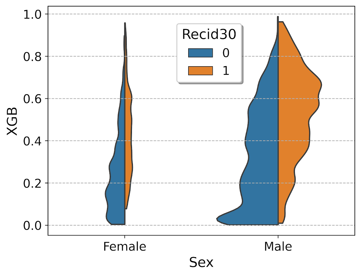
So here you can see we have more males in the sample, and they have a larger high risk blob that was correctly identified. Females have a risk profile more spread out, although there is a small clump of basically 0 risk that the model identifies.

You can also generate the graph so the areas for the violin KDE’s are normalized, so in both the original and resampled data we have fewer females, and more black individuals.

# Values for Sex for orig/resampled
print(pp_data['Sex'].value_counts(normalize=True))
print(resamp_pp['Sex'].value_counts(normalize=True))

# Values for Race orig/resampled
print(pp_data['Race'].value_counts(normalize=True))
print(resamp_pp['Race'].value_counts(normalize=True))

But if we set scale='area' in the chart the violins are the same size:

viol_race = sns.violinplot(x="Race", y="XGB", hue="Recid30",
                           data=resamp_pp, split=True, cut=0, 
                           bw=0.15, inner=None,
                           scale='area', scale_hue=True)
viol_race.legend_.set_bbox_to_anchor((0.81, 0.95))

I will have to see if I can make some time to contribute to seaborn to make it so you can pass in weights to the violinplot function.

Making aoristic density maps in R

I saw Jerry the other day made/updated an R package to do aoristic analysis. A nice part of this is that it returns the weights breakdown for individual cases, which you can then make maps of. My goto hot spot map for data visualization, kernel density maps, are a bit tough to work with weighted data though in R (tough is maybe not the right word, to use ggplot it takes a bit of work leveraging other packages). So here are some notes on that.

I have provided the data/code here. It is burglaries in Dallas, specifically I filter out just for business burglaries.

R Code Snippet

First, for my front end I load the libraries I will be using, and change the working directory to where my data is located.

############################
library(aoristic) #aoristic analysis 
library(rgdal)    #importing spatial data
library(spatstat) #weighted kde
library(raster)   #manipulate raster object
library(ggplot2)  #for contour graphs
library(sf)       #easier to plot sf objects

my_dir <- "D:\\Dropbox\\Dropbox\\Documents\\BLOG\\aoristic_maps_R\\data_analysis"
setwd(my_dir)
############################

Next I just have one user defined function, this takes an input polygon (the polygon that defines the borders of Dallas here), and returns a raster grid covering the bounding box. It also have an extra data field, to say whether the grid cell is inside/outside of the boundary. (This is mostly convenient when creating an RTM style dataset to make all the features conform to the same grid cells.)

###########################
#Data Manipulation Functions

#B is border, g is size of grid cell on one side
BaseRaster <- function(b,g){
    base_raster <- raster(ext = extent(b), res=g)
    projection(base_raster) <- crs(b)
    mask_raster <- rasterize(b, base_raster, getCover=TRUE) #percentage of cover, 0 is outside
    return(mask_raster)
}
###########################

The next part I grab the datasets I will be using, a boundary file for Dallas (in which I chopped off the Lochs, so will not be doing an analysis of boat house burglaries today), and then the crime data. R I believe you always have to convert date-times when reading from a CSV (it never smartly infers that a column is date/time). And then I do some other data fiddling – Jerry has a nice function to check and make sure the date/times are all in order, and then I get rid of points outside of Dallas using the sp over function. Finally the dataset is for both residential/commercial, but I just look at the commercial burglaries here.

###########################
#Get the datasets

#Geo data
boundary <- readOGR(dsn="Dallas_MainArea_Proj.shp",layer="Dallas_MainArea_Proj")
base_Dallas <- BaseRaster(b=boundary,g=200) 
base_df <- as.data.frame(base_Dallas,long=TRUE,xy=TRUE)

#Crime Data
crime_dat <- read.csv('Burglary_Dallas.csv', stringsAsFactors=FALSE)
#prepping time fields
crime_dat$Beg <- as.POSIXct(crime_dat$StartingDateTime, format="%m/%d/%Y %H:%M:%OS")
crime_dat$End <- as.POSIXct(crime_dat$EndingDateTime, format="%m/%d/%Y %H:%M:%OS")

#cleaning up data
aor_check <- aoristic.datacheck(crime_dat, 'XCoordinate', 'YCoordinate', 'Beg', 'End')
coordinates(crime_dat) <- crime_dat[,c('XCoordinate', 'YCoordinate')]
crs(crime_dat) <- crs(boundary)
over_check <- over(crime_dat, boundary)
keep_rows <- (aor_check$aoristic_datacheck == 0) & (!is.na(over_check$city))
crime_dat_clean <- crime_dat[keep_rows,]

#only look at business burgs to make it go abit faster
busi_burgs <- crime_dat_clean[ crime_dat_clean$UCROffense == 'BURGLARY-BUSINESS', ]
###########################

The next part preps the aoristic weights. First, the aoristic.df function is from Jerry’s aoristic package. It returns the weights broken down by 168 hours per day of the week. Here I then just collapse across the weekdays into the same hour, which to do that is simple, just add up the weights.

After that it is some more geographic data munging using the spatstat package to do the heavy lifting for the weighted kernel density estimate, and then stuffing the result back into another data frame. My bandwidth here, 3000 feet, is a bit large but makes nicer looking maps. If you do this smaller you will have a more bumpy and localized hot spots in the kernel density estimate.

###########################
#aoristic weights

#This takes like a minute
res_weights <- aoristic.df(busi_burgs@data, 'XCoordinate', 'YCoordinate', 'Beg', 'End')

#Binning into same hourly bins
for (i in 1:24){
    cols <- (0:6*24)+i+5
    lab <- paste0("Hour",i)
    res_weights[,c(lab)] <- rowSums(res_weights[,cols])
}

#Prepping the spatstat junk I need
peval <- rasterToPoints(base_Dallas)[,1:2]
spWin <- as.owin(as.data.frame(peval))
sp_ppp <- as.ppp(res_weights[,c('x_lon','y_lat')],W=spWin) #spp point pattern object

#Creating a dataframe with all of the weighted KDE
Hour_Labs <- paste0("Hour",1:24)

for (h in Hour_Labs){
  sp_den <- density.ppp(sp_ppp,weights=res_weights[,c(h)],
                        sigma=3000,
                        edge=FALSE,warnings=FALSE)
  sp_dat <- as.data.frame(sp_den)
  kd_raster <- rasterFromXYZ(sp_dat,res=res(base_Dallas),crs=crs(base_Dallas))
  base_df[,c(h)] <- as.data.frame(kd_raster,long=TRUE)$value
}
###########################

If you are following along, you may be wondering why all the hassle? It is partly because I want to use ggplot to make maps, but for its geom_contour it does not except weights, so I need to do the data manipulation myself to supply ggplot the weighted data in the proper format.

First I turn my Dallas boundary into a simple feature sf object, then I create my filled contour graph, supplying the regular grid X/Y and the Z values for the first Hour of the day (so between midnight and 1 am).

###########################
#now making contour graphs

dallas_sf <- st_as_sf(boundary)

#A plot for one hour of the day
hour1 <- ggplot() + 
  geom_contour_filled(data=base_df, aes(x, y, z = Hour1), bins=9) +
  geom_sf(data=dallas_sf, fill=NA, color='black') +
  scale_fill_brewer(palette="Greens") +
  ggtitle('       Hour [0-1)') + 
  theme_void() + theme(legend.position = "none")
hour1

png('Hour1.png', height=5, width=5, units="in", res=1000, type="cairo") 
hour1
dev.off()
###########################

Nice right! I have in the code my attempt to make a super snazzy small multiple plot, but that was not working out so well for me. But you can then go ahead and make up other slices if you want. Here is an example of taking an extended lunchtime time period.

###########################
#Plot for the afternoon time period
base_df$Afternoon <- rowSums(base_df[,paste0("Hour",10:17)])

afternoon <- ggplot() + 
  geom_contour_filled(data=base_df, aes(x, y, z = Afternoon), bins=9) +
  geom_sf(data=dallas_sf, fill=NA, color='black') +
  scale_fill_brewer(palette="Greens") +
  ggtitle('       Hour [9:00-17:00)') + 
  theme_void() + theme(legend.position = "none")
afternoon
###########################

So you can see that the patterns only slightly changed compared to the midnight prior graph.

Note that these plots will have different breaks, but you could set them to be equal by simply specifying a breaks argument in the geom_contour_filled call.

I will leave it up so someone who is more adept at R code than me to make a cool animated viz over time from this. But that is a way to mash up the temporal weights in a map.

Taking account of the baseline in kernel density maps using CrimeStat

When making kernel density maps sometimes the phenonema is heavily clustered in particular locations simply because the population at risk is uneven over the study space. xkcd puts this in a bit more of laymans terms than I do:

So how do we take into account the underlying population? It depends on the data, but if you actually have population at risk data as points we can make kernel density maps that are the ratio of the cases to the underlying total population. I will show how you can do this type of raster kernel density estimate in CrimeStat using some data on reported assaults and arrests from the city of Chicago.

To make the necessary smooth estimate of the proportions of arrests in CrimeStat you will need two seperate ones, the first primary file should be all arrests of interest, and the secondary file should be all of the incidents (so the arrests are a subset of all incidents). And of course both files need to have the geocoordinates already.

So CrimeStat has a nice GUI to make our KDE maps. So you will be greeted with the following screen after starting the CrimeStat program.

Now we can enter in our data. First click the Select Files button and then navigate to your data file. Here I saved the seperate files as DBFs, and for the primary file I use all of the arrests associated with an assault incident in Chicago in 2013.

Now that the file is loaded into CrimeStat, we need to specify what fields contain the spatial coordinates in the variables section. Then we set the appropriate options in the bottom panels. Here I am using projected coordinates in feet. I don’t specify a time unit so that option is superflous.

Now we can enter in our secondary file, which will be all of the assault incidents in Chicago in 2013. The Seconday File tab is in the set of minor tabs under the larger Data Setup tab (CrimeStat has an incredible number of routines, hence the many options). It is an equivalent workflow as to that of the primary file, import the spreadsheet, and define the fields.

Now we need to set up the reference grid to which we will write the raster output to. Still on the same Data Setup main tab, we then navigate to the Reference file minor tab. Here we specify a set of coordinates (in the particular projection of use) as a rectangle corresponding to the lower left and upper right corners. Then you can control how fine the grid is by specifying a larger number of columns. Here the cell sizes are 300 square feet. Note you can save the particular reference file for future use.

Now we can finally move onto estimating our kernel density map! Now navigate to the main Spatial Modeling I tab and navigate to the Interpolation I minor tab. To make a ratio of our two rasters (which will be the smoothed proportions of arrests). Here we choose the Dual KDE estimation, and specify the normal kernel. Typically for KDE maps the kernel makes very little difference, choosing an appropriate bandwidth impacts the look of the map to a much greater extent. I typically default to around 300 meters, but here I choose a smaller 500 foot bandwidth (we will see this is seriously undersmoothed – but I rather start with undersmoothed than oversmoothed).

The field Area units: points per ends up being superflous when specifying the ratio of the two densities. Clicking on the Save Result to button we can choose to save the output to various geographic data file formats (both vector and raster). Here I specify ArcGIS’s raster format.

Now we are ready to calculate the KDE raster. Simply click the Compute button at the bottom of CrimeStat, and be alittle patient with a dataset of this size (4,000 some arrests and over 17,500 total incidents). After that runs we can then import the rasters into your favorite GIS and make some maps.

You will notice when you first upload the raster there are several strange artifacts. This is a function of places with very few incidents have a low baseline with with to calculate the smoothed proportion of arrests. Unfortunately it appears CrimeStat specifies 0 where null data values should be (places with zero density in the denominator).

A quick fix to this problem though is to make a separate kernel density map of just the incidents and superimpose that on top of your smoothed arrests. Then you can make the zero density areas the same color as the background map so they are filtered out. Here I filter areas that have a incident density of less than <0.02 (these are absolute densities, so they sum to the total number of incidents used to calculate them to begin with).

So below are the final KDE maps. As you can see from all of them 500 feet is seriously undersmoothed, but the absolute densities of incidents and arrests (the two left most maps) appears to be highly correlated. If you look at the hit rate of arrests though in the right most map, the percent of arrests appear to be spatially random.

Other possibilities for similar analysis are say accidents involving injury or pedestrians where the baseline is all accidents, field stops that result in contraband recovery, or comparison of densities before and after an intervention (although here I may take the absolute difference as opposed to the ratio).

Of course this just scratches the surface of possible analysis. When the population at risk is not so conveniently labelled in the data set, such as coming from census geographies, one may consult the literature on dasymetric mapping (also see the head bang procedure in CrimeStat). Bivand et al. (2008) have an example of calculating the ratio raster along with some statistical tests, and the spatstat library has some more convenient functions to accomplish this and map the results (see the relrisk function). One can also estimate a logistic regression model with the spatial coordinates as non-linear predictors (e.g. using splines) and then plot the predicted probabilities for each grid cell.

I’m not sure of a quick global test of whether the proportion of arrests are random though. I thought off-hand you could use a spatial scan test for the case-control data (e.g. using SatScan or similar functions in the spatstat R library), although I’m not sure if that counts as quick.