
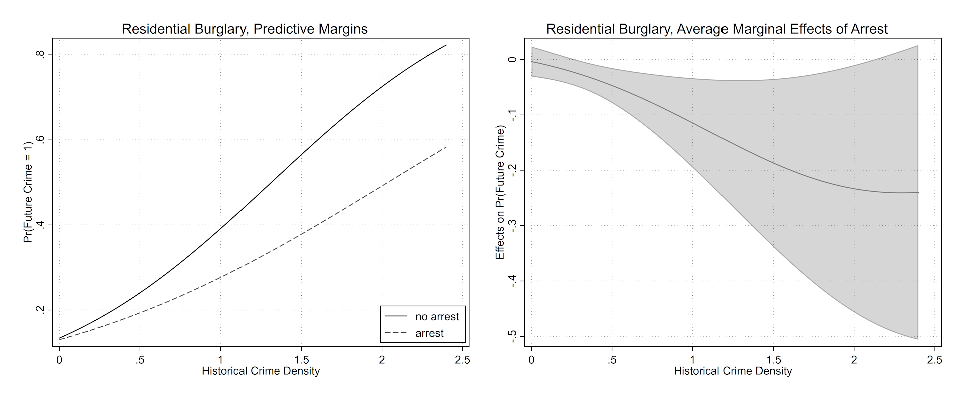
For a recent working paper I had a student of mine (Jordan Riddell) help write some code to make nice margin plots in Stata, based on the work of Ben Jann and his grstyle code. Another good resource is Trenton Mize’s Sociological Science article on non-linear interactions. Here is what the end output will look like.
My notes on how to get this to follow. Data and code to follow along can be downloaded from here.
Start Up
First in my do file, I have a typical start up that sets the working directory and logs the results to a text file. I use set more off so I don’t have to do the annoying this and tell Stata to keep scrolling down. The next part is partly idiosyncratic to my Stata work set up — I call Stata from a centralized install location here at EPPS in UTD. I don’t have write access there, so to install commands I need to set my own place to install them on my local machine. So I add a location to adopath that is on my machine, and I also do net set ado to that same location.
Finally, for here I ssc installed grstyle and palettes. The code is currently commented out, as I only need to install it once. But it is good for others to know what extra packages they need to fully replicate your results.
**************************************************************************
*START UP STUFF

*Set the working directory and plain text log file
cd "C:\Users\axw161530\Dropbox\Documents\BLOG\Stata_NiceMargins\Analysis"

*log the results to a text file
log using "LogitModels.txt", text replace

*so the output just keeps going
set more off

*let stata know to search for a new location for stata plug ins
adopath + "C:\Users\axw161530\Documents\Stata_PlugIns\V15"
net set ado "C:\Users\axw161530\Documents\Stata_PlugIns\V15"

*In this script I use
*net install http://www.stata-journal.com/software/sj18-3/gr0073/
*ssc install grstyle, replace
*ssc install palettes, replace
**************************************************************************
Graph Settings
Here is what I did to change my default graph settings. Again check out Ben Jann’s awesome website he made an all the great examples. That will be more productive than me commenting on every individual line.
**************************************************************************
*Graph Settings
grstyle clear
set scheme s2color
grstyle init
grstyle set plain, box
grstyle color background white
grstyle set color Set1
grstyle yesno draw_major_hgrid yes
grstyle yesno draw_major_ygrid yes
grstyle color major_grid gs8
grstyle linepattern major_grid dot
grstyle set legend 4, box inside
grstyle color ci_area gs12%50
**************************************************************************
Data Prep
So here is pretty straight forward. I read in the data as a CSV file, generate a new variable that is the weekly average number of crimes within 1000 feet in the historical crime data (see the working paper for more details). One trick I like to use with regression models with many terms is to make a global that specifies those variables, so I don’t need to retype them a bunch. I named it $ContVars here. Finally for simplicity in this script I am just examining the burglary incidents, so I get rid of the other crimes using the keep command.
**************************************************************************
*DATA PREP

*Getting the data
import delimited CrimeStrings_withData.csv

*Making the previous densities per time period
generate buff_1000_1 = buff_1000 * (7/1611)

*control variables used in the regression
global ContVars "d1 d2 d3 d4 d5 d6 d7 d8 d9 d10 d11 d12 d13 d14 d15 d16 d17 d18 whiteperc blackperc hispperc asianperc under17 propmove perpoverty perfemheadhouse perunemploy perassist i.month c.dateint"

*For here I am just examining burglary incidents
keep if crimetype == 3
**************************************************************************
Making a Nice marginsplot
So basically what I want to do in the end is to draw an interaction effect between a dummy variable (whether a crime resulted in an arrest) and a continuous variable (the historical crime density at a location). I am predicting whether a crime results in a near-repeat follow up — hot spots with more crime on average will have more near-repeats simply by chance.
When displaying that interaction effect though, I only want to limit it to the support of the historical crime density in the sample. Or stated another way, the historical crime density variable basically ranges from 0 to 2.5 in the sample — I don’t care what the interaction effect is then at a historical crime density of 3.
To do that in Stata, I use summarize to get the min/max of that historical crime density and pipe them into a global. The Grid global will then tell Stata how often to calculate those effects. Too few and the plot may not look smooth, too many and it will take margins forever to calculate the results. Here 100 points is plenty.
*I will need this later to draw the margins over the support
*Of the prior crime density
summarize buff_1000_1
global MyMin = r(min)
global MyMax = r(max)
global Grid = ($MyMax-$MyMin)/100
This may seem overkill, as I could just fill in those values by hand later. If you look at my replication code for my paper though, I ended up doing this same thing for four different crimes and two different estimates, so I wanted as automated approach that avoids as many magic numbers as possible.
Now I estimate my logistic regression model, with my interaction effect and the global $ContVars control variables I specified earlier. Here I am predicting whether a burglary has a follow up near-repeat crime (within 1000 feet and 7 days). I think an arrest will reduce that probability.
*Now estimate the logit model
logit future0_1000_7 i.arrest c.buff_1000_1 i.arrest#c.buff_1000_1 $ContVars
Note that the estimate of the interaction effect looks like this:
--------------------------------------------------------------------------------------
      future0_1000_7 |      Coef.   Std. Err.      z    P>|z|     [95% Conf. Interval]
---------------------+----------------------------------------------------------------
            1.arrest |  -.0327821    .123502    -0.27   0.791    -.2748415    .2092774
         buff_1000_1 |   1.457795   .0588038    24.79   0.000     1.342542    1.573048
                     |
arrest#c.buff_1000_1 |
                  1  |  -.5013652   .2742103    -1.83   0.067    -1.038807    .0360771
So how exactly do I interpret this? It is very difficult to interpret the coefficients directly — it is much easier to make graphs and visualize what those effects actually mean on the probability of a near-repeat burglary occurring.
Now the good stuff. Basically I want to show the predicted probability of a near-repeat follow up crime, conditional on whether an arrest occurred, as well as the historical crime density. The first line uses quietly, so I don’t get the full margins table in the output. The second is just all the goodies to make my nice grey scale plot. Note I name the plot — this will be needed for later combining multiple plots.
*Create the two margin plots
quietly margins arrest, at(c.buff_1000_1=($MyMin ($Grid) $MyMax))
marginsplot, recast(line) noci title("Residential Burglary, Predictive Margins") xtitle("Historical Crime Density") ytitle("Pr(Future Crime = 1)") plot1opts(lcolor(black)) plot2opts(lcolor(gs6) lpattern("--")) legend(on order(1 "no arrest" 2 "arrest")) name(main)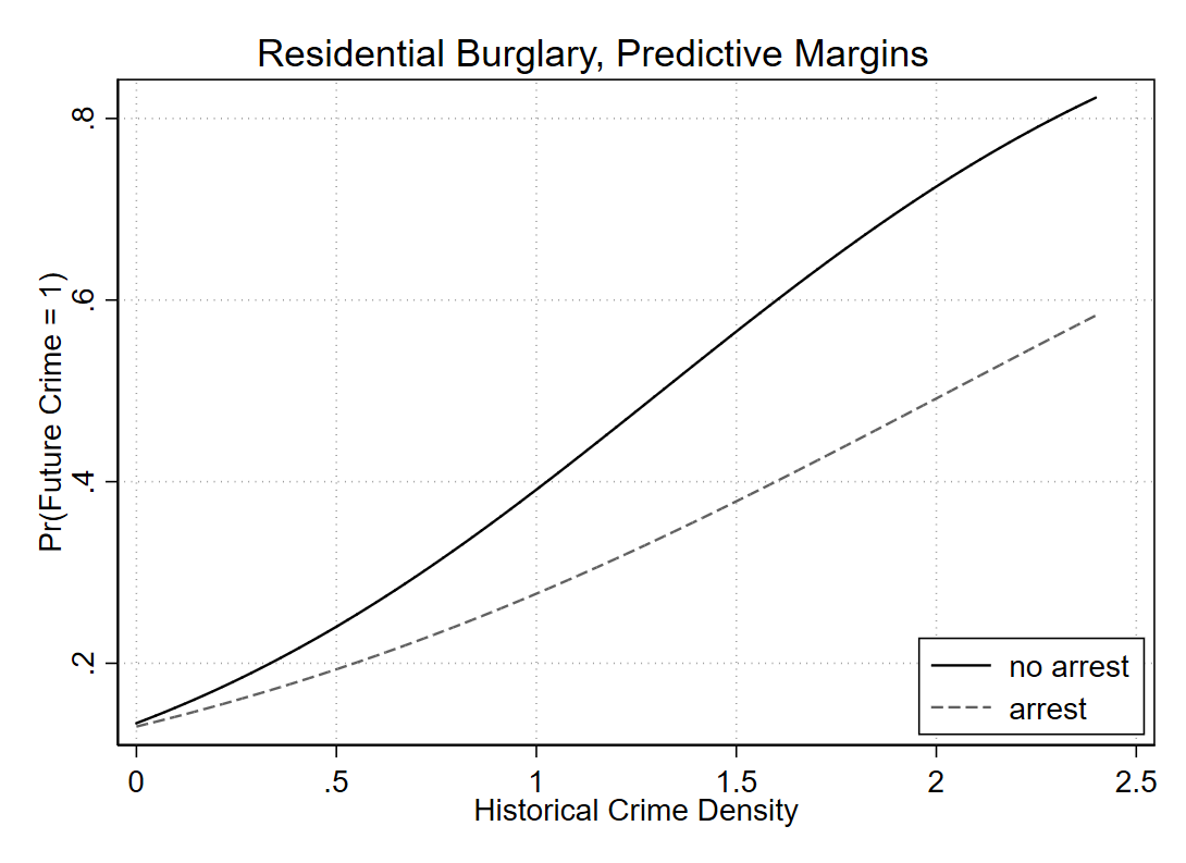
You could superimpose confidence intervals on the prior plot, but those are the pointwise intervals for the probability for each individual line, they don’t directly tell you about the difference between the two lines. Viz. the difference in lines often can lead to misinterpretation (e.g. remember the Cleveland example of viz. the differences in exports/imports originally drawn by Playfair). Also superimposing multiple error bands tend to get visually messy. So a solution is to directly graph the estimate of the difference between those two probabilities in a separate graph. (Another idea though I’ve seen is here, a CI of the difference set to the midpoint of the two lines.)
quietly margins, dydx(arrest) at(c.buff_1000_1=($MyMin ($Grid) $MyMax))
marginsplot, recast(line) plot1opts(lcolor(gs8)) ciopt(color(black%20)) recastci(rarea) title("Residential Burglary, Average Marginal Effects of Arrest") xtitle("Historical Crime Density") ytitle("Effects on Pr(Future Crime)") name(diff)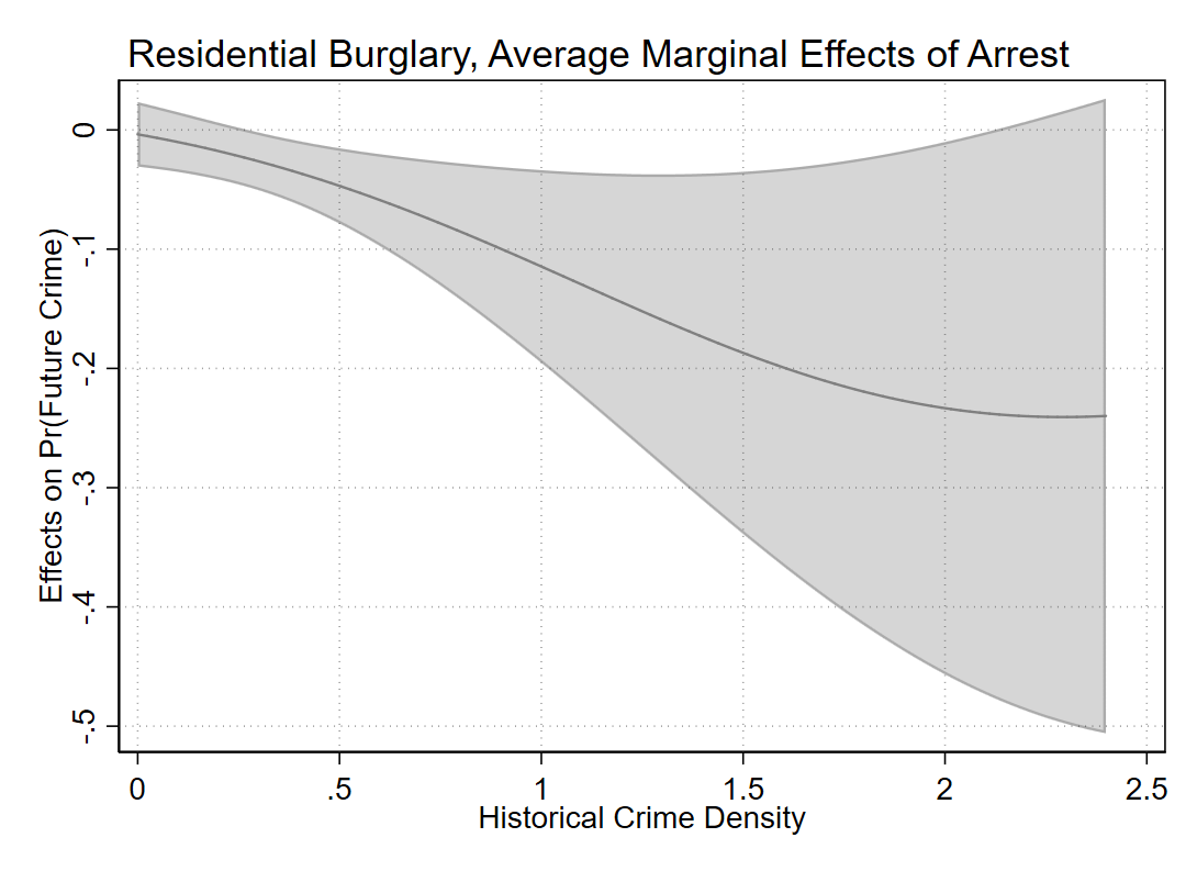
Yay for the fact that Stata can now draw transparent areas. So here we can see that even though the marginal effect grows at higher prior crime densities — suggesting an arrest has a larger effect on reducing near repeats in hot spots, the confidence interval of the difference grows larger as well.
To end I combine the two plots together (same image at the beginning of the post), and then export them to a higher resolution PNG.
*Now combining the plots together
graph combine main diff, xsize(6.5) ysize(2.7) iscale(.8) name(comb)
graph close main diff
graph export "BurglaryMarginPlot.png", width(6000) replace
I am often doing things interactively in the Stata shell when I am writing up scripts. Including redoing charts. To be able to redo a chart with the same name, you need to not only use graph close, but also graph drop it from memory. Then just dropping all the data and using exit will finish out your script and close down Stata entirely.
**************************************************************************
*FINISHING UP THE SCRIPT

*closing the combined graph
graph close comb

*This is necessary if you want to reuse the plot names
graph drop _all

*Finish the script.
drop _all
exit, clear
************************************************************************** 

Huma
/ December 4, 2020Hi Andrew,
This is a really useful post. Can you please do another post on how to plot above graphs for a diff-in-diff research design?
Many thanks!
Melanie
/ January 6, 2023I would be interested in seeing this as well!