Line plots are probably the most common type of plot I make. Here are my notes on making nice line plots in matplotlib in python. You can see the full replication code on Github here.
First, I will be working with UCR crime reports, for national level and then city level data from the Real Time Crime Index. The AH Datalytics crew saves their data in github as a simple csv file, and with the FBI CDE this code also downloads the most recent as well. getUCR are just helper functions to download the data, and cdcplot are some of my plot helpers, such as my personal matplotlib theme.
import cdcplot, getUCR
import pandas as pd
import matplotlib.pyplot as plt
from matplotlib import cm

# Get the National level and City data from Real Time Crime Index
us = getUCR.cache_fbi()
city = getUCR.prep_city()
So first, lets just do a basic plot of the national level MV Theft rate (here the rates are per 100,000 population, not per vehicles).
# Lets do a plot for National of the Motor Vehicle Theft Rate per pop
us['Date'] = pd.to_datetime(us['Date'])
us2020 = us[us['Date'].dt.year >= 2020]
var = 'motor-vehicle-theftrate'

# Basic
fig, ax = plt.subplots()
ax.plot(us2020['Date'],us2020[var])
fig.savefig('Line00.png', dpi=500, bbox_inches='tight')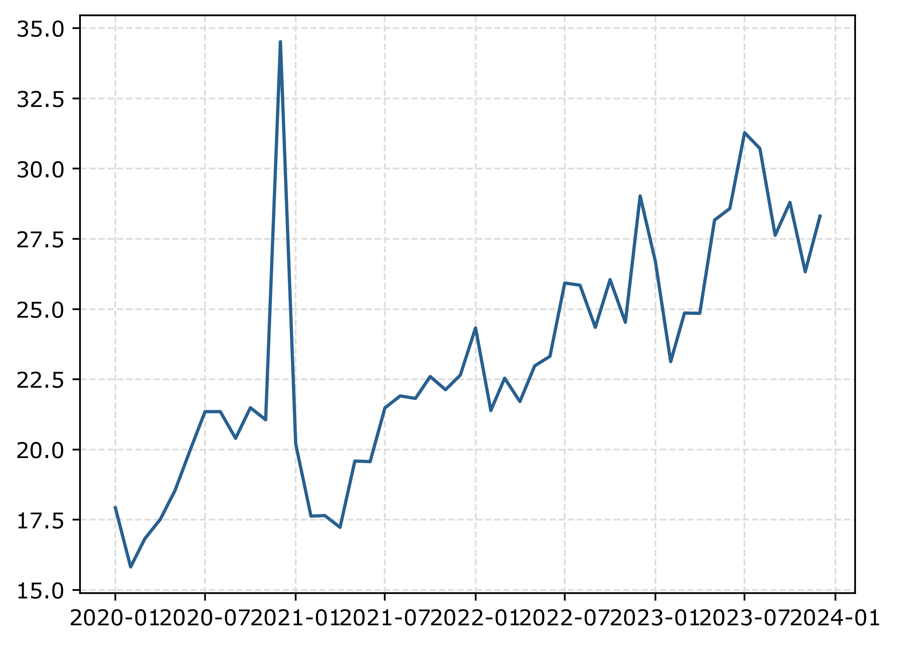
The big spike in December 2020 is due to the way FBI collects data. (Which I can’t find the specific post, but I am pretty sure Jeff Asher has written about in his substack.) So the glut of December reports are not actually extra reports in December, it is just the silly way the FBI reports the backlogged incidents.
You can also see the X axis labels are too close together. But otherwise (besides lack of labels) is acceptable. One thing I like to do with line plots is to superimpose point markers on the sample points. It doesn’t matter here so much, but this is helpful when you have irregular time points or missing data, it is clear that the time period is missing.
In matplotlib, you can do this by specifying -o after the x/y coordinates for the line. I also like the look of plotting with a white marker edge. Also making the plot slightly larger fixes the X axis labels (which have a nice default to showing Jan/July and the year). And finally, since the simplicity of the chart, instead of doing x or y axis labels, I can just put the info I need into the title. For a publication I would likely also put “per 100,000 population” somewhere (in a footnote on the chart or if the figure caption).
# Marker + outline + size
fig, ax = plt.subplots(figsize=(8,5))
ax.plot(us2020['Date'],us2020[var],'-o',
        color='k',markeredgecolor='white')
ax.set_title('Motor Vehicle Theft Rate in US')
fig.savefig('Line01.png', dpi=500, bbox_inches='tight')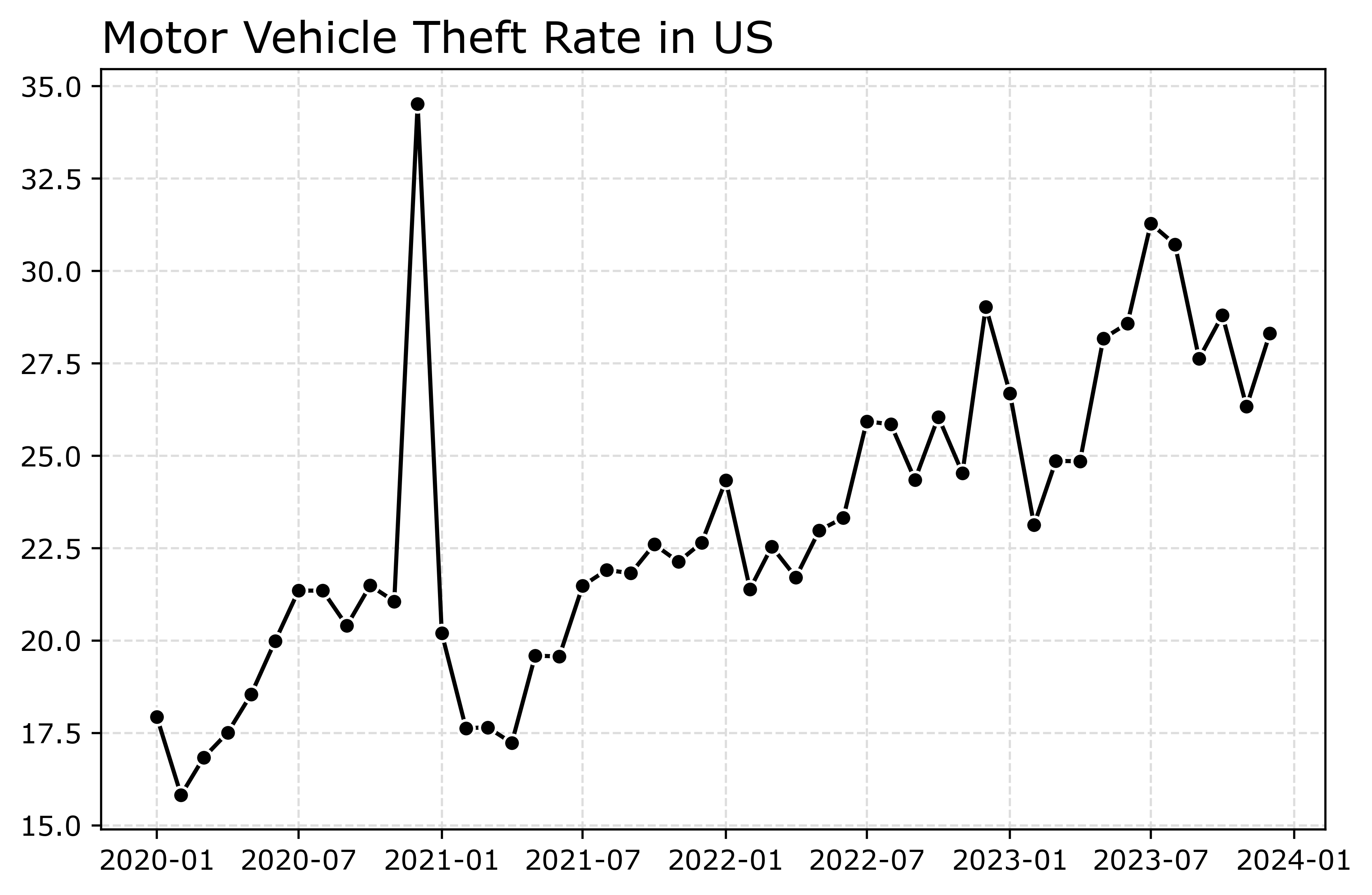
Markers are one way to distinguish between multiple lines as well. So you can do -s for squares superimposed on the lines, -^ for a triangle, etc. The white edge only looks nice for squares and circles though in my opinion. See the list of filled markers in this matplotlib documentation. Circles and squares IMO look the nicest and carry a similar visual weight. Here is superimposed Charlotte and US, showing off stars just to create show how to do it.
# Multiple cities
city[var] = (city['Motor Vehicle Theft']/city['Population'])*100000
nc2020 = city[(city['Year'] >= 2020) & (city['State_ref'] == 'NC')]
ncwide = nc2020.pivot(index='Mo-Yr',columns='city_state',values=var)
cityl = list(ncwide)
ncwide.columns = cityl # removing index name
ncwide['Date'] = pd.to_datetime(ncwide.index,format='%m-%Y')
ncwide.sort_values(by='Date',inplace=True)

fig, ax = plt.subplots(figsize=(8,5))
ax.plot(ncwide['Date'],ncwide['Charlotte, NC'],'-s',
        color='green',markeredgecolor='white',label='Charlotte')
ax.plot(us2020['Date'],us2020[var],'-*',
        color='k',label='US')
ax.legend()
ax.set_title('Motor Vehicle Theft Rate')
fig.savefig('Line02.png', dpi=500, bbox_inches='tight')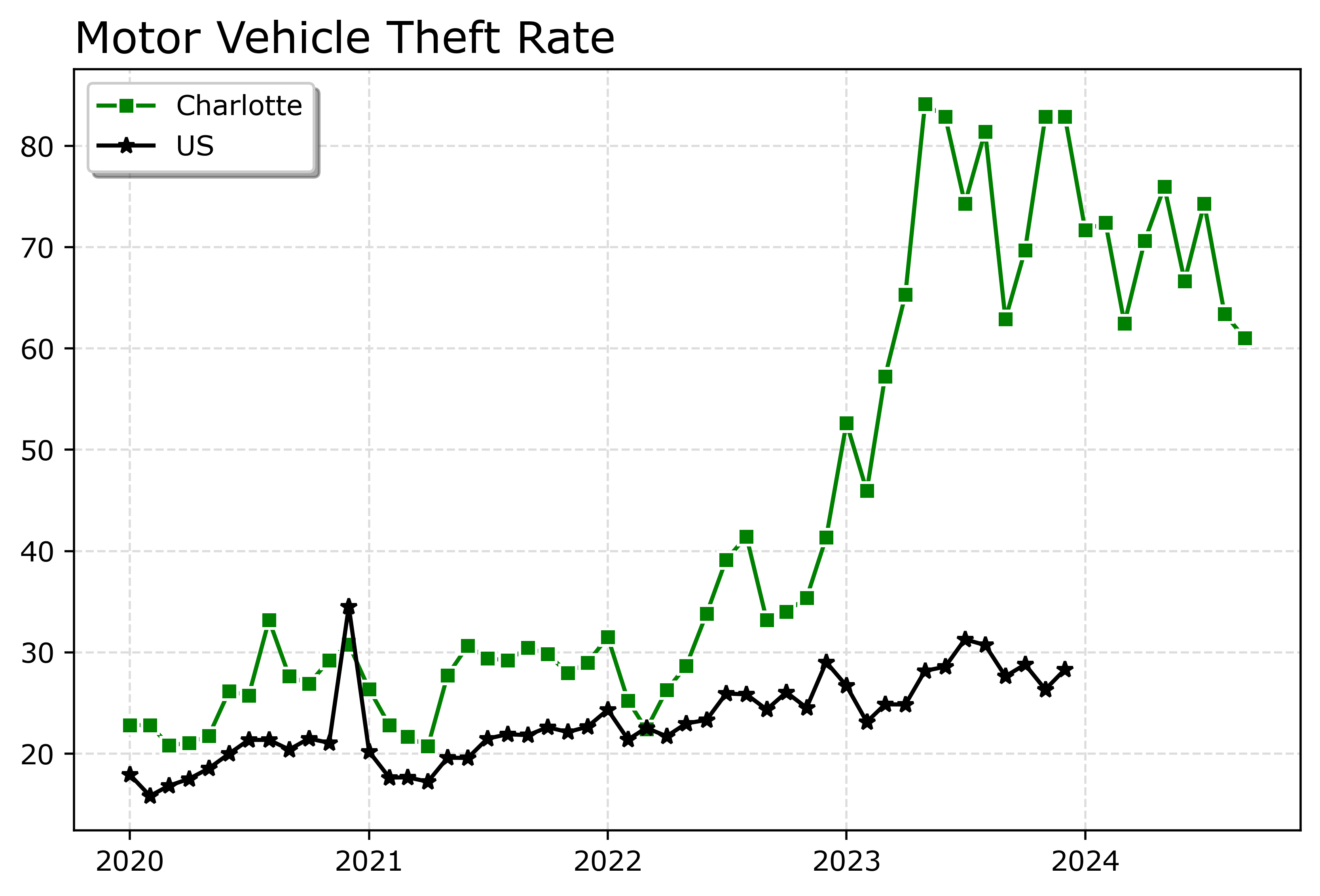
Charlotte was higher, but looked like it had parallel trends (just increased by around 10 per 100,000) with national trends from 2020 until early 2022. In early 2022, Charlotte dramatically increased though, and peaked/had high volatility since mid 2023 in a different regime shift from the earlier years.
When you make line plots, you want the lines to be a more saturated color in my opinion. It both helps them stand out, as well as makes it more likely to survive printing. No pastel colors. With the points superimposed, even with greyscale printing it will be fine. I commonly tell crime analysts to make a printable report for regular meetings, it is more likely to be viewed than an interactive dashboard.
You can technically do dashes as well via the text string input. I do not like them though typically, as they are less saturated. Here I show two different dash styles. And you could do dashes and points, e.g. :o, (see this matplotlib doc for the styles) I have never bothered to do that though.
# Dashes instead of points
fig, ax = plt.subplots(figsize=(8,5))
ax.plot(ncwide['Date'],ncwide['Charlotte, NC'],':',
        color='green',markeredgecolor='white',label='Charlotte')
ax.plot(ncwide['Date'],ncwide['Asheville, NC'],'--',
        color='#455778',label='Asheville')
ax.plot(us2020['Date'],us2020[var],'-',
        color='k',label='US')
ax.legend()
ax.set_title('Motor Vehicle Theft Rate')
fig.savefig('Line03.png', dpi=500, bbox_inches='tight')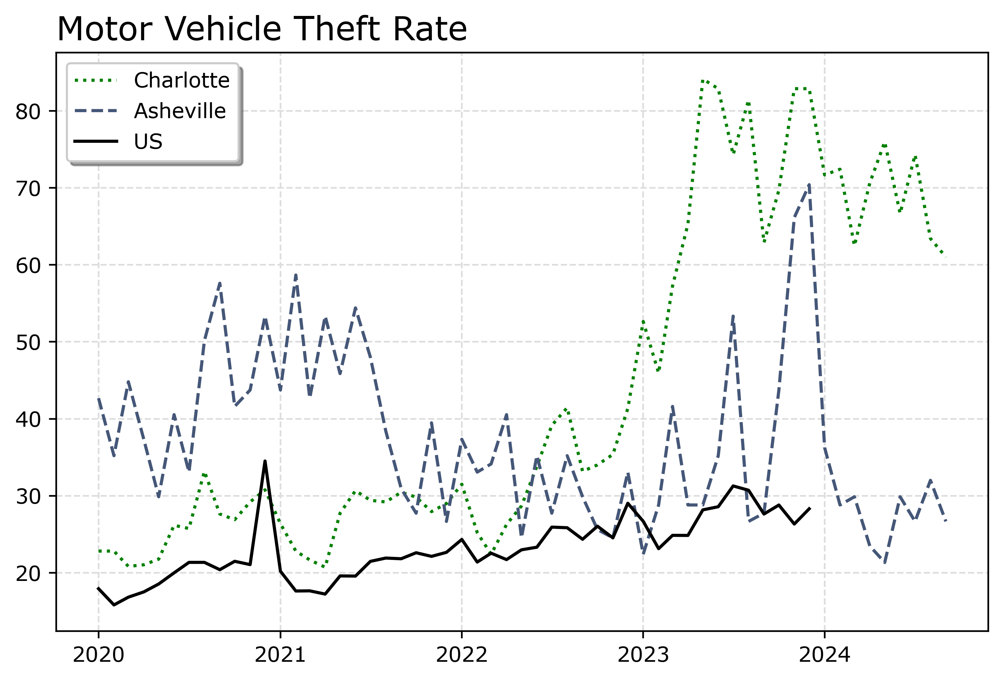
You can see Asheville had an earlier spike, went back down, and then in 2023 had another pronounced spike. Asheville has close to a 100k population, so the ups/downs correspond pretty closely to just the total counts per month. So the spikes in 2023 are an extra 10, 20, 40 mv thefts than you might have expected based on historical patterns.
If you must have many lines differentiated via colors in a static plot, the Tableau color palette or the Dark2 colors work the best. Here is an example plotting the North Carolina cities in a loop with the Tableau colors:
# It is difficult to untangle multiple cities
# https://matplotlib.org/stable/users/explain/colors/colormaps.html
fig, ax = plt.subplots(figsize=(12,8))
for i,v in enumerate(cityl):
    ax.plot(ncwide['Date'],ncwide[v],'-',color=cm.tab10(i),label=v)

ax.legend()
fig.savefig('Line04.png', dpi=500, bbox_inches='tight')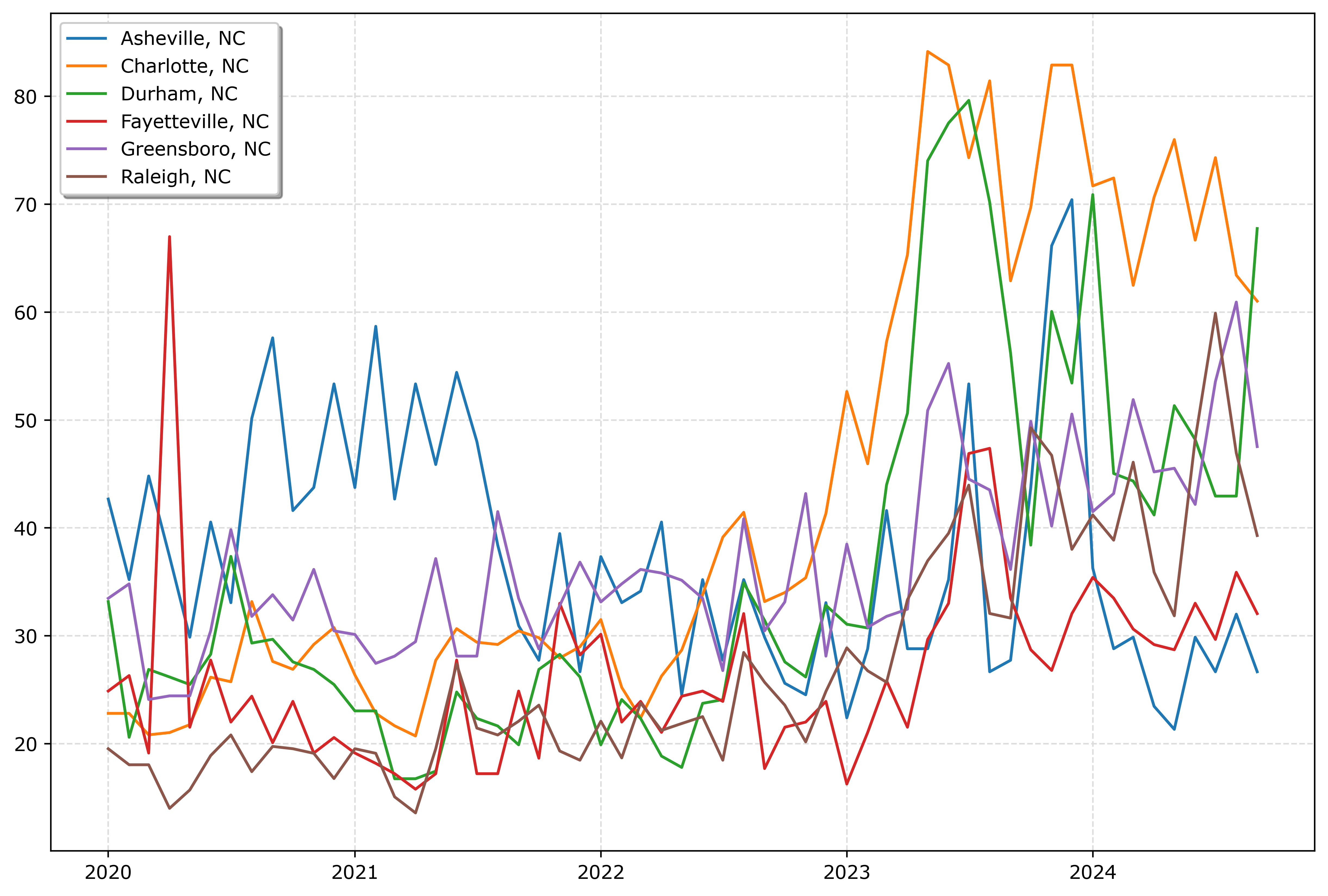
So you could look at this and see “blue does not fit the same pattern”, and then go to the legend to see blue is Asheville. It is a bit of work though to disentangle the other lines though.
And here is an example using the pandas plotting method with the Dark2 palette. I do this more for exploratory data analysis, I often end up editing so much of the axis that using the pandas short cuts are not less work. Here I would edit the axis so the lines do not abut the x axis ends. For old school R people, this is similar to matplot in R, so the data needs to be in wide format, not long. (And all the limitations that come with that.)
# pandas can be somewhat more succinct
fig, ax = plt.subplots(figsize=(12,8))
ncwide.plot.line(x='Date',ax=ax,color=cm.Dark2.colors)
fig.savefig('Line05.png', dpi=500, bbox_inches='tight')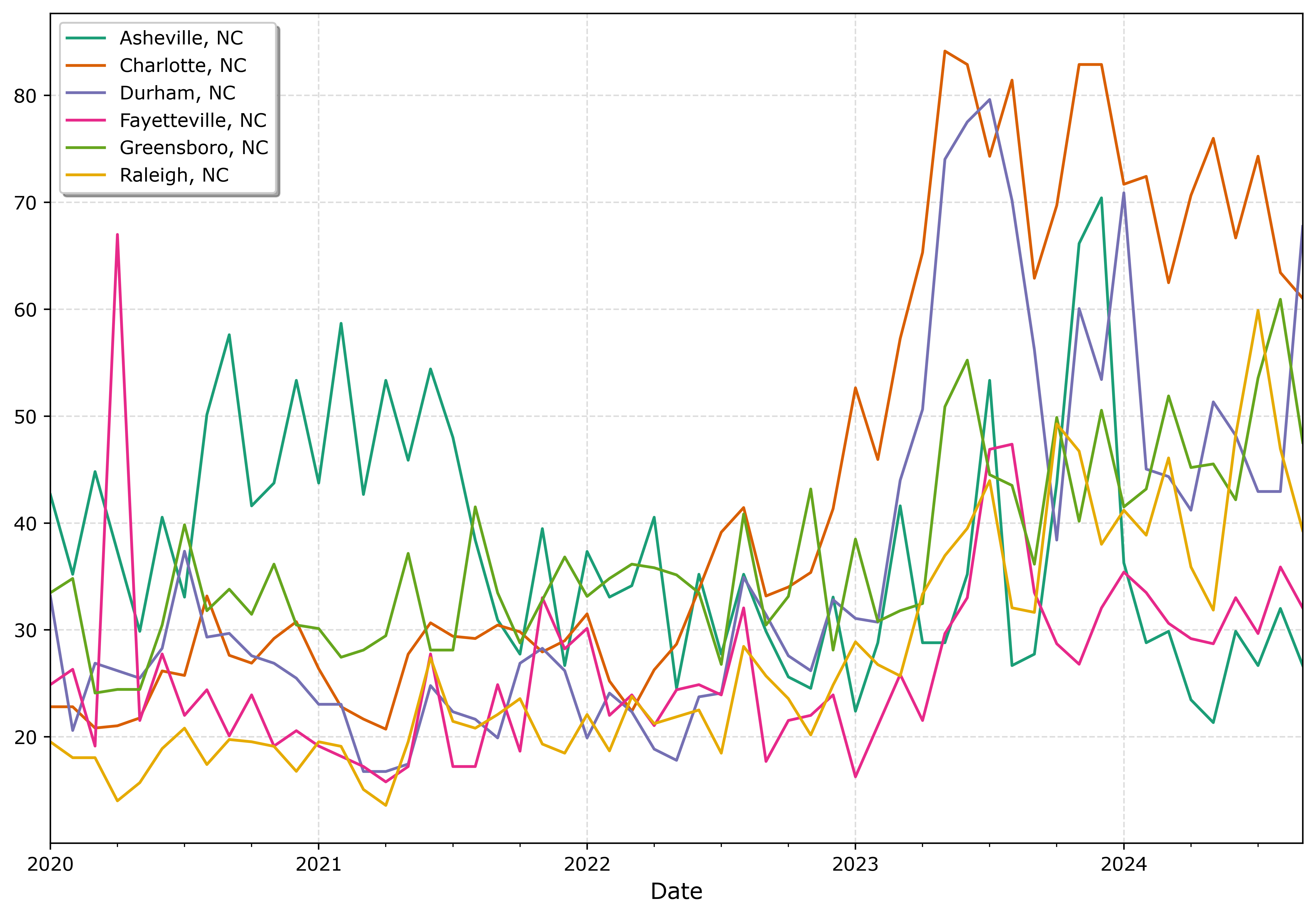
I tend to like the Tableau colors somewhat better though. The two greenish colors (Asheville and Greensboro) and the two orangish colors (Raleigh and Charlotte) I personally have to look quite closely to tell them apart. Men tend to have lower color resolution than women, I am not color blind and you may find them easier to tell the difference. Depending on your audience it would be good to assume lower than higher color acuity in the audience’s vision in general.
In my opinion, often you can only have 3 lines in a graph and it becomes too busy. It is partly due to how tortuous the lines are, so you can have many lines if they are parallel and don’t cross. But assuming you can have max 3 is a good baseline assumption.
An alternative though is to highlight specific lines. Here I highlight Durham and US, the other cities are light grey and in the background. Also looping over you can specific the order. I draw Durham last (so it goes on top). The grey cities are first (so are at the bottom). Here I only give the first grey background city a label, so the legend does not have duplicates.
# Highlight one city, compared to the rest
fig, ax = plt.subplots(figsize=(12,8))
ncwide.plot.line(x='Date',ax=ax,color=cm.Dark2.colors)
fig.savefig('Line05.png', dpi=500, bbox_inches='tight')


# Highlight one city, compared to the rest
fig, ax = plt.subplots(figsize=(12,8))
lab = 'Other NC'

for v in cityl:
    if v == 'Durham, NC':
        pass
    else:
        ax.plot(ncwide['Date'],ncwide[v],'-',color='lightgrey',label=lab)
        lab = None


ax.plot(us2020['Date'],us2020[var],'-o',
        color='k',markeredgecolor='white',label='US')
ax.plot(ncwide['Date'],ncwide['Durham, NC'],'-',linewidth=2,color='red',label='Durham')
ax.legend()
ax.set_title('Motor Vehicle Theft Rate')
fig.savefig('Line06.png', dpi=500, bbox_inches='tight')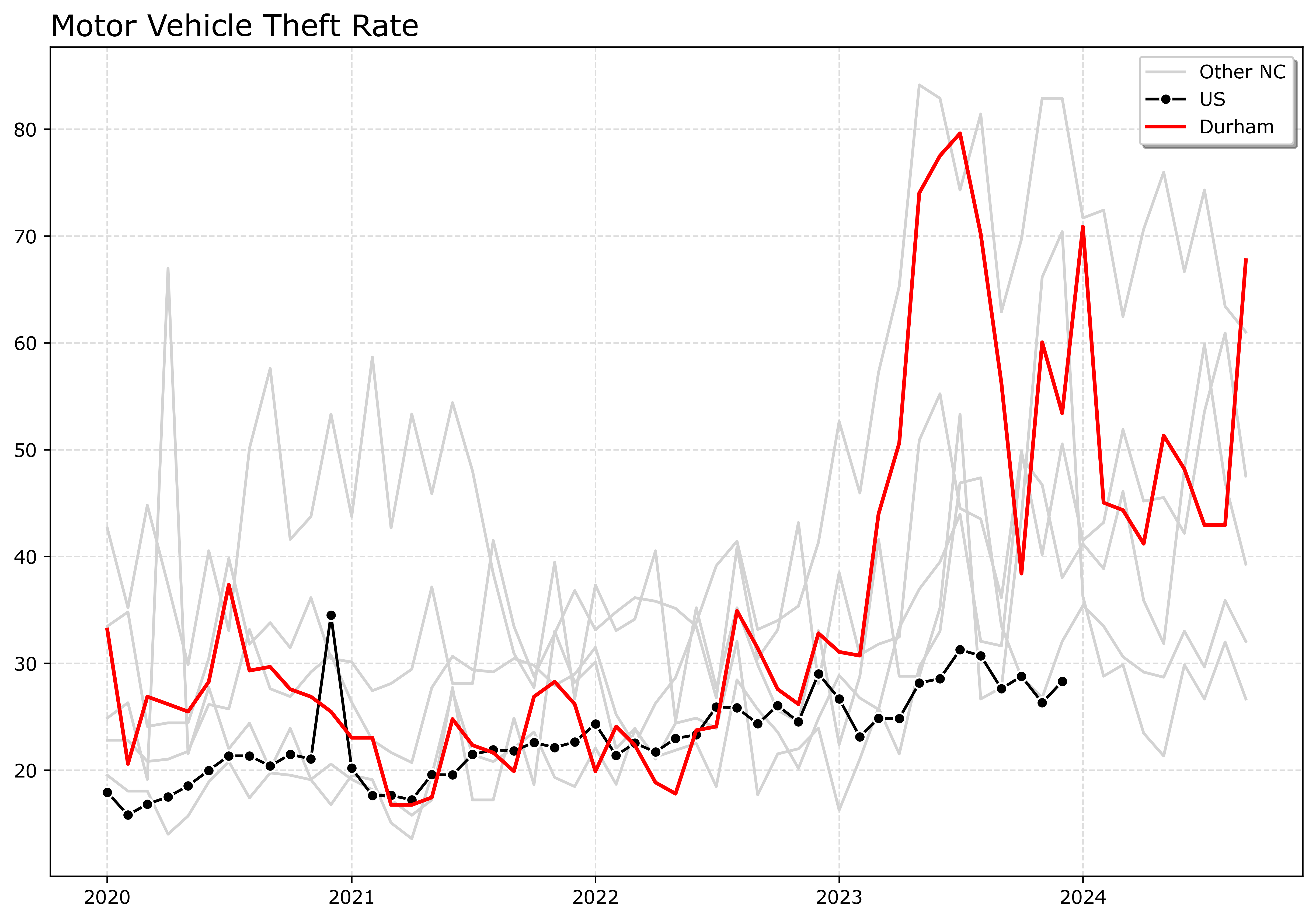
If I had many more lines, I would make the grey lines either smaller in width, e.g. linewidth=0.5, and/or make them semi-transparent, e.g. alpha=0.8. And ditto if you want to emphasize a particular line, making it a larger width (here I use 2 for Durham), makes it stand out more.
Durham here you can see has very similar overall trends compared to Charlotte.
And those are my main notes on making nice line plots in matplotlib. Let me know in the comments if you have any other typical visual flourishes you often use for line plots.