Making smoothed scatterplots in python

The other day I made a blog post on my notes on making scatterplots in matplotlib. One big chunk of why you want to make scatterplots though is if you are interested in a predictive relationship. Typically you want to look at the conditional value of the Y variable based on the X variable. Here are some example exploratory data analysis plots to accomplish that task in python.

I have posted the code to follow along on github here, in particular smooth.py has the functions of interest, and below I have various examples (that are saved in the Examples_Conditional.py file).

Data Prep

First to get started, I am importing my libraries and loading up some of the data from my dissertation on crime in DC at street units. My functions are in the smooth set of code. Also I change the default matplotlib theme using smooth.change_theme(). Only difference from my prior posts is I don’t have gridlines by default here (they can be a bit busy).

#################################
import pandas as pd
import numpy as np
import matplotlib.pyplot as plt
import seaborn as sns
import statsmodels.api as sm
import os
import sys

mydir = r'D:\Dropbox\Dropbox\PublicCode_Git\Blog_Code\Python\Smooth'
data_loc = r'https://dl.dropbox.com/s/79ma3ldoup1bkw6/DC_CrimeData.csv?dl=0'
os.chdir(mydir)

#My functions
sys.path.append(mydir)
import smooth
smooth.change_theme()

#Dissertation dataset, can read from dropbox
DC_crime = pd.read_csv(data_loc)
#################################

Binned Conditional Plots

The first set of examples, I bin the data and estimate the conditional means and standard deviations. So here in this example I estimate E[Y | X = 0], E[Y | X = 1], etc, where Y is the total number of part 1 crimes and x is the total number of alcohol licenses on the street unit (e.g. bars, liquor stores, or conv. stores that sell beer).

The function name is mean_spike, and you pass in at a minimum the dataframe, x variable, and y variable. I by default plot the spikes as +/- 2 standard deviations, but you can set it via the mult argument.

####################
#Example binning and making mean/std dev spike plots

smooth.mean_spike(DC_crime,'TotalLic','TotalCrime')

mean_lic = smooth.mean_spike(DC_crime,'TotalLic','TotalCrime',
                             plot=False,ret_data=True)
####################

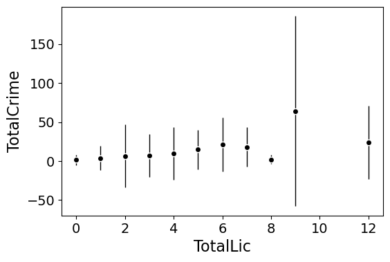
This example works out because licenses are just whole numbers, so it can be binned. You can pass in any X variable that can be binned in the end. So you could pass in a string for the X variable. If you don’t like the resulting format of the plot though, you can just pass plot=False,ret_data=True for arguments, and you get the aggregated data that I use to build the plots in the end.

mean_lic = smooth.mean_spike(DC_crime,'TotalLic','TotalCrime',
                             plot=False,ret_data=True)

Another example I am frequently interested in is proportions and confidence intervals. Here it uses exact binomial confidence intervals at the 99% confidence level. Here I clip the burglary data to 0/1 values and then estimate proportions.

####################
#Example with proportion confidence interval spike plots

DC_crime['BurgClip'] = DC_crime['OffN3'].clip(0,1)
smooth.prop_spike(DC_crime,'TotalLic','BurgClip')

####################

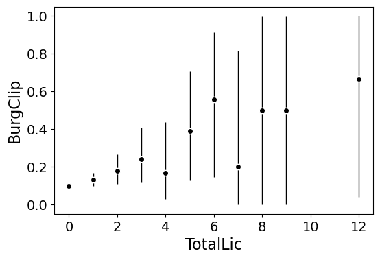
A few things to note about this is I clip out bins with only 1 observation in them for both of these plots. I also do not have an argument to save the plot. This is because I typically only use these for exploratory data analysis, it is pretty rare I use these plots in a final presentation or paper.

I will need to update these in the future to jitter the data slightly to be able to superimpose the original data observations. The next plots are a bit easier to show that though.

Restricted Cubic Spline Plots

Binning like I did prior works out well when you have only a few bins of data. If you have continuous inputs though it is tougher. In that case, typically what I want to do is estimate a functional relationship in a regression equation, e.g. Y ~ f(x), where f(x) is pretty flexible to identify potential non-linear relationships.

Many analysts are taught the loess linear smoother for this. But I do not like loess very much, it is often both locally too wiggly and globally too smooth in my experience, and the weighting function has no really good default.

Another popular choice is to use generalized additive model smoothers. My experience with these (in R) is better than loess, but they IMO tend to be too aggressive, and identify overly complicated functions by default.

My favorite approach to this is actually then from Frank Harrell’s regression modeling strategies. Just pick a regular set of restricted cubic splines along your data. It is arbitrary where to set the knot locations for the splines, but my experience is they are very robust (so chaning the knot locations only tends to change the estimated function form by a tiny bit).

I have class notes on restricted cubic splines I think are a nice introduction. First, I am going to make the same dataset from my class notes, the US violent crime rate from 85 through 2010.

years = pd.Series(list(range(26)))
vcr = [1881.3,
       1995.2,
       2036.1,
       2217.6,
       2299.9,
       2383.6,
       2318.2,
       2163.7,
       2089.8,
       1860.9,
       1557.8,
       1344.2,
       1268.4,
       1167.4,
       1062.6,
        945.2,
        927.5,
        789.6,
        734.1,
        687.4,
        673.1,
        637.9,
        613.8,
        580.3,
        551.8,
        593.1]

yr_df = pd.DataFrame(zip(years,years+1985,vcr), columns=['y1','years','vcr'])

I have a function that allows you to append the spline basis to a dataframe. If you don’t pass in a data argument, in returns a dataframe of the basis functions.

#Can append rcs basis to dataframe
kn = [3.0,7.0,12.0,21.0]
smooth.rcs(years,knots=kn,stub='S',data=yr_df)

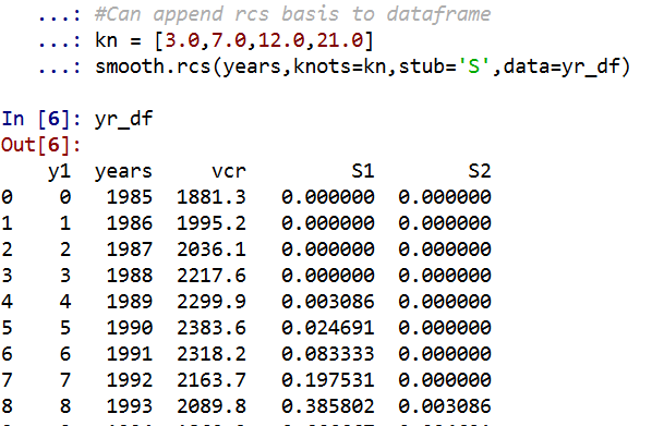
I also have in the code set Harrell’s suggested knot locations for the data. This ranges from 3 to 7 knots (it will through an error if you pass a number not in that range). This here suggests the locations [1.25, 8.75, 16.25, 23.75].

#If you want to use Harrell's rules to suggest knot locations
smooth.sug_knots(years,4)

Note if you have integer data here these rules don’t work out so well (can have redundant suggested knot locations). So Harell’s defaults don’t work with my alcohol license data. But it is one of the reasons I like these though, I just pick regular locations along the X data and they tend to work well. So here is a regression plot passing in those knot locations kn = [3.0,7.0,12.0,21.0] I defined a few paragraphs ago, and the plot does a few vertical guides to show the knot locations.

#RCS plot
smooth.plot_rcs(yr_df,'y1','vcr',knots=kn)

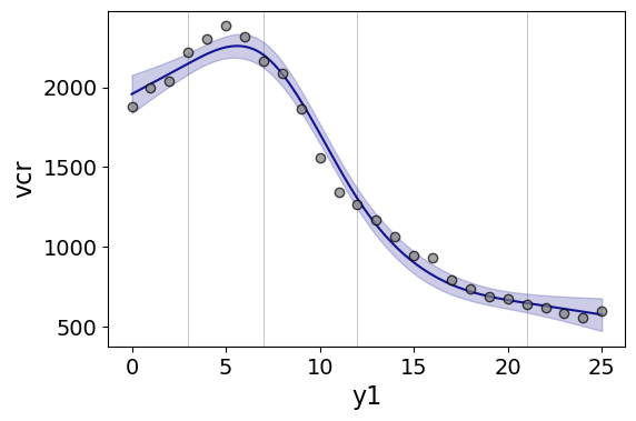
Note that the error bands in the plot are confidence intervals around the mean, not prediction intervals. One of the nice things though about this under the hood, I used statsmodels glm interface, so if you want you can change the underlying link function to Poisson (I am going back to my DC crime data here), you just pass it in the fam argument:

#Can pass in a family argument for logit/Poisson models
smooth.plot_rcs(DC_crime,'TotalLic','TotalCrime', knots=[3,7,10,15],
                fam=sm.families.Poisson(), marker_size=12)

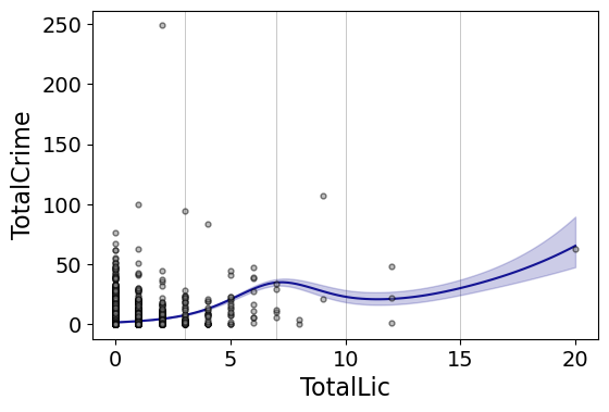
This is a really great example for the utility of splines. I will show later, but a linear Poisson model for the alcohol license effect extrapolates very poorly and ends up being explosive. Here though the larger values the conditional effect fits right into the observed data. (And I swear I did not fiddle with the knot locations, there are just what I picked out offhand to spread them out on the X axis.)

And if you want to do a logistic regression:

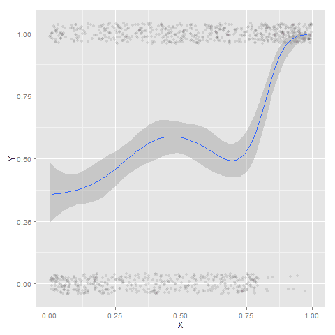
smooth.plot_rcs(DC_crime,'TotalLic','BurgClip', knots=[3,7,10,15],
                fam=sm.families.Binomial(),marker_alpha=0)

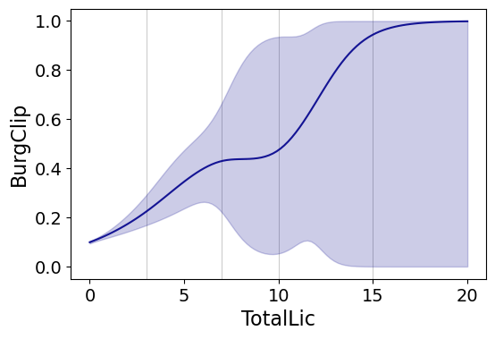
I’m not sure how to do this in a way you can get prediction intervals (I know how to do it for Gaussian models, but not for the other glm families, prediction intervals probably don’t make sense for binomial data anyway). But one thing I could expand on in the future is to do quantile regression instead of glm models.

Smooth Plots by Group

Sometimes you want to do the smoothed regression plots with interactions per groups. I have two helper functions to do this. One is group_rcs_plot. Here I use the good old iris data to illustrate, which I will explain why in a second.

#Superimposing rcs on the same plot
iris = sns.load_dataset('iris')
smooth.group_rcs_plot(iris,'sepal_length','sepal_width',
               'species',colors=None,num_knots=3)

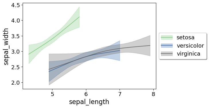
If you pass in the num_knots argument, the knot locations are different for each subgroup of data (which I like as a default). If you pass in the knots argument and the locations, they are the same though for each subgroup.

Note that the way I estimate the models here I estimate three different models on the subsetted data frame, I do not estimate a stacked model with group interactions. So the error bands will be a bit wider than estimating the stacked model.

Sometimes superimposing many different groups is tough to visualize. So then a good option is to make a set of small multiple plots. To help with this, I’ve made a function loc_error, to pipe into seaborn’s small multiple set up:

#Small multiple example
g = sns.FacetGrid(iris, col='species',col_wrap=2)
g.map_dataframe(smooth.loc_error, x='sepal_length', y='sepal_width', num_knots=3)
g.set_axis_labels("Sepal Length", "Sepal Width")

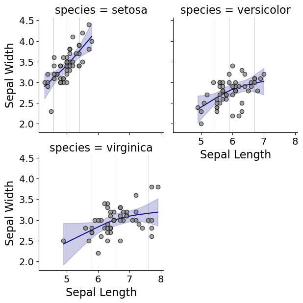
And here you can see that the not locations are different for each subset, and this plot by default includes the original observations.

Using the Formula Interface for Plots

Finally, I’ve been experimenting a bit with using the input in a formula interface, more similar to the way ggplot in R allows you to do this. So this is a new function, plot_form, and here is an example Poisson linear model:

smooth.plot_form(data=DC_crime,x='TotalLic',y='TotalCrime',
                 form='TotalCrime ~ TotalLic',
                 fam=sm.families.Poisson(), marker_size=12)

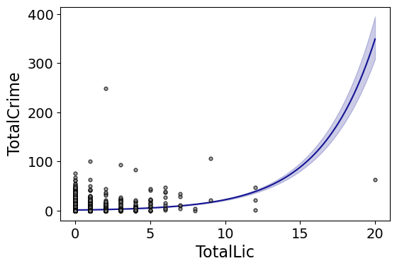
You can see the explosive effect I talked about, which is common for Poisson/negative binomial models.

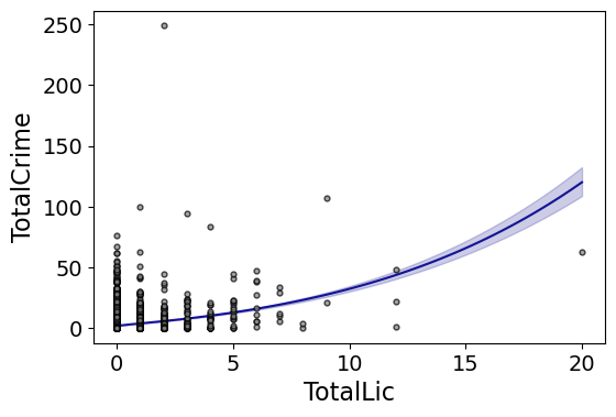
Here with the formula interface you can do other things, such as a polynomial regression:

#Can do polynomial terms
smooth.plot_form(data=DC_crime,x='TotalLic',y='TotalCrime',
                 form='TotalCrime ~ TotalLic + TotalLic**2 + TotalLic**3',
                 fam=sm.families.Poisson(), marker_size=12)

Which here ends up being almost indistinguishable from the linear terms. You can do other smoothers that are available in the patsy library as well, here are bsplines:

#Can do other smoothers
smooth.plot_form(data=DC_crime,x='TotalLic',y='TotalCrime',
                 form='TotalCrime ~ bs(TotalLic,df=4,degree=3)',
                 fam=sm.families.Poisson(), marker_size=12)

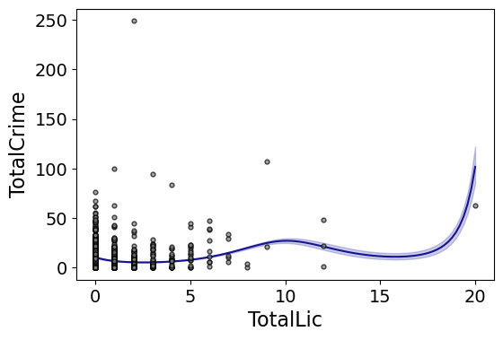
I don’t really have a good reason to prefer restricted cubic splines to bsplines, I am just more familiar with restricted cubic splines (and this plot does not illustrate the knot locations that were by default chosen, although you could pass in knot locations to the bs function).

You can also do other transformations of the x variable. So here if you take the square root of the total number of licenses helps with the explosive effect somewhat:

#Can do transforms of the X variable
smooth.plot_form(data=DC_crime,x='TotalLic',y='TotalCrime',
                 form='TotalCrime ~ np.sqrt(TotalLic)',
                 fam=sm.families.Poisson(), marker_size=12)
             

In the prior blog post about explosive Poisson models I also showed a broken stick type model if you wanted to log the x variable but it has zero values.

#Can do multiple transforms of the X variable
smooth.plot_form(data=DC_crime,x='TotalLic',y='TotalCrime',
                 form='TotalCrime ~ np.log(TotalLic.clip(1)) + I(TotalLic==0)',
                 fam=sm.families.Poisson(), marker_size=12)

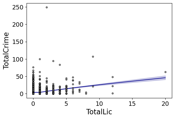
Technically this “works” if you transform the Y variable as well, but the resulting plot is misleading, and the prediction interval is for the transformed variable. E.g. if you pass a formula 'np.log(TotalCrime+1) ~ TotalLic', you would need to exponentiate the the predictions and subtract 1 to get back to the original scale (and then the line won’t be the mean anymore, but the confidence intervals are OK).

I will need to see if I can figure out patsy and sympy to be able to do the inverse transformation to even do that. That type of transform to the y variable directly probably only makes sense for linear models, and then I would also maybe need to do a Duan type smearing estimate to get the mean effect right.

Notes on making scatterplots in matplotlib and seaborn

Many of my programming tips, like my notes for making Leaflet maps in R or margins plots in Stata, I’ve just accumulated doing projects over the years. My current workplace is a python shop though, so I am figuring it out all over for some of these things in python. I made some ugly scatterplots for a presentation the other day, and figured it would be time to spend alittle time making some notes on making them a bit nicer.

For prior python graphing post examples, I have:

For this post, I am going to use the same data I illustrated with SPSS previously, a set of crime rates in Appalachian counties. Here you can download the dataset and the python script to follow along.

Making scatterplots using matplotlib

So first for the upfront junk, I load my libraries, change my directory, update my plot theme, and then load my data into a dataframe crime_dat. I technically do not use numpy in this script, but soon as I take it out I’m guaranteed to need to use np. for something!

################################################################
import pandas as pd
import numpy as np
import os
import matplotlib
import matplotlib.pyplot as plt
import seaborn as sns

my_dir = r'C:\Users\andre\OneDrive\Desktop\big_scatter'
os.chdir(my_dir)

andy_theme = {'axes.grid': True,
              'grid.linestyle': '--',
              'legend.framealpha': 1,
              'legend.facecolor': 'white',
              'legend.shadow': True,
              'legend.fontsize': 14,
              'legend.title_fontsize': 16,
              'xtick.labelsize': 14,
              'ytick.labelsize': 14,
              'axes.labelsize': 16,
              'axes.titlesize': 20,
              'figure.dpi': 100}

matplotlib.rcParams.update(andy_theme)
crime_dat = pd.read_csv('Rural_appcrime_long.csv')
################################################################

First, lets start from the base scatterplot. After defining my figure and axis objects, I add on the ax.scatter by pointing the x and y’s to my pandas dataframe columns, here Burglary and Robbery rates per 100k. You could also instead of starting from the matplotlib objects start from the pandas dataframe methods (as I did in my prior histogram post). I don’t have a good reason for using one or the other.

Then I set the axis grid lines to be below my points (is there a way to set this as a default?), and then I set my X and Y axis labels to be nicer than the default names.

################################################################
#Default scatterplot
fig, ax = plt.subplots(figsize=(6,4))
ax.scatter(crime_dat['burg_rate'], crime_dat['rob_rate'])
ax.set_axisbelow(True)
ax.set_xlabel('Burglary Rate per 100,000')
ax.set_ylabel('Robbery Rate per 100,000')
plt.savefig('Scatter01.png', dpi=500, bbox_inches='tight')
plt.show()
################################################################

You can see here the default point markers, just solid blue filled circles with no outline, when you get a very dense scatterplot just looks like a solid blob. I think a better default for scatterplots is to plot points with an outline. Here I also make the interior fill slightly transparent. All of this action is going on in the ax.scatter call, all of the other lines are the same.

################################################################
#Making points have an outline and interior fill
fig, ax = plt.subplots(figsize=(6,4))
ax.scatter(crime_dat['burg_rate'], crime_dat['rob_rate'], 
           c='grey', edgecolor='k', alpha=0.5)
ax.set_axisbelow(True)
ax.set_xlabel('Burglary Rate per 100,000')
ax.set_ylabel('Robbery Rate per 100,000')
plt.savefig('Scatter02.png', dpi=500, bbox_inches='tight')
plt.show()
################################################################

So that is better, but we still have quite a bit of overplotting going on. Another quick trick is to make the points smaller and up the transparency by setting alpha to a lower value. This allows you to further visualize the density, but then makes it a bit harder to see individual points – if you started from here you might miss that outlier in the upper right.

Note I don’t set the edgecolor here, but if you want to make the edges semitransparent as well you could do edgecolor=(0.0, 0.0, 0.0, 0.5), where the last number of is the alpha transparency tuner.

################################################################
#Making the points small and semi-transparent
fig, ax = plt.subplots(figsize=(6,4))
ax.scatter(crime_dat['burg_rate'], crime_dat['rob_rate'], c='k', 
            alpha=0.1, s=4)
ax.set_axisbelow(True)
ax.set_xlabel('Burglary Rate per 100,000')
ax.set_ylabel('Robbery Rate per 100,000')
plt.savefig('Scatter03.png', dpi=500, bbox_inches='tight')
plt.show()
################################################################

This dataset has around 7.5k rows in it. For most datasets of anymore than a hundred points, you often have severe overplotting like you do here. One way to solve that problem is to bin observations, and then make a graph showing the counts within the bins. Matplotlib has a very nice hexbin method for doing this, which is easier to show than explain.

################################################################
#Making a hexbin plot
fig, ax = plt.subplots(figsize=(6,4))
hb = ax.hexbin(crime_dat['burg_rate'], crime_dat['rob_rate'], 
               gridsize=20, edgecolors='grey', 
               cmap='inferno', mincnt=1)
ax.set_axisbelow(True)
ax.set_xlabel('Burglary Rate per 100,000')
ax.set_ylabel('Robbery Rate per 100,000')
cb = fig.colorbar(hb, ax=ax)
plt.savefig('Scatter04.png', dpi=500, bbox_inches='tight')
plt.show()
################################################################

So for the hexbins I like using the mincnt=1 option, as it clearly shows areas with no points, but then you can still spot the outliers fairly easy. (Using white for the edge colors looks nice as well.)

You may be asking, what is up with that outlier in the top right? It ends up being Letcher county in Kentucky in 1983, which had a UCR population estimate of only 1522, but had a total of 136 burglaries and 7 robberies. This could technically be correct (only some local one cop town reported, and that town does not cover the whole county), but I’m wondering if this is a UCR reporting snafu.

It is also a good use case for funnel charts. I debated on making some notes here about putting in text labels, but will hold off for now. You can add in text by using ax.annotate fairly easy by hand, but it is hard to automate text label positions. It is maybe easier to make interactive graphs and have a tooltip, but that will need to be another blog post as well.

Making scatterplots using seaborn

The further examples I show are using the seaborn library, imported earlier as sns. I like using seaborn to make small multiple plots, but it also has a very nice 2d kernel density contour plot method I am showing off.

Note this does something fundamentally different than the prior hexbin chart, it creates a density estimate. Here it looks pretty but creates a density estimate in areas that are not possible, negative crime rates. (There are ways to prevent this, such as estimating the KDE on a transformed scale and retransforming back, or reflecting the density back inside the plot would probably make more sense here, ala edge weighting in spatial statistics.)

Here the only other things to note are used filled contours instead of just the lines, I also drop the lowest shaded area (I wish I could just drop areas of zero density, note dropping the lowest area drops my outlier in the top right). Also I have a tough go of using the default bandwidth estimators, so I input my own.

################################################################
#Making a contour plot using seaborn
g = sns.kdeplot(crime_dat['burg_rate'], crime_dat['rob_rate'], 
                shade=True, cbar=True, gridsize=100, bw=(500,50),
                cmap='plasma', shade_lowest=False, alpha=0.8)
g.set_axisbelow(True)
g.set_xlabel('Burglary Rate per 100,000')
g.set_ylabel('Robbery Rate per 100,000')
plt.savefig('Scatter05.png', dpi=500, bbox_inches='tight')
plt.show()
################################################################ 

So far I have not talked about the actual marker types. It is very difficult to visualize different markers in a scatterplot unless they are clearly separated. So although it works out OK for the Iris dataset because it is small N and the species are clearly separated, in real life datasets it tends to be much messier.

So I very rarely use multiple point types to symbolize different groups in a scatterplot, but prefer to use small multiple graphs. Here is an example of turning my original scatterplot, but differentiating between different county areas in the dataset. It is a pretty straightforward update using sns.FacetGrid to define the group, and then using g.map. (There is probably a smarter way to set the grid lines below the points for each subplot than the loop.)

################################################################
#Making a small multiple scatterplot using seaborn
g = sns.FacetGrid(data=crime_dat, col='subrgn', 
                   col_wrap=2, despine=False, height=4)
g.map(plt.scatter, 'burg_rate', 'rob_rate', color='grey', 
       s=12, edgecolor='k', alpha=0.5)
g.set_titles("{col_name}")
for a in g.axes:
    a.set_axisbelow(True)
g.set_xlabels('Burglary Rate per 100,000')
g.set_ylabels('Robbery Rate per 100,000')
plt.savefig('Scatter06.png', dpi=500, bbox_inches='tight')
plt.show()
################################################################

And then finally I show an example of making a small multiple hexbin plot. It is alittle tricky, but this is an example in the seaborn docs of writing your own sub-plot function and passing that.

To make this work, you need to pass an extent for each subplot (so the hexagons are not expanded/shrunk in any particular subplot). You also need to pass a vmin/vmax argument, so the color scales are consistent for each subplot. Then finally to add in the color bar I just fiddled with adding an axes. (Again there is probably a smarter way to scoop up the plot coordinates for the last plot, but here I just experimented till it looked about right.)

################################################################
#Making a small multiple hexbin plot using seaborn

#https://github.com/mwaskom/seaborn/issues/1860
#https://stackoverflow.com/a/31385996/604456
def loc_hexbin(x, y, **kwargs):
    kwargs.pop("color", None)
    plt.hexbin(x, y, gridsize=20, edgecolor='grey',
               cmap='inferno', mincnt=1, 
               vmin=1, vmax=700, **kwargs)

g = sns.FacetGrid(data=crime_dat, col='subrgn', 
                  col_wrap=2, despine=False, height=4)
g.map(loc_hexbin, 'burg_rate', 'rob_rate', 
      edgecolors='grey', extent=[0, 9000, 0, 500])
g.set_titles("{col_name}")
for a in g.axes:
    a.set_axisbelow(True)
#This goes x,y,width,height
cax = g.fig.add_axes([0.55, 0.09, 0.03, .384])
plt.colorbar(cax=cax, ax=g.axes[0])
g.set_xlabels('Burglary Rate per 100,000')
g.set_ylabels('Robbery Rate per 100,000')
plt.savefig('Scatter07.png', dpi=500, bbox_inches='tight')
plt.show()
################################################################

Another common task with scatterplots is to visualize a smoother, e.g. E[Y|X] the expected mean of Y conditional on X, or you could do any other quantile, etc. That will have to be another post though, but for examples I have written about previously I have jittering 0/1 data, and visually weighted regression.

Jittered scatterplots with 0-1 data

Scatterplots with discrete variables and many observations take some touches beyond the defaults to make them useful. Consider the case of a categorical outcome that can only take two values, 0 and 1. What happens when we plot this data against a continuous covariate with my default chart template in SPSS?

Oh boy, that is not helpful. Here is the fake data I made and the GGRAPH code to make said chart.

*Inverse logit - see.
*https://andrewpwheeler.wordpress.com/2013/06/25/an-example-of-using-a-macro-to-make-a-custom-data-transformation-function-in-spss/.
DEFINE !INVLOGIT (!POSITIONAL  !ENCLOSE("(",")") ) 
1/(1 + EXP(-!1))
!ENDDEFINE.

SET SEED 5.
INPUT PROGRAM.
LOOP #i = 1 TO 1000.
  COMPUTE X = RV.UNIFORM(0,1).
  DO IF X <= 0.2.
    COMPUTE YLin = -0.5 + 0.3*(X-0.1) - 4*((X-0.1)**2).
  ELSE IF X > 0.2 AND X < 0.8.
    COMPUTE YLin = 0 - 0.2*(X-0.5) + 2*((X-0.5)**2) - 4*((X-0.5)**3).
  ELSE.
      COMPUTE YLin = 3 + 3*(X - 0.9).
  END IF.
  COMPUTE #YLin = !INVLOGIT(YLin).
  COMPUTE Y = RV.BERNOULLI(#YLin).
  END CASE.
END LOOP.
END FILE.
END INPUT PROGRAM.
DATASET NAME NonLinLogit.
FORMATS Y (F1.0) X (F2.1).

*Original chart.
GGRAPH
  /GRAPHDATASET NAME="graphdataset" VARIABLES=X Y
  /GRAPHSPEC SOURCE=INLINE.
BEGIN GPL
  SOURCE: s=userSource(id("graphdataset"))
  DATA: X=col(source(s), name("X"))
  DATA: Y=col(source(s), name("Y"))
  GUIDE: axis(dim(1), label("X"))
  GUIDE: axis(dim(2), label("Y"))
  ELEMENT: point(position(X*Y))
END GPL.

So here we will do a few things to the chart to make it easier to interpret:

SPSS can jitter the points directly within GGRAPH code (see point.jitter), but here I jitter the data slightly myself a uniform amount. The extra aesthetic options for making points smaller and semi-transparent are at the end of the ELEMENT statement.

*Making a jittered chart.
COMPUTE YJitt = RV.UNIFORM(-0.04,0.04) + Y.
FORMATS Y YJitt (F1.0).
GGRAPH
  /GRAPHDATASET NAME="graphdataset" VARIABLES=X Y YJitt
  /GRAPHSPEC SOURCE=INLINE.
BEGIN GPL
  SOURCE: s=userSource(id("graphdataset"))
  DATA: X=col(source(s), name("X"))
  DATA: Y=col(source(s), name("Y"))
  DATA: YJitt=col(source(s), name("YJitt"))
  GUIDE: axis(dim(1), label("X"))
  GUIDE: axis(dim(2), label("Y"), delta(1), start(0))
  SCALE: linear(dim(2), min(-0.05), max(1.05))
  ELEMENT: point(position(X*YJitt), size(size."3"), 
           transparency.exterior(transparency."0.7"))
END GPL.

If I made the Y axis categorical I would need to use point.jitter in the inline GPL code because SPSS will always force the categories to the same spot on the axis. But since I draw the Y axis as continuous here I can do the jittering myself.

A useful tool for exploratory data analysis is to add a smoothing term to plot – a local estimate of the mean at different locations of the X-axis. No binning necessary, here is an example using loess right within the GGRAPH call. The red line is the smoother, and the blue line is the actual proportion I generated the fake data from. It does a pretty good job of identifying the discontinuity at 0.8, but the change points earlier are not visible. Loess was originally meant for continuous data, but for exploratory analysis it works just fine on the 0-1 data here. See also smooth.mean for 0-1 data.

*Now adding in a smoother term.
COMPUTE ActualFunct = !INVLOGIT(YLin).
FORMATS Y YJitt ActualFunct (F2.1).
GGRAPH
  /GRAPHDATASET NAME="graphdataset" VARIABLES=X Y YJitt ActualFunct
  /GRAPHSPEC SOURCE=INLINE.
BEGIN GPL
  SOURCE: s=userSource(id("graphdataset"))
  DATA: X=col(source(s), name("X"))
  DATA: Y=col(source(s), name("Y"))
  DATA: YJitt=col(source(s), name("YJitt"))
  DATA: ActualFunct=col(source(s), name("ActualFunct"))
  GUIDE: axis(dim(1), label("X"))
  GUIDE: axis(dim(2), label("Y"), delta(0.2), start(0))
  SCALE: linear(dim(2), min(-0.05), max(1.05))
  ELEMENT: point(position(X*YJitt), size(size."3"), 
           transparency.exterior(transparency."0.7"))
  ELEMENT: line(position(smooth.loess(X*Y, proportion(0.2))), color(color.red))
  ELEMENT: line(position(X*ActualFunct), color(color.blue))
END GPL.

SPSS’s default smoothing is alittle too smoothed for my taste, so I set the proportion of the X variable to use in estimating the mean within the position statement.

I wish SPSS had the ability to draw error bars around the smoothed means (you can draw them around the linear regression lines with quadratic or cubic polynomial terms, but not around the local estimates like smooth.loess or smooth.mean). I realize they are not well defined and rarely have coverage properties of typical regression estimators – but I rather have some idea about the error than no idea. Here is an example using the ggplot2 library in R. Of course we can work the magic right within SPSS.

BEGIN PROGRAM R.
#Grab Data
casedata <- spssdata.GetDataFromSPSS(variables=c("Y","X"))
#ggplot smoothed version
library(ggplot2)
library(splines)
MyPlot <- ggplot(aes(x = X, y = Y), data = casedata) + 
          geom_jitter(position = position_jitter(height = .04, width = 0), alpha = 0.1, size = 2) +
          stat_smooth(method="glm", family="binomial", formula = y ~ ns(x,5))
MyPlot
END PROGRAM.

To accomplish the same thing in SPSS you can estimate restricted cubic splines and then use any applicable regression procedure (e.g. LOGISTIC, GENLIN) and save the predicted values and confidence intervals. It is pretty easy to call the R code though!

I haven’t explored the automatic linear modelling, so let me know in the comments if there is a simply way right in SPSS to get explore such non-linear predictions.