
Scatterplots with discrete variables and many observations take some touches beyond the defaults to make them useful. Consider the case of a categorical outcome that can only take two values, 0 and 1. What happens when we plot this data against a continuous covariate with my default chart template in SPSS?
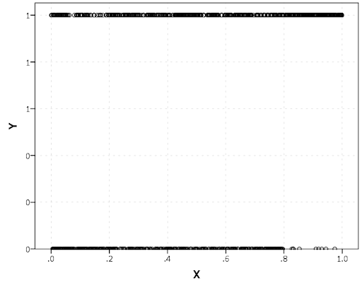
Oh boy, that is not helpful. Here is the fake data I made and the GGRAPH code to make said chart.
*Inverse logit - see.
*https://andrewpwheeler.wordpress.com/2013/06/25/an-example-of-using-a-macro-to-make-a-custom-data-transformation-function-in-spss/.
DEFINE !INVLOGIT (!POSITIONAL  !ENCLOSE("(",")") )
1/(1 + EXP(-!1))
!ENDDEFINE.

SET SEED 5.
INPUT PROGRAM.
LOOP #i = 1 TO 1000.
  COMPUTE X = RV.UNIFORM(0,1).
  DO IF X <= 0.2.
    COMPUTE YLin = -0.5 + 0.3*(X-0.1) - 4*((X-0.1)**2).
  ELSE IF X > 0.2 AND X < 0.8.
    COMPUTE YLin = 0 - 0.2*(X-0.5) + 2*((X-0.5)**2) - 4*((X-0.5)**3).
  ELSE.
      COMPUTE YLin = 3 + 3*(X - 0.9).
  END IF.
  COMPUTE #YLin = !INVLOGIT(YLin).
  COMPUTE Y = RV.BERNOULLI(#YLin).
  END CASE.
END LOOP.
END FILE.
END INPUT PROGRAM.
DATASET NAME NonLinLogit.
FORMATS Y (F1.0) X (F2.1).

*Original chart.
GGRAPH
  /GRAPHDATASET NAME="graphdataset" VARIABLES=X Y
  /GRAPHSPEC SOURCE=INLINE.
BEGIN GPL
  SOURCE: s=userSource(id("graphdataset"))
  DATA: X=col(source(s), name("X"))
  DATA: Y=col(source(s), name("Y"))
  GUIDE: axis(dim(1), label("X"))
  GUIDE: axis(dim(2), label("Y"))
  ELEMENT: point(position(X*Y))
END GPL.
So here we will do a few things to the chart to make it easier to interpret:
- jitter the points slightly on the Y-axis so they don’t overlap
- draw the points smaller and slightly transparent
SPSS can jitter the points directly within GGRAPH code (see point.jitter), but here I jitter the data slightly myself a uniform amount. The extra aesthetic options for making points smaller and semi-transparent are at the end of the ELEMENT statement.
*Making a jittered chart.
COMPUTE YJitt = RV.UNIFORM(-0.04,0.04) + Y.
FORMATS Y YJitt (F1.0).
GGRAPH
  /GRAPHDATASET NAME="graphdataset" VARIABLES=X Y YJitt
  /GRAPHSPEC SOURCE=INLINE.
BEGIN GPL
  SOURCE: s=userSource(id("graphdataset"))
  DATA: X=col(source(s), name("X"))
  DATA: Y=col(source(s), name("Y"))
  DATA: YJitt=col(source(s), name("YJitt"))
  GUIDE: axis(dim(1), label("X"))
  GUIDE: axis(dim(2), label("Y"), delta(1), start(0))
  SCALE: linear(dim(2), min(-0.05), max(1.05))
  ELEMENT: point(position(X*YJitt), size(size."3"),
           transparency.exterior(transparency."0.7"))
END GPL.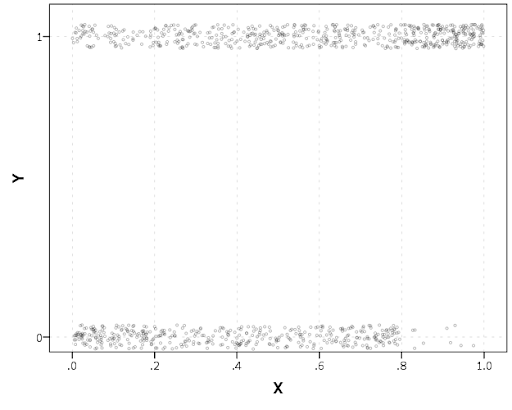
If I made the Y axis categorical I would need to use point.jitter in the inline GPL code because SPSS will always force the categories to the same spot on the axis. But since I draw the Y axis as continuous here I can do the jittering myself.
A useful tool for exploratory data analysis is to add a smoothing term to plot – a local estimate of the mean at different locations of the X-axis. No binning necessary, here is an example using loess right within the GGRAPH call. The red line is the smoother, and the blue line is the actual proportion I generated the fake data from. It does a pretty good job of identifying the discontinuity at 0.8, but the change points earlier are not visible. Loess was originally meant for continuous data, but for exploratory analysis it works just fine on the 0-1 data here. See also smooth.mean for 0-1 data.
*Now adding in a smoother term.
COMPUTE ActualFunct = !INVLOGIT(YLin).
FORMATS Y YJitt ActualFunct (F2.1).
GGRAPH
  /GRAPHDATASET NAME="graphdataset" VARIABLES=X Y YJitt ActualFunct
  /GRAPHSPEC SOURCE=INLINE.
BEGIN GPL
  SOURCE: s=userSource(id("graphdataset"))
  DATA: X=col(source(s), name("X"))
  DATA: Y=col(source(s), name("Y"))
  DATA: YJitt=col(source(s), name("YJitt"))
  DATA: ActualFunct=col(source(s), name("ActualFunct"))
  GUIDE: axis(dim(1), label("X"))
  GUIDE: axis(dim(2), label("Y"), delta(0.2), start(0))
  SCALE: linear(dim(2), min(-0.05), max(1.05))
  ELEMENT: point(position(X*YJitt), size(size."3"),
           transparency.exterior(transparency."0.7"))
  ELEMENT: line(position(smooth.loess(X*Y, proportion(0.2))), color(color.red))
  ELEMENT: line(position(X*ActualFunct), color(color.blue))
END GPL.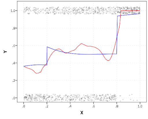
SPSS’s default smoothing is alittle too smoothed for my taste, so I set the proportion of the X variable to use in estimating the mean within the position statement.
I wish SPSS had the ability to draw error bars around the smoothed means (you can draw them around the linear regression lines with quadratic or cubic polynomial terms, but not around the local estimates like smooth.loess or smooth.mean). I realize they are not well defined and rarely have coverage properties of typical regression estimators – but I rather have some idea about the error than no idea. Here is an example using the ggplot2 library in R. Of course we can work the magic right within SPSS.
BEGIN PROGRAM R.
#Grab Data
casedata <- spssdata.GetDataFromSPSS(variables=c("Y","X"))
#ggplot smoothed version
library(ggplot2)
library(splines)
MyPlot <- ggplot(aes(x = X, y = Y), data = casedata) +
          geom_jitter(position = position_jitter(height = .04, width = 0), alpha = 0.1, size = 2) +
          stat_smooth(method="glm", family="binomial", formula = y ~ ns(x,5))
MyPlot
END PROGRAM.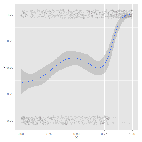
To accomplish the same thing in SPSS you can estimate restricted cubic splines and then use any applicable regression procedure (e.g. LOGISTIC, GENLIN) and save the predicted values and confidence intervals. It is pretty easy to call the R code though!
I haven’t explored the automatic linear modelling, so let me know in the comments if there is a simply way right in SPSS to get explore such non-linear predictions.


3 Comments