The Big 2020 Homicide Increase in Context

Jeff Asher recently wrote about the likely 2020 increase in Homicides, stating this is an unprecedented increase. (To be clear, this is 2020 data! Homicide reporting data in the US is just a few months shy of a full year behind.)

In the past folks have found me obnoxious, as I often point to how homicide rates (even for fairly large cities), are volatile (Wheeler & Kovandzic, 2018). Here is an example of how I thought the media coverage of the 2015/16 homicide increase was overblown.

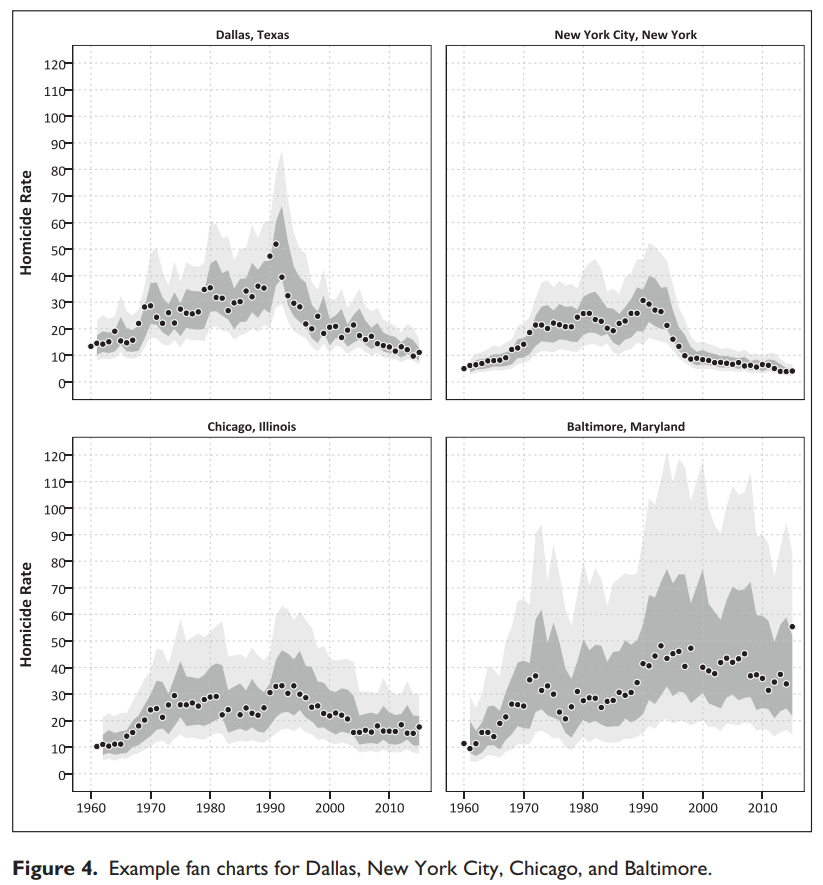
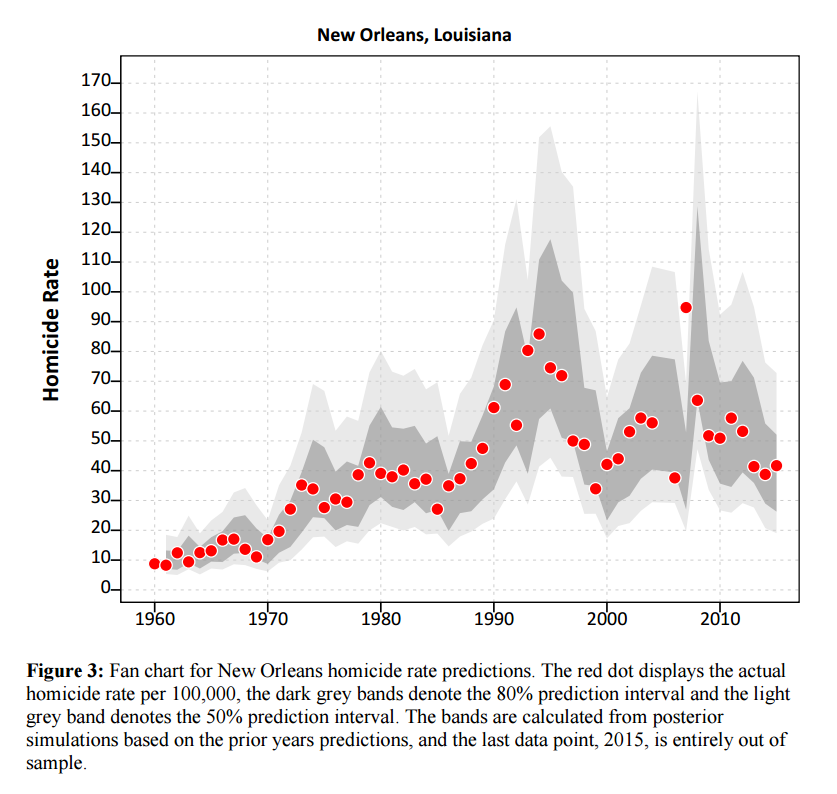
I actually later quantified this more formally with then students Haneul Yim and Jordan Riddell (Yim et al., 2020). We found the 2015 increase was akin to when folks on the news say a 1 in 100 year flood. So I was wrong in terms of it was a fairly substantive increase relative to typical year to year changes. Using the same methods, I updated the charts to 2020 data, and 2020 is obviously a much larger increase than the ARIMA model we fit based on historical data would expect:

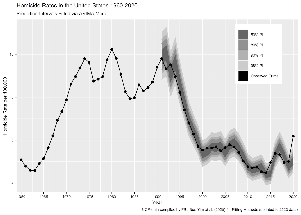
Looking at historical data, people often argue “it isn’t as high as the early 90’s” – this is not the point though I really intended to make (it is kind of silly to make a normative argument about the right or acceptable number of homicides) – but I can see how I conflated those arguments. Looking at the past is also about understanding the historical volatility (what is the typical year to year change). Here this is clearly a much larger swing (up or down) than we would expect based on the series where we have decent US coverage (going back to 1960).


For thinking about crime spikes, I often come from a place in my crime analyst days where I commonly was posed with ‘crime is on the rise’ fear in the news, and needed to debunk it (so I could get back to doing analysis on actual crime problems, not imaginary ones). One example was a convenience store was robbed twice in the span of 3 days, and of course the local paper runs a story crime is on the rise. So I go and show the historical crime trends to the Chief and the Mayor that no, commercial robberies are flat. And even for that scenario there were other gas stations that had more robberies in toto when looking at the data in the past few years. So when the community police officer went to talk to that convenience store owner to simply lock up his cash in more regular increments, I told that officer to also go to other stores and give similar target hardening advice.

Another aspect of crime trends is not only whether a spike is abnormal (or whether we actually have an upward trend), but what causes it. I am going to punt on that – in short it is basically impossible in normal times to know what caused short term spikes absent identifying specific criminal groups (which is not so relevant for nationwide spikes, but even in large cities one active criminal group can cause observable spikes). We have quite a bit of crazy going on at the moment – Covid, BLM riots, depolicing – I don’t know what caused the increase and I doubt we will ever have a real firm answer. We cannot run an experiment to see why these increases occurred – it is mostly political punditry pinning it on one theory versus another.

For the minor bit it is worth – the time series methods I use here signal that the homicide series is ARIMA(1,1,0) – which means both an integrated random walk component and a auto-regressive component. Random walks will occur in macro level data in which the micro level data are a bunch of AR components. So this suggests a potential causal attribution to increased homicides is homicides itself (crime begets more crime). And this can cause run away effects of long upwards/downwards trends. I don’t know of a clear way though to validate that theory, nor any obvious utility in terms of saying what we should do to prevent increases in homicides or stop any current trends. Even if we have national trends, any intervention I would give a thumbs up to is likely to be local to a particular municipality. (Thomas Abt’s Bleeding Out is about the best overview of potential interventions that I mostly agree with.)

References

  • Wheeler, A. P., & Kovandzic, T. V. (2018). Monitoring volatile homicide trends across US cities. Homicide Studies, 22(2), 119-144.
  • Yim, H. N., Riddell, J. R., & Wheeler, A. P. (2020). Is the recent increase in national homicide abnormal? Testing the application of fan charts in monitoring national homicide trends over time. Journal of Criminal Justice, 66, 101656.

Notes for the 2019/2020 updated homicide data. 2019 data is available from the FBI page, 2020 homicide data I have taken from estimates at USA Facts and total USA pop is taken from Google search results.

R code and data to replicate the chart can be downloaded here.

Sorting rates using empirical Bayes

A problem I have come across in a few different contexts is the idea of ranking rates. For example, say a police department was interested in increasing contraband recovery and are considering two different streets to conduct additional traffic enforcement on — A and B. Say street A has a current hit rate of 50/1000 for a rate of 5%, and street B has a recovery rate of 1/10 for 10%. If you just ranked by percentages, you would choose street B. But given the small sample size, targeting street B is not a great bet to actually have a 10% hit rate going forward, so it may be better to choose street A.

The idea behind this observation is called shrinkage. Your best guess for the hit rate in either location A or location B in the future is not the observed percentage, but somewhere in between the observed percentage and the overall hit rate. Say the overall hit rate for contraband recovery is only 1%, then you wouldn’t expect street B to have a 10% hit rate going forward, but maybe something closer to 2% given the very small sample size. For street A you would expect shrinkage as well, but given it is a much larger sample size you would expect the shrinkage to be much less, say a 4% hit rate going forward. In what follows I will show how to calculate that shrinking using a technique called empirical Bayesian estimation.

I wanted to apply this problem to a recent ranking of cities based on officer involved shooting rates via federalcharges.com (hat tip to Justin Nix for tweeting that article). The general idea is that you don’t want to highlight cities who have high rates simply by chance due to smaller population baselines. Howard Wainer talks about this problem of ranking resulted in the false idea that smaller schools were better based on small samples of test results. Due to the high variance small schools will be both at the top and the bottom of the distributions, even if all of the schools have the same overall mean rate. Any reasonable ranking needs to take that variance into account to avoid the same mistake.

The same idea can be applied to homicide or other crime rates. Here I provide some simple code (and a spreadsheet) so other analysts can easily replicate this sorting idea for their own problems.

Sorting OIS Shooting Rates

For this analysis I just took the reported rates by the federal changes post already aggregated to city, and added in 2010 census estimates from Wikipedia. I’d note these are not necessarily the correct denominator, some jurisdictions may cover less/more of the pop that these census designated areas. (Also you may consider other non-population denominators as well.) But just as a proof of concept I use the city population (which I suspect is what the original federal charges blog post used.)

The below graph shows the city population on the X axis, and the OIS rate per 100,000 on the Y axis. I also added in the average rate within these cities (properly taking into account that cities are different population sizes), and curves to show the 99% confidence interval funnel. You can see that the distribution is dispersed more than would be expected by the simple binomial proportions around the overall rate of close to 9 per 100,000.

The following section I have some more notes on how I calculated the shrinkage, but here is a plot that shows the original rate, and the empirical Bayes shrunk OIS rate. The arrow points to the shrunk rate, so you can see that places with smaller population proportions and those farther away from the overall rate are shrunk towards the overall OIS rate within this sample.

To see how this changes the rankings, here is a slopegraph of the before/after rankings.

So most of the rankings only change slightly using this technique. But if one incorporated cities with smaller populations though they would change even more.

The federal charges post also calculates differences in the OIS rate versus the homicide rate. That approach suffers from even worse problems in ignoring the variance of smaller population denominators (it compounds two high variance estimates), but I think the idea of adjusting for homicide rates in this context maybe has potential in a random effects binomial model (either as a covariate or a multivariate outcome). Would need to think about it/explore it some more though. Also to note is that the fatal encounters data is multiple years, so don’t be confused that OIS rates by police are larger than yearly homicide rates.

The Mathy Part, Empirical Bayes Shrinkage

There are a few different ways I have seen reported to do empirical Bayes shrinkage. One is estimating the beta distribution for the entire sample, and then creating a shrunk estimate for the observed rates for individual observations using the observed sample Beta estimates as a prior (hence empirical Bayes). David Robinson has a nice little e-book on batting averages and empirical Bayes that can be applied to basically any type of percentage estimate you are interested in.

Another way I have seen it expressed is based on the work of the Luc Anselin and the GeoDa folks using explicit formulas.

Either of these ways you can do in a spreadsheet (a more complicated way is to actually fit a random effects model), but here is a simpler run-down of the GeoDa formula for empirical shrinkage, which is what I use in the above example. (This will not necessarily be the same compared to David Robinson’s approach, see the R code in the zip file of results for comparisons to David’s batting average dataset, but are pretty similar for that example.) So you can think of the shrunk rate as a weighted average between the observed rate for location i as y_i, and the overall rate mu, where the weight is W_i.

Shrunk Rate_i = W_i*y_i + (1 - W_i)*mu

You then need to calculate the W_i weight term. Weights closer to 1 (which will happen with bigger population denominators) result in only alittle shrinkage. Weights closer to 0 (when the population denominator is small), result in much larger shrinkage. Below are the formulas and variable definitions to calculate the shrinkage.

  • i = subscript to denote area i. No subscript means it is a scalar.
  • r_i = total number of incidents (numerator) in area i
  • p_i = total population in area i (denominator)
  • y_i = observed rate in area i = r_i/p_i
  • k = total number of areas in study
  • mu = population mean rate = sum(r_i)/sum(p_i)
  • v = population variance = sum(p_i*[y_i - mu]^2]) / [sum(p_i)] - mu/(sum(p_i)/k)
  • W_i = shrinkage weight = v /[v + (mu/p_i)]

For those using R, here is a formula that takes the numerator and denominator as vectors and returns the smoothed rate based on the above formula:

#R function
shrunkrate <- function(num,den){
  sDen <- sum(den)
  obsrate <- num/den
  k <- length(num)
  mu <- sum(num)/sDen
  pav <- sDen/k
  v <- ( sum( den*(obsrate-mu)^2 ) / sDen ) - (mu/pav) 
  W <- v / (v + (mu/den))
  smoothedrate <- W*obsrate + (1 - W)*mu
  return(smoothedrate)
}

For those using SPSS I’ve uploaded macro code to do both the funnel chart lines and the shrunk rates.

For either missing values might mess things up, so eliminate them before using the functions. For those who don’t use stat software, I have also included an Excel spreadsheet that shows how to calculate the smoothed rates. It is in this zip file, along with other code and data used to replicate my graphs and results here.

For those interested in other related ideas, see

Monitoring homicide trends paper published

My paper, Monitoring Volatile Homicide Trends Across U.S. Cities (with coauthor Tom Kovandzic) has just been published online in Homicide Studies. Unfortunately, Homicide Studies does not give me a link to share a free PDF like other publishers, but you can either grab the pre-print on SSRN or always just email me for a copy of the paper.

They made me convert all of the charts to grey scale :(. Here is an example of the funnel chart for homicide rates in 2015.

And here are example fan charts I generated for a few different cities.

As always if you have feedback or suggestions let me know! I posted all of the code to replicate the analysis at this link. The prediction intervals can definately be improved both in coverage and in making their length smaller, so I hope to see other researchers tackling this as well.

New working paper – Monitoring volatile homicide trends across U.S. cities

I have a new working paper out — Monitoring volatile homicide trends across U.S. cities, with one of my colleagues Tomislav Kovandzic. You can grab the pre-print on SSRN, and the paper has links to code to replicate the charts and models in the paper.

Here I look at homicide rates in U.S. cities and use funnel charts and fan charts to show the typical volatility in homicide rates between cities and within cities over time. As I’ve written previously, I think much of the media narrative around homicide increases are hyperbolic and often cherry pick reasons why they think homicides are going up.

I’ve shown examples of funnel charts on this blog before, so I will use a different image as the tease. To generate the prediction intervals for fan charts I estimate binomial random effect models. Below is an example for New Orleans (homicide rate per 100,000 population):

As always, if you have feedback feel free to send me an email.