
I have a new working paper out — Monitoring volatile homicide trends across U.S. cities, with one of my colleagues Tomislav Kovandzic. You can grab the pre-print on SSRN, and the paper has links to code to replicate the charts and models in the paper.
Here I look at homicide rates in U.S. cities and use funnel charts and fan charts to show the typical volatility in homicide rates between cities and within cities over time. As I’ve written previously, I think much of the media narrative around homicide increases are hyperbolic and often cherry pick reasons why they think homicides are going up.
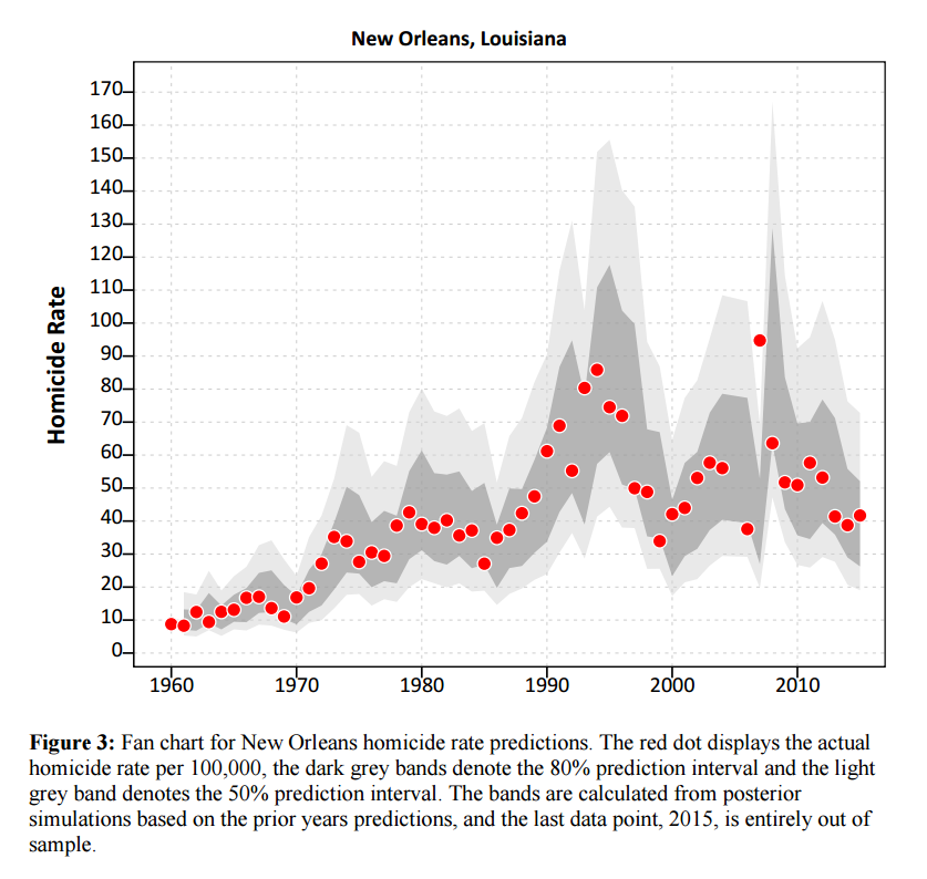
I’ve shown examples of funnel charts on this blog before, so I will use a different image as the tease. To generate the prediction intervals for fan charts I estimate binomial random effect models. Below is an example for New Orleans (homicide rate per 100,000 population):
As always, if you have feedback feel free to send me an email.


1 Comment