Cointegration analysis of Ethereum and BitCoin

So a friend recently has heavily encouraged investment into Ethereum and NFTs. Part of the motivation of these cryptocurrencies is to be independent of fiat currency. So that lends itself to a hypothesis – are cryptocurrency prices and more typical securities independent? Or are we simply seeing similar trends in these different securities over time? This is a job for cointegration analysis. The python code is simple enough to follow along in a blog post.

So first I import the libraries I am using – it leverages the Yahoo finance API to download ticker data (here I analyze closing prices), and statsmodels to conduct the various analyses in python.

from datetime import datetime
import numpy as np
import pandas as pd
import yfinance as yf
import matplotlib.pyplot as plt

from statsmodels.tsa.stattools import adfuller, ccf
from statsmodels.tsa.api import VAR
from statsmodels.tsa.vector_ar import vecm

Now we can download the ticker data, here I will analyze BitCoin and Ethereum, along with Gold prices and the S&P 500 index fund.

# BTC-USD : Bitcoin
# ETH-USD : Ethereum
# ^GSPC ; S&P 500
# GC=F : Gold

end_date = datetime.now().strftime("%Y-%m-%d")
print(end_date) #running as of 2/9/2022

tick_str = 'BTC-USD ETH-USD ^GSPC GC=F'
dat = yf.download(tick_str,start='2017-01-01',end=end_date)

Now for data prep – I am going to interpolate missing data (for when the market was closed). Then I only subset out Fridays at close to conduct a weekly analysis. Even weekly is too short for me to bother with rebalancing if I do decide to invest.

# Fill in missing data before sub-sampling to once a week
dat2 = dat.interpolate()

# Only Fridays close post 11/9/2017
dat2.reset_index(inplace=True)
after = pd.to_datetime('2017-11-09')
sel = (dat2.Date >= after) & (dat2.Date.dt.weekday == 4) #Friday
sdat = dat2.loc[sel,['Date','Close']]
sdat.columns = ['Date'] + ['BitCoin','Eth','S&P 500','Gold']
sdat.set_index('Date',inplace=True)

Now lets look at the overall trends by superimposing these four stocks on the same graph. Just min-max normalizing to range from 0 to 1.

# Time Series Graphs of Each
# Normalized to be 0/1
snorm = sdat.copy()
for v in sdat:
    mi,ma = sdat[v].min(),sdat[v].max()
    snorm[v] = (sdat[v] - mi)/(ma-mi)

# All four series on the same graph
snorm.plot(linewidth=2)
plt.show()

So you can see these all appear to follow a similar upward trajectory after Covid hit in 2020, although crypto has way more volatility recently. If we subset out just the crypto’s, we can see how they trend with each other more easily.

s2 = sdat.copy()
s2['BitCoin/10'] = s2['BitCoin']/10
s2[['BitCoin/10','Eth']].plot(linewidth=2)
plt.show()

So based on this, I would say that maybe Bitcoin is a leading indicator of Ethereum (increases in BitCoin precede increases in Eth with maybe just a week lag).

Typically with any time series analysis like this, we are concerned with whether the series are stationary. Just going off of my Ender’s Applied Econometric Time Series book, we typically look at the Adjusted Dickey-Fuller test for the levels:

# Integration analysis
adfuller(sdat['BitCoin'], regression='ct', maxlag=5, autolag='t-stat', regresults=True)

And we can see this fails to reject the null, so we would conclude the series is integrated. Since we have a fairly large sample here (over 200 weeks), the test should be reasonably powered. If we then take the first differences and conduct the same test, we then reject the null of an integrated series (here for Bitcoin).

# Create differenced data
sdiff = sdat.diff().dropna()

# All appear 1st order integrated!
adfuller(sdiff['BitCoin'], regression='ct', maxlag=5, autolag='t-stat', regresults=True)

So this reasonably suggests Bitcoin is an I(1) process. Doing the same for all of the other securities in this example you come to the same inference, all integrated of order 1 (which is very typical for stock data).

Using the differenced data, we can see the cross-correlations between different securities. In this example, it appears BitCoin/Ethereum just have a large 1 positive lag, and close to 0 after that.

# Only 1 lag positive in differenced data
pd.Series(ccf(sdiff['BitCoin'],sdiff['Eth'])[:10]).plot(kind='bar',grid=False)

So based on this, I subsequent only look at 1 lag in subsequent models. (Prior week impacts current week, since we are analyzing weekly data.)

So you need to be careful here – typically we want to avoid doing regression analysis of integrated time series, as that can lead to spurious correlations. But in the case a series is co-integrated, it is ok to conduct analysis on the levels. So here we do the analysis of the levels for each of the securities to assess our hypothesis. (Including temporal trends results in different coefficients, but similar overall inferences.)

mod = VAR(sdat)
res = mod.fit(1) #trend='ctt'
res.summary()

So we can see here that contrary to the graphs, Ethereum has a negative relationship with BitCoin – when Ethereum goes up a dollar, the following week BitCoin goes down $1.7. For BitCoin the relationships with S&P is negative (but weaker), and Gold it is positive.

# Ethereum causes BitCoin to go down
irf = res.irf(4)
irf.plot(orth=False,impulse='Eth',response='BitCoin')

For Ethereum the converse is not true though – BitCoin + increases Ethereum (although given that BitCoin is currently 10x the value of Eth the magnitude is smaller).

# Ethereum causes BitCoin to go down
irf = res.irf(4)
irf.plot(orth=False,impulse='Eth',response='BitCoin')

There are more formal tests to look at Granger causality and cointegration with error correction models, but looking at the VAR of the levels I think is the easiest to Grok here.

Do not take this as investment advice, looking at the volatility of these securities makes me very hesistant to invest even a small sum.

# Granger causality test
gc = res.test_causality('Eth', 'BitCoin', kind='f').summary()
print(gc)

# Cointegration test
ecm = vecm.coint_johansen(sdat[['BitCoin','Eth']], 1, 1)
print(ecm.max_eig_stat)
print(ecm.max_eig_stat_crit_vals)

ecm = vecm.VECM(sdat[['BitCoin','Eth']],deterministic='co')
est = ecm.fit()

est.plot_forecast(4,n_last_obs=10)
plt.show()

Based on this analysis it might make sense to include BitCoin as a portfolio diversification relative to traditional stocks – if willing to assume quite a bit of risk. If you are a gambler it may make sense to do some type of pairs trading strategy between Eth/Bitcoin on a short term basis. (If I had some real magic low risk money making strategy I would not put it in a blog post!)

Gambling is fun (and it is fun to think damn if I invested in Eth in 2019 I would be up 10x) – but I don’t think I am going onto the crypto roller-coaster at the moment.

The Big 2020 Homicide Increase in Context

Jeff Asher recently wrote about the likely 2020 increase in Homicides, stating this is an unprecedented increase. (To be clear, this is 2020 data! Homicide reporting data in the US is just a few months shy of a full year behind.)

In the past folks have found me obnoxious, as I often point to how homicide rates (even for fairly large cities), are volatile (Wheeler & Kovandzic, 2018). Here is an example of how I thought the media coverage of the 2015/16 homicide increase was overblown.

I actually later quantified this more formally with then students Haneul Yim and Jordan Riddell (Yim et al., 2020). We found the 2015 increase was akin to when folks on the news say a 1 in 100 year flood. So I was wrong in terms of it was a fairly substantive increase relative to typical year to year changes. Using the same methods, I updated the charts to 2020 data, and 2020 is obviously a much larger increase than the ARIMA model we fit based on historical data would expect:

Looking at historical data, people often argue “it isn’t as high as the early 90’s” – this is not the point though I really intended to make (it is kind of silly to make a normative argument about the right or acceptable number of homicides) – but I can see how I conflated those arguments. Looking at the past is also about understanding the historical volatility (what is the typical year to year change). Here this is clearly a much larger swing (up or down) than we would expect based on the series where we have decent US coverage (going back to 1960).


For thinking about crime spikes, I often come from a place in my crime analyst days where I commonly was posed with ‘crime is on the rise’ fear in the news, and needed to debunk it (so I could get back to doing analysis on actual crime problems, not imaginary ones). One example was a convenience store was robbed twice in the span of 3 days, and of course the local paper runs a story crime is on the rise. So I go and show the historical crime trends to the Chief and the Mayor that no, commercial robberies are flat. And even for that scenario there were other gas stations that had more robberies in toto when looking at the data in the past few years. So when the community police officer went to talk to that convenience store owner to simply lock up his cash in more regular increments, I told that officer to also go to other stores and give similar target hardening advice.

Another aspect of crime trends is not only whether a spike is abnormal (or whether we actually have an upward trend), but what causes it. I am going to punt on that – in short it is basically impossible in normal times to know what caused short term spikes absent identifying specific criminal groups (which is not so relevant for nationwide spikes, but even in large cities one active criminal group can cause observable spikes). We have quite a bit of crazy going on at the moment – Covid, BLM riots, depolicing – I don’t know what caused the increase and I doubt we will ever have a real firm answer. We cannot run an experiment to see why these increases occurred – it is mostly political punditry pinning it on one theory versus another.

For the minor bit it is worth – the time series methods I use here signal that the homicide series is ARIMA(1,1,0) – which means both an integrated random walk component and a auto-regressive component. Random walks will occur in macro level data in which the micro level data are a bunch of AR components. So this suggests a potential causal attribution to increased homicides is homicides itself (crime begets more crime). And this can cause run away effects of long upwards/downwards trends. I don’t know of a clear way though to validate that theory, nor any obvious utility in terms of saying what we should do to prevent increases in homicides or stop any current trends. Even if we have national trends, any intervention I would give a thumbs up to is likely to be local to a particular municipality. (Thomas Abt’s Bleeding Out is about the best overview of potential interventions that I mostly agree with.)

References

  • Wheeler, A. P., & Kovandzic, T. V. (2018). Monitoring volatile homicide trends across US cities. Homicide Studies, 22(2), 119-144.
  • Yim, H. N., Riddell, J. R., & Wheeler, A. P. (2020). Is the recent increase in national homicide abnormal? Testing the application of fan charts in monitoring national homicide trends over time. Journal of Criminal Justice, 66, 101656.

Notes for the 2019/2020 updated homicide data. 2019 data is available from the FBI page, 2020 homicide data I have taken from estimates at USA Facts and total USA pop is taken from Google search results.

R code and data to replicate the chart can be downloaded here.

A Tableau walkthough: Seasonal chart

So my workplace uses Tableau quite a bit, and I know it is becoming pretty popular for crime analysis units as well. So I was interested in trying to pick some up. It can be quite daunting though. I’ve tried to sit through a few general tutorials, but they make my head spin.

Students of mine when I teach ArcGIS have said it is so many buttons it can be overwhelming, and Tableau is much the same way. I can see the appeal of it though, in particular for analysts who exclusively use Excel. The drag/drop you can somewhat intuitively build more detailed charts that are difficult to put together in Excel. And of course out of the box it produces interactive charts you can share, which is really the kicker that differentiates Tableau from other tools.

So instead of sitting through more tutorials I figured I would just jump in and make a few interactive graphics. And along the way I will do tutorials, same as for my other crime analysis labs, for others to follow along.

And I’ve finished/posted my first tutorial, making a seasonal chart. It is too big to fit into a blog post (over 30 screenshots!). But shows how to make a monthly seasonal chart, which is a nice interactive to have for Compstat like meetings.

Here is the final interactive version, and here is a screenshot of the end result:

And you can find the full walkthrough with screenshots here:

TABLEAU SEAONAL CHART TUTORIAL/WALKTHROUGH

Some Things Crime Analysts Should Consider When Using Tableau

So first, I built this using the free version of Tableau. I don’t think the free version will cut it though for most crime analysts.

One of the big things I see Tableau as being convenient is a visualization layer on top of a database. It can connect to the live database, and so automatically update. You cannot do this though with the free version. (And likely you will need some SQL chops to get views for data in formats you can’t figure out how to coerce Tableau functions.)

So if you go through the above tutorial and say that is alot of work, well it is, but you can set it up once on a live data stream, and it just works going forward.

The licensing isn’t crazy though, and if you are doing this for data that can be shared with the public, I think that can make sense for crime analysts. For detailed report info that cannot be shared with the public, it is a bit more tricky though (and I definitely cannot help with the details for doing your own on prem server).

There are other totally free interactive dashboard like options as well, such as Shiny in R, plotly libraries (in R and python), and python has a few other interactive ones as well. The hardest part really is the server portion for any of them (making it so others can see the interactive graphic). Tableau is nice and reactive though in my experience, even when hooked up to a live data stream (but not crazy big data).

I hope to expand to my example Poisson z-score charts with error bands, and then maybe see if I can build a dashboard with some good cross-linking between panes with geo data.

For this example I am almost 100% happy with the end result. One thing I would like is for the hover behavior to select the entire line (but the tooltips still be individual months). Also would like the point at the very end to be larger, and not show the label. But these are very minor things in the end.

Simulating runs of events

I still lurk on the Cross Validated statistics site every now and then. There was a kind of common question about the probability of a run of events occurring, and the poster provided a nice analytic solution to the problem using Markov Chains and absorbing states I was not familiar with.

I was familiar with a way to approximate the answer though using a simple simulation, and encoding data via run length encoding. Run length encoding works like this, if you have an original sequence that is AABBBABBBB, then the run length encoded version of this sequence is:

A,2
B,2
A,1
B,4

This is a quite convenient sparse data format to be familiar with. E.g. if you are using tensors in various deep learning libraries, you can encode the data like this and then stack the tensor. But the stacked tensor is just a view, so it doesn’t take up as much memory as the initial full tensor.

Using this encoding also makes a simulation to answer the question, how often do runs of 5+ occur in this hypothetical experiment quite easy to estimate. You just calculate the run length encoded version of the data, and see if any of the lengths are equal to or greater than 5. Below are code snippets in R and Python.

While the analytic solution is of course preferable when you can figure it out, simulations are nice to test whether the solution is correct, as well as to provide an answer when you are not familiar with how to analytically derive a solution.

R Code

R has a native run-length encoding command, rle. The reason is that runs tests are a common time series technique for looking at randomness. Encourage you to run the code yourself to see how my simulated answer lines up with the analytic answer provided on the stats site!

##########################################
# R Code
set.seed(10)
die <- 1:6
run_sim <- function(rolls=1000, conseq=5){
    test <- sample(die,rolls,TRUE)
    res <- max(rle(test)$lengths) >= conseq
    return(res)
}

sims <- 1000000
results <- replicate(sims, run_sim(), TRUE)
print( mean(results) )
##########################################

Python Code

The python code is very similar to the R code. Main difference is there is no native run length encoding command in numpy or scipy I am aware of (although there should be)! So I edited a function I found from Stackoverflow to accomplish the rle.

##########################################
# Python code

import numpy as np
np.random.seed(10)

# Edited from https://stackoverflow.com/a/32681075/604456
# input numpy arrary, return tuple (lengths, vals)
def rle(ia):
    y = np.array(ia[1:] != ia[:-1])         # pairwise unequal (string safe)
    i = np.append(np.where(y), len(ia) - 1) # must include last element
    z = np.diff(np.append(-1, i))           # run lengths
    return (z, ia[i])

die = list(range(6))

def run_sim(rolls=1000, conseq=5):
    rlen, vals = rle(np.random.choice(a=die,size=rolls,replace=True))
    return rlen.max() >= conseq

sims = 1000000
results = [run_sim() for i in range(sims)]
print( sum(results)/len(results) )
##########################################

I debated on expanding this post to show how to do these simulations in parallel, this is a bit of a cheesy experiment to show though. To do 1 million simulations on my machine still only takes like 10~20 seconds for each of these code snippets. So that will have to wait until another post!

You may be thinking why do I care about runs of dice rolls? Well, it can be extended to many different types of time series monitoring problems. For example, when I worked as a crime analyst at Troy I thought about this in terms of analyzing domestic violent reports. They were too numerous for me to read through every report, so I needed to devise a system to identify if there were anomalous patterns in the recent number of reports. You could devise a test here, say how many days of 10+ reports in a row, and see how frequently you would expect that occur in say a year of monitoring. The simulations above could easily be amended to do that, via doing simulations of the Poisson distribution instead of dice rolls, or assigning weights to particular outcomes.

The Failed Idea Bin: Temporal Aggregation and the Crime/Stop Relationship

A recent paper by the Hipp/Kim/Wo trio analyzing robbery at very fine temporal scales in NYC reminded me on a failed project I never quite worked out to completion. This project was about temporal aggregation bias. We talk about spatial aggregation bias quite a bit, which I actually don’t think is that big of deal for many projects (for reasons discussed in my dissertation).

I think it is actually a bigger deal though when dealing with temporal relationships, especially when we are considering endogenous relationships between crime and police action in response to crime. This is because they are a countervailing endogenous relationship – most endogenous relationships are positively correlated, but here we think police do more stuff (like arrests and stops) in areas with more crime, and that crime falls in response.

I remember the first time I thought about the topic was when I was working with the now late Dennis Smith and Robert Purtell as a consultant for the SQF litigation in NYC. Jeff Fagan had some models predicting the number of stops in an area, conditional on crime and demographic factors at the quarterly level. Dennis and Bob critiqued this as not being at the right temporal aggregation – police respond to crime patterns much faster than at the quarterly level. So Jeff redid his models at the monthly level and found the exact same thing as he did at the quarterly level. This however just begs the question of whether monthly is the appropriate temporal resolution.

So to try to tackle the problem I took the same approach as I did for my dissertation – I pretend I know what the micro level equation looks like, and then aggregate it up, and see what happens. So I start with two endogenous equations:

crime_t1 = -0.5*(stops_t0) + e_c
stops_t1 =  0.5*(crime_t0) + e_s

And then aggregation is just a sum of the micro level units:

Crime_T = (crime_t1 + crime_t0)
Stops_T = (stops_t1 + stops_t0)

And then what happens when we look at the aggregate relationship?

Crime_T = Beta*(Stops_T)

Intuitively here you may see where this is going. Since crime and stops have the exact same countervailing effects on each other, they cancel out if you aggregate up one step. I however show in the paper if you aggregate up more than two temporal units in this situation the positive effect wins. The reason is that back substitution for prior negative time series relationships oscillates (so a negative covariance at t-1 is a positive covariance at t-2). And in the aggregate the positive swamps the negative relationship. Even estimating Crime_T = Beta*(Stops_T-1) does not solve the problem. These endogenous auto-regressive relationships actually turn into an integrated series quite quickly (a point that cannot be credited to me, Clive Granger did a bunch of related work).

So this presented a few hypotheses. One, since I think short run effects for stops and crime are more realistic (think the crackdown literature), the covariance between them at higher resolutions (say monthly) should be positive. You should only be able to recover the deterrent effect of stops at very short temporal aggregations I think. Also crime and stops should be co-integrated at large temporal aggregations of a month or more.

Real life was not so convenient for me though. Here I have the project data and code saved. I have the rough draft of the theoretical aggregation junk here for those interested. Part of the reason this is in the failed idea bin is that neither of my hypotheses appears to be true with the actual crime and stop data. For the NYC citywide data I broke up stops into radio-runs and not-radio-runs (less discretion for radio runs, but still should have similar deterrent effects), and crimes as Part 1 Violent, Part 1 Non-Violent, and Part 2. More recently I handed it off to Zach Powell, and he ran various vector auto-regression models at the monthly/weekly/daily/hourly levels. IIRC it was pretty weak sauce evidence that stops at the lower temporal aggregations showed greater evidence of reducing crime.

There of course is a lot going on that could explain the results. Others have found deterrent effects using instrumental variable approaches (such as David Greenberg’s work using Arellano-Bond, or Wooditch/Weisburd using Bartik instruments). So maybe my idea that spatial aggregation does not matter is wrong.

Also there is plenty of stuff going on specifically in NYC. We had the dramatic drop in stops due to the same litigation. Further work by MacDonald/Fagan/Geller have shown stops that met a higher reasonable suspicion standard based on the reported data have greater effects than others (essentially using Impact zones as an instrument there).

So it was a question I was never able to figure out – how to correctly identify the right temporal unit to examine crime and deterrence from police action.

Some notes on PChange – estimating when trajectories cross over time

J.C. Barnes and company published a paper in JQC not too long ago and came up with a metric, PChange, to establish the number of times trajectories cross in a sample. This is more of interest to life course folks, although it is not totally far fetched to see it applied to trajectories of crime at places. Part of my interest in it was simply that it is an interesting statistical question — when two trajectories with errors cross. A seemingly simple question that has a few twists and turns. Here are my subsequent notes on that metric.

The Domain Matters

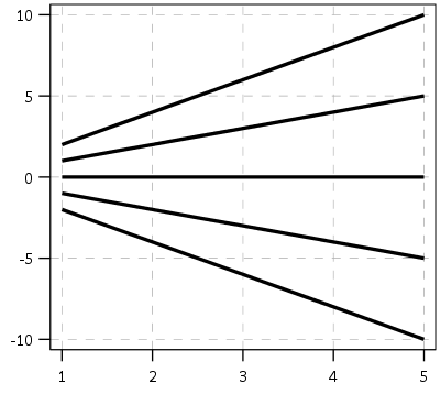
First, here is an example of the trajectories not crossing:

This points to an important assumption about those lines not crossing though that was never mentioned in the Barnes paper — the domain matters. For instance, if we draw those rays further back in time what happens?

They cross! This points to an important piece of information when evaluating PChange — the temporal domain in which you examine the data matters. So if you have a sample of juvenile delinquency measures from 14-18 you would find less change than a similar sample from 12-20.

This isn’t really a critique of PChange — it is totally reasonable to only want to examine changes within a specific domain. Who cares if delinquency trajectories cross when people are babies! But it should be an important piece of information researchers use in the future if they use PChange — longer samples will show more change. It also won’t be fair to compare PChange for samples of different lengths.

A Functional Approach to PChange

For above you may ask — how would you tell if a trajectory crosses outside of the domain of the data? The answer to that question is you estimate an underlying function of the trajectory — some type of model where the outcome is a function of age (or time). With that function you can estimate the trajectory going back in time or forward in time (or in between sampled measurements). You may not want to rely on data outside of the domain (its standard error will be much higher than data within the time domain, forecasting is always fraught with peril!), but the domain of your sample is ultimately arbitrary. So what about the question will the trajectories ever cross? Or would the trajectories have crossed if I had data for ages 12-20 instead of just 16-18? Or would they have crossed if I checked the juveniles at age 16 1/2 instead of only at 16?

So actually instead of the original way the Barnes paper formulated PChange, here is how I thought about calculating PChange. First you estimate the underlying trajectory for each individual in your sample, then you take the difference of those trajectories.

y_i = f(t)
y_j = g(t)
y_delta = f(t) - g(t) = d(t)

Where y_i is the outcome y for observation i, and y_j is the outcome y for observation j. t is a measure of time, and thus the anonymous functions f and g represent growth models for observations i and j over time. y_delta is then the difference between these two functions, which I represent as the new function d(t). So for example the functions for each individual might be quadratic in time:

y_i = b0i + b1i(t) + b2i(t^2)
y_j = b0j + b1j(t) + b2j(t^2)

Subsequently the difference function will also be quadratic, and can be simply represented as:

y_delta = (b0i - b0j) + (b1i - b1j)*t + (b2i - b2j)*t^2

Then for the trajectories to cross (or at least touch), y_delta just then has to equal zero at some point along the function. If this were math, and the trajectories had no errors, you would just set d(t) = 0 and solve for the roots of the equation. (Most people estimating models like these use functions that do have roots, like polynomials or splines). If you cared about setting the domain, you would then just check if the roots are within the domain of interest — if they are, the trajectories cross, if they are not, then they do not cross. For data on humans with age, obviously roots for negative human years will not be of interest. But that is a simple way to solve the domain problem – if you have an underlying estimate of the trajectory, just see how often the trajectories cross within equivalent temporal domains in different samples.

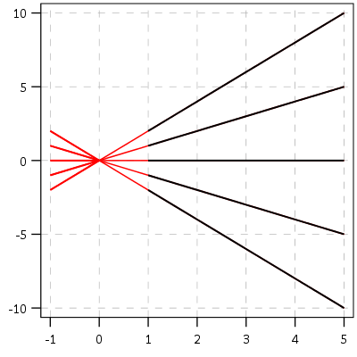
I’d note that the idea of having some estimate of the underlying trajectory is still relevant even within the domain of the data — not just extrapolating to time periods outside. Consider two simple curves below, where the points represent the time points where each individual was measured.

So while the two functions cross, when only considering the sampled locations, like is done in Barnes et al.’s PChange, you would say these trajectories do not cross, when in actuality they do. It is just the sampled locations are not at the critical point in the example for these two trajectories.

This points to another piece of contextual information important to interpreting PChange — the number of sample points matter. If you have samples every 6 months, you will likely find more changes than if you just had samples every year.

I don’t mean here to bag on Barnes original metric too much — his PChange metric does not rely on estimating the underlying functional form, and so is a non-parametric approach to identifying change. But estimating the functional form for each individual has some additional niceties — one is that you do not need the measures to be at equivalent sample locations. You can compare someone measured at 11, 13, and 18 to someone who is measured at 12, 16, and 19. For people analyzing stuff for really young kids I bet this is a major point — the underlying function at a specific age is more important then when you conveniently measured the outcome. For older kids though I imagine just comparing the 12 to 11 year old (but in the same class) is probably not a big deal for delinquency. It does make it easier though to compare say different cohorts in which the measures are not at nice regular intervals (e.g. Add Health, NLYS, or anytime you have missing observations in a longitudinal survey).

In the end you would only want to estimate an underlying functional form if you have many measures (more so than 3 in my example), but this typically ties in nicely with what people modeling the behavior over time are already doing — modeling the growth trajectories using some type of functional form, whether it is a random effects model or a group based trajectory etc., they give you an underlying functional form. If you are willing to assume that model is good enough to model the trajectories over time, you should think it is good enough to calculate PChange!

The Null Matters

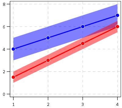
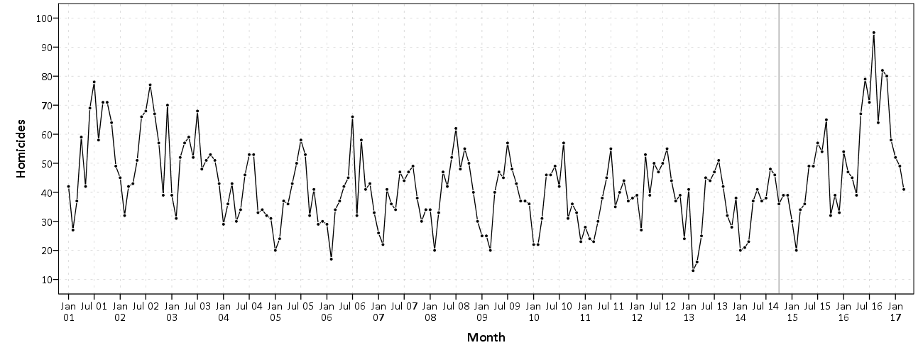
So this so far would be fine and dandy if we had perfect estimates of the underlying trajectories. We don’t though, so you may ask, even though y_delta does not exactly equal zero anywhere, its error bars might be quite wide. Wouldn’t we then still infer that there is a high probability the two trajectories cross? This points to another hidden assumption of Barnes PChange — the null matters. In the original PChange the null is that the two trajectories do not cross — you need a sufficient change in consecutive time periods relative to the standard error to conclude they cross. If the standard error is high, you won’t consider the lines to cross. Consider the simple table below:

Period A_Level A_SE B_Level B_SE
1      4         1    1.5   0.5     
2      5         1    3     0.5
3      6         1    4.5   0.5
4      7         1    6     0.5

Where A_Level and B_Level refer to the outcome for the four time periods, and A_SE and B_SE refer to the standard errors of those measurements. Here is the graph of those two trajectories, with the standard error drawn as areas for the two functions (only plus minus one standard error for each line).

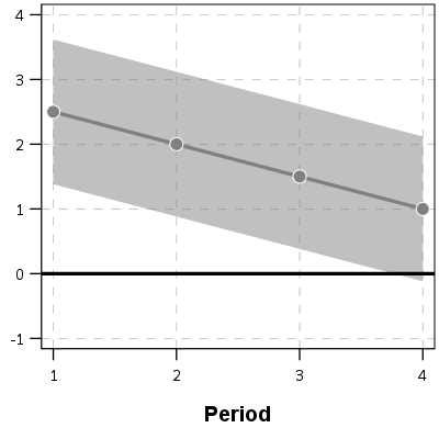
And here is the graph of the differences — assuming that the covariance between the two functions is zero (so the standard error of the difference equals sqrt(A_SE^2 + B_SE^2)). Again only plus/minus one standard error.

You can see that the line never crosses zero, but the standard error area does. If our null is H0: y_delta = 0 for any t, then we would fail to reject the null in this example. So in Barnes original PChange these examples lines would not cross, whereas with my functional approach we don’t have enough data to know they don’t cross. This I suspect would make a big difference in many samples, as the standard error is going to be quite large unless you have very many observations and/or very many time points.

If one just wants a measure of crossed or did not cross, with my functional approach you could set how wide you want to draw your error bars, and then estimate whether the high or low parts of that bar cross zero. You may not want a discrete measure though, but a probability. To get that you would integrate the probability over the domain of interest and calculate the chunk of the function that cross zero. (Just assume the temporal domain is uniform across time.)

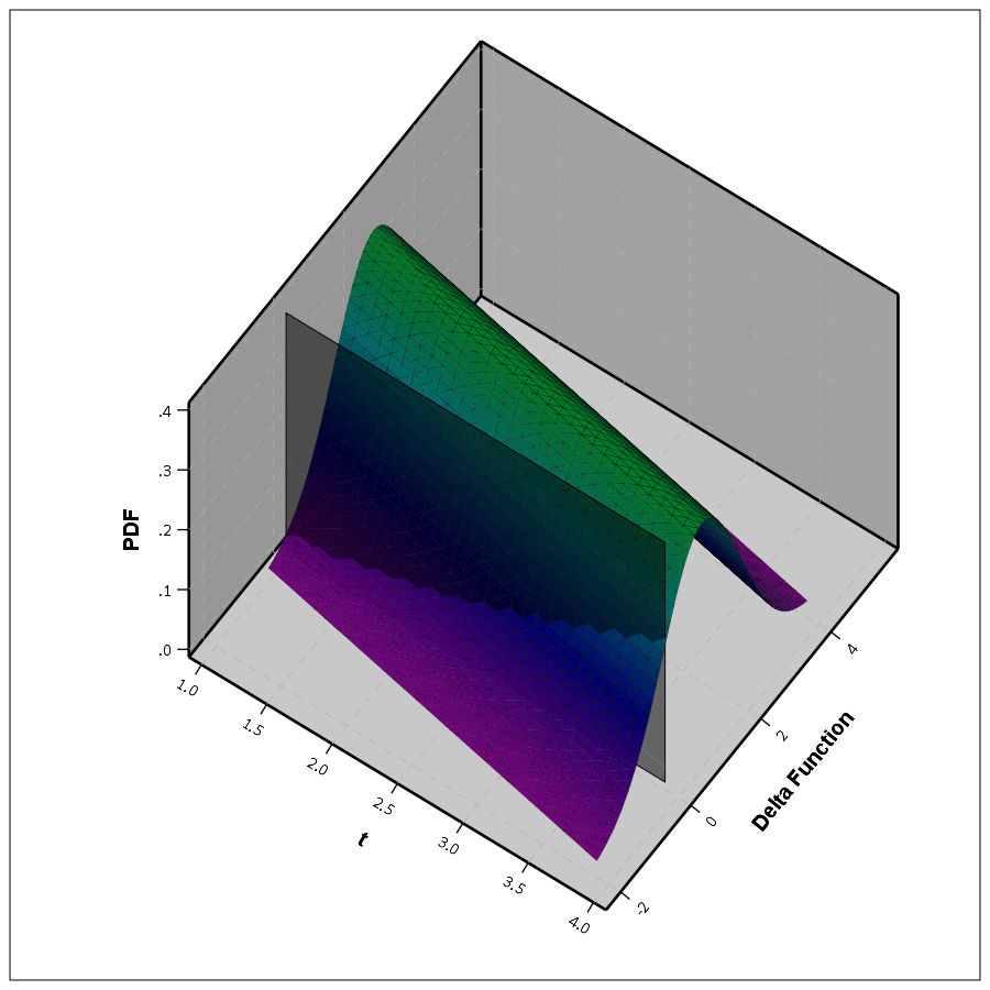
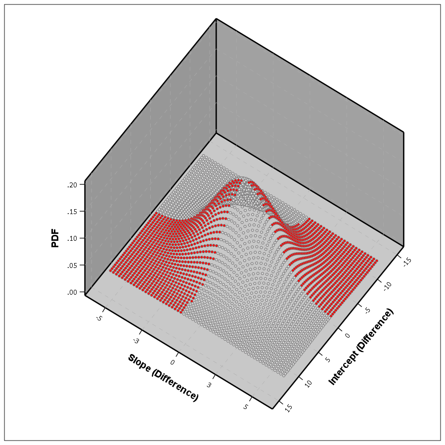
So in 3d, my difference function would look like this, whereas to the bottom of the wall is the area to calculate the probability of the lines crossing, and the height of the surface plot is the PDF at that point. (Note the area of the density is not normalized to sum to 1 in this plot.)

This surface graph ends up crossing more than was observed in my prior 2d plots, as I was only plotting 1 standard error. Here imagine that the top green part of the density is the mean function — which does not cross zero — but then you have a non-trivial amount of the predicted density that does cross the zero line.

In the example where it just crosses one time by a little, it seems obvious to consider the small slice as the probability of the two lines crossing. I think to extend this to not knowing to test above or below the line you could calculate the probability on either side of the line, take the minimum, and then double that minimum for your p-value. So if say 5% of the area is below the line in my above example, you would double it and say the two-tailed p-value of the lines crossing is p = 0.10. Imagine the situation in which the line mostly hovers around 0, so the mass is about half on one side and half on the other. In that case the probability the lines cross seems much higher than 50%, so doubling seems intuitively reasonable.

So if you consider this probability to be a p-value, with a very small p-value you would reject the null that the lines cross. Unlike most reference distributions for p-values though, you can get a zero probability estimate of the lines crossing. You can aggregate up those probabilities as weights when calculating the overall PChange for the sample. So you may not know for certain if two trajectories cross, but you may be able to say these two trajectories cross with a 30% probability.

Again this isn’t to say that PChange is bad — it is just different. I can’t give any reasoning whether assuming they do cross (my functional approach) or assuming they don’t cross (Barnes PChange) is better – they are just different, but would likely make a large difference in the estimated number of crossings.

Population Change vs Individual Level Change

So far I have just talked about trying to determine whether two individual lines cross. For my geographic analysis of trajectories in which I have the whole population (just a sample in time), this may be sufficient. You can calculate all pairwise differences and then calculate PChange (I see no data based reason to use the permutation sample approach Barnes suggested – we don’t have that big of samples, we can just calculate all pairwise combinations.)

But for many of the life course researchers, they are more likely to be interested in estimating the population of changes from the samples. Here I will show how you can do that for either random effects models, or for group based trajectory models based on the summary information. This takes PChange from a sample metric to a population level metric implied via your models you have estimated. This I imagine will be much easier to generalize across samples than the individual change metrics, which will be quite susceptible to outlier trajectories, especially in small samples.

First lets start with the random effects model. Imagine that you fit a linear growth model — say the random intercept has a variance of 2, and the random slope has a variance of 1. So these are population level metrics. The fixed effects and the covariance between the two random effect terms will be immaterial for this part, as I will discuss in a moment.

First, trivially, if you selected two random individuals from the population with this random effects distribution, the probability their underlying trajectories cross at some point is 1. The reason is for linear models, two lines only never cross if the slopes are perfectly parallel. Which sampling from a continuous random distribution has zero probability of them being exactly the same. This does not generalize to more complicated functions (imagine parabolas concave up and concave down that are shifted up and down so they never cross), but should be enough of a motivation to make the question only relevant for a specified domain of time.

So lets say that we are evaluating the trajectories over the range t = [10,20]. What is the probability two individuals randomly sampled from the population will cross? So again with my functional difference approach, we have

y_i = b0i + b1i*t
y_j = b0j + b1j*t
y_delta = (b0i - b0j) + (b1i - b1j)*t

Where in this case the b0 and b1 have prespecified distributions, so we know the distribution of the difference. Note that in the case with no covariates, the fixed effects will cancel out when taking the differences. (Generalizing to covariates is not as straightforward, you could either assume they are equal so they cancel out, or you could have them vary according to additional distributions, e.g. males have an 90% chance of being drawn versus females have a 10% chance, in that case the fixed effects would not cancel out.) Here I am just assuming they cancel out. Additionally, taking the difference in the trajectories also cancels out the covariance term, so you can assume the covariance between (b0i - b0j) and (b1i - b1j) is zero even if b0 and b1 have a non-zero covariance for the overall model. (Post is long enough — I leave that as an exercise for the reader.)

For each of the differences the means will be zero, and the variance will be the two variances added together, e.g. b0i - b0j will have a mean of zero and a variance of 2 + 2 = 4. The variance of the difference in slopes will then be 2. Now to figure out when the two lines will cross.

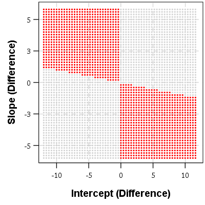
If you make a graph where the X axis is the difference in the intercepts, and the Y axis is the difference in the slopes, you can then mark off areas that indicate the two lines will cross given the domain. Here for example is a sampling of where the lines cross – red is crossing, grey is not crossing.

So for example, say we had two random draws:

y_i = 1   + 0.5*t
y_j = 0.5 + 0.3*t
y_delta = 0.5 + 0.2*t

This then shows that the two lines do not cross when only evaluating t between 10 and 20. They have already diverged that far out (you would need negative t to have the lines cross). Imagine if y_delta = -6 + 0.2*t though, this line does cross zero though, at t = 10 this function equals -1, whereas at t = 20 the function equals 4.

If you do another 3d plot you can plot the bivariate PDF. Again integrate the chunks of areas in which the function crosses zero, and voila, you get your population estimate.

This works in a similar manner to higher order polynomials, but you can’t draw it in a nice graph though. I’m blanking at the moment of a way to find these areas offhand in a nice way — suggestions welcome!

This gets a bit tricky thinking about in relation to individual level change. This approach does not assume any error in the random draws of the line, but assumes the draws will have a particular distribution. So the PChange does not come from adding up whether individual lines in your sample cross, it comes from the estimated distribution of what the difference in two randomly drawn lines would look like that is implied by your random effects model. Think if based on your random effect distribution you randomly drew two lines, calculated if they crossed, and then did this simulation a very large number of times. The integrations I’m suggesting are just an exact way to calculate PChange instead of the simulation approach.

If you were to do individual change from your random effects model you would incorporate the standard error of the estimated slope and intercept for the individual observation. This is for your hypothetical population though, so I see no need to incorporate any error.

Estimating population level change from group based trajectory models via my functional approach is more straightforward. First, with my functional approach you would assume individuals who share the same latent trajectory will cross with a high probability, no need to test that. Second, for testing whether two individual trajectories cross you would use the approach I’ve already discussed around individual lines and gain the p-value I mentioned.

So for example, say you had a probability of 25% that a randomly drawn person from group A would cross a randomly drawn person from Group B. Say also that Group A has 40/100 of the sample, and Group B is 60/100. So then we have three different groups: A to A, B to B, and A to B. You can then break down the pairwise number in each group, as well as the number of crosses below.

Compare   N    %Cross Cross
A-A      780    100    780
B-B     1770    100   1770
A-B     2400     25    600
Total   4950     64   3150

So then we have a population level p-change estimate of 64% from our GBTM. All of these calculations can be extended to non-integers, I just made them integers here to simplify the presentation.

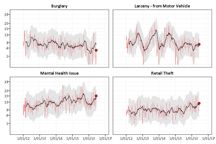
Now, that overall PChange estimate may not be real meaningful for GBTM, as the denominator includes pairwise combinations of folks in the same trajectory group, which is not going to be of much interest. But just looking at the individual group solutions and seeing what is the probability they cross could be more informative. For example, although Barnes shows the GBTM models in the paper as not crossing, depending on how wide the standard errors of the functions are (that aren’t reported), this functional approach would probably assign non-zero probability of them crossing (think low standard error for the higher group crossing a high standard error for the low group).


Phew — that was a long post! Let me know in the comments if you have any thoughts/concerns on what I wrote. Simple question — whether two lines cross — not a real simple solution when considering the statistical nature of the question though. I can’t be the only person to think about this though — if you know of similar or different approaches to testing whether two lines cross please let me know in the comments.

Graphs and interrupted time series analysis – trends in major crimes in Baltimore

Pete Moskos’s blog is one I regularly read, and a recent post he pointed out how major crimes (aggravated assaults, robberies, homicides, and shootings) have been increasing in Baltimore post the riot on 4/27/15. He provides a series of different graphs using moving averages to illustrate the rise, see below for his initial attempt:

He also has an interrupted moving average plot that shows the break more clearly – but honestly I don’t understand his description, so I’m not sure how he created it.

I recreated his initial line plot using SPSS, and I think a line plot with a guideline shows the bump post riot pretty clearly.

The bars in Pete’s graph are not the easiest way to visualize the trend. Here making the line thin and lighter grey also helps.

The way to analyze this data is using an interrupted time series analysis. I am not going to go through all of those details, but for those interested I would suggest picking up David McDowell’s little green book, Interrupted Time Series Analysis, for a walkthrough. One of the first steps though is to figure out the ARIMA structure, which you do by examining the auto-correlation function. Here is that ACF for this crime data.

You can see that it is positive and stays quite consistent. This is indicative of a moving average model. It does not show the geometric decay of an auto-regressive process, nor is the autocorrelation anywhere near 1, which you would expect for an integrated process. Also the partial autocorrelation plot shows the geometric decay, which is again consistent with a moving average model. See my note at the bottom, how this interpretation was wrong! (Via David Greenberg sent me a note.)

Although it is typical to analyze crime counts as a Poisson model, I often like to use linear models. Coefficients are much easier to interpret. Here the distribution of the counts is high enough I am ok using a linear interrupted ARIMA model.

So I estimated an interrupted time series model. I include a dummy variable term that equals 1 as of 4/27/15 and after, and equals 0 before. That variable is labeled PostRiot. I then have dummy variables for each month of the year (M1, M2, …., M11) and days of the week (D1,D2,….D6). The ARIMA model I estimate then is (0,0,7), with a constant. Here is that estimate.

So we get an estimate that post riot, major crimes have increased by around 7.5 per day. This is pretty similar to what you get when you just look at the daily mean pre-post riot, so it isn’t really any weird artifact of my modeling strategy. Pre-riot it is under 25 per day, and post it is over 32 per day.

This result is pretty robust across different model specifications. Dropping the constant term results in a larger post riot estimate (over 10). Inclusion of fewer or more MA terms (as well as seasonal MA terms for 7 days) does not change the estimate. Inclusion of the monthly or day of week dummy variables does not make a difference in the estimate. Changing the outlier value on 4/27/15 to a lower value (here I used the pre-mean, 24) does reduce the estimate slightly, but only to 7.2.

There is a bit of residual autocorrelation I was never able to get rid of, but it is fairly small, with the highest autocorrelation of only about 0.06.

Here is the SPSS code to reproduce the Baltimore graphs and ARIMA analysis.

As a note, while Pete believes this is a result of depolicing (i.e. Baltimore officers being less proactive) the evidence for that hypothesis is not necessarily confirmed by this analysis. See Stephen Morgan’s analysis on crime and arrests, although I think proactive street stops should likely also be included in such an analysis.


This Baltimore data just shows a bump up in the series, but investigating homicides in Chicago (here at the monthly level) it looks to me like an upward trend post the McDonald shooting. This graph is at the monthly level.

I have some other work on Chicago homicide geographic patterns going back quite a long time I can hopefully share soon!

I will need to update the Baltimore analysis to look at just homicides as well. Pete shows a similar bump in his charts when just examining homicides.

For additional resources for folks interested in examining crime over time, I would suggest checking out my article, Monitoring volatile homicide trends across U.S. cities, as well as Tables and Graphs for Monitoring Crime Patterns. I’m doing a workshop at the upcoming International Association for Crime Analysts conference on how to recreate such graphs in Excel.


David Greenberg sent me an email  to note my interpretation of the ACF plots was wrong – and that a moving average process should only have a spike, and not show the slow decay. He is right, and so I updated the interrupted ARIMA models to include higher order AR terms instead of MA terms. The final model I settled on was (5,0,0) — I kept adding higher order AR terms until the AR coefficients were not statistically significant. For these models I still included a constant.

For the model that includes the outlier riot count, it results in an estimate that the riot increased these crimes by 7.5 per day, with a standard error of 0.5

This model has no residual auto-correlation until you get up to very high lags. Here is a table of the Box-Ljung stats for up to 60 lags.

Estimating the same ARIMA model with the outlier value changed to 24, the post riot estimate is still over 7.

Subsequently the post-riot increase estimate is pretty robust across these different ARIMA model settings. The lowest estimate I was able to get was a post mean increase of 5 when not including an intercept and not including the outlier crime counts on the riot date. So I think this result holds up pretty well to a bit of scrutiny.

IACA Conference 2017 workshop: Monitoring temporal crime trends for outliers (Excel)

This fall at the International Association of Crime Analysts conference I am doing a workshop, Monitoring temporal crime trends for outliers: A workshop using Excel. If you can’t wait (or are not going) I have all my materials already prepared, which you can download here. That includes a walkthrough of my talk/tutorial, as well as a finished Excel workbook. It is basically a workshop to go with my paper, Tables and graphs for monitoring temporal crime trends: Translating theory into practical crime analysis advice.

For some preview, I will show how to make a weekly smoothed chart with error bands:

As well as a monthly seasonal chart:

I use Excel not because I think it is the best tool, but mainly because I think it is the most popular among crime analysts. In the end I just care about getting the job done! (Although I’ve given reasons why I think Excel is more painful than any statistical program.) Even though it is harder to make small multiple charts in Excel, I show how to make these charts using pivot tables and filters, so watching them auto-update when you update the filter is pretty cool.

For those with SPSS I have already illustrated how to make similar charts in SPSS here. You could of course replicate that in R or Stata or whatever if you wanted.

I am on the preliminary schedule currently for Tuesday, September 12th at 13:30 to 14:45. I will be in New Orleans on the 11th, 12th and 13th, so if you want to meet always feel free to send an email to set up a time.

Weekly and monthly graphs for monitoring crime patterns (SPSS)

I was recently asked for some code to show how I created the charts in my paper, Tables and Graphs for Monitoring Crime Patterns (Pre-print can be seen here).

I cannot share the data used in the paper, but I can replicate them with some other public data. I will use calls for service publicly available from Burlington, VT to illustrate them.

The idea behind these time-series charts are not for forecasting, but to identify anomalous patterns – such as recent spikes in the data. (So they are more in line with the ideas behind control charts.) Often even in big jurisdictions, one prolific offender can cause a spike in crimes over a week or a month. They are also good to check more general trends as well, to see if crimes have had more slight, but longer term trends up or down.

For a preview, we will be making a weekly time series chart:

In the weekly chart the red line is the actual data, the black line is the average of the prior 8 weeks, and the grey band is a Poisson confidence interval around that prior moving average. The red dot is the most recent week.

And we will also be making a monthly seasonal chart:

The red line is the counts of calls per month in the current year, and the lighter grey lines are prior years (here going back to 2012).


So to start, I saved the 2012 through currently 6/20/2016 calls for service data as a csv file. And here is the code to read in that incident level data.

*Change this to where the csv file is located on your machine.
FILE HANDLE data /NAME = "C:\Users\andrew.wheeler\Dropbox\Documents\BLOG\Tables_Graphs".
GET DATA  /TYPE=TXT
  /FILE="data\Calls_for_Service_Dashboard_data.csv"
  /ENCODING='UTF8'
  /DELCASE=LINE
  /DELIMITERS=","
  /QUALIFIER='"'
  /ARRANGEMENT=DELIMITED
  /FIRSTCASE=2
  /DATATYPEMIN PERCENTAGE=95.0
  /VARIABLES=
  AdjustedLatitude AUTO
  AdjustedLongitude AUTO
  AlcoholRelated AUTO
  Area AUTO
  CallDateTime AUTO
  CallType AUTO
  Domv AUTO
  DayofWeek AUTO
  DrugRelated AUTO
  EndDateTime AUTO
  GeneralTimeofDay AUTO
  IncidentNumber AUTO
  LocationType AUTO
  MentalHealthRelated AUTO
  MethodofEntry AUTO
  Month AUTO
  PointofEntry AUTO
  StartDateTime AUTO
  Street AUTO
  Team AUTO
  Year AUTO
  /MAP.
CACHE.
EXECUTE.
DATASET NAME CFS.

First I will be making the weekly chart. What I did when I was working as an analyst was make a chart that showed the recent weekly trends and to identify if the prior week was higher than you might expect it to be. The weekly patterns can be quite volatile though, so I smoothed the data based on the average of the prior eight weeks, and calculated a confidence interval around that average count (based on the Poisson distribution).

As a start, we are going to turn our date variable, CallDateTime, into an SPSS date variable (it gets read in as a string, AM/PM in date-times are so annoying!). Then we are going to calculate the number of days since some baseline – here it is 1/1/2012, which is Sunday. Then we are going to calculate the weeks since that Sunday. Lastly we select out the most recent week, as it is not a full week.

*Days since 1/1/2012.
COMPUTE #Sp = CHAR.INDEX(CallDateTime," ").
COMPUTE CallDate = NUMBER(CHAR.SUBSTR(CallDateTime,1,#Sp),ADATE10).
COMPUTE Days = DATEDIFF(CallDate,DATE.MDY(1,1,2012),"DAYS").
COMPUTE Weeks = TRUNC( (Days-1)/7 ).
FREQ Weeks /FORMAT = NOTABLE /STATISTICS = MIN MAX.
SELECT IF Weeks < 233.

Here I do weeks since a particular date, since if you do XDATE.WEEK you can have not full weeks. The magic number 233 can be replaced by sometime like SELECT IF Weeks < ($TIME - 3*24*60*60). if you know you will be running the syntax on a set date, such as when you do a production job. (Another way is to use AGGREGATE to figure out the latest date in the dataset.)

Next what I do is that when you use AGGREGATE in SPSS, there can be missing weeks with zeroes, which will mess up our charts. There end up being 22 different call-types in the Burlington data, so I make a base dataset (named WeekFull) that has all call types for each week. Then I aggregate the original calls for service dataset to CallType and Week, and then I merge the later into the former. Finally I then recode the missings intos zeroes.

*Make sure I have a full set in the aggregate.
FREQ CallType.
AUTORECODE CallType /INTO CallN.
*22 categories, may want to collapse a few together.
INPUT PROGRAM.
LOOP #Weeks = 0 TO 232.
  LOOP #Calls = 1 TO 22.
    COMPUTE CallN = #Calls.
    COMPUTE Weeks = #Weeks.
    END CASE.
  END LOOP.
END LOOP.
END FILE.
END INPUT PROGRAM.
DATASET NAME WeekFull.

*Aggregate number of tickets to weeks.
DATASET ACTIVATE CFS.
DATASET DECLARE WeekCalls.
AGGREGATE OUTFILE='WeekCalls'
  /BREAK Weeks CallN
  /CallType = FIRST(CallType)
  /TotCalls = N.

*Merge Into WeekFull.
DATASET ACTIVATE WeekFull.
MATCH FILES FILE = *
  /FILE = 'WeekCalls'
  /BY Weeks CallN.
DATASET CLOSE WeekCalls.
*Missing are zero cases.
RECODE TotCalls (SYSMIS = 0)(ELSE = COPY).

Now we are ready to calculate our statistics and make our charts. First we create a date variable that represents the beginning of the week (for our charts later on.) Then I use SPLIT FILE and CREATE to calculate the prior moving average only within individiual call types. The last part of the code calculates a confidence interval around prior moving average, and assumes the data is Poisson distributed. (More discussion of this is in my academic paper.)

DATASET ACTIVATE WeekFull.
COMPUTE WeekBeg = DATESUM(DATE.MDY(1,1,2012),(Weeks*7),"DAYS").
FORMATS WeekBeg (ADATE8).

*Moving average of prior 8 weeks.
SORT CASES BY CallN Weeks.
SPLIT FILE BY CallN.
CREATE MovAv = PMA(TotCalls,8).
*Calculating the plus minus 3 Poisson intervals.
COMPUTE #In = (-3/2 + SQRT(MovAv)).
DO IF #In >= 0.
  COMPUTE LowInt = #In**2.
ELSE.
  COMPUTE LowInt = 0.
END IF.
COMPUTE HighInt = (3/2 + SQRT(MovAv))**2.
EXECUTE.

If you rather use the inverse of the Poisson distribution I have notes in the code at the end to do that, but they are pretty similar in my experience. You also might consider (as I mention in the paper), rounding fractional values for the LowInt down to zero as well.

Now we are ready to make our charts. The last data manipulation is to just put a flag in the file for the very last week (which will be marked with a large red circle). I use EXECUTE before the chart just to make sure the variable is available. Finally I keep the SPLIT FILE on, which produces 22 charts, one for each call type.

IF Weeks = 232 FinCount = TotCalls.
EXECUTE.

*Do a quick look over all of them.
GGRAPH
  /GRAPHDATASET NAME="graphdataset" VARIABLES=WeekBeg TotCalls MovAv LowInt HighInt FinCount MISSING=VARIABLEWISE
  /GRAPHSPEC SOURCE=INLINE.
BEGIN GPL
  SOURCE: s=userSource(id("graphdataset"))
  DATA: WeekBeg=col(source(s), name("WeekBeg"))
  DATA: TotCalls=col(source(s), name("TotCalls"))
  DATA: MovAv=col(source(s), name("MovAv"))
  DATA: LowInt=col(source(s), name("LowInt"))
  DATA: HighInt=col(source(s), name("HighInt"))
  DATA: FinCount=col(source(s), name("FinCount"))
  SCALE: pow(dim(2), exponent(0.5))
  GUIDE: axis(dim(1))
  GUIDE: axis(dim(2), label("Crime Count"))
  ELEMENT: line(position(WeekBeg*TotCalls), color(color.red), transparency(transparency."0.4"))
  ELEMENT: area(position(region.spread.range(WeekBeg*(LowInt+HighInt))), color.interior(color.lightgrey), 
  transparency.interior(transparency."0.4"), transparency.exterior(transparency."1"))
  ELEMENT: line(position(WeekBeg*MovAv))
  ELEMENT: point(position(WeekBeg*FinCount), color.interior(color.red), size(size."10"))
END GPL.
SPLIT FILE OFF.

This is good for the analyst, I can monitor many series. Here is an example the procedure produces for mental health calls:

The current value is within the confidence band, so it is not alarmingly high. But we can see that they have been trending up over the past few years. Plotting on the square root scale makes the Poisson count data have the same variance, but a nice thing about the SPLIT FILE approach is that SPSS does smart Y axis ranges for each individual call type.

You can update this to make plots for individual crimes, and here I stuff four different crime types into a small multiple plot. I use a TEMPORARY and SELECT IF statement before the GGRAPH code to select out the crime types I am interested in.

FORMATS TotCalls MovAv LowInt HighInt FinCount (F3.0).
TEMPORARY.
SELECT IF ANY(CallN,3,10,13,17).
GGRAPH
  /GRAPHDATASET NAME="graphdataset" VARIABLES=WeekBeg TotCalls MovAv LowInt HighInt FinCount CallN MISSING=VARIABLEWISE
  /GRAPHSPEC SOURCE=INLINE.
BEGIN GPL
  PAGE: begin(scale(900px,600px))
  SOURCE: s=userSource(id("graphdataset"))
  DATA: WeekBeg=col(source(s), name("WeekBeg"))
  DATA: TotCalls=col(source(s), name("TotCalls"))
  DATA: MovAv=col(source(s), name("MovAv"))
  DATA: LowInt=col(source(s), name("LowInt"))
  DATA: HighInt=col(source(s), name("HighInt"))
  DATA: FinCount=col(source(s), name("FinCount"))
  DATA: CallN=col(source(s), name("CallN"), unit.category())
  COORD: rect(dim(1,2), wrap())
  SCALE: pow(dim(2), exponent(0.5))
  GUIDE: axis(dim(1))
  GUIDE: axis(dim(2), start(1), delta(3))
  GUIDE: axis(dim(3), opposite())
  GUIDE: form.line(position(*,0),color(color.lightgrey),shape(shape.half_dash))
  ELEMENT: line(position(WeekBeg*TotCalls*CallN), color(color.red), transparency(transparency."0.4"))
  ELEMENT: area(position(region.spread.range(WeekBeg*(LowInt+HighInt)*CallN)), color.interior(color.lightgrey), 
  transparency.interior(transparency."0.4"), transparency.exterior(transparency."1"))
  ELEMENT: line(position(WeekBeg*MovAv*CallN))
  ELEMENT: point(position(WeekBeg*FinCount*CallN), color.interior(color.red), size(size."10"))
  PAGE: end()
END GPL.
EXECUTE.

You could do more fancy time-series models to create the confidence bands or identify the outliers, (exponential smoothing would be similar to just the prior moving average I show) but this ad-hoc approach worked well in my case. (I wanted to make more fancy models, but I did not let the perfect be the enemy of the good to get at least this done when I was employed as a crime analyst.)


Now we can move onto making our monthly chart. These weekly charts are sometimes hard to visualize with highly seasonal data. So what this chart does is gives each year a new line. Instead of drawing error bars, the past years data show the typical variation. It is then easy to see seasonal ups-and-downs, as well as if the latest month is an outlier.

Getting back to the code — I activate the original calls for service database and then close the Weekly database. Then it is much the same as for weeks, but here I just use calendar months and match to a full expanded set of calls types and months over the period. (I do not care about normalizing months, it is ok that February is only 28 days).

DATASET ACTIVATE CFS.
DATASET CLOSE WeekFull.

COMPUTE Month = XDATE.MONTH(CallDate).
COMPUTE Year = XDATE.YEAR(CallDate).

DATASET DECLARE AggMonth.
AGGREGATE OUTFILE = 'AggMonth'
  /BREAK Year Month CallN
  /MonthCalls = N.

INPUT PROGRAM.
LOOP #y = 2012 TO 2016.
  LOOP #m = 1 TO 12.
    LOOP #call = 1 TO 22.
      COMPUTE CallN = #call.
      COMPUTE Year = #y.
      COMPUTE Month = #m.
      END CASE.
    END LOOP.
  END LOOP.
END LOOP.
END FILE.
END INPUT PROGRAM.
DATASET NAME MonthAll.

MATCH FILES FILE = *
  /FILE = 'AggMonth'
  /BY Year Month CallN.
DATASET CLOSE AggMonth.

Next I select out the most recent month of the date (June 2016) since it is not a full month. (When I originally made these charts I would normalize to days and extrapolate out for my monthly meeting. These forecasts were terrible though, even only extrapolating two weeks, so I stopped doing them.) Then I calculate a variable called Current – this will flag the most recent year to be red in the chart.

COMPUTE MoYr = DATE.MDY(Month,1,Year).
FORMATS MoYr (MOYR6) Year (F4.0) Month (F2.0).
SELECT IF MoYr < DATE.MDY(6,1,2016).
RECODE MonthCalls (SYSMIS = 0)(ELSE = COPY).

*Making current year red.
COMPUTE Current = (Year = 2016).
FORMATS Current (F1.0).

SORT CASES BY CallN MoYr.
SPLIT FILE BY CallN.

*Same thing with the split file.
GGRAPH
  /GRAPHDATASET NAME="graphdataset" VARIABLES=Month MonthCalls Current Year
  /GRAPHSPEC SOURCE=INLINE.
BEGIN GPL
  SOURCE: s=userSource(id("graphdataset"))
  DATA: Month=col(source(s), name("Month"), unit.category())
  DATA: MonthCalls=col(source(s), name("MonthCalls"))
  DATA: Current=col(source(s), name("Current"), unit.category())
  DATA: Year=col(source(s), name("Year"), unit.category())
  GUIDE: axis(dim(1))
  GUIDE: axis(dim(2), label("Calls"), start(0))
  GUIDE: legend(aesthetic(aesthetic.color.interior), null())
  SCALE: cat(aesthetic(aesthetic.color.interior), map(("0",color.lightgrey),("1",color.red)))
  ELEMENT: line(position(Month*MonthCalls), color.interior(Current), split(Year))
END GPL.

You can again customize this to be individual charts for particular crimes or small multiples. You can see in the example at the beginning of the post Retail thefts are high for March, April and May. I was interested to examine overdoses, as the northeast (and many parts of the US) are having a problem with heroin at the moment. In the weekly charts they are so low of counts it is hard to see any trends though.

We can see that overdoses were high in March. The other highest line are months in 2015, so it looks like a problem here in Burlington, but it started around a year ago.

For low counts of crime (say under 20 per month) seasonality tends to be hard to spot. For crimes more frequent though you can often see pits and peaks in summer and winter. It is not universal that crimes increase in the summer though. For ordinance violations (and ditto for Noise complaints) we can see a pretty clear peak in September. (I don’t know why that is, there is likely some logical explanation for it though.)

My main motivation to promote these is to replace terrible CompStat tables of year-over-year percent changes. All of these patterns I’ve shown are near impossible to tell from tables of counts per month.

Finally if you want to export your images to place into another report, you can use:

OUTPUT EXPORT /PNG IMAGEROOT = "data\TimeGraphs.png".

PNG please – simple vector graphics like these should definately not be exported as jpegs.

Here is a link to the full set of syntax and the csv data to follow along. I submitted to doing an hour long training session at the upcoming IACA conference on this, so hopefully that gets funded and I can go into this some more.

Estimating group based trajectory models using SPSS and R

For a project I have been estimating group based trajectory models for counts of crime at micro places. Synonymous with the trajectory models David Weisburd and colleagues estimated for street segments in Seattle. Here I will show how using SPSS and the R package crimCV one can estimate similar group based trajectory models. Here is the crimCV package help and here is a working paper by the authors on the methodology. The package specifically estimates a zero inflated poisson model with the options to make the 0-1 part and/or the count part have quadratic or cubic terms – and of course allows you specify the number of mixture groups to search for.

So first lets make a small set of fake data to work with. I will make 100 observations with 5 time points. The trajectories are three separate groups (with no zero inflation).

*Make Fake data.
SET SEED 10.
INPUT PROGRAM.
LOOP Id = 1 TO 100.
END CASE.
END LOOP.
END FILE.
END INPUT PROGRAM.
DATASET NAME OrigData.
*Make 3 fake trajectory profiles.
VECTOR Count(5,F3.0).
DO REPEAT Count = Count1 TO Count5 /#iter = 1 TO 5.
COMPUTE #i = #iter - 3.
COMPUTE #ii  = #i**2.
COMPUTE #iii = #i**3.
  DO IF Id <= 30.
    COMPUTE #P    = 10 + #i*0.3 + #ii*-0.1 + #iii*0.05.
    COMPUTE Count = RV.POISSON(#P).
  ELSE IF Id <=60.
    COMPUTE #P    =  5 + #i*-0.8 + #ii*0.3 + #iii*0.05.
    COMPUTE Count = RV.POISSON(#P).
  ELSE. 
    COMPUTE #P    =  4 + #i*0.8 + #ii*-0.5 + #iii*0.
    COMPUTE Count = RV.POISSON(#P).
  END IF.
END REPEAT.
FORMATS Id Count1 TO Count5 (F3.0).
EXECUTE.

Note The crimCV package wants the data to be wide format for the models, that is each separate time point in its own column. Now we can call R code using BEGIN PROGRAM R to recreate the wide SPSS dataset in an R data frame.

*Recreate SPSS data in R data frame.
BEGIN PROGRAM R.
casedata <- spssdata.GetDataFromSPSS(variables=c("Id","Count1","Count2",
                                                "Count3","Count4","Count5")) #grab data from SPSS
casedataMat <- as.matrix(casedata[,2:6]) #turn into matrix
#summary(casedata) #check contents
#casedataMat[1:10,1:5]
END PROGRAM.

Now to fit one model with 3 groups (without calculating the cross validation statistics) the code would be as simple as:

*Example estimating model with 3 groups and no CV.
BEGIN PROGRAM R.
library(crimCV)
crimCV(casedataMat,3,rcv=FALSE,dpolyp=3,dpolyl=3)
END PROGRAM.

But when we are estimating these group based trajectory models we don’t know the number of groups in advance. So typically one progressively fits more groups and then uses model selection criteria to pick the mixture solution that best fits the data. Here is a loop I created to successively estimate models with more groups and stuffs the models results in a list. It also makes a separate data frame that saves the model fit statistics, so you can see which solution fits the best (at least based on these statistics). Here I loop through estimates of 1 through 4 groups (this takes about 2 minutes in this example). Be warned – here are some bad programming practices in R (the for loops are defensible, but growing the lists within the loop is not – they are small though in my application and I am lazy).

*looping through models 1 through 4.
BEGIN PROGRAM R.
results <- c()  #initializing a set of empty lists to store the seperate models
measures <- data.frame(cbind(groups=c(),llike=c(),AIC=c(),BIC=c(),CVE=c())) #nicer dataframe to check out model 
                                                                            #model selection diagnostics
max <- 4 #this is the number of grouping solutions to check

#looping through models
for (i in 1:max){
    model <- crimCV(casedataMat,i,rcv=TRUE,dpolyp=3,dpolyl=3)
    results <- c(results, list(model))
    measures <- rbind(measures,data.frame(cbind(groups=i,llike=model$llike,
                                          AIC=model$AIC,BIC=model$BIC,CVE=model$cv)))
    #save(measures,results,file=paste0("Traj",as.character(i),".RData")) #save result
    }
#table of the model results
measures
END PROGRAM.

In my actual application the groups take a long time to estimate, so I have the commented line saving the resulting list in a file. Also if the model does not converge it breaks the loop. So here we see that the mixture with 3 groups is the best fit according to the CVE error, but the 2 group solution would be chosen by AIC or BIC criteria. Just for this tutorial I will stick with the 3 group solution. We can plot the predicted trajectories right within R by selecting the nested list.

*plot best fitting model.
BEGIN PROGRAM R.
plot(results[[3]])
#getAnywhere(plot.dmZIPt) #this is the underlying code
END PROGRAM.

Now the particular object that stores the probabilities is within the gwt attribute, so we can transform this to a data frame, merge in the unique identifier, and then use the STATS GET R command to grab the resulting R data frame back into an SPSS dataset.

*Grab probabiltiies back SPSS dataset.
BEGIN PROGRAM R.
myModel <- results[[3]] #grab model
myDF <- data.frame(myModel$gwt) #probabilites into dataframe
myDF$Id <- casedata$Id #add in Id
END PROGRAM.
*back into SPSS dataset.
STATS GET R FILE=* /GET DATAFRAME=myDF DATASET=TrajProb.

Then we can merge this R data frame into SPSS. After that, we can classify the observations into groups based on the maximum posterior probability of belonging to a particular group.

*Merge into original dataset, and the assign groups.
DATASET ACTIVATE OrigData.
MATCH FILES FILE = *
  /FILE = 'TrajProb'
  /BY ID
  /DROP row.names.
DATASET CLOSE TrajProb.
*Assign group based on highest prob.
*If tied last group wins.
VECTOR X = X1 TO X3.
COMPUTE #MaxProb = MAX(X1 TO X3).
LOOP #i = 1 TO 3.
  IF X(#i) = #MaxProb Group = #i.
END LOOP.
FORMATS Group (F1.0).

Part of the motivation for doing this is not only to replicate some of the work of Weisburd and company, but that it has utility for identifying long term hot spots. Part of what Weisburd (and similarly I am) finding is that crime at small places is pretty stable over long periods of time. So we don’t need to make up to date hotspots to allocate police resources, but are probably better off looking at crime over much longer periods to identify places for targeted strategies. Trajectory models are a great tool to help identify those long term high crime places, same as geographic clustering is a great tool to help identify crime hot spots.