
Pete Moskos’s blog is one I regularly read, and a recent post he pointed out how major crimes (aggravated assaults, robberies, homicides, and shootings) have been increasing in Baltimore post the riot on 4/27/15. He provides a series of different graphs using moving averages to illustrate the rise, see below for his initial attempt:

He also has an interrupted moving average plot that shows the break more clearly – but honestly I don’t understand his description, so I’m not sure how he created it.

I recreated his initial line plot using SPSS, and I think a line plot with a guideline shows the bump post riot pretty clearly.
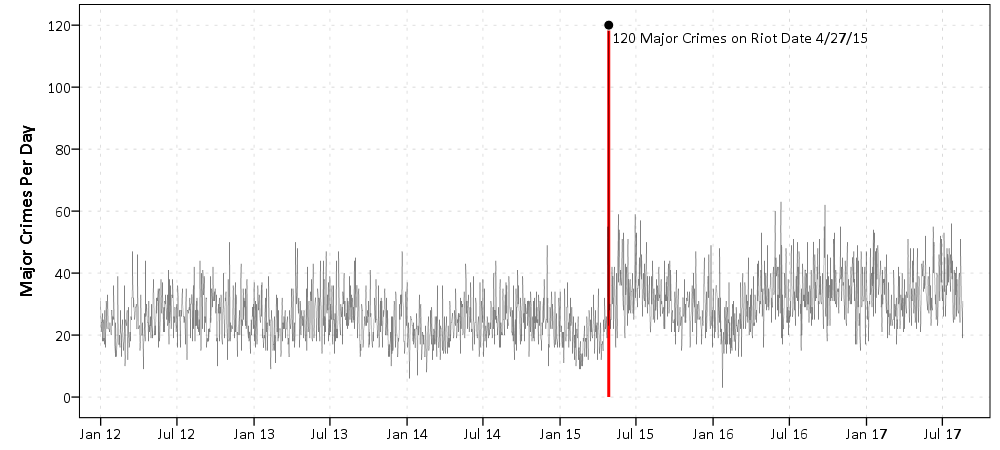
The bars in Pete’s graph are not the easiest way to visualize the trend. Here making the line thin and lighter grey also helps.
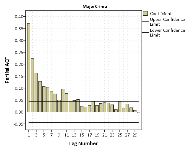
The way to analyze this data is using an interrupted time series analysis. I am not going to go through all of those details, but for those interested I would suggest picking up David McDowell’s little green book, Interrupted Time Series Analysis, for a walkthrough. One of the first steps though is to figure out the ARIMA structure, which you do by examining the auto-correlation function. Here is that ACF for this crime data.
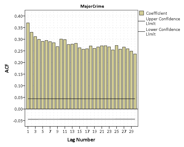
You can see that it is positive and stays quite consistent. This is indicative of a moving average model. It does not show the geometric decay of an auto-regressive process, nor is the autocorrelation anywhere near 1, which you would expect for an integrated process. Also the partial autocorrelation plot shows the geometric decay, which is again consistent with a moving average model. See my note at the bottom, how this interpretation was wrong! (Via David Greenberg sent me a note.)
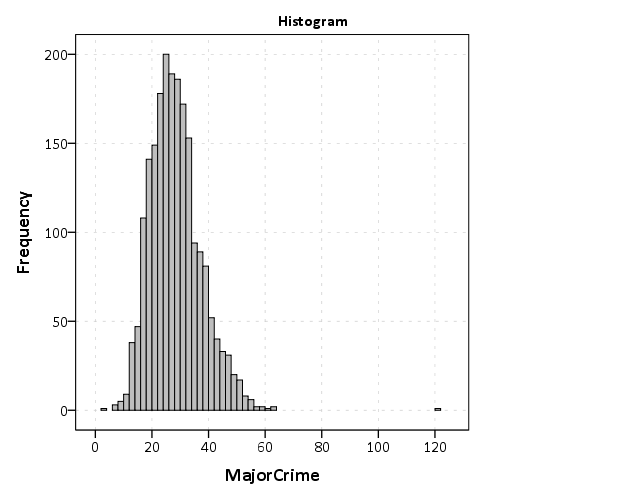
Although it is typical to analyze crime counts as a Poisson model, I often like to use linear models. Coefficients are much easier to interpret. Here the distribution of the counts is high enough I am ok using a linear interrupted ARIMA model.
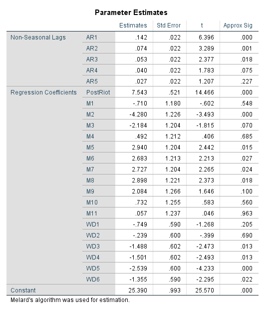
So I estimated an interrupted time series model. I include a dummy variable term that equals 1 as of 4/27/15 and after, and equals 0 before. That variable is labeled PostRiot. I then have dummy variables for each month of the year (M1, M2, …., M11) and days of the week (D1,D2,….D6). The ARIMA model I estimate then is (0,0,7), with a constant. Here is that estimate.
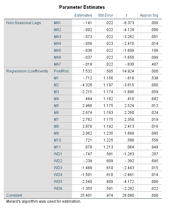
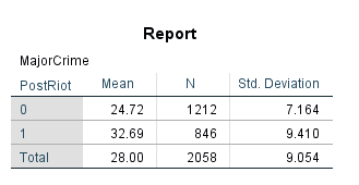
So we get an estimate that post riot, major crimes have increased by around 7.5 per day. This is pretty similar to what you get when you just look at the daily mean pre-post riot, so it isn’t really any weird artifact of my modeling strategy. Pre-riot it is under 25 per day, and post it is over 32 per day.
This result is pretty robust across different model specifications. Dropping the constant term results in a larger post riot estimate (over 10). Inclusion of fewer or more MA terms (as well as seasonal MA terms for 7 days) does not change the estimate. Inclusion of the monthly or day of week dummy variables does not make a difference in the estimate. Changing the outlier value on 4/27/15 to a lower value (here I used the pre-mean, 24) does reduce the estimate slightly, but only to 7.2.
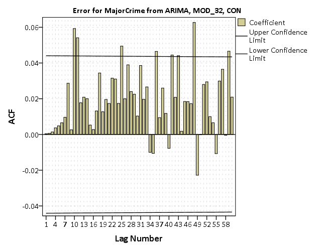
There is a bit of residual autocorrelation I was never able to get rid of, but it is fairly small, with the highest autocorrelation of only about 0.06.
Here is the SPSS code to reproduce the Baltimore graphs and ARIMA analysis.
As a note, while Pete believes this is a result of depolicing (i.e. Baltimore officers being less proactive) the evidence for that hypothesis is not necessarily confirmed by this analysis. See Stephen Morgan’s analysis on crime and arrests, although I think proactive street stops should likely also be included in such an analysis.
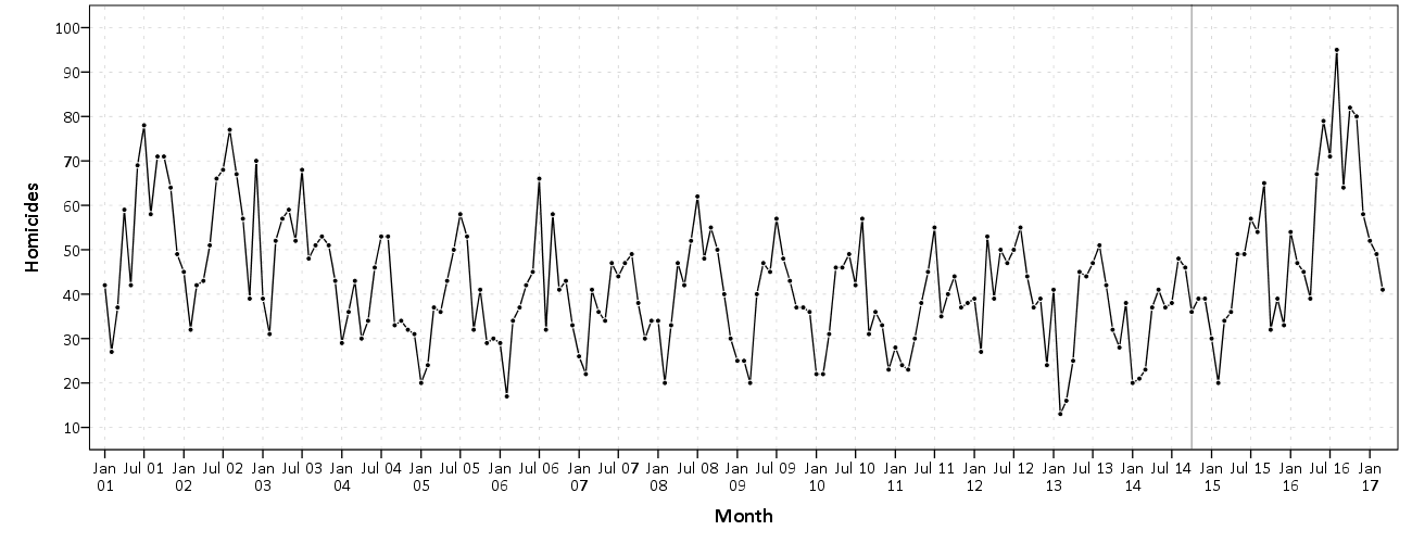
This Baltimore data just shows a bump up in the series, but investigating homicides in Chicago (here at the monthly level) it looks to me like an upward trend post the McDonald shooting. This graph is at the monthly level.
I have some other work on Chicago homicide geographic patterns going back quite a long time I can hopefully share soon!
I will need to update the Baltimore analysis to look at just homicides as well. Pete shows a similar bump in his charts when just examining homicides.
For additional resources for folks interested in examining crime over time, I would suggest checking out my article, Monitoring volatile homicide trends across U.S. cities, as well as Tables and Graphs for Monitoring Crime Patterns. I’m doing a workshop at the upcoming International Association for Crime Analysts conference on how to recreate such graphs in Excel.
David Greenberg sent me an email to note my interpretation of the ACF plots was wrong – and that a moving average process should only have a spike, and not show the slow decay. He is right, and so I updated the interrupted ARIMA models to include higher order AR terms instead of MA terms. The final model I settled on was (5,0,0) — I kept adding higher order AR terms until the AR coefficients were not statistically significant. For these models I still included a constant.
For the model that includes the outlier riot count, it results in an estimate that the riot increased these crimes by 7.5 per day, with a standard error of 0.5
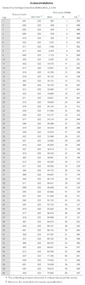
This model has no residual auto-correlation until you get up to very high lags. Here is a table of the Box-Ljung stats for up to 60 lags.
Estimating the same ARIMA model with the outlier value changed to 24, the post riot estimate is still over 7.
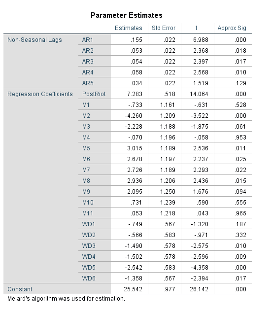
Subsequently the post-riot increase estimate is pretty robust across these different ARIMA model settings. The lowest estimate I was able to get was a post mean increase of 5 when not including an intercept and not including the outlier crime counts on the riot date. So I think this result holds up pretty well to a bit of scrutiny.

