New paper out: Trauma Center Drive Time Distances and Fatal Outcomes among Gunshot Wound Victims

A recent paper with Gio Circo, Trauma Center Drive Time Distances and Fatal Outcomes among Gunshot Wound Victims, was published in Applied Spatial Analysis and Policy. In this work, me and Gio estimate the marginal effect that drive time distances to the nearest Level 1 trauma center have on the probability a victim dies of a gun shot wound, using open Philadelphia data.

If you do not have access to that published version, here is a pre-print version. (And you can always email me or Gio and ask for a copy.) Also because we use open data, we have posted the data and code used for the analysis. (Gio did most of the work!)

For a bit of the background on the project, Gio had another paper estimating a similar model using Detroit data. But Gio estimated those models with aggregate data. I was familiar with more detailed Philly shooting data, as I used it for an example hot spot cluster map in my GIS crime mapping class.

There are two benefits to leveraging micro data instead of the aggregated data. One is that you can incorporate micro level incident characteristics into the model. The other is that you can get the exact XY coordinates where the incident occurred. And using those exact coordinates we calculate drive time distances to the hospital, which offer a slight benefit in terms of leave-one-out cross-validated accuracy compared to Euclidean distances.

So in terms of incident level characteristics, the biggest factor in determining your probability of death is not the distance to the nearest hospital, but where you physically get shot on your body. Here is a marginal effect plot from our models, showing how the joint effect of injury location (as different colors) and the drive time distance impact the probability of death. So if you get shot in the head vs the torso, you have around a 30% jump in the probability of death from that gun shot wound. Or if you get shot in an extremity you have a very low probability of death as well.

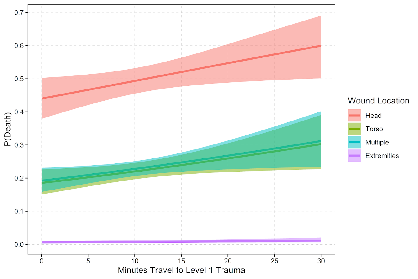
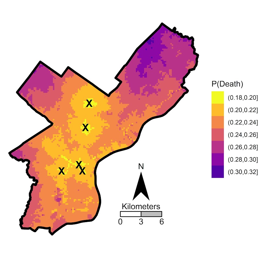
But you can see from that the margins for drive times are not negligible. So if you are nearby a hospital and shot in the torso your probability of dying is around 20%, whereas if you are 30 minutes away your probability rises to around 30%. You can then use this to map out isochrone type survivability estimates over the city. This example map is if you get shot in the torso, and the probability of death based on the drive time distance to the nearest Level 1 trauma location.

Fortunately many shootings do not occur in the northern most parts of Philadelphia, here is a map of the number of shootings over the city for our sample.

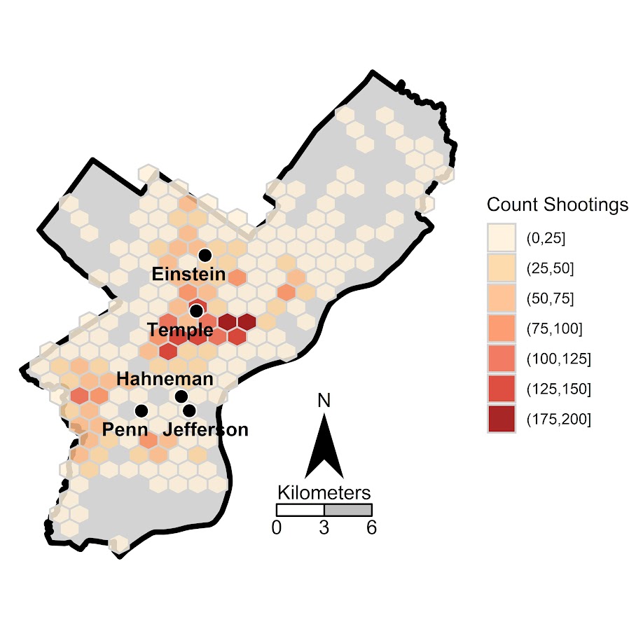
You can subsequently use these models to either do hypothetical take a trauma center away or add a trauma center. So given the density of shootings and drive time distances, it might make sense for Philly to invest in a trauma center in the shooting hot spot in the Kensington area (northeast of Temple). (You could technically figure out an ‘optimal’ location given the distribution of shootings, but since you can’t just plop down a hospital wherever it would make more sense to do hypothetical investments in current hospitals.)

For a simplified example, imagine you had 100 shootings in the torso that were an average 20 minutes away. The average probability of death in that case is around 25% (so ~25 homicides). If you hypothetically have a location that is only 5 minutes away, the probability goes down to more like 20% (so ~20 homicides). So in that hypothetical, the distance margin would have prevented 5 deaths.

One future piece of research I would be interested in examining is pre-post Shotspotter. So in that article Jen Doleac is right in that the emipirical evidence for Shotspotter reducing shootings is pretty flimsy, but preventing mortality by getting to the scene faster may be one mechanism that ShotSpotter can justify its cost.

New working paper – Monitoring volatile homicide trends across U.S. cities

I have a new working paper out — Monitoring volatile homicide trends across U.S. cities, with one of my colleagues Tomislav Kovandzic. You can grab the pre-print on SSRN, and the paper has links to code to replicate the charts and models in the paper.

Here I look at homicide rates in U.S. cities and use funnel charts and fan charts to show the typical volatility in homicide rates between cities and within cities over time. As I’ve written previously, I think much of the media narrative around homicide increases are hyperbolic and often cherry pick reasons why they think homicides are going up.

I’ve shown examples of funnel charts on this blog before, so I will use a different image as the tease. To generate the prediction intervals for fan charts I estimate binomial random effect models. Below is an example for New Orleans (homicide rate per 100,000 population):

As always, if you have feedback feel free to send me an email.

Preprint – A Quasi-Experimental Evaluation Using Roadblocks and Automatic License Plate Readers to Reduce Crime in Buffalo, NY

I have a new preprint article posted on SSRN – A Quasi-Experimental Evaluation Using Roadblocks and Automatic License Plate Readers to Reduce Crime in Buffalo, NY. This is some work I have been conducting with Scott Phillips out at SUNY Buffalo (as well as Dae-Young Kim, although he is not on this paper).

Here is the abstract:

Purpose: To evaluate the effectiveness of a hot spots policing strategy: using automated license plate readers at roadblocks.

Design: Different roadblock locations were chosen by the Buffalo Police Department every day over a two month period. We use propensity score matching to identify a set of control locations based on prior counts of crime and demographic factors before the intervention took place. We then evaluate the reductions in Part 1 crimes, calls for service, and traffic accidents at roadblock locations compared to control locations.

Findings: We find modest reductions in Part 1 violent crimes (10 over all roadblock locations and over the two months) using t-tests of mean differences. We find a 20% reduction in traffic accidents using fixed effects negative binomial regression models. Both results are sensitive to the model used though, and the fixed effects models predict increases in crimes due to the intervention.

Research Limitations: The main limitations are the quasi-experimental nature of the intervention, the short length of the intervention, and that many micro places have low baseline counts of crime.

Originality/Value: This adds to literature on hot spots policing – in particular on the use of automated license plate readers and traffic enforcement at hot spots of crime. While the results are mixed, it provides some evidence that the intervention has potential to reduce crime.

And here is one figure from the paper, showing how street units are defined, and given the intersection the road block was stationed on how we determined the treated street units:

Feedback is always welcome!

New working paper: What We Can Learn from Small Units of Analysis

I’ve posted a new working paper, What We Can Learn from Small Units of Analysis to SSRN. This is a derivative of my dissertation (by the same title). Below is the abstract:

This article provides motivation for examining small geographic units of analysis based on a causal logic framework. Local, spatial, and contextual effects are confounded when using larger units of analysis, as well as treatment effect heterogeneity. I relate these types of confounds to all types of aggregation problems, including temporal aggregation, and aggregation of dependent or explanatory variables. Unlike prior literature critiquing the use of aggregate level data, examples are provided where aggregation is unlikely to hinder the goals of the particular research design, and how heterogeneity of measures in smaller units of analysis is not a sufficient motivation to examine small geographic units. Examples of these confounds are presented using simulation with a dataset of crime at micro place street units (i.e. street segments and intersections) in Washington, D.C.

As always, if you have comments or critiques let me know.

Tables and Graphs paper rejection/update – and on the use of personal pronouns in scientific writing

My paper, Tables and Graphs for Monitoring Temporal Crime Patterns was recently rejected from Policing: An International Journal of Police Strategies & Management. I’ve subsequently updated the SSRN draft based on feedback from the review, and here I post the reviews and my responses to those reviews (in the text file).

One of the main critiques by both reviewers was that the paper was too informal, mainly because of the use of "I" in the paper. I use personal pronouns in writing intentionally, despite typical conventions in scientific writing, so I figured a blog post about why I do this is in order. I’ve been criticized for it on other occasions as well, but this is the first time it was listed as a main reason to reject an article of mine.

My main motivation comes from Michael Billig’s book Learn to Write Badly: How to Succeed in the Social Sciences (see a prior blog post I wrote on the contents). In a nut-shell, when you use personal pronouns it is clear that you, the author, are doing something. When you rewrite the sentence to avoid personal pronouns, you often obfuscate who the actor is in a particular sentence.

For an example of Billig’s point that personal pronouns can be more informative, I state in the paper:

I will refer to this metric as a Poisson z-score.

I could rewrite this sentence as:

This metric will be referred to as a Poisson z-score.

But that is ambiguous as to its source. Did someone else coin this phrase, and I am borrowing it? No – it is a phrase I made up, and using the personal pronoun clearly articulates that fact.

Pretty much all of the examples where I eliminated first person in the updated draft were of the nature,

In this article I discuss the use of percent change in tables.

which I subsequently changed to:

This article discusses the use of percent changes as a metric in tables.

Formal I suppose, but insipid. All rewriting the sentence to avoid the first person pronoun does is make the article seem like a sentient being, as well as forces me to use the passive tense. I don’t see how the latter is better in any way, shape, or form – yet this is one of the main reasons my paper is rejected above. The use of "we" in academic articles seems to be more common, but using "we" when there is only one author is just silly. So I will continue to use "I" when I am the only author.

New paper: The Effect of 311 Calls for Service on Crime in D.C. At Micro Places

I have a new pre-print posted, The Effect of 311 Calls for Service on Crime in D.C. At Micro Places, at SSRN. Here is the abstract:

Broken windows theory has been both confirmed and refuted with several different measures of physical disorder. Small experiments tend to confirm the priming effects of physical disorder on minor deviant acts, but measures based on order maintenance policing and surveys are much more mixed. Here I use 311 calls for service as a proxy for physical disorder, as it is a simple alternative compared to neighborhood audits or community surveys. For street segments and intersections in Washington D.C., I show that 311 calls for service based on detritus (e.g. garbage on the street) and infrastructure complaints (e.g. potholes in sidewalks) have a positive but very small effect on Part 1 crimes while controlling for unobserved neighborhood effects. This suggests that 311 calls for service can potentially be a reliable indicator of physical disorder where available. The findings partially confirm the broken windows hypothesis, but reducing physical disorder is unlikely to result in appreciable declines in crime.

And here are some maps of the crimes and calls per service per the regular grid I use as the neighborhood boundaries (because everything is better with some pretty maps!):

As always, if you have feedback I am all ears. This is what I signed up to present at ASC this fall, and is based on work in my dissertation.

New paper: Replicating Group-Based Trajectory Models of Crime at Micro-Places in Albany, NY

I posted a pre-print of a paper myself, Rob Worden and Sarah McLean have finished, Replicating Group-Based Trajectory Models of Crime at Micro-Places in Albany, NY. This is part of the work of the Finn Institute in collaboration with the Albany police department, and the goal of the project was to identify micro places (street segments and intersections) that showed long term patterns of being high crime places.

The structured abstract is below:

Objectives: Replicate two previous studies of temporal crime trends at the street block level. We replicate the general approach of group-based trajectory modelling of crimes at micro-places originally taken by Weisburd, Bushway, Lum and Yan (2004) and replicated by Curman, Andresen, and Brantingham (2014). We examine patterns in a city of a different character (Albany, NY) than those previously examined (Seattle and Vancouver) and so contribute to the generalizability of previous findings.

Methods: Crimes between 2000 through 2013 were used to identify different trajectory groups at street segments and intersections. Zero-inflated Poisson regression models are used to identify the trajectories. Pin maps, Ripley’s K and neighbor transition matrices are used to show the spatial patterning of the trajectory groups.

Results: The trajectory solution with eight classes is selected based on several model selection criteria. The trajectory of each those groups follow the overall citywide decline, and are only separated by the mean level of crime. Spatial analysis shows that higher crime trajectory groups are more likely to be nearby one another, potentially suggesting a diffusion process.

Conclusions: Our work adds additional support to that of others who have found tight coupling of crime at micro-places. We find that the clustering of trajectories identified a set of street units that disproportionately contributed to the total level of crime citywide in Albany, consistent with previous research. However, the temporal trends over time in Albany differed from those exhibited in previous work in Seattle but were consistent with patterns in Vancouver.

And here is one of the figures, a drawing of the individual trajectory groupings over the 14 year period. As always, if you have any comments on the paper feel free to shoot me an email.

Dissertation Defense

The date is set, Friday, February 27, 2015 at 10:00 a.m. in Draper Hall, Room 105. As always, if you feel like sitting in the mail room and flipping through it, it is there! (My crappy picture – I do not have smart phone.)

But if not, here is a pdf copy of the dissertation. If anyone is interested, here are my hacks to get LaTex to conform to SUNY Albany’s dissertation guidelines.

The title is What we can learn from small units of analysis, and here is my abstract:

The dissertation is aimed at advancing knowledge of the correlates of crime at small geographic units of analysis. I begin by detailing what motivates examining crime at small places, and focus on how aggregation creates confounds that limit causal inference. Local and spatial effects are confounded when using aggregate units, so to the extent the researcher wishes to distinguish between these two types of effects it should guide what unit of analysis is chosen. To illustrate these differences, I examine local, spatial and contextual effects for bars, broken windows and crime using publicly available data from Washington, D.C.

Rejected!

My Critique of Slope Graphs paper was recently rejected as a short article from The American Statistician. I’ve uploaded the new paper to SSRN with the suggested critiques and my responses to them (posted here).

I ended up bugging Nick Cox for some pre peer-review feedback and he actually agreed! (A positive externality of participating at the Cross Validated Q/A site.) The main outcome of Nick’s review was a considerably shorter paper. The reviews from TAS were pretty mild (and totally reasonable), but devoid of anything positive. The main damning aspect of the paper is that the reviewers (including Cox) just did not find the paper very interesting or well motivated.

My main motivation was the recent examples of slope graphs in the popular media, most of which are poor statistical graphics (and are much better suited as a scatterplot). The most obvious being Cairo’s book cover, which I thought in and of itself deserved a critique – but maybe I should not have been so surprised about a poor statistical graphic on the cover. This I will not argue is a rather weak motivation, but one I felt was warranted given the figures praising the use of slopegraphs in inappropriate situations.

In the future I may consider adding in more examples of slopegraphs besides the cover of Albert Cairo’s book. In my collection of examples I may pull out a few more examples from the popular media and popular data viz books (besides Cairo’s there are blog post examples from Ben Fry and Andy Kirk – haven’t read their books so I’m unsure if they are within them.) For a preview, pretty much all of the examples I consider bad except for Tufte’s original ones. Part of the reason I did not do this is that I wrote the paper as a short article for TAS — and I figured adding these examples would make it too long.

I really had no plans to submit it anywhere besides TAS, so this may sit as just a pre-print for now. Let me know if you think it may be within the scope of another journal that I may consider.

A critique of slopegraphs

I’ve recently posted a pre-print of an article, A critique of slopegraphs, on SSRN. In the paper I provide a critique of the use of slopegraphs and present alternative graphics to use in their place, using the slopegraph displayed on the cover of Albert Cairo’s The Functional Art as motivation – below is my rendering of that slopegraph.

Initially I wanted to write a blog post about the topic – but I decided to give all of the examples and full discussion I wanted it would be far too long. So I ended up writing a (not so short) paper. Below is the abstract, and I will try to summarize it in a few quick points (but obviously I encourage you to read the full paper!)

Slopegraphs are a popular form of graphic depicting change along two independent axes by means of a connecting line. The critique here lists several reasons why interpreting the slopes may be misleading and suggests alternative plots depending on the goals of the visualization. Guidelines as to appropriate situations to use slopegraphs are discussed.

So the three main points I want to make are:

  • The slope is not the main value of interest in a slopegraph. The slope is itself an arbitrary function of how far away the axes are placed from one another.
  • Slopegraphs are poor for judging correlation and seeing a functional relationship between the two values. Scatterplots or just graphing the change directly are often better choices.
  • Slopegraphs are difficult to judge when the variance between axes changes (which produce either diverging or converging slopes) and when the relationship is negative (which produces many crossings in the slopes).

I’ve catalogued a collection of articles, examples and other critiques of slopegraphs at this location. Much of what I say is redundant with critiques of slopegraphs already posted in other blogs on the internet.

I’m pretty sure my criminal justice colleagues will not be interested in the content of the paper, so I may need to cold email someone to review it for me before I send it off. So if you have comments or a critique of the paper I would love to hear it!