Making caterpillar plots for random effects in SPSS

For one of my classes for PhD students (in seminar research and analysis), I talk about the distinction between random effect models and fixed effect models for a week.

One of my favorite plots to go with random effect models is called a caterpillar plot. So typically folks just stop at reporting the variance of the random intercepts and slopes when they estimate these models. But you not only get the global variance estimates, but can also get an estimate (and standard error) for each higher level variable. So if I have 100 people, and I do a random intercept for those 100 people, I can say “Joe B’s random intercept is 0.5, and Jane Doe’s random intercept is -0.2” etc.

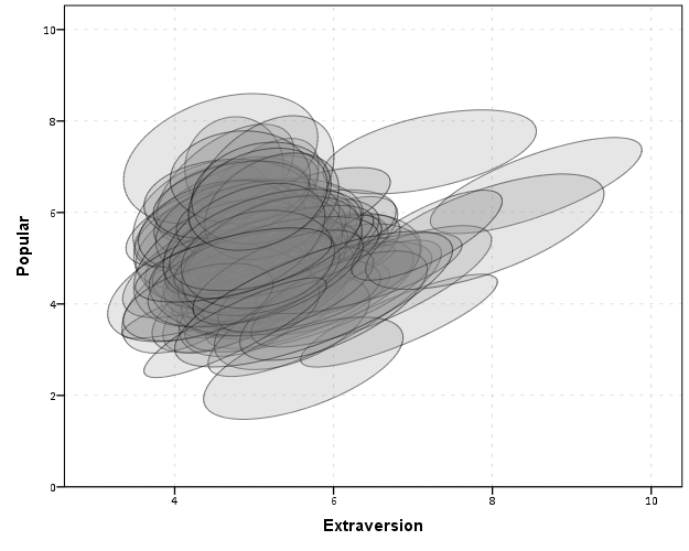
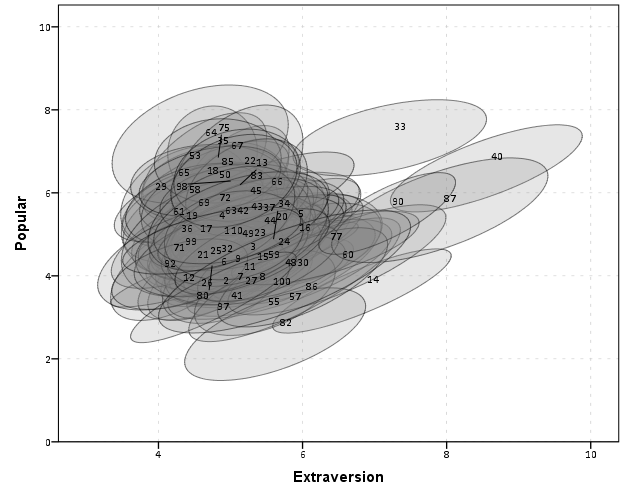
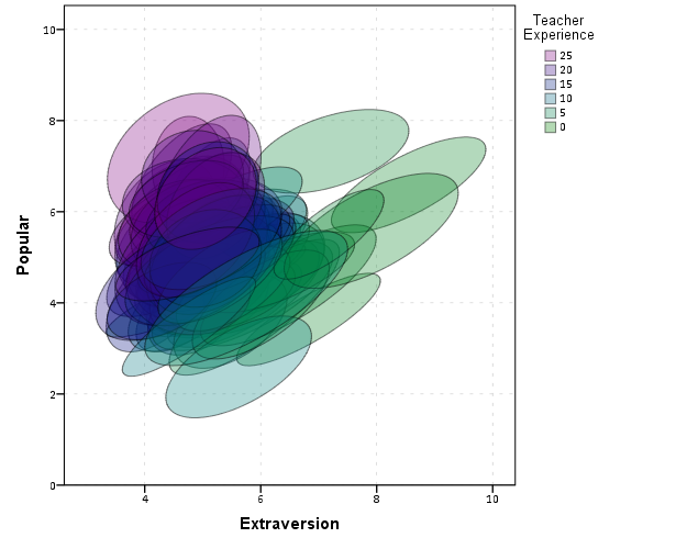
So this is halfway in between confirmatory data analysis (we used a model to get those estimates) but is often useful for further understanding the model and seeing if you should add anything else. E.g. if you see the random intercepts have a high correlation with some other piece of person information, that information should be incorporated into the model. It is also useful to spot outliers. And if you have spatial data mapping the random intercepts should be something you do.

SPSS recently made it easier to make these types of plot (as of V25), so I am going to give an example. In my class, I give code examples in R, Stata, and SPSS whenever I can, so this link contains code for all three programs. I will be using data from my dissertation, with crime on street segments in DC, nested within regular grid cells (used to approximate neighborhoods).

SPSS Code

So first data prep, I define where my data is using FILE HANDLE, read in the csv file of the data, compute a new variable (the sum of both detritus and physical infrastructure 311 calls). Then finally I declare that the FishID variable (my grid cells neighborhoods) is a nominal level variable. SPSS needs that defined correctly for later models.

*************************************************************.
FILE HANDLE data /NAME = "??????Your Path Here!!!!!!!!!!!".

*Importing the CSV file into SPSS.
GET DATA  /TYPE=TXT
  /FILE="data\DC_Crime_withAreas.csv"
  /ENCODING='UTF8'
  /DELCASE=LINE
  /DELIMITERS=","
  /QUALIFIER='"'
  /ARRANGEMENT=DELIMITED
  /FIRSTCASE=2
  /DATATYPEMIN PERCENTAGE=95.0
  /VARIABLES=
  MarID AUTO
  XMeters AUTO
  YMeters AUTO
  FishID AUTO
  XMetFish AUTO
  YMetFish AUTO
  TotalArea AUTO
  WaterArea AUTO
  AreaMinWat AUTO
  TotalLic AUTO
  TotalCrime AUTO
  CFS1 AUTO
  CFS2 AUTO
  CFS1Neigh AUTO
  CFS2Neigh AUTO
  /MAP.
CACHE.
EXECUTE.
DATASET NAME CrimeDC.
DATASET ACTIVATE CrimeDC.

*Compute a new variable, total number of 311 calls for service.
COMPUTE CFS = CFS1 + CFS2.
EXECUTE.

VARIABLE LEVEL FishID (NOMINAL).
*************************************************************.

Now onto the good stuff, estimating our model. Here we are looking at the fixed effects of bars and 311 calls on crime on street segments, but also estimating a random intercept for each grid cell. As of V25, SPSS lets you specify an option to print the solution for the random statements, which we can capture in a new SPSS dataset using the OMS command.

So first we declare our new dataset to dump the results in, Catter. Then we specify an OMS command to capture the random effect estimates, and then estimate our negative binomial model. I swear SPSS did not use to be like this, but now you need to end the OMS command before you putz with that dataset.

*************************************************************.
DATASET DECLARE Catter.

OMS
  /SELECT TABLES
  /IF SUBTYPES='Empirical Best Linear Unbiased Predictions'
  /DESTINATION FORMAT=SAV OUTFILE='Catter' VIEWER=YES
  /TAG='RandTable'.

*SOLUTION option only as of V25.
GENLINMIXED
  /FIELDS TARGET=TotalCrime
  /TARGET_OPTIONS DISTRIBUTION=NEGATIVE_BINOMIAL
  /FIXED EFFECTS=TotalLic CFS
  /RANDOM USE_INTERCEPT=TRUE SUBJECTS=FishID SOLUTION=TRUE
  /SAVE PREDICTED_VALUES(PredRanEff).

OMSEND TAG='RandTable'.
EXECUTE.
DATASET ACTIVATE Catter.
*************************************************************.

And now we can navigate over to the saved table and make our caterpillar plot. Because we have over 500 areas, I sort the results and don’t display the X axis. But this lets you see the overall distribution and spot any outliers.

*************************************************************.
*Lets make a caterpillar plot.
FORMATS Prediction Std.Error LowerBound UpperBound (F4.2).
SORT CASES BY Prediction (D).

GGRAPH
  /GRAPHDATASET NAME="graphdataset" VARIABLES=Var1 Prediction LowerBound UpperBound
  /GRAPHSPEC SOURCE=INLINE
  /FRAME INNER=YES.
BEGIN GPL
  SOURCE: s=userSource(id("graphdataset"))
  DATA: Var1=col(source(s), name("Var1"), unit.category())
  DATA: Prediction=col(source(s), name("Prediction"))
  DATA: LowerBound=col(source(s), name("LowerBound"))
  DATA: UpperBound=col(source(s), name("UpperBound"))
  SCALE: cat(dim(1), sort.data())
  GUIDE: axis(dim(1), null())
  GUIDE: axis(dim(2), label("BLUP"))
  SCALE: linear(dim(2), include(0))
  ELEMENT: edge(position(region.spread.range(Var1*(LowerBound + UpperBound))), size(size."0.5")))
  ELEMENT: point(position(Var1*Prediction), color.interior(color.black), size(size."1"))
END GPL.
*************************************************************.

And here is my resulting plot.

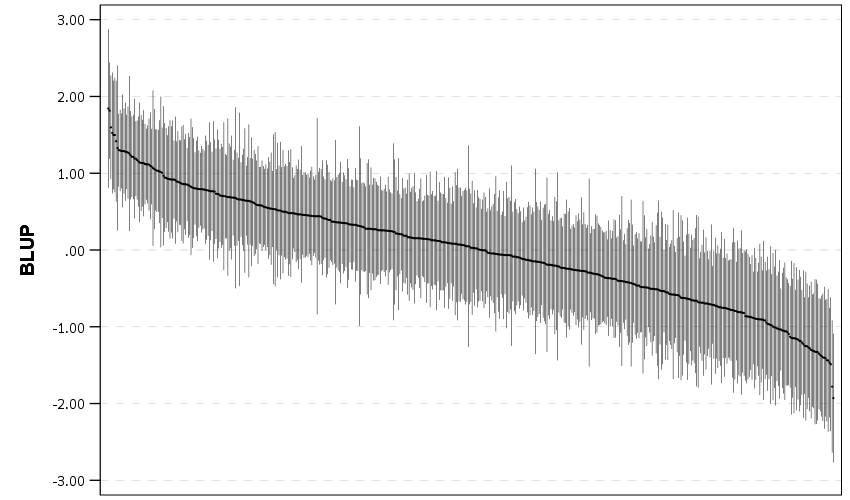
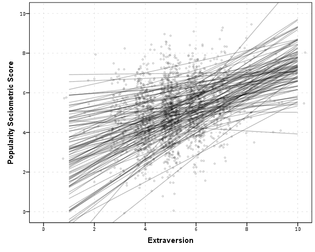
And I show in the linked code some examples for not only random intercepts, but you can do the same thing for random slopes. Here is an example doing a model where I let the TotalLic effect (the number of alcohol licenses on the street segment) vary by neighborhood grid cell. (The flat 0 estimates and consistent standard errors are grid cells with 0 licenses in the entire area.)

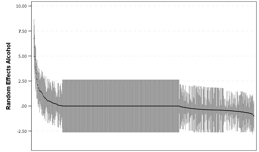
The way to interpret these estimates are as follows. The fixed effect part of the regression equation here is: 0.247 + 0.766*Licenses. That alcohol license effect though varies across the study area, some places have a random slope of +2, so the equation could then be thought of as 0.247 + (0.766 + 2)*Licenses (ignoring the random intercept part). So the effect of bars in that area is much larger. Also there are places with negative effects, so the effects of bars in those places are smaller. You can do the same type of thought experiments simply with the reported variance components, but I find the caterpillar plots to be a really good visual to show what those random effects actually mean.

For other really good multilevel modelling resources, check out the Centre for Multilevel Modelling, and Germán Rodríguez’s online notes. Eventually I will get around to uploading my seminar class notes and code snippets, but in the mean time if you see a week and would like my code examples, always feel free to email.

Smoothed regression plots for multi-level data

Bruce Weaver on the SPSS Nabble site pointed out that the Centre for Multilevel Modelling has added some syntax files for multilevel modelling for SPSS. I went through the tutorials (in R and Stata) a few years ago and would highly recommend them.

Somehow following the link trail I stumbled on this white paper, Visualising multilevel models; The initial analysis of data, by John Bell and figured it would be good fodder for the the blog. Bell basically shows how using smoothed regression estimates within groups is a good first step in data analysis of complicated multi-level data. I obviously agree, and previously showed how to use ellipses to the same effect. The plots in the Bell whitepaper though are very easy to replicate directly in base SPSS syntax (no extra stat modules or macros required) using just GGRAPH and inline GPL.

For illustration purposes, I will use the same data as I did to illustrate ellipses. It is the popular2.sav sample from Joop Hox’s book. So onto the SPSS code; first we will define a FILE HANDLE for where the popular2.sav data is located and open that file.

FILE HANDLE data /NAME = "!!!!!!Your Handle Here!!!!!".
GET FILE = "data\popular2.sav".
DATASET NAME popular2.

Now, writing the GGRAPH code that will follow is complicated. But we can use the GUI to help us write the most of it and them edit the pasted code to get the plot we want in the end. So, the easiest start to get the graph with the regression lines we want in the end is to navigate to the chart builder menu (Graphs -> Chart Builder), and then create a scatterplot with extrav on the x axis, popular on the y axis, and use class to color the points. The image below is a screen shot of this process, and below that is the GGRAPH code you get when you paste the syntax.

*Base plot created from GUI.
GGRAPH
  /GRAPHDATASET NAME="graphdataset" VARIABLES=extrav popular class[LEVEL=NOMINAL] MISSING=LISTWISE 
    REPORTMISSING=NO
  /GRAPHSPEC SOURCE=INLINE.
BEGIN GPL
  SOURCE: s=userSource(id("graphdataset"))
  DATA: extrav=col(source(s), name("extrav"))
  DATA: popular=col(source(s), name("popular"))
  DATA: class=col(source(s), name("class"), unit.category())
  GUIDE: axis(dim(1), label("extraversion"))
  GUIDE: axis(dim(2), label("popularity sociometric score"))
  GUIDE: legend(aesthetic(aesthetic.color.exterior), label("class ident"))
  ELEMENT: point(position(extrav*popular), color.exterior(class))
END GPL.

Now, we aren’t going to generate this chart. With 100 classes, it will be too difficult to identify any differences between classes unless a whole class is an extreme outlier. Here I am going to make several changes to generate the linear regression line of extraversion on popular within each class. To do this we will make some edits to the ELEMENT statement:

  • replace point with line
  • replace position(extrav*popular) with position(smooth.linear(extrav*popular)) – this tells SPSS to generate the linear regression line
  • replace color.exterior(class) with split(class) – the split modifier tells SPSS to generate the regression lines within each class.
  • make the regression lines semi-transparent by adding in transparency(transparency."0.7")

Extra things I did for aesthetics:

  • I added jittered points to the plot, and made them small and highly transparent (these really aren’t necessary in the plot and are slightly distracting). Note I placed the points first in the GPL code, so the regression lines are drawn on top of the points.
  • I changed the FORMATS of extrav and popular to F2.0. SPSS takes the formats for the axis in the charts from the original variables, so this prevents decimal places in the chart (and SPSS intelligently chooses to only label the axes at integer values on its own).
  • I take out the GUIDE: legend line – it is unneeded since we do not use any colors in the chart.
  • I change the x and y axis labels, e.g. GUIDE: axis(dim(1), label("Extraversion")) to be title case.

*Updated chart with smooth regression lines.
FORMATS extrav popular (F2.0).
GGRAPH
  /GRAPHDATASET NAME="graphdataset" VARIABLES=extrav popular class[LEVEL=NOMINAL] MISSING=LISTWISE 
    REPORTMISSING=NO
  /GRAPHSPEC SOURCE=INLINE.
BEGIN GPL
  SOURCE: s=userSource(id("graphdataset"))
  DATA: extrav=col(source(s), name("extrav"))
  DATA: popular=col(source(s), name("popular"))
  DATA: class=col(source(s), name("class"), unit.category())
  GUIDE: axis(dim(1), label("Extraversion"))
  GUIDE: axis(dim(2), label("Popularity Sociometric Score"))
  ELEMENT: point.jitter(position(extrav*popular), transparency.exterior(transparency."0.7"), size(size."3"))
  ELEMENT: line(position(smooth.linear(extrav*popular)), split(class), transparency(transparency."0.7"))
END GPL.

So here we can see that the slopes are mostly positive and have intercepts varying mostly between 0 and 6. The slopes are generally positive and (I would guess) around 0.25. There are a few outlier slopes, and given the class sizes do not vary much (most are around 20) we might dig into these outlier locations a bit more to see what is going on. Generally though with 100 classes it doesn’t strike me as very odd as some going against the norm, and a random effects model with varying intercepts and slopes seems reasonable, as well as the assumption that the distribution of slopes are normal. The intercept and slopes probably have a slight negative correlation, but not as much as I would have guessed with a set of scores that are so restricted in this circumstance.

Now the Bell paper has several examples of using the same type of regression lines within groups, but using loess regression estimates to assess non-linearity. This is really simple to update the above plot to incorporate this. One would simply change smooth.linear to smooth.loess. Also SPSS has the ability to estimate quadratic and cubic polynomial terms right within GPL (e.g. smooth.cubic).

Here I will suggest a slightly different chart that allows one to assess how much the linear and non-linear regression lines differ within each class. Instead of super-imposing all of the lines on one plot, I make a small multiple plot where each class gets its own panel. This allows much simpler assessment if any one class shows a clear non-linear trend.

  • Because we have 100 groups I make the plot bigger using the PAGE command. I make it about as big as can fit on my screen without having to scroll, and make it 1,200^2 pixels. (Also note when you use a PAGE: begin command you need an accompanying PAGE: end() command.
  • For the small multiples, I wrap the panels by setting COORD: rect(dim(1,2), wrap()).
  • I strip the x and y axis labels from the plot (simply delete the label options within the GUIDE statements. Space is precious – I don’t want it to be taken up with axis labels and legends.
  • For the panel label I place the label on top of the panel by setting the opposite option, GUIDE: axis(dim(3), opposite()).

WordPress in the blog post shrinks the graph to fit on the website, but if you open the graph up in a second window you can see how big it is and explore it easier.

*Checking for non-linear trends.
GGRAPH
  /GRAPHDATASET NAME="graphdataset" VARIABLES=extrav popular class[LEVEL=NOMINAL] MISSING=LISTWISE 
    REPORTMISSING=NO
  /GRAPHSPEC SOURCE=INLINE.
BEGIN GPL
  PAGE: begin(scale(1200px,1200px))
  SOURCE: s=userSource(id("graphdataset"))
  DATA: extrav=col(source(s), name("extrav"))
  DATA: popular=col(source(s), name("popular"))
  DATA: class=col(source(s), name("class"), unit.category())
  COORD: rect(dim(1,2), wrap())
  GUIDE: axis(dim(1))
  GUIDE: axis(dim(2))
  GUIDE: axis(dim(3), opposite())
  ELEMENT: line(position(smooth.linear(extrav*popular*class)), color(color.black))
  ELEMENT: line(position(smooth.loess(extrav*popular*class)), color(color.red))
  PAGE: end()
END GPL.

The graph is complicated, but with some work one can go group by group to see any deviations from the linear regression line. So here we can see that most of the non-linear loess lines are quite similar to the linear line within each class. The only one that strikes me as noteworthy is class 45.

Here there is not much data within classes (around 20 students), so we have to wary of small samples to be estimating these non-linear regression lines. You could generate errors around the linear and polynomial regression lines within GPL, but here I do not do that as it adds a bit of complexity to the plot. But, this is an excellent tool if you have many points within your groups and it can be amenable to quite a large set of panels.

Visualizing multi-level data using ellipses

After reading Elliptical Insights: Understanding Statistical Methods through Elliptical Geometry (Friendly, Monette & Fox 2013) I was interested in trying ellipses out for viz. multi-level data. Note there is an add-on utility for SPSS to draw ellipses in R graphics (ScatterWEllipse.spd), but I wanted to give it a try in SPSS graphics.

So I’ve made two SPSS macros. The first, !CorrEll, takes two variables and returns a set of data that can be used by the second macro, !Ellipse, to draw data ellipses based on the eigenvectors and eigenvalues of those 2 by 2 covariance matrices by group. In this example I will be using the popular2.sav data available from Joop Hox’s Multilevel Analysis book. The code can be downloaded from here to follow along.

So first lets define the FILE HANDLE where the data and scripts are located. Then we can read in the popular2.sav data. I only know very little about the data – but it is students nested within classrooms (pretty close to around 20 students in 100 classes), and it appears focused on student evaluations of teachers.


FILE HANDLE Mac / name = "!Location For Your Data!".
INSERT FILE = "Mac\MACRO_CorrEll.sps".
INSERT FILE = "Mac\MACRO_EllipseSPSS.sps".
GET FILE = "Mac\popular2.sav".
DATASET NAME popular2.

Now we can call the first macro, !CorrEll for the two variables extrav (a measure of the teachers extroversion) and popular (there are two popular measures in here, and I am unsure what the difference between them are – this is the "sociometry" popular variable though). This will return a dataset with the means, variances and covariances for those two variables split by the group variable class. It will also return the major and minor diameters based on the square root of the eigenvalues of that 2 by 2 matrix, and then the ellipse is rotated according to direction of the covariance.


!CorrEll X = extrav Y = popular Group = class.

This returns a dataset named CorrEll as the active dataset, with which we can then draw the coordinate geometry for our ellipses using the !Ellipse macro.


!Ellipse X = Meanextrav Y = Meanpopular Major = Major Minor = Minor Angle = AngDeg Steps = 100.

The Steps parameter defines the coordinates around the circle that are drawn. So more steps means a more precise drawing (but also more datapoints to draw). This makes a new dataset called Ellipse as the active dataset, and based on this we can draw those ellipses in SPSS using the path element with the split modifier so the ellipses aren’t drawn in one long pen stroke. Also note the ellipses are not closed circles (that is the first point does not meet the last point) so I use the closed() option when drawing the paths.


FORMATS X Y Id (F3.0).
GGRAPH
  /GRAPHDATASET NAME="graphdataset" DATASET = 'Ellipse' VARIABLES=X Y Id
  REPORTMISSING=NO
  /GRAPHSPEC SOURCE=INLINE.
BEGIN GPL
 SOURCE: s=userSource(id("graphdataset"))
 DATA: X=col(source(s), name("X"))
 DATA: Y=col(source(s), name("Y"))
 DATA: Id=col(source(s), name("Id"), unit.category())
 GUIDE: axis(dim(1), label("Extraversion"))
 GUIDE: axis(dim(2), label("Popular"))
 ELEMENT: path(position(X*Y), split(Id), closed())
END GPL.

With 100 groups this is a pretty good test of the efficacy of the display. While many multi-level modelling strategies will have fewer groups, if the technique can not scale to at least 100 groups it would be a tough sell. So above is a bit of an overplotted mess, but here I actually draw the polygons with a light grey fill and use a heavy amount of transparency in both the fill and the exterior line. To draw the ellipses I use the polygon element and connect the points using the link.hull statement. The link.hull modifier draws the convex hull of the set of points, which of course an ellipse is convex.


GGRAPH
  /GRAPHDATASET NAME="graphdataset" DATASET = 'Ellipse' VARIABLES=X Y Id
  REPORTMISSING=NO
  /GRAPHSPEC SOURCE=INLINE.
BEGIN GPL
 SOURCE: s=userSource(id("graphdataset"))
 DATA: X=col(source(s), name("X"))
 DATA: Y=col(source(s), name("Y"))
 DATA: Id=col(source(s), name("Id"), unit.category())
 GUIDE: axis(dim(1), label("Extraversion"))
 GUIDE: axis(dim(2), label("Popular"))
 ELEMENT: polygon(position(link.hull(X*Y)), split(Id), color.interior(color.grey), transparency.interior(transparency."0.8"),
          transparency.exterior(transparency."0.5"))
END GPL.

I thought that using a fill might make the plot even more busy, but that doesn’t appear to be the case. Using heavy transparency helps a great deal. Now what can we exactly learn from these plots?

First, you can assess the distribution of the effect of extroversion on popularity by class. In particular for multi-level models we can assess whether we can to include random intercepts and/or random slopes. In this case the variance of the extroversion slope looks very small to me, so it may be reasonable to not let its slope vary by class. Random intercepts for classes though seem reasonable.

Other things you can assess from the plot are if there are any outlying groups, either in coordinates on the x or y axis, or in the direction of the ellipse. Even in a busy – overplotted data display like this we see that the covariances are all basically in the same positive direction, and if one were strongly negative it would stick out. You can also make some judgements about the between group and within group variances for each variable. Although any one of these items may be better suited for another plot (e.g. you could actually plot a histogram of the slopes estimated for each group) the ellipses are a high data density display that may reveal many characteristics of the data at once.

A few other interesting things that are possible to note from a plot like this are aggregation bias and interaction effects. For aggregation bias, if the direction of the orientation of the ellipses are in the opposite direction of the point cloud of the means, it provides evidence that the correlation for the aggregate data is in the opposite direction as the correlation for the micro level data.

For interaction effects, if you see any non-random pattern in the slopes it would suggest an interaction between extroversion and some other factor. The most common one is that slopes with larger intercepts tend to be flatter, and most multi-level software defaults to allow the intercepts and slopes to be correlated when they are estimated. I was particularly interested in this here, as the popularity score is bounded at 10. So I really expected that to have a limiting effect on the extroversion slope, but that doesn’t appear to be the case here.

So unfortunately none of the cool viz. things I mention (outliers, aggregation bias or interaction effects) really appear to occur in this plot. The bright side is it appears to be a convenient set of data to fit a multi-level model too, and even the ceiling effect of the popularity measure do not appear to be an issue.

We can add in other data to the plot from either the original dataset or the CorrEll calculated dataset. Here is an example of grabbing data from the CorrEll dataset and labelling the ellipses with their group numbers. It is not very useful for the dense cloud, but for the outlying groups you can pretty easily see which label is associated with each ellipse.


DATASET ACTIVATE CorrEll.
FORMATS Meanpopular Meanextrav class (F3.0).
DATASET ACTIVATE Ellipse.
GGRAPH
  /GRAPHDATASET NAME="graphdataset" DATASET = 'Ellipse' VARIABLES=X Y Id
  /GRAPHDATASET NAME="Center" DATASET = 'CorrEll' VARIABLES=Meanpopular Meanextrav class
  REPORTMISSING=NO
  /GRAPHSPEC SOURCE=INLINE.
BEGIN GPL
 SOURCE: s=userSource(id("graphdataset"))
 DATA: X=col(source(s), name("X"))
 DATA: Y=col(source(s), name("Y"))
 DATA: Id=col(source(s), name("Id"), unit.category())
 SOURCE: c=userSource(id("Center"))
 DATA: CentY=col(source(c), name("Meanpopular"))
 DATA: CentX=col(source(c), name("Meanextrav"))
 DATA: class=col(source(c), name("class"), unit.category())
 GUIDE: axis(dim(1), label("Extraversion"))
 GUIDE: axis(dim(2), label("Popular"))
 ELEMENT: polygon(position(link.hull(X*Y)), split(Id), color.interior(color.grey), transparency.interior(transparency."0.8"),
          transparency.exterior(transparency."0.5"))
 ELEMENT: point(position(CentX*CentY), transparency.exterior(transparency."1"), label(class))
END GPL.

Another piece of information we can add into the plot is to color the fill of the ellipses using some alternative variable. Here I color the fill of the ellipse according to teacher experience with a green to purple continuous color ramp. SPSS uses some type of interpolation through some color space, and the default is the dreaded blue to red rainbow color ramp. With some experimentation I discovered the green to purple color ramp is aesthetically pleasing (I figured the diverging color ramps from colorbrewer would be as good a place to start as any). I use a diverging ramp as I want a higher amount of discrimination for exploratory graphics like this. Using a sequential ramp ends up muting one end of the spectrum, which I don’t really want in this circumstance.


DATASET ACTIVATE popular2.
DATASET DECLARE TeachExp.
AGGREGATE OUTFILE='TeachExp'
  /BREAK=Class
  /TeachExp=FIRST(texp).
DATASET ACTIVATE Ellipse.
MATCH FILES FILE = *
  /TABLE = 'TeachExp'
  /RENAME (Class = Id)
  /BY Id.
FORMATS TeachExp (F2.0).
*Now making plot with teacher experience colored.
DATASET ACTIVATE Ellipse.
GGRAPH
  /GRAPHDATASET NAME="graphdataset" DATASET = 'Ellipse' VARIABLES=X Y Id TeachExp
  REPORTMISSING=NO
  /GRAPHSPEC SOURCE=INLINE.
BEGIN GPL
 SOURCE: s=userSource(id("graphdataset"))
 DATA: X=col(source(s), name("X"))
 DATA: Y=col(source(s), name("Y"))
 DATA: TeachExp=col(source(s), name("TeachExp"))
 DATA: Id=col(source(s), name("Id"), unit.category())
 GUIDE: axis(dim(1), label("Extraversion"))
 GUIDE: axis(dim(2), label("Popular"))
 GUIDE: legend(aesthetic(aesthetic.color.interior), label("Teacher Experience"))
 SCALE: linear(aesthetic(aesthetic.color.interior), aestheticMinimum(color.green), aestheticMaximum(color.purple))
 ELEMENT: polygon(position(link.hull(X*Y)), split(Id), color.interior(TeachExp), transparency.interior(transparency."0.7"),
          transparency.exterior(transparency."0.5"))
END GPL.

Again I use a heavy amount of transparency and it produces what I think is a very nice looking plot. From this we can deduce that there is a clear relationship between extroversion and teacher experience, younger teachers tend to be more extroverted. We can also see that teacher experience explains some of the differences in means not explained by extroversion. That is some of the teachers with higher mean popular scores but lower extroversion scores are more experienced. This suggests the effects of teacher experience and extroversion are additive in the model predicting popularity.

You could of course color the ellipse with other variables as well. Because these are data ellipses and not confidence ellipses, you could make ellipses with fewer observations more transparent to illustrate that those estimates are less certain. Here the classrooms are all very similar size, so the error in the estimates is basically constant for all of the groups in this example.

The current code calculates the ellipses based on the eigenvectors and eigenvalues of the covariance matrix, but I may change this in the future to calculate them based on the Cholesky decomposition. If you read the Friendly paper most of the notation is written in terms of the Cholesky decomposition, and this would allow one to estimate confidence ellipses as well as the data ellipses here. So you could draw an ellipse that shows a confidence interval as opposed to the ellipses here that are just one possible level curve through the bivariate normal estimate.

Another thing I noticed the other day in the bowels of the SPSS chart template was that the xml defined glyphs had a rotation and an aspect parameter, so you could actually make a set of ellipse glyphs (although to cycle through them in SPSS charts is a pain). That makes me think that rotation and aspect should be mappable in the grammar of graphics, but I am unfamiliar with any statistical packages that allow you to easily manipulate figures in plots by specifying either the rotation of a glyph or the aspect of the glyph.

Let me know if there are any other good examples of using ellipses to visualize multi-level data.