Machine learning models and the market for lemons

The market for lemons is an economic concept in which buyers of a good cannot distinguish between quality products and poor products (the lemons). This lack of knowledge makes it so that people selling lemons can always underbid people with higher quality products. In the long run, all quality vendors are driven out, and only cheap lemon sellers remain.

I believe people selling predictive models (or machine learning models, or forecasting products, or artificial intelligence, to round out all the SEO terms) are highly susceptible to this. This occurs in markets in which the predictive models cannot be easily evaluated.

What reminded me of this is I recently saw a vendor saying they have the “most accurate” population health predictive models. This is a patently absurd assertion (even if you hosted a kaggle style competition, it would only apply to that kaggle dataset, not a more general claim to that particular institutions population). But the majority of buyers (different healthcare systems), likely have no way to evaluate my companies claims vs this vendors.

ChatGPT is another recent example. Although it can generate on its face “quality” answers, don’t use it to diagnose your illnesses. ChatGPT is very impressive at generating grammatically correct responses, so to a layman may appear to be high quality, but really it is very superficial in most domains (no different than using google searches to do anything complicated, which can be useful sometimes but is very superficial).

So what is the solution? From a consumer perspective, here is my advice. You should ask the vendor to do a demonstration on your own data. So you ask the vendor, “here is my data for 2019, can you forecast the 2020 data?”, or something along those lines where you provide a training set and a test set. Then you have the vendor generate predictions for test set, and you do the evaluation yourself to see if there predictions are worth the cost of the product.

This is a situation in which academic peer review has some value as well (as well as data competitions). You can see that the method a particular group used was validated by its peers, but ultimately the local tests on your own data will be needed. Even if my recidivism model is accurate for Georgia, it won’t necessarily generalize to your state.

If you are in a situation in which you do not have data to validate the results in the end, you need to rely on outside experts and understanding the methodology used to generate the estimates. A good example of this is people selling aggregate crime data (that literally make numbers up). I have slated a blog post about that in the near future to go into more detail, but in short there is no legitimate seller of second hand crime data in the US currently.

If you are interested in building or evaluating predictive models, please get in touch with my consulting services. While I say that markets for lemons can drive prices down, I still see quite a few ridiculous SaaS prices, like $900k for a black box, unevaluated early intervention system for police.

At least so far many of these firms are using the Joel Spolsky 6 figure sales approach for crappy products. My consulting firm can easily beat a six digit price tag, so the lemons have not driven me out yet.

New paper: An Open Source Replication of a Winning Recidivism Prediction Model

Our paper on the NIJ forecasting competition (Gio Circo is the first author), is now out online first in the International Journal of Offender Therapy and Comparative Criminology (Circo & Wheeler, 2022). (Eventually it will be in special issue on replications and open science organized by Chad Posick, Michael Rocque, and Eric Connolly.)

We ended up doing the same type of biasing as did Mohler and Porter (2022) to ensure fairness constraints. Essentially we biased results to say no one was high risk, and this resulted in “fair” predictions. With fairness constraints or penalities you sometimes have to be careful what you wish for. And because not enough students signed up, me and Gio had more winnings distributed to the fairness competition (although we did quite well in round 2 competition even with the biasing).

So while that paper is locked down, we have the NIJ tech paper on CrimRXiv, and our ugly code on github. But you can always email for a copy of the actual published paper as well.

Of course since not an academic anymore, I am not uber focused on potential future work. I would like to learn more about survival type machine learning forecasts and apply it to recidivism data (instead of doing discrete 1,2,3 year predictions). But my experience is the machine learning models need very large datasets, even the 20k rows here are on the fringe where regression are close to equivalent to non-linear and tree based models.

Another potential application is simple models. Cynthia Rudin has quite a bit of recent work on interpretable trees for this (e.g. Liu et al. 2022), and my linked post has examples for simple regression weights. I suspect the simple regression weights will work reasonably well for this data. Likely not well enough to place on the scoreboard of the competition, but well enough in practice they would be totally reasonable to swap out due to the simpler results (Wheeler et al., 2019).

But for this paper, the main takeaway me and Gio want to tell folks is to create a (good) model using open source data is totally within the capabilities of PhD criminal justice researchers and data scientists working for these state agencies.They are quantitaive skills I wish more students within our field would pursue, as it makes it easier for me to hire you as a data scientist!

References

Assessing Categorical Effects in Machine Learning Models

One model diagnostic for machine learning models I like are accumulated local effects (ALE), see Wheeler & Steenbeek (2021) for an example and Molnar (2020) for a canonical mathematical reference. With these we get some ex-ante interpretability of models – I use this for mostly EDA of the final fitted model. Here is an example of seeing the diffusion effect of DART stations on robberies in Dallas from my cited paper:

So the model is behaving as expected – nearby DART stations causes an uptick, and that slowly diffuses away. And the way the ML model is set up it can estimate that diffusion effect, I did not apriori specify what that should look like.

These are essentially average/marginal effects (or approximate derivatives) for complicated machine learning models. In short pseudoish/python code, pretend we have a set of data D and a model, the local effect of variable x at the value 5 is something like:

D['x'] = 5 # set all the data for x to value 5
pred5 = mod.predict(D)
D['x'] = 5 + 0.001 # change value x by just alittle
predc = mod.predict(D)
loc_eff = (pred5 - predc)/0.001
print(loc_eff.mean())

So in shorthand [p(y|x) - p(y|x+s)]/s, so s is some small change (approximate the continuous derivative via finite differences). Then you generate these effects (over your sample), for various values of x, and then make a plot.

Many people say that this only applies to numerical features. So say we have a categorical effect with three variables, a/b/c. We could calculate p(y|a) and p(y|b), but because a - b is not defined (what is the difference in categorical variables), we cannot have anything like a derivative in the ALE for categorical features.

This seems to me though short sited. While we cannot approximate a derivative, the value p(y|a) - p(y|b) is pretty interpretable without the division – this is the predicted difference if we switch from category a to category b. Here I think a decent default is to simply do p(y|cat) - mean(p(y|other cat)), and then you can generate average categorical effects for each category (with very similar interpretation to ALEs). For those who know about regression contrasts, this would be like saying we have dummy variables for A/B/C, and the effect of A is contrast coded via 1,-1/2,-1/2.

Here is a simple example in python. For data see my prior post on the NIJ recidivism challenge or mine and Gio’s working paper (Circo & Wheeler, 2021). Front end cleaning up the data is very similar. I use a catboost model here.

import catboost
import numpy as np
import pandas as pd

# Ommitted Code, see 
# https://andrewpwheeler.com/2021/07/24/variance-of-leaderboard-metrics-for-competitions/
# for how pdata is generated
pdata = prep_data(full_data)

# Original train/test split
train = pdata[pdata['Training_Sample'] == 1].copy()
test = pdata[pdata['Training_Sample'] == 0].copy()

# estimate model, treat all variables as categorical
y_var = 'Recidivism_Arrest_Year1'
x_vars = list(pdata)
x_vars.remove(y_var)
x_vars.remove('Training_Sample')
cat_vars = list( set(x_vars) - set(more_clip) )

cb = catboost.CatBoostClassifier(cat_features=cat_vars)
cb.fit(train[x_vars],train[y_var])

Now we can do the hypothetical change the category and see how it impacts the predicted probabilities (you may prefer to do this on the logit scale, but since it is conditional on all other covariates it should be OK IMO). Here I calculate the probabilities over each of the individual PUMAs in the sample.

# Get the differences in probabilities swapping
# out each county, conditional on other factors
pc = train.copy()
counties = pd.unique(train['Residence_PUMA']).tolist()
res_vals = []
for c in counties:
    pc['Residence_PUMA'] = c
    pp = cb.predict_proba(pc[x_vars])[:,1]
    res_vals.append(pd.Series(pp))

res_pd = pd.concat(res_vals,axis=1)
res_pd.columns = counties
res_pd

So you can see for the person in the first row, if they were in PUMA 16, they would have a predicted probability of recidivism of 0.140. If you switched them to PUMA 24, it changes to 0.136. So you can see the PUMA overall doesn’t appear to have much of an impact on the recidivism prediction in this catboost model.

Now here is leave one out centering as I stated before. So we compare PUMA 16 to the average of all other PUMAs, within each row.

# Now mean center
n = res_pd.shape[1]
row_sum = res_pd.sum(axis=1)
row_adj = (-1*res_pd).add(row_sum,axis=0)/(n-1)
ycent = res_pd - row_adj
ycent

And now we can do various column aggregations to get the average categorical effects per each category. You can do whatever aggregation you want (means/medians/percentiles). (I’ve debated on making my own library to make ALEs a bit more general and return variance estimates as well.)

# Now can get mean/sd/ptils
mn = ycent.mean(axis=0)
sd = ycent.std(axis=0)
low = ycent.quantile(0.025,axis=0)
hig = ycent.quantile(0.975,axis=0)
fin_stats = pd.concat([mn,sd,low,hig],axis=1)
# Cleaning up the data
fin_stats.columns = ['Mean','Std','Low','High']
fin_stats.reset_index(inplace=True)
fin_stats.rename(columns={"index":"PUMA"}, inplace=True)
fin_stats.sort_values(by='Mean',ascending=False,
                      inplace=True,ignore_index=True)
fin_stats

And we can see that while I sorted the PUMAs and PUMA 25 has a mean effect of 0.03, its standard deviation is quite high. The only PUMA that the percentiles do not cover 0 is PUMA 13, with a negative effect of -0.06.

Like I said, I like these more so for model checking/EDA/face validity. Here I would dig into further PUMA 25/13, make sure nothing funny is going on with the data (and whether I should try to tease out more features from these in real life if I had access to the source data, e.g. smaller aggregations). The other PUMAs though are quite unremarkable and have spreads of +/-2 percentage points pretty consistently.

References

  • Circo, G., & Wheeler, A.P. (2021). National Institute of Justice Recidivism Forecasting Challange Team “MCHawks” Performance Analysis. CrimRXiv.
  • Molnar, C. (2020). Interpretable machine learning. Ebook.
  • Wheeler, A. P., & Steenbeek, W. (2021). Mapping the risk terrain for crime using machine learning. Journal of Quantitative Criminology, 37(2), 445-480.

Learning a fair loss function in pytorch

Most of the time when we are talking about deep learning, we are discussing really complicated architectures – essentially complicated sets of (mostly linear) equations. A second innovation in the application of deep learning though is the use of back propagation to fit under-determined systems. Basically you can feed these systems fairly complicated loss functions, and they will chug along with no problem. See a prior blog post of mine of creating simple regression weights for example.

Recently in the NIJ challenge, I used pytorch and the non-linear fairness function defined by NIJ. In the end me and Gio used an XGBoost model, because the data actually do not have very large differences in false positive rates between racial groups. I figured I would share my example here though for illustration of using pytorch to learn a complicated loss function that has fairness constraints. And here is a link to the data and code to follow along if you want.

First, in text math the NIJ fairness function was calculated as (1 - BS)*(1 - FP_diff), where BS is the Brier Score and FP_diff is the absolute difference in false positive rates between the two groups. My pytorch code to create this loss function looks like this (see the pytorch_mods.py file):

# brier score loss function with fairness constraint
def brier_fair(pred,obs,minority,thresh=0.5):
    bs = ((pred - obs)**2).mean()
    over = 1*(pred > thresh)
    majority = 1*(minority == 0)
    fp = 1*over*(obs == 0)
    min_tot = (over*minority).sum().clamp(1)
    maj_tot = (over*majority).sum().clamp(1)
    min_fp = (fp*minority).sum()
    maj_fp = (fp*majority).sum()
    min_rate = min_fp/min_tot
    maj_rate = maj_fp/maj_tot
    diff_rate = torch.abs(min_rate - maj_rate)
    fin_score = (1 - bs)*(1 - diff_rate)
    return -fin_score

I have my functions all stashed in different py files. But here is an example of loading up all my functions, and fitting my pytorch model to the training recidivism data. Here I set the threshold to 25% instead of 50% like the NIJ competition. Overall the model is very similar to a linear regression model.

import data_prep as dp
import fairness_funcs as ff
import pytorch_mods as pt

# Get the train/test data
train, test = dp.get_y1_data()
y_var = 'Recidivism_Arrest_Year1'
min_var = 'Race' # 0 is White, 1 is Black
x_vars = list(train)
x_vars.remove(y_var)

# Model learning fair loss function
m2 = pt.pytorchLogit(loss='brier_fair',activate='ident',
                     minority=min_var,threshold=0.25)
m2.fit(train[x_vars],train[y_var])

I have a burn in start to get good initial parameter estimates with a more normal loss function before going into the more complicated function. Another approach would be to initialize the weights to the solution for a linear regression equation though. After that burn in though it goes into the NIJ defined fairness loss function.

Now I have functions to see how the different model metrics in whatever sample. Here you can see the model is quite balanced in terms of false positive rates in the training sample:

# Seeing training sample fairness
m2pp = m2.predict_proba(train[x_vars])[:,1]
ff.fairness_metric(m2pp,train[y_var],train[min_var],thresh=0.25)

But of course in the out of sample test data it is not perfectly balanced. In general you won’t be able to ensure perfect balance in whatever fairness metrics out of sample.

# Seeing test sample fairness
m2pp = m2.predict_proba(test[x_vars])[:,1]
ff.fairness_metric(m2pp,test[y_var],test[min_var],thresh=0.25)

It actually ends up that the difference in false positive rates between the two racial groups, even in models that do not incorporate the fairness constraint in the loss function, are quite similar. Here is a model using the same architecture but just the usual Brier Score loss. (Code not shown, see the m1 model in the 01_AnalysisFair.py file in the shared dropbox link earlier.)

You can read mine and Gio’s paper (or George Mohler and Mike Porter’s paper) about why this particular fairness function is not the greatest. In general it probably makes more sense to use an additive fairness loss instead of multiplicative, but in this dataset it won’t matter very much no matter how you slice it in terms of false positive rates. (It appears in retrospect the Compas data that started the whole false positive thing is somewhat idiosyncratic.)

There are other potential oddities that can occur with such fair loss functions. For example if you had the choice between false positive rates for (white,black) of (0.62,0.60) vs (0.62,0.62), the latter is more fair, but the minority class is worse off. It may make more sense to have an error metric that sets the max false positive rate you want, and then just has weights for different groups to push them down to that set threshold.

These aren’t damning critiques of fair loss functions (these can be amended/changed to behave better), but in the end defining fair loss functions will be very tricky. Both for empirical reasons as well as for ethical ones – they will ultimately involve quite a few trade-offs.

Extending sklearns OrdinalEncoder

I’ve used a variant of this for a few different projects, so figured it was worth sharing. Sklearn’s OrdinalEncoder is close, but not quite what I want for a few different scenarios. Those are:

  • mixed input data types
  • missing data support (which can vary across the mixed input types)
  • the ability to limit encoding of rare categories (useful for regression models)

So I have scripted up a simple new class, what I call SimpleOrdEnc(), and can share it here in the blog post.

from sklearn.preprocessing import OrdinalEncoder
import numpy as np
import pandas as pd

class SimpleOrdEnc():
    def __init__(self, dtype=int, unknown_value=-1, lim_k=None,
                 lim_count=None):
        self.unknown_value = unknown_value
        self.dtype = dtype
        self.lim_k = lim_k
        self.lim_count = lim_count
        self.vars = None
        self.soe = None
    def fit(self, X):
        self.vars = list(X)
        # Now creating fit for each variable
        res_oe = {}
        for v in list(X):
            res_oe[v] = OrdinalEncoder(dtype=self.dtype,
                handle_unknown='use_encoded_value',
                        unknown_value=self.unknown_value)
            # Get unique values minus missing
            xc = X[v].value_counts().reset_index()
            # If lim_k, only taking top K value
            if self.lim_k:
                top_k = self.lim_k - 1
                un_vals = xc.loc[0:top_k,:]
            # If count, using that to filter
            elif self.lim_count:
                un_vals = xc[xc[v] >= self.lim_count].copy()
            # If neither
            else:
                un_vals = xc
            # Now fitting the encoder for one variable
            res_oe[v].fit( un_vals[['index']] )
        # Appending back to the big class
        self.soe = res_oe
    # Defining transform/inverse_transform classes
    def transform(self, X):
        xcop = X[self.vars].copy()
        for v in self.vars:
            xcop[v] = self.soe[v].transform( X[[v]].fillna(self.unknown_value) )
        return xcop
    def inverse_transform(self, X):
        xcop = X[self.vars].copy()
        for v in self.vars:
            xcop[v] = self.soe[v].inverse_transform( X[[v]].fillna(self.unknown_value) )
        return xcop

This works mostly the same way that other sklearn objects do. You instantiate the object, then call fit, transform, inverse_transform, etc. Under the hood it just turns the data into a collection of ordinal encoders, but does a few things. One is that it strips missing values from the original fit data – so out of the box you do not need to do anything like x.fillna(-1), it just works. It is on you though to choose a missing unknown value that does not collide with potential encoded or decoded values. (Also for fit it should be a pandas dataframe, weird stuff will happen if you pass other numpy objects or lists.)

The second are the lim_k or the lim_count arguments. This is useful if you want to encode rare categories as another value. lim_k is if you want to say keep the top 20 categories in the fitted dataset. lim_count sets the threshold at how many cases are in the data, e.g. if you have at least 100 keep it. lim_k takes precedence over lim_count, so if you specify both lim_count is ignored.

These args also confound the missing values, so missing (even if it is common in the data), gets assiged to the ‘other’ category in this encoding. If that is not the behavior you want, I don’t see any way around not explicitly using fillna() before all this.

So here is a simple example use case:

x1 = [1,2,3]
x2 = ['a','b','c']
x3 = ['z','z',None]
x4 = [4,np.nan,5]

x = pd.DataFrame(zip(x1,x2,x3,x4),columns=['x1','x2','x3','x4'])
print(x)

oe = SimpleOrdEnc()
oe.fit(x)

# Transform to the same data
tx = oe.transform(x)
print(tx)

# Inverse transform gives you None
ix = oe.inverse_transform(tx)
print(ix)

So you can see this handles missing input data, but the inverse transform always returns None values for missing. The fit method though returns numeric encoded columns with the same variable names. I default to missing values of -1 as light boost (and I think catboost as well), have those as the default missing data values for categorical data.

Here is an example limiting the output to only categories that have at least 10 observations, and setting the missing data value to 99 instead of -1.

size = 1000
x1 = np.random.choice(['a','b','c'], size).tolist()
x2 = np.random.choice([1, np.nan, 2], size, p=[0.8,0.18,0.02]).tolist()
x3 = np.random.choice(['z','y','x','w',np.nan], size, p=[0.8,0.15,0.04, 0.005, 0.005]).tolist()
x = pd.DataFrame(zip(x1,x2,x3),columns=['x1','x2','x3'])

oe = SimpleOrdEnc(lim_count=10, unknown_value=99)
oe.fit(x)

# Checking with a simpler data frame

x1 = ['a','b','c','d',None,]
x2 = [1,2,-1,4,np.nan]
x3 = ['z','y','x','w','v']
sx = pd.DataFrame(zip(x1,x2,x3),columns=['x1','x2','x3'])

oe.transform(sx)

Because the class is all wrapped up in one object, you can then use pickle to save the object/use later in pipelines. If I know I want to test out specific regression models with my data, I often use the lim_count to make sure I am not keeping a bunch of small dangles of high cardinality data. (Often in my data I use missing data is rare enough I don’t even want to worry about imputing, I rather just treat it as a rare category.)

One use case this does not work out so well though for is ICD codes in wide format. Will need to write another blog post about that. But often will just reshape wide to long to fit these encoders.

Weighting machine learning models

Here is a trick I have seen on several occasions people could take advantage of to make fitting models for big data more convenient. If you are using data that is all categorical and a fairly small number of variables, you can aggregate your data and fit models using weights, instead of fitting models on the original micro level data.

For a recent example at my work, was working on a model that originally has around 6 million observations and around a dozen categorical inputs (each with fairly high cardinality, e.g. around 1000 different categories). When aggregating to unique cases, this model is well under half a million rows though. It is much easier for me to iterate and fit models on the half a million row dataset than the 6 million row one.

Here I will show an example using NIBRS data. See my prior blog post on Association Rules for background on the data, I will be using the 2012 NIBRS dataset, which has over 5 million observations. Below is python code to illustrate, but pretty much all statistical packages allow you weight observations.

So first I load the libraries I will be using, and make a nice function to print out the logit coefficients for a sklearn model.

import pandas as pd
import numpy as np
from scipy.stats import binom
from sklearn.linear_model import LogisticRegression
from sklearn.metrics import roc_auc_score

# Function to pretty print logit coefficients
def nice_coef(mod,x_vars):
    coef = list(mod.coef_[0]) + list(mod.intercept_)
    vlist = x_vars + ['Intercept']
    return pd.DataFrame(zip(vlist,coef),columns=['Var','Coef'])

Next we can read in my NIRBS data directly from the dropbox link (replace www with dl to do this in general for dropbox links).

# See https://github.com/apwheele/apwheele.github.io/tree/master/MathPosts/association_rules
# For explanation behind NIBRS data
ndum = pd.read_csv('https://dl.dropbox.com/sh/puws33uebzt9ckd/AADVM86qPJVqP4RHWkWfGBzpa/NIBRS_DummyDat.csv?dl=0')
# If you want to read original NIRBS data
# use https://dl.dropbox.com/sh/puws33uebzt9ckd/AACL3wBhZDr3P_ZbsbUxltERa/NIBRS_2012.csv?dl=0

This data is already prepped with the repeated dummy variables for different categories. It is over 5 million observations, but a simple way to work with this data is to use a groupby and create a weight variable:

group_vars = list(ndum)
ndum['weight'] = 1
ndum_agg = ndum.groupby(group_vars, as_index=False).sum() # sums the weight variable

print(ndum.shape)
print(ndum_agg.shape)

So you can see we went from over 5 million observations to only a few over 7000.

A few notes here. One, if querying the data from a DB, it may be better to do the counts on the DB side and only load in the tinier data into memory, e.g. SELECT COUNT(ID) AS weight, A1,A2... FROM Table GROUP BY A1,A2,.....

Second, I do not have any missing data here, but pandas groupby will by default drop missing rows. So you may want to do something like data.fillna(-1).groupby, or the option to not drop NA values.

Now, lets go onto to fitting a model. Here I am using logit regression, as it is easier to compare the inputs for the weighted/non-weighted model, but you can do this for whatever machine learning model you want. I am predicting the probability an officer is assaulted.

logit_mod = LogisticRegression(penalty='none', solver='newton-cg')
y_var = 'ass_LEO_Assault'
x_vars = group_vars.copy() #[0:7]
x_vars.remove(y_var)

# Takes a few minutes on my machine!
logit_mod.fit(ndum[x_vars],ndum[y_var])

# Coefficients for the model
bigres = nice_coef(logit_mod,x_vars)
bigres

I was not sure if my computer would actually fit this model without running out of memory. But it did crunch it out in a few minutes. Now lets look at the results when we estimate the model with the weighted data. In all the sklearn models you can just pass in a sample_weight into the fit function.

logit_mod.fit(ndum_agg[x_vars],ndum_agg[y_var],sample_weight=ndum_agg['weight'])

weight_res = nice_coef(logit_mod,x_vars)
weight_res

You can see that these are basically the same model predictions. For a few of the coefficients you can find discrepancies starting at the second decimal, but the majority are within floating point errors.

bigres['Coef'] - weight_res['Coef']

This was fit instantly instead of waiting several minutes. For more intense ML models (like random forests), this can dramatically improve the time it takes to fit models.

If you are interested in doing a train/test split, this is quite easy with the weights as well. Basically you just need to allocate some of the weight to the train and some to the test. Here I show how to do that using a binomial random variable. Then you feed the train weights to the fit function:

train_prop = 0.5
train_weight = binom.rvs(ndum_agg['weight'].astype(int), train_prop, random_state=10)
test_weight = ndum_agg['weight'] - train_weight

logit_mod.fit(ndum_agg[x_vars],ndum_agg[y_var],sample_weight=train_weight)

And in sklearn pretty much all of the evaluation functions also take a sample weight function.

pred_probs = logit_mod.predict_proba(ndum_agg[x_vars])

# Eval metrics for the test data
roc_auc_score(ndum_agg[y_var],pred_probs[:,1],sample_weight=test_weight)
roc_auc_score(ndum_agg[y_var],pred_probs[:,1],sample_weight=train_weight)

So this shows that the AUC metric decreases in the test dataset (as you would expect it to). Note do not take this model seriously, I would need to think more thoroughly about the selection of rows here, as well as how to effectively interpret these particular categorical inputs in a more reasonable way than eyeballing the coefficients.

I am wondering if weighting the data is actually a more convenient way to do train/test CV splits, just change the weights instead of splitting up datasets. (You could also do fractional weights, e.g. train_weight = ndum_agg['weight']/2, which works nice for stratifying the sample, but may cause some issues generalizing.)

So note this does not always work – but works best with sparse/categorical data. If you have numeric data, you can try to discretize the data to a reasonable amount to still model it as a continuous input (e.g. round age to one decimal, e.g. 20.1). But if you have more than a few numeric inputs you will have a much harder time compressing the data into a smaller number of weighted rows.

It also only works if you have a limited number of inputs. If you have 100 variables you will be able to aggregate less than if you are working with 10.

But despite those limitations, I have come across several different examples in my career where aggregating and weighting the data was clearly the easiest approach, and NIBRS is a great example.

ROC and calibration plots for binary predictions in python

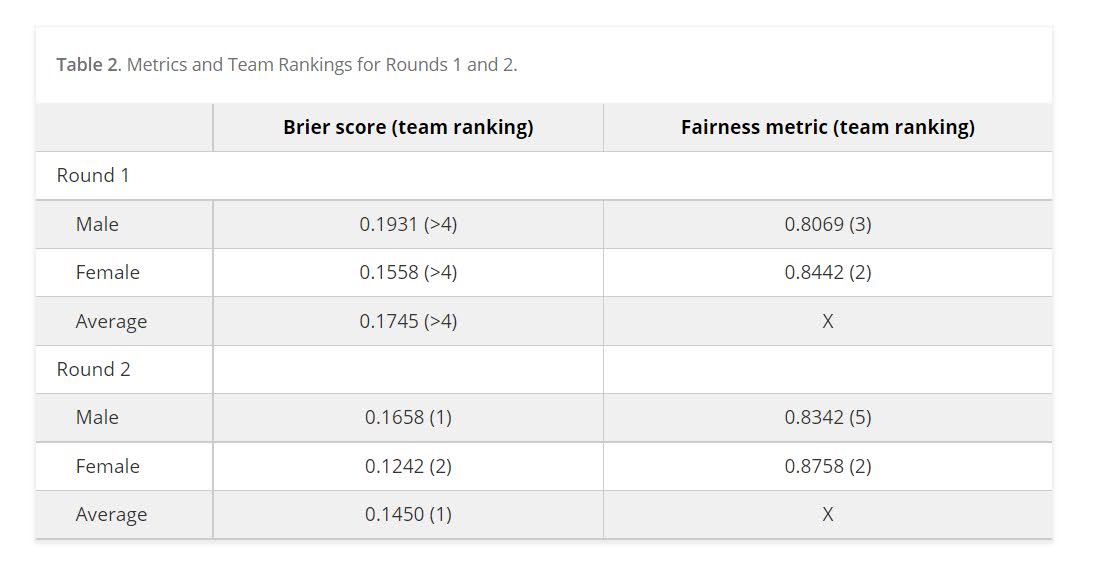
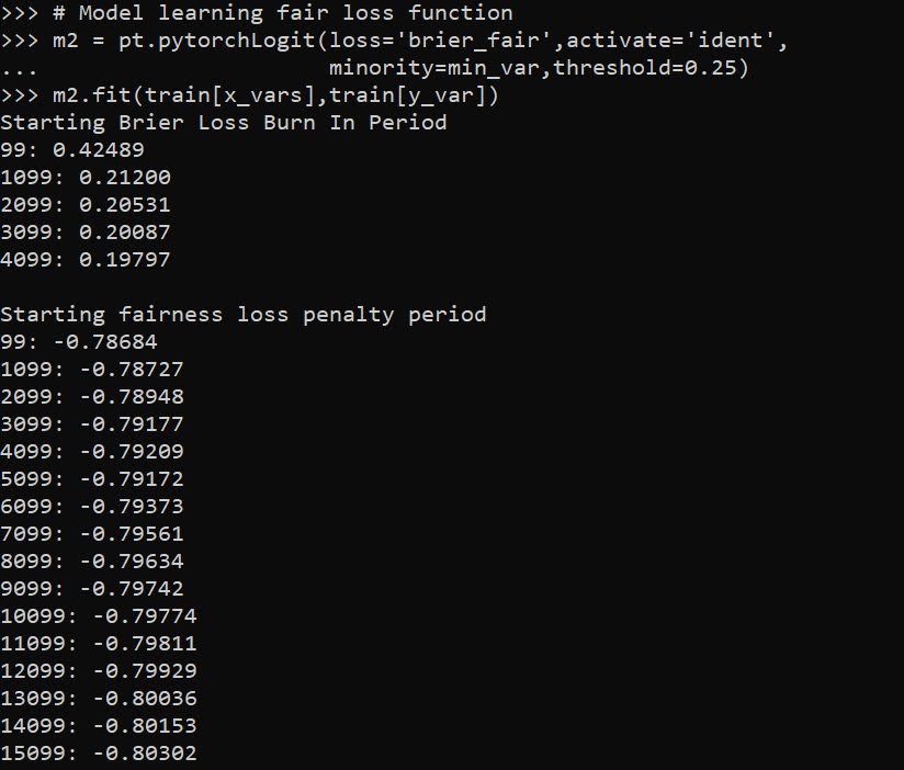
When doing binary prediction models, there are really two plots I want to see. One is the ROC curve (and associated area under the curve stat), and the other is a calibration plot. I have written a few helper functions to make these plots for multiple models and multiple subgroups, so figured I would share, binary plots python code. To illustrate their use, I will use the same Compas recidivism data I have used in the past, (CSV file here). So once you have downloaded those two files you can follow along with my subsequent code.

Front Prep

First, I have downloaded the binary_plots.py file and the PreppedCompas.csv file to a particular folder on my machine, D:\Dropbox\Dropbox\Documents\BLOG\binary_plots. To import these functions, I append that path using sys, and change the working directory using os. The other packages are what I will be using the fit the models.

###############################################
# Front end prep

import pandas as pd
import numpy as np
from xgboost import XGBClassifier
from sklearn.ensemble import RandomForestClassifier
from sklearn.linear_model import LogisticRegression

import os
import sys

my_dir = r'D:\Dropbox\Dropbox\Documents\BLOG\binary_plots'
os.chdir(my_dir)

# Can append to path
sys.path.append(my_dir)
import binary_plots

np.random.seed(10) #setting the seed for the random
# split for train/test
###############################################

Next up I prepare the data, this is just boring stuff turning categorical variables into various dummies and making a train/test split for the data (which can be done in a variety of ways).

###############################################
# Prepping Compas Data

#For notes on data source, check out 
#https://github.com/apwheele/ResearchDesign/tree/master/Week11_MachineLearning
recid = pd.read_csv('PreppedCompas.csv')

#Preparing the variables I want
recid_prep = recid[['Recid30','CompScore.1','CompScore.2','CompScore.3',
                    'juv_fel_count','YearsScreening']].copy()
recid_prep['Male'] = 1*(recid['sex'] == "Male")
recid_prep['Fel'] = 1*(recid['c_charge_degree'] == "F")
recid_prep['Mis'] = 1*(recid['c_charge_degree'] == "M")

print( recid['race'].value_counts() )
dum_race = pd.get_dummies(recid['race'])
# White for reference category
for d in list(dum_race):
    if d != 'Caucasion':
        recid_prep[d] = dum_race[d]

print( recid['marital_status'].value_counts() )
dum_mar = pd.get_dummies(recid['marital_status'])
recid_prep['Single'] = dum_mar['Single']
recid_prep['Married'] = dum_mar['Married'] + dum_mar['Significant Other']
# reference category is separated/unknown/widowed

#Now generating train and test set
recid_prep['Train'] = np.random.binomial(1,0.75,len(recid_prep))
recid_train = recid_prep[recid_prep['Train'] == 1].copy()
recid_test = recid_prep[recid_prep['Train'] == 0].copy()

#Independant variables
ind_vars = ['CompScore.1','CompScore.2','CompScore.3',
            'juv_fel_count','YearsScreening','Male','Fel','Mis',
            'African-American','Asian','Hispanic','Native American','Other',
            'Single','Married']

# Dependent variable
y_var = 'Recid30'
###############################################

Next, the sklearn library makes it quite easy to fit a set of multiple models. Most of the time I start with XGBoost, random forests, and a normal logistic model with no coefficient penalty. I just stuff the base model object in a dictionary, pipe in the same training data, and fit the models. Then I can add in the predicted probabilities from each model into the test dataset. (These plots I show you should only show on the test dataset, of course the data will be calibrated on the training dataset.)

###############################################
# Training three different models, Logit,
# Random Forest, and XGBoost

final_models = {}
final_models['XGB'] = XGBClassifier(n_estimators=100, max_depth=5)
final_models['RF'] = RandomForestClassifier(n_estimators=1000, max_depth=10, min_samples_split=50)
final_models['Logit'] = LogisticRegression(penalty='none', solver='newton-cg')

# Iterating over each model and fitting on train
for nm, mod in final_models.items():
    mod.fit(recid_train[ind_vars], recid_train[y_var])

# Adding predicted probabilities back into test dataset
for nm, mod in final_models.items():
    # Predicted probs out of sample
    recid_test[nm] =  mod.predict_proba(recid_test[ind_vars])[:,1]
###############################################

This is fairly tiny data, so I don’t need to worry about how long this takes or run out of memory. I’d note you can do the same model, but different hyperparameters in this approach. Such as tinkering with the depth for tree based models is one I by default limit quite a bit.

AUC Plots

First, my goto metric to see the utility of a particular binary prediction model is the AUC stat. This has one interpretation in terms of the concordance stat, an AUC of 0.7 means if you randomly picked a 0 case and a 1 case, the 1 case would have a higher value 70% of the time. So AUC is all about how well your prediction discriminates between the two classes.

So with my binary_plots function, you can generate an ROC curve for the test data for a single column of predictions as so:

# A single column
binary_plots.auc_plot(recid_test, y_var, ['Logit'], save_plot='AUC1.png')

As I have generated predictions for multiple models, I have also generated a similar graph, but stuff the AUC stats in the matplotlib legend:

# Multiple columns to show different models
pred_prob_cols = list(final_models.keys()) #variable names
binary_plots.auc_plot(recid_test, y_var, pred_prob_cols, save_plot='AUC2.png')

It is also the case you want to do these plots for different subgroups of data. In recidivism research, we are often interested in sex and racial breakdowns. Here is the Logit model AUC broken down by Males (1) and Females (0).

# By subgroups in the data
binary_plots.auc_plot_long(recid_test, y_var, 'Logit', group='Male', save_plot='AUC3.png')

So this pulls the labels from the data, but you can pass in strings to get nicer labels. And finally, I show how to put both of these together, both by models and by subgroups in the data. Subgroups are different panels, and you can pass in a fontsize moniker to make the legends smaller for each subplot, and a size for each subplot (they are squares).

# Lets make nicer variable names for Male/Females and Racial Groups
recid_test['Sex'] = recid_test['Male'].replace({0: 'Female', 1:'Male'})
recid_test['Race'] = recid[recid_prep['Train'] == 0]['race']
recid_test['Race'] = recid_test['Race'].replace({'Hispanic': 'Other', 'Asian':'Other', 'Native American':'Other', 'African-American':'Black', 'Caucasian':'White'})

# Now can do AUC plot by gender and model type
binary_plots.auc_plot_wide_group(recid_test, y_var, pred_prob_cols, 'Sex', size=4, leg_size='x-small', save_plot='AUC4.png')

The plots have a wrap function (default wrap at 3 columns), so you can plot as many subgroups as you want. Here is an example combing the sex and race categories:

One limitation to note in these plots, ROC plots are normalized in a way that the thresholds for each subgroup may not be at the same area of the plot (e.g. a FPR of 0.1 for one subgroup implies a predicted probability of 30%, whereas for another subgroup it implies a predicted probability of 40%).

ROC/AUC is definitely not a perfect stat, most of the time we are only interested in the far left hand side of the ROC curve (how well we can identify high risk cases without a ton of false positives). That is why I think drawing the curves are important – one model may have a higher AUC, but it is in an area of the curve not relevant for how you will use the predictions in practice. (For tree based models with limited depth and limited variables, it can produce flat areas in the ROC curve for example.)

But I find the ROC curve/AUC metric the most useful default for both absolute comparisons (how well is this model doing overall), as well as relative model comparisons (is Model A better than Model B).

Most models I work with I can get an AUC of 0.7 without much work, and once I get an AUC of 0.9 I am in the clearly diminishing returns category to tinkering with my model (this is true for both criminology related models I work with, as well as healthcare related models in my new job).

This is of course data dependent, and even an AUC of 0.9 is not necessarily good enough to use in practice (you need to do a cost-benefit type analysis given how you will use the predictions to figure that out).

Calibration Charts

For those with a stat background, these calibration charts I show are a graphical equivalent of the Hosmer-Lemeshow test. I don’t bother conducting the Chi-square test, but visually I find them informative to not only see if an individual model is calibrated, but also to see the range of the predictions (my experience XGBoost will be more aggressive in the range of predicted probabilities, but is not always well calibrated).

So we have the same three types of set ups as with the ROC plots, a single predicted model:

# For single model
binary_plots.cal_data('XGB', y_var, recid_test, bins=60, plot=True, save_plot='Cal1.png')

For multiple models, I always do these on separate subplots, they would be too busy to superimpose. And because it is a single legend, I just build the data and use seaborn to do a nice small multiple. (All of these functions return the dataframe I use to build the final plot in long format.) The original plot was slightly noisy with 60 bins, so I reduce it to 30 bins here, but it is still slightly noisy (but each model is pretty well calibrated). XGBoost has a wider range of probabilities, random forests lowest bin is around 0.1 and max is below 0.8. Logit has lower probabilities but none above 0.8.

# For multiple models
binary_plots.cal_data_wide(pred_prob_cols, y_var, recid_test, bins=30, plot=True, save_plot='Cal2.png')

For a single model, but by subgroups in the data. The smaller other race group is more noisy, but again each model appears to be approximately calibrated.

# For subgroups and one model
binary_plots.cal_data_group('XGB', y_var, 'Race', recid_test, bins=20, plot=True, save_plot='Cal3.png')

And a combo of subgroup data and multiple models. Again the smaller subgroup Females appear more noisy, but all three models appear to be doing OK in this quick example.

# For subgroups and multiple models
binary_plots.cal_data_wide_group(pred_prob_cols, y_var, 'Sex', recid_test, bins=20, plot=True, save_plot='Cal4.png')

Sometimes people don’t bin the data (Peter Austin likes to do a smoothed plot), but I find the binned data easier to follow and identify deviations above/below predicted probabilities. In real life you often have some fallout/dropoff if there is feedback between the model and how other people respond to the model (e.g. the observed is always 5% below the predicted).

Using Random Forests in ArcPro to forecast hot spots

So awhile back had a request about how to use the random forest tool in ArcPro for crime prediction. So here I will show how to set up the data in a way to basically replicate how I used random forests in this paper, Mapping the Risk Terrain for Crime using Machine Learning. ArcPro is actually pretty nice to replicate how I set it up in that paper to do the models, but I will discuss some limitations at the end.

I am not sharing the whole project, but the data I use you can download from a prior post of mine, RTM Deep Learning style. So here is my initial data set up based on the spreadsheets in that post. So for original data I have crimes aggregated to street units in DC Prepped_Crime.csv (street units are midpoints in street blocks and intersections), and then point dataset tables of alcohol outlet locations AlcLocs.csv, Metro entrances MetroLocs.csv, and 311 calls for service Calls311.csv.

I then turn those original csv files into several spatial layers, via the display XY coordinates tool (these are all projected data FYI). On top of that you can see I have two different kernel density estimates – one for 311 calls for service, and another for the alcohol outlets. So the map is a bit busy, but above is the basic set of information I am working with.

For the crimes, these are the units of analysis I want to predict. Note that this vector layer includes spatial units of analysis even with 0 crimes – this is important for the final model to make sense. So here is a snapshot of the attribute table for my street units file.

Here we are going to predict the Viol_2011 field based on other information, both other fields included in this street units table, as well as the other point/kernel density layers. So while I imagine that ArcPro can predict for raster layers as well, I believe it will be easier for most crime analysts to work with vector data (even if it is a regular grid).

Next, in the Analysis tab at the top click the Tools toolbox icon, and you get a bar on the right to search for different tools. Type in random forest – several different tools come up (they just have slightly different GUI’s) – the one I showcase here is the Spatial Stats tools one.

So this next screenshot shows filling in the data to build a random forest model to predict crimes.

  1. in the input training features, put your vector layer for the spatial units you want to predict. Here mine is named Prepped_Crime_XYTableToPoint.
  2. Select the variable to predict, Viol_2011. The options are columns in the input training features layer.
  3. Explanatory Training Variables are additional columns in your vector layer. Here I include the XY locations, whether a street unit is an intersection, and then several different area variables. These variables are all calculated outside of this procedure.

Note for the predictions, if you just have 0/1 data, you can change the variable to predict as categorical. But later on in determining hotspots you will want to use the predicted probability from that output, not the binary final threshold.

For explanatory variables, here it is ok to use the XY coordinates, since I am predicting for the same XY locations in the future. If I fit a model for Dallas, and then wanted to make predictions for Austin, the XY inputs would not make sense. Finally it is OK to also include other crime variables in the predictions, but they should be lagged in time. E.g. I could use crimes in 2010 (either violent/property) to predict violent crimes in 2011. This dataset has crimes in 2012, and we will use that to validate our predictions in the end.

Then we can also include traditional RTM style distance and kernel density inputs as well into the predictions. So we then include in the training distance features section our point datasets (MetroLocs and AlcLocs), and in our training rasters section we include our two kernel density estimates (KDE_311 calls and KernelD_AlcL1 is the kernel density for alcohol outlets).

Going onto the next section of filling out the random forest tool, I set the output for a layer named PredCrime_Test2, and also save a table for the variable importance scores, called VarImport2. The only other default I change is upping the total number of trees, and click on Calculate Uncertainty at the bottom.

My experience with Random Forests, for binary classification problems, it is a good idea to set the minimum leaf size to say 50~100, and the depth of the trees to 5~10. But for regression problems, regulating the trees is not necessarily as big of a deal.

Click run, and then even with 1000 trees this takes less than a minute. I do get some errors about missing data (should not have done the kernel density masked to the DC boundary, but buffered the boundary slightly I think). But in the end you get a new layer, here it is named PredCrime_Test2. The default symbology for the residuals is not helpful, so here I changed it to proportional circles to the predicted new value.

So you would prioritize your hotspots based on these predicted high crime areas, which you can see in the screenshot are close to the historical ranks but not a 100% overlap. Also this provides a potentially bumpy (but mostly smoothed) set of predicted values.

Next what I did was a table join, so I could see the predicted values against the future 2012 violent crime data. This is just a snap shot, but see this blog post about different metrics you can use to evaluate how well the predictions do.

Finally, we saved the variable importance table. I am not a big fan of these, these metrics are quite volatile in my experience. So this shows the sidewalk area and kernel density for 311 calls are the top two, and the metro locations distance and intersection are at the bottom of variable importance.

But these I don’t think are very helpful in the end (even if they were not volatile). For example even if 311 calls for service are a good predictor, you can have a hot spot without a large number of 311 calls nearby (so other factors can combine to make hotspots have different factors that contribute to them being high risk). So I show in my paper linked at the beginning how to make reduced form summaries for hot spots using shapely values. It is not possible using the ArcPro toolbox (but I imagine if you bugged ESRI enough they would add this feature!).

This example is for long term crime forecasting, not for short term. You could do random forests for short term, such as predicting next week based on several of the prior weeks data. This would be more challenging to automate though in ArcPro environment I believe than just scripting it in R or python IMO. I prefer the long term forecasts though anyway for problem oriented strategies.

Transforming predicted variables in regression

The other day on LinkedIn I made a point about how I think scikits TransformedTargetRegressor is very likely to mislead folks. In fact, the example use case in the docs for this function is a common mistake, fitting a model for log(y), then getting predictions phat, and then simply exponentiating those predictions exp(phat).

On LinkedIn I gave an example of how this is problematic for random forests, but here is a similar example for linear regression. For simplicity pretend we only have 3 potential residuals (all equally likely), either a residual of -1, 0, or 1.

Now pretend our logged prediction is 5, so if we simply do exp(5) we get about 148. Now what are our predictions is we consider those 3 potential residuals?

Resid  Pred-Resid Modified_Pred LinPred
  -1     5 - -1        exp(6)     403
   0     5 -  0        exp(5)     148
   1     5 -  1        exp(4)      55

So if we take the mean of our LinPred column, we then get a prediction of about 202. The prediction using this approach is much higher than the naive approach of simply exponentiating 5. The difference is that the exp(5) estimate is the median, and the above estimate taking into account residuals is the mean estimate.

While there are some cases you may want the median estimate, in that case it probably makes more sense to use a quantile estimator of the median from the get go, as opposed to doing the linear regression on log(y). I think for many (probably most) use cases in which you are predicting dollar values, this underestimate can be very problematic. If you are using these estimates for revenue, you will be way under for example. If you are using these estimates for expenses, holy moly you will probably get fired.

This problem will happen for any non-linear transformation. So while some transformations are ok, in scikit for example minmax or standardnormal scalars are ok, things like logs, square roots, or box-cox transformations are not. (To know if it is a linear transformation, if you do a scatterplot of original vs transformed, if it is a straight line it is ok, if it is a curved line it is not!)

I had a friend go back and forth with me for a bit after I posted this. I want to be clear this is not me saying the model of log(y) is the wrong model, it is just to get the estimates for the mean predictions, you need to take a few steps. In particular, one approach to get the mean estimates is to use Duan’s Smearing estimator. I will show how to do that in python below using simulated data.

Example Duan’s Smearing in python

So first, we import the libraries we will be using. And since this is simulated data, will be setting the seed as well.

######################################################
import pandas as pd
import numpy as np
np.random.seed(10)

from sklearn.linear_model import LinearRegression
from sklearn.compose import TransformedTargetRegressor
######################################################

Next I will create a simple linear model on the log scale. So the regression of the logged values is the correct one.

######################################################
# Make a fake dataset, say these are housing prices
n = (10000,1)
error = np.random.normal(0,1,n)
x1 = np.random.normal(10,3,n)
x2 = np.random.normal(5,1,n)
log_y = 10 + 0.2*x1 + 0.6*x2 + error
y = np.exp(log_y)

dat = pd.DataFrame(np.concatenate([y,x1,x2,log_y,error], axis=1),
                   columns=['y','x1','x2','log_y','error'])
x_vars = ['x1','x2']

# Lets look at a histogram of y vs log y
dat['y'].hist(bins=100)
dat['log_y'].hist(bins=100)
######################################################

Here is the histogram of the original values:

And here is the histogram of the logged values:

So although the regression is the conditional relationship, if you see histograms like this I would also by default use a regression to predict log(y).

Now here I do the same thing as in the original function docs, I fit a linear regression using the log as the function and exponential as the inverse function.

######################################################
# Now lets see what happens with the usual approach
tt = TransformedTargetRegressor(regressor=LinearRegression(),
                                func=np.log, inverse_func=np.exp)
tt.fit(dat[x_vars], dat['y'])
print( (tt.regressor_.intercept_, tt.regressor_.coef_) ) #Estimates the correct values

dat['WrongTrans'] = tt.predict(dat[x_vars])

dat[['y','WrongTrans']].describe()
######################################################

So here we estimate the correct simulated values for the regression equation:

But as we will see in a second, the exponentiated predictions are not so well behaved. To illustrate how the WrongTrans variable behaves, I show its distribution compared to the original y value. You can see that on average it is a much smaller estimate. Our sample values have a mean of 7.5 million, and the naive estimate here only has a mean of 4.6 million.

Now here is a way to get an estimate of the mean value. In a nutshell, what you do is take the observed residuals, pretty much like that little table I did in the intro of this blog post, generate predictions given those residuals, and then back transform them and take the mean.

Although this example is using logged regression, I’ve made it pretty general. So if you used any box cox transformation instead of the logged (e.g. sklearns power_transform, it will work.

######################################################
# Duan's smearing, non-parametric approach via residuals

# Can make this general for any function inside of 
# TransformedTargetRegressor
f = tt.get_params()['func']              #function
inv_f = tt.get_params()['inverse_func']  #and inverse function

# Non-parametric approach, approximate via residuals
# Using numpy broadcasting
log_pred = f(dat['WrongTrans'])
resids = f(dat['y']) - log_pred
resids = resids.values.reshape(1,n[0])
dp = inv_f(log_pred.values.reshape(n[0],1) + resids)
dat['DuanPreds'] = dp.mean(axis=1)

dat[['y','WrongTrans','DuanPreds']].describe()
######################################################

So you can see that the Duan Smeared predictions are looking better, at least the mean of the predictions is much closer to the original.

I’ve intentionally done this example without using train/test, as we know the true answers. But in that case, you will want to use the residuals from the training dataset to apply this transformation to the test dataset.

So the residuals and the Duan smearing estimator do not need to be the same dimension. So for example if you have a big data application, you may want to do something like resids = resids.sample(1000) above.

Also another nice perk of this is you can use dp above to give you prediction intervals, so np.quantile(dp,[0.025,0.975], axis=1).T would give you a 95% prediction interval of the mean on the linear scale as well.

Extra, Parametric Estimation

Another approach, which may make sense given the application, is instead of using the observed residuals to give a non-parametric estimate, you can estimate the distribution of the residuals, and then use that to make either an integral estimate of the Smeared estimate back on the original scale. Or in the case of the logged regression there is a closed form solution.

I show how to construct the integral estimator below, again trying to be more general. The integral approach will work for say any box-cox transformation.

######################################################
# Parametric approach, approximating residuals via normal

from scipy.stats import norm
from scipy.integrate import quad

# Look at the residuals again
resids = f(dat['y']) - f(tt.predict(dat[x_vars]))

# Check to make sure that the residuals are really close to normal
# Before doing this
resids.hist(bins=100)

# Fit to a normal distribution 
loc, scale = norm.fit(resids)

# Define integral
def integrand(x,pred):
    return norm.pdf(x, loc, scale)*inv_f(pred - x)

# Pred should be the logged prediction
# -50,50 should be changed if the residuals are scaled differently
def duan_param(pred):
    return quad(integrand, -50, 50, args=(pred))[0]

# This takes awhile to apply to the whole data frame!
dat['log_pred'] = f(tt.predict(dat[x_vars]))
sub_dat = dat.head(100).copy()
sub_dat['DuanParam'] = sub_dat['log_pred'].apply(duan_param)

# Can see that these are very similar to the non-parametric
print( sub_dat[['DuanPreds','DuanParam']].head(10) )

And you can see that this normal based approximation works just fine here, since by construction the model residuals are pretty well behaved in my simulation.

It happens to be the case that there is a simpler estimate than the integral approach (which you can see in my notes takes awhile to estimate).

###########
# Easier way, but only applicable to log transform
# https://en.wikipedia.org/wiki/Smearing_retransformation
test_val = np.log(5000000)

# Integral approach
print( duan_param(test_val) ) 

# Approach for just log transformed
mult = np.exp(0.5*resids.var())
print( np.exp(test_val)*mult )
##########

So you can see the integral vs the closed form function are very close:

The differences could be due to the the integral is simply an estimate (and you can see I did not do negative to positive infinity, but chopped it off, I do not know if there is a better function to estimate the integral or general approach here).

It wouldn’t surprise me if there are closed form solutions for box-cox transforms as well, but I am not familiar with them offhand. Again the integral approach (or the non-parametric approach) will work for whatever function you want. The function itself could be whatever crazy/discontinuous function you want. But this parametric Duan’s Smearing approach relies on the residuals being normally distributed. (I suppose you could use some other types of continuous distribution estimate if you have reason to, I have only seen normal distribution estimates though in practice.)

Other Notes

While this focuses on regression, I do not think this will perform all that badly for other types of models (such as random forests or xgboost). But for forests it may make sense to simply pull out the individual tree estimates, back transform them, and get the mean of that backtransformed estimate. I have a different blog post that has a function showing how to scoop up the individual predictions from a random forest model.

It should also apply the same to any regression model with regularization. But if you want to do this, there are of course other alternative models you may consider that may be better suited towards your end goals of predictions on the linear/original scale.

For example, if you really want prediction intervals, it may make sense to not transform the data, and estimate a quantile regression model at the 5% and 95% quantiles. This would give you a 90% prediction interval.

Another approach is that it may make sense to use a different model, such as Poisson regression or negative binomial regression (or another generalized linear model in general). Even if your data are not integer counts, you can still use these models! (They just need to be 0 and above, no negative values.)

That Stata blog suggests to use Poisson and then robust standard errors, but that is a bad idea if you are really interested in predictions as well (see Gary Kings comment and linked paper). But you can just do negative binomial models in most cases then, and that is a better default than Poisson for many real world datasets.

Adjusting predicted probabilities for sampling

Ryx had a blog post the other day about how many confuse how to turn predicted probabilities into a final classification 0/1 decision, Why Do So Many Practicing Data Scientists Not Understand Logistic Regression?. (Highly suggest Ryx’s blog and twitter feed in general, opinions expressed frequently mirror my own very closely.)

So I won’t go into why SMOTE (synthetic upsampling of the rare class) in general doesn’t make sense for most predictive applications here. (It may in some complicated machine learning scenarios I don’t fully understand.) But, there are a few scenarios where downsampling makes total sense. One is in case control studies, where it is costly to sample the control cases. (Motivated in part to write this as I reviewed a paper the other day that estimated marginal effects on the probability scale using case-control data, so they need to adjust them using the same technique I show here.) The other scenario, which I expect is more common for the working data scientist, is you just have a crazy large dataset, so you need to downsample just to fit the model of interest.

Say you are looking at fraud in bank transactions, and you have 500 million transactions and only 500,000 identified fraud cases. It makes total sense to take a sample of 500,000 control cases and then fit your models on the cases vs controls using whatever complicated model you want just so you can get an answer in a decent time on your local machine.

The predicted probabilities from that adjusted sample though will be wrong. But fortunately it is quite easy to adjust them back to the scale you want (and this will work just as well for SMOTE upsampling as well). I illustrate using an example in python and XGBoost. Most examples online show this for GLMs, but it works the same way for any model that returns a predicted probability.

So first lets load our libraries and create some simulated data. Here the positive class only occurs around 5% of the time.

#############################################
import numpy as np
import pandas as pd
import matplotlib
import matplotlib.pyplot as plt
from xgboost import XGBClassifier

#Creating simulated data

np.random.seed(10)
total_cases = 1000000
x1 = np.random.uniform(size=total_cases)
x2 = np.random.binomial(1,0.5,size=total_cases)
x3 = np.random.poisson(5,size=total_cases)
y_logit = -1 + 0.3*x1 + 0.1*x2 + -0.5*x3 + 0.05*x1*x2 + -0.03*x2*x3
y_prob = 1/(1 + np.exp(-y_logit))
y_bin = np.random.binomial(1,y_prob)
my_vars = ['x1','x2','x3','y_prob','y_bin']
sim_data = pd.DataFrame(zip(x1,x2,x3,y_prob,y_bin),
                        columns=my_vars)
x_vars = my_vars[:3]
y_var = my_vars[-1]

#Checking the distribution, make intercept larger if
#Not enough 0's to your liking
print( sim_data[y_var].mean() )
sim_data['y_prob'].hist(bins=100)
#############################################

The model is not that complicated (just some interactions), so hopefully XGBoost has no problem fitting it. But say we are in the ‘need to downsample because my data is too big scenario’. So here I create a training dataset that has a 50/50 split for the positive negative cases, and keep the test data the same.

#############################################
#Creating test/train samples

sim_data['index'] = range(sim_data.shape[0])
train = sim_data[sim_data['index'] <= 700000]
test = sim_data[sim_data['index'] > 700000]

#downsampling the training dataset
#so classes are equal
down_n = train['y_bin'].sum()
down_prop = train['y_bin'].mean()
down_neg = train[train['y_bin'] == 0].sample(n=down_n)
down_pos = train[train['y_bin'] == 1]
train_down = pd.concat([down_neg,down_pos],axis=0)

wrong_pr =  train_down[y_var].mean()
print( wrong_pr )
#############################################

So if you are following along in python, wrong_pr here is exactly 0.5 by construction. So next we fit our XGBoost model, generate the predicted probabilities on the test dataset, and then draw a lift-calibration chart. (If you are not familiar with what XGBoost is, I suggest this statquest series of videos. You can just pretend it is a black box here though that you get out predicted probabilities.)

#############################################
#Upping the number of trees for a higher resolution of 
#predicted probabilities
model = XGBClassifier(n_estimators=1000)
model.fit(train_down[x_vars], train_down[y_var])

#making predictions for the test set
#probabilities
y_pred = model.predict_proba(test[x_vars])
test['y_pred_down'] = y_pred[:,1]

#Now looking at the calibration
def cal_data(prob, true, data, bins, plot=False, figsize=(6,4), save_plot=False):
    cal_dat = data[[prob,true]].copy()
    cal_dat['Count'] = 1
    cal_dat['Bin'] = pd.qcut(cal_dat[prob], bins, range(bins) ).astype(int) + 1
    agg_bins = cal_dat.groupby('Bin', as_index=False)['Count',prob,true].sum()
    agg_bins['Predicted'] = agg_bins[prob]/agg_bins['Count']
    agg_bins['Actual'] = agg_bins[true]/agg_bins['Count']
    if plot:
        fig, ax = plt.subplots(figsize=figsize)
        ax.plot(agg_bins['Bin'], agg_bins['Predicted'], marker='+', label='Predicted')
        ax.plot(agg_bins['Bin'], agg_bins['Actual'], marker='o', markeredgecolor='w', label='Actual')
        ax.set_ylabel('Probability')
        ax.legend(loc='upper left')
        if save_plot:
            plt.savefig(save_plot, dpi=500, bbox_inches='tight')
        plt.show()
    return agg_bins

cal_down = cal_data(prob='y_pred_down',true=y_var,data=test,bins=60,
                    plot=True, figsize=(6,6)) 
#############################################

Oh my, you can see that our calibration is very bad. I am predicting something to happen 80% of the time in the top bin, but in reality it only happens 20% of the time. But we can fix it using an adjustment formula (originally saw the idea from Norm Matloff and rewrote an R function to python).

#############################################
#Rebalancing function

#rewrite from
#https://github.com/matloff/regtools/blob/master/inst/UnbalancedClasses.md
#and https://www.listendata.com/2015/04/oversampling-for-rare-event.htm
def classadjust(condprobs,wrongprob,trueprob):
    a = condprobs/(wrongprob/trueprob)
    comp_cond = 1 - condprobs
    comp_wrong = 1 - wrongprob
    comp_true = 1 - trueprob
    b = comp_cond/(comp_wrong/comp_true)
    return a/(a+b)

test['y_pred_adj'] = classadjust(test['y_pred_down'], wrong_pr, down_prop)

cal_adj = cal_data(prob='y_pred_adj',true=y_var,data=test,bins=60,
                    plot=True, figsize=(6,6))
#############################################

Alright, now we are much closer. It still is overpredicting at the highest classes (predicts 40% of the time when it should predict only 20%), but it is well calibrated for low predictions.

For kicks, I estimated the XGBoost model using the original sample data that is unbalanced and calculated the calibration plot.

#############################################
#What does it look like if I train with original?

model2 = XGBClassifier(n_estimators=1000) 
model2.fit(train[x_vars], train[y_var]) #takes a minute!

#making predictions for the test set
#probabilities
y_pred = model2.predict_proba(test[x_vars])
test['y_pred_orig'] = y_pred[:,1]

cal_adj = cal_data(prob='y_pred_orig',true=y_var,data=test,bins=60,
                    plot=True, figsize=(6,6))
#############################################

So this is slightly better than the adjusted downsampled XGBoost, but it still shows it is overpredicting for the tail of the dataset. But the overprediction here is like 31% vs 23%, where prior we were talking about 40% vs 20%.

Why these calibration metrics matter is that to generate estimates of how much money your model is making in practice will almost always rely on correctly estimating predicted probabilities, which translate into true positives and false negatives. If the model is not well calibrated, your estimates of these will be gravely off.

It doesn’t always matter, these transformations don’t change the rank order of the predictions. So say you are always just grabbing the top 100 predictions, this adjustment does not change what predictions are in the top 100. It will change how many of those cases though you expect to translate into true positives though.