Too relaxed? Naive Bayes does not improve recidivism forecasting in the NIJ challenge

So the paper Improving Recidivism Forecasting With a Relaxed Naïve Bayes Classifier (Lee et al., 2023), recently published in Crime & Delinquency, has incorrect results. Note I am not sandbagging on the authors, I reviewed this paper for JQC and Journal of Criminal Justice, so I have given the authors this same feedback already (multiple times!). The authors however did not correct their results, and just journal shopped and published the wrong findings.

I have replication code here to review. (Note I initially made a mistake in my code replication, reversed calculating p(x|y), I calculated p(y|x) by accident, see this older code I shared in my prior reviews, but I was still correct in my assertion that Lee’s results were wrong.)

So the main thing that made me go to this effort, the authors report unbelieveable results. They report Brier Scores for Females (Round 1) of 0.104 and for males 0.159 – these scores blow the competition out of the water. The leaderboard was 0.15 for Females and 0.19 for males. Note how I don’t list to the third decimal – the difference between the teams you needed to go down that low. Lee also reports unbelievably low Brier scores for the alternative logit and random forest models – their results just on their face are not believable.

If the authors really believe their results this kind of sucks for them they did not participate in the NIJ challenge, they would have won more than $150,000! But I am pretty sure they are miscalculating their Brier scores somewhere. My replication code shows them in the same ballpark as everyone else, but they would not have made the leaderboard. Here are my estimates of what their Brier scores should be reported as (the Brier column below in the two tables):

Folks can go and look at their paper and their set of spreadsheets in the supplemental material – I have posted not many more than 50 lines of (non-comment) python code that replicates their regression model coefficients and shows their Brier scores are wrong though. (And subsequently any points Lee et al. 2023 make about fairness are thus wrong as well.)

NIJ probably released papers at some point, but if you want to see other folks discussion, there is Circo & Wheeler (2022) (for mine and Gio’s results for team MCHawks), and Mohler & Porter (2021) for team PASDA.

I may put in the slate sometime to discuss naive Bayes (and other categorical encoding schemes). It is not a bad idea for data with many categories, but for this NIJ data there just isn’t that much to squeeze out of the data. So any future work will be unlikely to dramatically improve upon the competition results (it is difficult to overfit this data). Again given my analysis here, I am pretty sure a valid data analysis (not peeking) at best will “beat” the competition results in the 3rd decimal place (if they can improve at all).

Now part of the authors argument is that this method (relaxed naive Bayes) results in simpler interpretations. Typically people interpret “simple” models in terms of the end results, e.g. having a simple checklist of integer weights. The more I deal with predictive models though, I think this is maybe misguided. You could also interpret “simple” in terms of the code used for how someone derived the weights (and evaluated the final metrics). This is important when auditing code that others have written, as you will ultimately take the code and apply it to your data.

I think this “simpler to estimate the same results” is probably more important for scientists and outside groups wanting to verify the integrity of any particular machine learning model than “simple end result weights”. Otherwise scientists can make up results and say my method is better. Which is simpler I suppose, but misses the boat a bit in terms of why we want simple models to begin with.

References

Prediction Intervals for Random Forests

I previously knew about generating prediction intervals via random forests by calculating the quantiles over the forest. (See this prior python post of mine for getting the individual trees). A recent set of answers on StackExchange show a different approach – apparently the individual tree approach tends to be too conservative (coverage rates higher than you would expect). Those Cross Validated posts have R code, figured it would be good to illustrate in python code how to generate these prediction intervals using random forests.

So first what is a prediction interval? I imagine folks are more familiar with confidence intervals, say we have a regression equation y = B1*x + e, you often generate a confidence interval around B1. Imagine we use that equation to make a prediction though, y_hat = B1*(x=10), here prediction intervals are errors around y_hat, the predicted value. They are actually easier to interpret than confidence intervals, you expect the prediction interval to cover the observations a set percentage of the time (whereas for confidence intervals you have to define some hypothetical population of multiple measures).

Prediction intervals are often of more interest for predictive modeling, say I am predicting future home sale value for flipping houses. I may want to generate prediction intervals that cover the value 90% of the time, and only base my decisions to buy based on the much lower value (if you are more risk averse). Imagine I give you the choice of buy a home valuated at 150k - 300k after flipped vs a home valuated at 230k-250k, the upside for the first is higher, but it is more risky.

In short, this approach to generate prediction intervals from random forests relies on out of bag error metrics (it is sort of like a for free hold out sample based on the bootstrapping approach random forest uses). And based on the residual distribution, one can generate forecast intervals (very similar to Duan’s smearing).

To illustrate, I will use a dataset of emergency room visits and time it took to see a MD/RN/PA, the NHAMCS data. I have code to follow along here, but I will walk through it in this post (that code has some nice functions for data definitions for the NHAMCS data).

At work I am working on a project related to unnecessary emergency room visits, and I actually went to the emergency room in December (for a Kidney stone). So I am interested here in generating prediction intervals for the typical time it takes to be served in an ER to see if my visit was normal or outlying.

Example Python Code

First for some set up, I import the libraries I am using, and read in the emergency room use data:

import numpy as np
import pandas as pd
from nhanes_vardef import * #variable definitions
from sklearn.ensemble import RandomForestRegressor
from sklearn.model_selection import train_test_split

# Reading in fixed width data
# Can download this data from 
# https://ftp.cdc.gov/pub/Health_Statistics/NCHS/Datasets/NHAMCS/
nh2019 = pd.read_fwf('ED2019',colspecs=csp,header=None)
nh2019.columns = list(fw.keys())

Here I am only going to work with a small set of the potential variables. Much of the information wouldn’t make sense to use as predictors of time to first being seen (such as subsequent tests run). One thing I was curious about though was if I changed my pain scale estimate would I have been seen sooner!

# WAITTIME
# PAINSCALE [- missing]
# VDAYR [Day of Week]
# VMONTH [Month of Visit]
# ARRTIME [Arrival time of day]
# AGE [top coded at 95]
# SEX [1 female, 2 male]
# IMMEDR [triage]
#  9 = Blank
#  -8 = Unknown
#  0 = ‘No triage’ reported for this visit but ESA does conduct nursing triage
#  1 = Immediate
#  2 = Emergent
#  3 = Urgent
#  4 = Semi-urgent
#  5 = Nonurgent
#  7 = Visit occurred in ESA that does not conduct nursing triage 

keep_vars = ['WAITTIME','PAINSCALE','VDAYR','VMONTH','ARRTIME',
             'AGE','SEX','IMMEDR']
nh2019 = nh2019[keep_vars].copy()

Many of the variables encode negative values as missing data, so here I throw out visits with a missing waittime. I am lazy though and the rest I keep as is, with enough data random forests should sort out all the non-linear effects no matter how you encode the data. I then create a test split to evaluate the coverage of my prediction intervals out of sample for 2k test samples (over 13k training samples).

# Only keep wait times that are positive
mw = nh2019['WAITTIME'] >= 0
print(nh2019.shape[0] - mw.sum()) #total number missing
nh2019 = nh2019[mw].copy()

# Test hold out sample to show
# If coverage is correct
train, test = train_test_split(nh2019, test_size=2000, random_state=10)
x = keep_vars[1:]
y = keep_vars[0]

Now we can fit our random forest model, telling python to keep the out of bag estimates.

# Fitting the model on training data
regr = RandomForestRegressor(n_estimators=1000,max_depth=7,
  random_state=10,oob_score=True,min_samples_leaf=50)
regr.fit(train[x], train[y])

Now we can use these out of bag estimates to generate error intervals around our predictions based on the test oob error distribution. Here I generate 50% prediction intervals.

# Generating the error distribution
resid = train[y] - regr.oob_prediction_
# 50% interval
lowq = resid.quantile(0.25)
higq = resid.quantile(0.75)
print((lowq,higq)) 
# negative much larger
# so tends to overpredict time

Even 50% here are quite wide (which could be a function of both the data has a wide variance as well as the model is not very good). But we can test whether our prediction intervals are working correctly by seeing the coverage on the out of sample test data:

# Generating predictions on out of sample data
test_y = regr.predict(test[x])
lowt = (test_y + lowq).clip(0) #cant have negative numbers
higt = (test_y + higq)

cover = (test[y] >= lowt) & (test[y] <= higt)
print(cover.mean())

Pretty much spot on. So lets see what the model predicts my referent 50% prediction interval would be (I code myself a 2 on the IMMEDR scale, as I was billed a CPT code 99284, which those should line up pretty well I would think):

# Seeing what my referent time would be
myt = np.array([[6,4,12,930,36,2,6]])
mp = regr.predict(myt)
print(mp)
print( (mp+lowq).clip(0), (mp+higq) )

So a predicted mean of 35 minutes, and a prediction interval of 4 to 38 minutes. (These intervals based on the residual quantiles are basically non-parametric, and don’t have any strong assumptions about the distribution of the underlying data.)

To first see the triage nurse it probably took me around 30 minutes, but to actually be treated it was several hours long. (I don’t think you can do that breakdown in this dataset though.)

We can do wider intervals, here is a screenshot for 80% intervals:

You can see that they are quite wide, so probably not very effective in identifying outlying cases. It is possible to make them thinner with a better model, but it may just be the variance is quite wide. For folks monitoring time it takes for things (whether time to respond to calls for service for police, or here be served in the ER), it probably makes sense to build models focusing on quantiles, e.g. look at median time served instead of mean.

Regression Discontinuity Designs

Regression Discontinuity Designs (RDD) are one way to evaluate predictive model systems with causal outcomes associated with what you do with that information. For a hypothetical example, imagine you have a predictive model assessing the probability that you will be diagnosed with diabetes in the next two years. Those that score above 30% probability get assigned a caseworker, to try to prevent that individual from contracting diabetes. How do you know how effective that caseworker is in reducing diabetes in those high risk individuals?

The RDD design works like this – you have your running variable (here the predicted probability), and the threshold (over 30%) that gets assigned a treatment. You estimate the probability of the actual outcome (it may be other outcomes besides just future diabetes, such as the caseworker may simply reduce overall medical costs even if the person still ends up being diagnosed with diabetes). You then estimate the dip in the predicted outcome just before and just after the threshold. The difference in those two curves is the estimated effect.

Here is an example graph illustrating (with fake data I made, see the end of the post). The bump in the line (going from the blue to the red) is then the average treatment effect of being assigned a caseworker, taking into account the underlying trend that higher risk people here are more likely to have higher medical bills.

A few things to note about RDD – so there is a tension between estimating the underlying curve and the counterfactual bump at the threshold. Theoretically values closer to the threshold should be more relevant, so some (see the Wikipedia article linked earlier) try to estimate non-linear weighted curves, giving cases closer to the threshold higher weights. This often produces strange artifacts (that Andrew Gelman likes to point out on his blog) that can miss-estimate the RDD effect. This is clearly the case in noisy data if the line dips just before the threshold and curves up right after the threshold.

So you can see in my code at the end I prefer to estimate this using splines, as opposed to weighted estimators that have a bit of noise. (Maybe someday I will code up a solution to do out of sample predictive evaluations for this as an additional check.) And with this approach it is easy to incorporate other covariates (and look at treatment heterogeneity if you want). Note that while wikipedia says the weighted estimator is non-parametric this is laughably wrong (it is two straight lines in their formulation, a quite restrictive for actually) – while I can see some theoretical justification for the weighted estimators, in practice these are quite noisy and not very robust to minor changes in the weights (and you always need to make some parametric assumptions in this design, both for the underlying curve as well as the standard error around the threshold bump).

There are additional design details you need to be worried about, such as fuzzy treatments or self selection. E.g. if a person can fudge the numbers a bit and choose which side of the line they are on, it can cause issues with this design. In those cases there may be a reasonable workaround (e.g. an instrumental variable design), but the jist of the research design will be the same.

Last but not least, to actually conduct this analysis you need to cache the original continuous prediction. In trying to find real data for this blog post, many criminal justice examples of risk assessment people only end up saving the final categories (low, medium, high) and not the original continuous risk instrument.

If folks have a good public data example that I could show with real data please let me know! Scouting for a bit (either parole/probabation risk assessment, or spatial predictive policing) has not turned up any very good examples for me to construct examples with (also health examples would be fine as well).


This is the simulated data (in python), the RDD graph, and the statsmodel code for how I estimate the RDD bump effect. You could of course do more fancy things (such as penalize the derivatives for the splines), but this I think would be a good way to estimate the RDD effect in many designs where appropriate.

from matplotlib import pyplot as plt
import numpy as np
import pandas as pd
import statsmodels.api as sm
import statsmodels.formula.api as smf

########################################
# Simulating data
np.random.seed(10)
n_cases = 3000 # total number of cases
# pretend this is predicted prob
prob = np.random.beta(3,10,size=n_cases)
# pretend this is med costs over a year
med_cost = 3000 + 5000*prob + -500*(prob > 0.3) + np.random.normal(0,500,n_cases)
df = pd.DataFrame(zip(prob,med_cost), columns=['Prob','MedCost'])
# could do something fancier with non-linear effects for prob
########################################

########################################
# Fitting regression model

# Knots are small distance from threshold
# (Could also do a knot right on threshold)
mod = smf.ols(formula='MedCost ~ bs(Prob,knots=[0.2,0.25,0.35,0.4]) + I(Prob > 0.3)', data=df)
res = mod.fit()
print(res.summary())
########################################

########################################
# Plotting fit

# Getting standard errors
prob_se = res.get_prediction().summary_frame()
prob_se['Prob'] = prob
prob_se.sort_values(by='Prob',inplace=True,ignore_index=True)
low = prob_se[prob_se['Prob'] <= 0.3].copy()
high = prob_se[prob_se['Prob'] > 0.3].copy()

# Getting effect for threshold bump
coef = res.summary2().tables[1]
ci = coef.iloc[1,4:6].astype(int).to_list()

fig, ax = plt.subplots(figsize=(6,4))
ax.scatter(df['Prob'], df['MedCost'], c='grey',
           edgecolor='k', alpha=0.15, s=5, zorder=1)
ax.axvline(0.3, linestyle='solid', alpha=1.0, 
           color='k',linewidth=1, zorder=2)
ax.fill_between(low['Prob'],low['mean_ci_lower'],
                low['mean_ci_upper'],alpha=0.6,
                zorder=3, color='darkblue')
ax.fill_between(high['Prob'],high['mean_ci_lower'],
                high['mean_ci_upper'],alpha=0.6,
                zorder=3, color='red')
ax.set_xlabel('Predicted Prob Diabetes')
ax.set_ylabel('Medical Costs')
ax.set_title(f'RDD Reduced Cost Estimate {ci[0]} to {ci[1]} (95% CI)')
ax.text(0.3,6500,'Threshold',rotation=90, size=9,
         ha="center", va="center",
         bbox=dict(boxstyle="round", ec='k',fc='grey'))
plt.savefig('RDD.png', dpi=500, bbox_inches='tight')
########################################

Variance of leaderboard metrics for competitions

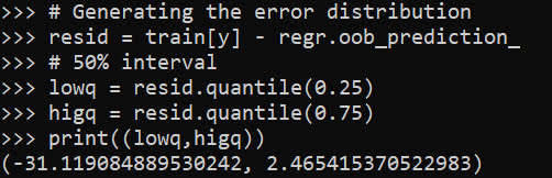
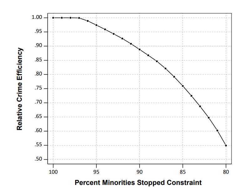
In doing a post mortem on our results for the NIJ recidivism challenge, first I calculated the extent to which our predictions would have done better if we did not bias our predictions to meet the fairness challenge. In the end, for Round 1 our team would have been in 3rd or 4th place for the small team rankings if we went with the unbiased predictions. It ended up being it only increased our Brier score by around ~0.001-0.002 though for each. (So I am glad we biased with a chance to win the fairness competition in the end.)

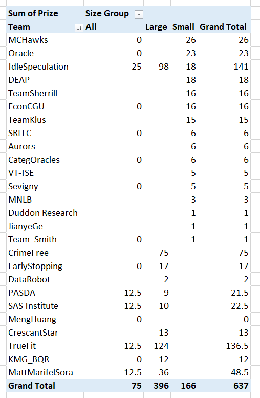
The leaderboards are so tight across the competition, often you need to go to the fourth decimal to determine the rankings. Here are the rankings for Round 1 Brier Scores for the small team:

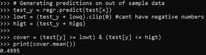
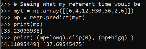
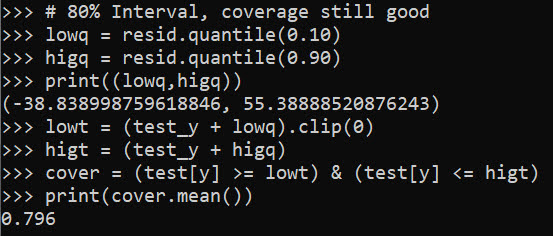
Ultimately these metrics used to determine the rankings are themselves statistics measured with error. So here I did a simulation to see the extent that these metrics had error.

These are not exactly the models we ended up using, but are very close (only performed slightly worse than the ones we ended up going with), but here I will show an example in python comparing rankings between a logit regression with L1 penalties vs a lightboosted model. So for some upfront on the python libraries I will be using, and I download the data directly:

import numpy as np
import pandas as pd
from scipy.stats import binom
from sklearn.linear_model import LogisticRegression
from lightgbm import LGBMClassifier
from sklearn.metrics import roc_auc_score, brier_score_loss

full_data = pd.read_csv('https://data.ojp.usdoj.gov/api/views/ynf5-u8nk/rows.csv?accessType=DOWNLOAD',index_col='ID')

The next part is just encoding the data. I am doing this for R1, so only using a certain set of information.

# Numeric Impute
num_imp = ['Gang_Affiliated','Supervision_Risk_Score_First',
           'Prior_Arrest_Episodes_DVCharges','Prior_Arrest_Episodes_GunCharges',
           'Prior_Conviction_Episodes_Viol','Prior_Conviction_Episodes_PPViolationCharges',
           'Residence_PUMA']

# Ordinal Encode (just keep puma as is)
ord_enc = {}
ord_enc['Gender'] = {'M':1, 'F':0}
ord_enc['Race'] = {'WHITE':0, 'BLACK':1}
ord_enc['Age_at_Release'] = {'18-22':6,'23-27':5,'28-32':4,
                  '33-37':3,'38-42':2,'43-47':1,
                  '48 or older':0}
ord_enc['Supervision_Level_First'] = {'Standard':0,'High':1,
                         'Specialized':2,'NA':-1}
ord_enc['Education_Level'] = {'Less than HS diploma':0,
                              'High School Diploma':1,
                              'At least some college':2,
                              'NA':-1}
ord_enc['Prison_Offense'] = {'NA':-1,'Drug':0,'Other':1,
                             'Property':2,'Violent/Non-Sex':3,
                             'Violent/Sex':4}
ord_enc['Prison_Years'] = {'Less than 1 year':0,'1-2 years':1,
                           'Greater than 2 to 3 years':2,'More than 3 years':3}

# _more clip 
more_clip = ['Dependents','Prior_Arrest_Episodes_Felony','Prior_Arrest_Episodes_Misd',
             'Prior_Arrest_Episodes_Violent','Prior_Arrest_Episodes_Property',
             'Prior_Arrest_Episodes_Drug',
             'Prior_Arrest_Episodes_PPViolationCharges',
             'Prior_Conviction_Episodes_Felony','Prior_Conviction_Episodes_Misd',
             'Prior_Conviction_Episodes_Prop','Prior_Conviction_Episodes_Drug']

# Function to prep data as I want, label encode
# And missing imputation
def prep_data(data,ext_vars=['Recidivism_Arrest_Year1','Training_Sample']):
    cop_dat = data.copy()
    # Numeric impute
    for n in num_imp:
        cop_dat[n] = data[n].fillna(-1).astype(int)
    # Ordinal Recodes
    for o in ord_enc.keys():
        cop_dat[o] = data[o].fillna('NA').replace(ord_enc[o]).astype(int)
    # _more clip
    for m in more_clip:
        cop_dat[m] = data[m].str.split(' ',n=1,expand=True)[0].astype(int)
    # Only keeping variables of interest
    kv = ext_vars + num_imp + list(ord_enc.keys()) + more_clip
    return cop_dat[kv].astype(int)

pdata = prep_data(full_data)

I did smart ordinal encoding, minus the missing data. So logit models are not super crazy with this data, although dummy variables + imputatation are likely a better approach (I am just being lazy here). But those should not be an issue for the tree based boosted models. Here I estimate models using the original train/test split chosen by NIJ:

y_var = 'Recidivism_Arrest_Year1'
x_vars = list(pdata)
x_vars.remove(y_var)
x_vars.remove('Training_Sample')

cat_vars = list( set(x_vars) - set(more_clip) )

l1 = LogisticRegression(penalty='l1', solver='liblinear')
lb = LGBMClassifier(silent=True)

# Original train/test split
train = pdata[pdata['Training_Sample'] == 1].copy()
test = pdata[pdata['Training_Sample'] == 0].copy()

# Fit models, and then eval on out of sample
l1.fit(train[x_vars],train[y_var])
lb.fit(train[x_vars],train[y_var],feature_name=x_vars,categorical_feature=cat_vars)

l1pp = l1.predict_proba(test[x_vars])[:,1]
lbpp = lb.predict_proba(test[x_vars])[:,1]

And then we can see how our two models do in this scenario according to the AUC or the Brier score statistic.

# ROC for the models
aucl1 = roc_auc_score(test[y_var],l1pp)
auclb = roc_auc_score(test[y_var],lbpp)
print(f'AUC L1 {aucl1}, AUC LightBoosted {auclb}')

# Brier score for models
bsl1 = brier_score_loss(test[y_var],l1pp)
bslb = brier_score_loss(test[y_var],lbpp)
print(f'Brier L1 {bsl1}, Brier LightBoosted {bslb}')

So you can see that the L1 model wins over the light boosted model (despite the wonky encoding with missing data) for both the AUC (+0.002) and the Brier Score (+0.001). (Note this is for the pooled sampled for both males/females.)

But is this just luck of the draw for the particular train/test dataset? That is, when we chose another train/test split, but fit the same models, would the light boosted model win some of the time? Here I do that, using the approximately 70% train/test split, but make it random and then estimate the test set Brier/AUC.

res = [] #list to stuff results into

for i in range(1000):
    print(f'Round {i}')
    rand_train = binom.rvs(1,0.7,size=pdata.shape[0])
    train = pdata[rand_train == 1].copy()
    test = pdata[rand_train == 0].copy()
    l1.fit(train[x_vars],train[y_var])
    lb.fit(train[x_vars],train[y_var],feature_name=x_vars,categorical_feature=cat_vars)
    l1pp = l1.predict_proba(test[x_vars])[:,1]
    lbpp = lb.predict_proba(test[x_vars])[:,1]
    aucl1 = roc_auc_score(test[y_var],l1pp)
    auclb = roc_auc_score(test[y_var],lbpp)
    bsl1 = brier_score_loss(test[y_var],l1pp)
    bslb = brier_score_loss(test[y_var],lbpp)
    loc_tup = (i,aucl1,auclb,bsl1,bslb)
    res.append(loc_tup)

fin_data = pd.DataFrame(res,columns=['Iter','AUCL1','AUCLB','BSL1','BSLB'])

fin_data.describe().T
# L1 wins for Brier score
(fin_data['BSL1'] < fin_data['BSLB']).mean()
# L1 wins for AUC
(fin_data['AUCL1'] > fin_data['AUCLB']).mean()

So you can see that the standard deviation for AUC is around 0.005, and the Brier Score is 0.002, also based on the means/min/max we can see that these two models have quite a bit of overlap in the distribution.

But, the results are correlated – when L1 tends to do worse, lightboosted also does worse. So when we look at the rankings, in this scenario L1 wins the majority of the time (but not always). This suggests to me that it was a good thing NIJ did not use AUC to judge, Brier scores seem much less volatile than AUC in this sample.

We can check out the correlations between the scores. AUC only has a correlation of around 0.8, whereas Brier has a correlation of 0.9. (If correlations were 1 the train/test split wouldn’t matter, the same person would always win in the rankings.)

# Results tend to be fairly correlated
fin_data.corr()
fin_data.cov()

But despite these models having a clear winner in this example, the margins between these two models are larger than the margins in the typical leaderboards. So I did a simulation using the observed leaderboard Brier scores for males for R1 as the means, and used the variance/covariance estimates above to make random draws.

This shows us, given the four observed leaderboard metrics, and my guesstimates for the typical error, how often will the leaders flip. Tighter scores and larger variances mean more flips.

# Simulation to see how often rankings flip
mu = np.array([0.1916, 0.1919, 0.1920, 0.1922])
tv = len(mu)
sd = 0.002 # sd and corr based on my earlier simulation
cor = 0.9
var = sd**2
cov = cor*(sd**2)

# filling the var/covariance matrix
r = np.ones((tv,tv)) * cov
np.fill_diagonal(r, var)

# Generating random multivariate normal
np.random.seed(10)
y = np.random.multivariate_normal(mu, r, size=1000)
y_ranks = y.argsort(axis=1)

# Making a nicer long dataset to see how often ranks swapped
persons = ['IdleSpeculation','SRLLC','Sevigny','TeamSmith']
y_rankdf = pd.DataFrame(y_ranks,columns=persons)
longy = y_rankdf.melt()

# How often are the ranks switched?
pd.crosstab(longy['variable'],longy['value'], normalize='columns')

How to read this table is that in the observed data for small team Males Round 1, IdleSpeculation was Ranked #1 with a Brier Score of 0.1916. My simulations show that based on those prior estimates, IdleSpeculation takes the top prize the most often (column 0), but only 43% of the time. You can see that even the bottom score here by TeamSmith takes #1 in 10% of the simulations.

This shows that there is some signal in the leaderboard, if it was totally random each of the ranks would have ~25% in each outcome. But it is clearly far from certain though either. This only considers people on the leaderboard who I know their results. It could also easily be someone in 5,6,7 could even have swapped to the #1 results.

What can we learn from this? One, the leaderboard results are unlikely to signify substantively improved models between different competitors. Clearly IdleSpeculation did well across the entire competition, but it would be hard to argue they were clearly better than everyone else (e.g. IdleSpeculations #3 rank in females in round 1 I suspect is just as likely due to bad luck as it is to their model being substantively worse than TeamKlus or TeamSherill).

Two, I think it would be better for competitions like this for people to submit algorithms, and then the algorithms can be judged on various train/tests (or a grid search cross-validation, or whatever). Using a simple train/test split like this will always come with some noise in the rankings.

This also solves the issue with transparency. Currently NIJ is simply asking us to submit a paper saying how we did the results. It would be more transparent to force people to submit code to replicate the results 100% (as well as prevent any obvious cheating).

Prelim results for NIJ Recidivism Challenge

So the prelim results for the NIJ recidivism challenge are up. My team, MCHawks with Gio Circo, did ok. Here is a breakdown of team winnings (minus the student category) per 1k. So while we won the most in the small team category, IdleSpeculation overall kicked our butt!

We actually biased our predictions to meet the racial fairness constraint, so you can see we did much better in those categories in Round 1 and Round 2. Unfortunately you only win if you get top in this category – no second place winners here (it says Brier score in these tables, but this is (1 - BrierScore)*(1 - FPDifference):

But we got lucky and won the overall in Round 2 despite biasing our predictions. Round 3 we have no excuse really, while the predictions were biased it did not matter.

We will do a paper for the results, but overall our approach is pretty standard. For each round we did a grid search over various models – for R1 and R3 we did a L1 logit, for R2 we did an XGBoost model. I did attempt a specialized Logit model with the fairness constraints in the loss function (and just used backpropogation to fit the model, ala deep learning), but in practice the way the fairness metric is done this just added noise into the estimate.

I will have more to say in the future about fairness metrics, unfortunately here I do not think it was well thought out. It was simply the false positive rate comparing white/black subgroups, assuming a threshold of 0.5, which does not make sense in practice. (I’ve written about calculating the threshold for bail here, it applies the same to parole though as well.) So for each model we simply clipped probabilities to be below 0.5 to meet this – no one predicted high means 0 false positives for each group.

So the higher threshold makes it silly, also the multiplication between the metrics I don’t think is a good idea either. I think it can be amended though to be a more reasonable additive fairness constraint. E.g. BrierScore + lambda*FPDifference, where lambda is a tuner to set how you want to make the tradeoff (and FP may be the total N difference, not a proportion difference, which can be volatile for small N). (Also I think it makes more sense to balance false negatives than false positives in the CJ example, but any algorithm to balance one can be flipped to balance the other.)

I do like how NIJ spreads prizes out, instead of Kaggle like with only 1/2/3 big prizes. I wish here we could submit two predictions though (one for main and one for fair). (I am pretty sure we would have placed in Year1 if we did not bias our predictions.)

RTM Deep Learning Style

In my quest to better understand deep learning, I have attempted to replicate some basic models I am familiar with in criminology, just typical OLS and the more complicated group based trajectory models. Another example I will illustrate is doing a variant of Risk Terrain Modeling.

The typical way RTM is done is:

Data Prep Part:

  1. create a set of independent variables for crime generators (e.g. bars, subway stops, liquor stores, etc.) that are either the distance to the nearest or the kernel density estimate
  2. Turn these continuous estimates into dummy variables, e.g. if within 100 meters = 1, else = 0. For kernel density they typically z-score and if a z-score > 2 the dummy variable equals 1.
  3. Do 2 for varying distance/bandwidth selections, e.g. 100 meters, 200 meters, etc. So you end up with a collection of distance variables, e.g. Bars_100, Bars_200, Bars_400, etc.

Modeling Part

  1. Fit a Lasso regression predicting your crime outcome constraining all of the variables to be positive. (So RTM will never say a crime generator has a negative effect.)
  2. For the variables that passed this Lasso stage, then do a variable selection routine. So instead of the final model having Bars_100 and Bars_400, it will only choose one of those variables.

For the modeling part, we can replicate various parts of these in a deep learning environment. For the constrain the coefficients to be positive, when you see folks refer to a “RelU” or the rectified linear unit function, all this means is that the coefficients are constrained to be positive. For the variable selection part, I needed to hack my own – it ends up being a combo of a custom dropout scheme and then pruning in deep learning lingo.

Although RTM is typically done on raster grid cells for the spatial unit of analysis, this is not a requirement. You can do all these steps on vector (e.g. street segments) or other areal spatial units of analysis.

Here I illustrate using street units (intersections and street segments) from DC. The crime generator data I take from my dissertation (and I have a few pubs in Crime & Delinquency based on that work). The crime data I illustrate using 2011 violent Part 1 UCR (homicide, agg assault, robbery, no rape in the public data).

The crime dataset is over time, and I describe in an analysis (with Billy Zakrzewski) on examining pre/post crime around DC medical marijuana dispensaries.

The data and code to replicate can be downloaded here. It is python, and for the deep learning model I used pytorch.

RTM Example in Python

So I will walk through briefly my second script, 01_DeepLearningRTM.py. The first script, 00_DataPrep.py, does the data prep, so this data file already has the crime generator variables prepared in the manner RTM typically creates them. (The rtm_dl_funcs.py has the functions to do the feature extraction and create the deep learning model, to do distance/density in sci-kit is very slick, only a few lines of code.)

So first I just define the libraries I will be using, and import my custom rtm functions I created.

######################################################
import numpy as np
import pandas as pd
import torch
device = torch.device("cuda:0")
import os
import sys

my_dir = r'C:\Users\andre\OneDrive\Desktop\RTM_DeepLearning'
os.chdir(my_dir)
sys.path.append(my_dir)
import rtm_dl_funcs
######################################################

The next set of code grabs the crime data, and then defines my variable sets. I have plenty more crime generator data from my dissertation, but to make it easier on myself I just focus on distance to metro entrances, the density of 311 calls (a measure of disorder), and the distance and density of alcohol outlets (this includes bars/liquor stores/gas stations that sell beer, etc.).

Among these variable sets, the final selected model will only choose one within each set. But I have also included the ability for the model to incorporate other variables that will just enter in no-matter what (and are not constrained to be positive). This is mostly to incorporate an intercept into the regression equation, but here I also include the percent of sidewalk encompassing one of my street units (based on the Voronoi tessellation), and a dummy variable for whether the street unit is an intersection. (I also planned on included the area of the tessalation, but it ended up being an explosive effect, my dissertation shows its effect is highly non-linear, so didn’t want to worry about splines here for simplicity.)

######################################################
#Get the Prepped Data
crime_data = pd.read_csv('Prepped_Crime.csv')

#Variable sets for each
db = [50, 100, 200, 300, 400, 500, 600, 700, 800]
metro_set = ['met_dis_' + str(i) for i in db]
alc_set = ['alc_dis_' + str(i) for i in db]
alc_set += ['alc_kde_' + str(i) for i in db]
c311_set = ['c31_kde_' + str(i) for i in db]

#Creating a few other generic variables
crime_data['PercSidewalk'] = crime_data['SidewalkArea'] / crime_data['AreaMinWat']
crime_data['Const'] = 1
const_li = ['Const','Intersection','PercSidewalk']
full_set = const_li + alc_set + metro_set + c311_set
######################################################

The next set of code turns my data into a set of torch tensors, then I grab the size of my independent variable sets, which I will end up needing when initializing my pytorch model.

Then I set the seed (to be able to reproduce the results), create the model, and set the loss function and optimizer. I use a Poisson loss function (will need to figure out negative binomial another day).

######################################################
#Now creating the torch tensors
x_ten = torch.tensor(crime_data[full_set].to_numpy(), dtype=float)
y_ten = torch.tensor(crime_data['Viol_2011'].to_numpy(), dtype=float)
out_ten = torch.tensor(crime_data['Viol_2012'].to_numpy(), dtype=float)

#These I need to initialize the deep learning model
gen_lens = [len(alc_set), len(metro_set), len(c311_set)]
    
#Creating the model 
torch.manual_seed(10)

model = rtm_dl_funcs.RTM_torch(const=len(const_li), 
                               gen_list=gen_lens)
criterion = torch.nn.PoissonNLLLoss(log_input=True, reduction='mean')
optimizer = torch.optim.Adam(model.parameters(), lr=0.001) #1e-4
print( model )
######################################################

If you look at the printed out model, it gives a nice summary of the different layers. We have our one layer for the fixed coefficients, and another three sets for our alcohol outlets, 311 calls, and metro entrances. We then have a final cancel layer. The idea behind the final cancel layer is that the variable selection routine in RTM can still end up not selecting any variables for a set. I ended up not using it here though, as it was too aggressive in this example. (So will need to tinker with that some more!)

The variable selection routine is very volatile – so if you have very correlated inputs, you can essentially swap one for the other and get near equivalent predictions. I often see folks who do RTM analyses say something along the lines of, “OK this RTM selected A, and this RTM selected B, so they are different effects in these two samples” (sometimes pre/post, other times comparing different areas, and other times different crime outcomes). I think this is probably wrong though to make that inference, as there is quite a bit of noise in the variable selection process (and the variable selection process itself precludes making inferences on the coefficients themselves).

My deep learning example inherited the same problems. So if you change the initialized weights, it may end up selecting totally different inputs in the end. To get the variable selection routine to at least select the same crime generator variables in my tests, I do a burn in period in which I implement a random dropout scheme. So instead of the typical dropout, for every forward pass it does a random dropout to only select one variable randomly out of each crime generator set. After that converges, I then use a pruning layer to only pick the coefficient that has the largest effect, and again do a large set of iterations to make sure the results converged. So different means but same ends to the typical RTM steps 4 and 5 above. I also have like I said a ReLU transformation after each layer, so the crime generator variables are always positive, any negative effects will be pruned out.

One thing that is nice about deep learning is that it can be quite fast. Here each of these 10,000 iteration sets take less than a minute on my desktop with a GPU. (I’ve been prototyping models with more parameters and more observations at work on my laptop with just a CPU that only take like 10 to 20 minutes).

######################################################
#Burn in part, random dropout
for t in range(10000):
    #Forward pass
    y_pred = model(x=x_ten)
    #Loss
    loss_insample = criterion(y_pred, y_ten)
    optimizer.zero_grad()
    loss_insample.backward(retain_graph=True)
    optimizer.step()
    if t % 1000 == 0:
        print(f'loss: {loss_insample.item()}' )

#Switching to pruning all but the largest effects
model.l1_prune()

for t in range(10000):
    #Forward pass
    y_pred = model(x=x_ten, mask_type=None, cancel=False)
    #Loss
    loss_insample = criterion(y_pred, y_ten)
    optimizer.zero_grad()
    loss_insample.backward(retain_graph=True)
    optimizer.step()
    if t % 1000 == 0:
        print(f'loss: {loss_insample.item()}' )

print( model.coef_df(nm_li=full_set, cancel=False) )
######################################################

And this prints out the results (as incident rate ratios), so you can see it selected 50 meters alcohol kernel density, 50 meters distance to the nearest metro station, and kernel density for 311 calls with an 800 meter bandwidth.

I have in the code another example model when using a different seed. So testing out on around 5 different seeds it always selected these same distance/density variables, but the coefficients are slightly different each time. Here is an example from setting the seed to 12.

These models are nothing to brag about, using the typical z-score the predictions and set the threshold to above 2, the PAI is only around 3 (both for in-sample 2011 and out of sample 2012 is slightly lower). It is a tough prediction task – the mean number of violent crimes per street unit per year is only 0.3. Violent crime is fortunately very rare!

But with only three different risk variables, we can do a quick conjunctive analysis, and look at the areas of overlap.

######################################################
#Adding model 1 predictions back into the dataset
pred_mod1 = pd.Series(model(x=x_ten, mask_type=None, cancel=False).exp().detach().numpy())
crime_data['Pred_M1'] = pred_mod1

#Check out the areas of overlapping risk
mod1_coef = model.coef_df(nm_li=full_set, cancel=False)
risk_vars = list(set(mod1_coef['Variable']) - set(const_li))
conj_set = crime_data.groupby(risk_vars, as_index=False)['Const','Pred_M1','Viol_2012'].sum()
print(conj_set)
######################################################

In this table Const is the total number of street units selected, Pred_M1 is the expected number of crimes via Model 1, and then I show how well it conforms to the predictions out of sample 2012. So you can see in the aggregate the predictions are not too far off. There only ends up being one street unit that overlaps for all three risk factors in the study area.

I believe the predictions would be better if I included more crime generator variables. But ultimately the nature of how RTM works it trades off accuracy for simple models. Which is fair – it helps to ease the nature of how a police department (or some other entity) responds to the predictions.

But this trade off results in predictions that don’t fare as well compared with more complicated models. For example I show (with Wouter Steenbeek) that random forests do much better than RTM. To make those models more interpretable we did local decompositions for hot spots, so say this hot spot is 30% alcohol outlets, 20% nearby apartments, etc.

So there is no doubt more extensions for RTM you could do in a deep learning framework, but they will likely always result in more complicated and less interpretable models. Also here I don’t think this code will be better than the traditional RTM folks, the only major benefit of this code is it will run faster – minutes instead of overnight for most jobs.

New preprint: Allocating police resources while limiting racial inequality

I have a new working paper out, Allocating police resources while limiting racial inequality. In this work I tackle the problem that a hot spots policing strategy likely exacerbates disproportionate minority contact (DMC). This is because of the pretty simple fact that hot spots of crime tend to be in disadvantaged/minority neighborhoods.

Here is a graph illustrating the problem. X axis is the proportion of minorities stopped by the police in 500 by 500 meter grid cells (NYPD data). Y axis is the number of violent crimes over along time period (12 years). So a typical hot spots strategy would choose the top N areas to target (here I do top 20). These are all very high proportion minority areas. So the inevitable extra police contact in those hot spots (in the form of either stops or arrests) will increase DMC.

I’d note that the majority of critiques of predictive policing focus on whether reported crime data is biased or not. I think that is a bit of a red herring though, you could use totally objective crime data (say swap out acoustic gun shot sensors with reported crime) and you still have the same problem.

The proportion of stops by the NYPD of minorities has consistently hovered around 90%, so doing a bunch of extra stuff in those hot spots will increase DMC, as those 20 hot spots tend to have 95%+ stops of minorities (with the exception of one location). Also note this 90% has not changed even with the dramatic decrease in stops overall by the NYPD.

So to illustrate my suggested solution here is a simple example. Consider you have a hot spot with predicted 30 crimes vs a hot spot with predicted 28 crimes. Also imagine that the 30 crime hot spot results in around 90% stops of minorities, whereas the 28 crime hot spot only results in around 50% stops of minorities. If you agree reducing DMC is a reasonable goal for the police in-and-of-itself, you may say choosing the 28 crime area is a good idea, even though it is a less efficient choice than the 30 crime hot spot.

I show in the paper how to codify this trade-off into a linear program that says choose X hot spots, but has a constraint based on the expected number of minorities likely to be stopped. Here is an example graph that shows it doesn’t always choose the highest crime areas to meet that racial equity constraint.

This results in a trade-off of efficiency though. Going back to the original hypothetical, trading off a 28 crime vs 30 crime area is not a big deal. But if the trade off was 3 crimes vs 30 that is a bigger deal. In this example I show that getting to 80% stops of minorities (NYC is around 70% minorities) results in hot spots with around 55% of the crime compared to the no constraint hot spots. So in the hypothetical it would go from 30 crimes to 17 crimes.

There won’t be a uniform formula to calculate the expected decrease in efficiency, but I think getting to perfect equality with the residential pop. will typically result in similar large decreases in many scenarios. A recent paper by George Mohler and company showed similar fairly steep declines. (That uses a totally different method, but I think will be pretty similar outputs in practice — can tune the penalty factor in a similar way to changing the linear program constraint I think.)

So basically the trade-off to get perfect equity will be steep, but I think the best case scenario is that a PD can say "this predictive policing strategy will not make current levels of DMC worse" by applying this algorithm on-top-of your predictive policing forecasts.

I will be presenting this work at ASC, so stop on by! Feedback always appreciated.

New preprint: The accuracy of the violent offender identification directive (VOID) tool to predict future gun violence

I have a new preprint out, The accuracy of the violent offender identification directive (VOID) tool to predict future gun violence. This is work with Rob Worden and Jasmine Silver from our time at the Finn Institute. Below is the abstract:

We evaluate the Violent Offender Identification Directive (VOID) tool, a risk assessment instrument implemented within a police department to prospectively identify offenders likely to be involved with future gun violence. The tool uses a variety of static measures of prior criminal history that are readily available in police records management systems. The VOID tool is assessed for predictive accuracy by taking a historical sample and calculating scores for over 200,000 individuals known to the police at the end of 2012, and predicting 103 individuals involved with gun violence (either as a shooter or a victim) during 2013. Despite weights for the instrument being determined in an ad-hoc manner by crime analysts, the VOID tool does very well in predicting involvement with gun violence compared to an optimized logistic regression and generalized boosted models. We discuss theoretical reasons why such ad-hoc instruments are likely to perform well in identifying chronic offenders for all police departments.

There were just slightly over 100 violent gun offenders we were trying to pick out of over 200,000. The VOID tool did really well! Here is a graph comparing how many of those offenders VOID captured compared to a generalized boosted model (GBM), and two different logistic regression equations.

I have some of my thoughts in this article as to why a simple tool does just as well as more complicated regression and machine learning techniques, which is a common finding in recidivism studies as well. My elevator pitch for why that is is because most offenders are generalists, and for example you can basically swap prior arrests for robbery with prior arrests for motor vehicle theft — they both provide essentially the same signal for future potential criminality. See also discussion of this on Dan Simpson’s post on the Stat Modeling, Causal Inference and Social Science blog, which in turn makes me think the idea behind simple models can be readily applied to many decision points in the criminal justice field.

The simple takeaway from this for crime analysts making chronic offender lists is that don’t let the perfect be the enemy of the good. Analysts can likely create an ad-hoc weighting to prioritize chronic offenders and it will do quite well compared to fancier models.

I will be presenting this work at the ACJS conference in New Orleans on Saturday 2/17/18. It is a great session, with YongJei Lee, Jerry Ratcliffe, Bryanna Fox, and Stacy Sechrist (see session 384 in the ACJS program), so stop on by. If you want to catch up with me in New Orleans just send me an email. And as always if you have feedback on the draft I am all ears.

How wide to make the net in actuarial tools? (false positives versus false negatives)

An interesting debate/question came up in my work recently. I conducted an analysis of a violence risk assessment tool for a police department. Currently the PD takes around the top 1,000 scores of this tool, and then uses further intelligence and clinical judgements to place a small number of people on a chronic offender list (who are then subject to further interventions). My assessment of the predictive validity when examining ROC curves suggested the tool does a pretty good job discriminating violent people up to around the top 6,000 individuals and after that flattens out. In a sample of over 200,000, the top 1000 scores correctly classified 30 of the 100 violent cases, and the top 6000 classified 60.

So the question came up should we recommend that the analysts widen the net to the top 6,000 scores, instead of only examining the top 1,000 scores? There are of course costs and limitations of what the analysts can do. It may simply be infeasible for the analysts to review 6,000 people. But how do you set the limit? Should the clinical assessments be focused on even fewer individuals than 1,000?

We can make some estimates of where the line should be drawn by setting weights for the cost of a false positive versus a false negative. Implicit in the whole exercise of predicting violence in a small set of people is that false negatives (failing to predict someone will be violent when they are) greatly outweigh a false positive (predicting someone will be violent but they are not). The nature of the task dictates that you will always need to have quite a few false positives to classify even a few true positives, and no matter what you do there will only be a small number of false negatives.

Abstractly, you can place a value on the cost of failing to predict violence, and a cost on the analysts time to evaluate cases. In this situation we want to know whether the costs of widening the net to 6,000 individuals are less than the costs of only examining the top 1,000 individuals. Here I will show we don’t even need to know what the exact cost of a false positive or a false negative is, only the relative costs, to make an estimate about whether the net should be cast wider.

The set up is that if we only take the top 1,000 scores, it will capture 30 out of the 100 violent cases. So there will be (100 – 30) false negatives, and (1000 – 30) false positives. If we increase the scores to evaluate the top 6,000, it will capture 60 out the 100 violent cases, but then we will have (6000 – 60) false positives. I can not assign a specific number to the cost of a false negative and a false positive. So we can write these cost equations as:

1) (100 - 30)*FN + (1000 - 30)*FP = Cost Low
2) (100 - 60)*FN + (6000 - 60)*FP = Cost High

Even though we do not know the exact cost of a false negative, we can talk about relative costs, e.g. 1 false negative = 1000*false positives. There are too many unknowns here, so I am going to set FP = 1. This makes the numbers relative, not absolute. So with this constraint the reduced equations can be written as:

1) 70*FN +  970 = Cost Low
2) 40*FN + 5940 = Cost High

So we want to know the ratio at which there is a net benefit over including the top 6,000 scores versus only the top 1,000. So this means that Cost High < Cost Low. To figure out this point, we can subtract equation 2 from equation 1:

3) (70 - 40)*FN - 4970 = Cost Low - Cost High

If we set this equation to zero and solve for FN we can find the point where these two equations are equal:

30*FN - 4970 = 0
30*FN = 4970
FN = 4970/30 = 165 + 2/3

If the value of a false negative is more than 166 times the value of a false positive, Cost Low - Cost High will be positive, and so the false negatives are more costly to society relative to the analysts time spent. It is still hard to make guesses as to whether the cost of violence to society is 166 times more costly than the analysts time, but that is at least one number to wrap your head around. In a more concrete example, such as granting parole or continuing to be incarcerated, given how expensive prison is net widening (with these example numbers) would probably not be worth it. But here it is a bit more fuzzy especially because the analysts time is relatively inexpensive. (You also have to guess how well you can intervene, in the prison example incarceration essentially reduces the probability of committing violence to zero, whereas police interventions can not hope to be that successful.)

As long as you assume that the classification rate is linear within this range of scores, the same argument holds for net widening any number. But in reality there are diminishing returns the more scores you examine (and 6,000 is basically where the returns are near zero). If you conduct the same exercise between classifying zero and the top 1,000, the rate of the cost of a false negative to a false positive needs be 32+1/3 to justify evaluating the top 1,000 scores. If you actually had an estimate of the ratio of the cost of false positives to false negatives you could then figure out exactly how wide to make the net. But if you think the ratio is well above 166, you have plenty of reason to widen the net to the larger value.

ROC and Precision-Recall curves in SPSS

Recently I was tasked with evaluating a tool used to predict violence. I initially created some code to plot ROC curves in SPSS for multiple classifiers, but then discovered that the ROC command did everything I wanted. Some recommend precision-recall curves in place of ROC curves, especially when the positive class is rare. This fit my situation (a few more than 100 positive cases in a dataset of 1/2 million) and it was pretty simple to adapt the code to return the precision. I will not go into the details of the curves (I am really a neophyte at this prediction stuff), but here are a few resources I found useful:

The macro is named !Roc and it takes three parameters:

  • Class – the numeric classifier (where higher equals a greater probability of being predicted)
  • Target – the outcome you are trying to predict. Positive cases need to equal 1 and negative cases 0
  • Suf – this the the suffix on the variables returned. The procedure returns “Sens[Suf]”, “Spec[Suf]” and “Prec[Suf]” (which are the sensitivity, specificity, and precision respectively).

So here is a brief made up example using the macro to draw ROC and precision and recall curves (entire syntax including the macro can be found here). So first lets make some fake data and classifiers. Here Out is the target being predicted, and I have two classifiers, X and R. R is intentionally made to be basically random. The last two lines show an example of calling the macro.

SET SEED 10.
INPUT PROGRAM.
LOOP #i = 20 TO 70.
  COMPUTE X = #i + RV.UNIFORM(-10,10).
  COMPUTE R = RV.NORMAL(45,10).
  COMPUTE Out = RV.BERNOULLI(#i/100).
  END CASE.
END LOOP.
END FILE.
END INPUT PROGRAM.
DATASET NAME RocTest.
DATASET ACTIVATE RocTest.
EXECUTE.

!Roc Class = X Target = Out Suf = "_X".
!Roc Class = R Target = Out Suf = "_R".

Now we can make an ROC curve plot with this information. Here I use inline TRANS statements to calculate 1 minus the specificity. I also use a blending trick in GPL to make the beginning of the lines connect at (0,0) and the end at (1,1).

*Now make a plot with both classifiers on it.
GGRAPH
  /GRAPHDATASET NAME="graphdataset" VARIABLES=Spec_X Sens_X Spec_R Sens_R 
  /GRAPHSPEC SOURCE=INLINE.
BEGIN GPL
  PAGE: begin(scale(770px,600px))
  SOURCE: s=userSource(id("graphdataset"))
  DATA: Spec_X=col(source(s), name("Spec_X"))
  DATA: Sens_X=col(source(s), name("Sens_X"))
  DATA: Spec_R=col(source(s), name("Spec_R"))
  DATA: Sens_R=col(source(s), name("Sens_R"))
  TRANS: o = eval(0)
  TRANS: e = eval(1)
  TRANS: SpecM_X = eval(1 - Spec_X)
  TRANS: SpecM_R = eval(1 - Spec_R) 
  COORD: rect(dim(1,2), sameRatio())
  GUIDE: axis(dim(1), label("1 - Specificity"), delta(0.1))
  GUIDE: axis(dim(2), label("Sensitivity"), delta(0.1))
  GUIDE: text.title(label("ROC Curve"))
  SCALE: linear(dim(1), min(0), max(1))
  SCALE: linear(dim(2), min(0), max(1))
  ELEMENT: edge(position((o*o)+(e*e)), color(color.lightgrey))
  ELEMENT: line(position(smooth.step.right((o*o)+(SpecM_R*Sens_R)+(e*e))), color("R"))
  ELEMENT: line(position(smooth.step.right((o*o)+(SpecM_X*Sens_X)+(e*e))), color("X"))
  PAGE: end()
END GPL.

This just replicates the native SPSS ROC command though, and that command returns other useful information as well (such as the actual area under the curve). We can see though that my calculations of the curve are correct.

*Compare to SPSS's ROC command.
ROC R X BY Out (1)
  /PLOT CURVE(REFERENCE)
  /PRINT SE COORDINATES.

To make a precision-recall graph we need to use the path element and sort the data in a particular way. (SPSS’s line element works basically the opposite of the way we need it to produce the correct sawtooth pattern.) The blending trick does not work with this graph, but it is immaterial in interpreting the graph.

*Now make precision recall curves.
*To make these plots, need to reshape and sort correctly, so the path follows correctly.
VARSTOCASES
  /MAKE Sens FROM Sens_R Sens_X
  /MAKE Prec FROM Prec_R Prec_X
  /MAKE Spec FROM Spec_R Spec_X
  /INDEX Type.
VALUE LABELS Type
 1 'R'
 2 'X'.
SORT CASES BY Sens (A) Prec (D).
GGRAPH
  /GRAPHDATASET NAME="graphdataset" VARIABLES=Sens Prec Type
  /GRAPHSPEC SOURCE=INLINE.
BEGIN GPL
  PAGE: begin(scale(770px,600px))
  SOURCE: s=userSource(id("graphdataset"))
  DATA: Sens=col(source(s), name("Sens"))
  DATA: Prec=col(source(s), name("Prec"))
  DATA: Type=col(source(s), name("Type"), unit.category())
  COORD: rect(dim(1,2), sameRatio())
  GUIDE: axis(dim(1), label("Recall"), delta(0.1))
  GUIDE: axis(dim(2), label("Precision"), delta(0.1))
  GUIDE: text.title(label("Precision-Recall Curve"))
  SCALE: linear(dim(1), min(0), max(1))
  SCALE: linear(dim(2), min(0), max(1))
  ELEMENT: path(position(Sens*Prec), color(Type))
  PAGE: end()
END GPL.
*The sawtooth is typical.

These curves both show that X is the clear winner. In my use application the ROC curves are basically superimposed, but there is more separation in the precision-recall graph. Being very generic, most of the action in the ROC curve is at the leftmost area of the graph (with only a few positive cases), but the PR curve is better at identifying how wide you have to cast the net to find the few positive cases. In a nut-shell, you have to be willing to live with many false positives to be able to predict just the few positive cases.

I would be interested to hear other analysts perspective. Predicting violence is a popular topic in criminology, with models of varying complexity. But what I’m finding so far in this particular evaluation is basically that there are set of low hanging fruit of chronic offenders that score high no matter how much you crunch the numbers (around 60% of the people who committed serious violence in a particular year in my sample), and then a set of individuals with basically no prior history (around 20% in my sample). So basically ad-hoc scores are doing about as well predicting violence as more complicated machine learning models (even machine learning models fit on the same data).