Home buying and collective efficacy

With the recent large appreciation in home values, around 20% in the prior year, there have been an increase in private investors purchasing homes to rent out. Recent stories on this by Tyler Dukes and colleagues have collated open parcel data to identify the scope of these companies across all of North Carolina.

For bit of background, I tried to purchase a home in Plano, TX early 2018. Homes in our price range at that time were going in a single day and typically a few thousand over asking price.

Fast forward to early 2021, I am full remote data scientist instead of a professor, and kiddo is in online school. Even with the pay bump, housing competition was even worse in Plano at this point, so we knew we were likely going to have to move school districts to be able to purchase a home. So we decided to strike out, and ended up looking around Raleigh. Ended up quite quickly deciding to purchase a new build home in the suburb of Clayton (totally recommend our realtor, Ellen Pitts, her crew did quite a bit of work for us remotely).

I was lucky to get in then it appears – many of the new developments in the area are being heavily scooped up by these equity firms (and rent would be ~$600 more for my home than the mortgage). So I downloaded the public data Dukes put together, and loaded it into Excel to make a quick map of the properties.

For a NC state view, we have big clusters in Charlotte, Greensboro and Raleigh:

We can zoom in, and here is an overview of triangle area:

So you can see that inside the loop in Raleigh is pretty sparse, but many of the newer developments on the east side have many more of the private firm purchased houses. Charlotte is much more infilled with these private firms purchasing properties.

Zooming in even further to my town of Clayton, there is quite a bit of variance in the proportion of private vs residential purchases across various developments. My development is less than 50% of these purchases, several developments though appear almost 100% private purchased though. (This is not my home/neighborhood FYI.)


So what does this have to do with collective efficacy? Traditionally areas with higher home ownership have been associated with lower rates of crime. For not criminologists reading my blog, one of the most prominent criminological theories is that state actions only move the needle slightly on increasing/decreasing crime, people enforcing social norms is a bigger factor that explains high crime vs low crime areas. Places with people churning out more frequently – which occurs in areas with more renters – tend to have fewer people effectively keeping the peace. Because social scientists love to make up words, we call this concept collective efficacy.

Downloading and looking at this data, while I was mostly just interested in zooming into my neighborhood and seeing the infill of renters, sparked a criminological hypothesis: I expect neighborhoods with higher rates of private equity purchased housing in the long run to have higher rates of criminal behavior.

This hypothesis will be difficult to test in the wild. It is partially confounded with capital – those who buy their homes accumulate more wealth over time (again mortgage is quite a bit cheaper than rent, so even ignoring home value appreciation this is true). But the variance in the number of homes purchased by private equity firms in different areas makes me wonder if there is enough variation to do a reasonable research design to test my hypothesis, especially in the Charlotte area in say two or three years post a development being finished.

Using Natural Frequencies to Reason about Tests

Hackernews shared an article about visualizing Bayes Theorem using Venn diagrams, with the common example of going from sensitivity/specificity of a test to switch the probability of ‘do I have cancer’. I actually do not find Bayes Theorem to be really helpful to think through this problem. I much prefer Gerd Gigerenzer’s approach using natural frequencies.

So here is an example, say we have a Covid rapid test that has a sensitivity of 90%. This metric is “if you have Covid, how often does the test say you have Covid”. In conditional probability terms we would write this P( Test Says + | Actually Have Covid ).

Often times we want to know the opposite conditional though, “if we test positive, what is the actual probability we have Covid?”. So we want to know P( Actually Have Covid | Test Says + ). This is switching the conditional from the earlier metric. To figure that out though, we need some more information though. One thing we need is an estimate of “Actually Have Covid” in the overall population. Pretend this is 5% for our scenario.

Another is the false positive rate of the test, P( Test Says + | Do Not Have Covid ). Lets say for our example this is 10%. Now how do we figure out P( Actually Have Covid | Test Says + )? Lets use this nice little tree diagram, where we consider a hypothetical scenario of 1000 people getting Covid rapid tests:

So first thing to note is that the first split in the tree is something that doesn’t have anything to do with the tests at all – it is the overall proportion of Covid cases in the population. Here 5% means out of our 1000 people that take rapid tests, we expect only 50 of them to actually have Covid.

The second level of the splits are the two data based pieces of information, the sensitivity is the split on the left side. The test captures 90% of the true positives, so 45 out of the 50 get a positive result on the rapid test. The right split is the false negative rate of 10%, of those 950 without Covid, 95 will get a false positive result.

So in the end, we have 45 true positives out of 45 + 95 total positive tests (the colored balls in the tree diagram). That is our personal estimate of I tested positive for Covid, do I actually have Covid, P( Actually Have Covid | Test Says + ). This estimate is 32%, or a metric we sometimes like to call the Positive Predictive Value of the test. I have an Excel spreadsheet where you can insert different overall proportions in the underlying population (the prevalence) as well as different estimates of a tests sensitivity/false-positive rate, and it spits out the nice diagram.

In the end even if you have a very sensitive test with a low false positive rate, if the prevalence is very low you will have a low positive predictive value. For example in my work, in predicting chronic offenders involved with shootings, among the top 1000 predictions the PPV was only 3%. Because shooting someone or being shot is very rare. If you compare those top 1000 they have around 200 times higher probability than a random person, but still overall that probability is quite low.

Note for data science folks that these different metrics all relate to the ROC curve. In my head I often translate sensitivity to “capture rate” – the proportion of true cases the test captures in the wild, I can never remember sensitivity. Sometimes in ROC curves I label this as the True Positive Rate, although software often uses 1 – Specificity vs Sensitivity.

Based on the above scenario you may be thinking to yourself ‘I can’t fill out all of the unknowns’, especially such as knowing the underlying prevalence of the outcome in the population. For overall prevalence’s you can often make reasonable guesses. For error rates for tests, that often takes some digging or guess work as to typical error rates though. So even if we don’t have uber precise estimates, we can still make reasonable decisions based on the range of likely scenarios filling in the info we need.

Knowing the Right Conditional Probability?

While in general I like the tree diagram approach, it doesn’t help with the more general issue of knowing the correct probability you care about to make decisions. Totally agree with Gigerenzer’s overall approach (he is basically glass half full compared to Kahneman/Tversky, if you present info the right way we don’t make so biased as decisions), but even scientific experts often make conditional probability mistakes.

Much of the public discussion about Covid in particular is making a specious set of probability estimates to justify positions. Just copy-pasting my Hackernews comment giving examples from the Rogan/Gupta interview, but think that is very symbolic overall of the news coverage:

I think a more basic problem is people don’t even know how to formulate meaningful probability hypothetical/counterfactuals to begin with (let alone update them). For Covid stuff pretty much all an individual should care about is:

P(Bad Stuff | I take action A) > P(Bad Stuff | I take action B)

So you take action B in this scenario (simplifying to ignore costs, many of these decisions are costless). We get a bunch of meaningless drivel in the news though that doesn’t help anyone make any meaningful probability estimates to help them make decisions. I think the Rogan/Gupta interview is a good example. We get various non-sense comparisons such as:

P(Bad Stuff | Covid, Person 5, No Vaccine) < P(Bad Stuff | Covid, Person 50, Vaccine)

[Rogan to Gupta why is it OK for 50 year old to feel safe and not a young kid without a vaccine? Irrelevant counter-factual unless someone invents a reverse aging treatment.]

P(Heart Inflammation | Covid Vaccine, Young Male) > P(Death | Covid, Young Male)

[Rogan saying side effects for young people outweigh benefits. This is true but death is quite a bit worse than the side effects, and this does not consider other Bad Stuff from Covid like long haulers.]

Knowing Bayes Theorem doesn’t help someone figure out the right probability statement they should be interested in to begin with.

The news overall is very frustrating, especially scientific coverage. Often times news entirely avoids any specific numeric estimate, but is often not even clear what the estimate is. A common one from news coverage is P(Bad Thing | ?????), I often can’t tell what composes the conditional on the right hand side. Sometimes it is those tested positive, sometimes it is the overall population in an area, sometimes it is those in the hospital, etc. Those different conditionals can greatly change how you interpret that information.

References

  • Gigerenzer, G. (2011). What are natural frequencies?. BMJ, 343.
  • Wheeler, A. P., Worden, R. E., & Silver, J. R. (2019). The accuracy of the violent offender identification directive tool to predict future gun violence. Criminal Justice and Behavior, 46(5), 770-788.

The WDD test with different area sizes

So I have two prior examples of weighting the WDD test (a simple test for pre-post crime counts in an experimental setting):

And a friend recently asked about weighting for different areas, so the test is crime reduction per area density instead of overall counts. First before I get into the example, this isn’t per se necessary. All that matters in the end for this test to be valid is 1) the crime data are Poisson distributed, 2) the control areas follow parallel trends to the treated area. So based on this I’ve advocated that it is ok to have a control area be ‘the rest of the city’ for example.

Some of my work on long term crime trends at micro places, shows low-crime and high-crime areas all tend to follow the same overall temporal trends (and Martin Andresen’s related work one would come to the same conclusion). So that would suggest you can aggregate up many low crimes to make a reasonable control comparison to a hot spot treated area.

So as I will show weighting by area is possible, but it actually changes the identification strategy slightly (whereas the prior two weighting examples do not) – the parallel trends assumption needs to be on the crime per area estimate, as opposed to the original count scale. Since the friend who asked about this is an Excel GURU (check out Grant’s very nice YouTube videos for crime analysis) I will show how to do the calculations in Excel, as well as how to do a simulation to show my estimator behaves as it should. (And the benefit of that is you can do power analysis based on the simulations.)

Example Calculations in Excel

I have posted an Excel spreadsheet to show the calculations here. But for a quick overview, I made the spreadsheet very similar to the original WDD calculation, you just need to insert your areas for the different treated/control/displacement areas.

And you can check out the formulas, again it is just weighting the estimator by the areas, and then making the appropriate transformations to the variance estimates.

I have an added extra portion of this though – a simulation tab to show the estimator works.

Only thing to note, a way to simulate to Poisson data in Excel is to generate a random number on the unit interval (0,1), and then for the distribution of interest use the inverse CDF function. There is no inverse Poisson function in Excel, but you can reasonably approximate it via the inverse binomial with a very large number of trials. I’ve tested and it is good enough for my purposes to use a base of 10k for the binomial trials.

The simulation tab on this spreadsheet you can input your own numbers for planning purposes as well. So the idea is if you think you can only reasonably reduce crimes by X amount in your targeted areas, this lets you do power analysis. So in this example, going from 60 to 40 crimes results in a power estimate of only 0.44 (so you will fail to reject the null over 5 out of 10 times, even if your intervention actually works as well as you think). But if you think you can reduce crimes from 60 to 30, the power in this example gets close to 0.8 (what you typically shoot for in up-front experiments, although there is no harm for going for higher power!). So if you have low power you may want to expand the time periods under study or expand the number of treated areas.

Wrap Up

Between this and the prior WDD examples, I have about wrapped up all the potential permutations of weighting I can think of offhand. So you can mix/match all of these different weighting strategies together (e.g. you could do multiple time periods and area weighting). It is just algebra and carrying through the correct changes to the variance estimates.

I do have one additional blog post slated in the future. David Wilson has a recent JQC article using a different estimate, but essentially the same pre/post data I am using here. The identifying assumptions are different again for this (parallel trends on the ratio scale, not the linear scale), and I will have more to say when I think you would prefer the WDD to David’s estimator. (In short I think David’s is good for meta-analysis, but I prefer my WDD for individual evaluations.)

Confidence intervals around proportions

So you probably learned about confidence intervals around means in your introductory statistics class. For a refresher, a confidence interval covers a particular statistic at a pre-specified rate. So if I generate 100 90% intervals around a mean, I expect that those confidence intervals would cover the true underlying mean around 90 times out of those 100. So it is a statement about the procedure overall – not any individual test.

This repeated coverage property is often not exactly what we want in statistics. But, I often find examining confidence intervals around samples to be an informative way to quantify uncertainty in estimates. For example, I have a machine learning model serving up predictions to a subsequent auditing process. I expect this to maintain a hit rate above 20%. The past week I only had a hit rate of 30/200 (15%), should I be worried? Probably not, a 95% confidence interval around that proportion is 10% to 21%.

Proportions come up so often that intro stats courses should probably talk more extensively about generating confidence intervals around them. There are many different confidence intervals for proportions, Wikipedia lists 7 different options!

I prefer where possible to use the Clopper-Pearson intervals by default. I will show an examples of generating Clopper-Pearson intervals in Excel and Python. But, another situation I have come across is I want to do these intervals entirely in SQL. For that situation, I will show how to use Agresti–Coull intervals.

Excel Clopper-Pearson

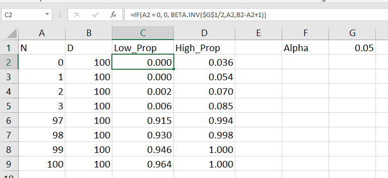
In Excel, if the A column contains the numerator, the B column contains the denominator, and if G1 has the alpha level, this brutish formula gets you the lower bound of your confidence interval;

=IF(A2=0, 0, BETA.INV($G$1/2, A2, B2-A2+1))

A here is your upper bound;

=IF(A2=B2, 1, BETA.INV(1-$G$1/2, A2+1, B2-A2))

And here is a screenshot of the filled in results:

Note for my criminology friends, you can use this for very extreme proportions as well. So say you had a homicide rate of 10 per 100,000, where the observed sample was 30 homicides in a city of 300,000. You can generate a binomial confidence interval around the proportion and then translate back to the rate per 100,000. So in that scenario, it results in a 95% confidence interval of a homicide rate of 6.7 to 14.3.

This is actually the reason I like defaulting to Clopper-Pearson. The other approximations can fail very badly for extreme tail events like this.

Python Clopper-Pearson

Here is a simple function in python to return the Clopper-Pearson intervals. This works for vectorized inputs as well (e.g. numpy arrays or pandas series).

import numpy as np
from scipy.stats import beta

def binom_int(num,den, confint=0.95):
    quant = (1 - confint)/ 2.
    low = beta.ppf(quant, num, den - num + 1)
    high = beta.ppf(1 - quant, num + 1, den - num)
    return (np.nan_to_num(low), np.where(np.isnan(high), 1, high))

And here is an example use:

hits = np.array([0, 1, 2, 3, 97, 98, 99, 100])
tries = np.array([100]*len(hits))
lowCI, highCI = binom_int(hits, tries)

Check out my prior blog post on making smoothed scatterplots on how to plot those proportion spikes in matplotlib.

SQL Agresti–Coull

So as I mentioned previously, I prefer the Clopper-Pearson intervals. This however relies on the availability of a function for the inverse beta distribution. One common situation is I just have all my tables in SQL, and I want to make a dashboard connected to a view of my tables. So the proportion of some event broken downs by days/weeks/months etc.

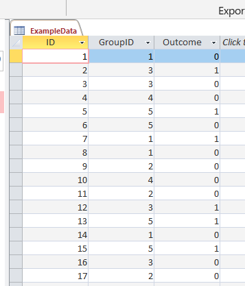
In that case exporting the data to python and re-uploading to the database can be a bit of a hassle, whereas creating a view is much less work. So here is an example query to calculate the proportion intervals entirely in SQL. So the initial table is a micro level table of events with 0/1 for a particular group. (This screenshot is for Access, but this should work in various databases.)

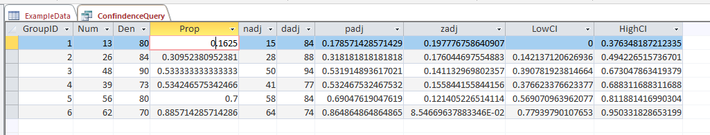
And then it is a groupby to get the original numerator, denominator, and proportion. Then a few rows calculating the adjusted proportion (add 2 to the numerator and 2*2 to the denominator), then finally this can still produce lower than 0 and higher than 1 intervals, so I cap those off.

/* This is for Access, for others may want to use SQRT() instead of SQR()
   Also may want to use CASE WHEN instead of IIF */
SELECT
   GroupID,
   SUM(Outcome) AS Num,
   COUNT(Outcome) AS Den,
   Num/Den AS Prop,
   Num + 2 AS nadj,
   Den + 2*2 as dadj,
   nadj/dadj as padj,
   2*SQR((padj/nadj)*(1 - padj)) AS zadj,
   IIF( padj < zadj, 0, padj - zadj) AS LowCI,
   IIF( (1 - padj) < zadj, 1, padj + zadj) AS HighCI
FROM ExampleData
GROUP BY GroupID;

This produces a 95% confidence interval for the final two columns. If you wanted to generate say a 99% confidence interval, you would replace the 2’s in the above table with 2.6. (In R you can do qnorm(1 - a/2), where a is 1 - confidence_level, to figure out this constant.)

What you shouldn’t use these intervals for

While I believe many applications of dashboards are well suited to including confidence intervals, confidence intervals (like p-values) are apt to be misinterpreted. One common one is that for a single 95% confidence interval, that does not mean the interval covers the true estimate with a 95% probability. This is an inference for an individual sample that is not possible in frequentist statistics – that summary would be akin to a posterior credible interval in Bayesian statistics. Confidence intervals are about the procedure, if we do this procedure over and over again, in the long run it will cover the true statistic (which we do not observe for any individual sample), according to the level we set.

Another common mistake with confidence intervals is when comparing two different intervals, them overlapping is sometimes interpreted as no difference. But this is a very conservative test (e.g. will fail to reject the null of no differences too often).

So say we were monitoring a process over time, and in October the process was 20% (40/200) and in November it was 28% (168/600). October’s confidence interval is 15% to 26%, and November’s confidence interval is 24% to 32%. So since those intervals overlap, we should conclude there are no differences correct? Not exactly, if we do a direct test for the differences in proportions (akin to a t-test of mean differences), we get a confidence interval of the difference as -14% to -1% (in R prop.test(c(40,168), c(200,600))). So in that direct hypothesis test, we would conclude October’s percent is lower than Novembers percent.

Geoff Cumming suggests that when going from individual confidence intervals to comparisons between groups, one confidence interval needs to cover the point estimate for the other group to conclude the two groups are different.

But that being said, I believe many dashboards would be improved if incorporating such confidence intervals. So although they may not always provide the test of interest, they are a good way to prevent yourself from over-interpreting noisy trends in smaller samples. In the case of comparing two intervals, for most situations I deal with, being conservative in saying this process is not showing differences is a better approach than worrying about minor fluctuations (although just depends on the use case whether that default behavior makes sense.)

So please, when reporting proportions with small samples, provide a confidence interval around those proportions!

Amending the WDD test to incorporate Harm Weights

So I received a question the other day about amending my and Jerry Ratcliffe’s Weighted Displacement Difference (WDD) test to incorporate crime harms (Wheeler & Ratcliffe, 2018). This is a great idea, but unfortunately it takes a small bit of extra work compared to the original (from the analysts perspective). I cannot make it as simple as just piping in the pre-post crime weights into that previous spreadsheet I shared. The reason is a reduction of 10 crimes with a weight of 10 has a different variance than a reduction of 25 crimes with a weight of 4, even though both have the same total crime harm reduction (10*10 = 4*25).

I will walk through some simple spreadsheet calculations though (in Excel) so you can roll this on your own. HERE IS THE SPREADSHEET TO DOWNLOAD TO FOLLOW ALONG. What you need to do is to calculate the traditional WDD for each individual crime type in your sample, and then combine all those weighted WDD’s estimates in the end to figure out your crime harm weighted estimate in the end (with confidence intervals around that estimated effect).

Here is an example I take from data from Worrall & Wheeler (2019) (I use this in my undergrad crime analysis class, Lab 6). This is just data from one of the PFA areas and a control TAAG area I chose by hand.

So first, go through the motions for your individual crimes in calculating the point estimate for the WDD, and then also see the standard error of that estimate. Here is an example of piping in the data for thefts of motor vehicles. The WDD is simple, just pre-post crime counts. Since I don’t have a displacement area in this example, I set those cells to 0. Note that the way I calculate this, a negative number is a good thing, it means crime went down relative to the control areas.

Then you want to place those point estimates and standard errors in a new table, and in those same rows assign your arbitrary weight. Here I use weights taken from Ratcliffe (2015), but these weights can be anything. See examples in Wheeler & Reuter (2020) for using police cost of crime estimates, and Wolfgang et al. (2006) for using surveys on public perceptions of severity. Many of the different indices though use sentencing data to derive the weights. (You could even use negative weights and the calculations here all work, say you had some positive data on community interactions.)

Now we have all we need to calculate the harm-weighted WDD test. The big thing here to note is that the variance of Var(x*harm_weight) = Var(x)*harm_weight^2. So that allows me to use all the same machinery as the original WDD paper to combine all the weights in the end. So now you just need to add a few additional columns to your spreadsheet. The point estimate for the harm reduction is simply the weight multiplied by the point estimate for the crime reduction. The variance though you need to square the standard error, and square the weight, and then multiply those squared results together.

Once that is done, you can pool the harm weighted stats together, see the calculations below the table. Then you can use all the same normal distribution stuff from your intro stats class to calculate z-scores, p-values, and confidence intervals. Here are what the results look like for this particular example.

I think this is actually a really good idea to pool results together. Many place based police interventions are general, in that you might expect them to reduce multiple crime types. Various harm scores are a good way to pool the results, instead of doing many individual tests. A few caveats though, I have not done simulations like I did in the WDD peer reviewed paper, I believe these normal approximations will do OK under the same circumstances though that we suggest it is reasonable to do the WDD test. You should not do the WDD test if you only have a handful of crimes in each area (under 5 in any cell in that original table is a good signal it is too few of crimes).

These crime count recommendations I think are likely to work as well for weighted crime harm. So even if you give murder a really high weight, if you have fewer than 5 murders in any of those original cells, I do not think you should incorporate it into the analysis. The large harm weight and the small numbers do not cancel each other out! (They just make the normal approximation I use likely not very good.) In that case I would say only incorporate individual crimes that you are OK with doing the WDD analysis to begin with on their own, and then pool those results together.

Sometime I need to grab the results of the hot spots meta-analysis by Braga and company and redo the analysis using this WDD estimate. I think the recent paper by Braga and Weisburd (2020) is right, that modeling the IRR directly makes more sense (I use the IRR to do cost-benefit analysis estimates, not Cohen’s D). But even that is one step removed, so say you have two incident-rate-ratios (IRRs), 0.8 and 0.5, the latter is bigger right? Well, if the 0.8 study had a baseline of 100 crimes, that means the reduction is 100 - 0.8*100 = 20, but if the 0.5 study had a baseline of 30 crimes, that would mean a reduction of 30 - 0.5*30 = 15, so in terms of total crimes is a smaller effect. The WDD test intentionally focuses on crime counts, so is an estimate of the actual number of crimes reduced. Then you can weight those actual crime decreases how you want to. I think worrying about the IRR could even be one step too far removed.

References

Nearby Analysis Example (Excel)

The other day on Twitter I made a comment to Joel Caplan about how I would solve analysis with multiple buffers and not counting overlaps. A typical GIS workflow would go:

  • take your points of interest and create buffers
  • join the points to the buffer polygons, and get a count of the crimes of interest

I often do the analysis in different way though – I do a spatial join of the location of interest to the point features, in which you get a field that is the distance to the nearest feature, and then subsequently do analysis on that distance field. In that workflow, it makes it much easier to change the size of the buffer for sensitivity analysis, or conduct analysis on different subsets of data.

To start I am going to be working with a set of robberies in Dallas (from the open data, not quite 16k), and DART stations (n = 74). (DART is the Dallas above ground train.) You can access the Excel file I am doing analysis with here. Using excel as I often suggest it for undergrads/masters for projects who aren’t up to speed with programming – so this is a good illustration of that buffer analysis workflow.

Distance to Nearest

To start, I would typically use a GIS system (or R/python/SQL) to calculate the distance to a nearest object. But I don’t have access to Arc anymore, so I am going to show you a way to do this right in Excel. This only works for projected data (not latitude/longitude), and calculating distance from point-to-point.

So first, to figure out the distance between two points in Euclidean space, we can just use the Pythagorean theorem that you learned in grade school, Distance = sqrt( (x1 - x2)^2 + (y1 - y2)^2 ). Because we are doing this in an Excel spreadsheet and want to find the nearest Dart station to the robbery, we will use a little array formula magic. I named my table of Dart locations Dart, and so the array formula to find the nearest distance in Excel is:

=MIN( SQRT( (B2 - Dart[X])^2  + (C2 - Dart[Y])^2))

When you enter this formula, hit Ctrl + Shift + Enter, else it just returns the distance to the first Dart station. If you did this right, you will see the formula have {} brackets around it in the formula bar.

Distance will be defined in whatever the projected units are in – here they are in feet. But by using MIN with the array, it returns the distance to the nearest station. To get the ID of the associated station, we need to do a similar formula (and this only works with numeric ID fields). You can basically do an array IF formula, and the only station this is true for will be the MAX of that array. (Again hit Ctrl + Shift + Enter when finishing off this cell calculation instead of just Enter.)

=MAX(IF(F2=SQRT((B2 - Dart[X])^2  + (C2 - Dart[Y])^2), Dart[DartID],0))

User beware – this runs super fast on my machine (surprisingly) but it is quite a few computations under the hood. For much larger data again use a GIS/database/Stat program to do these calculations.

Using Pivot Tables to do Buffer Analysis

So now that we have those distance fields, it is easy to do a formula along the lines of you want to count up the robberies within 1000 feet. You can do another IF formula that is something like IF([@Distance] < 1000, 1, 0).

And then go ahead and make a pivot table, and put the DartID as the rows, and the Within distance field you just made as the values (to sum in the pivot table).

Then bam, you have your buffer analysis. Here I sorted the pivot table so you can see the highest crime Dart is 12. (I haven’t looked up which one this is, you can use Excel though to map them out).

So say you wanted to change the buffer size? It is as simple as changing out the 1000 in the prior formula to a different value. One thing I like to do though is to make a lookup table to define different bins. You can see I named that table BuffTable (naming the tables makes it easier to refer to them later in array formulas, also I shifted down the pivot table to not accidently overwrite it later).

And now I use a combination of MATCH to find what row it falls into for this table, and INDEX to return the row label I want. So first I have =MATCH([@Distance],BuffTable[Within Bounds],1). This is very similar to VLOOKUP, and will match to the row that the distance is less than.

This just returns the row number of the match though – I want to pipe in those nicer labels I made. To do that, I nest the match results within index, =INDEX(BuffTable, MATCH([@Distance],BuffTable[Within Bounds],1)+1, 2). And voila, I get my binned data.

Now we can do our pivot table so the columns are the new field we just made (make sure to refresh the pivot table).

And we can do our buffer analysis and varying buffers. Just update the tables to however you want the buffers, hit refresh, and everything will be updated. (I should have done the labels so they are ordered a bit more nicely in the pivot table.)

I like this approach for students, as it is easy to pivot/filter on other characteristics as well. Want to get arrest rates around areas? Want to see changes in crimes nearby different DART stations over time? It is just a few formulas/filters and a pivot table away in this format.

Distance to Nearest Analysis for DART stations

Another analysis I think is useful is to look at the cumulative distance analysis. I got this idea from a paper of Jerry Ratcliffe’s.

So what you can do is to round the distance data, e.g. using a formula like this will round the data to every 300 feet.

=ROUND([@Distance]/300,0)*300

And then you can make a pivot table of the rounded counts. Here I also did additional stats to calculate the spatial density of the points, and show the distance decay curve.

Jerry’s paper I linked to looks for change points – I think that idea is somewhat misleading though. It does look like a change point in Jerry’s graphs, but that is a function of the binning I think (see this Xu/Griffiths paper, same method, finer bins, and shows a more smooth decay).

So here I tied the round function to a cell, and again I can just update the value to a different bin size, and everything get auto-updated in the spreadsheet. Here is a bin size of 100 feet, which introduces some volatility in the very nearby locations, but you can see still pretty much follows that smooth distance decay effect.

Actually the Xu/Griffiths paper looks at the street network distance, which I think makes more sense. (And again need a GIS to do that analysis.) The buffer areas can behave funny, and won’t have a direct relationship to the street length exposure, so I think the typical Euclidean analysis can be misleading in some cases. I will need to save that for another blog post though!

Creating an animated heatmap in Excel

I’ve been getting emails recently about the online Carto service not continuing their free use model. I’ve previously used this service to create animated maps heatmaps over time, in particular a heatmap of reported meth labs over time. That map still currently works, but I’m not sure how long it will though. But the functionality can be replicated in recent versions of Excel, so I will do a quick walkthrough of how to make an animated map. The csv to follow along with, as well as the final produced excel file, you can down download from this link.

I split the tutorial into two parts. Part 1 is prepping the data so the Excel 3d Map will accept the data. The second is making the map pretty.

Prepping the Data

The first part before we can make the map in Excel are:

  1. eliminate rows with missing dates
  2. turn the data into a table
  3. explicitly set the date column to a date format
  4. save as an excel file

We need to do those four steps before we can worry about the mapping part. (It took me forever to figure out it did not like missing data in the time field!)

So first after you have downloaded that data, double click to open the Geocoded_MethLabs.csv file in word. Once that sheet is open select the G column, and then sort Oldest to Newest.

It will give you a pop-up to Expand the selection – keep that default checked and click the Sort button.

After that scroll down to the current bottom of the spreadsheet. There are around 30+ records in this dataset that have missing dates. Go ahead and select the row labels on the left, which highlights the whole row. Once you have done that, right click and then select Delete. Again you need to eliminate those missing records for the map to accept the time field.

After you have done that, select the bottom right most cell, L26260, then scroll back up to the top of the worksheet, hold shift, and select cell A1 (this should highlight all of the cells in the sheet that contain data). After that, select the Insert tab, and then select the Table button.

In the pop-up you can keep the default that the table has headers checked. If you lost the selection range in the prior step, you can simply enter it in as =$A$1:$;$26260.

After that is done you should have a nice blue formatted table. Select the G column, and then right click and select Format Cells.

Change that date column to a specific date format, here I just choose the MM/DD/YY format, but it does not matter. Excel just needs to know it represents a date field.

Finally, you need to save the file as an excel file before we can make the maps. To do this, click File in the top left header menu’s, and then select Save As. Choose where you want to save the file, and then in the Save as Type dropdown in the bottom of the dialog select xlsx.

Now the data is all prepped to create the map.

Making an Animated Map

Now in this part we basically just do a set of several steps to make our map recognize the correct data and then make the map look nice.

With the prior data all prepped, you should be able to now select the 3d Map option that you can access via the Insert menu (just to the right of where the Excel charts are).

Once you click that, you should get a map opened up that looks like mine below.

Here it actually geocoded the points based on the address (very fast as well). So if you only have address data you can still create some maps. Here I want to change the data though so it uses my Lat/Lon coordinates. In the little table on the far right side, under Layer 1, I deleted all of the fields except for Lat by clicking the large to their right (see the X circled in the screenshot below). Then I selected the + Add Field option, and then selected my Lng field.

After you select that you can select the dropdown just to the right of the field and set it is Longitude. Next navigate down slightly to the Time option, and there select the DATE field.

Now here I want to make a chart similar to the Carto graph that is of the density, so in the top of the layer column I select the blog looking thing (see its drawn outline). And then you will get various options like the below screenshot. Adjust these to your liking, but for this I made the radius of influence a bit larger, and made the opacity not 100%, but slightly transparent at 80%.

Next up is setting the color of the heatmap. The default color scale uses the typical rainbow, which should be avoided for multiple reasons, one of which is color-blindness. So in the dropdown for colors select Custom, and then you will get the option to create your own color ramp. If you click on one of the color swatches you will then get options to specify the color in a myriad of ways.

Here I use the multi-hue pink-purple color scheme via ColorBrewer with just three steps. You can see in the above screenshot I set the lowest pink step via the RGB colors (which you can find on the color brewer site.) Below is what my color ramp looks like in the end.

Next part we want to set the style of the map. I like the monotone backgrounds, as it makes the animated kernel density pop out much more (see also my blog post, When should we use a black background for a map). It is easy to experiement with all of these different settings though and see which ones you like more for your data.

Next I am going to change the format of the time notation in the top right of the map. Left click to select the box around the time part, and then right click and select Edit.

Here I change to the simpler Month/Year. Depending on how fast the animation runs, you may just want to change it to year. But you can leave it more detailed if you are manually dragging the time slider to look for trends.

Finally, the current default is to show all of the data permanently. There are examples where you may want to do that (see the famous example by Nathan Yau mapping the growth of Wal Mart), but here we do not want that. So navigate back to the Layer options on the right hand side, and in the little tiny clock above the Time field select the dropdown, and change it to Data shows for an instant.

Finally I select the little cog in the bottom of the map window to change the time options. Here I set the animation to run longer at 30 seconds. I also set the transition duration to slightly longer at 5 seconds. (Think of the KDE as a moving window in time.)

After that you are done! You can zoom in the map, set the slider to run (or manually run it forward/backward). Finally you can export the map to an animated file to share or use in presentations if you want. To do that click the Create Video option in the toolbar in the top left.

Here is my exported video


Now go make some cool maps!

IACA Conference 2017 workshop: Monitoring temporal crime trends for outliers (Excel)

This fall at the International Association of Crime Analysts conference I am doing a workshop, Monitoring temporal crime trends for outliers: A workshop using Excel. If you can’t wait (or are not going) I have all my materials already prepared, which you can download here. That includes a walkthrough of my talk/tutorial, as well as a finished Excel workbook. It is basically a workshop to go with my paper, Tables and graphs for monitoring temporal crime trends: Translating theory into practical crime analysis advice.

For some preview, I will show how to make a weekly smoothed chart with error bands:

As well as a monthly seasonal chart:

I use Excel not because I think it is the best tool, but mainly because I think it is the most popular among crime analysts. In the end I just care about getting the job done! (Although I’ve given reasons why I think Excel is more painful than any statistical program.) Even though it is harder to make small multiple charts in Excel, I show how to make these charts using pivot tables and filters, so watching them auto-update when you update the filter is pretty cool.

For those with SPSS I have already illustrated how to make similar charts in SPSS here. You could of course replicate that in R or Stata or whatever if you wanted.

I am on the preliminary schedule currently for Tuesday, September 12th at 13:30 to 14:45. I will be in New Orleans on the 11th, 12th and 13th, so if you want to meet always feel free to send an email to set up a time.