
Hackernews shared an article about visualizing Bayes Theorem using Venn diagrams, with the common example of going from sensitivity/specificity of a test to switch the probability of ‘do I have cancer’. I actually do not find Bayes Theorem to be really helpful to think through this problem. I much prefer Gerd Gigerenzer’s approach using natural frequencies.
So here is an example, say we have a Covid rapid test that has a sensitivity of 90%. This metric is “if you have Covid, how often does the test say you have Covid”. In conditional probability terms we would write this P( Test Says + | Actually Have Covid ).
Often times we want to know the opposite conditional though, “if we test positive, what is the actual probability we have Covid?”. So we want to know P( Actually Have Covid | Test Says + ). This is switching the conditional from the earlier metric. To figure that out though, we need some more information though. One thing we need is an estimate of “Actually Have Covid” in the overall population. Pretend this is 5% for our scenario.
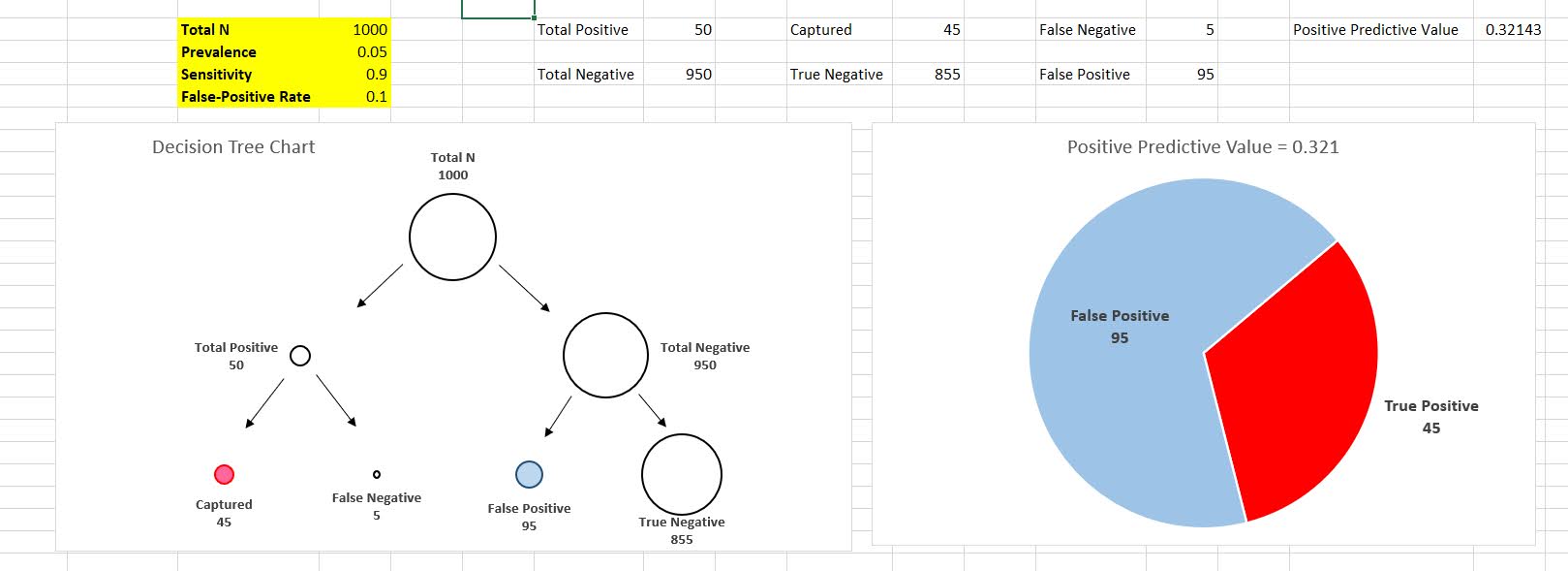
Another is the false positive rate of the test, P( Test Says + | Do Not Have Covid ). Lets say for our example this is 10%. Now how do we figure out P( Actually Have Covid | Test Says + )? Lets use this nice little tree diagram, where we consider a hypothetical scenario of 1000 people getting Covid rapid tests:
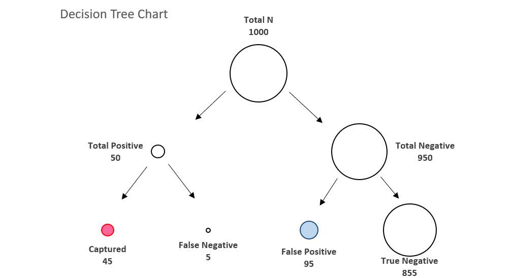
So first thing to note is that the first split in the tree is something that doesn’t have anything to do with the tests at all – it is the overall proportion of Covid cases in the population. Here 5% means out of our 1000 people that take rapid tests, we expect only 50 of them to actually have Covid.
The second level of the splits are the two data based pieces of information, the sensitivity is the split on the left side. The test captures 90% of the true positives, so 45 out of the 50 get a positive result on the rapid test. The right split is the false negative rate of 10%, of those 950 without Covid, 95 will get a false positive result.
So in the end, we have 45 true positives out of 45 + 95 total positive tests (the colored balls in the tree diagram). That is our personal estimate of I tested positive for Covid, do I actually have Covid, P( Actually Have Covid | Test Says + ). This estimate is 32%, or a metric we sometimes like to call the Positive Predictive Value of the test. I have an Excel spreadsheet where you can insert different overall proportions in the underlying population (the prevalence) as well as different estimates of a tests sensitivity/false-positive rate, and it spits out the nice diagram.
In the end even if you have a very sensitive test with a low false positive rate, if the prevalence is very low you will have a low positive predictive value. For example in my work, in predicting chronic offenders involved with shootings, among the top 1000 predictions the PPV was only 3%. Because shooting someone or being shot is very rare. If you compare those top 1000 they have around 200 times higher probability than a random person, but still overall that probability is quite low.
Note for data science folks that these different metrics all relate to the ROC curve. In my head I often translate sensitivity to “capture rate” – the proportion of true cases the test captures in the wild, I can never remember sensitivity. Sometimes in ROC curves I label this as the True Positive Rate, although software often uses 1 – Specificity vs Sensitivity.
Based on the above scenario you may be thinking to yourself ‘I can’t fill out all of the unknowns’, especially such as knowing the underlying prevalence of the outcome in the population. For overall prevalence’s you can often make reasonable guesses. For error rates for tests, that often takes some digging or guess work as to typical error rates though. So even if we don’t have uber precise estimates, we can still make reasonable decisions based on the range of likely scenarios filling in the info we need.
Knowing the Right Conditional Probability?
While in general I like the tree diagram approach, it doesn’t help with the more general issue of knowing the correct probability you care about to make decisions. Totally agree with Gigerenzer’s overall approach (he is basically glass half full compared to Kahneman/Tversky, if you present info the right way we don’t make so biased as decisions), but even scientific experts often make conditional probability mistakes.
Much of the public discussion about Covid in particular is making a specious set of probability estimates to justify positions. Just copy-pasting my Hackernews comment giving examples from the Rogan/Gupta interview, but think that is very symbolic overall of the news coverage:
I think a more basic problem is people don’t even know how to formulate meaningful probability hypothetical/counterfactuals to begin with (let alone update them). For Covid stuff pretty much all an individual should care about is:
P(Bad Stuff | I take action A) > P(Bad Stuff | I take action B)
So you take action B in this scenario (simplifying to ignore costs, many of these decisions are costless). We get a bunch of meaningless drivel in the news though that doesn’t help anyone make any meaningful probability estimates to help them make decisions. I think the Rogan/Gupta interview is a good example. We get various non-sense comparisons such as:
P(Bad Stuff | Covid, Person 5, No Vaccine) < P(Bad Stuff | Covid, Person 50, Vaccine)
[Rogan to Gupta why is it OK for 50 year old to feel safe and not a young kid without a vaccine? Irrelevant counter-factual unless someone invents a reverse aging treatment.]
P(Heart Inflammation | Covid Vaccine, Young Male) > P(Death | Covid, Young Male)
[Rogan saying side effects for young people outweigh benefits. This is true but death is quite a bit worse than the side effects, and this does not consider other Bad Stuff from Covid like long haulers.]
Knowing Bayes Theorem doesn’t help someone figure out the right probability statement they should be interested in to begin with.
The news overall is very frustrating, especially scientific coverage. Often times news entirely avoids any specific numeric estimate, but is often not even clear what the estimate is. A common one from news coverage is P(Bad Thing | ?????), I often can’t tell what composes the conditional on the right hand side. Sometimes it is those tested positive, sometimes it is the overall population in an area, sometimes it is those in the hospital, etc. Those different conditionals can greatly change how you interpret that information.
References
- Gigerenzer, G. (2011). What are natural frequencies?. BMJ, 343.
- Wheeler, A. P., Worden, R. E., & Silver, J. R. (2019). The accuracy of the violent offender identification directive tool to predict future gun violence. Criminal Justice and Behavior, 46(5), 770-788.

