The WDD test with different area sizes

So I have two prior examples of weighting the WDD test (a simple test for pre-post crime counts in an experimental setting):

And a friend recently asked about weighting for different areas, so the test is crime reduction per area density instead of overall counts. First before I get into the example, this isn’t per se necessary. All that matters in the end for this test to be valid is 1) the crime data are Poisson distributed, 2) the control areas follow parallel trends to the treated area. So based on this I’ve advocated that it is ok to have a control area be ‘the rest of the city’ for example.

Some of my work on long term crime trends at micro places, shows low-crime and high-crime areas all tend to follow the same overall temporal trends (and Martin Andresen’s related work one would come to the same conclusion). So that would suggest you can aggregate up many low crimes to make a reasonable control comparison to a hot spot treated area.

So as I will show weighting by area is possible, but it actually changes the identification strategy slightly (whereas the prior two weighting examples do not) – the parallel trends assumption needs to be on the crime per area estimate, as opposed to the original count scale. Since the friend who asked about this is an Excel GURU (check out Grant’s very nice YouTube videos for crime analysis) I will show how to do the calculations in Excel, as well as how to do a simulation to show my estimator behaves as it should. (And the benefit of that is you can do power analysis based on the simulations.)

Example Calculations in Excel

I have posted an Excel spreadsheet to show the calculations here. But for a quick overview, I made the spreadsheet very similar to the original WDD calculation, you just need to insert your areas for the different treated/control/displacement areas.

And you can check out the formulas, again it is just weighting the estimator by the areas, and then making the appropriate transformations to the variance estimates.

I have an added extra portion of this though – a simulation tab to show the estimator works.

Only thing to note, a way to simulate to Poisson data in Excel is to generate a random number on the unit interval (0,1), and then for the distribution of interest use the inverse CDF function. There is no inverse Poisson function in Excel, but you can reasonably approximate it via the inverse binomial with a very large number of trials. I’ve tested and it is good enough for my purposes to use a base of 10k for the binomial trials.

The simulation tab on this spreadsheet you can input your own numbers for planning purposes as well. So the idea is if you think you can only reasonably reduce crimes by X amount in your targeted areas, this lets you do power analysis. So in this example, going from 60 to 40 crimes results in a power estimate of only 0.44 (so you will fail to reject the null over 5 out of 10 times, even if your intervention actually works as well as you think). But if you think you can reduce crimes from 60 to 30, the power in this example gets close to 0.8 (what you typically shoot for in up-front experiments, although there is no harm for going for higher power!). So if you have low power you may want to expand the time periods under study or expand the number of treated areas.

Wrap Up

Between this and the prior WDD examples, I have about wrapped up all the potential permutations of weighting I can think of offhand. So you can mix/match all of these different weighting strategies together (e.g. you could do multiple time periods and area weighting). It is just algebra and carrying through the correct changes to the variance estimates.

I do have one additional blog post slated in the future. David Wilson has a recent JQC article using a different estimate, but essentially the same pre/post data I am using here. The identifying assumptions are different again for this (parallel trends on the ratio scale, not the linear scale), and I will have more to say when I think you would prefer the WDD to David’s estimator. (In short I think David’s is good for meta-analysis, but I prefer my WDD for individual evaluations.)

Statement on recent officer involved shooting research

Several recent studies (Johnson et al., 2019; Jetelina et al., 2020) use a similar study design to assess racial bias in officer involved shootings (OIS). In short, critiques of this work by Jon Mummolo (JM) are correct – they make a fundamental error in the analysis that renders the results mostly meaningless (Knox and Mummalo, 2020). JM critiques the work as switching conditional probabilities, this recent OIS work estimates the probability of the race of someone shot by police conditional on other characteristics, e.g. tests the hypothesis P(White | Other Stuff, Being Shot) = P(Minority | Other Stuff, Being Shot). Whereas we want Being Shot on the left hand side, e.g. P(Being Shot | Race), and switching these probabilities results in mostly a meaningless estimate in terms of inferring police behavior. You ultimately need to look at some cases in which folks were not shot to have a meaningful research design.

I’ve been having similar conversations with folks since publishing my work on officer involved shootings (Wheeler et al., 2017). Most folks don’t understand the critique, and unfortunately most folks also don’t take critiques very well. So this post is probably a waste of time, but here it is anyway.

The Road

I’m likely to get some of the timing wrong in how I came to be interested in this area – but here is what I remember. David Klinger and Richard Rosenfeld published a piece in Criminology & Public Policy (CPP) examining the count of OIS’s in neighborhoods in St. Louis, conditional on demographic and violent crime counts in those neighborhoods (Klinger et al., 2016). So in quantoid speak they estimated the expected number of OIS in neighborhoods, E[OIS_n | Demographic_n, Crime_n].

I thought this work was mostly meaningless, mainly because it really only makes sense to look at rates of behavior. You could stick a count of anything police do on the left hand side of this regression and the violent crime coefficient will be the largest positive effect. So you could say estimate the counts of officers helping old ladies cross the street, and you would make the same inferences as you would about OIS. It is basically just saying where officers spend more of their time at (in violent crime areas), and subsequently have more interactions with individuals. It doesn’t say anything fundamentally about police behavior in regards to racial bias.

So sometime in 2016 me and Scott Phillips came up with the study design using when officers draw their firearm as the denominator. (Before I moved to Dallas I knew about their open data.) It was the observational analogue to the shoot/don’t shoot lab experiments Lois James did (James et al., 2014). Also sometime during the time period Roland Fryer came out with his pre-print, in which he used Taser uses as the counter-factual don’t shoot cases (Fryer, 2019). I thought drawing the firearm made more sense as a counterfactual, but both are subject to the same potential selection effect. (Police may be quicker to the draw their firearms with minorities, which I readily admit in my paper.)

Also in that span Justin Nix came out with the birds-eye view CPP paper using the national level crowd sourced data (Nix et al., 2017) to estimate racial bias. They make what to me is a similar conditional probability mistake as the papers that motivated this post. Using the crowdsourced national level data, they estimate the probability of being unarmed, conditional on race (in the sample of just folks who were killed by the police). So they test whether P(Unarmed | White, Shot) = P(Unarmed | Minority, Shot).

Since like I said folks don’t really understand the conditional probability argument, basically at this point I just say folks get causality backwards. The police shooting at someone does not make them armed or unarmed, the same way police shooting at someone does not change their race. You cannot estimate a regression of X ~ beta*Y, then interpret beta as how much X causes Y. The stuff on the right hand side of the conditional probability statement works mostly the same way, we want to say stuff on the right hand side of the condition causes some change in the outcome.

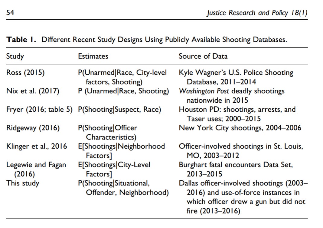
I have this table I made in Wheeler et al. (2017) to illustrate various research designs – you can see the Ross (2015) made the same estimate of P(Unarmed | Race, Shot) as Justin did.

At this point you typically get a series of different retorts to the “you estimated the wrong conditional probability complaint”. The ones I’ve repeatedly seen are:

  1. No data is perfect. We should work with what we have.
  2. We ask a different research question.
  3. Our analysis are just descriptive, not causal.
  4. Our findings are consistent with a bunch of other work.

For (3) I would be OK if the results are described correctly, pretty much all of these articles are clearly interested in making inferences about police behavior though (which you cannot do with just looking at these negative encounters). It isn’t just a slip of mistaking conditional probabilities (like a common p-value mishap that doesn’t really impact the overall conclusions), the articles are directly motivated to make inferences about police behavior they cannot with this study design.

For (2) it is useful to consider how might the descriptive conditional probabilities be actually interpreted in a reasonable manner. So if we estimate P(Offender Race | Shot), you can think of a game where if you see a news headline about an OIS, and you want to guess the race of the person shot by police, what would be your best guess. Ditto for P(Unarmed | Shot), what is the probability of someone being unarmed conditional on them being shot. This game is clearly a superficial type of thing to estimate, those probabilities don’t say anything though about behavior in terms of things police officers can control, they are all just a function of how often police get in interactions with those different races (or armed status) of individuals.

Consider a different hypothetical, the probability a human is shot by police versus an animal. P(Human | Shot) is waay larger than P(Animal | Shot), are police biased against humans? No, the police just don’t deal with animals they need to shoot on a regular basis.

For (1) I will follow up below with some examples of how I think using this OIS data could actually be effective for shaping police behavior in practice, but suffice to say just collecting OIS you can’t really say anything about racial bias in terms of officer decision making.

I will say that a bunch of the individuals I am critiquing here I consider friends. Steve Bishopp was one of the co-authors on my OIS work with Dallas data. If I go to a conference Justin is one of the people I would prefer to sit down and have a drink with. I’ve been schmoozing up folks with good R programming skills to come to Dallas to work for Jenn Reingle-Gonzalez. They have all done other work I think is good. See Tregel et al. (2019) or Jetelina et al. (2017) or Cesario et al. (2019) for other examples I think are more legitimate research articles amongst the same people who I am critiquing here.

So in response to (4) I think you all made the wrong mistake – the conditional probability mistake is an easy one to make. So sorry to my friends whom I think are wrong about this. That being said, most of the vitriol in public forums, often accusing people of ad-hominem attacks on their motivations, is pretty much always out of line. I think basically everyone on Twitter is being a jerk to be frank. I’ve seen it all around on both sides in the most recent Twitter back and forth (both folks calling Jenn racist and JM biased against the police). None of them are racist or biased for/against the police. I suppose to expect any different though is setting myself up for dissapointment. I was called racist by academic reviewers for Wheeler et al. (2017) (it took 4 rejects for my OIS paper before it was published). I’ve seen Justin get critiques on Twitter for being white in the past when doing work in this area.

I think CJ folks questioning JM’s motivation miss the point of his critique though. He isn’t saying police are biased and these papers are wrong, he is just saying these research papers are wrong because they can’t tell whether police are biased one way or another.

Who gives a shit

So while I think better research could be conducted in this area – JM has his work on bounding estimates (Knox et al., 2019), and I imagine someone can come up with a reasonable instrumental variable strategy to address the selection bias in the same vein as my shoot/don’t shoot (say officer instruments, or exogenous incidents that make officers more on edge and more likely to draw their firearm). But I think the question of whether “the police” are racially biased is a facile question. Globally labelling all police (or a single department) as racist is mostly a waste of time. Good for academic papers and to get people riled up in Twitter, not so much for anything else.

The police are simply a cross section of the general public. So in terms of whether some officers are racist this is true (as it is for the general public). Or maybe even we are all a little racist (ala the implicit bias hypothesis). We can only observe behavior, we cannot peer into the hearts and minds of men. But suffice to say racism is still a part of our society in some capacity I believe is a pretty tame statement.

Subsequently if you gather enough data you will be able to get some estimate of the police being racist (the null is for sure wrong). But if people can’t reasonably understand conditional probabilities, imagine trying to have a conversation about what is a reasonable amount of racial bias for monitoring purposes (inferiority bounds). Or that this racial bias estimate is not for all police, but some mixture of police officers and actions. Hard pass on either of those from me.

Subsequently this work has no bearing on actual police practice (including my own). They are of very limited utility – at best a stick or shield in civil litigation. They don’t help police departments change behavior in response to discovering (or not discovering) racial bias. And OIS are basically so rare they are worthless for all but the biggest police departments in terms of a useful monitoring metric (it won’t be sensitive enough to say whether a police department as a whole is doing good or doing bad).

So what do I think is potentially useful way to use this data? I’ve used the term “monitoring metric” a few times – what I mean by that is using the information to actually inform some response. Internally for police departments, shootings should be part of an early intervention system used to monitor individual officers for problematic behavior. From a state or federal government perspective, they could actively monitor overall levels of force used to identify outlier agencies (see this blog post example of mine). For the latter think proactively identifying problematic departments, instead of the typical current approach of wait for some major incident and then the Department of Justice assigns a federal monitor.

In either of those strategies just looking at shootings won’t be enough, they would need to use all levels of use of force to effectively identify either bad individual cops or problematic departments as a whole. Hence why I suggested adding all levels of force to say NIBRS, rather than having a stand alone national level OIS database. And individual agencies already have all the data they need to do an effective early intervention system.

I’m not totally oppossed to having a national level OIS database just based on normative arguments – e.g. you think it is a travesty we can’t say how many folks were killed by police in the prior year. It is not a totally hollow gesture, as making people record the information does provide a level of oversight, so may make a small difference. But that data won’t be able to say anything about the racial bias in individual police officer decision making.

References

Cesario, J., Johnson, D. J., & Terrill, W. (2019). Is there evidence of racial disparity in police use of deadly force? Analyses of officer-involved fatal shootings in 2015–2016. Social psychological and personality science, 10(5), 586-595.

Fryer Jr, R. G. (2019). An empirical analysis of racial differences in police use of force. Journal of Political Economy, 127(3), 1210-1261.

Klinger, D., Rosenfeld, R., Isom, D., & Deckard, M. (2016). Race, crime, and the micro-ecology of deadly force. Criminology & Public Policy, 15(1), 193-222.

Knox, D., Lowe, W., & Mummolo, J. (2019). The bias is built in: How administrative records mask racially biased policing. Available at SSRN.

Knox, D., & Mummolo, J. (2020). Making inferences about racial disparities in police violence. Proceedings of the National Academy of Sciences, 117(3), 1261-1262.

James, L., Klinger, D., & Vila, B. (2014). Racial and ethnic bias in decisions to shoot seen through a stronger lens: Experimental results from high-fidelity laboratory simulations. Journal of Experimental Criminology, 10(3), 323-340.

Jetelina, K. K., Bishopp, S. A., Wiegand, J. G., & Gonzalez, J. M. R. (2020). Race/ethnicity composition of police officers in officer-involved shootings. Policing: An International Journal.

Jetelina, K. K., Jennings, W. G., Bishopp, S. A., Piquero, A. R., & Reingle Gonzalez, J. M. (2017). Dissecting the complexities of the relationship between police officer–civilian race/ethnicity dyads and less-than-lethal use of force. American journal of public health, 107(7), 1164-1170.

Johnson, D. J., Tress, T., Burkel, N., Taylor, C., & Cesario, J. (2019). Officer characteristics and racial disparities in fatal officer-involved shootings. Proceedings of the National Academy of Sciences, 116(32), 15877-15882.

Nix, J., Campbell, B. A., Byers, E. H., & Alpert, G. P. (2017). A bird’s eye view of civilians killed by police in 2015: Further evidence of implicit bias. Criminology & Public Policy, 16(1), 309-340.

Ross, C. T. (2015). A multi-level Bayesian analysis of racial bias in police shootings at the county-level in the United States, 2011–2014. PloS one, 10(11).

Tregle, B., Nix, J., & Alpert, G. P. (2019). Disparity does not mean bias: Making sense of observed racial disparities in fatal officer-involved shootings with multiple benchmarks. Journal of crime and justice, 42(1), 18-31.

Wheeler, A. P., Phillips, S. W., Worrall, J. L., & Bishopp, S. A. (2017). What factors influence an officer’s decision to shoot? The promise and limitations of using public data. Justice Research and Policy, 18(1), 48-76.

Adding a command button to a toolbar in ArcGIS

I’m currently teaching a graduate level class in Crime Mapping using ArcGIS. I make my own tutorials from week to week, and basically sneak in generic pro-tips for using the software while students are doing other regular types of analyses. I can only subject my students to so much though – but here is one I have found useful, adding a regularly used button to a toolbar.

I use CrimeStat to generate kernel densities from point data, so as of V10 whenever I want to make a classified raster map I get this error:

V9 it used to just do this for you automatically :(.

I typically make classified raster maps simply because I think they look nicer than continous ones. My continuous ones always look fuzzy, whereas having discrete cuts you can focus attention on particular hot spot areas. It is arbitrary for sure – but that is something we need to learn to live with when making maps.

So in class I had students open ArcToolBox, navigate down the tree, and find the Calculate Statistics tool for rasters. In my personal set up though I do this enough that I added the button to my toolbar. So first, go to the file menu and in customize -> toolbars make sure you have the spatial analyst toolbar selected. (Here is a kernel density grd file to follow along with if you want.)

Now in the right hand most edge of the new spatial analyst toolbar, left click on the little downward pointing arrow and select Customize. (Sorry, my toolbar is a bit crowded!)

In the customize window that pops up, select the Commands tab. Now in this window you can select any particular command and then drag it onto any toolbar. Here I go to Data Management in the left hand categories area, and then scroll down till I find the Calculate Statistics button.

Then I left click on the Calculate Statistics row, hold down the mousebutton, and drag it to my toolbar.

Now you are done, and ArcGIS saves this button on the toolbar when making future maps. You can change the icon if you want, but there are tooltips when hovering over the icon (so even if you have multiple hammers on your toolbars it only takes a second to browse between them).

Making and Exploring Crime Networks (Access and Excel)

I’ve been doing quite a bit of stuff with gang networks lately at work. Networks are a total PIA though to create and do data manipulation on in traditional spreadsheets and statistic tools, so I figured I would blog about some of my attempts to ease the pain for fellow crime analysts.

First I will show how to create an edge list in Access from the way a traditional police RMS database is set up. Second I will show a trick about exploring people and gangs by creating a dynamic lookup in Excel. You can download the Access Database I used and the Excel spreadsheet here to follow along.

Making an Edge List in Access

I’ve previously shown how to make an edgelist in SPSS. I’ll cast the net wider and show how to do this in Access though.

In a nutshell, an edge list is a table of the form:

Person A, Person B
Person B, Person C
Person C, Person D

Where being in the same row shows some type of connection between the two persons, e.g. Person A is connected to Person B. In police databases the connections most often of interest are co-offending (e.g. two people were arrested for the same incident) or being stopped together (e.g. in the same car or during the same field interrogation).

Typically police databases will have a table that lists a common incident identifier, along with persons associated with that incident and their involvement. Here is a screen shot of the simple example I made in an Access Database to mimic this which I named IncidentPersons:

So here we can see that for incident 1, Andy Pandy, Sandy Randy, and Candy Dandy are all persons involved. Candy is the victim, and the other two were arrested. This table is always called something different for every PD’s RMS system, but some examples I have come across are crossref and person_exploded. All RMS’s I have seen though have some sort of table like this.

To make an edge list from this table takes some knowledge of SQL, but it can be done in one query. Basically we will be joining a table to itself, and selecting out distinct rows. Here is the most basic SQL query in Access to accomplish this.

SELECT DISTINCT F.PersonID, F.PersonName, S.PersonID, S.PersonName
FROM IncidentPersons AS F INNER JOIN IncidentPersons AS S ON F.IncidentID = S.IncidentID
WHERE F.PersonID < S.PersonID;

To walk through this, we make two table aliases from the same original IncidentPersons table, F and S. Then we do an INNER JOIN based on the original incident ID. If we stopped here without the last WHERE clase, what would happen is we would have pairs of people with themselves, and with duplicate ties of the form A -> B and B -> A. So selecting only instances in which F.PersonID < S.PersonID eliminates those self edges and duplicates. The last part here is SELECT DISTINCT instead of select. This will make it so any particular edge is only returned once. (If you deleted DISTINCT in this database, Andy Pandy -> Sandy Randy would be returned twice.)

Running this query we then have:

In practice it will be more complicated because you will want to filter certain connections and add more info. on people into the final edge list. Here I ignore the involvement type, but you may want to only restrict matches to certain co-involvements (since offender-victim is of a different nature than co-offending). You also may want to not just know those connected, but count up the number of times those people are connected. For my work, I have always just limited to co-offending and being stopped together (and haven’t ever worried about the number of ties).

Also depending on how the database is normalized, often people names will change/have spelling errors, but they will still be linked to the same personid. These different spellings would cause the DISTINCT selection to not work as expected. A workaround is to only select based on the unique PersonID’s and not import other data, then in an additoional query merge in the person data. For gang network analysis you will likely want to merge in gang affiliation (which will probably be in a seperate table, not in the RMS). If you are still following along though you can figure that stuff out on your own.

Making an Edge Lookup Table in Excel

So now that I have shown how to make the edge table, what to do with it now? (No excuses – since I gave examples in both SPSS and SQL!) Here I will show a simple trick to explore the network using filtering in Excel.

The edge list itself is often the needed format to import into other network based software. So you can make a nice network graph using Gephi or whatever. The graph is good to see the overall form of the network when the graph is limited to only a few nodes, but they are typically really complicated, and tools like Gephi aren’t very good for drilling down into specific people. Here I will show my simple drilldown solution using Excel.

The network I use for this example is entirely made up; it was simulated using NetworkX (python), names are random based on some internet lists of popular baby names and last names I forgot the source of already, and Date of births are random between 1975 and 1997. I also made up a list of 7 gangs (but people have a 9/16 chance to be assigned to no gang).

So starting with an edgelist, here is a screenshot of my made up edge list excel table.

The problem in this format is if I filter the Id.1 column for 19 (BONNIE BARKER), they could potentially be in the Id.2 column as well, so I potentially miss edges. A simple solution to this is just to duplicate the data, but switch the order of the edges. Then when I filter by Id = 19, I will get all possible Bonnie Barker edges.

For a simple example of how to do this on a small table, if you start with:

17,19
18,19
19,20
19,21

If you filter the first column by 19, you will eliminate the 19’s in the second column. So just make a new table that has the ID’s reversed:

19,17
19,18
20,19
21,19

And then stack the two tables on top of one another

17,19 |
18,19 |  Table 1
19,20 |
19,21 |
19,17 +
19,18 +  Table 2
20,19 +
21,19 +

So now if you filter the first column by 19 you get 19’s all four connections. This is just three copy-pastes in excel to go from the original edge list to this table.

Now we can make a filter that dynamically changes based on user input. Here I make a selection in the top row, in N2 you can put in a persons ID. Then in A2, the formula is =IF(B2=$N$1,1,0). You can then paste this formula down, and it always references cell N2 because of the absolute $ modifiers.

Here is a screenshot of my example LookupTable in excel filtering for person 431.

If you update the personid in N1, then hit the reapply button in the toolbar (or hit Ctrl+Alt+L) to update the filter. Here I updated to be person 382.

The context of why I created this example was to identify people that were connected to gang members, but themselves were not in the gang. Basically have a list to take to officers and say, are you sure this person is not an actual member of the gang? The spreadsheet is then a tool if I have a meeting, where someone can say, who is Raelyn Hatfield connected to? I can easily update the id and filter.

You can do this drill down in the original edge table if you have the IF condition look in both the first and second id column, but I do this because it is easier to see who a person is connected to. You only have to look in one column – you don’t have to scan back and forth between two columns to see the connections.

You can also do other aggregations on this table as well. For instance if you aggregate using a pivot table and count the number of instances it is the edge centrality of a person (i.e. the number of different people a person is connected to).

If you want to do a drilldown of specific gangs you could use the same logic and build another filter column, but this will duplicate people when they are connected to another person in the same gang. That would be an instance where it might be easier to use just the original edge table.

Hello world!

Feel free to navigate to the About Me page to get to know a little about who I am. As a brief introduction to what I plan to blog about, I have waiting in the thralls (many) potential posts on data management and constructing statistical graphics in SPSS. I may also throw in some posts in general on data visualization, on making maps, and research tips.

I don’t plan on saying much here in direct relation to my research agenda (you can read the boring papers in the C.V. section if you are interested in that),  but posts on said topics may sneak in from time to time.

I make no guarantees on the regularity with which I post. Unless of course you want to pay me to blog!