When I still taught advanced research methods for PhD students, I debated on having a section on age-period-cohort (APC) analysis. Part of the reason I did not bother with that though is there were no good open source datasets (that I was aware of). A former student asking about APC analysis, as well as a recent NBER working paper on suicide rates (Marcotte & Hansen, 2023) brought it to mind again.
I initially had plans to do more modelling examples, but I decided on just showing off the graphs I generated. The graphs themselves I believe are quite informative.
So I went and downloaded mortality rates USA mortality rates for suicides and drug overdoses, spanning 1999-2022 for suicide and 1999-2021 for drug. Here is the data and R code to recreate these graphs in the post to follow along.
To follow along here in brief, we have a dataset of death and population counts, broken down by year and age:
# Age-Period-Cohort plots
library(ggplot2)

# Read in data
suicide <- read.csv('Suicides.csv')

# Calculate Rate & Cohort
suicide$Cohort <- suicide$Year - suicide$Age
suicide$Rate <- (suicide$Deaths/suicide$Population)*100000

# Suicide only 11-84
suicide <- suicide[suicide$Age >= 11,]
head(suicide)
And this produces the output:
> head(suicide)
   Age Year Deaths Population Cohort      Rate
16  11 1999     22    4036182   1988 0.5450696
17  11 2000     24    4115093   1989 0.5832189
18  11 2001     24    4344913   1990 0.5523701
19  11 2002     22    4295720   1991 0.5121377
20  11 2003     15    4254047   1992 0.3526054
21  11 2004     18    4207721   1993 0.4277850
A few notes here. 1) I limited the CDC Vital stats data to 1999, because in the Wonder dataset pre-1999 you can’t get individual year-age breakdowns, you need to do 5 year age bins. This can cause issues where you need to age-adjust within those bins (Gelman & Auerbach, 2016), that should be less of a problem with single year breakdowns. So I would go back further were it not for that. 2) When breaking down to individual years, the total count of suicides per age bracket is quite small. Initially I was skeptical of Marcotte & Hansen’s (2023) claims of LGBTQ subgroups potentially accounting for increased trends among young people (I just thought that group was too small for that to make sense), but looking at the counts I don’t think that is the case.
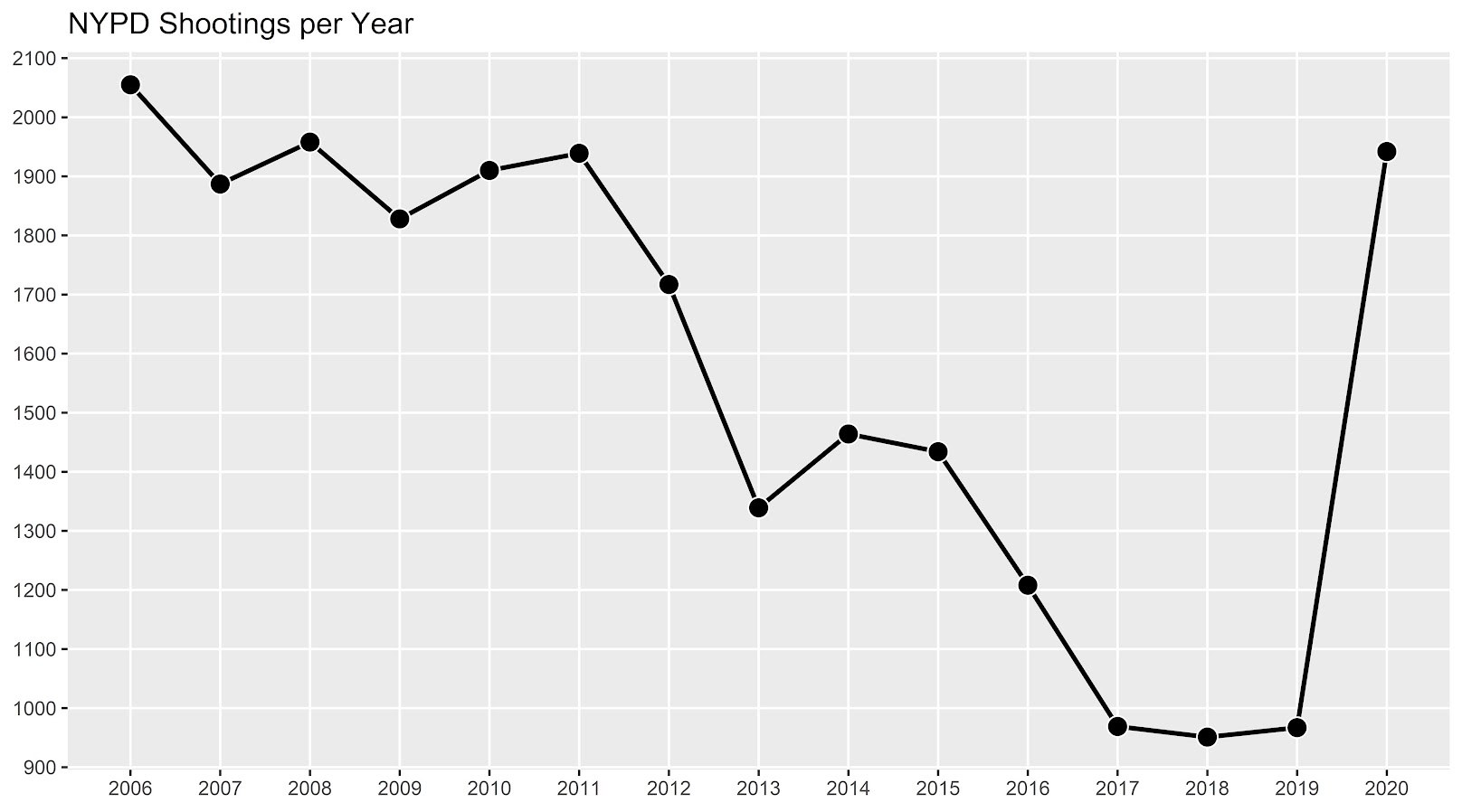
When I think about age-period-cohort analysis, my mind goes age effects > period effects > cohort effects. I think people often mix up cohort effects with things that are actually age effects. (And also generation labels are not real.) In criminology, the age-crime-curve was established back in the 1800’s by Quetelet.
So I focus on graphing the age curve, and look at deviations from that to try to visually identify period effects or cohort effects. Here is the plot to look at each of the age curves, broken down by year.
ap <- ggplot(data=suicide, aes(x = Age, y = Rate, color=Year, group=Year)) +
             geom_line() +
             scale_colour_distiller(palette = "PuOr") +
             scale_x_continuous(breaks=seq(10,80,10)) +
             scale_y_continuous(breaks=seq(0,30,5)) +
             labs(x='Age',y=NULL,title='Suicide Rate per 100,000',caption="USA Rates via CDC Wonder")
ap
When using diverging color ramps to visualize a continuous variable, you get a washed out effect in the middle. So I am not sure the best color ramp here, but it does provide a nice delineation and gradual progression from the curve in the early 2000’s compared to the suicide curve in 2022. (Also spot the one outlier year, it is age 75 for the “provisional” 2022 counts. I leave it in as it is a good showcase for how plots can help spot bad data.)
The blog the graph will be tinier, open it up in a new tab on your desktop computer to get a good look at the full size image.
Here looking at the graph you can see two things other researchers looking at similar data have discussed. In the early 2000’s, you had a gradual increase from 20’s to the peak suicide rate at mid 40’s. More recent data has shifted that peak to later ages, more like peak 55. Case & Deaton (2015) discussing deaths of despair (of which suicide is a part) focussed on this shift, and noted that females in this age category increased at a higher rate relative to males.
Marcotte & Hansen (2023) focus on the younger ages. So in the year 2000, the age-suicide curve was a gradual incline from ages early 20’s until the peak. Newer cohorts though show steeper inclines in the earlier ages, so the trend from ages 20-60 is flatter than before.
Period effects in these charts will look like the entire curve is the same shape, and it is just shifted up and down. (It may be better to graph these as log rates, but keeping on the linear scale for simplicity.) We have a bit of a shape change though, so these don’t rule out cohort effects.
Here is the same plot, but grouping by cohorts instead of years. So the age-suicide curve is indexed to the birth year for an individual:
cp <- ggplot(data=suicide, aes(x = Age, y = Rate, color=Cohort, group=Cohort)) +
             geom_line() +
             scale_colour_distiller(palette = "Spectral") +
             scale_x_continuous(breaks=seq(10,80,10)) +
             scale_y_continuous(breaks=seq(0,30,5)) +
             labs(x='Age',y=NULL,title='Suicide Rate per 100,000',caption="USA Rates via CDC Wonder")
cp
My initial cheeky thought (not that there aren’t enough ways to do APC models already), was to use mixture models to identify discrete cohorts. Something along the lines of this in the R flexmix package (note this does not converge):
library(flexmix)
knot_loc <- c(20,35,50,65) # for ages
model <- stepFlexmix(cbind(Deaths, Population - Deaths) ~ bs(Age, knot_loc) | Cohort,
                     model = FLXMRglm(family = "binomial", fixed = ~Year),
                     data = suicide, k = 3)
But there is an issue with this when looking at the cohort plot, you have missing data for cohorts – to do this you would need to observe the entire age-curve for a cohort. There may be a way to estimate this using latent class models in Stata (and fixing some of the unidentified spline coefficients to a fixed value), but to me just looking at the graphs I think is all I really care about. You could maybe say the orange cohorts in the late 90’s are splitting off, but I think that is consistent with period effects. (And is also a trick of the colors I used in the plot.)
You could do mixtures for the year plots, see some of the work by Elana Erosheva (Erosheva et al., 2014), but that again just isn’t how I think about APC analysis.
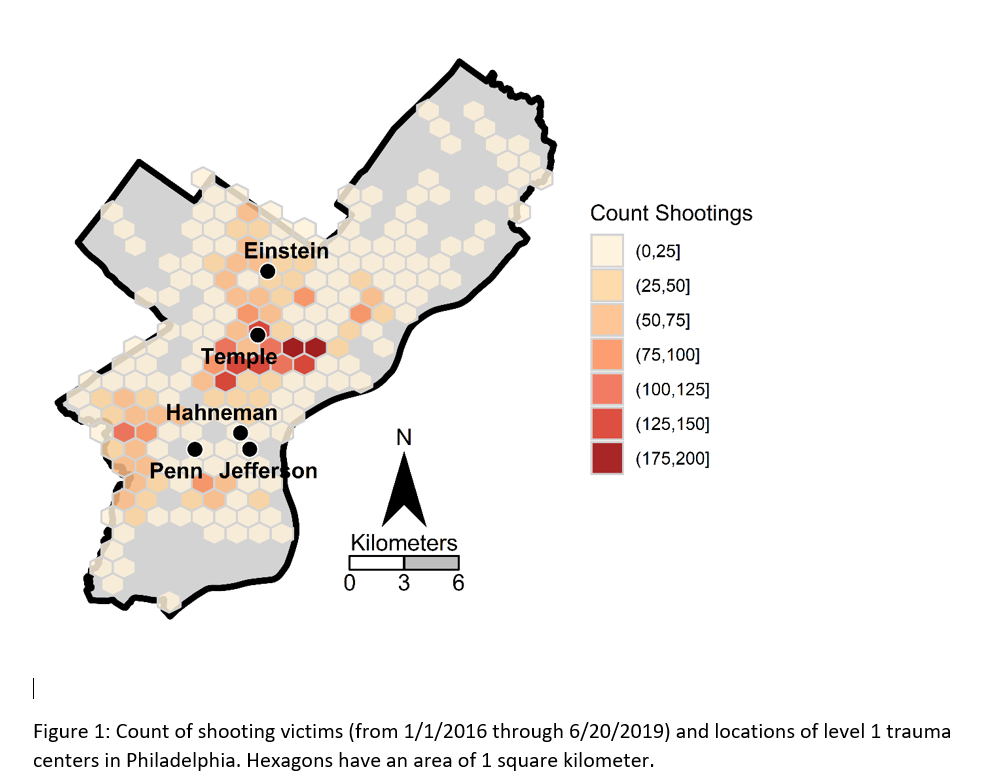
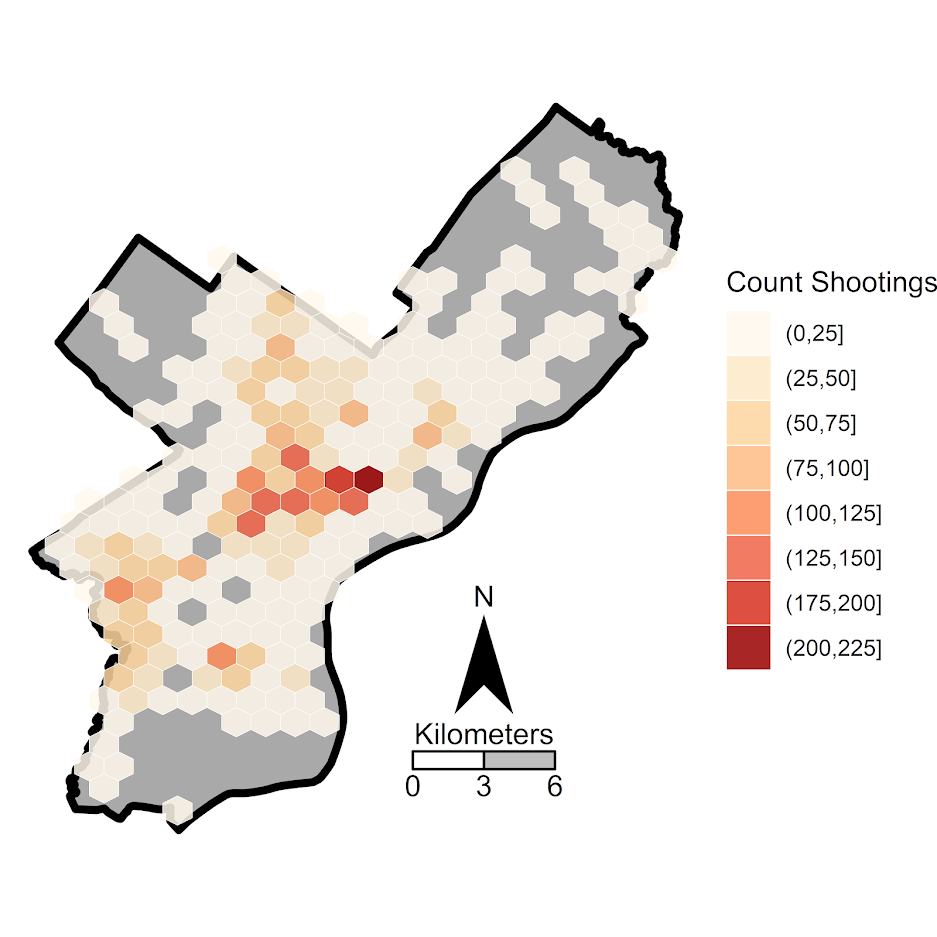
Doing this same exercise for drug overdoses rates, (which I not can overlap with suicide – you can commit suicide via intentionlly taking too many drugs) we can clearly see the dramatic rise in recent years. We can also see the same trends in earlier ages now being peak, but also increases and shifts to older ages.
The cohort plot here looks like a Spinosaurus crest:
Which I believe is more consistent with (very strong) period effects, not so much cohort effects. Drug overdoses are increasing across both younger and older cohorts.
Nerd Notes
These datasets don’t have covariates, which to use the APC method in Spelman (2022) you would need those (it uses covariates to estimate period effects). I am not so sure that is the best approach to APC decomposition, but it is horses for courses.
What I wish is that the CDC distributed the vital statistics data at the micro level (where each row is a death, with all of the covariates), along with a matching variable dataset of the micro level American Community Survey and the weights. That doesn’t solve the APC issue with identifying the different effects, but makes it easier to do more complicated modelling, e.g. I could fit models or generate graphs for age-gender differences more easily, decompose different death types, etc.
Final nerd note is about forecasting mortality trends. While I am familiar with the PCA-functional data approach advocated by Rob Hyndman (Hyndman & Ullah, 2007), I don’t think that will do very well with this data. I am wondering if doing some type of multi-level GAM model, and doing short term extrapolation of the period effect (check out Gavin Simpson’s posts on multi-level smooths, 1, 2, 3).
So maybe something like:
library(mgcv)
smooth_model <- gam(cbind(Deaths, Population - Deaths) ~ s(Year) + s(Age,by=Cohort),
                    family = binomial("logit"),
                    data = suicide)
Or maybe just use s(Age,Year) and not worry about the cohort effect. Caveat emptor about this model, this is just my musings, I have not in-depth studied it to make sure it behaves well (although a quick check R does not complain when fitting it).
References
- Case, A., & Deaton, A. (2015). Rising morbidity and mortality in midlife among white non-Hispanic Americans in the 21st century. Proceedings of the National Academy of Sciences, 112(49), 15078-15083.
- Erosheva, E. A., Matsueda, R. L., & Telesca, D. (2014). Breaking bad: Two decades of life-course data analysis in criminology, developmental psychology, and beyond. Annual Review of Statistics, 1, 301-332.
- Gelman, A., & Auerbach, J. (2016). Age-aggregation bias in mortality trends. Proceedings of the National Academy of Sciences, 113(7), E816-E817.
- Hyndman, R. J., & Ullah, M. S. (2007). Robust forecasting of mortality and fertility rates: A functional data approach. Computational Statistics & Data Analysis, 51(10), 4942-4956.
- Marcotte, D. E., & Hansen, B. (2023). The Re-Emerging Suicide Crisis in the US: Patterns, Causes and Solutions (No. w31242). National Bureau of Economic Research.
- Spelman, W. (2022). How cohorts changed crime rates, 1980–2016. Journal of Quantitative Criminology, 38(3), 637-671.