
I wrote a small op-ed based on the homicide studies work I recently published about interpreting crime trends. Unfortunately that op-ed was not picked up by anyone (I missed the timing abit, maybe next year when the UCR stats come out I can just update the numbers and make the same point). I’ve posted that op-ed here, and I wanted to make a quick blog post detailing how I made the interactive graphs in that post using R and the Plotly library. All the data and code to replicate this can be downloaded from here.
Unfortunately with my free wordpress blog I cannot embed the actual interactive graphics, but I will provide links to online versions at my UT Dallas page that work and show a screenshot of each. So first, lets load all of the libraries that you will need, as well as set the working directory. (Of course change it to where you have your data saved on your local machine.)
#########################################################
#Making a shiny app for homicide rate chart
library(shiny)
library(ggplot2)
library(plotly)
library(htmlwidgets)
library(scales)

mydir <- "C:\\Users\\axw161530\\Box Sync\\Projects\\HomicideGraphs\\Analysis\\Analysis"
setwd(mydir)
#########################################################
Now I just read in the data. I have two datasets, the funnel rates just has additional columns to draw the funnel graphs already created. (See here or here, or the data in the original Homicide Studies paper linked at the top, on how to construct these.)
############################################################
#Get the data

FunnRates <- read.csv(file="FunnelData.csv",header=TRUE)
summary(FunnRates)
FunnRates$Population <- FunnRates$Pop1 #These are just to make nicer labels
FunnRates$HomicideRate <- FunnRates$HomRate

IntRates <- read.csv(file="IntGraph.csv",header=TRUE)
summary(IntRates)
############################################################
Funnel Chart for One Year
First, plotly makes it dead easy to take graphs you created via ggplot and turn them into an interactive graph. So here is a link to the interactive chart, and below is a screenshot.
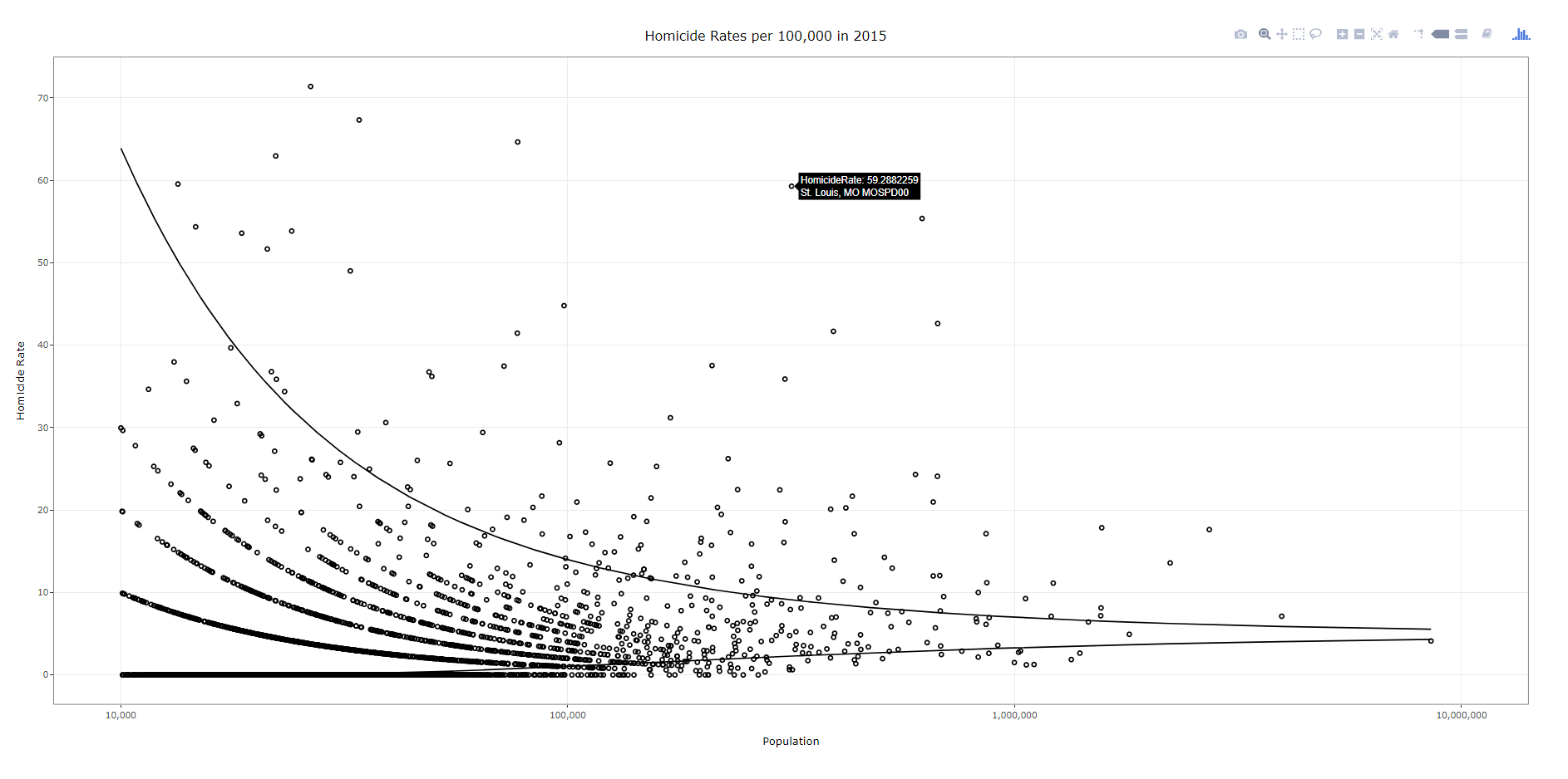
To walk through the code, first you make your (almost) plane Jane ggplot object. Here I name it p. You will get an error for an “unknown aesthetics: text”, but this will be used by plotly to create tooltips. Then you use the ggplotly function to turn the original ggplot graph p into an interactive graph. By default the plotly object has more stuff in the tooltip than I want, which you can basically just go into the innards of the plotly object and strip out. Then the final part is just setting the margins to be alittle larger than default, as the axis labels were otherwise slightly cut-off.
############################################################
#Make the funnel chart
year_sel <- 2015
p <- ggplot(data = FunnRates[FunnRates$Year == year_sel,]) + geom_point(aes(x=Population, y=HomicideRate, text=NiceLab), pch=21) +
     geom_line(aes(x=Population,y=LowLoc99)) + geom_line(aes(x=Population,y=HighLoc99)) +
     labs(title = paste0("Homicide Rates per 100,000 in ",year_sel)) +
     scale_x_log10("Population", limits=c(10000,10000000), breaks=c(10^4,10^5,10^6,10^7), labels=comma) +
     scale_y_continuous("Homicide Rate", breaks=seq(0,110,10)) +
     theme_bw() #+ theme(text = element_text(size=20), axis.title.y=element_text(margin=margin(0,10,0,0)))

pl <- ggplotly(p, tooltip = c("HomicideRate","text"))
#pl <- plotly_build(p, width=1000, height=900)
#See https://stackoverflow.com/questions/45801389/disable-hover-information-for-a-specific-layer-geom-of-plotly
pl$x$data[[2]]$hoverinfo <- "none"
pl$x$data[[3]]$hoverinfo <- "none"
pl % layout(margin = list(l = 75, b = 65))
############################################################
After this point you can just type pl into the console and it will open up an interactive window. Or you can use the saveWidget function from the htmlwidgets package, something like saveWidget(as_widget(pl), "FunnelChart_2015.html", selfcontained=TRUE) to save the graph to an html file.
Now there are a couple of things. You can edit various parts of the graph, such as its size and label text size, but depending on your application these might not be a good idea. If you need to take into account smaller screens, I think it is best to use some of the defaults, as they adjust per the screen that is in use. For the size of the graph if you are embedding it in a webpage using iframe’s you can set the size at that point. If you look at my linked op-ed you can see I make the funnel chart taller than wider — that is through the iframe specs.
Funnel Chart over Time
Ok, now onto the fun stuff. So we have a funnel chart for one year, but I have homicide years from 1965 through 2015. Can we examine those over time. Plotly has an easy to use additional argument to ggplot graphs, named Frame, that allows you to add a slider to the interactive chart for animation. The additional argument ids links one object over time, ala Hans Rosling bubble chart over time. Here is a link to the interactive version, and below is a screen shot:
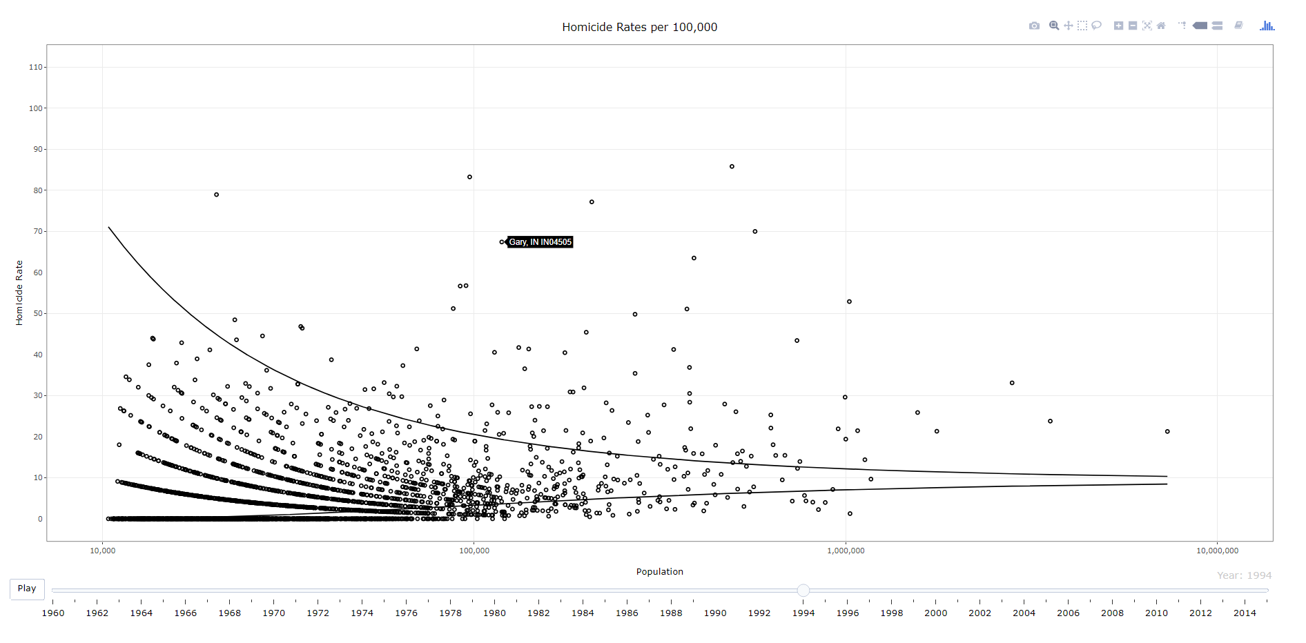
############################################################
#Making the funnel chart where you can select the year
py <- ggplot(data = FunnRates) + geom_point(aes(x=Population, y=HomicideRate, text=NiceLab, frame=Year,ids=ORI), pch=21) +
      geom_line(aes(x=Population,y=LowLoc99,frame=Year)) + geom_line(aes(x=Population,y=HighLoc99,frame=Year)) +
      labs(title = paste0("Homicide Rates per 100,000")) +
      scale_x_log10("Population", limits=c(10000,10000000), breaks=c(10^4,10^5,10^6,10^7), labels=comma) +
      scale_y_continuous("Homicide Rate", breaks=seq(0,110,10), limits=c(0,110)) +
      theme_bw() #+ theme(text = element_text(size=20), axis.title.y=element_text(margin=margin(0,10,0,0)))

ply % animation_opts(0, redraw=FALSE)
ply$x$data[[2]]$hoverinfo <- "none"
ply$x$data[[3]]$hoverinfo <- "none"
saveWidget(as_widget(ply), "FunnelChart_YearSelection.html", selfcontained=FALSE)
############################################################
The way I created the data it does not make sense to do a smooth animation for the funnel line, so this just flashes to each new year (via the animation_opts spec). (I could make the data so it would look nicer in an animation, but will wait for someone to pick up the op-ed before I bother too much more with this.) But it accomplishes via the slider the ability for you to pick which year you want.
Fan Chart Just One City
Next we are onto the fan charts for each individual city with the prediction intervals. Again you can just create this simple chart in ggplot, and then use plotly to make a version with tooltips. Here is a link to an interactive version, and below is a screenshot.
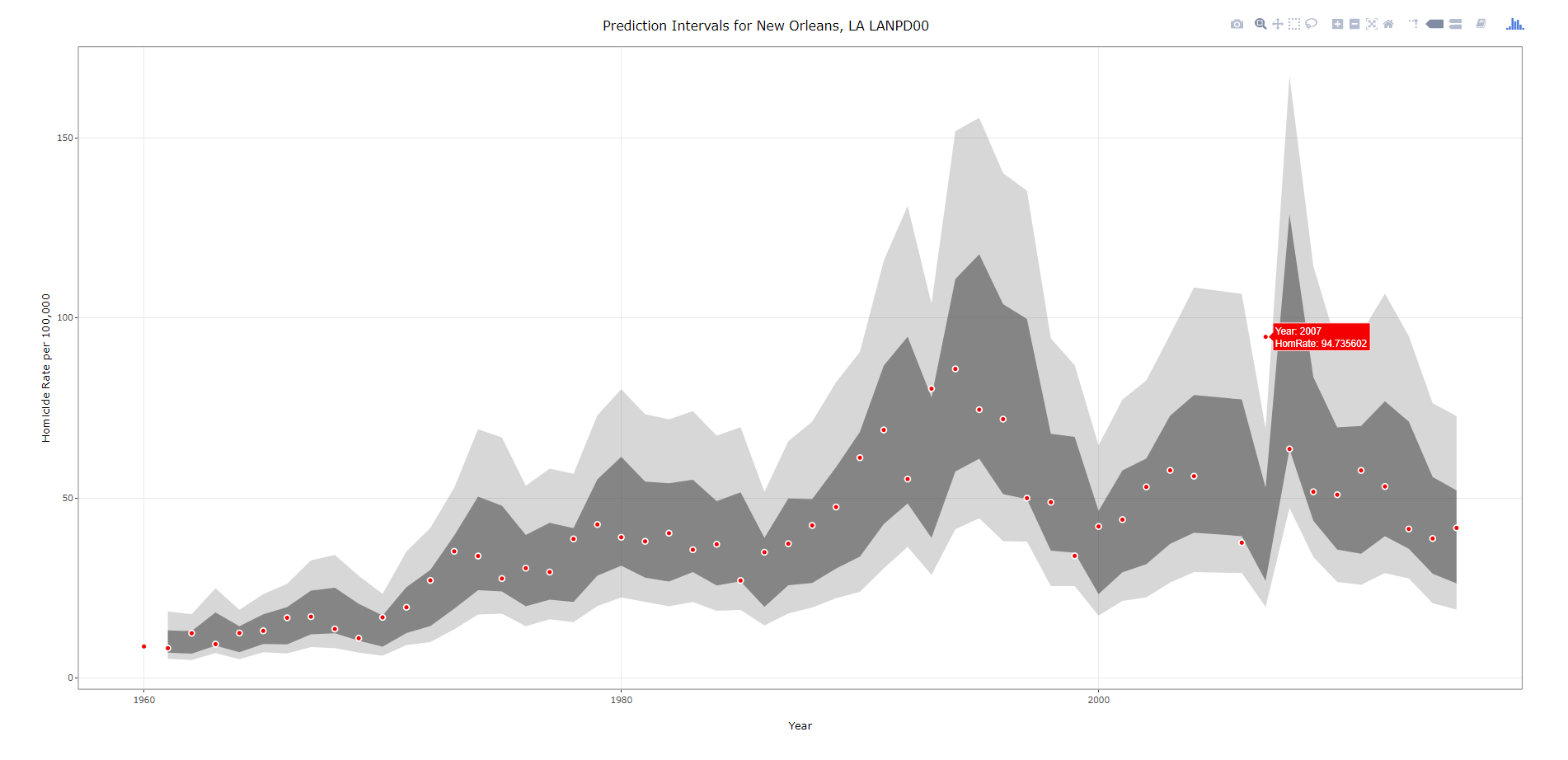
###################################################
#Making the fan graph for New Orleans
titleLab <- unique(IntRates[,c("ORI","NiceLab","AgencyName","State")])
p2 <- ggplot(data=IntRates[IntRates$ORI == "LANPD00",], aes(x=Year, y=HomRate)) +
     geom_ribbon(aes(ymin=LowB, ymax=HighB), alpha=0.2) +
     geom_ribbon(aes(ymin=LagLow25, ymax=LagHigh25), alpha=0.5) +
     geom_point(shape=21, color="white", fill="red", size=2) +
     labs(x = "Year", y="Homicide Rate per 100,000") +
     #scale_x_continuous(breaks=seq(1960,2015,by=5)) +
     ggtitle(paste0("Prediction Intervals for ",titleLab[titleLab$ORI == "LANPD00",c("NiceLab")])) +
     theme_bw() #+ theme(text = element_text(size=20), axis.title.y=element_text(margin=margin(0,10,0,0)))
#p2
pl2 <- ggplotly(p2, tooltip = c("Year","HomRate"), dynamicTicks=TRUE)
pl2$x$data[[1]]$hoverinfo <- "none"
pl2$x$data[[2]]$hoverinfo <- "none"
pl2 % layout(margin = list(l = 100, b = 65))
#pl2
saveWidget(as_widget(pl2), "FanChart_NewOrleans.html", selfcontained=FALSE)
###################################################
Note when you save the widget to selfcontained=FALSE, it hosts several parts of the data into separate folders. I always presumed this was more efficient than making one huge html file, but I don’t know for sure.
Fan Chart with Dropdown Selection
Unfortunately the frame type animation does not make as much sense here. It would be hard for someone to find a particular city of interest in that slider (as a note though the slider can have nominal data, if I only had a few cities it would work out ok, with a few hundred it will not though). So feature request if anyone from plotly is listening — please have a dropdown type option for ggplot graphs! In the meantime though there is an alternative using a tradition plot_ly type chart. Here is that interactive fan chart with a police agency dropdown, and below is a screenshot. Note there was problems with this, will need to update based on updates to plotly and ggplot make this easier I believe.
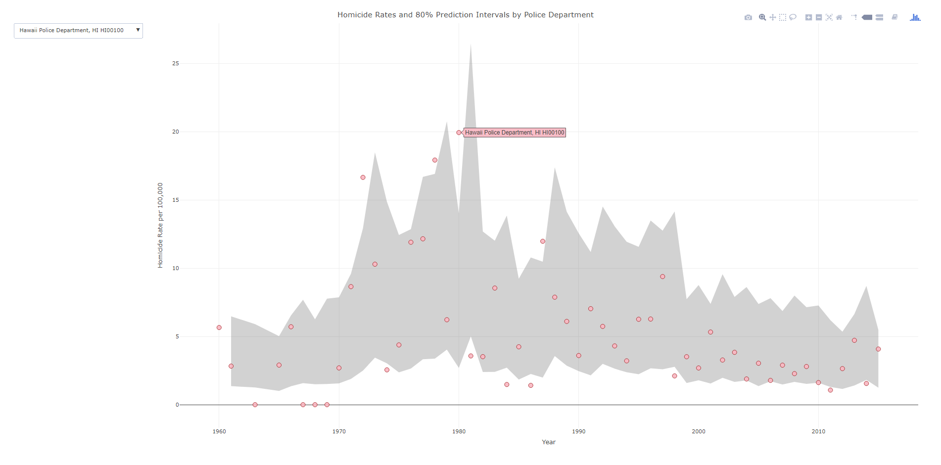
###################################################
#Making the fan graph where you can select the city of interest
#Need to have a dropdown for the city

titleLab <- unique(IntRates[,c("ORI","NiceLab","State")])
nORI <- length(titleLab[,1])
choiceP <- vector("list",nORI)
for (i in 1:nORI){
choiceP[[i]] <- list(method="restyle", args=list("transforms[0].value", unique(IntRates$NiceLab)[i]), label=titleLab[i,c("NiceLab")])
}

trans <- list(list(type='filter',target=~NiceLab, operation="=", value=unique(IntRates$NiceLab)[1]))
textLab <- ~paste("Homicide Rate:",HomRate,'$ Year:',Year,'$ Homicides:',Homicide,'$ Population:',Pop1,'$ Agency Name:',NiceLab) #Lets try with the default plotly #See https://community.plot.ly/t/need-help-on-using-dropdown-to-filter/6596 ply4 %          plot_ly(x= ~Year,y= ~HighB, type='scatter', mode='lines', line=list(color='transparent'), showlegend=FALSE, name="90%", hoverinfo="none", transforms=trans) %>%
        add_trace(y=~LowB,  type='scatter', mode='lines', line=list(color='transparent'), showlegend=FALSE, name='10%', hoverinfo="none", transforms=trans,
          fill = 'tonexty', fillcolor='rgba(105,105,105,0.3)') %>%
        add_trace(x=~Year,y=~HomRate, text=~NiceLab, type='scatter', mode='markers', marker = list(size=10, color = 'rgba(255, 182, 193, .9)', line = list(color = 'rgba(152, 0, 0, .8)', width = 1)),
          hoverinfo='text', text=textLab, transforms=trans) %>%
        layout(title = "Homicide Rates and 80% Prediction Intervals by Police Department",
          xaxis = list(title="Year"),
          yaxis = list(title="Homicide Rate per 100,000"),
          updatemenus=list(list(type='dropdown',active=0,buttons=choiceP)))

saveWidget(as_widget(ply4), "FanChart_Dropdown.html", selfcontained=FALSE)
###################################################
So in short plotly makes it super-easy to make interactive graphs with tooltips. Long term goal I would like to make a visual supplement to the traditional UCR report (I find the complaint of what tables to include to miss the point — there are much better ways to show the information that worrying about the specific tables). So if you would like to work on that with me always feel free to get in touch!


Fernando A. Velez
/ October 8, 2019A great work andrew..thanks for sharing these examples. This is just that I’m doing now, but with a bar stack, however, I can’t make the dropdown selector work correctly, can you help me?
apwheele
/ October 14, 2019You will probably be better off asking for help on Stackoverflow (make sure to have a reproducible example). I am not that expert with it myself.
I will need to update these examples using ggplot with dropdowns, https://plotly-r.com/improving-ggplotly.html