
One aspect of SPSS charts that you need to use syntax for is to create side-by-side charts. Here I will illustrate a frequent use case, time series charts with different Y axes. You can download the data and code to follow along here. This is data for Buffalo, NY on reported crimes from the UCR data tool.
So after you have downloaded the csv file with the UCR crime rates in Buffalo and have imported the data into SPSS, you can make a graph of violent crime rates over time.
*Making a chart of the violent crime rate.
GGRAPH
  /GRAPHDATASET NAME="graphdataset" VARIABLES=Year ViolentCrimerate MISSING=LISTWISE
    REPORTMISSING=NO
  /GRAPHSPEC SOURCE=INLINE.
BEGIN GPL
  SOURCE: s=userSource(id("graphdataset"))
  DATA: Year=col(source(s), name("Year"))
  DATA: ViolentCrimerate=col(source(s), name("ViolentCrimerate"))
  GUIDE: axis(dim(1), label("Year"))
  GUIDE: axis(dim(2), label("Violent Crime Rate per 100,000"))
  ELEMENT: line(position(Year*ViolentCrimerate))
  ELEMENT: point(position(Year*ViolentCrimerate), color.interior(color.black), color.exterior(color.white), size(size."7"))
END GPL.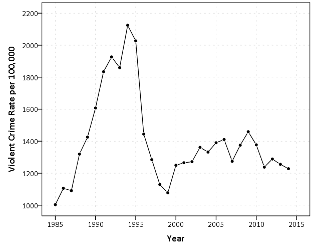
I like to superimpose the points on simple line charts, to reinforce where the year observations are. Here we can see that there is a big drop post 1995 for the following four years (something that would be hard to say exactly without the points). Part of the story of Buffalo though is the general decline in population (similar to most of the rust belt part of the nation since the 70’s).
*Make a chart of the population decline.
GGRAPH
  /GRAPHDATASET NAME="graphdataset" VARIABLES=Year Population MISSING=LISTWISE
    REPORTMISSING=NO
  /GRAPHSPEC SOURCE=INLINE.
BEGIN GPL
  SOURCE: s=userSource(id("graphdataset"))
  DATA: Year=col(source(s), name("Year"))
  DATA: Population=col(source(s), name("Population"))
  GUIDE: axis(dim(1), label("Year"))
  GUIDE: axis(dim(2), label("Population"))
  ELEMENT: line(position(Year*Population))
  ELEMENT: point(position(Year*Population), color.interior(color.black), color.exterior(color.white), size(size."7"))
END GPL.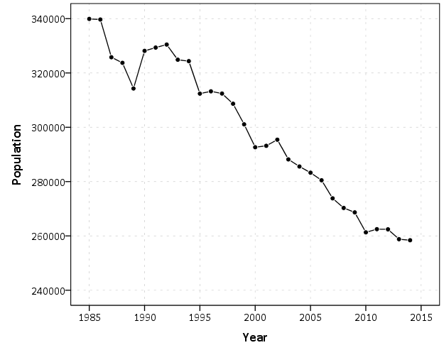
Now we want to place these two charts over top of one another. So check out the syntax below, in particular to GRAPH: begin statements.
*Now put the two together.
GGRAPH
  /GRAPHDATASET NAME="graphdataset" VARIABLES=Year Population ViolentCrimerate
  /GRAPHSPEC SOURCE=INLINE.
BEGIN GPL
  SOURCE: s=userSource(id("graphdataset"))
  DATA: Year=col(source(s), name("Year"))
  DATA: Population=col(source(s), name("Population"))
  DATA: ViolentCrimerate=col(source(s), name("ViolentCrimerate"))
  GRAPH: begin(origin(14%,12%), scale(85%, 60%))
  GUIDE: axis(dim(1), label("Year"), opposite())
  GUIDE: axis(dim(2), label("Violent Crime Rate per 100,000"))
  ELEMENT: line(position(Year*ViolentCrimerate))
  ELEMENT: point(position(Year*ViolentCrimerate), color.interior(color.black), color.exterior(color.white), size(size."7"))
  GRAPH: end()
  GRAPH: begin(origin(14%, 75%), scale(85%, 20%))
  GUIDE: axis(dim(1), label("Year"))
  GUIDE: axis(dim(2), label("Population"))
  ELEMENT: line(position(Year*Population))
  ELEMENT: point(position(Year*Population), color.interior(color.black), color.exterior(color.white), size(size."7"))
  GRAPH: end()
END GPL. 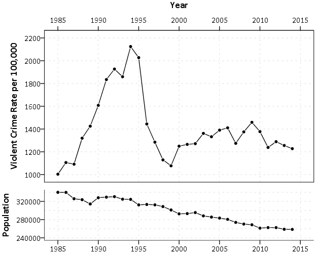
In a nutshell, the graph begin statements allow you to chunk up the graph space to make different/arbitrary plots. The percentages start in the top right, so for the first violent crime rate graph, the origin is listed as 14% and 12%. This means the graph starts 14% to the right in the overall chart space, and 12% down. These paddings are needed to make room for the axis labels. Then for the scale part, it lists it as 85% and 60%. The 85% means take up 85% of the X range in the chart, but only 60% of the Y range in the chart. So this shows how to make the violent crime chart take a bigger proportion. of the overall chart space than the population chart. You can technically do charts with varying axes in SPSS without this, but you would have to make the panels take up an equal amount of space. This way you can make the panels whatever proportion you want.
For Buffalo the big drop in 1996 is largely due to a very large reduction in aggravated assaults (from over 3,000 in 1995 to under 1,600 in 1996). So here I superimpose a bar to viz. the proportion of all violent crimes. This wouldn’t be my first choice of how to show this, but I think it is a good illustration of how to superimpose and/or stack additional charts using this same technique in SPSS.
*Also superimposing a stacked bar chart on the total types of crimes in the background.
COMPUTE PercentAssault = (Aggravatedassault/ViolentCrimeTotal)*100.
FORMATS PercentAssault (F2.0).
EXECUTE.

GGRAPH
  /GRAPHDATASET NAME="graphdataset" VARIABLES=Year Population ViolentCrimerate PercentAssault
  /GRAPHSPEC SOURCE=INLINE.
BEGIN GPL
  SOURCE: s=userSource(id("graphdataset"))
  DATA: Year=col(source(s), name("Year"))
  DATA: Population=col(source(s), name("Population"))
  DATA: ViolentCrimerate=col(source(s), name("ViolentCrimerate"))
  DATA: PercentAssault=col(source(s), name("PercentAssault"))
  GRAPH: begin(origin(14%,12%), scale(75%, 60%))
  GUIDE: axis(dim(1), label("Year"), opposite())
  GUIDE: axis(dim(2), label("Violent Crime Rate per 100,000"))
  ELEMENT: line(position(Year*ViolentCrimerate))
  ELEMENT: point(position(Year*ViolentCrimerate), color.interior(color.black), color.exterior(color.white), size(size."7"))
  GRAPH: end()
  GRAPH: begin(origin(14%, 75%), scale(75%, 20%))
  GUIDE: axis(dim(1), label("Year"))
  GUIDE: axis(dim(2), label("Population"))
  ELEMENT: line(position(Year*Population))
  ELEMENT: point(position(Year*Population), color.interior(color.black), color.exterior(color.white), size(size."7"))
  GRAPH: end()
  GRAPH: begin(origin(14%, 12%), scale(75%, 60%))
  SCALE: linear(dim(2), min(0), max(60))
  GUIDE: axis(dim(1), null())
  GUIDE: axis(dim(2), label("Percent Assault"), opposite(), color(color.red), delta(10))
  ELEMENT: bar(position(Year*PercentAssault), color.interior(color.red), transparency.interior(transparency."0.7"), transparency.exterior(transparency."1.0"), size(size."5"))
  GRAPH: end()
END GPL.
While doing multiple time series charts is a common use, you can basically use your imagination about what you want to accomplish with this. Another common example is to put border histograms on scatterplot (which the GPL reference guide has an example of). Here is an example I posted recently to Nabble that has the number of individuals at risk in a Kaplan-Meier plot.


